
Last Seen Blogs


Text
Group Project Commentary
My group decided to create a bag styling guide for milennials. As explained in our design document, we initially decided to focus on Longchamp itself.After feedback from our tutor and classmates we decided to change our focus to bags for milennials in general to broaden our topic and make it more appealing to our target group, which was mainly females. I was tasked to create the spread for Fjalllraven Kanken, while my group members did spreads for Longchamp, Fila and Coach. The explanation for the bags were from personal experience using the bag, but there was research done about the functions and history of the bag. I chose to use the colour yellow as it stood out from the bluish-grey background that was part of the colour scheme that my group and I selected.
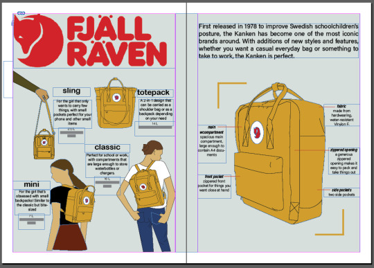
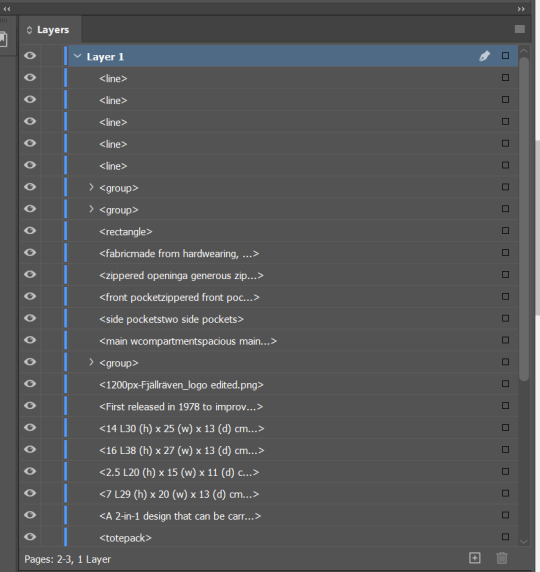
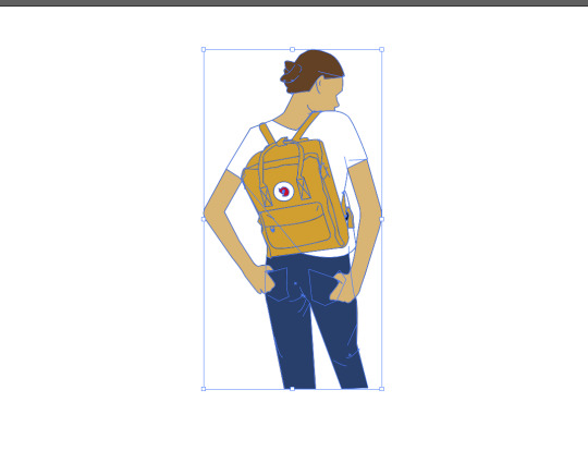
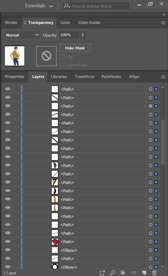
above is a screenshot of the spread that I did together with its layers. The fonts that I used were all sans serif to convey the functional yet stylish aesthetic vibe of the bag. As we were not able to use stock images, the images of the font, bags and models carrying the bags were all done on illustrator. Attached below is an example of the work that I did on illustrator together with its layers. I decided to use black lines to outline the vector images to convey the rugged and urban aesthetic of the brand.
0 notes
Text
Assignment 3 Commentary

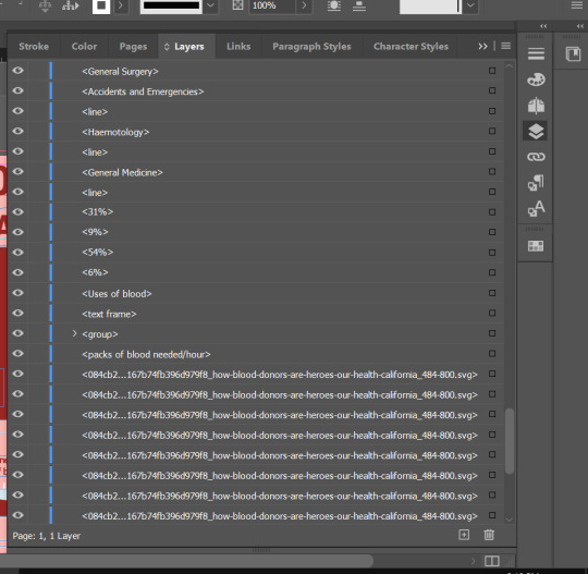
I decided to do a infographic on blood donation in Singapore, and focuses on convincing non-donors and one-time donors to be regular, long-term donors. This infographic provides information about the blood levels in Singapore and addresses concerns and facts that non-regular donors might want to know about blood donation. As compared to the previous critique, I made the graphs and images smaller to allow for more breathing space between the different rows. I also made the colours for the current blood leves in Singapore monochromatic. Some of the information in the second row was also changed to be more focused on my target audience. As seen in the example of the screenshot of my layers, most of my work was done using Indesign. I used Photoshop to crop some images as well as Illustrator to create shapes, such as the blood bag in the third row. I decided to have all my fonts be sans-serif as it would be easier on the eyes, given that this infographic is more focused on images than on words. I made the headers for each section bigger so that the viewer would know which image is under which section.
Sources:
Singapore Red Cross (https://www.redcross.sg/)
- Why should I donate blood? (https://www.redcross.sg/give-blood/why-should-i-donate-blood.html)
- I’m ready to donate (https://www.redcross.sg/give-blood/i-m-ready-to-donate.html)
- Where to donate blood (https://www.redcross.sg/give-blood/where-to-donate-today.html)
0 notes
Text
Assignment 2 Commentary
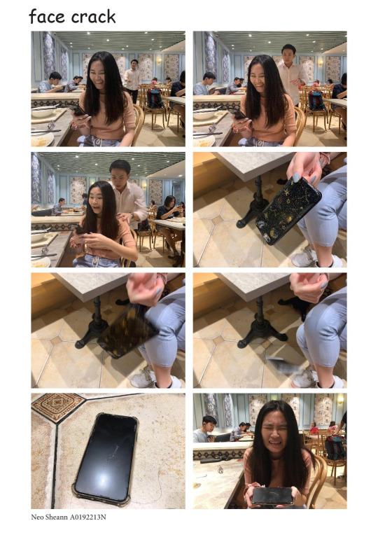
This is my final product for assignment 2. The story line that I thought of was the subject getting scared by her friend and dropping her phone, which resulted in a cracked screen.
For the first two images, I had the subject in the middle of the frame and the person that was scaring her approaching her from the back. The third frame was him scaring the subject, as can be seen in her change of expression. The next 3 scenes show the series of the phone falling onto the floor. The seventh scene shows the phone on the floor with a visible crack in the middle of the screen and along the sides, and the last scene shows my friend looking upset about the situation.
I titled this “face crack” as it means to react with extreme facial expression, which is evident here. It is also a play on words to represent the the phone crack.


Above is the original story board that I came up with as well as my first draft that I presented for critique. I took individual shots for my first draft and got critique that I needed better angles to capture the falling of the phone. I also received feedback to have the person doing the scaring to have more emotion and be apparent in the background of the first two images as well.
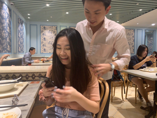
To fix this problem I decided to take a series of burst shots for each scene in order for me to get the appropriate shot. An example of a shot that I did not use for the final product can be seen below. I did not choose it as I did not feel that the emotions that were displayed in the image would convey the meaning of being scared as well as the picture that eventually chose.
0 notes
Text
In-Lecture Exercise F
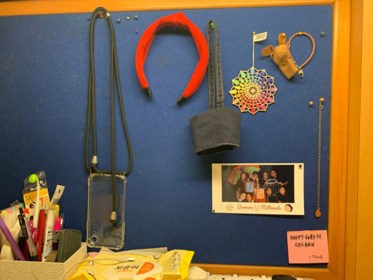
There is a red, blue, yellow, green and yellow orange hue in this image.
The red hue can be seen in the bright red headband. It works well in attracting attention. Blue is the colour of the pin board and conveys a sense of calmness in this image as it serves as a background for the items on the board. Green can be seen on the tip of the pen in the pen holder and in the picture on the board. It does not convey much emotion or mood as it is not very significant in the image. The yellow packet of wet tissue conveys a sense of happiness. The yellow orange hue of the wall provides a sense of stability.
0 notes
Text
Assignment 1 Commentary

I chose to abstract an image of a cup of iced tea. For the first step, I simply outlined all the lines of the object, including the the less obvious lines such as that of the tea bag and the water level. This allowed me to retain as much of the original image as possible. For the second step, I removed the lines on the sleeve because we would still be able to tell that the sleeve was a sleeve without the lines on. I also removed the tea bag but left the string and the tag as it would still represent tea. I then straightened the lines of the cup so that the image was cleaner. I then removed the line that represented the water level, changed the skew of the tea tag and used only one straight line for the tag. In the last step, I removed the sleeve and pushed up the straw indent such that the lines would be cleaner and straighter.
Compared to the initial image, I think that my final image has less lines but is still able to show that it is a cup of iced tea. The process made me consider what I should take out and what I should leave in the image in for my abstract image to convey the same meaning as the initial image.
0 notes
Text
In-Lecture Exercise E (Typography Case Study)
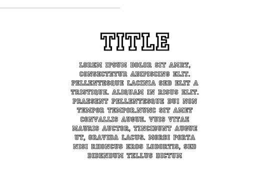
There are several issues with the typography above. Firstly, the typeface selected for the body text makes it hard for the reader to read the text. It is a decorative/ novelty face that should be only used in headings. The text is also all in caps which makes it the text feel as if it is in the reader’s face and makes for an uncomfortable reading experience. Both the title and the body text are in Serif as well which shows no contrast in the title and body. The body text is also aligned to the center, which is inconsistent and also hard to read.
To improve this typographic representation, I would change the font of the body text to a Serif typeface and not caps-lock the text as it would make it easier to read. I would also align the text to the left to have a more consistent starting point. I would do this first to ensure that my text is legible.
0 notes
Text
In Lecture Exercise D
The subject I have chosen to take a photograph of is my laptop as I was going through the lecture alone in my room.
Picture 1:
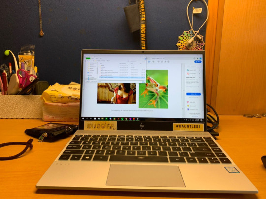
This photograph is a neutral shot of my laptop with it being in the middle of the picture. It should be a familiar shot to most audiences as this is what they would see if they were to use a laptop on a table as well.
Picture 2:
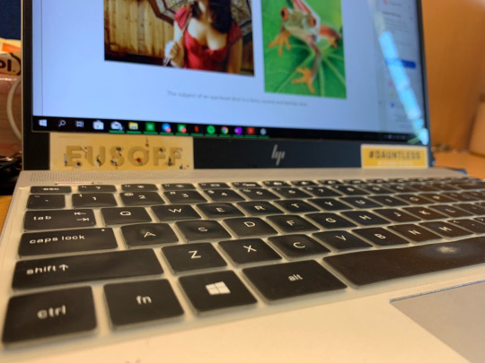
This second photograph is taken from a dutch angle that places the keyboard in the focus of the photo. This allows the audience to know and see that it is the keyboard in particular that the photographer wants them to focus their attention to.
Picture 3:

This third photograph was taken from a top-down angle which makes the laptop look smaller and less significant although it takes up most of the space in this photo. Viewers will be able to sense a feeling of dominance through the photo and look at the laptop to be more of an appliance that assists humans more than something that is humans are reliant on.
Picture 4:
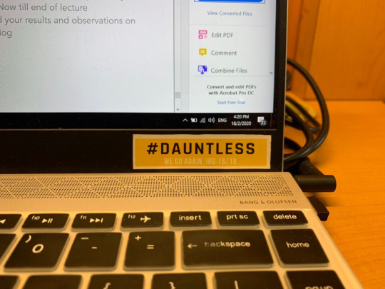
This last image is a neutral shot of the laptop, but with the “Dauntless” sticker in focus as it is in the middle of the photo. Although it does not occupy much space on the screen, it is the only item that is full seen in this image. Other things such as the keyboard and the laptop screen are cut off by the image. This signals to the viewer to draw their attention to the sticker instead of the other parts of the laptop.
0 notes
Text
In-Lecture Exercise C

The advertisement above features a Heinz Ketchup bottle that is made up of tomato slices stacked unevenly above one another with a caption that reads “No one grows Ketchup like Heinz”. The signifier is the ketchup bottle that is made up of tomato slices. The Heinz stickers that are stuck on the tomatoes allow the viewer to know that the image is supposed to represent a bottle of Ketchup It signifies the fact that Heinz’s Ketchup is very natural. Along with the caption, the use of the tomato slices to make up the ketchup bottle allows viewers to know that Heinz produces the most natural Ketchup on the market and that no one can come close to what they produce.
0 notes
Text
In-Lecture Exercise B
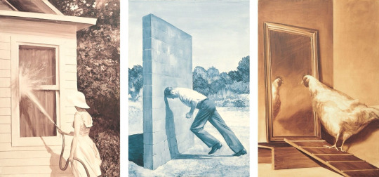
Titled A short History of Modernism, This piece of art by Mark Tansey represents is separated into three different pieces of art, each depicting a different scene. Despite this, there is a sense of coherence across the three paintings through the monochromatic colour schemes of the paintings and how each subject in the frame is faced towards the left. This painting can be interpreted to be how modernist painting have changed as compared to the past. From the first painting, it can be inferred that modernist painters are trying to start on a clean slate instead of following the norms of painters in the past. The second painting can be interpreted to be how Tansey himself might be facing some obstructions while creating modernist pieces of art. The third painting may be used to show how these creators may need to reflect on their art. I think that this piece is successful in conveying how artists create modernist paintings. However, this image may not be appreciated or easily understood by the mass population.
0 notes