
ocostalita
Inspire creativity
Visual Communication loading...
17 posts
Don't wanna be here? Send us removal request.
Last Seen Blogs

rebekahcohencorbettkeyclass-blog
Untitled

umagtv
Sin título
theamamazingmarla
Marla!
halo--hall
sleazy rider
Text
Get going
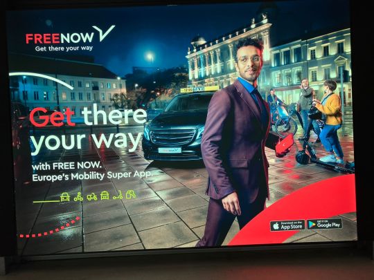
While at the Dublin airport, I saw this ad banner and found it very well designed, which really catches the attention. It has many elements on it that takes the viewer's attention. The typography is added in different colours to highlight key words in the text. The clip-art images of car, bike, motobyke, taxi, scooter presents the options the app provides. Photography which shows casual people and also very formal people that would benefit from the service, and also shows the transport provided itself.
Although there is a lot of information added to the banner, it is clear and easy to relate to one of the situations, which can bring the interest of a passenger who just arrived in the city.
0 notes
Text
Christmas time!
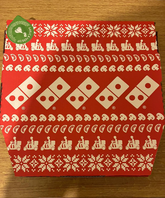
Domino's packaging for Christmas is clever and simple, with a few repetitive elements that in my opinion clearly connects to the brand and to this time of the year.
The brand name is not added, however is represented by it's domino's logo. The delivery service is represented by the driver and the motorcycle, the pizza is represented by mushroom and tomatoes toppings and the flowers represents the Christmas decorations.
All in white and red colours (which are associated with Christmas). It's a fun and simple package that represents the brand.
0 notes
Text
Aged like a fine wine

The Matsu wine brand has an interesting way to present the age of the wine. It has the name of the wine displayed very discrete in the down right corner of the label and has no further information apart from a picture showing a young, middle aged, and senior man representing the age of the wine.
This is a well known brand and they have build brand recognition within their target market so only this information is enough to convey the idea of the product.
0 notes
Text
Out of tone
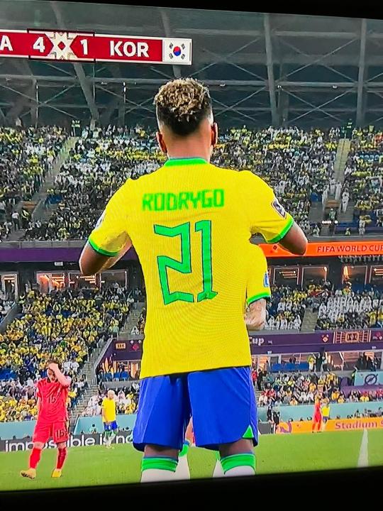
Watching the Brazil - South Korea match tonight and have noticed a few changes in the team's Jersey, which by the way I found very disturbing to the eyes.
First the neon colour added to the collar, sleeves, and numbers seem off and don't make a harmonious combination with the other colours in my opinion.
Secondly I find the typography with regular font very poor and the number don't stand out, even with the stroke added to it. Therefore the design brings discomfort to the eyes.
I prefer the standard format where they have dark green color as the complementary colour for the shirt and a bold typography without stroke which brings a much stronger effect in my opinion.
0 notes
Text
The place with two names
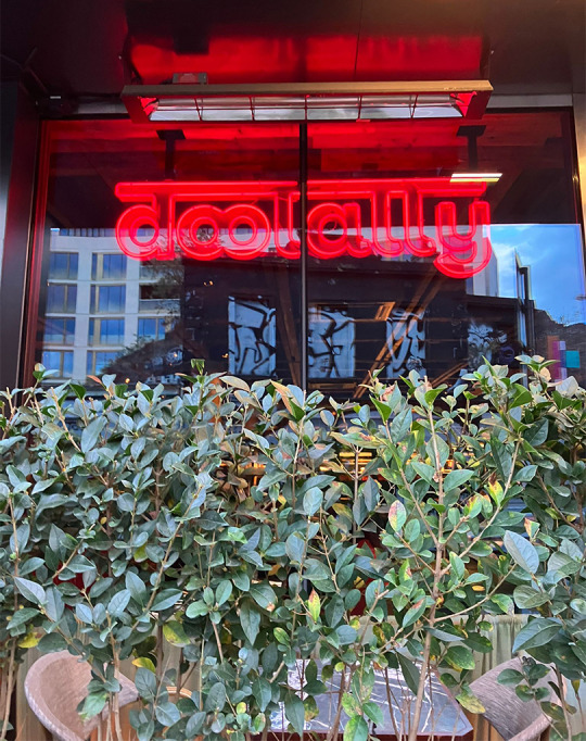
Always when I pass by the doolally restaurant I try to understand the displayed name and in the beginning I couldn't even identify what it was. This is a restaurant in portobello that has the name displayed in two languages. Its typography is had to visualise and the illumination added also doesn't help. I've thought that during the night it gets easier to read, but still seems quite confusing.
Since the design is unusual and the restaurant is located in a busy area the company could benefit from free advertising made by customers or tourists posts on social media. However the display is not very legible in pictures and the company doesn't have a common name, which I believe makes it difficult to make the restaurant popular by word of mouth.
0 notes
Text
Morning Dublin!
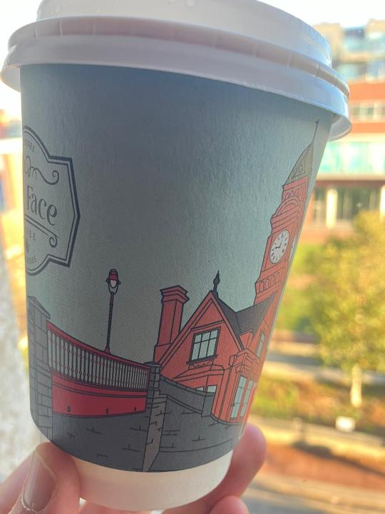
This is one of my favorite places to grab a coffee in Dublin, not only because of the delicious coffee, but I love the design of the shop and the nice feeling it transmits. It's called Four Face coffee, in Rathmines.
The design of their cup reflects the design of the shop, a mix of images from different places around Dublin, they also have a world map in the wall. Rathmines is a neighborhood with a large mix of nationalities, the images around the shop and in the cup it brings a touristic feeling to me.
The printed colours have a texture that reminds of hand painting which gives a delicate tone to the brand. Even though the places illustrated are not representing the exact location, as the bridge wouldn't be close to the Rathmines College, the design keeps the colours of each structure. The graphic mixes both places in a harmonious way and in my opinion it differentiates from other coffee shop brands.
0 notes
Text
Inspiring nature
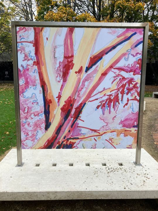
This is another exhibition very close to the interactive outdoor previous posted and managed by the same company. There are a number of paintings and this in particular caught my attention because it transmits a very important message in my opinion.
The tree communicates bleeding and dying, bringing a concern which is very alive nowadays, because of deforestation in Amazon forest for example, also the cutting of trees in cities to make buildings and roads.
After reading the painting's description I realized that the artist wanted to represent an Ash tree in his garden and did the painting during lock-down as a way to bring nature to life. However, he does mention that the nature is disappearing and trees like this are being affected by fungal infection which causes damage and death of the tree. Even though I seem to have got the message wrong I do believe that brings a moment of reflection when the viewer sees the image.
0 notes
Text
Interactive media
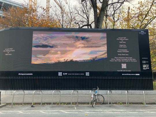
This outdoor screen is quite innovative and cool as it invites the viewer to scan the QR code to get more details about the information in the screen. I have passed by many times and for a while there were just ads so I guess companies could rent the spot.
Now they have an exhibition showing, however it is quite hard to see during the day because of the contrast with the natural light, but I did scanned the QR code and could have a better idea of the exhibition.
I believe that this innovative communication does make viewers curious as it seems very different from anything around town. I believe it works better during the night after working hours because as mentioned during the day is hard to see and this is a busy spot for people walking/cycling jogging in certain hours, so it can be a bit chaotic to spot and pay attention to the outdoor screen.
People might avoid stopping during the night though as they can consider dangerous because it is too empty during the night. So I believe the company could have picked a better location thinking in these points.
0 notes
Text
Shades of blue

Blue is a colour that conveys security and is one of the most popular colour chosen by companies, as they want to communicate trust with their public.
This news in the Irish Times, makes a interesting connection with the colour blue and insecurity feeling that these large companies have brought to Ireland these week. With many lay-offs, these companies have taken many by surprise.
This picture in The Irish Times is clearly directed to the social media tech companies as it has the text Stripe with a high transparency element, so meta and twitter stand out. Also the lines and circles show the networking which straight connects to these companies.
0 notes
Text
Past & future
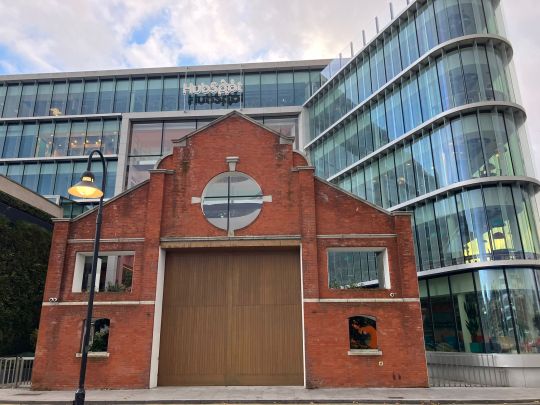
This is the Hubspot office in Dublin and I can't quite decide if I love it or if it is visually disturbing me. I have to say that it does a great job on catching attention.
As it is a mix of contemporary with modern, it conveys the idea of different stages of the city and it gives the contrast of the types of architecture. However to me it transmits a felling of not fitting to that area of Dublin where most of the modern buildings are placed.
The name of the company in white, gets a bit unnoticed in my opinion, maybe if was in a larger size, or even kept the orange colour present in the company’s logo would have looked better. During the night the building is illuminated by lights with various colours, the company name will be illuminated by blue lights, but still wouldn't stand out.
0 notes
Text
From above
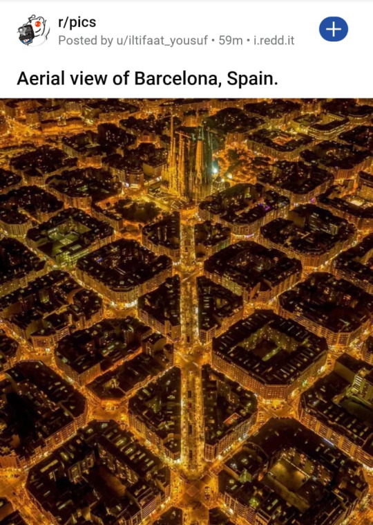
Saw this post on redd.it and the angle the picture was taken really fascinated me. I believe it's taken from a drone, but the photographer made sure to have the information balanced out.
The repetition principle is noticed with the rounded corner squares, triangles, and the streets which looks like diagonal lines. The only vertical line is located central and is the main avenue. There is hierarchy on the image as the wider line leads the viewer to the top of the picture where is most important information (Sagrada Familia).
By taking the picture during the night the photographer captured the contrast of colours of dark building with bright streets, and even not able to see much of the buildings, they look full of details which from above gives a delicate touch in my opinion. Also the light of the streets and continuous intersections convey the idea that the city is surrounded by gold.
0 notes
Text
A while Ago

This cover of the Rolling Stones magazine with Paul McCartney and Linda McCartney is framed at the Bad Bobs pub in Temple Bar. The picture of the couple transmits to me the love of Linda to Paul McCartney as she has her arms around him. His face conveys plainess and looks like he is singing or talking, as he was photographed with the mouth open.
The typeface used for the name of the magazine is in Serif, and is not very easy to read. But that was the style used by the brand in that time, and it was recognised by the public. The colour of the header is red, with a font with drips in the edge of each letter, reminds me of blood which I believe was the goal of the design of this magazine to transmits a rock'n roll feel.
The colour of the text above the magazine's name is not in contrast with the colours in that area, so the message is not easily seen. However the writing on the left down the page has hierarchy with the name of the singer interviewed in a larger font size (most important information) and the text in this area is white which contrasts with the black of the background.
The typeface is in San Serif with some piece of information that are in smaller size being in bold having the writing balanced out.
0 notes
Text
Pack'n Go!

This bookcase has a lovely design. A few pictures displayed in a random order conveys the idea of when we check the pics from a trip. The yellow texture transmits to me the idea of sand, or a bit like vintage, the idea of a memory.
The title is in San-serif typeface in a bold font, and large font size, in vibrant and warm colours emphasizes the message of the book. The gradient colours of the text convey the idea of a sunset, the texture as previously mentioned conveys sand. Who doesn’t have a great memory for a summer vacation?!
The images communicate a number of options of what memories the reader could have from a travel. It could be a walk in the countryside, an experience with a sport, a view from the top of a hill, a dangerous road on the way down, a famous city or monument, or even a local drink that made all the fun.
The memories of the authors could clearly become an inspiration for the readers. The mix of fonts brings informality but doesn’t take out the significance of the text.
0 notes
Text
Perfect mix

I personally love the mix of visual elements of this package. It's fun, easy to read, and caught my attention with its vibrant colours.
The logo has the brand name in a serif typeface which relates to classic, and trustful brand. It is the most important message in the package as it helps to create brand recognition. The other parts of the text are in different san-serif typeface sizes and fonts. These could have become messy, however I see that sizes, bold font, and spacing balances out the distribution of information.
The clear design of the package makes it easy for the consumer to decide which product to get. The text “Crunchy nut granola” suggests the crunchy characteristic of the product, and transmits motion as it is written in curve lines. Also the bite in the letter R can easily connect to kids because brings fun to the writing.
Other characteristics of the product like flavour, and nutrients are in smaller font size. But they are all in capital letters, and in good contrast, which makes clear to read.
There are other piece of information, in my opinion all very well distinguished. Also the picture clearly shows the product, and the colours chosen convey energy and fun, which connects with what consumers want for a breakfast meal.
0 notes
Text
Bloody orange

Watched The Woman King at Stella theater this week, such a powerful and exciting movie. The poster is vibrant and gives an energetic feeling.
It has the vivid orange suggests to me the idea of fire, which is constantly seen throughout the movie. The shades of red orange colour reminds me of the ground, direct related to the fights for land, and it puts forth the idea of blood which is seen in many of the battle scenes.
For the text, a neutral colour was used to give a contrast to the red and orange which already catches a lot of attention. Different font sizes were used to distinguish each information presented. However it seems too many different sizes to me, mixing up the message of the text.
I believe that adding one extra neutral colour like black would have helped to balance the colors, and it would have been a better option to transmit the different functions of the text.
0 notes
Text
Perceptions of colour
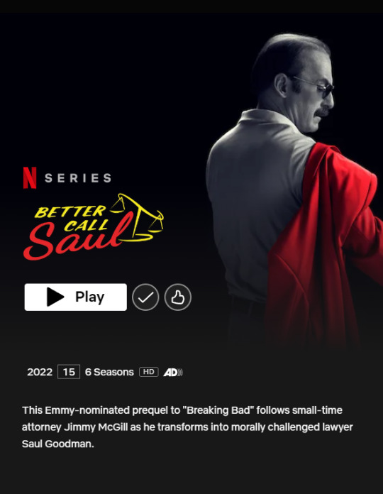
I have just finished watching the full series of Netflix Better Call Saul. As mentioned in the brief description in the picture, it is a prequel to Breaking Bad. The contrast in colours refers to the black and white and coloured scenes, I have to say that I was lost a few times during the series.
The first minutes of the first episode of each season (until season 5) there were scenes showing what happens after the Breaking Bad timeline. So, in order for the public to understand the difference in time, a contrast was applied by editing it to black and white. As the future timeline was happening in a different location, in my opinion it would have been easier to follow if it was added location/year in each scene instead.
Black and white were used in scenes that were happening in the future, coloured was added for scenes in the present and past. This was extremely confusing to me as I am used to relate black and white to an idea of something that happened in the past. Another confusing point is that there was consistency in these black and white scenes until season 5, however in the last season (season 6) it was taken a different approach.
As for the red and yellow colours in the picture, the main character embraces an extravagant personality, this is represented by his red suit and the distinctive text in yellow. Red and yellow are considered warm colours which also make me think that the colour of the text is connected to the location that is Albuquerque in New Mexico, a place that has hot weather and desert.
0 notes
Text
Precious history
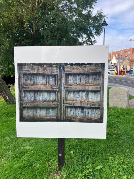
While walking at Charlemont street today I was surprised by an outdoor exhibition that shows numerous pictures captured by photographer Allen Kiely from different locations of the canal. One side of the panel was showing a picture from an aerial view, and the other side a close-up of another area.
This image in specific shows one of the lock gates along the canal. It called my attention due to the visual element of texture which clearly shows the wood material, and transmitted to me a vintage feeling which connects directly to the idea of the of the exhibition, that is to mark the National Heritage week.
More details about this exhibition can be found on: https://www.heritageweek.ie/event-listings/outdoor-exhibition-dublins-grand-and-royal
1 note
·
View note