octopusunoreverse
Page to screen
WHERE THE WILD THINGS ARE
39 posts
Don't wanna be here? Send us removal request.
Last Seen Blogs
sutekiyomitsu
Obusesshon
nicoliine
Nico Loves Pink And Frogs
ozgur-beden
Özgür Beden
lazyasszoroandsexynicorobin
I'M NOT AN ARTIST! PLEASE READ BIO!

beardtuna72
The Love of Friedrichsen 707
Text
did i ever post this? i cant remember. either way- old art from mid 2019 (?) of kind of what i wanted out of the fabled comic #7. obsessed with all the unresolved plot with engie and his dad
1K notes
·
View notes
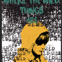
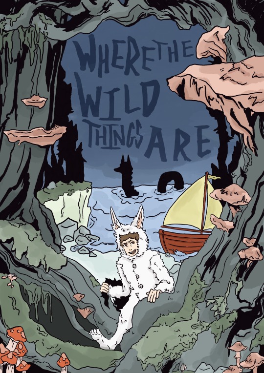
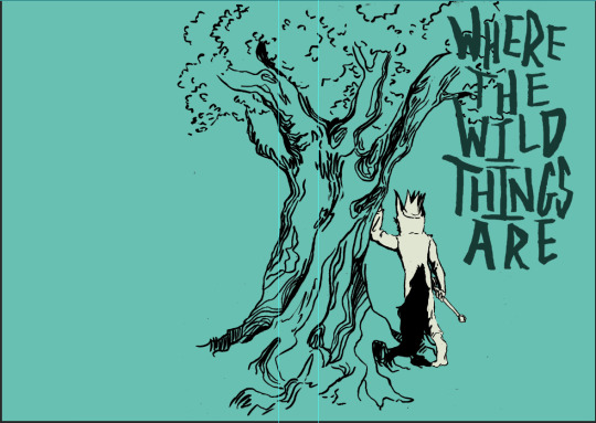
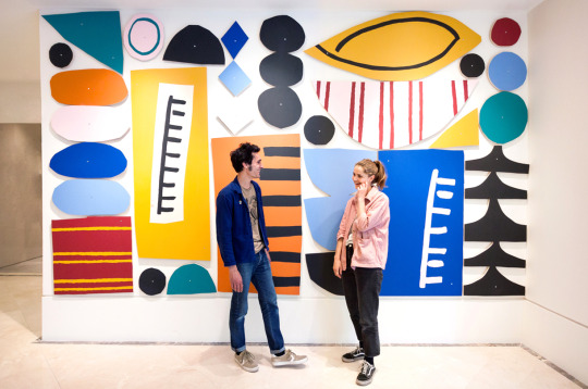
Photo
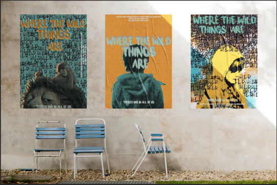
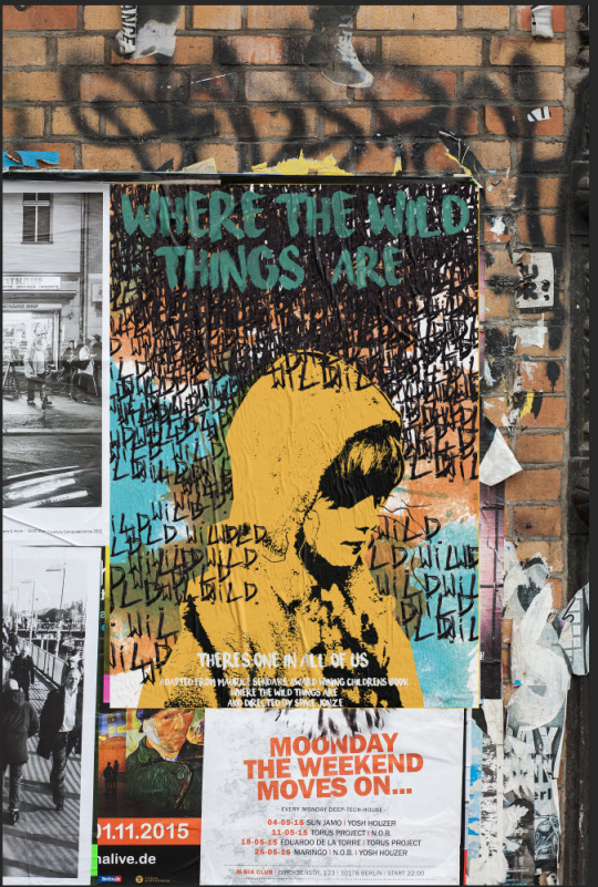
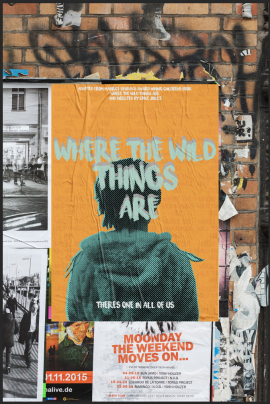
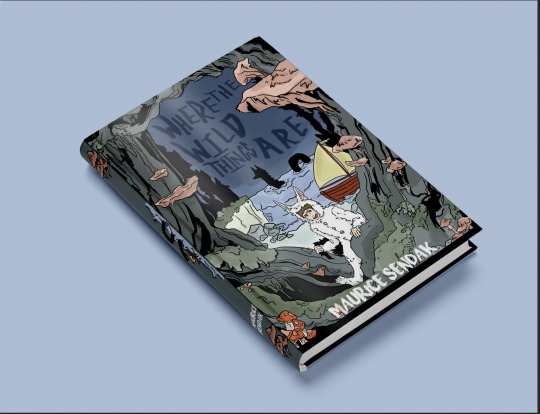
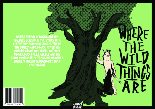
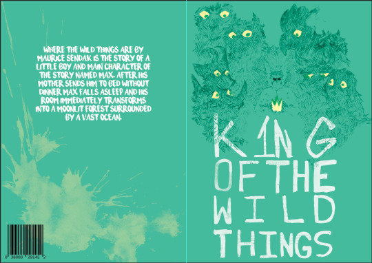
Mockups - this is an example of my poster cover outcome “where the wild things are” mocked up.
- the importance of mocking up the poster is to see how they would be in a scenario
1 note
·
View note
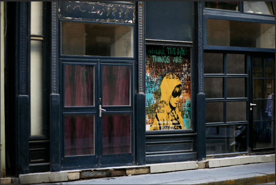
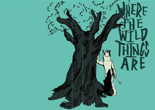
Photo
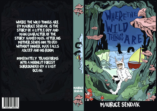
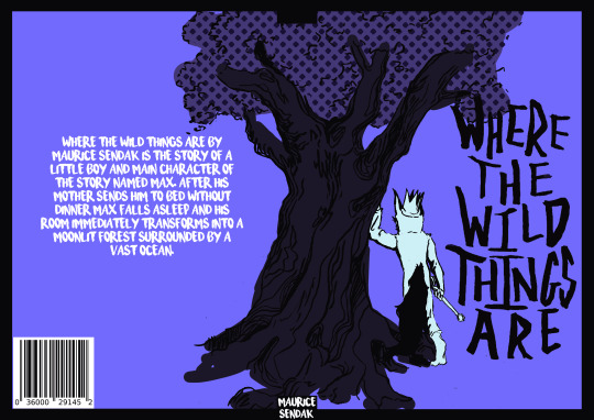
Mockups - this is an example of my book cover outcome “where the wild things are” mocked up.
- the importance of mocking up the book is to present to see wether or not if the design works in a scenario.
1 note
·
View note
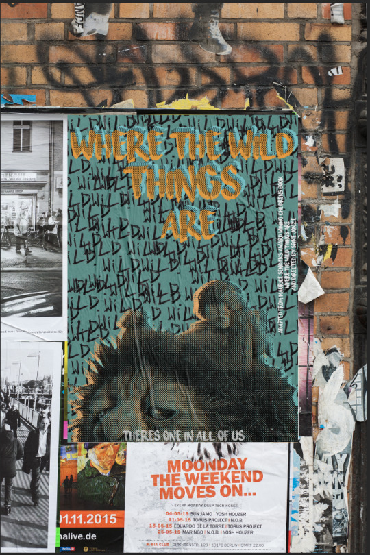
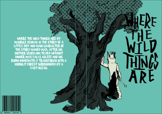
Photo
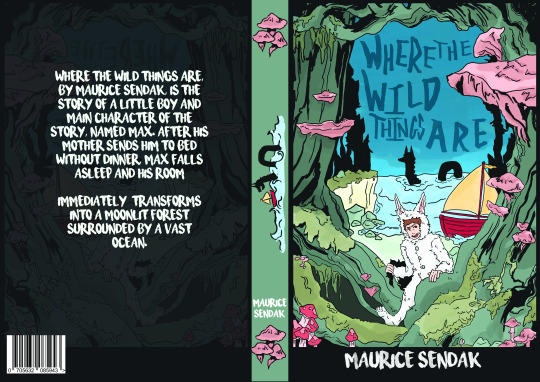
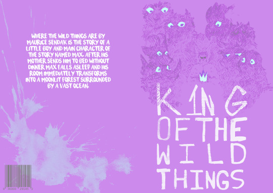
This was one of 3 experiments with changing the colours by messing with the hue, brightness and saturation.
this was the only experimentation where I ended up using the second one.
1 note
·
View note
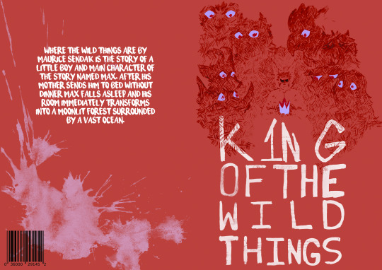
Photo


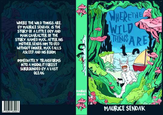
this was one of 3 experiments with changing the colours by messing with the hue, brightness and saturation.
1 note
·
View note
Photo

this was one of 3 experiments with changing the colours by messing with the hue, brightness and saturation.
0 notes
Video
This was the second animation I ended up completing for this project, I was much more happier with this outcome as I think it was a lot smoother in its animation, though I know that I used a poster outcome and built it off that Im still quite proud off it, this wasn't planed to be my main poster outcome, so I feel like I did it a little more justice by animating it instead of leaving it to rot, I pertly enjoyed the start the repeating wild growing down the page it for me was my favourite part of the animation itself, over all I the only problem I had with this animation was putting all the separate frames into one photoshop document
0 notes
Text
What makes a book cover
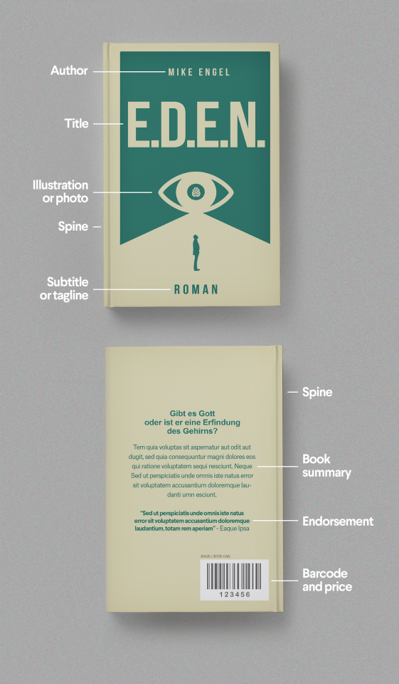

This book itself has a excellent compersiotion and output for the story itself it beltufully tells the story of travel and journey, along side the textures they used in what looks like watercolour images of buildings the boat and the river, the use of presenting the spine of the book also as a river is not only creative but extends the idea of a long adventure, the type they used feels natural and fitting for the book, and the idea to use more simplistic and less stylistic to highlight that it is the book summery, so its easier for a person to skim over the text to get an idea of the story.
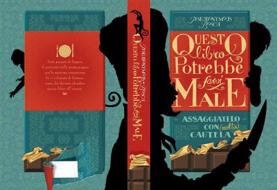
I partially enjoy the large amount of texture and patterns use in just about ever aspect except the silhouette of the characters are so clear and interesting they all stand out so well why also working together. the colour pallet is rich which well balances the idea of chocolate both of them being in rich in their own way. its easy to workout what's the foreground, middle ground and background, the foreground obviously the shelf who from the context of the rest of the book cover is hunting for what I can only assume is the figure in the background hiding behind the chocolate which is the middle ground, the type they use gives the image of richness alongside the pallet, it does a certain amount of elegance, I especially enjoy the fact that the artist also used the spine of the book to creat another chocolate bar showing a person who hasn't read the book yet the importance of this particular item to the book.
This particular book cover I think it beautiful image that works so well for the book and the story it tells the use of of Lino print creating a grungy feeling having the creator in the image fell like its not fully there and it harder for you to work out exactly what the subject , the choses of having the creator in a silhouette like manner also helps this, I think that the dissection to use a limited colour pallet red, black and white creates a mood of fear and unknowing as well as a grungy newspaper feeling.

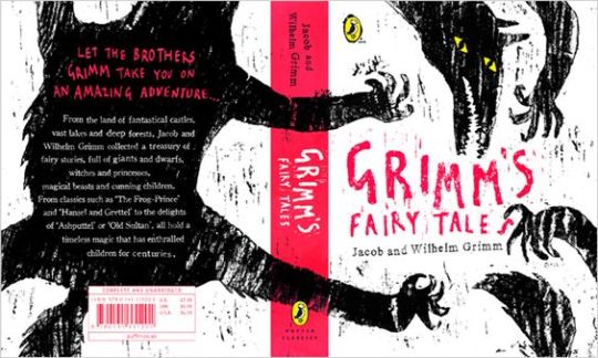
I picked out this book particularly because it was for children and it has a lot elements, heavy illustrative and has so many layers to it all bringing the composition together, I other the beautiful symbolism through out it and its perspective, Ive got to say that I personally love the colour pallet its perfect for a children book of this style and theme.
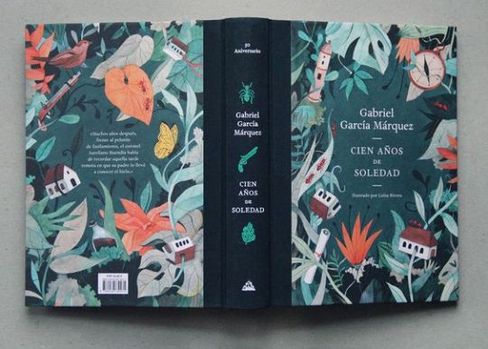
I love the style of this book the illustration it heavily used through out of book cover its well done and it has depth and perspective, and so meany little hints to items that are important on not only on the front and back cover and on the spine of the book, the type and font are something I've seen before on books but the placement works well sitting it in the middle of the illustration framing it.
0 notes
Text
Solve complex practical and technical problems

This was the first attempt as working with a book cover format, along side of just working with drawings from the previous works shop, as you can see I didn't particular have a proper idea with the competition and it was mainly experimentation for to understand the basic structure of a book cover, I knew from the start that I wasn’t going to use it as a final outcome in any shape or form, there were aspects that i enjoy the illustration of characters and central image it was actually my first drawing of the wild things in the picture, its one reason why I had no real features I realised while drawing them it didn't fit with my own style without it being to strange or worrisome for it to be presented on a children's book, other than that I worked on a limited colour pallet, its a theme Ive tried abasing in my other world, planing out a pallet with the work in mind, colour creates a theme and a theme comes with a mood that follows it. This did allow me to discover that a book cover looks strange when there are no interactions of what part is what panel.
This drawing was for me to go head first into the illustration route of a book cover I wanted the overall image and aesthetic to be playful and feel like it felt right for a children’s book, I wanted it to look engaging to the audience (children) and to display the narrative with out giving major key parts away, its why I chose key elements from the original books illustrations such as the character max and his wolf costume, the boat that he uses to travel to the place where the wild things are and a the inspiration from one of the scenes in the book of a wild thing that resided in the water. All these little things together to make up aspects of the book cover, and with this combined with my work on perspective to show a move and development in the story showing travel, on top of that that the colour combination to create a natural felling with the colours combined with a blue tint to create a outdoors feeling.

This particular first attempt of my first animation didn’t work for a number of reasons due to the fact that I didn’t think that it fit for the target audience being children it felt to stiff and the composition and the portrait chose of the image, because I focused to much on the type and it’s structure to fit around it, thought on the other side of it that I did enjoy the limited amount of line art that I had see around the children’s illustrated books, but I do think I made it to dark and the colours are to similar to each other and the size was to big for the idea I originally had for the animation.
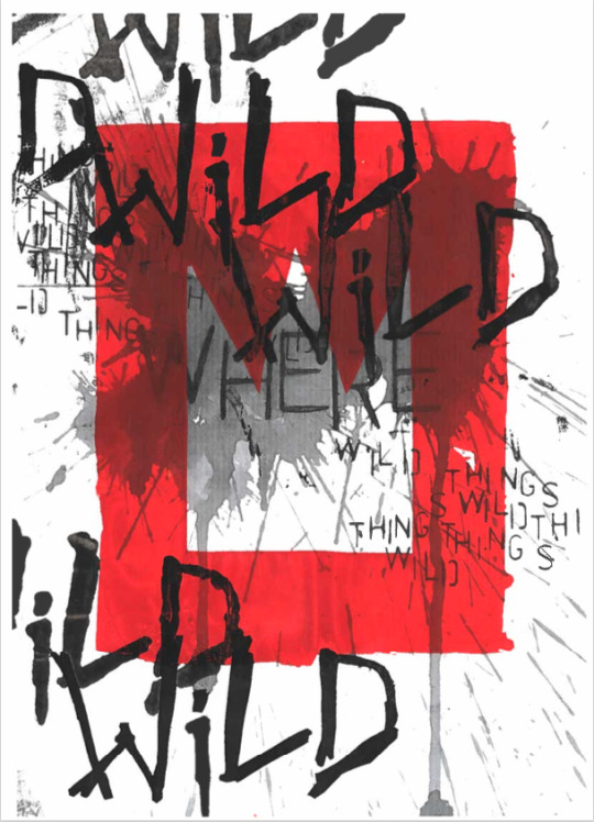
This was one of my favourite outcomes from the hand based workshops, for screen printing, this particular one was to create a engaging peace with a more grungy look at the book/movie, the composition and perspective that was created through the layering with the red screen printing framing the text, and creating texture with the overlapping screen prints, but I do think I ignored the main audience when creating this as the colour looks a lot more violent for what I think a children's book should present, but the overall image dose remind me of childish scribbles.
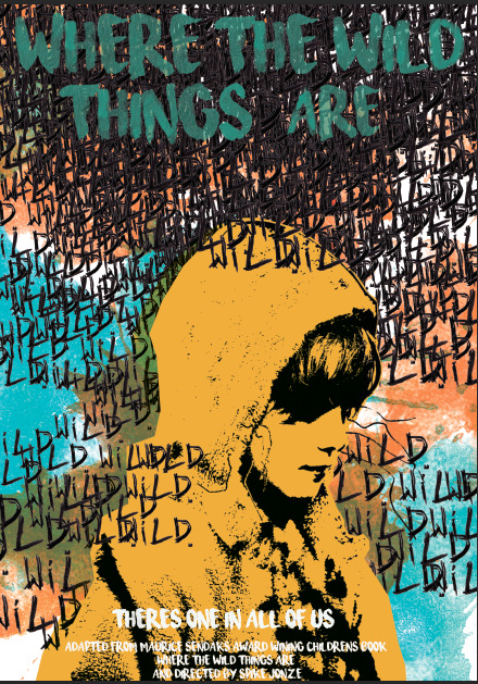
this was my favourite outcomes for the posters I think that this presents the mood and struggles that the main character max struggles through the chaotic lettering spread around allowing the audience understand that their a struggle to overcome, but overall it is one of my best in my opinion for working with an audience I thing the clashing colours stands out to the target audience (9-12 years old) they standout to them the colours are still bright, the poster contains differed medians such as the ink splatter that was scanned in from a hand based workshop as well as the hand drawn type ‘wild’ and the image of Max was taken from the movie itself and thresholded with a block of colour to make it stand out behind the threshold and the white font stands the best against the image .
1 note
·
View note
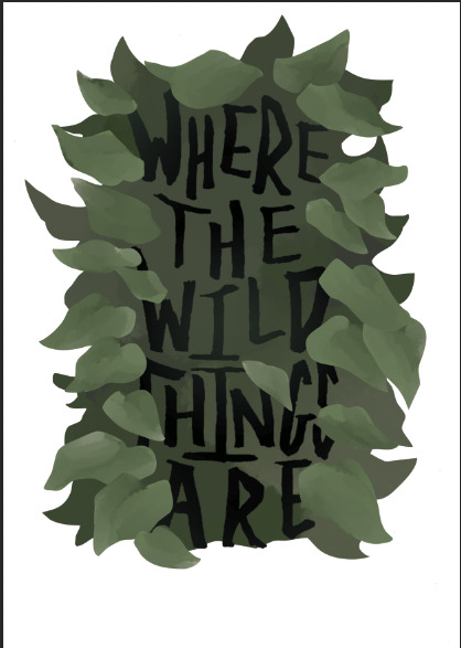
Video
This was my first attempt at an animation, for the first time in a while so I initially struggled with understand what I was doing the first time, which I most likely the reason why I wasn’t happy with this. The effect I was trying to create this blowing in the wind effect, the full idea was that I was going to have the crown roll onto the screen, but I wasn't able to create this because I struggled with getting the perspective of it correctly, but I do believe that I was successful in creating the effect of wind blowing through the leafs.
The reason behind my design of the bush and leafs to have this simplistic style made up from blobs and shapes, I did this because it was a similar to other children book such as the very hungry caterpillar, the mixed up chameleon, to improve this I probably by changing the colours to something lighter I would of also made it a full page instead and would of added more elements from the book/movie like the crown, the wild things, the boats etc. I also could of tried to of make it more bush like, because the image looks to framed around the type, I should of concentrated on making it look more like a bush, but I over all didn't like this because it didn't fit in with either the book or movie.
1 note
·
View note
Photo
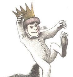

The character of max in the book and movie represent the character in different ways, first of all the looking at the mediums of a children's illustrated book it obviously would have less character development, this would make scene because children's stories tend to be teaching a lesson; especially to younger audience, the main symbolisms behind it is imagination and when Max’s anger gets the better of him and he is sent to bed with out his dinner by his mother, he turns to his imagination as a form of escapism, and in his room he creates the ‘wild things’ as a compony of people he can relate to as he Is also consided a ‘wild thing’ by the others around him (his mother) in an environment where he can feel comfortable in.
In comparison movie Max is shown to fell a lot more human this might of been because this wasn't just a character in a book, it was more realistic the emotional connection to the character especially because you can relate to the problems Max faces, divorce of his parents, the loneliness and separation he feels from others, which Is a relatable for both children and adults, which bleeds into the fact, especially with his perspective on the world, I personally can even relate to movie Max is because of my views on the world was from a different direction perspective, my parents were getting divorced and I was a lonely child. this is just and example of how relatable the character was it also showed how self-destructive one could be while not felling they have any control over a situation especially for a child, Spike Jonze did a great way of justifying Max’s issues with in the book and turning them into a relate bull issue that didn't vilify the character, he also shows the frustration of none of the other adults and children not completely understand, why he acts this way or how to actually help, its why he runs away and initially joins the wild thing.
Now this is not to say that there are not similarities between the two versions of the characters, the wolf costume of example of his emotional outrage frustration, anger, anxiety, and fear, but it also represents the fact he his hiding behind his own wild thing.
0 notes
Text
Little white lies
Little white lies is a magazine created with the sole aim of capturing and reviewing movies through out the year normally printing 4 times a year quarterly, though the magazine has become more well known for its independent ethos and iconic, striking illustrative covers created by a new artists each time, deadicating its front section to upcoming theatrical release.
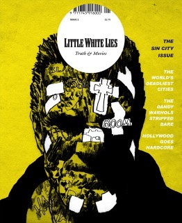
Sin City Issue 2 - Jul/Aug 2005 this one was one of the first early covers that stood out to me, reminiscent of early grunge comic styles used for the gritty Noir/Action graphic novels, fitting for the fact that the movie itself is based of the Sin city comics, the difference for this is that the artist for this cover has taken the features form the actor to then blend it with the style used for comics; heavy sett shadows sonf light shown but blacking out the ares where the shadows are completely in black and leaving the background showing through to show where the light hits, but they still show a lot of texture in the face by using what I can assume is almost like a dry brush texture, roughing up the face implanting the idea that this character is ether rough character or dangerous, the artist also hints at the story itself with smaller type and illustration shown in the form of tattoos hidden under the layers of grime and of what I would assume are plasters, I do like the white negative look off it.
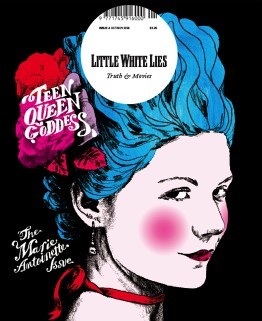
Marie Antoinette Issue 8 - Oct/Nov 2006 I personally like this one because the vibrant colours, hinting most likely to her more risky and existing life before she became romantic heroine that we know now in history, though its nice to at least learn more about the various females throughout history as there stores are normally erased or twisted, so for a historical drama I believe it works well, the one single figure of Marie Antoinette by herself standing out against the flat black background, making the character of Antoinette the main visual point of the illustration, because she is, looking at the portrait itself, id assume they took a image of the actor in their costume and thresholded it and then they most likely multiplied the layer so that they could then drawn underneath, similar to the techniques in the pen tool workshop.
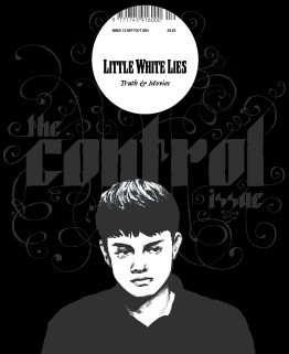
Control Issue 13 - Sep/Oct 2007 the cover for this one I like the monochrome colours and black used, it gives this feeling of hollow pared along side the mood the thresholded image of the actor, I particularly enjoy the typography the font strong and bold in its shapes has these spirals exploding, visually interpreting it as them loosing control which I thinks works very well for a sci-fi mystery thriller film, so meany lose ends left unsolved. the colour palette as I said before is monochrome which I think is a interesting handle on a typical cover the highlighting the character with lighter colours showing the characters important and stands out against the simple darker colour background and text.
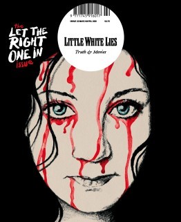
Let the Right One In Issue 22 - Mar/Apr 2009 This Swedish romantic horror film reinvented vampier in the love film, because lets be honest most vampire movie suck, the artist took one of the iconic scenes from the movie and beautify painted it with water colours and pencil/graphite, the iconic light eyes of the character shine through as the, watercolour blood drips down her face ones again reminiscent to the movie itself, I like the use of the hair being used to silhouette the face, the position/placement of the face itself it feels like its looking directly into your soul almost.
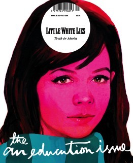
An Education Issue 25 - Sep/Oct 2009 I think this is a brilliant depiction of a coming of age movie, straight away introducing you to the main character, the bright pink hue, brilliantly used to show off the innocences of the character themselves, and that is pushed by the limited about of skin showing. the illustration itself seems to of been done with gouache paints considering the smoothness of the colours working together on the page, the hair, nose and eyes are my favourite, especially with the eyes and nose they have so much detail, you can see the youth in the eyes and the realistic look of them works so well and I love how the artist has used just shadow and light to detail the nose, and I like the hair personally because of the way they got light to reflect onto it as well as how it looks so soft and neat it looked.
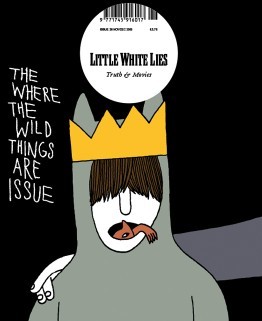
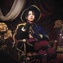
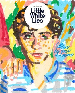
Where the Wild Things Are Issue 26 - Nov/Dec 2009 I wanted to personally wanted to look at this issue was because it relates to the movie/book that I am looking at now, I think this is a brilliant concept for the movie I personally love the childish simple drawing, reminding me of childish drawings, and I like the idea of the ‘wild things’ climbing from in Max’s mouth, I think this is brilliant due to the fact that Max has problems of acting out in such a wild way. it also relates to the original poster for the movie ‘there is one in all of us’, I like the use of the colours are quite depressing in itself, but in the realistic view of the movie where in the ‘real’ world the character maxi is struggling with the divorce of his family.
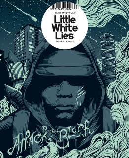
Attack the BlockIssue 34 - Mar/Apr 2011 This one stood out to me both because of the colour pallet and the style of the outline. The outline themselves reminds me primarily of the linocuts, I think it shows the mystery and the lack of empathy for there assailants and how the gang themselves blend together when the character is all one colour. I personally loved the background/the sky it has beautiful speckles of stars and meteorite shower. I don’t particularly understand the Artists use of smoke, id have to assume that it has a impact or relevance to the story itself but it beautify shapes that fit with the Lino style.
Call me by your name - issue 71- Sep/Oct 2017 I particularly like this illustration for this coming-of-age romantic drama film, though I personally don’t like cinematic worlds use of age gaps between their gay romantic relationships. but this particularly artistic interpretation, the oil pastils drawing dose defiantly scream coming of age movie and it also dose make me think of the link that combines with the main character being half Italian, the background flows but also seems to be pulled away from the page, maybe because of the fact that there is less gaps in the foreground, I also like there use of lighting its done well to be presented coming from the right side of the page. But the type that they used to show the title docent fit for the rest of the image, naturally I believe that the artists probably wanted to remove from the original type from the movie poster.
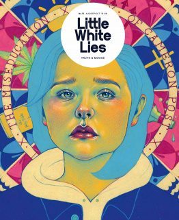
The miseducation of Cameron post Issue 76 - Aug/Sep/Oct 2018 I believe that this depiction of their movie, the colour used for the face is a direct reference to the film poster the yellows, green and pinks. the background gives away so much for the movie and the elements and its relationships with the story of being sent to a conversion camp, and the coping methods that one turns to. The expression on there face is a well done illustration of Chloë Grace Moretz, I honestly recognised her straight away without knowing that it was her in the movie; back to the expression itself shows so much betray, sadness and heartbreak all in one, its an expression that is shown through out the film a common apparition.
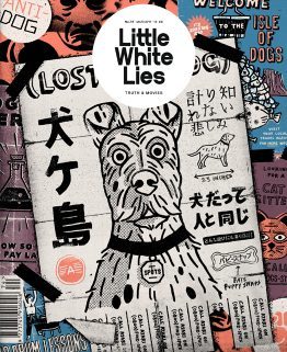
isle of dogs - Issue 74 - Mar/Apr 2018 I personally loved this movie, the entire stile used in the cover in the magazine is in the same style used throughout the movie itself, the movie used these 2D elements through out the stop animation. the posters show off so meany aspects of the movie the setting of the movie ‘the isle of dogs’ the science group trying to find a cure for the ‘dog flu’ it hints to the open scenes that were done in the original Japanese style. This is a common aspect in this imagery it has little elements of the story dotted around this.
2 notes
·
View notes
Text
Book cover 2
I personally liked the direction I went with the start of this book cover, I much more enjoyed the illustrative look of this it reminds me of the old illustrations you'd see in old victorian books, I really like the way it overlaps on to the spine and spills onto the back cover .
I wanted to try out the similar colours I used for the movie posters I had made, personally I don't think I would go with this background colour again for the book covers, I think I would personally go with a lot more softer colours I was to recolour this cover.
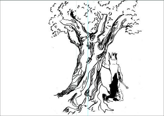
I then wanted to try to at lest colour the rest of the image to see if that would improve the general mood of the image, I think I personally went way to dark with the tree I probably should of gone with a lighter colour that might of even reminisced the original books strange trees, but I went dark for the tree because I wanted to be in a similar colour group to the turquoise used for the background while not looking too similar to the colour used to colour Max’s wolf costume in.
Over all I think I most defiantly will come back to the initial design to this, probably adding to the design itself, making int a bit more friendlier and adding one of the wild things, to give more detail off the book itself.
0 notes
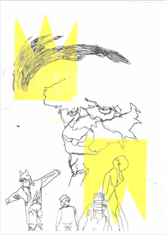
Text
Book cover 1
This book cover was created by the experimentation of scanning in hand based work and trying to compile them into a presettable compensation that flows with the the sort of the childish but structured look.
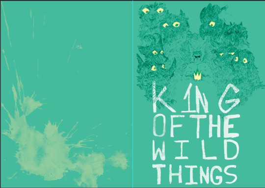
The fist part that I wanted to use was the paint splat I created in the hand based typography, that part was quite childish and I wanted to see what would look like, over the light turquoise background I thought it looked to bright so i ‘colour dodge’ the layer, I believe that this blended the layers and there colours together in a more suitable way allowing there composition to flow much better.
The reason I had to put a colour layer above the drawing is because the original drawing was original red and didn't fit well with the sort of idea I wanted to go for when creating this experimentation.
I regretted that I didn't actual exsperiment with the title itself I regret it because I enjoyed the shape I made out of the words a crown, I have tried to do this with the title itself in the ‘Develop minimalistic film posters/ book covers concepts’ on the 14/10/2020 but I still couldn't get it right maybe I should of tried a different font I don't really know, i’d possibly try again.
I also regretted drawing this sketch in red pencil, though I wasn't originally planing to draw it to be use in any experimentation, but after the positive feed back and little other work that really sat right with me I decided to go with it. though I did struggle to change its line art colour to something similar to black (same thing for the type as they were both red and it didn't sit right with me) which is probably another reason this book cover didn't sit right with me.
0 notes
Text
Book covers from around the world
Not all book publishing company's around the world are going to have different views on what is going to be rational for their audiences, as different contraries have different cultures referring to the media they consume, the religion they follows and the laws that the country, this can also boil down to the censorship rules they have as well.
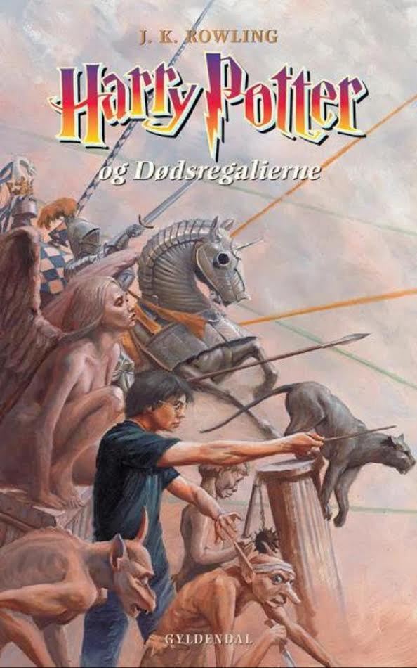
If I was to look at a popular set of books such as ‘Harry Potter’ that is a wildly loved over the world, and due to these different publishing companies and there thought progress.
Indonesia
Overview Indonesia book cover is honestly so beautiful and intrigue, the composition flows together so well, the use of colour light purple/lavender and the orange used for the font makes it stand out while not drawing the eyes to far from the detail illustrations, the illustration itself tells you so much info without actually giving to much away to a first time reader. this extends to the back cover, even though it is a pastels down edit with less opacity it works so much better than if it was just a pure flat colour background with the blurb over the top, were as with this one the lower opacity flows better with the rest of the book and and it docent attract from the blurb.and the next thing was the type that was used was the same as the original but the colour dose stand out well against the purple used, that being said they are complementary colours. this book cover I could tell that the heavy illustration on this book would be directed at children but the high level of the art done on this cover that I think this would work so well for all ages.

Sweden
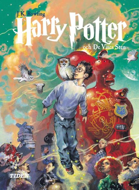
Overview Sweden’s book cover is whimsical, the image involves a lot of colour and depictions of magic, people and items that are in the movies, the illustration docent allude that strongly to the event that happen in the movie as much and mostly shows of the amazing illustration done, the colours are so bright and eye catching the main protagonist Harry is clearly seen in the foreground, the artist put a lot more energy onto doing this as the background fades off into the background (perspective) though i do think that adds to the idea that the story has yet to begin and there is a adventure that they will have to follow, and the next thing was the type that was used was the same as the original but the artists used white stands out against very well against the very colourful book cover, the amount of magical element of the entire illustration I can tell right away that this is fall children of all ages, I personal would buy this myself.
United Kingdom
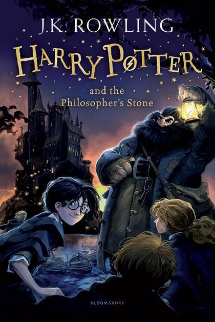
Overview the United Kingdom new book covers show the word the book creates in more detail with the illustration, the illustration is from the scene where they arrive to Hogwarts, they did a well job at using the light in the background bringing forth the building of Hogwarts and the characters in the foreground, I personally enjoy the fact that they changed the original text which is nice because having looked at all these different book coves from around the world and lots of them use original title, so this was nice, plus I like how it fells a lot more modern and works a lot better for this book cover, I can tell straight away that this version of the UK books are directed towards children right way.
Denmark
Overview Denmark is very realistic with the design, it looks like it could of been painted in oil paint, I think the realism in this book cover itself ruins the magic the story tends to carry, I can defiantly tell this was directed more towards the older audience with the chosen style, but the depiction of the chess set peaces beautify express one of the scenes from the book where Ron and harry use the giant chess peaces in a challenge in Hogwarts dungeon, this ones type gives me very much 90′s vibe and its the most redeeming quality of this plain book cover, this book cover decently gives me the idea that its pointed towards a older audience.
Japan
Overview Japan’s book cover is very interesting, it feels personal to japans own culture and view of the supernatural/magic. the use of pastels, reminds me of childhood drawings, the colours show both the magical wonder and the danger that emanates related from the story, everything hidden in shadows, aluminised only by the moon reflecting on the lake, with japans type they used the trade mark type but other than that and the English title at the top, but they use some quite normal type of the Japanese symbols/language. I honestly can't tell what age range I'm assumed its for a child the entire book covers format is kinda confusing to me.

The United States of America
Overview I personally think that the USA is quite boring, don't get me wrong the colours intriguing to a child and the imagery especial intriguing to boys, but it dose depicted the title of the book it depicts the chamber of secrets, and snakes and the phoenix, and seeing this I think its honestly a boring and plain presentation of a book that contains so much more. also on the artistic view of it I dont like how everything looks to soft around the edges of it; it looks like it would just slip off the page, its just too fuzzy for me to particularly focus on any of it; thought this I most likely due to the artist of the covers preferred medium probably being something that has a chalky look to it obviously a hand based medium, possibly chalk, oil pastels or just plain colour pencils. overall I can defiant see that this was a safe chose for a book directed at children.

0 notes
Text
Screen printing workshop: Part Two
with these screen prints I wanted to focus on the crown stencil.
-I like the minimalistic of this one just the yellow crown flipped.
- and with the one below I liked the placement of this one smack square in the middle overlapping over the photocopy, I liked the fact that the photocopy is in black and white.
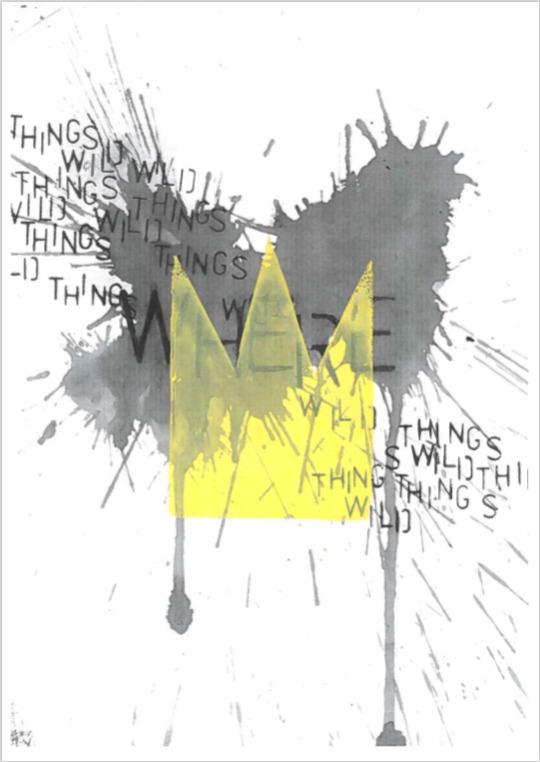

this one of my favourite peaces I ended up making I loved the explosiveness of this work I like the layering to this one, the first layer being a photocopy of a typography workshop, and then the bright vibrant red print, made by using the cutout of the crown making this negative space of the crown, and then the overlapping, messy type.
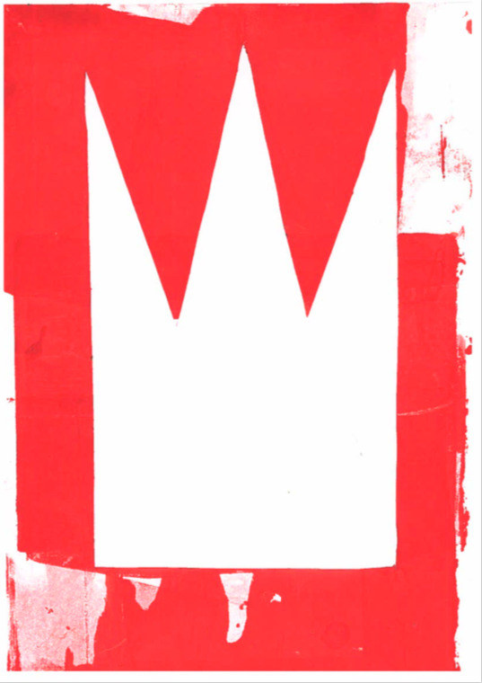
- this was the original stencil I made that were too large for the screen, but I decided to still use it this one I used this to print the one print the one below as a sort of expressive peace instead, but I liked the out come of the stencil and the messiness of it that I decided to keep it.
- as stated before this one was made with the larger stencil, I also used the cut out from the smaller stencil to block out some space from the print, I perticuly liked the out come of this it makes me think of a unstableness and power that such a item would carry with them.
1 note
·
View note
Text
Screen print artists
Laura Slater
Slater’s work has a minimalistic but heavily detailed work cased by her screen printing technique. with her screen prints she focuses on shapes and the textures that she can use to print with, this unique look of her art has landed her jobs with Ikea, John Lewis and Bliss Home and her work exhibited at the Tate modern museum, cove park, Land x The Plant Room.
she has love for printing on fabric, those have been made into clothing, pillows , masks and cosmetics bags.
I particularly love this sort of unity and unhingment that has somehow crawled its way into her work, like yin and yang. her compression is orderly but the prints are unique in that none mach up quite like another, there all different to one another.
Tom Abbiss Smith
Tom Abbiss Smith works digitally, and his work is presented on fabric/clothing, food product, packaging etc.
Smith’s work as well is both messy and well put together, there's always seems like there's a lot going on with his work, though if you looked at its basic elements and the shapes that make it up, you can see that he adds texture to some of the shapes to make it stand out or emphasise a partially object in the images, for example the image below has both flowers and a orange that stand out against the rest.
HENRI MATISSE

His work uses multiple techniques for creating texture, splats, spray, scribbles, strokes of paint, but at the same time it is still a flat image at the same time.
overall I think
Atelier Bingo
Atelier Bingo is the work of two two illustrator, surface pattern & graphic designer from France called Maxime Prou & Adèle Favreau, they have this passion for screen printing to create bright colourful and abstract pieces of work that have been used for all sorts of mediums and clients such as; Urban Outfitters, Vogue,The Paris Review and more and there mediums range from prints, advertisement, fabric and gifs.
their outcome can range from small peaces you could hold in your own hands to gigantic peaces that stand high and firm on a wall, there work includes these choppy shapes that lay around each other, in some cases in the image below you can make out almost the silhouette figures head, almost rabbit like, sometimes these shapes are just scribbles, overlapping in colours, with the bold background standing flat below normal (red, black, white, pinks or blue).
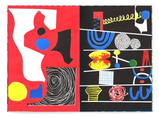
compering the works of Laura Slater, Tom Abbiss Smith and the calibrate work of Atelier Bingo, the first thing that stands out against each other is the various colours each artists use Slater works in flat bold such as blacks, blues and yellows, but she can also use split complementary, in some of here more fashionable in its colours quite similar to Tom Abbiss Smith colours, these colours are quite natural and calming, especial in contrast to Atelier Bingo is bright and works with mostly primary colours (plus the monochrome colours black&white so there are neutral colours to contradict the primary colours and so the compression flow better).
next thing we can look with the print is the texture that they use or creates, for example Laura Slaters dose add her own texture and patterns in her work, but with her screen printing her work it comes with these natural mistakes and ares where the printing ink might not reach all the time if there isn't enough pressure in all the places, where as both Tom Abbiss Smith and Atelier Bingo also work use digital mediums in there work which can show that they both have a preference for shapes what are completely made from and out of the shape almost in completely flat shapes till they then go over the shapes with a texture that they like. thought this is where the two take a different path Tom Abbiss Smith’s work can be clearly seen created with brushes/stamps that have been made and strategically placed and manoeuvred for their preference, where as Atelier Bingo is more chaotic with its texture, sometimes its quite childish in the fact that it reminds me off the squared paper or the chalkboard along side the bright primary colours and strange shapes, this also conflicts with Tom Abbiss Smith’s work as his works create images, mostly of nature and plants.
0 notes