
olivia-erskine-designresearch604
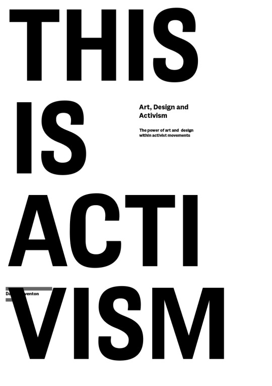
Design Research 604
28 posts
Don't wanna be here? Send us removal request.
Last Seen Blogs


Text
Summary
In summary, this assignment has been incredibly beneficial in establishing where I want to go with my design practice, and understanding what my role as a designer is and can contribute to society. It took me a really long time to actually understand the assignment, what it was and what I was meant to get out of it. The way that it was explained for the first few weeks just really wasn't clicking with me, and I was finding it very difficult to grasp. I think taking some space to think about it over lockdown and really process the information helped a lot. Once it finally clicked I was able to get on with it and narrow down my topic of interest. Overall, the project has definitely made me view communication design in a completely different light. I had never considered in depth the responsibility that I hold as a designer to use my skills for the greater good, and to consider what I am communicating. I was under the impression that communication design was always contributing to consumerism and capitalism in some way - a thought that I was not happy about - and had just sort of accepted this until now. Reading about all of these different movements throughout history and design's role in these has been inspiring, and opened my eyes to the possibilities that it holds.
In my postcards I tried to include a variety of methods and contexts, but I am aware they are largely based around the social movements that have been prominent in recent Western history. Going forward I definitely need to try and branch out from this and look at it from a less western-centric, more intersectional point of view. Having a basic understanding of what design activism actually is now will allow me to do this. I also intend to look at more local and current activist movements in Aotearoa and the design involved in these. This was difficult to do with only the internet for research resources through lockdown. By choosing to highlight the movements that I have, I am not intending to imply that they are the most or only important parts of global activist history by any means.
Going forward in my design practice, there are still a number of elements of this topic that I am interested in exploring. Just a few of them are:
What lies in the future of global design activism?
Is there a key to successful design activism, and if so, what is it?
Are there any disadvantages to the power of design activism?
What can I contribute through my practice?
How can design activism be used to amplify the voices of oppressed groups without drowning them out?
What would activism look like without design? Can the two exist as single entities?
What does design activism look like and contribute in my community?
These questions, alongside many more, are what I am yet to discover about the world of design activism.
0 notes
Text
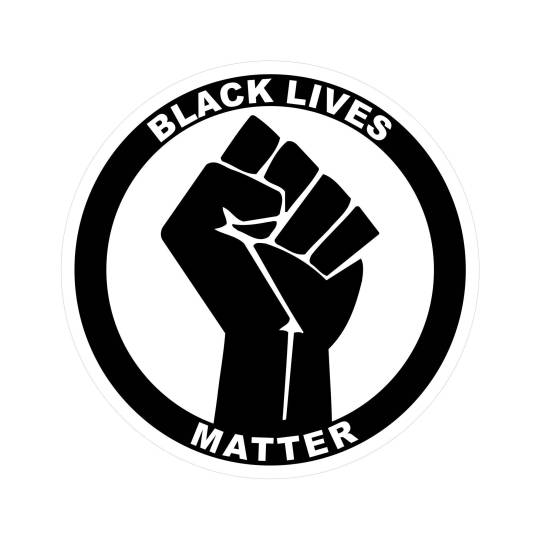
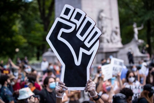
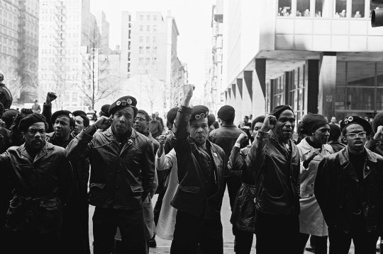
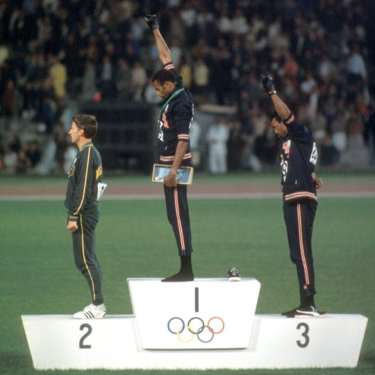
The raised fist icon that has represented the black lives matter movement throughout history, and particularly in recent years, is another strong example of iconography in activism. The deep history of the symbol comes from the gesture of a raised fist- a show of strength, unity and defiance. This gesture is often used by and associated with the BLM/black civil rights movement. The symbol acts as a physical embodiment of this, conveying the action of protest, communicating the movement's history, and unifying the movement. This version of the fist icon was adopted by the movement in 2014, and is now a key identifying factor of the movement.
https://www.capitalfm.com/news/black-lives-matter/blm-black-power-fist-symbol-meaning-history/
https://www.rd.com/article/history-behind-the-clenched-first-and-the-symbol-for-black-power/
0 notes
Text
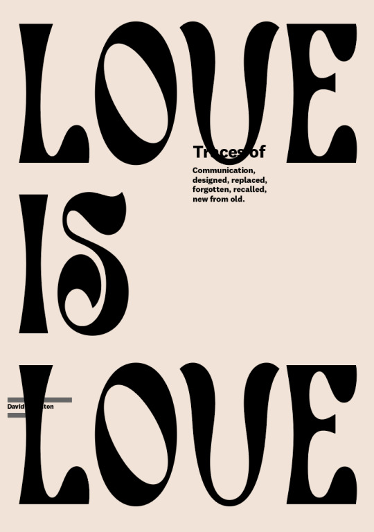
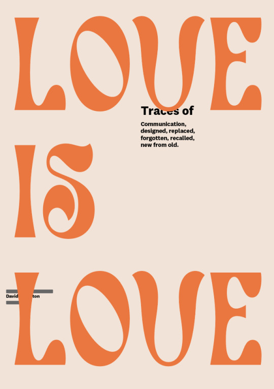
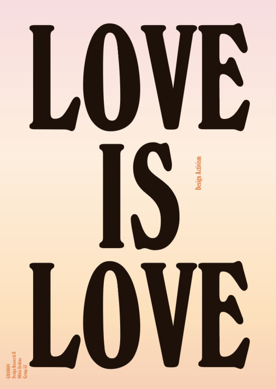
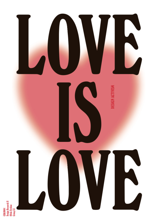
These are the different iterations from the creation of my A2 poster. I wanted to create a 1970's inspired pride poster. During my research I learnt that the 70's was the time in which the pride movement really gained traction, and also when it started to see results, with homosexuality decriminalised in Aotearoa soon after in 1986. These two fonts both reference the design style of the 70's, as does the warm colour palette. I like the font of the top two posters, it feels symbolic of the fluidity and personality of the LGBTQ community, but it didn't feel like it was making the bold statement that I wanted it to. For the third iteration, I chose this bold serif font that demands attention, and still references the 70's. I originally swatched some colours off the lesbian pride flag to make up the colours of the background, but then decided that this still didn't feel bold or attention grabbing enough. The heart fells like a fitting symbol for was I am trying to communicate, still incorporating the warm colours. I wanted the poster to feel like a bold statement, while still being warm and inviting, conveying the feeling of the LGBTQ community. I decided not to use the typical rainbow colour palette that is associated with pride to challenge myself to think outside the box, and so the poster can be in reference to pride, but also just communicate the message that love is love in every situation for everyone. I had intended to print this poster out and paste it up around my community, in a bid to spread the message of LGBTQ pride and general positivity, but due to lockdown I haven't had access to a printer. I also would have loved to screen print this, but again haven't had access to the facilities.
0 notes
Text
My initial poster concept closer to the beginning of this project was to create a composition like this using black paint on paper, or printed out, and photograph someone holding it up like a protest placard. The intention of this was to show the context of design activism and how it can be powerful even in its simplest form. However after discussing this with Natalie I established that the poster is meant to be more of an example of our work within the context of our topic, rather than explicitly representative of it. I decided instead to look at how I can use my design skills to create actual activism.
0 notes
Text
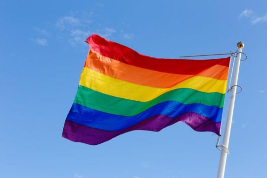

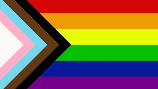
Learning about the history of the LGBTQ+ pride flag has been really interesting. I think most people would agree it is one of recent history's most widely used and strongest pieces of design activism. It is so deeply connected with and representative of the LGBTQ+ community, and has been since its creation. It's such an important symbol of unity and a meeting point for a community that has for so long been mistreated. It is used at any pride protests and parades, to show that somewhere is a safe space for members of the community, on clothing and dotted throughout many different areas of society. It has been important an important element of creating inclusivity and supporting those who may not be safe or able to express themselves in their situation. The flag has since been updated to be even more inclusive in representing marginalised LGBTQ+ communities of colour, along with pink, light blue and white, which are used on the transgender pride flag. The flag doesn't contain any text or imagery but the history and context behind it says everything that it needs to. It has also led to the use of the term 'rainbow' as another way of saying LGBTQ+, which I think is really nice and positive. The rainbow colours are a perfect representation of all of the amazing different people and personalities that create the community, the positivity and happiness that it brings, and represent that being queer is something as natural, beautiful, special and proud as a rainbow in the sky.
https://www.dezeen.com/2018/06/12/daniel-quasar-lgbt-rainbow-flag-inclusive/
https://www.britannica.com/story/where-did-the-word-hippie-come-from
https://www.apa.org/pi/lgbt/resources/history
https://www.architecturaldigest.com/story/london-design-museum-acquires-original-gay-pride-flag-david-bowie-blackstar
0 notes
Text
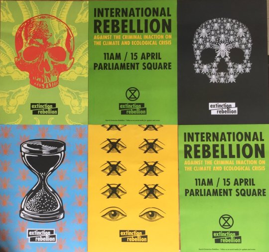
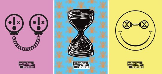
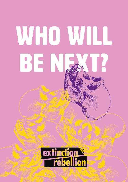
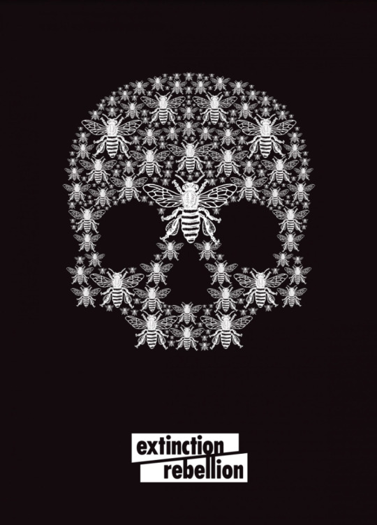
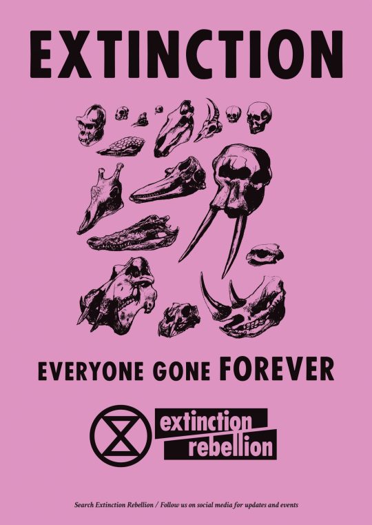
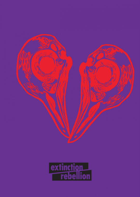
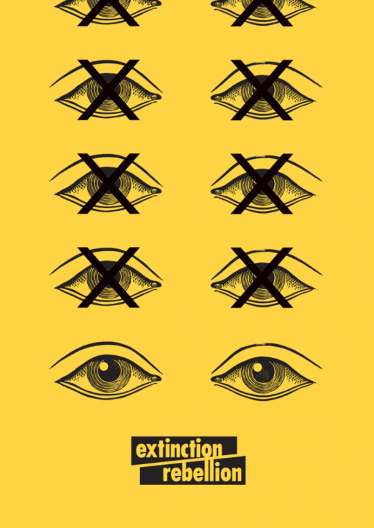
Extinction Rebellion is a global activist collective fighting for climate action. Founded in 2018, the group is one of the most prominent collectives within the modern day climate action movement. They organise protests, share information, raise awareness and spread the message of the unfolding climate emergency endangering the earth. A large element of their activism is their designs. Created by a volunteer group, the designs have been distributed throughout the world in the form of poster, banners, stickers, flags, patches and more, all available for use directly from their website. This is a fairly unique but incredibly effective approach, in that they have intentionally build a unified and cohesive visual identity. These posters can be seen throughout many cities - including Auckland - pasted up by supporters of the movement. The organisation of this is impressive, and it has been incredibly successful in spreading their message as well as bringing awareness to the movement itself. I found out about it through one of these posters pasted to the side of a building, and now I immediately identify them when I see them around the city or elsewhere, as their identity is so unified. Overall I think it is a really strong example of design activism, its ability to create visual identity, and the power that this holds.
0 notes
Text
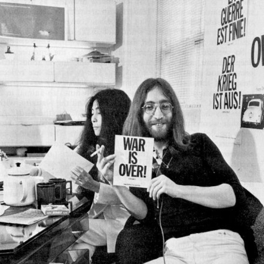
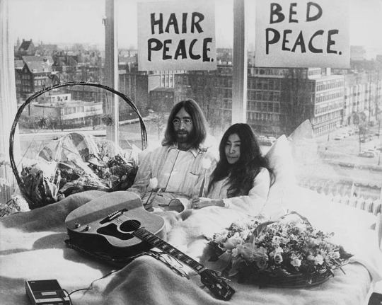
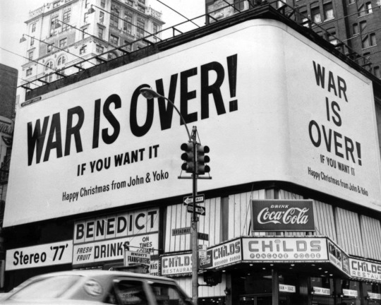
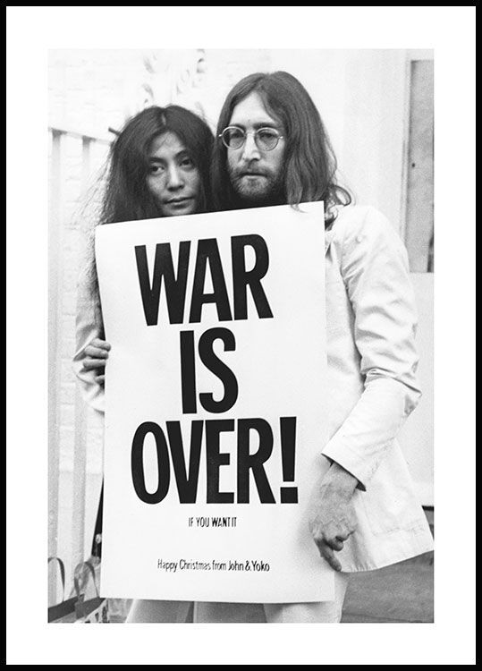
This 'War is over' design was created for John Lennon and Yoko Ono's anti-war peace campaign of 1969-1970. The design was shared in the form of posters, billboards, flyers and in newspapers throughout the world. Alongside the song created for the movement. 'Happy Xmas (War Is Over), this is probably one of the most well-known examples of design activism. While this is at least partially thanks to the preexisting platform of Lennon and Ono, it shows that even design as simple as black text on white paper can be incredibly powerful, especially with a contextual background supporting it. The fact that it's in plain black and white reflects the message, being that choosing either peace or war is a simple decision.
Sources:
https://publicdelivery.org/war-is-over/
https://artsmia.medium.com/it-was-50-years-ago-today-fd1acb7ff851#:~:text=On%20December%2015%2C%201969%2C%20millions,slogan%3A%20%E2%80%9CWar%20is%20over!&text=On%20December%2015%2C%20Lennon%20and,thousands%20of%20posters%20and%20handbills.
0 notes
Text
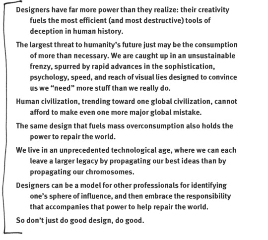
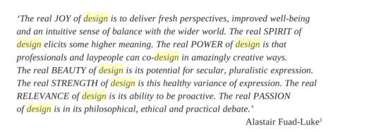
These are some quotes taken from the book Design Activism: Beautiful Strangeness for a Sustainable World by Alastair Fuad-Luke. They have really stuck with me and have shaped my approach to this project. The first one in particular summarises everything that I am trying to explore and explain in my critical commentary and through the postcards. I really want to focus on the idea that design holds such an immense power to communicate important messages, especially within activism, while it also holds the power to cause harm to society. It definitely enforces the idea that being a designer holds responsibility, something that I haven't thought to consider within my practice until now.
0 notes
Text
This is the updated plan for my critical commentary, focusing specifically on design activism. I also realised that I had the layout of the paragraphs slightly wrong, so this is following the layout that Sue explained of two overarching paragraphs, and two more specific to me. There is a lot that I want to cover, but I'll likely just have to narrow it down to the key points.
0 notes
Text
I've started to write my critical commentary, but have come to realise that I need to narrow down the ideas that I'm talking about. 'Art and design within activism' is too broad of a topic to cover in only 1500 words, and the 'art' aspect of it is less relevant to me as a designer. I think I'm going to focus specifically on design activism from here on, as that on its own is already more than I'm going to be able to cover. It related better to my design practice and having a more specific topic will help in my research.
0 notes
Text
This is the feedback that I received from the formative hand in. It was mostly positive feedback and shows me I'm heading in the right direction. I think that the next steps going forward are:
- Research some more modern examples to discuss the context/methods of
- Develop my critical commentary
- Narrow down my ideas so they are more specific
0 notes
Text
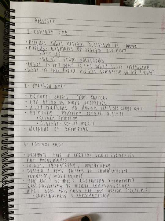
Critical Commentary Plan
This is the more in-depth plan for my critical commentary writing. I was quite stuck on the layout and development of the writing, but watching Sue's video on the essay outline helped me to develop this plan, alongside compiling all of the different layouts we've been given.
Abstract:
Summarise idea
Summarise key methods and contexts
Paragraph One (context):
The power of art and design to create a visual identity for and communicate the messages of activist movements
What would activism look like without these practices?
Discuss how the concepts or ideas presented in the text have supported the development of your design ideas.
Paragraph Two (method):
Printing - screen printing/silk screen/letterpress through history
Spray paint/paint/art - by hand
Method One, describe the method – this might include techniques, tools, or visual style.
Explain how the method affects the look or aesthetics (the feel or look) of the design. Remember the method should be relevant to your interests, briefly comment on how you might use this method in the future (why?) or how you use it now (Why is it important to your design style?)
Paragraph Three (context):
How art and design’s role in activism has changed throughout the course of history
Use the different postcards to back this up
Its place in our modern society
Context two. Try to build relationships between your contexts and methods – by now you should be discussing how the concepts or ideas presented in the text have supported the development of your design ideas.
NOTE: You are not describing the content of the texts; you are discussing the ideas and concepts related to the contexts and how the texts supported your understanding or thinking about the context (topic).
Contexts enable you to discuss the influences shaping your ideas.
Paragraph Four (method):
Art and design activism in a digital world
Method two. What is the method? Why is it important to your design style? What effects are produced by employing this method of making that are important to you as a designer?
Conclusion
What is the variant between an effective and ineffective use of art and design in activism? Is there such a thing as ‘bad’ activism?
Is it by chance that some movement’s designs become memorable and widely-known, or are there certain factors that make it this way?
What disadvantages are there to the power of art and design in activism?
Could you effectively have one without the other - solely art and activism or design and activism - is this less effective?
At what point does activist art cross the line to just being art?
What lies in the future for activism and what is design’s role in this? How will it change? How can we prepare?
Can art ever just be art?
Can art design and activism ever exist singularly? Can you have one without the other?
Art & design AS activism OR art & design FOR activism
0 notes
Text
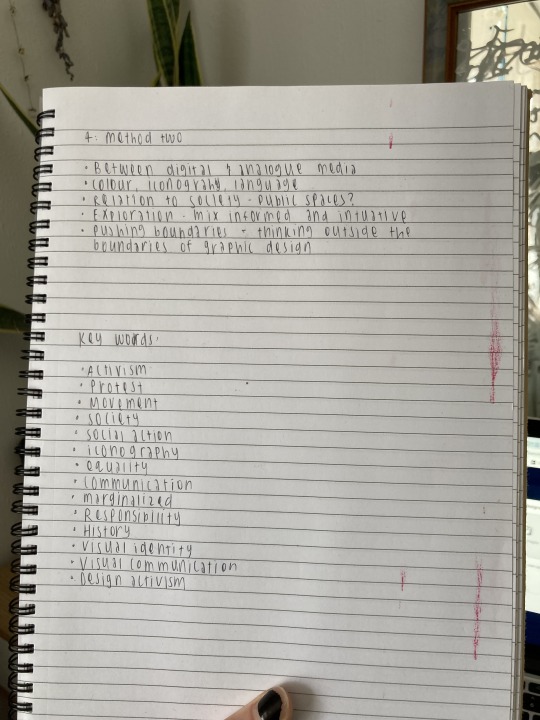
Beginning to plan and brainstorm critical commentary - defining the key points of discussion.
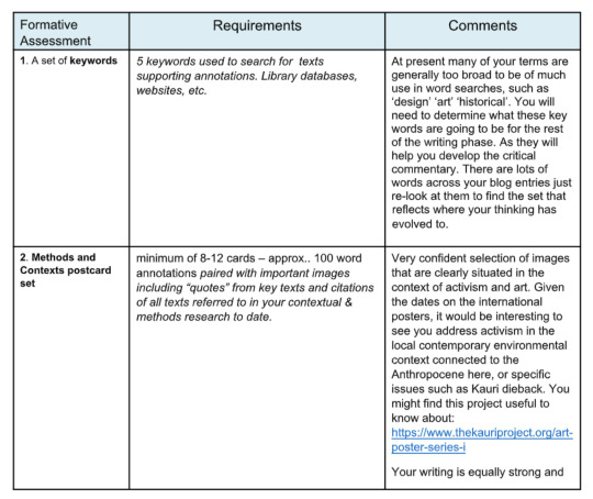
List the Keywords you have highlighted in your annotations.
Activism
Context
Design
Art
Protest
Movement
Historical
Modern
Sociopolitical
Social issue
Visual Identity
Visual Communication
Collective
Society
An Abstract (100-150 words)
Art and design’s role in activism
Art and design in some of history’s biggest social movements - Anti-nuclear, Black Civil Rights, Guerrilla Girls, AIDS awareness.
Plan for two short paragraphs related to Contextual knowledge.
Contexts supply specific types of background information situating your ideas. (Overarching ideas)
The power of art and design in creating visual identity for movements
The power of art and design to communicate the messages of collectives and movements
The role of art and design in protests
How art and design’s role in activism has changed throughout the course of history
Art and design activism in public spaces
Review of contexts build on your annotations and cite from, at least two credible sources. Use quotes.
Plan for two short paragraphs related to Methods.
Methods explain the way a design is made and the effect of the chosen process on the look of the design. (Specific to making)
Analysis of practice-led research method(s) used or considered for use.
The making of protest banners/placards/posters
Print press?
More in depth research needed into methods - maybe discussing methods of more modern day activism, as very little information on historic.
Plan a concluding statement.
Conclusions generally summarise.
Highlight the key ideas and why these methods are important to you in a single statement.
Discuss insights or breakthroughs in understanding and defining your practice-led design research.
Art and design play a larger role in society than just serving capitalism and consumerism
Art and design may not be the focal point of movement’s communication, but they are vital in conveying their message and creating a lasting visual identity
Some of the most widely recognised pieces of art and design in history have been activism
Your conclusion should form and frame a potential practice-led research direction or questions for future exploration in Year 3.
What is the variant between an effective and ineffective use of art and design in activism?
Is it by chance that some movement’s designs become memorable and widely-known, or are there certain factors that make it this way?
What disadvantages are there to the power of art and design in activism?
Could you effectively have one without the other - solely art and activism or design and activism - is this less effective?
At what point does activist art cross the line to just being art?
What lies in the future for activism and what is design’s role in this? How will it change? How can we prepare?
0 notes
Text
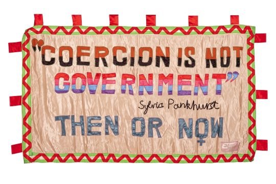
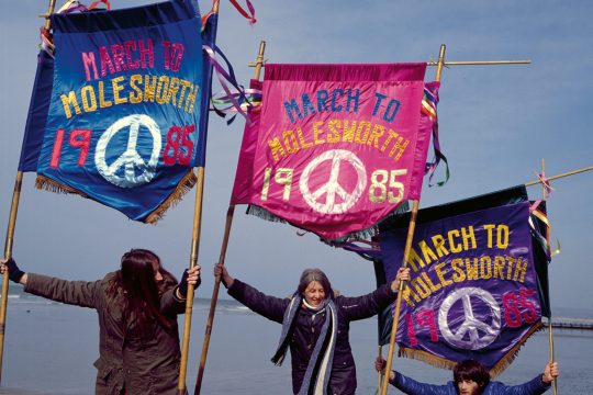
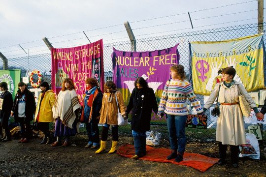
Greenham Common Women’s Peace Camp: Women for Life on Earth
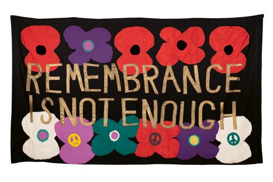
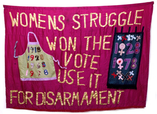
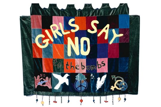
"The borough of Berkshire in the southeast of England is a close-knit collection of small villages and towns. Besides the M4 that runs through it, these areas are connected by your typical winding English country roads. In the populated areas, houses are often close together in a mix of Cotswold stone architecture and quaint cottages with thatched roofs. In the early 1980s however, residents of one of its towns, Newbury, were startled at the sight of cruise missiles – usually around 20 feet long – meandering their way past their windows. Its local airforce base, Greenham Common, had been chosen as their new home in line with NATO’s response to Soviet SS20 missiles, potentially signifying not only an advancing of the cold war but future nuclear conflict.Also startled at the announcement were a group of women in Wales. In the years leading to the announcement of Greenham Common housing missiles in 1981, they had already been voicing similar concerns as part of Nuclear Wales, a group that protested the dumping of nuclear waste from 1977 to 1979. In turn, they formed a protest group of solidarity with their English neighbours, showcasing their concern with a march between the two locations as the Women for Life on Earth. Predominantly women-led, and later women-only, the protestors were anti-violent mothers and grandmothers along with their children. Yet in the eyes of Thatcher’s government, the press and US military commanders, their valid concern for the future was insignificant, and even viewed as a greater present threat. “It’s amazing how the establishment don’t like women getting up and doing things, isn’t it?” laughs Thalia Campbell, the movement’s primary protest banner-maker, over the phone to It’s Nice That 40 years later. “It’s quite dangerous, being an uppity woman."
“Then came the idea to start making banners. I thought we’d kill them with beauty.”
Thalia, along with the Women for Life on Earth march’s organisers – Ann Pettitt, Karmen Cutler, Liney Seward and Lynne Whittemore (and close to 40 other women) – began their protest in Cardiff, Wales, on 27 August 1981. On foot, they headed first to Newport, then to Bristol and across to Hampshire and Berkshire. In their bags were sandwiches for sustenance and an address book of church halls that offered floors to sleep on along the way. The walk from Cardiff to Greenham is no short leg, after all, spanning 110 miles over the border from Wales to England, taking the group ten days in total. Not to mention, the summer of 81 was a scorcher – a factor that sticks clear in Thalia’s mind for the blisters she had on her feet, and the catcalls from cars and lorries hooting at the women marching in shorts and T-shirts.Even in this early stage, the Greenham protestors’ gender became the key storyline in how the group’s objectives were reported and later vilified. After “haranguing them for any kind of coverage initially,” the press caught up with the group as they reached Bristol’s Severn Bridge. Journalists cornered protestors to ask challenging questions of the women while instructing their photographers to lie on the ground “to take photographs of four teenage girls’ legs and knickers,” recalls Thalia. “At that moment I thought, how am I going to fight the press? How can I beat this absolute horror? Then came the idea to start making banners. I thought we’d kill them with beauty.” Protest banners soon became a medium for the Greenham women to powerfully translate their thoughts into an immediate message. In a way, these banners would do the talking, while the group vowed to only speak to press with specific points of view “so they had no wishy-washy stuff,” explains Thalia. “Everything we said mattered so they couldn’t pick something sweet and nice to put out, which was a hard lesson to learn.”
https://www.itsnicethat.com/features/women-for-peace-greenham-common-banners-four-corners-thalia-campbell-art-publication-260821
This form of art and as activism is very unique and different to everything else I've seen and researched. The concept of quilts rather than a standard poster or newsprint is very out of the box. It is an interesting method of creating, making quilts and banners to communicate their message. It is a different and simple approach but that idea of "killing them with beauty” really shows how the aesthetics and visual identity of a movement can be such an important element of its communication. The banners gained them extra media attention and captured the interest of their audience, which in my opinion is an example of art successfully used for activism.
1 note
·
View note
Text
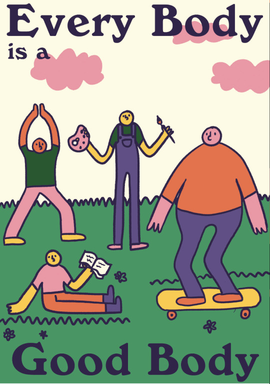
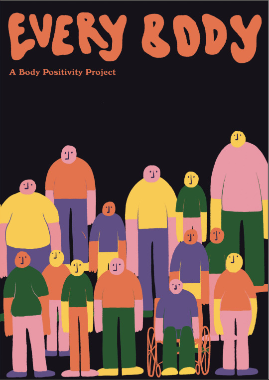
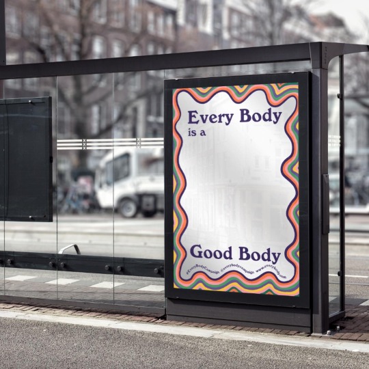
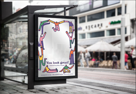
The Every Body Project
This is the campaign concept that I created for my studio class in 2020. The aim of the campaign is to bring attention to the issues that many men face surrounding negative body image. It is intended to raise awareness, work to reduce the stigma surrounding the topic, and act as a source of body positivity. Negative body image is something that many people struggle with; breakingmuscle.com states that 45% of men are dissatisfied with their bodies. The portrayal of ‘ideal’ or ‘perfect’ body types in the media enforces unrealistic body standards that many feel pressured to conform to. In recent years, the body positivity movement has gained popularity, supported by many brands and individuals. However, one shortfall of the movement is its lack of inclusivity. Body positivity aimed at anyone other than females is few and far between. As this is an issue that affects people of all genders, it makes sense for the body positivity movement to be applicable to everybody. Hence, I created this campaign concept in order to help fill the gap in the movement.
Even though many males struggle with body image issues, there is a lot of stigma around the issue and many feel uncomfortable discussing it. Not addressing the issue is not only unhealthy, but can become more serious when people don’t feel confident enough to reach out for help. Men account for 25-36% of people who suffer from eating disorders, but only make up 10% of those who seek treatment. In summary, this campaign is intended to encourage men and non-binary people in New Zealand to embrace body positivity and be accepting of their bodies.
The concept behind this project was essentially to create a campaign that would improve someones day, and make them feel more positively about themselves. I wanted to really focus on the positivity aspect of body positivity, hence why I chose to use such a bright, colourful and fun aesthetic. It is hard to make someone feel more positive when they are looking at something that has a negative or serious tone, so it was important for me to align the messaging with the visual elements. The concept is a non-profit project run through a mixture of online and offline platforms. Social media and a website are the key means of communicating the campaign. Alongside this, billstickers and posters are a large part of the project, as they tie back in to the idea of improving someone’s day by bringing them some body positivity. Posters can be iterated into many different forms, whether that be billstickers, bus shelters, billboards, flyers, etc. This makes them a versatile touchpoint with the audience as they can be displayed in many different environments.
Campaigns are probably the most common example of design used for activism, and the Every Body Project was my take on that. I thoroughly researched the issue through a variety of sources before setting out to design the campaign, and targeted it to those who I felt were most in need. As this project was a year ago now, my design skills have improved with practice, and I would likely design this campaign very differently given the opportunity now. Regardless of this, I still stand by the cause and context that the campaign was about. It was evidently a good starting point to light my interest in design activism.
0 notes
Text
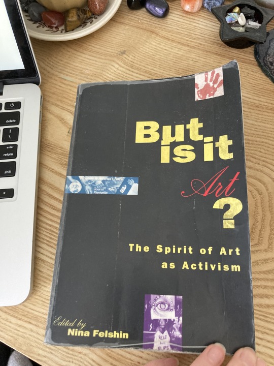
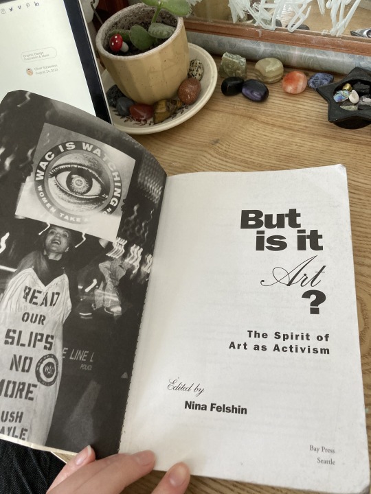
This book 'But is it Art' has provided me with some really valuable information and insights during the research process so far. Although I haven't had a chance to read the whole thing through yet, I've skimmed over the first few pages of each section and found it very engaging. The book looks at activist culture and the relationship between art, community, culture and activism. It features 12 different activism groups/movements from the 1960's-1990's, and discusses the role that art played in these. Each group has in some way used public space in an innovative way to address issues of sociopolitical or cultural significance. The book includes Silence = Death and the Guerrilla Girls, two groups that I have already been researching but want to look at more in depth before the next stages of hand in. I've started further research into the other groups within the book that interested me. One of the quotes that really stood out to me in this book was "Until the late 1960's, formalism - one of the last gasps of modernism - was critically ascendant. Formalism sought to define each art in terms of its self -defining characteristics, emphasising not only the purity of relative to other disciplines, but also the separateness of culture from other areas of life. Beginning in the late 1960's. however, changes began to occur in the art world that reflected changes in the 'real world'. The hybrid cultural practice examined in this book has evolved from these changes. Shaped as much by the "real world" as by the art world, activist art represents a confluence of the aesthetic, sociopolitical, and technological impulses of the past twenty-five years or more that have attempted to challenge, explore, or blur the boundaries and hierarchies traditionally defining the culture as represented by those in power."
This quote goes on to further explanation, but this extract summarises the chapter's topic quite well, largely discussing the birth of art and design activism, and the different occurrences that led to this social and cultural shift.
0 notes
Text
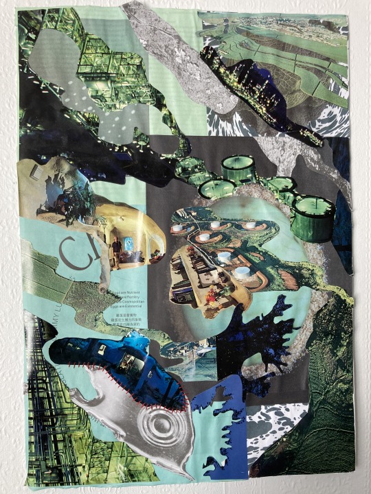
This is the most recent piece of art/design that I have created under the theme of activism - loosely speaking. I created this collage around the thoughts and theme of human behaviour, and the way that man-made matter has become deeply entwined with the natural world. Human behaviour over the last few decades has, to be blunt, destroyed the natural world and ecosystems of the Earth. From deforestation to deep sea mining, air pollution, climate change, oil spills, coral bleaching and the extinction of species, the Earth is being damaged piece by piece, and soon this harm will be irreversible. I find these issues hard to comprehend at times, and I imagine others do too, so I made this collage as a way to portray those thoughts and feelings in an abstract and visual way.
When I set out to make this I had no idea what it was going to look like or what direction I was heading with it. I flicked through my collection of old second-hand magazines and tore out anything that felt to me like a representation of the natural or man-made world - land, ocean and water as well as farms and infrastructure. I thought that the images of the architecture created using organic forms and matter was an interesting balance between the two. The colour palette ended up being a perfect reflection of the hues that I would use to portray the environment. I stuck some pages straight onto the paper, leaving their harsh lines as is with no real grid or pattern. This kind of represents the man made portion of the piece. Over top I followed the organic lines and shape of the imagery to create these diagonal irregular shapes that feel to me like some kind of plant, seaweed or microorganism. I layered these over the top of the base, placing them with no real structure. The last step in the creation of this collage was the stitching that can be seen in the bottom left corner. I wanted to somehow reference the fact that this piece is about the disintegration of the natural world, and those stitches are there as a representation of the insignificant and unsubstantial effort that humans are putting in to fix it - almost like humans are trying to stitch up the world with a needle and thread.
Although this may not be outwards activism in the form of a poster or a campaign, it is an example of how art and design can be used to discuss social issues, even in more subtle ways.
0 notes