
Last Seen Blogs
residentrockstar
Resident Rock Star Magazine
bxsmer
bxsmer
degriss
H i- :33

bibtmnyashk
Без названия
Text
Final Exam

For the holiday season, I recently watched the film The Nightmare Before Christmas. I watch this film every year with my family between the Halloween and Christmas season. I have always been fascinated by the blend of dark and whimsical elements throughout the movie. The scenery is beautifully crafted and visually stunning. For my project, I wanted to create the spiral scene on canvas, but with my own touch.


Throughout the semester, I became fascinated with Jackson Pollock's tactics. His unique techniques of dripping and splattering paint created dynamic and expressive artworks. His use of different mediums and tools allowed him to embrace abstract expressionism. I believe Pollock's works convey a sense of energy and movement. Splatter painting is something I wanted to attempt for myself.


On Thursday, November 30th, I purchased a circular canvas at Michaels. When I returned home I began to draft a sketch of the spiral hill using pencil upon the blank canvas. I had a bin of acrylic paint at home and a small bin of paint brushes. I spread an old table cloth on the floor in my garage and placed the canvas down. I cut out the shape of the curved hill from a piece of construction paper. I pressed it over the sketch I previously drew and made size adjustments. My plan was to make the background first, which would represent the moon. I blended colors of red, orange, and yellow together, covering the canvas without order or pattern.
I had several attempts at creating the splatter technique effectively. I found the most effect was to use a small fan brush and to flick it back so the paint would launch onto the canvas. One brief challenge was the I accidentally broke the paintbrush when I bent it backwards. I found other brushes of different sizes and continued. I also used a tooth brush to create small spats. I began to drip acrylic paint directly on the canvas from the bottle. I would gently blend colors with the brush, or leave bubbles of paint as it was. I wanted the painting to have undefined texture. I would also use a piece of sting and physically hit the canvas with it to leave marks of different color.
After I worked on the background, I pulled back the piece of construction paper that covered the hill. I poured black paint directly on the spiral hill, filling the space that remained. My goal was to make the hill darker than the moon background. I wanted to show contrast, so I added hints of blue and purple on the hill.

Overall, I think the painting turned out to be as I hoped it would. This was my first time experimenting with splatter painting tactics. I wanted to go out of my comfort zone and step outside of what I am used to. I have a better appreciation for artists such as Jackson Pollock as I have tried his tactics for myself. I challenged myself and had fun doing so. I would say I am pleased with my work and found the project to be rewarding.
I will entitle the painting "Splatter Hill"
-Daniel Mentzer
0 notes
Text
Virtual Sketchbook 4
Daniel Mentzer
Art Appreciation, ARH2000
November 19th, 2023
Virtual Sketchbook 4
Jackson Pollock avoided any sense of uniformity in his works. He embraced abstract imagery and experimented with unconventional techniques. Pollock combined mediums that would normally not be used in an art piece, such as sand, broken glass, pebbles, string, and nails. He chose to use a stick to paint rather than a brush and would also pour paint directly from its can. With his unique art style, he broke away from traditional American norms. I think it is inspiring the ways he expressed his individuality and pushed boundaries for what was considered uniform from an artistic perspective. If he were still alive, it would be interesting to imagine how he would challenge contemporary artistry and explore new mediums and materials.


I have decided to write a piece of abstract / nonrepresentational music. I used the online software “Flat.io” to write my original piano score. I have entitled my piece as “110101.” Music is a big part of my life, and I always strive to express new ideas whether I am playing an instrument or composing. I choose to transcribe music as a hobby, but I also play the alto saxophone in a volunteer concert band. Learning to play piano is a challenge for me, but composing piano scores online is a hobby I have taken interest in. When composing my piano score, I chose to use elements that are not typical to a standard score of music. The most common meter of music is in 4/4 time. I chose to write in 3/4 time, of which there are 3 beats per measure instead of a standard 4. I used dissonance, which gives a “crunchy” sound to a note. Dissonance refers to a lack of harm and an uneasy sound used between two or more notes. While the bass rhythm throughout the piece is generally structured the same throughout, I chose to make the main treble rhythm unpredictable. I incorporated elements of harmony that sound as if they shouldn’t make sense but eventually become resolved. At measure 28 of the piece, I used what are called “triplets” to push three notes in a space that there should be two. At this point, what a listener might believe is the melody alternates and transitions into the final portion of the song.
0 notes
Text
Virtual Sketchbook 3
Still Life with Parrots, Jan Davidsz de Heem
October 19th, 2023


I can recall visiting the Ringling Museum on a day trip with my family when I was a child. The Painting, Still Life with Parrots stuck out to me at the time, and I still was able to remember it very vividly to this day. I was pleased to visit the Ringling Museum of Art today and view the painting in person once again. A question arose regarding why Jan Davidsz de Heem’s artwork stuck out to me after years passed without viewing it.
Still Life with Parrots was developed by Jan Davidsz de Heem by the use of oil on canvas. I would describe the art piece to be larger in person than its appearance in photos. The painting is about the size of three, five-foot tall adults standing next to each other. I was amazed by how much detail and precision went into every inch of the piece. The painting is rather colorful and decorative. The top right corner contrasts with the mood for the rest of the painting. The top right corner is a dark grey color and black. Much of the painting is filled with variation of color. I would say the most vibrant and eye-catching segment of the piece is the red parrot. The lobster directly in the middle is also a bright red color. A maroon tablecloth rests underneath overflowing fruit and rich silverware. The fruit is mixed with variation of shapes, sizes, and colors such as orange, green, and yellow. The painting illuminates a balanced separation between light and dark. The framework of the painting is also quite captivating. In the midst of the darkness is a grey parrot that is easy to miss at first glance. I noticed that it appears the two birds are fighting over a piece of fruit. My thought was “Why are the parrots fighting over one piece of fruit when there is plenty to share?” Through the simplicity of the design, I believe there is a deeper meaning that is representative of greed.
The reason why I remember Still Life with Parrots from my childhood is because of the way it initially made me feel. The figures and shapes are recognizable and lifelike. The design of the parrot and table piled high with fruit and riches is realistic and simple. There exists a sense of calmness and relation to the natural world. The painting was made in the late 1640s. According to Oxford University Press, “De Heem integrated the large and colorful Flemish style, with its strong contrasts, with the relatively small, simple, sober and intimate paintings more typical of the northern Netherlands.” Jan Davidsz de Heem wanted to visually represent the prosperous nature of the Dutch in the 17th century.
One of the reasons I picked this painting is because I was fascinated by the idea of Still Life. Taking everyday objects or animals and embracing their simplicity can be effective. Expressing ideas and emotions while simultaneously developing a story is why I love art. Upon my visit today at the Ringling Museum of Art, I noticed a crowd gathered around the Still Life section. For this reason, I would claim that Jan Davidsz de Heem clearly sent his message out to modern artists. For a crowd to form around his artwork nearly 400 years after its creation shows that his messages have and will continue to spark inspiration.
Sources:
Segal, Sam. 18, January 2006. Grove Art Online, Oxford University Press, Retrieved October 19th, 2023 from https://www.oxfordartonline.com/groveart/display/10.1093/gao/9781884446054.001.0001/oao-9781884446054-e-7000037157?rskey=VClZNT&result=2
0 notes
Text
Virtual Sketchbook 2, Daniel Mentzer
Journaling:
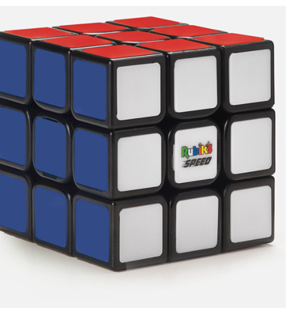
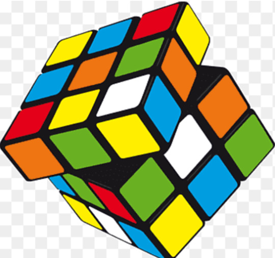
Unity and Variety- Unity is the combination and completion of elements in a work of art. An art piece with unity has the characteristic of oneness. A standard and finished Rubik's cube has unity as its structure is defined, and one color is represented around each panel. Variety offers a collaboration of different elements in a work of art. An unfinished Rubik's cube shows variety as colors are mixed upon one another, and its shape can become altered through rotation.
Balance - The distribution of visual alignment, position, or weight in a work of art. Art could have symmetrical or asymmetrical balance. A turtle is symmetrically proportional to oneself, whereas a fiddler crab is asymmetrical.


Emphasis and Subordination - Emphasis draws the focus of an audience to a particular area. Emphasis can be used to highlight areas of importance and draw the artist's purpose or message further across. Subordination is the area that is contrasted and diminished apart from the area of emphasis. Subordination is neutral or of lesser importance. Emphasis and subordination is used through camera work in film. Films often use focused lenses to to draw our attention towards the main character or a crucial scene.

Directional Forces - A piece of art might include implied directional forces. When a viewer looks at a piece of art, their eyes might be directed from one area to another. This path could be determined through lines that are imaginary, or are truly provided.
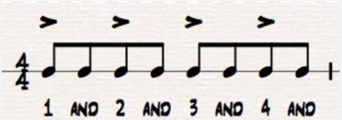
Repetition and Rhythm - Repetition in art is when visual elements are continuously recurred in a sequence or pattern. Rhythm is when elements of a sequence are followed through in repetition while containing variations. Rhythm creates a sense of movement or flow. Music can have elements of repetition and rhythm.
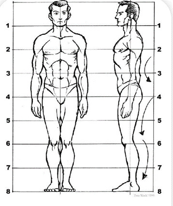
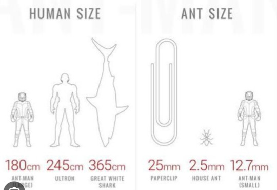
Scale and Proportion - Scale is the visual appearance of size in correspondence to a separate thing or object. Proportion is the sizes that correspond and make up one individual object of its own entirety. A human being is uniquely proportional to one's own self. However, an ant is significantly small in scale to the size of a human.
Writing and Looking: "Sauce Boat with Ladle," Eva Zeisel.
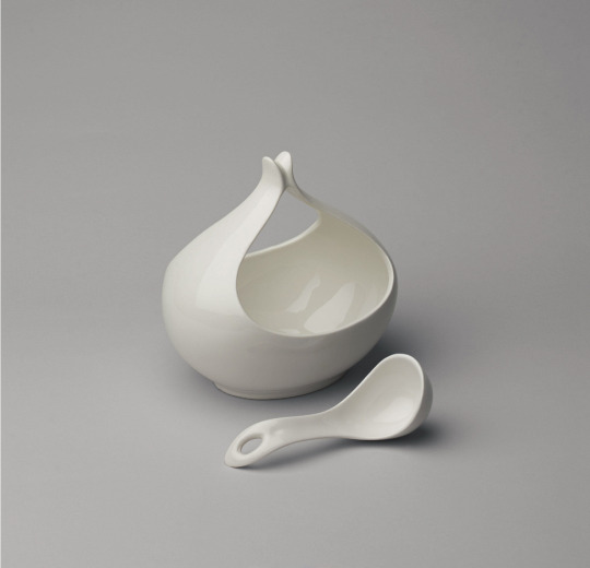
This art piece has unity, as both instruments have a defined structure, and appear to belong to one another while remaining as separate objects. They are both the same color and have implied directional forces. The "Sauce Boat" appears to be an open bowl at its base, while extending and opening up and outward. The "Ladle" is flat on surface, while its base is a defined spoon shape. The ladle is small in scale to the Sauce Boat. Both objects could have symmetry when viewed at a different position and angle.
Connecting Art to your World: Colors can affect mood and trigger emotional responses. I believe red can stimulate a sense of hunger. I know that I have driven past the red Chick-Fil-A or McDonalds sign and suddenly started to crave a meal when I previously was not hungry beforehand. If I were to choose a color scheme to represent myself, I would choose white and different variations of blue. The Tampa Bay Rays share the same color scheme, of which I am reminded of the times my father and I watched baseball games together. The first car I purchased on my own is blue. My first uniform at my first job was blue. My bedroom is also white and blue.
Art Project:
I can recall memories from when my siblings and I were little. My mother and father would tell us we were going on a road trip, but would not tell us where our destination was. One of my first memories was when I was 3 years old and my parents gifted me and my siblings a surprise visit to Disney World. I have always been fascinated with theme parks and have an interest with the history of Walt Disney World. The memories I have with my family is what I believe makes me who I am.
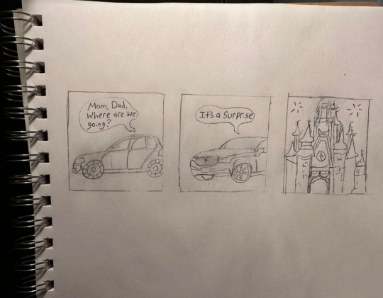
-Daniel Mentzer
Photo Design:
Group 1: Logos
McDonalds- Golden arches
Nike - Swoosh / checkmark
PlayStation - Letters "P" and "S" intertwined
Disney - Walt Disney's signature
Starbucks - A circle with green and white color scheme including a siren character
Apple - A bitten apple
Google Chrome - A circle with blue center, surrounded by a red, green, and yellow ring
Minecraft - Block of dirt as used in game
Target - 3 circles with 2 red and 1 white
Android - Green robot character
Hyundai - An italicized letter "H" surrounded by an oval
Toyota - Three ovals that represent the shape of a steering wheel ; Each letter of "Toyota" is also hidden in the symbol (Did not realize this beforehand!)
Logos are designed to be memorable and attract the attention of consumers. The way I know about these logos is most likely through advertisements such as commercials, billboards, or social media.
I have made psychological connections that allow me to recognize the logos and retain memory of what the company or brand does, and how it makes me feel. Logos that have distinct and unique features make the viewer wonder what they are looking at and draw attention to the product or company.
0 notes
Text
LOGOS
Group 1
McDonalds- Golden arches
Nike - Swoosh / checkmark
PlayStation - Letters "P" and "S" intertwined
Disney - Walt Disney's signature
Starbucks - A circle with green and white color scheme including a siren character
Apple - A bitten apple
Google Chrome - A circle with blue center, surrounded by a red, green, and yellow ring
Minecraft - Block of dirt as used in game
Target - 3 circles with 2 red and 1 white
Android - Green robot character
Hyundai - An italicized letter "H" surrounded by an oval
Toyota - Three ovals that represent the shape of a steering wheel ; Each letter of "Toyota" is also hidden in the symbol (Did not realize this beforehand!)
Logos are designed to be memorable and attract the attention of consumers. The way I know about these logos is most likely through advertisements such as commercials, billboards, or social media.
I have made psychological connections that allow me to recognize the logos and retain memory of what the company or brand does, and how it makes me feel. Logos that have distinct and unique features make the viewer wonder what they are looking at and draw attention to the product or company.
0 notes
Text
Virtual Sketchbook 1

2. The image I provided is a drawing that my father created when he was around the same age that I currently am. When I was little, my dad told stories about pieces of art that he had around the house. He showed me pieces from his youth that he still had and explained how he made them. The provided artwork is what inspired me to create works of art myself. He told me that he drew and colored the entire piece in one night and gave it to my mother as a gift. His artwork has remained hung up in the hallway of my home for as long as I can remember. My father used different Disney themed magazines as a reference and combined images of the characters sleeping on a campsite, He used colored pencils and chalk.
3. I am currently 21 years old, and I am a male. I am from Florida and am white. I like to write music, go to theme parks, watch movies, and make art. This fall, I will join a concert band and play the alto saxophone. I work at two hospitals in a materials management position. I am responsible for maintaining the supply and inventory throughout both locations. What makes me unique is the people I am surrounded with. I am family oriented, and I do the best I can to put my loved ones at the core of my priorities.
4.The photo I have chosen is very special to me. In February of this year, my family and I traveled to California for a week vacation. We had always dreamed of going to Disneyland and we were finally going to be able to. The photo was taken on the bus ride heading toward the park. It was an exciting moment as we had planned and scheduled the trip two years prior. I was incredibly thrilled to enter the park, and I was most excited about being able to share the moment and spend time with my family. The moment itself is what I capture as a self-portrait.

0 notes
Text
Cathédrale Notre Dame De Chartres
August 17th, 2023


1145-1513. Notre Dame de Chartres. Chartres, France. Cathedral length 427’, Façade height 157’, South Tower height 344’, North Tower height 377’
Hi everyone, my name is Daniel Mentzer. I am primarily an online student and have attended SCF since 2020. A fun fact about me is that I enjoy going to theme parks.
Looking at both images of the cathedral brought upon a sense of calmness. The amount of detail within the exterior and interior architecture is crafted remarkably. I was reminded of the Disney film, "The Hunchback of Notre Dame."
I was not aware of the amount of cathedrals that exist in Paris. 197 churches exist in Paris, while 37 of them are Notre Dame cathedrals.
The cathedral shown in the images is officially known as Cathédrale Notre Dame de Chartres. In the year 1194, the cathedral was burnt to the ground. It took 30 years to reconstruct.
A veil that was historically protected by the church was accordingly worn by Virgin Mary, the mother of Jesus. It was initially believed to have been destroyed during the fire. The veil was found and left undamaged days later.
Notre Dame de Chartres contains 176 stained-glass windows. A single panel could contain nearly 50 panels of varying sizes and shapes.
The sculptures and features found in the stained glass windows reflect scenes from the Old and New Testaments. The color blue was used to represent heavenly paradise, while red exemplifies the blood of Jesus Christ.
My initial perspective has not changed, yet researching information about Notre Dame de Chartres has made me appreciate the architecture more. Even after drastic devastation from a great fire, religious faith preserved the means to rebuild the church. While revisiting the image of the interior church, I can view the great lengths of craftmanship placed within the walls, the archways, the windows, and the statues. I learned that stained glass windows in the cathedral were designed to tell the biblical story for those who could not read. Preserving works of art found throughout the cathedral in its entirety sets a foundation for individuals who are passionate to learn.
1 note
·
View note