rachael-leach-whc
Rachael Leach
I have finished my Photography course at West Herts.
103 posts
Don't wanna be here? Send us removal request.
Last Seen Blogs

xplatinumxluxexsimsx
PlatinumLuxeSims

voodoochili
Voodoo Chili

anniflamma
The Little Flame Anni

song-world
Untitled
Text
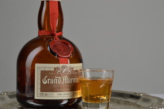
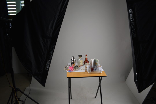
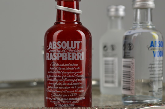
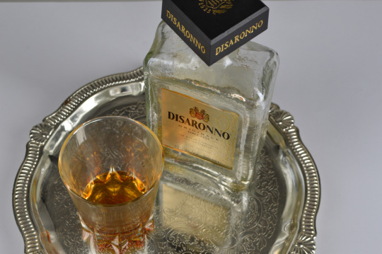
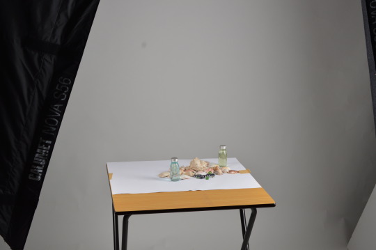
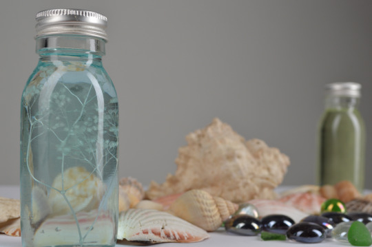
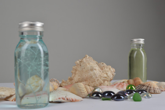
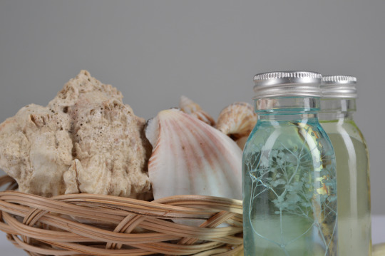
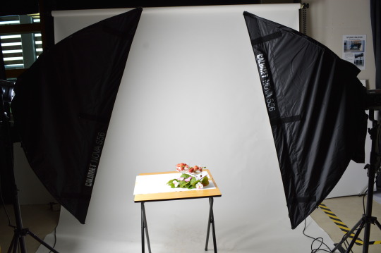
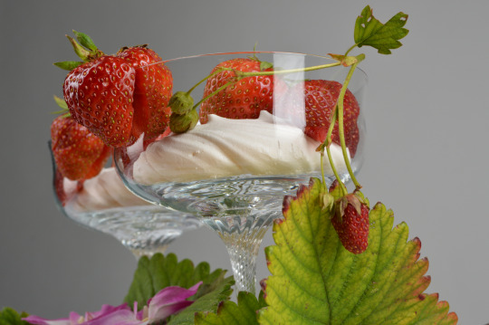
Set Building Evaluation
Evaluation
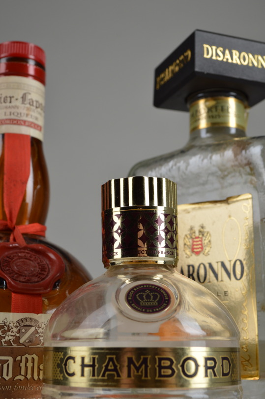
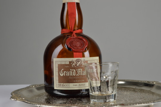
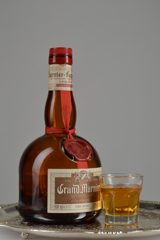
For my set build I really enjoyed shooting them as they were creative ideas that I managed to capture and show through the camera.
If I was to choose a favourite image I would probably choose one of the darker shot ones as I really liked the lighting within them. As it only highlights on the shiny material on the bottles. These images were unintentional as they were double shots, take one and the camera took another but I really like them because of the darkness.
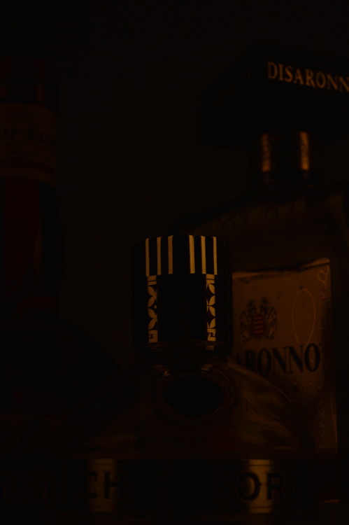
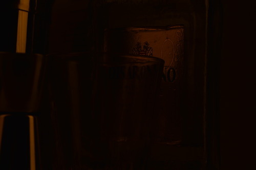
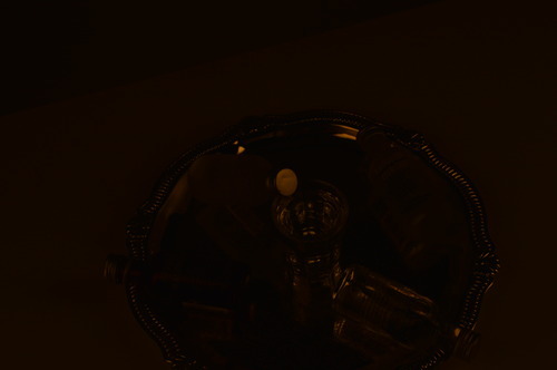
But I don't have a favourite out of the better shoots, they were all equally enjoyable and I feel that I got some really good shots out of them and it was hard choosing the better versions to put up here.
0 notes


Photo
(via 500px / Show me your teeth by Alfons van Bokhorst)
2K notes
·
View notes
Quote
You are so used to your features, you don’t know how beautiful you look to a stranger.
(via jolinxo)
1M notes
·
View notes
Quote
I know it’s over, and it never really began, but in my heart it was so real.
The Smiths (via 5ullen)
445K notes
·
View notes
Quote
Just because you miss someone, it doesn’t mean you should go back to them. Sometimes you have to just keep missing them until you wake up one morning and realise that you don’t anymore.
Unknown (via stevenbong)
Fuuuuucking on point
(via ayy-youfuckyou)
462K notes
·
View notes
Photo
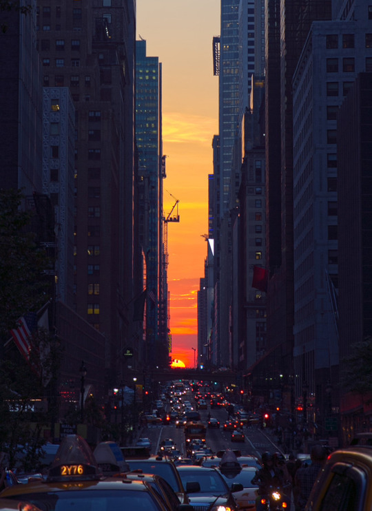

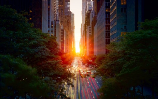
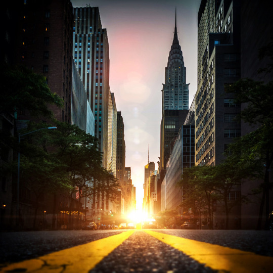

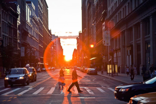

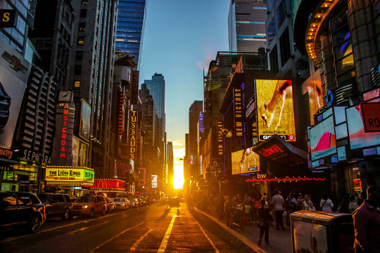
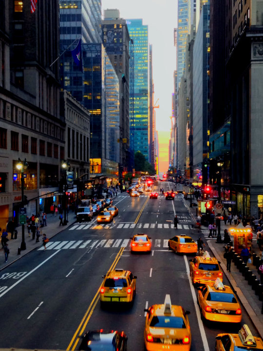
This year, the sun will set on the grid with half the disk above the horizon and half below on Thursday, May 29, 2014 at 8:16 p.m. EDT.
1. Arrive 30 minutes before the sun sets on the grid.
2. Positioning yourself as far east in Manhattan as possible, but ensure that when you look west across the avenues you can still see New Jersey.
3. Clear cross streets include 14th, 23rd, 34th. 42nd, 57th, and several streets adjacent to them.
4. The Empire State building and the Chrysler building render 34th street and 42nd streets especially striking vistas.
photo credits: 1)©greg chow 2)©jim su 3)bons ny 4)©dan martland 5)©justin kiner 6)12oz prophet 7)©jimmy crotty 8)©cynthia hajner 9)©c’est la vie annie
h/t 500px
7K notes
·
View notes
Photo
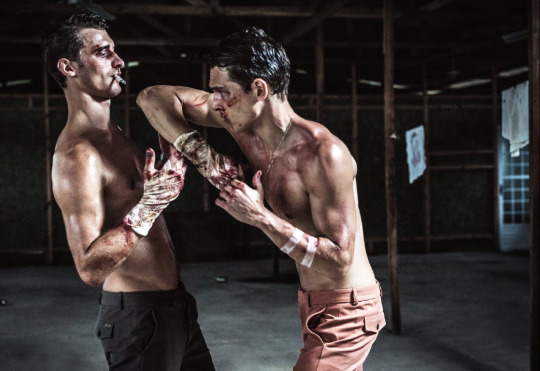

'Luchadores' - Models: Alexandre Cunha & Clement Chabernaud - Photographer: Alfonso Ohnur - Fashion Editor/Stylist: Berta Alvarez - Esquire España May 2014 - Location: Salvador, Bahia, Brazil
Gucci
Ermenegildo Zegna - Carhartt WIP - Jockey - Prada
Adolfo Dominguez - Converse All Star Chuck Taylor
Carhart WIP - Tommy Hilfiger - Nike - Emporio Armani
Givenchy - Converse All Star Chuck Taylor
Hackett - Reebok - Prada - H&M
Adidas - Dolce & Gabbana
Jewelry worn through out - Suárez Joyeria
966 notes
·
View notes
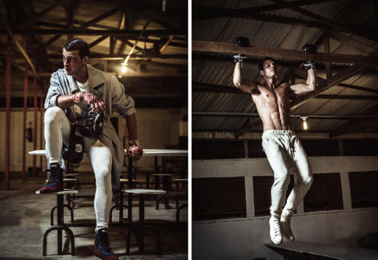
Photo
'Luchadores' - Models: Alexandre Cunha & Clement Chabernaud - Photographer: Alfonso Ohnur - Fashion Editor/Stylist: Berta Alvarez - Esquire España May 2014 - Location: Salvador, Bahia, Brazil
Gucci
Ermenegildo Zegna - Carhartt WIP - Jockey - Prada
Adolfo Dominguez - Converse All Star Chuck Taylor
Carhart WIP - Tommy Hilfiger - Nike - Emporio Armani
Givenchy - Converse All Star Chuck Taylor
Hackett - Reebok - Prada - H&M
Adidas - Dolce & Gabbana
Jewelry worn through out - Suárez Joyeria
966 notes
·
View notes

Text
FMP Evaluaton
Evaluation
I feel that for the FMP I started off well but near the end of it I started to slack on the work. So if I was to do this project again I would research better places to photograph that would be calendar worthy and have a better grasp on the ideas that I will be accomplishing. I would do more test shoots and gather a wider range/collection of images to choose from.
I took on board Marks advice and used an image from my first shoot and placed it in the Autumn/Winter months as the lighting and feel of the images gave a wintery vibe.
I like the final images that I have decided to use as these are expressive photographs that suit the months they were chosen for. But I feel that I could compose a full documented calendar over time, taking a series of images each month that best describe that month, like I tried to do with February.
I am aware that my final image/s are from my test shoots but I really liked them and I don't think I would of gotten any better images. I am also aware that I didn't do a test shoot of Rickmansworth Aquadrome at sunset but I feel that those images would of had the same dull feel and look to them as the Ruislip Lido series. Though my October image is from my Ruislip Lido series as it gave that sort of monthly/seasonally vibe.
But I feel that these set of images (minus February) are strong and draw your eye into the image. My favourite was the May image with the swan arching its wings into a heart shape, and you can see the individual feathers on its wings and the use of shadow within the image, defining and highlighting the back of the swans neck. And the light on the water reflects back, adding more light into the image. I don't think the image is too busy as the water and the grass define and bring the swan into focus, helps capture your attention.
But now I would have to say that the April image is closely running in in second place, and I believe that it really suits April, as the colours in it are just a bunch of nice, complimenting shades that you see around April time and enhance everything, and the tree in the foreground just nicely frames the photograph, drawing your eye into the middle and background where the sailing boats and the clear blue sky can be seen.
0 notes
Photo


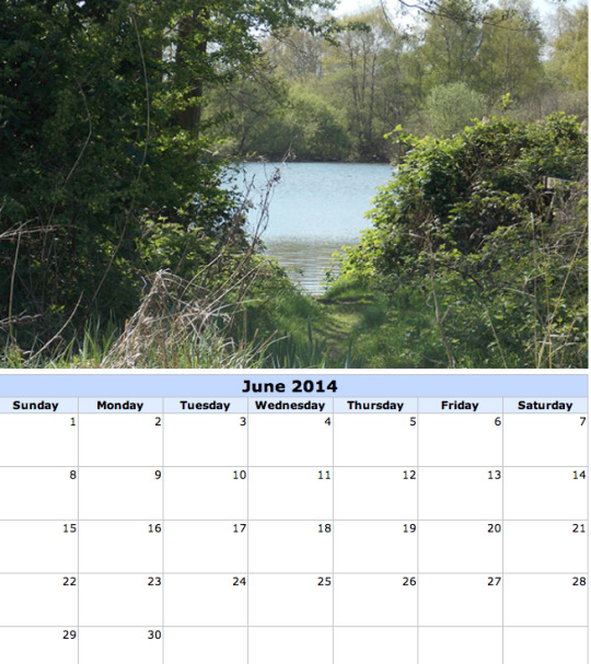
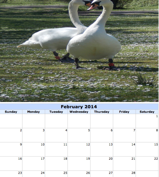
Extra (Final?) Calendar Images. Unfortunately the February picture does not fit into the grid as it is a portrait due to the editing, not a landscape image, which is a shame as that image is romantic and suitable for the February page as Valentines falls within that month.
0 notes
Text
Eliminated Images

This image has a beautiful colouring in the sky, a light, soft pink haze with a white glow coming from the top left hand corner. As I was writing this and studying the picture closely, I came to realize that the image is beautiful, even though it is blurred which is the main reason why I didn't choose it as one of my final images but it actually looks like that the image was take on film, giving it that grainy quality and look. The sky is my favourite thing about this image. (From first shoot.)
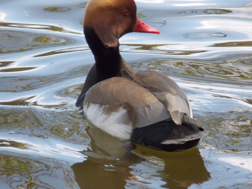
This image wasn't part of the elected because, even though it's got a crisp, sharp clarity, the top of the ducks head was chopped off, which cuts short the image and the splendid colouring of the Red-crested Pochards' head. This duck-the Red-crested Pochard is not native to our lands, its mostly found in South and Central Europe in brackish lagoons and reedy lakes. This is the male duck of the species. (From second shoot.)
0 notes
Text
Research Cont. Into Calendar Labs
Calendar Labs- http://www.calendarlabs.com/photo-calendar.php
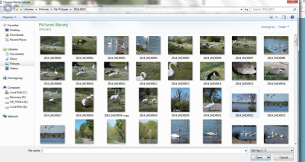
Uploading the picture to the site you have to choose from your collection your favourite image that you think would look good calendar style.
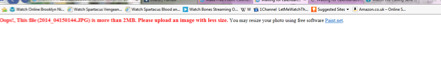
This is telling me that the file is too large for the calendar and it redirects me to a software site that I should download to resize my image.
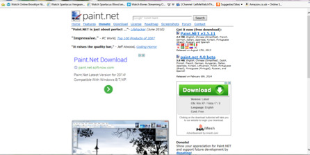
Paint Net-http://www.getpaint.net/ A software site provider for editing pictures-Sent my way after trying to upload the wrong sized image onto the calendar labs site.
Paint Net Reviews-http://www.pcpro.co.uk/reviews/software/373384/paint-net This site just gives us a product review instead of a performance review from those that have used it.
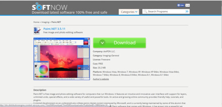
Clicking the download button it took me to this page. After downloading it on to my laptop it turned out that it wasn't a suitable match for either of them as a 32bit doesn't go on a 64bit or something like that. So this editing software was not compatible with my laptop.
So I opened the image in Photoshop.
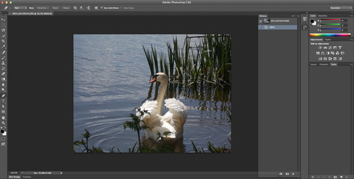

The original picture size.

The size I changed the picture to. But unfortunately this too was too big for the site.

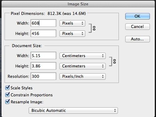
This size was a perfect match for the format of the calendar, I suppose I could of gone a bit smaller of bigger but I am happy with this outcome.
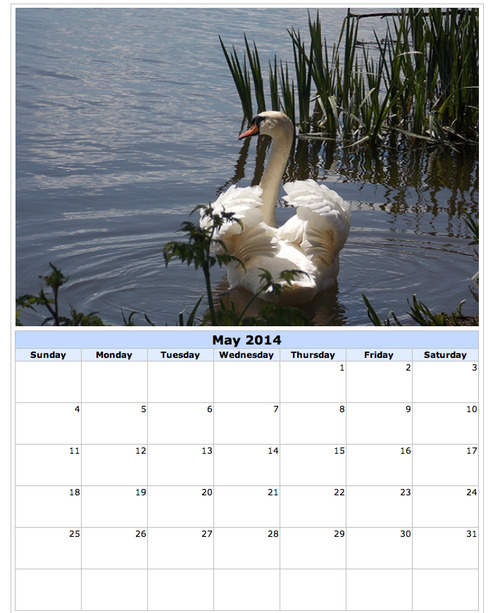
The picture has fitted the format required to make the calendar.
0 notes