
Last Seen Blogs
madaramikejimajuicyfatass
madara's thigh stockings

banzaidad
Untitled

weaseltotheface
rwby is good actually you guys are just boring

rainbooms-and-royalty
An MLP: FiM Fan Blog
lorlocks
Lorlocks
Text
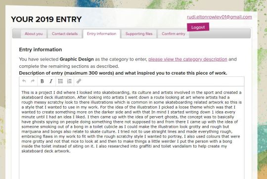
We were given the task of coming up with an idea and creating something for the young creative awards.
The first thing I am going to do is start with an idea list of different projects I could create.
Poster
Logo
Illustration
advertisement.
Typography piece.
Skateboard graphics.
Motion Graphic
Animation.
mid day drinking
Photography
Lighter Design.
Portrait Drawings
Life Drawing
Clothing graphics
Collage Work
Isometric Work
Architecture/Building Designs
Tattoo Designs
Some of these topics/Ideas are rather broad so I am going to look at three of them and think about what route I would go down If I was to go with the specified topic area/idea.
Out of the things listen the once that I would most like to create are, Isometric work, Illustrations and skateboard graphics.
Isometric Work.
I really like some isometric posters and design and have never really given it a try because I think it might be a bit hard to wrap my head around it with it potentially being almost 3d on a 2d platform but I could possibly make a Isometric character or buildings or some sort of scene there are many options and possibility as Isometric Work is more of a style but it is something I am interested in and would like to try out at some point.
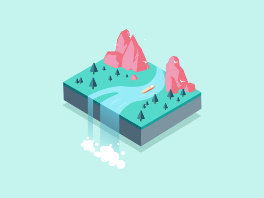
Illustration Work.
I really like illustration and would like to make something within illustrator or Photoshop but I am not very good at digital drawing and would like to learn more about it and get better at using Wacom pads but I could also create anything under this topic like animation or character design or just nice poster drawings.
Skateboard Graphics.
I like this idea and have been skateboarding for a few years and have always wanted to make some graphics for skateboard decks. I could do lots of things here and incorporate illustrations or isometric work but If I decide to go with this idea I need to think about If I want to create a deck for a specific brand or company or I could start a fake skate company or just design a set of board graphics.
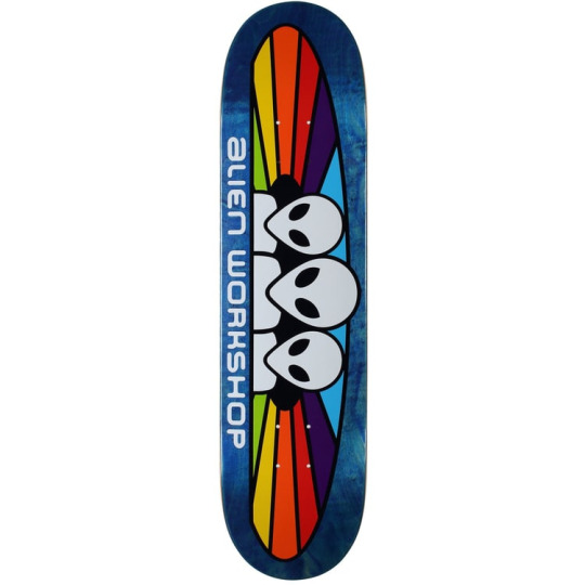
After thinking about each topic I am going to make skateboard deck graphics as I can go with anything form vector work to more traditional illustrations allowing me to keep developing my idea of what I am going to put on the boards and if I want to capture a certain brand or style.
Neck Face
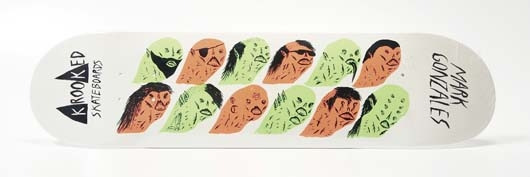
Neck Face is a anonymous graffiti artist and illustrator and is know for his more dark and grungy work which is also commonly comedic. He was born in California in 1984 where his work is featured on the streets but also in art galleries around the world, his first gallery show was when he was 18-years-old and was sponsored by Rich Jacobs and held at New Image Art gallery in West Hollywood, California. His drawing style is said to be rough and scratchy with bloody violent themes attached to his work. His first skateboard design was for krooked skateboards creating a pro model for skater Mark Gonzales. Neck face uses lots of mediums from marker pens spray paints and pencils but sharp metal masks, felt installations, and sculptures have been featured in his work.
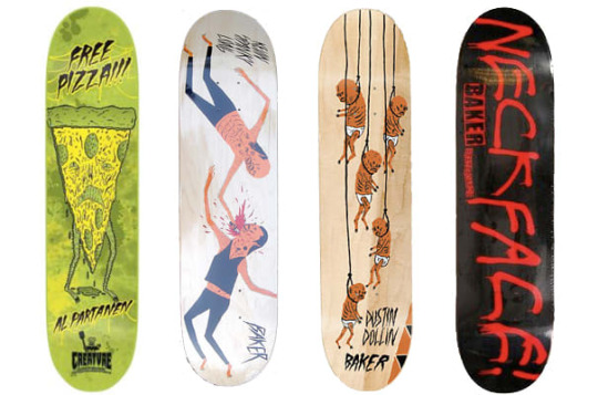
I really like this idea and look of dark illustration and would like to incorporate it in my work. His work also reminds me of other artists I like such as Lumps and Jenkins and Pollynor.
Pollynor
Lumps
Design process.
The artist Lumps dose not really have a specific he says he gets most of hist ideas from artist inspiration and constantly doodling in other words its more of a waterfall process. He usually starts with doodles then goes to sketches and then finally inking of digital tracing.
Christoph Niemann
Christoph is an illustrator, graphic designer and author of several books but out of these things he is mainly known for his illustrations. He was born in 1970 in Waiblingen in west Germany. He studied in Germany and developed his art but his career really took off when he moved to New York in america in 1997 and worked on and created many covers for the popular magazines and news papers such as the new Yorker, Atlantic monthly and the new York times. His work follows lots of different styles as he uses lots of things to create his work from pencils to paints and painting with coffee.
I do really like his illustrations and I think the reason why there so good is because of how creative and abstract some of the ideas are. He does things to help his imagination go wild and to help him create interesting ideas, for example he has multiple sketchbooks with one shape on the front and then he will fill the hole sketchbook with drawings incorporating the shape. One of the things he does to help his work be as creative as possible is that he says when things are going well you should always pick another direction allowing him to really experiment and create complex ideas.
The reason I am looking into this illustrator is because I watched a Netflix documentary and I really like the way he works.
His design process.
He usually does all his work in his office as he says he cant do it anywhere els and he will work from nine in the morning to six at night. He has everything he needs with him before he starts working allowing him to just start and create something. the thing that I like about his approach is that he doesn't plan or wait for inspiration to hit him he will just start drawing and let the ideas come to him, he says “you haft to trust that crazy things happen”. He dose not like to put words or titles to his work as he feels that the illustration should explain itself and represent the contents its associated with. When he works to deadlines he dose not allow himself to experiment to much and he will just jump right in by putting pen to paper. He says that its not about waiting around for hours waiting for inspiration to arrive its about turning up and starting because once you start creating something creations and ideas take place and this is something that I really like the idea of and would like to try in my work.
Now that I know that I want to make skateboard graphics and have some artist that I like that could help inspire me and influence my work I need to work out what work process I am going to use.
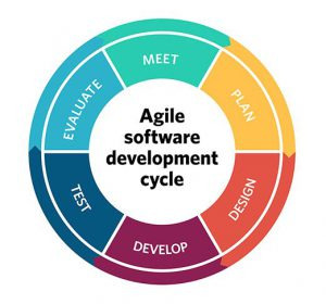
Agile
The agile process is essentially a process where you slowly develop an idea allowing yourself to go back and develop your work working with clients and getting feedback helping you create your finial piece that is suitable for the client or you design project. Essentially your not fixed on one pacific idea you are allowing yourself to develop it and change your idea before the final development process making it a safer working method when it comes to client work or product development.
Benefits: using this method can lead to better customer satisfaction, quicker development time as you may not need to go and change a whole idea because you are working with other minds or a client throughout the design process meaning you are both know the final look and outcome. Sometimes you need people to look at your work as others can help and bring ideas to the table or maybe point out flaws or things you missed.
Problems: You might not want to create exactly what you want. There is a chance that you might be relying on other people to do something and they might not be able to do it as well or as quick as you. Working with people can speed up the process of things but also slow things down if your working with people that do not agree with you or you do not like what they are doing.
Waterfall
Waterfall is a method where you create a set idea and then develop it. This method can work well for projects that are for yourself and also clients if the clients trust in your ability to create what there looking for in one shot. One of the problems with this method is that is can be risky for example if your working with a client and they want a logo so you have an idea and make it then the client might not like it and you haft to go back to the drawing board wasting lots of time but if you use the agile process you can work with people to develop your ideas making it fit the brief resulting in happy costumers. Waterfall can work well but can also be very hit or miss I think it depends on the project your doing.
Benefits: This method can be quick as you do not go back as much as agile and you are potentially setting a goal and finishing it without time to converse or adjust. You are able to do things your way without someone telling you how they might want to build on your ideas/designs. If your using this method with a client it might mean there giving you full creative freedom meaning you can create what you want to make and how to do it.
Problems: Without involving others or conversing with your client as much it might mean you spend lots of time creating a final product and your client does not like It and wants you to try again meaning you have wasted time. Sometimes you do not see the faults in your work and having someone els look at it means that they might be able to help you or bring something to the table but if you are not getting others too look at it your designs might not be as polished as they could be.
There are different ways to plan out your work and your process an you can use things like action plans, lists, graphs and more. There are even webistes out there to help with teams devloping something or helping people get things done essentially using action plans.
Monday.com is a website that allows you to manage tasks so you can do things on the site such as check progress of tasks, set tasks and communicate with the people your working with. This site uses things like action plans and graphs.
There are other sites that offer simular survices such as Mavenlink who also have features that help you keep track of time and budegets allowing you to not just manage your team but also finace.
Because I am creating this project for the young creative awards and there is no specific criteria I can just make what I want to make so I think the waterfall method will work well as I will create the idea I want to create with me being the only person that needs to be happy with the final piece I can develop it how I want. I would like to incorporate a bit of a agile work process into me development to as I feel it is a good idea to get other people opinions on my work which might help me create something that a larger audience likes other than me.
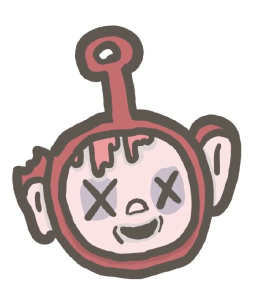
After looking into some artist I want to go down the digital illustration route and want to make something potentially dark and gory. Because these are skateboard decks I might try and incorporate some skate culture. I have been skating for a long time and am familiar with the background, skateboarding still has this rebellious reputation with more grungy brands like thrasher and enjoy promoting a look of skaters being influenced by drugs sex and just being general rule beakers. This idea is a little old fashion now as skateboarding welcomes everyone but this traditional outlaw skateboard scene is often portrayed in skateboard decks especially when there representing skaters for pro models.
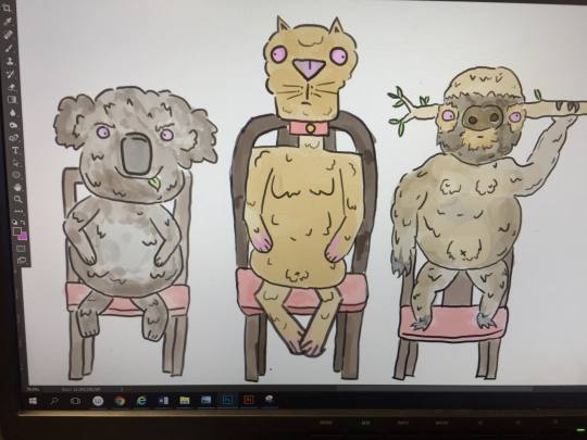
I have not really done any illustration so I drew some illustrations to help me get used to wacom pads and start to get the hang of digital drawing. Here is one of the drawings I did.
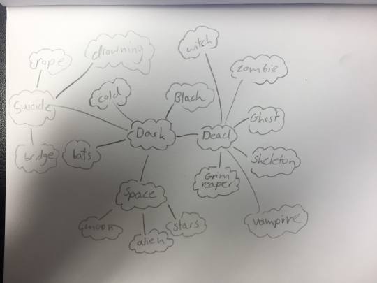
I am thinking of going down the route of darker illustration for the skateboard decks so I made a mind map to help me think of visuals I can bring into my work.
I then tried to come up with five ideas in five minutes with the visual elements from my mind map in mind.
The one minute ideas that I came up with were.
1 Skeleton with a boner
2 Alien on the moon drinking beer in a deck chair
3 one planet eating another planet
4 the grim reaper cutting vegetables with its blade
5 Pervert ghosts
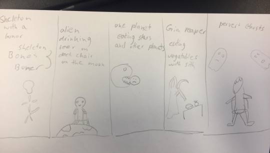
The Idea that I like and would like to develop further is pervert ghosts as I think I will be able to fit ghosts on a skateboard deck well and I also think it could be funny ghost spying on people in possibly dodgy situations.
I am now going to list some scenarios that you might not want other people to witness.
Being on the toilet
Sleeping
Having sex
doing drugs
killing someone
spiting in food
keying a car
illegal graffiti
littering
being sick
eating bogies
eating other peoples food
robbing a shop
smoking in work
cheating at video games
I then got my friend to look at the different options I had written down and she said she liked doing drugs, eating bogies because its relatable and also littering because its a common thing people do.
I like the idea of doing drugs, drinking in mid day so the next thing I did was create quick sketches of some of the things I listed here are the sketches.
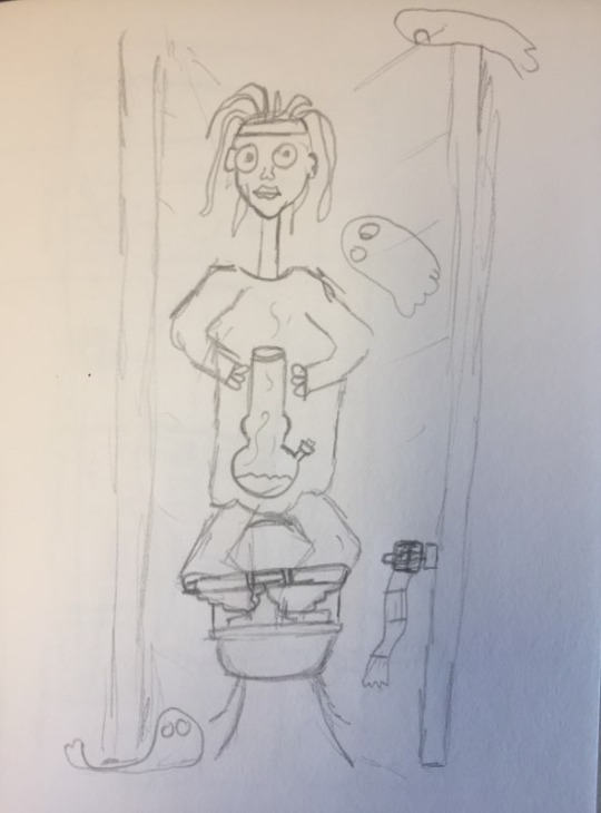
After doing the sketches and just thinking off the top of my head I had three ideas for the skateboard decks.
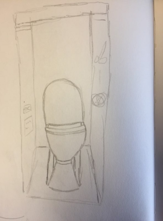
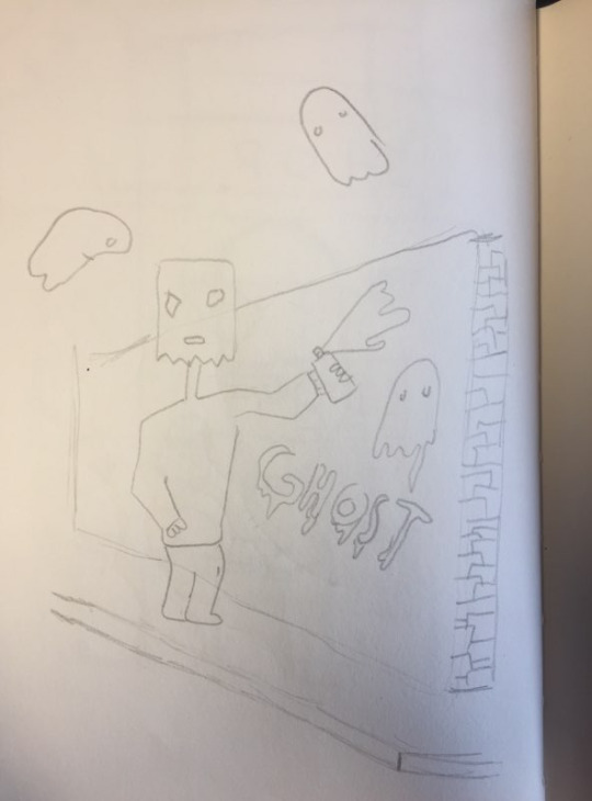
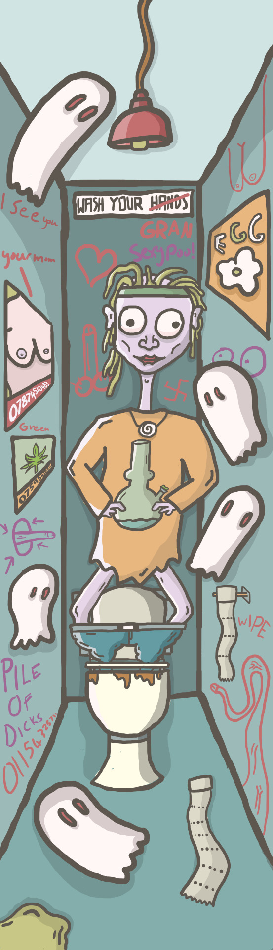
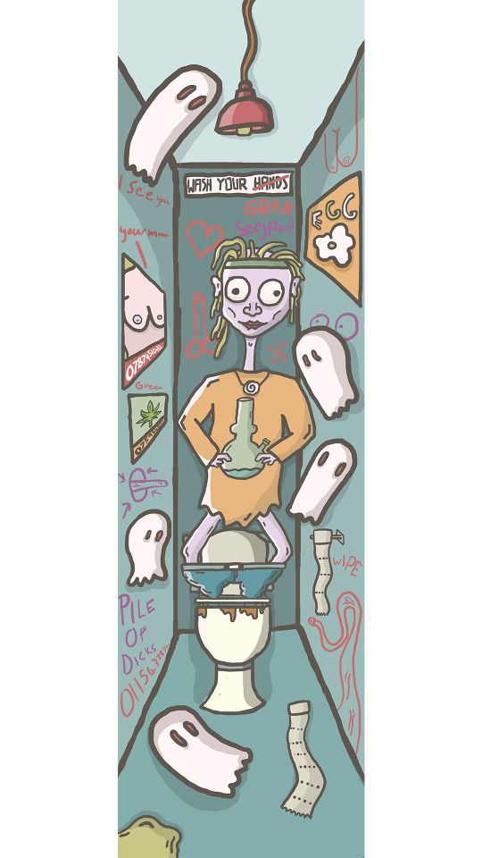
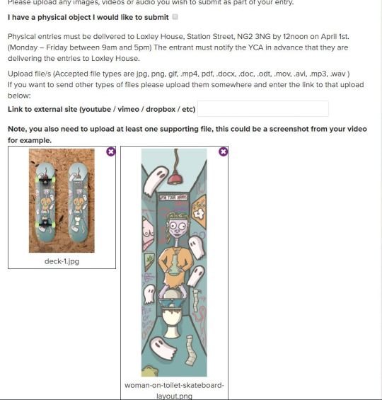
1- for the first idea I wanted to have someone in a toilet cubicle smoking weed out of a bong and then the person will have ghosts around them basically spying on the person. I want to make the artwork look scratchy and grotty like my artists and I also think it would be fun to vandalize the toilet with posters and graffiti. To make things a little more weird I had the idea to put the character with the bong inside the toilet instead of them siting on it.
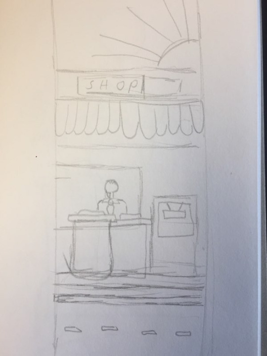
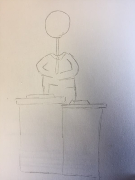
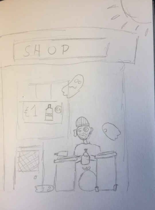
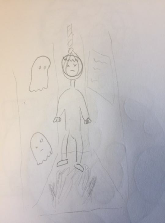
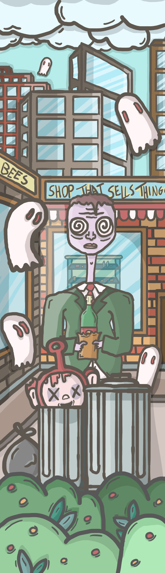
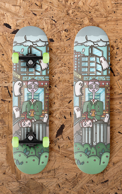
2- for the second Idea I wanted to make a business man that was sneakily drinking in the middle of the day behind some bins outside some sort of corner shop. And then I will follow the theme of pervert ghosts and out in ghosts spying on the character.
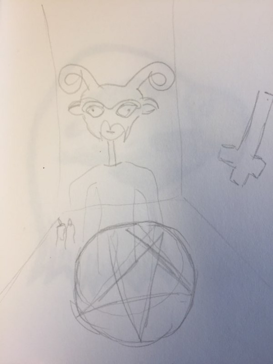
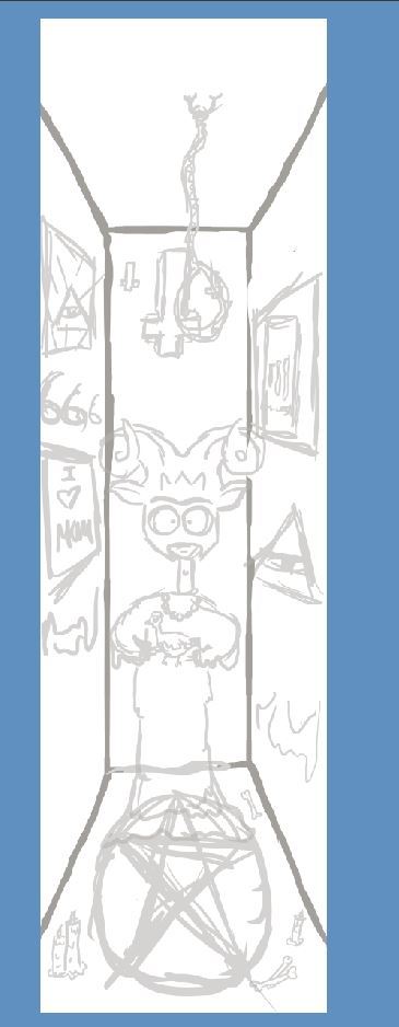
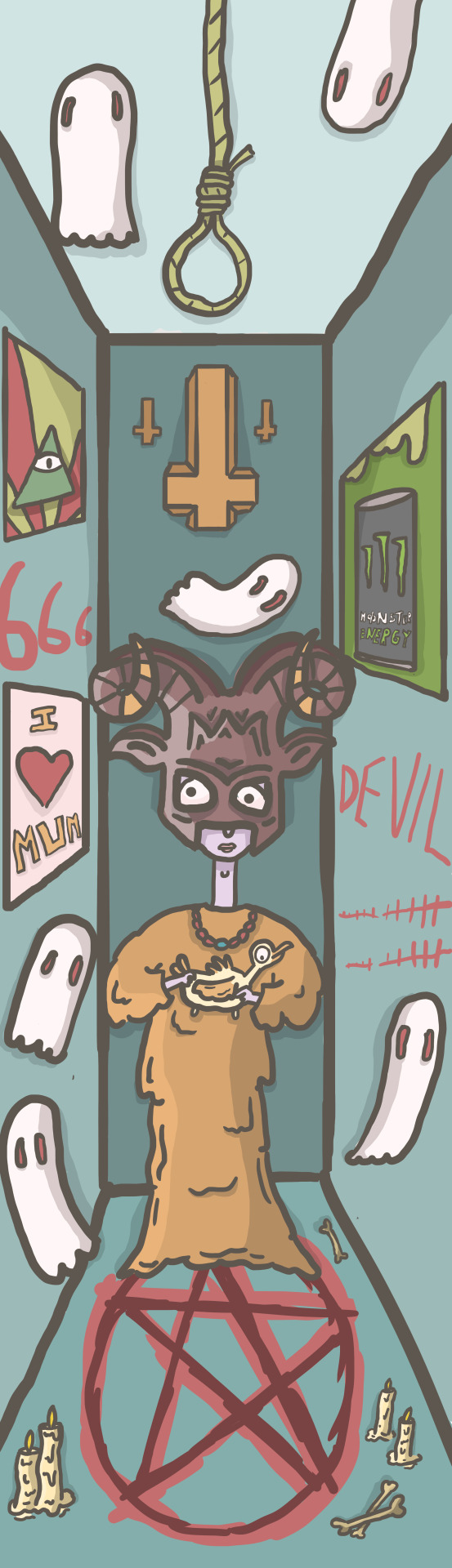
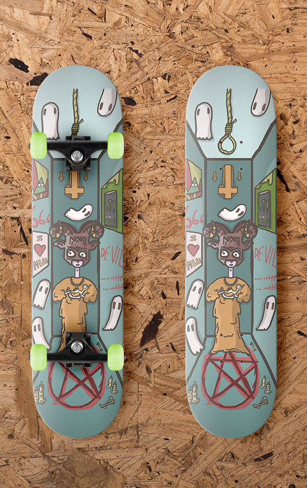
3- the third idea I wanted to draw was a character practicing Satanism so I want the character to have a goat mask on and then maybe a chicken that he is about to sacrifice and then the room the character is in will be filled with things that relate to satanism and the devil.
with my ideas and creation of the illustration I am taking more of a waterfall approach as this is just a project that I have come up with and am not creating it for anyone but me but I like to possibly bring some agile methods into my work to help potentially develop it.
Now that I have done the sketches and have my ideas for the pervert ghosts skateboard series/triptych I went into the design process where I used Photoshop and a wacom pad and pen to create the illustrations.
The plan is to take inspiration from the artists I researched and skate culture. I want my work to have a rough scratchy feel like lumps and pollynors work but I want to follow a design process that fits with christoph niemann so for he illustrations I have a idea but I am mainly going to be looking at my very rough sketches as a guide and the reason I haven't done more detailed sketches of what I want the final piece to look like is because I want to start drawing and hope that different ideas and elements of things I could add to the illustrations come to me as I draw hophally making something a little weird and wacky and this is an approach Christopher niemann uses in his work.
My design process.
first thing I did was google the size of a skateboard deck for Photoshop and it said 9.5 x 33 inches so I used this but skateboards are a variety of sizes but I trusted google and used that as my dimensions. I then used my sketches as reference and started the designing. The process that I usually do is I would do a rough drawing of the thing I was trying to make in Photoshop to give me a rough guide for when I put in my line work. I then turned the opacity of that layer down and started putting in the line work. Whilst I did this I tried to not make the line work look too clean to fit the scratchy rough style I was trying to incorporate into my work so I would rarely hold shift when drawing lines and if I did I used the pressure sensitivity in the wacom pad to make all the lines different weights and thickness. After I had the line work down for the thing I was drawing I would create a layer bellow which would be the coloring layer, so I then colored in everything under the line work. I tried to make my color pallet for the three boards look a little grotty and dirty and then once I had done the coloring in I created two layers one for shadows and one for highlights. I would then work out where the light source is and using white and black to draw over the color layer and then turn the opacity of those layers down to create more depth and lighting. Then lastly I add another layer and draw in final shadows. When creating I am working of my minimal sketches in the hope that ideas come to me naturally but I will also be doing research to influence my creations. Another thing I will be always thinking about is that this is a skateboard design so the main focus of the illustration will be in the middle because the trucks of a skateboard cover the top and bottom section of the deck.
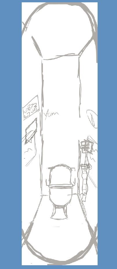
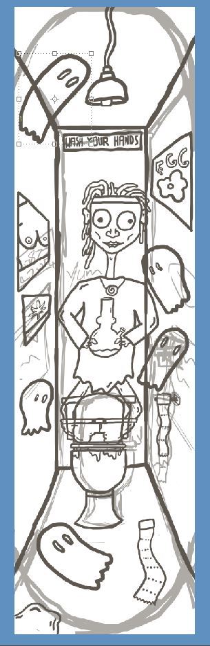
Once I had my ideas and rough sketches I started to create my first skateboard graphic of the character standing in a toilet. I started drawing the basics such as the things that I knew were going to be involved in the drawing such as the character the toilet and walls to the cubicle. I then started to think of things that could be added to the drawing and one of the main areas where I could just draw and doodle to try and make creations happen much like Christoph Niemann would was the vandalism I wanted to do on the toilet walls. Most of the vandalism will be coming off the top of my head but because I wanted to incorporate elements of an agile design process (involving others in my work) I showed people on instergram my work so far on the drawing and asked them about toilet graffiti to get some inspiration and possible thoughts of the project. The question I asked was what have you seen on toilet walls and here are some of the responses.
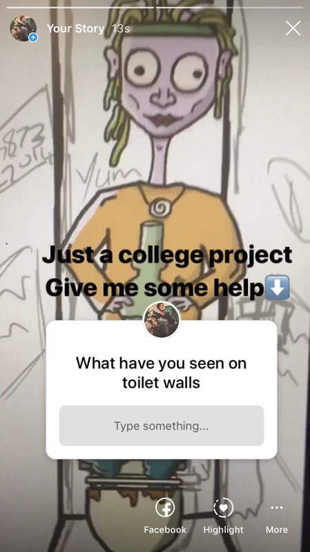
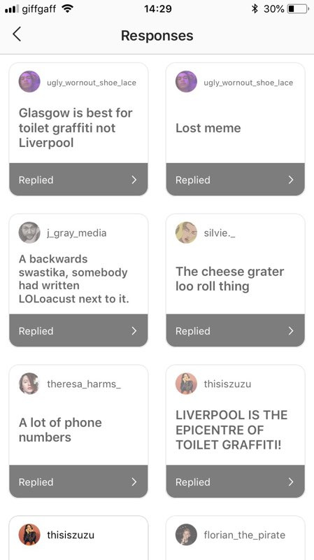
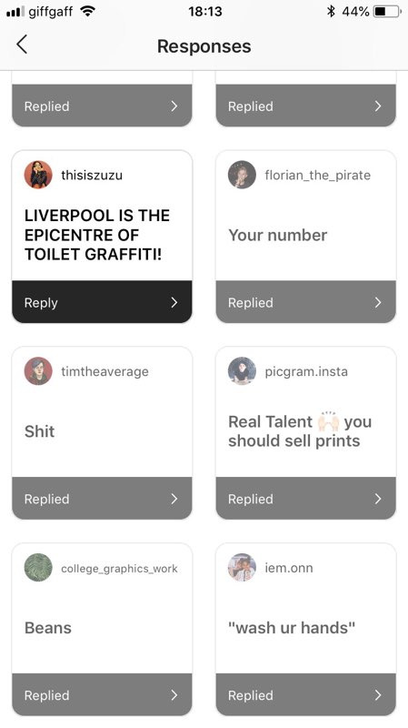
I also took a look in to Liverpool and Glasgow toilet graffiti as people were saying that these places had the best toilet graffiti. I was also sent these photos by people from Instagram as a response to my question.
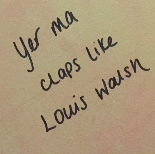
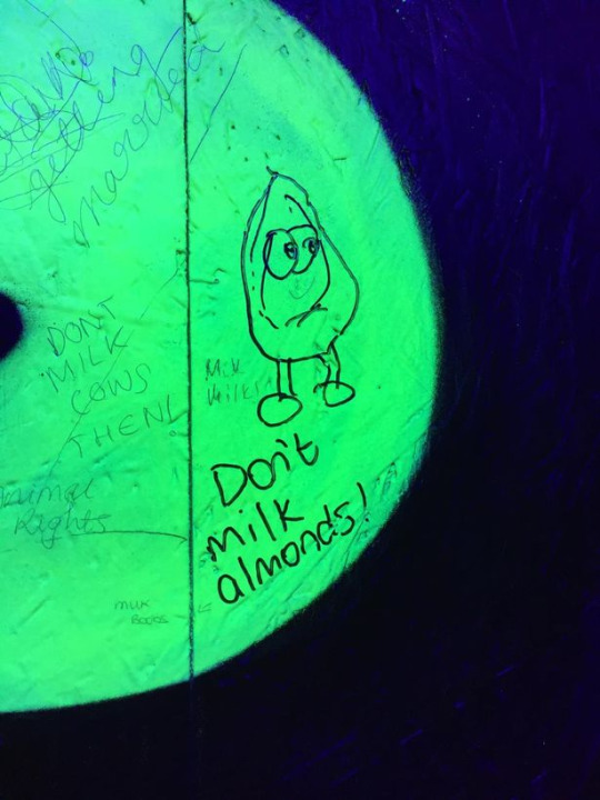
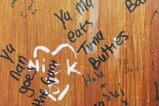
After geting feedback and people involved to help inspire me I was ready to start coming up with the things to put on the walls. Some of the graffiti I came up with were things such as a dick snake, glory hole and a sign that said wash your hands and then hands had bee crossed out and replaced with gran. From this point on for the first board I did not do anymore research and I just drawed and doodled letting ideas come to me, Once I had the basic sketching and line work done for the toilet and walls I started adding posters to the walls and toilet doodles off the top of my head. Because I was working completely Randomly I didn't have very structured layers in Photoshop as I would have an idea start sketching it, then doing the line work, coloring and shading and then once I had finished that I would move onto the next drawing, I did this because I was just trying to start creating and get my ideas for the drawing down much like the artists I have researched but when I wanted to move certain parts of my drawings around I wouldn't know which layers where which so I spent some time grouping things so it would be easier to move around but it still got a little confusing but I was still following the idea of sketch, ink, color then work out where the light source is going from and draw dark and light sections to whatever I was drawing to give the illustrations depth. I was coming to the end of my illustration and I was almost finished but I asked for a second opinion making my work flow have a bit more of a agile approach and the advise that I got was if I was going to fill all the walls up with posters and doodles I should file other parts of the drawing up because I looked a little bare. I agreed so I decided to add some little extra drawings such as toilet roll on the floor and vomit and then where ever there were patches in the illustration where it did not look as full as the other parts I would draw a ghost to fill the space making the hole illustration look full and busy but hopefully not too crammed so you can understand what the drawing is.
Here are the sketches layers the line work and then the final coloring in with black and white shading.
For the next skateboard design I wanted to try and plan everything out and just have a little bit more structer to my layers so I would get so confused on which layer and section I was working on and it would make it easier to go back and edit my illustrations which is something that I did a lot when I was drawing shadows and highlights so the plan was to simply keep things in groups and label all the groups and each group would have an outline inking layer a color layer a layer for shadow and a layer for highlights and then possibly another layer for touch ups and extra things I wanted to put in basically so I could go back and change or add things. I still went in with the same plan as the first illustration so I just drew the basics in a digital sketch form going off my very basic sketch and then started adding everything in working with each element or section one at a time.
Example of the process.
Inking/line work

coloring
Highlights and shadows.
for this illustration I once again let things just come to my head and drew everything how I wanted so I also didn't have a specific color pallet in mind I just picked colors that I thought would work with the idea that I needed to make all three illustrations look similar because its a trip tic of pieces and I wanted the colors to be a little bit more gross and dirtier..
Here are the sketch layers and final piece.

For the final illustration which is to do with satanism I used the same design methods as the other illustrations but for this one I had to do some research mainly looking at symbols and reading about satanism practices.
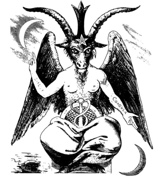
for this illustration I made the layout look simulat to the first one because I really liked having the walls that you could place things on. I added things like upside down corsses and some comedic things such as a poster saying I love mom. I also had the idea to add a moster energy poster and the reason for this is because one the drink is called moster but I remeber watching a video where a lady explains how the monster energy drink is satanic. Here is that short video.
youtube
Here is the sketch layers and final illustration.

Evaluation.
What were the final ideas.
The final idea was to create three skateboard illustrations to put on skateboard decks. The title for the three boards is Pervert Ghosts and the concept of the art is ghost spying on people doing things they maybe shouldn't be doing. I am also trying to represent skate culture and artwork and illustrations within the skateboarding scene.
For the first board I wanted it to be drugs related and because marijuana is popular in skate culture as skateboarding emerged from the more hippie surfing scene I decided yo have a character smoking out of a bong surrounded by ghosts in a toilet cubicle.
The second idea was to focus on daytime drinking as lots of business men potentially use drink and drugs to keep them going so I wanted to have a character in a suit drinking behind some bins surrounded by ghosts spying/perving on the character.
For the last board I wanted to explore Satanism as the concept involves ghosts and evolved from me doing idea generation within dark themes so for the last illustration I wanted to have a character sacrificing a animal like a chicken surrounded by artwork and items attached to the culture.
How did you arrive at these Ideas.
To come up with the concept and ideas I was exploring in all the different ways of idea generation and one of them was writing down an idea a minute and I did this with darker themes in mind and I came up with pervert ghosts. I then came up with the ideas for the illustration by doing more idea generation and looking at the different angles and topics I could work with that related to the concept of pervert ghosts.
What inspired me?
I have been skateboarding for a few years so I am inspired by the culture and skateboarding as a whole as it is something I enjoy to do but I also really like art attached to skateboarding and artists that work within street ware and skateboarding. So I looked at some artists that I liked and was inspired by there styles and work methods to develop ideas and the process to creating work.
what specific approaches did you practice?
I looked into different design approaches and I decided to take more of a water fall approach to my work as I came up with the idea and the artwork and final piece will just be for me and not a client but I did also try and bring some of an agile approach to my work as I think its useful to get other peoples opinions on your work and get opinions and tips so I mainly used a waterfall approach so I could create exactly what I wanted to make but then also bring in other people to help develop my work making it appeal to more people than just myself. After researching artist I took influence from there work flow and used it in my work for example there techniques in idea generation such as getting a pen and just randomly drawing letting the ideas come to you and trying to not give yourself to many specific boundaries so you can truly create what your mind can come up with.
What issues did I encounter?
I didn't really encounter many issues but one thing that I did on the first illustration was not label or group my layers making it really tricky for me to go back and redraw or edit certain bits because I was spending a lot of time trying to find the right layers.
How did you overcome them?
For the second and third illustrations I grouped and labeled the elements in my drawings and tried to follow a layer structure for each illustration putting coloring, line work, shadows and highlights into different sections.
what have you learnt during this project?
I have learnt more about different methods to develop ideas and also more about structuring your design process. I have also learnt lots about illustration such as using a wacom pad experimenting with brushes and pressure sensitivity and layer structure when drawing.
What do you like
I really like the first illustration from the character to the posters and graffiti on the wall I also like the scratchy more rough grotty art style I was trying to portray. I think the more dirty looking color pallets look good and I think I did some good illustrations with shadows and highlights thinking where the light source might have been coming from. I also think the composition was okay and I did a good job at keeping the main focus of the illustration in the middle as skateboard trucks would be covering the top and bottom of the illustration I especially think the layout of the second illustration looks nice with all the elements and layers with the bushes at the front and then the character and shops in the middle with a city skate at the top.
What do you not like.
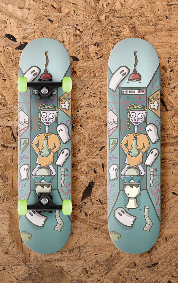
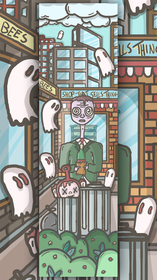
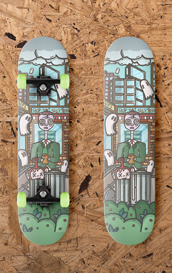
I think the background of the first and last illustrations look very similar compared to the 2nd illustration and it just makes it look out of place because its a triptych they should all look similar so I should of eather made each illustration all in completely different looking scenes or have all three in a the box like room that the first and last illustration have. I also think the last illustration seems a little bare and not as full as the other too. Also the character is not very good and I do not like the goat mask I gave him. I am also not a huge fan of the colors in the second illustration as I do not like the grays in in the skyline I think there a bit too dark and I could of added brinks or more texture like the shops have but I didn't because its in the background so it doesn't have as much focus. I also think the color pallet for all three designs vary to much so I should of been more strict with my colors and stuck to a specific color pallet. I did try and use the same colors from across the illustrations as much as I could but I feel like there is too much of variation of colors throughout the three illustrations. Also the moc up that I made of the designs on skateboards the decks are a little to big leaving a small section at the top and bottom of the board with no illustration on it.


I uploaded my work to the young creative awards but I only uploaded my first illustration as I dint think the other too were as good or good enough.
1 note
·
View note