
Safia Rassool
BA Visual Communications / Arts University Bournemouth
1176 posts
Don't wanna be here? Send us removal request.
Last Seen Blogs


Text
Final Major Project Evaluation
My Final Major Project has been one to remember!
Due to the length of the FMP my initial research varied massively, however it has always been clear to me that I have an interest in issues/topics surrounding women - most probably because I can relate to them.
My decision designs were informed by primary and secondary research throughout but the most influential finding was probably the discussion surrounding the pill being sold over the counter this year. I utilised this finding to frame my project in a way that made it relevant for women in the current day - and therefore more impactful. Normally, my projects are based heavily on academic research - however this time, I have made the conscious effort to use physical tests, and experimentations as research, instead of relying so heavily on content that is already out there. I wanted my FMP to be original and I definitely think I have achieved that.
It is fair to say that my project has gone through many changes and developments throughout. The most drastic was the packaging change from a box to a sachet. Although this was stressful in the moment, I am extremely happy I put the effort in to make this change, as one of my main aims was to break the codes and conventions of medical packaging as a tool to get women to change their existing views on the pill. By changing the packaging form completely, I challenged negative conceptions of the pill and give the packaging a completely contemporary approach, more suited to the modern day woman. Throughout the process I was testing my designs as a way to highlight any issues and therefore develop them further.
My FMP consists of multiple elements: the packaging, leaflet, stickers and instagram presence. This is the most elements I have ever created for a project and I am happy that I pushed myself to do so. In my opinion, all the outcomes are cohesive and express my FMP's aim of celebrating the pill as a symbol of women's control clearly. There is no room for question, which I am happy about as I wanted the outcomes to be powerful opposed to weak. I think the outcomes are successful due to a strong, thought through brand identity, style and tone of voice which is carried throughout. Every decision was made carefully to ensure that control, power, freedom and rights for women were expressed - right down to the type face choice which has impact as well as softness to reflect femininity.
In regards to time management, I am proud of myself for always keeping on top of the work that I set myself. I can confidently say that the previous years at University have allowed me to master my time management and highlighted tools such as to do lists and weekly planners as my best friend. I was strict on myself in regards to time as I wanted this project to reflect industry as much as possible.
In my opinion the tutorials and sign ups were a great opportunity for me to highlight my progress to my tutors and also welcome feedback, which I enjoy hearing and take well. I find it helpful to get a second opinion on my designs however, at the same time - I am independent enough to make my own decisions regarding my FMP. This was the last project I was ever going to do in an education setting, and although I took feedback well, I also made my own choices as it was my project at the end of the day.
This project really allowed me to work on many areas of design e.g. packaging, editorial and animation etcs which I loved! Despite this, I always think I can improve - especially with regards to animation which I find the hardest. I found that watching youtube tutorials really helped me and After Effects really doesn't seem that scary anymore!
My FMP taught me so much. I actually ended up educating myself on the history of the contraceptive pill which has resulted in my own opinion of it being changed. I now feel much more appreciative for the tiny pill that I take everyday and encourage my friends to feel the same. Additionally, this project has strengthened my online skills, for example, how to present myself and my work through a webcam - which I know will be a vital skill going forward into the post covid world.
On reflection, I wouldn't make any drastic changes to my process, as I really did enjoy the topic and felt confident in my choices throughout. If I had more time, I definitely would have spent more time on the animations for social media as I resulted in creating gifs due to them being easier. I know if I had more time, I could have created some really great assets to encourage community further. I also would have loved to get my packaging printed properly so I could get a feel for how all the elements would work together.
In regards to my self promotional pieces, I am happy with my the branding and design, although I have an internship at this moment, I know I will use them for future job opportunities.
Overall, I am proud of myself not only for this project - but for the three years!
2 notes
·
View notes
Text
Self Promotional Pieces
My unusual surname is a massive part of my identity and always has been so I though it would be fitting to play upon this in my branding. I think the editing of the O's not only shows I am flexible and adaptable but different.
I kept the colours muted and simple, as I really love classic design. My main aim with all my promotional pieces was to keep it classic, and simple to allow my design to speak for itself. I definitely think I have achieved this across my portfolio, business cards and website.
Website: safiarassool.myportfolio.com
Business card:

Portfolio (I have presented it on Issuu so you can see all the pages):
issuu
0 notes

Text
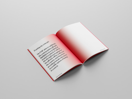
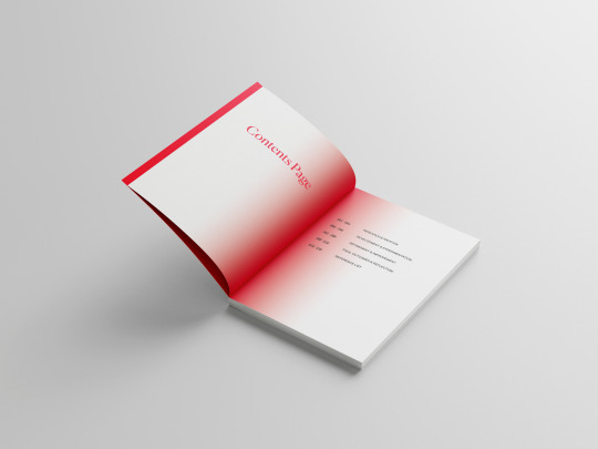
Final Process Book
Here are some mockups of my final display book. As you can see I chose to keep the design cohesive with my final outcomes by using the brand colours and stickers on the back.
I really like the use of gradient in the spine, this is something I have never played with before but I think it is really simple but effective! As the process book had a word limit I tried my hardest to keep my critical analysis clear and concise whilst only including the most pivotal parts of my process.
I am very happy with how it has turned out, as I think I tried to push the design throughout slightly more than usual whilst still retaining clarity and a nice reading pace.


0 notes
Text
Important final note about colours.
Sometimes the intensity of my colours varies, this is because some outcomes are designed for print e.g. the leaflet and others are fully for screen purposes e.g. any images.
Please refer to the identity folder within the final outcomes folder for the colour palette.
0 notes
Text
Refining Learning Agreement
As my project is coming to an end I felt it was important to look back over my learning agreement to ensure it fully resonated with my FMP's aims.
I made a couple small amendments to the synopsis of study to ensure this.

0 notes
Text
Final Outcomes (Instagram Presence)
Full mockup:
Posts:


Gifs:


Carousel:

0 notes
Text
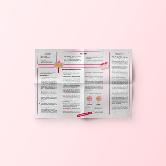
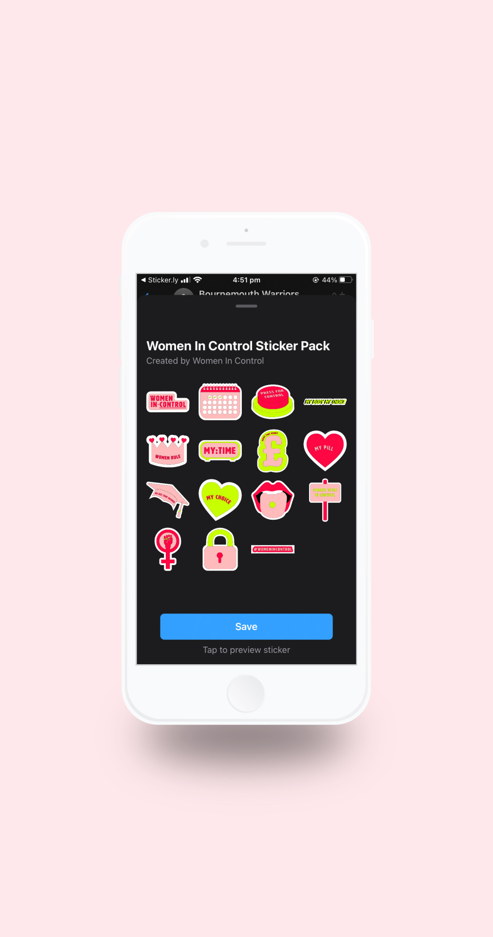
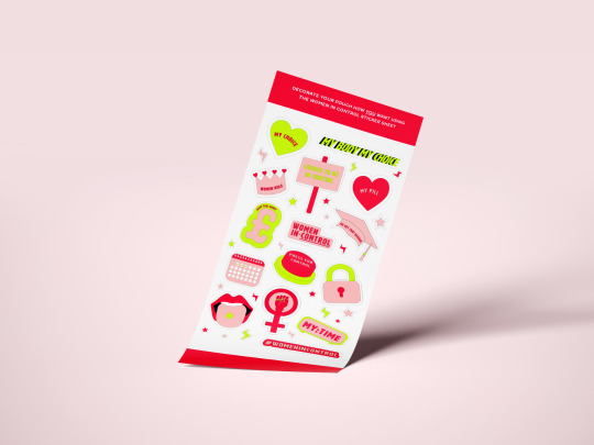
Final Outcomes (Stickers - digital & physical)
Digital:

Physical:
0 notes
Text
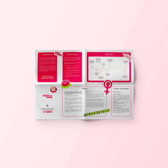
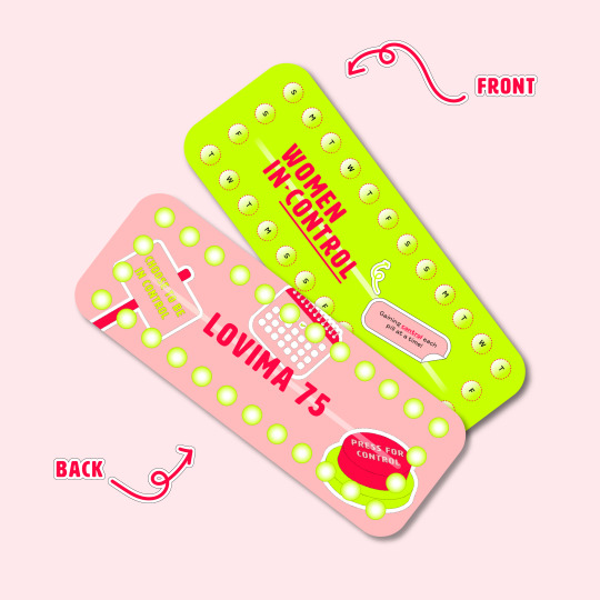
Final Outcomes (Identity & Packaging)
Identity:
Sachet:


Pill Strip:
0 notes
Text
Using carousel design for the Pill's timeline

Using carousels on Instagram is a very popular way to tell a story or share multiple posts at once. I felt I could apply this to the Women In Control instagram by taking a shortened version of the pill's timeline seen on the leaflet.
Although the timeline is shortened I think is works really well to show the progression we have made with the pill and how we as women should be extremely grateful that we have the opportunity to take it - and now buy it over the counter.
0 notes
Text
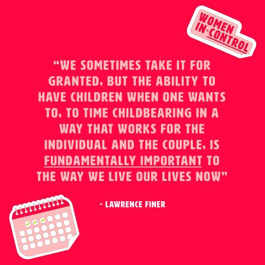
Instagram posts - quotes that encourage women to appreciate their pill

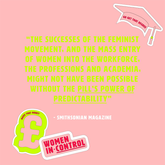

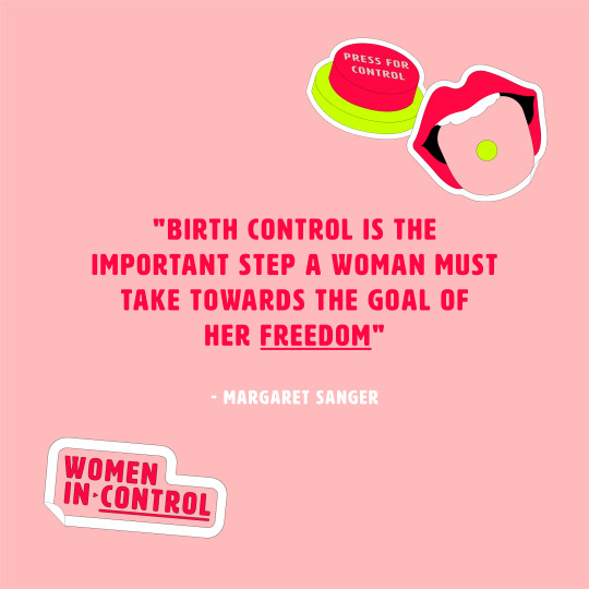
I used the powerful quotes to create images that could be uploaded to the Instagram. I used the brand colours, font and underlining to keep the design cohesive with the brand identity. I also included stickers that were relevant to the quote which Is a fun addition to the design.
I think this was a really simplistic but effective way of encouraging women on instagram to recognise their pill for the gift it really is!
0 notes
Text
Powerful quotes I could use on my instagram
“We sometimes take it for granted, but the ability to have children when one wants to, to time childbearing in a way that works for the individual and the couple, is fundamentally important to the way we live our lives now,” said Lawrence Finer
The successes of the feminist movement, and the mass entry of women into the workforce, the professions and academia, might not have been possible without the pill’s power of predictability.
https://www.smithsonianmag.com/history/why-the-oral-contraceptive-is-just-known-as-the-pill-4337831/
"the pill became widely known as The Pill, perhaps the only product in American history so powerful that it needed no name" - Jonathan Eig
https://www.nationalgeographic.com/adventure/article/141218-birth-control-pill-contraception-science-medicine-ngbooktalk
"Birth control is the important step a woman must take towards the goal of her freedom" - Maragret Sanger
0 notes
Text
Further gif trials/creation
1. Showcasing the sticker pack and encouraging women to download them in order to show their support and celebration for the pill.
I think the stacking style of the sticker is simple but effective at highlighting the collection as it mimics a physical pile.
*IF THIS GIF IS COMING UP CORRUPTED PLEASE VIEW ON GOOGLE NOT SAFARI, I DON'T KNOW WHY IT IS HAVING THIS ISSUE*

0 notes
Text
Gif trial 2 - incorporating stickers
I developed my initial gif trial by incoorporating my stickers. I think this ensures the design of the gifs are cohesive with my entire brand identity. It also injects a playfulness into the gifs which I like.
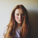
As you can see I sourced and edited two more images of females to go with the quotes. I made an effort to source images of women that are diverse in ethnicity and age as I want the content to be as relatable as possible.
I think the 1st and last stickers work well with the quotes but the sticker choice for the middle gif is not as relevant. I am going to switch these up.


changing stickers for the second gif:

0 notes
Text
Gif Trial 1
The feedback I got from my crit stated that my animations were lacking impact. It was agreed that a gif would work much better in an instagram setting and fit my brand identity better.
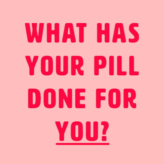
This is my initial trial using the brand colours and simple cut transitions. I still wanted to have that real person element so I chose to include a female to correspond with the what your pill has done for you quote. I think this makes it more relatable for women and personal.

0 notes
Text
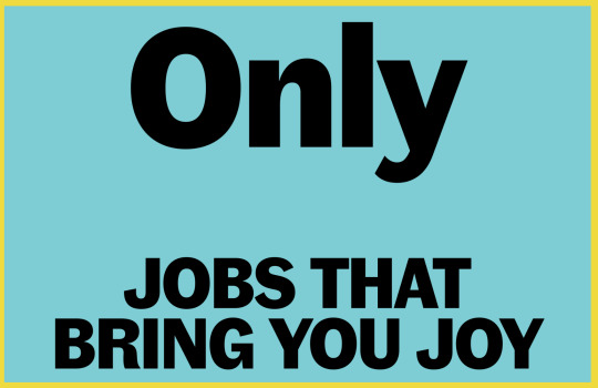
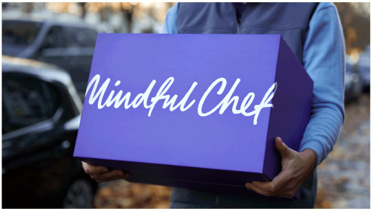
Ragged Edge Animations/Gifs
Ragged edge produce really simplistic but effective gif's for brands. I took specific interest in their gifs for Otta and Mindful chef and feel that I could apply a similar style to my FMP's message and illustrative stickers.
I think I was trying to do too much with my previous animation trials and adopting a more simple and colourful style like these will emphasise my message and keep Instagram users' attention.
Otta:


Mindful Chef:


0 notes