Last Seen Blogs

polishedbybrie
POLISHED BY BRIE

wanmusic
wanderland

paqizi-type
Paqizi Type

ododok30
誤讀

viknes-blog
Untitled
Text
Rationale
The topic we have chosen is climate change focusing around the issue to increase the number of trees standing to counter CO2 emissions. To counter the problem of CO2 emissions our proposed small actions will be based around the usage of paper. First solution was to use technology such as, Computers to send , recieve and store documents, second was to print smater by printing documents double sidedand by using a smaller font, and finally recycling or reusing paper. These solutions were chosen because they are very easy to do. With these small actions preformed by many will reduced the demand for paper and in turn, the number of trees (For paper production) to support consumer demand.
Video Rational
In the video and also over to the website design we decided to go with a clean isometric style with with a pale colour pallet. With the illustrations used I tried to use animations that worked similarly to there style, the animations were not squashed or streched to exagerate movement. The back ground was allways the same a choice I made as not to over complicate the scenes, and we used a logo and little catch phrase at the end of eah video because it rounded off the video nicely and created a lasting thought.
0 notes
Video
Solutions Video
Video displays simple changes that make a big impact.
0 notes


Photo


Header Development from bottom to top ( Bottom = first concept, Top = final ) . gif added to final to be cohesive with information gifs.
0 notes
Photo


Wire frame displays the layout of a website. I have decided to have two pages instead of on long page. Wire frame displays the hover function that I intend to put into website to make it more interesting and engaging. Sections will contain a large gif that will be a few frames of the video and on top will be the subject title e.g deforestation. if one choses to learn more about deforestation, all the have to do is hover over the gif, the section will expand and information will appear. My intention for this is to keep information brief and digestible, similar to the effect of the infographic video. The video is positioned at the top, viewers watch it, then scroll down to the gifs that summarise the video and provide further information. The page will be simple but engaging to make a memorable experience.
0 notes
Photo


Further Developments
Header font variations = We chose Pacifico font because it has more character then the other fonts such as Oswald which later on put as the body text. Sub headings were going to be the same as the header font but when Pacifico font is scaled down it becomes much harder to read hence why we used the Oswald
0 notes
Photo


Initial Website Concepts
All are based off the template website found on stream. Here I tried to implement the isometric style as the light colour scheme. All lines are on a 30 degree angle. I thought about putting text on this angle but I though about its readability. It would look nice but will be hard to read and difficult to code.
0 notes
Photo


final story boards i produced before doing the videos, changes were made when i was creating the videos like added animations and illustrations also the story board for the second solutions part came out with a weak amount of animation and story telling, so that was bulked up while working on it.
0 notes
Photo


third story board rough, developed more ideas, these rough story boards were made before i would start work on AE
0 notes
Photo


2nd story board rough again, but progress of ideas more developed.
0 notes


Photo


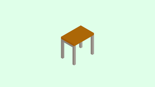
these were more of the finalized illustrations for the video, colours are all really nice almost pale colours really easy to look at.
0 notes
Text
https://youtu.be/wC5QNU3_bjA
https://youtu.be/ATqSILLhJeo
we drew inspiration from videos like these.
0 notes
Photo


here are screen grabs from the initial concept stage where we tried different ideas and discovered a style. we had quickly picked to go with the isometric style with its simplicity and easy to look at nature.
0 notes