
seadeebees-blog
Art Looking At Blog
Catherine B. of ARH3471
28 posts
Don't wanna be here? Send us removal request.
Last Seen Blogs


Photo
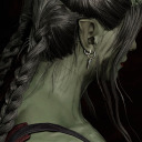
This piece is great because it's so simple, yet the message is totally clear. I don't think I've ever seen a neon uterus before and now I think we need more of them because how more in-your-face about feminism can you get? Neon lights usually carry the "trashy" connotation, with this set up and name, it looks heroic; one of the most political parts of the female body is glowing with two boxing gloves hanging off its uterine tubes. What's really great about the glowing neon is that it signals light coming from within; there are no lights flashing on this. This piece lights up the dark room it's in with its own power and doesn't need anything else. Hanging off this brilliant pink light are two boxing gloves representing the hard fight women have had to go through to have rights over their uterus. I especially like the use of the white gloves because, while the red gloves are classic, the white gloves fit well with the aesthetic. One thing that I think could've made this piece a little more powerful is maybe the artist could've dirtied the gloves a bit to make them look like they're been through a hard battle, but that's just my opinion, though, and the artist conveyed what they wanted well enough.
This, to me, is the best kind of art: it makes a powerful statement with only a few parts. The simplified neon pink uterus stands out and calls attention to itself, then letting the white boxing gloves give the rest of the statement.
Zoë Buckman, Champ (2016) at PULSE Miami Beach 2016.
1K notes
·
View notes
Photo
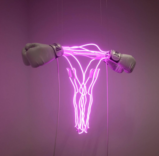
I've never seen a piece quite like this one, it gives off such a strange feel. While it's not central to the narrative, it's funny how all the signs span the political spectrum and it's impartial to any party since it only accepts those that lose. What also is interesting is that the installation is set up in front of a historic house built in the 1700s, the same century that the country won it's independence, therefore signaling the start of the US and how it's all changed from that time to this past election. I think it's great as a small time capsule to display the changes in public opinion throughout the years and it does that in a very subtle way. Campaign signs are seen as throwaway items after an election, however this artist took something that no one really thinks about and turned it into a statement. The really cool thing about this installation is that it's still in process, you can look at it now, forget about it, and then come back many elections later and see how it grows. Because this piece shows signs from all parties, it remains apolitical and sticks to its role as an observer to the American political scene. I'm glad all of these signs were preserved because from a design standpoint, you can also see how the trends in graphic design have changed over the years. You can compare signage from the early 20th century to the signs of now and notice the differences.
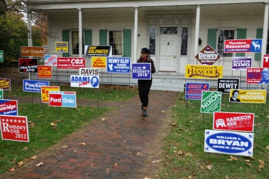
On this dreary day, artist Nina Katchadourian added Hillary Clinton to her project that collects signs for the runner-up to every American presidential campaign.
#NinaKatchadourian’s “Monument to the Unelected” (2008/12 and ongoing), installed at the Lefferts Historic House in Prospect Park, Brooklyn, which will stay on view this weekend, where pedestrians walking down Flatbush Avenue, spying the work through the fence, or visitors within Prospect Park, can witness this visual narrative of American alternate histories. (📸@allisoncmeier for Hyperallergic)
1K notes
·
View notes
Photo
That’s amazing!! When I first read “digital artist” for a second I thought that the floors were just photoshopped, but seeing that it’s real is better than I expected. I found a video of the carpets in action:
vimeo
Seeing the carpets move is fantastic and the accompanying music is great. Although, I’m not sure what the balls some of the people are holding are for.
I looked a little more into him and saw another piece of his called VOÛTES CÉLESTES 2016, which featured a similar concept, but upside-down, on the inside of the 16th century Saint-Eustache Church in Paris. It’s as stunning as the carpet piece but evokes a different feeling, at least from me. The church piece is unaffected by the viewer and they can only look up and watch as the patterns change overhead. It gives a more space-like feel since it’s so far up and unreachable. Here’s the video for this one.
vimeo
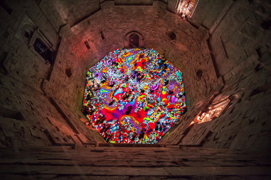
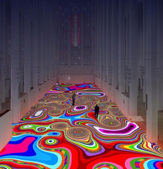
Miguel Chevalier and his beautiful art work are definitely something to admire. Miguel is a French digital artist whom was born in Mexico. Many critiques in todays art scene classify him as a pioneer of digital and virtual art. his works often revolve around the same procedures. He creates vivid patterns of colors and projects them throughout the installation space that he is using. typically, when viewing these beautiful moving patterns there will be music playing. Critiques say that they relate him works to visual poetry and how he connects the digital and physical workWith some of his other projections hell set up mesh materials. Those materials stretch through the interior of the space only enabling the piece to seem more dimensional than we already perceive it. one critique to me put it perfectly into words. he states, ‘It’s as if Miguel is elevating life itself to a sacred status in such a hallowed space, while once again lifting the illusory veil of separation that divides us.’.
The images I have featured here are from his Magic Carpet collection. These are more of an interactive piece for the fact that as a viewer one would be able to walk amongst the colors projected beneath them. He relates viewing his work to the logic he uses when creating it. He relates the images to hybridization, generativity, interactivity and even networking; the same concepts as mentioned, that are used during the process. His light projections are even sometimes referred to as light carpets. Shapes, colors and designs move about the floor in a sort of disorienting yet mesmerizing fashion.
4 notes
·
View notes
Text
One way Biennials are very different from Art Shows is that they don’t sell any of the art that is featured at the show. Biennials are strictly for displaying art; there’s no exchange of cash at Biennials, therefore artists aren’t pressured to conform to the current art market. Another way they’re different is that because Biennials are only temporary, artists are free to make large installations that otherwise wouldn’t be bought by museums. A different person also curates Biennials every time, letting fresh ideas from different minds in so the showings and themes won’t get stale. A final aspect of Biennials is that they can take place anywhere since they’re only temporary installations. Biennials can bring the arts to places that have almost nothing to do with the arts. This aspect encourages smaller local artists to participate and it introduces the world of fine art to communities with no access to it.
Examples of 3 Biennials are:

The Lofoten International Art Festival was started in 1991 and takes place in the small archipelago of Lofoten in Northern Norway, right above the Artic Circle. It features local and international artists and challenges them to make art that incorporates the environment or to make a statement about art placement. It’s also taken place in odd locations such as a bunker and a fish drying rack.
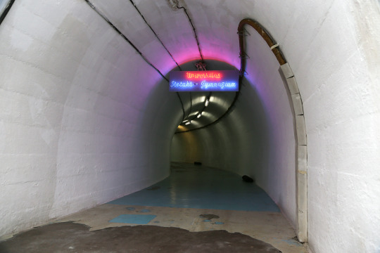
The Project Biennial D-0 ARK Underground was created in the little town of Konjic, Bosnia in the underground nuclear bunker made for President Josip Broz Tito during the height of the Cold War. This Biennial now wants to change this underground bunker into an institution of the arts to push away the past history of communism.
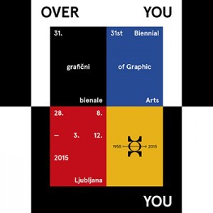
The Biennial of Graphic Arts in Ljubljana, Slovenia was created in 1955 and originally for displaying post-war art from both sides of the Iron Curtain and now, in current times, it displays art that challenges the Eurocentric viewpoint with Third-World art. While mostly concerned with printmaking, the Biennial is branching out to include other mediums.
1 note
·
View note
Photo
Body horror is one of the few things that truly freak me, so seeing this chapter just made me release a long sigh. The first in the chapter to really catch my eye was Louise Bourgeois’s piece Untitled (2001), with how blatant and in your face it is about it’s subject. The form of the main object degrades women down to their genitals being just a hole. The shoes on top give the feminine appearance of the ballet shoes but the female form in the image lacks the feet to wear them, losing her agency to move away from the stand she’s lain on. It seems inspired by the cliché way a woman can be objectified as “just a hole to fuck”.
Another outstandingly creepy piece is Jake and Dinos Chapman’s Zygotic Acceleration, Biogenetic, De-Sublimated Libidinal Model (Enlarged x 1000), which features a blob of deformed children with their orifices molded into grotesque sexual forms. This pieces shines as a harrowing world of sexually exploited children and child objectification.
0 notes
Text
Oh, wow! I’ve been a Talking Heads fan since I was a wee lass and this looks amazing! I love how unique David Byrne is with his musical and artful endeavors.
One of my favorites of his is his collaboration with St. Vincent, Love This Giant. I even love the story of how it happened to: Annie Clark of St. Vincent was asked if she could collaborate with anyone, it would be David Byrne. He heard about this and contacted her to ask if she wanted to collaborate, the rest is history.
I really want to get the chance to go and see it
MEET THE ARTIST
David Byrne & Mala Gaonkar 2016-2017
For my next few post, as I had mentioned I want to start with featured artists explain their biography and recent works. My Second artist or artists rather are David Byrne & Mala Gaonkar. David Byrne is the co-founder of a from what I understand acclaimed band “Talking Heads.” As a solo artist, his career is spastic and wide-ranging. He’s written/ directed feature films and written books, but he has also been a visual artist since the 70′s. Mala Goankar is his right hand college, while there is not as much information about her she is a Visual Artist and known for her collaboration exhibitions.
Together they created a show called The Institute Presents: NEUROSOCIETY, It represents big questions like Who are you? Who are we? Are you in control of your own destiny? There is debate wether you can consider this Art, Theatre, performance art, and how one can define the repeated experience as temporary. The viewer is taken through an 80-minute immersive theater performance. Because I want able to get too many photographs from the show, the best way to explain it is as follows. The audience is guided with the video and performing artists through a series of experiences created in collaboration with scientists. Both artists worked with neuroscience labs to create the technology in an artistic experience. The exhibition is apart of the Pace Art + Technology in Menlo Park and opened just a few days ago at the end of October and will run through March 31, 2017.


1 note
·
View note
Video
youtube
At first glance, the music video for The Prodigy’s song “Smack My Bitch Up” seems like a basic psychedelic video. Directed by Swedish director Jonas Åkerlund, the video is shot from a first-person perspective to put the viewer in the protagonist’s shoes, however it also does the job of hiding the protagonist’s face. The video is filled with many illegal acts such as snorting cocaine and drunk driving; it also depicts violent scenes, female abuse, and an entire sex scene. At the end, however, the English electro pop group throws a twist at the audience by having the protagonist look in the mirror to reveal that they are actually female. The original broadcast featured a censored version of the acts depicted, but it still stirred up controversy and was removed from MTV’s rotation An uncensored version was finally broadcast in 2002 on MTV2 and it was placed at the top of MTV’s Most Controversial Videos. In the video for “Smack My Bitch Up”, director Åkerlund and The Prodigy use the images shown to subvert the audience’s view on aesthetics and the connotative and denotative meaning while communicating a message about counter-hegemonic thought and what the gaze means by having a` female commit the acts that audiences assume a male would.
The way the video is introduced and shot makes it appear as if it’s a mindless drive into clubbing culture instead of making any sort of statement. Since it’s from a first-person perspective, the camera changes as the protagonist’s mental state changes: the edges of the screen blur and flip around when the protagonist is inebriated. This style of camerawork helps drive the aesthetic of a night of clubbing. The repeated abuse of women and the song constantly echoing “Change my pitch up, smack my bitch up” also help drive home this low-brow aesthetic. Clubs visited throughout the video are all dirty and disgusting; the colors range from dirt brown to the neon glows of the club lights. Blatant misogyny and nasty scenes all aid in the director’s attempt to make the audience assume that the video is glorifying the club culture through the aesthetic.
0 notes
Photo

It’s really interesting to think about the connection between the plight of women and the plight of workers. In an essay by Helen Molesworth she argues that feminist art should be taken more seriously and look at the complexity in a feminist piece because it says more than just the female experience, it reflects our society as a whole.
Molesworth compares women struggling in a patriarchal society to the rest of society struggling under the thumb of the government. She thinks that viewing feminist art as strictly feminist art stifles any other conversation around it and, in a way, causes others to “devalue” it as lesser art. Her belief is that female domestic issues like housework is inherently related to janitorial work. The tireless labor of sanitation workers compares to the countless hours women have spent cleaning a house.
She compares the displaying of female genitals to comparing people’s private lives because they’re both purposely hidden away from the public. Although the comparison is really insightful, I feel it’s a bit of a stretch to call art displaying female genitals actually representing someone’s private life. I think a lot of Molesworth’s perspectives are perspectives really only she owns. It’s just such a far stretch it gives to me the idea that she’s grasping at straws to legitimize most feminist art.
0 notes
Photo
“Culture in Action”
The Fallout from the Culture Wars of the 80s
Conceived by Mary Jane Jacob in 1991, the aim was to involve the public with public art. She wanted to make it more interactive with the public. Jacob wanted to have the community work together with the artist to create art. Art installations can incorporate the local community as well as the artist and comment on site-specific issues such as poverty or HIV/AIDS awareness. Interactive art can also connect with communities and different groups.
One issue facing new public art installations is location; wherever an installation is located can change the meaning of a piece and the understanding. A piece located in a city square is going to come off differently than if it were installed in a rural community. Installations also have to be wary of what audience they’re reaching out to. To use the same comparison as earlier, putting some highbrow art installation in a rural community will have a different audience than a city square. Tastes will vary and an installation may succeed or fail depending on how the audience views it.
2 notes
·
View notes
Photo
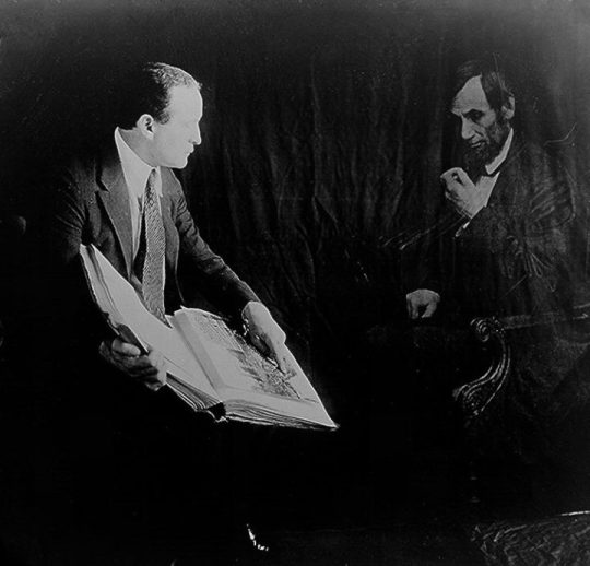
It’s so great to see the world pre-photoshop and other photo editing techniques. It’s sometimes strange to think that we would fool people as much as we do now with photoshop as we did then. What’s also interesting is the similarity between the old techniques and the ones we use today, such as the filters and such in photoshop and other digital editing software. It’s funny how even today people edit photos to look like ghosts just like back then. However, it is nice that this technique was also used in reverence to the dead. I think it's a really sweet way to remember the dead.
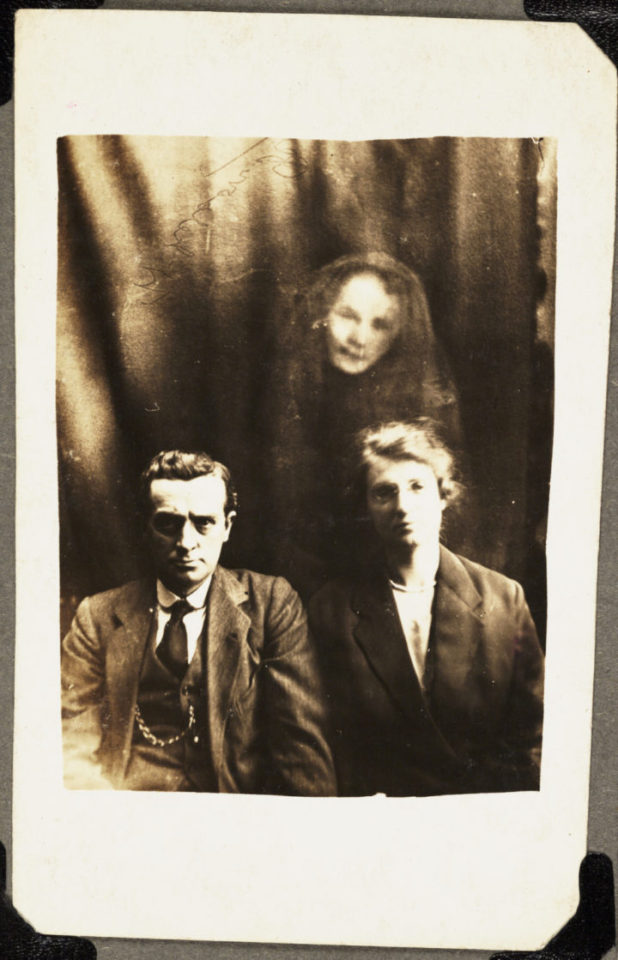
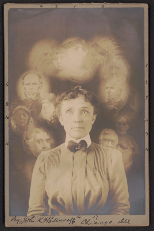
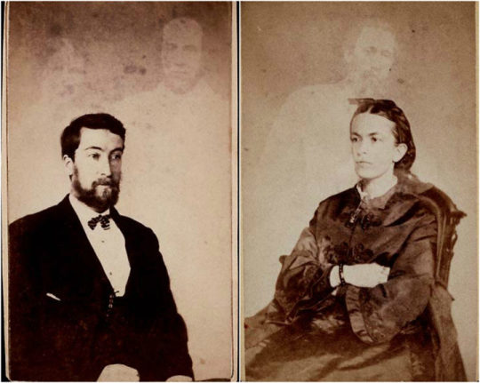
“In 1860, William H. Mumler set up the first photography studio that claimed to capture the dead, and his success started a movement of spirit images. Mumler is the first known spirt photographer, but he inspired a slew of others whose popularity endured through World War I…However, the way these photographs were made, usually with double exposures or composite images, was a known pre-digital photography trick, even before Mumler set up shop…Nevertheless, the mournful need for these images was so strong, that people believed.”
60 notes
·
View notes
Photo


A fresh piping-hot new meme out there are these terrifying counter-signal anti-Hillary ads that pose as pro-Hillary ads. They feature catchy hashtags such as #DraftOurDaughters and #FightForHer and show women in combat uniforms. The idea of women in the military doesn’t bother me; it’s the creators’ belief in complete certainty that a war with Russia will begin with a Clinton Administration win. As political propaganda, I think it’s brilliant; they look as though they’re real ads created by the Clinton camp, they even push the feminist attitudes prevalent in Hillary’s campaign. There’s even a couple that cheekily reference the Black Lives Matter movement.

Throughout this election, the Trump camp has been on point with their use of political propaganda to influence this election. Most of the online Trump camp heeds from the seedier parts of the internet, however, these are also the parts the birth the most memes. Memes have had an unprecedented effect on this election that even major news media outlets are talking about them.
Political memes are like the Nazi propaganda machine on steroids, but unlike the Nazis, memes have a farther reach in our little global community and are created by people who are unpaid and only fueled by passion, so they’ll never end.

The meme machine for Bernie was a worthy contender but fizzled out because supporters didn’t have nearly the bite that Trump supporters had. Even a Gary Johnson PAC wanted in on the fun and funneled $30K into meme making. It’s so strange to think that something as stupid as memes are actually having an impact on the world outside the internet. It’s crazy that memes have become so popular, that I’m talking about them in a college class.

0 notes
Text
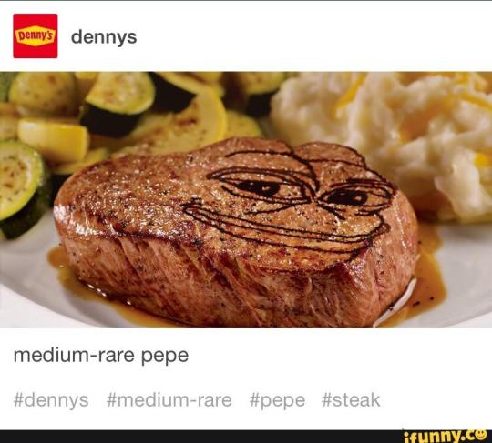
Many corporations have social media accounts that are used for advertising, but the most infamous ones are the social media accounts for the restaurant chain Denny’s. While they have many noteworthy posts, the one I’m going to focus on is the post where they reference Pepe the frog. The post, posted on Tumblr, features the popular meme Pepe the frog photoshopped on top of a photo of one of Denny’s steaks with the caption: “medium-rare pepe [sic]”. The ad uses meta-communication by referencing a popular Internet meme that if someone didn’t use the Internet often they wouldn’t understand. This loses the older audience that doesn’t use the Internet, but rallies the younger audience by referencing something so close to young people’s lives. This ad also creates a spectacle out of referencing something so sensitive in pop culture.
This is from a different class, but it got me to thinking about another question: could the social media accounts for corporations be considered performance art? We don't have to include the accounts that only answer questions for customers, but interns are paid (or unpaid) to sit on social media and create this character that has to interact positively with customers while also advertising their company, and I think that that sort of dedication to a character is should be noted. I don't see any text posts being being shown in museums any time soon in the future, but I do think that they should get some praise.
0 notes
Text
This is so cool and creepy at the same time! I live the dichotomy of the eye-catching paint revealing the names to black silent film stars who were overlooked by history. The way the typeface is so distorted, though, makes it hard to read the names (at least, in the pictures) so it might not be helping the artist’s cause of calling attention to these names. Either way, I absolutely love the distorted text, even if the theme is a bit lost. If anything, the aesthetic is the perfect part for me. I know saying this as a white woman is incredibly insensitive, but I can’t deny how awesome this looks. The article says that they’re supposed to be “wild”, however, to me they look more like ghost coming back to remind everyone that they existed in the most conspicuous way. This gives off the same aura as a war memorial with all the names on the wall. I think that this could definitely be expanded to have more names in a larger area. Even if I didn’t pick up the “wild” vibe from this, I think that the message still comes out that they don’t want to be forgotten.
Conjuring the Specters of Black Silent Film Actors
Conjuring the Specters of Black Silent Film Actors
Gary Simmons, “Ghost Reels” (2016), mixed media, site-specific installation at The Drawing Center, New York, 2016. (All photographs by Martin Parsekian, courtesy Drawing Center)
James Wright once wrote a poem about the lost, “who flutter in the driven wind, / Wild for the body, ghost on ghost.” That wind might be generated by our own energetic efforts of recovery: frantically searching…
View On WordPress
8 notes
·
View notes
Photo
I didn’t realize that you were so religious! That’s awesome! I don’t consider myself a very religious person, but it’s great that you have a faith especially in this field where religion is so scoffed. I’m from a relatively religious area, so the opposite usually happened to me, not that it really bothered me. Coming here, I’m constantly surprised by how bitter people are towards religion. I have friends who take every chance they can to bash Christianity whenever it comes up, to the point where even I get a bit offended. I feel as if the whole “accept all forms of art” attitude of most of the art world stops when someone makes something they don’t agree with. This type of attitude stifles any meaningful conversation that isn't just parroting other people's opinions over and over again.

Spirituality and Art.
How I express my christianity in Secular Handcuffs.
To begin, I want anyone who may come across this to understand I by no means hate the secular movement in art. I do not personally like things that personally offend me, I do not support the works of artists like that. However, I understand that is the personal expression of others and there is always a meaning behind pieces like “Piss Christ”. It has been my experience that pieces I make of religious narratives, Clothing traditionally nude figures and ANYTHING including a cross are typically scoffed at in the art world.
More specifically the educational environment. Though there were some debates about a student recent pieces in the SVAD Building, this university is very liberal in movements. I think there is something wonderful and encouraging about this. I personally just do not channel that expression into sexuality. Because the Christian Art label tends to hang over my work if i make certain pieces of art or express to clients of teachers this fact.. M work has turned toward symbolism and in many ways this decomposition theme. The piece above is a good example of this. The narrative Sculpture above (”the materiality of paper”) is a work of my own representing the decomposition of a tree. However, when I made this piece it had nothing to do with environmentalism. This was a Narrative representation of the pressures and challenges I face as a christian artist encouraged to create and think i ways I don’t feel exemplifies my personal expression.
1 note
·
View note
Text
Just wanted to clarify that this show was not funded by Trump and Trump had nothing personally to do with it.
While I don’t support Trump, isn’t art supposed to be about pushing boundaries and breaking taboo? At this point, the media has demonized all of his supporters and made Trump out to be the actual devil, anyone who actively supports Trump is socially ostracized to the point where it is a taboo. What ever happened to a healthy political discourse? This article’s writer is hilariously heinous in their outright disgust for anything that challenges their viewpoint on the political landscape. The article calls the art show ironic and believes that the show failed since the proceeds went to Hillary, but judging by how triggered this author is (…”a phrase that, even as I type it, has caused my head to spin around on my neck and spray cartoonish green vomit (or pig’s blood?) across every surface in my kitchen…”) and proving that they were getting censored, I think the show succeeded in what it wanted.
It’s best to know that Milo Yiannopoulos is a provocateur and champions that title whenever he can. If you watch any clip of him, he wallows in whatever hate is shot his way and fires back with quick wit and well-informed responses.
youtube
Obviously, pretty much this whole show was put on just to prove how silenced conservative voices are in the art world, the place for free ideas. The article calls the comparison to Piss Christ a false equivalency, but is it really? Piss Christ is about censorship from the church, while this art show is about censorship from the left. Which does happen and is obvious when you compare media reports from networks like CNN or MSNBC and foreign reports from companies like the BBC, Reuters, and RTNews.
While I don’t agree with everything Milo says, I support his right to speak his mind freely and treat his opinion with the same respect as any other opinion. He does have legitimate criticism of Hillary and the DNC and deserves to be heard.
People like Laura O’Reily are why Milo and others are doing this. This sort of suppression culture is why a guy like Trump has a growing movement behind him.
The Sordid Irony of a Pro-Trump Art Show
The Sordid Irony of a Pro-Trump Art Show
A view of ‘#DaddyWillSaveUs’ (all photos by the author for Hyperallergic) (click to enlarge)
By the time I arrived at 132 West 18th Street, the bathtub full of pig’s blood was gone, as were all but one of the D-list bêtes noires of the areligious right that had conspired to assemble what organizer Lucian Wintrich described to me as “the first conservative art show” New York City had ever seen.…
View On WordPress
17 notes
·
View notes
Link
One of the easiest ways for anyone to pick out a film that’s “post-modern” is when the chronology is scrambled. For most people, the first film the comes to mind at the thought of a non-linear narrative is Tarantino’s Pulp Fiction, however the idea of a non-linear narrative first comes from D. W. Griffin’s Intolerance all the way back in 1916. Since then, many films have experimented with narrative timelines.
Honestly, non-linear narratives are some of my favorite narratives and since we mentioned the six different forms of video art in class, I wanted to share the list of them. In particular, D. W. Griffin’s Intolerance is interesting because it’s a response to critics calling his movie Birth of a Nation intolerant because Birth of a Nation is usually considered the quintessential KKK film.
1 note
·
View note
Photo
Yeah! It’s kind of stupid, but I get excited sometimes thinking about what future civilizations will think when they find these. I feel like these earthworks will be similar to the Stonehenge in terms of how confusing some might be for future people, especially the more abstract ones like Nancy Holt’s Sun Tunnels. My number one worry about works like the Spiral Jetty, is longevity, just how long will something like this last in the future? I feel that with the changing sea tides, it will disappear. Of course, it disappearing might be just what Smithson wanted; it came along quietly and then left as it came.
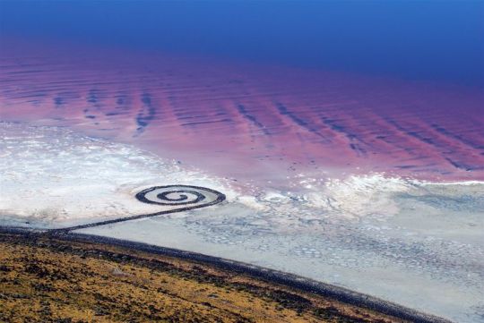
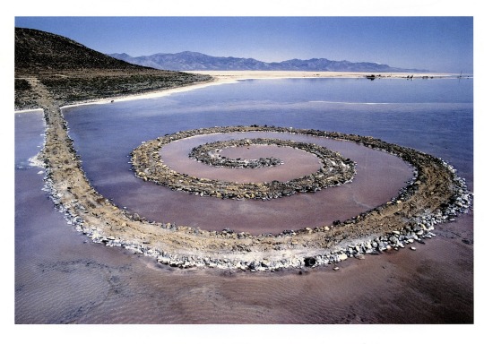
The Spiral Jetty is a piece by Robert Smithson that stands as an example for Earthworks. There are many new concerns that arise due to the scientific knowledge of the 1960’s as compared to the past. One new concern for this era of Earthworks, focused on late-modernist leanings, is public opinion. Earthworks in a more primitive age would be much more isolated, much less publicized. Robert Smithson made a 32-minute film showing the construction of the spiral jetty, he used two dump trucks, a large tractor, and a front end loader to haul the 6,650 tons of rock and earth into the lake. Obviously concerns arise in the regard for safety and use of construction machines, which traditionally wouldn’t be considered an artist’s tools.
Man, I really want to make work like this. Earthworks are seemingly some of the most permanent forms of art. I am particularly intrigued by the idea that this form of art maintains the longest-lasting impression on the world. Like the Pyramids of Giza, or something!
1 note
·
View note