
sleepingpatterns
SleepingPatterns
I make fanfiction (and other things) into books!
163 posts
Don't wanna be here? Send us removal request.
Last Seen Blogs


Text
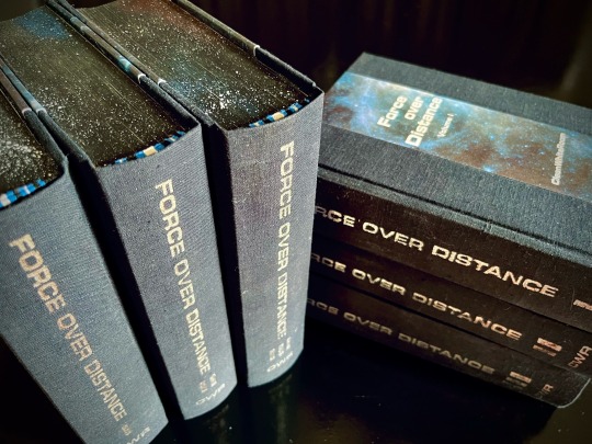
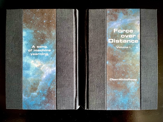
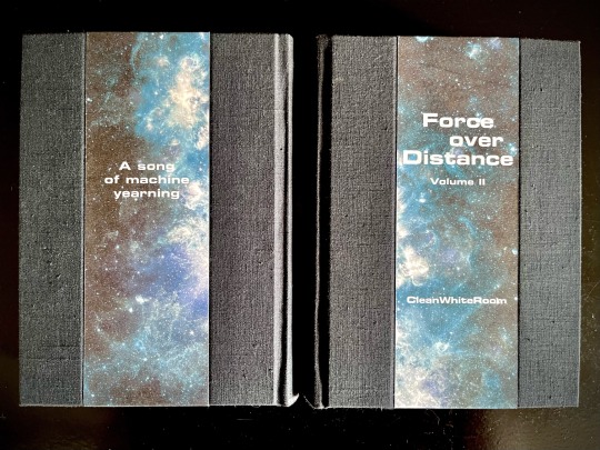
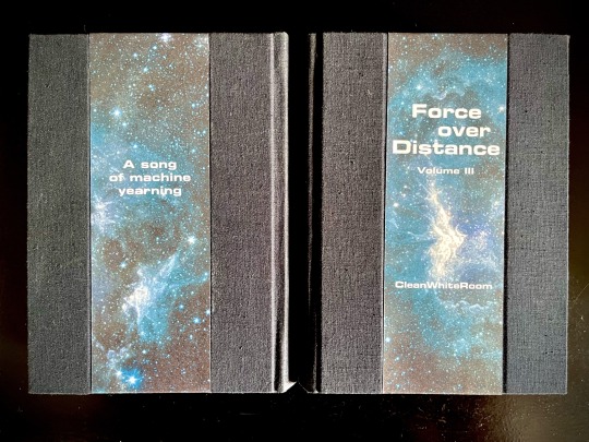


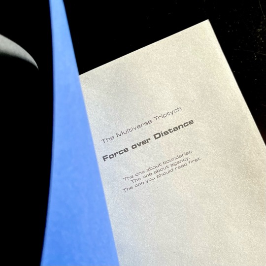
My magnum opus, the jewel of my Binderary round-up, the result of four months of hard work (that is to say, a lot of force applied over distance), the project affectionately known as The Motherfuckers (because it was rather unclear if I was going to finish these books or if they were going to be the end of me).
Force over Distance by cleanwhiteroom. It is currently also on AO3.
I was first introduced to this incredible story by a dear friend, who first sold me on actually watching SGU, and then said that they remember this fic since like 2011, which is always a promising sign. I went digging and found out I was in luck - the story was being rewritten and reuploaded on the author's blog. The next two weeks are described by the same friend as "one of the scariest moments in our cohabitation" as I'd spent literally every waking moment injecting the story directly into my eyeballs, and let me tell you, I'd not been doing a lot of sleeping at that time.
Then I gathered up my courage and reached out to CWR re: my burning desire to bind this story. And the rest, well. Let's dig into it, shall we?
This was my first time typesetting 540k words. Considering I tend to prefer larger font sizes for increased legibility, it was immediately obvious that this was going to be a multivolume project. I settled on three, as it's the relationship between three individuals that forms the core of the story.
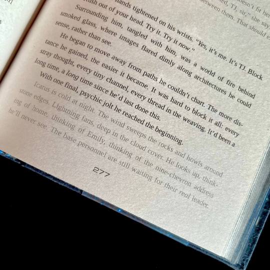
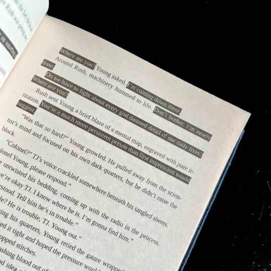
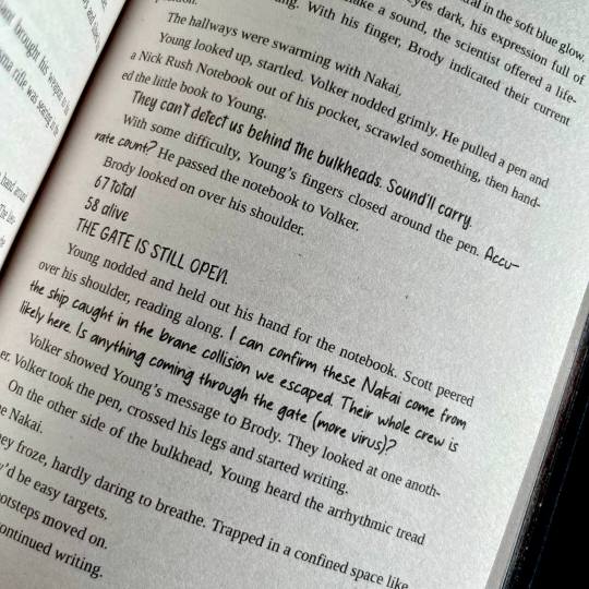
I also knew I wanted to keep the typeset in black and white, but play around with light and dark a lot. So I did. One of the first design idea I actually had was the way I wanted to handle projected speech. Mental link between Young, Rush and Destiny is THE most vital part of the story, and I wanted to make it immediatly obvious. I also wanted to be able to take one glance at the page and tell how much of the action is actually just two guys staring each other down :) Hence the blackout effect of thoughts being represented as light over darkness.
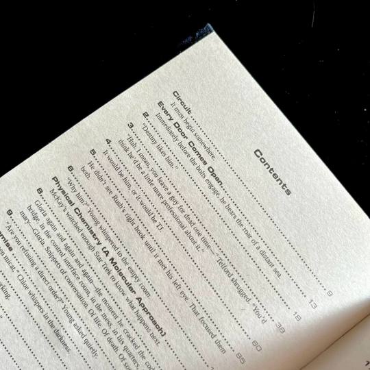
I also wanted to preserve as much of my reading experience as possible. So I saved all the chapter quotes/summaries in the TOC, and hid the chapter content warnings in the frame of the gate that marks the beginning of each chapter. For most of the chapter the warnings stay the same, so after a while you stop really noticing them, but then you open a new chapter and see that the familiar shape of the words has changed, and get this UH-OH feeling. Which, I think is very much how it works in my design, because when the warnings change there's usually another line of text added.
For flashbacks and dream sequences I switched from italics to a lighter shade of gray. I woudn't say it's more legible per say, but it's in keeping with the overall light/dark theme.
There are instances of people using handwritten notes in the story. I collected more than a dozen of assorted handwriting fonts, with each character having their own "handwriting". So when, for example, someone begins writing in someone else's hand, you immediately know it.
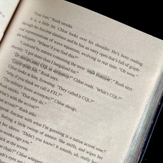
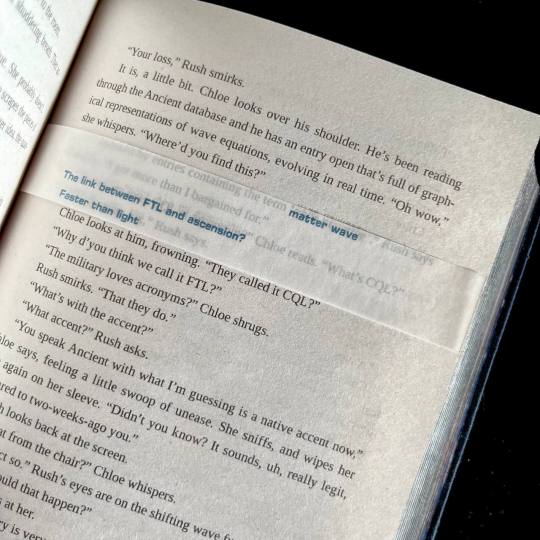
The most insane, labor-intensive part of the typeset, however, was the way I decided to handle the Ancient translations. CWR's gone through the trouble of setting up hover-to-discover for it, which gives you a very different reading experience than, say, having the translations in the endnotes. So, naturally, I said to myself that I want to replicate that, and footnotes just won't do the trick. So. Every instance of Ancient in the text has an underlay of light gray Ancient script. And an OVERLAY of paper vellum with the translation printed in blue. Now, not to toot my own horn too much, but if looks SICK AS FUCK. You also MAYBE SHOULD NOT LIVE LIKE THIS. For the two copies of this work I had to cut up 10 sheets of vellum into strips, and then spent from 20 minutes to an hour per volume tipping the strips in their proper places. I then had to wear kinetic tape on both my hands to help with the joint pain. (It was worth it.)
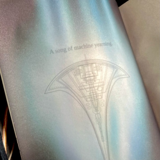
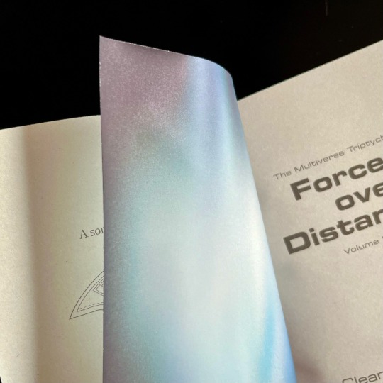
Now for the title spread. It is also paper vellum that you see as soon as you turn the first page (the half-title), and see it covering the title of the book and author's name. And then you turn it. And the shields sing the matter wave of Destiny through the black. And yeah, I think that's very, very clever of me, actually.
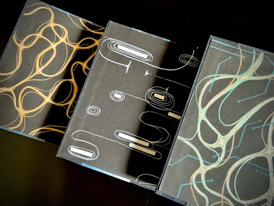
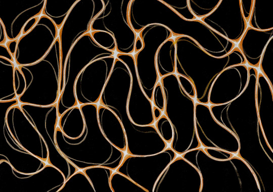
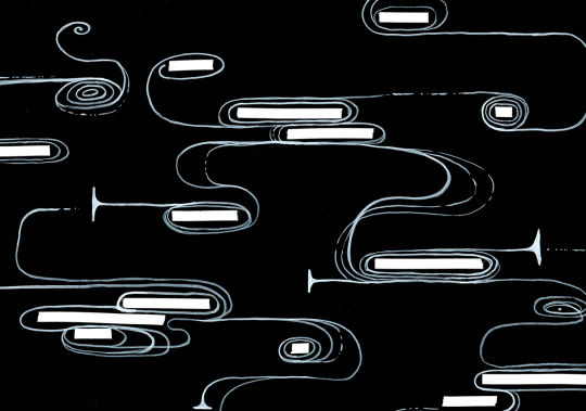
Then, of course, were the endpapers. All 12 of them are unique abstract paintings done on black cardstock by hand with brush pens and correction tape, I scanned a sample of each set for posterity. All of them are my interpretations of characters' midscapes. For volume 1 I went with the fire wind of Rush's thoughts. Volume 2 was for Young, and I went for the reverse blackout poetry effect (because for all the mental talking they do, the unprojected thoughts are opaque to their counterparts) and all the loops, hairpins and blocks he does. Volume 3 is for the combination - Rush's fire wind, changing its color to match the circuitry pattern of Destiny's AI.
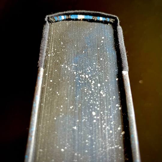
The rest, in comparison, is easy. All volumes are stitched with 3 strands of embroidery floss, a combination of black, blue and silvery-gray. The French double-core endbands are sewn in the same color scheme (though with a different shade of blue and gray switched for white for added contrast). The edges are painted and splattered to look like space.
The covers feature my (signature at this point, I guess) half-cloth river pattern, with the base being dark blue linen and the printed parts being Spitzer telescope images of the W51 star forge, Jack-O'-Lantern Nebula and the Eagle Nebula (courtesy of NASA), waxed by hand for added sheen. The spines are foiled in silver with a foil quill.
Each set is 5 pound of solid hand-crafted book, with one set being my personal copy, and the other sent as a gift to the author.
And that's it, folks! This has been an incredible project to work on, and I'm very proud of what I achieved with it.
416 notes
·
View notes
Text


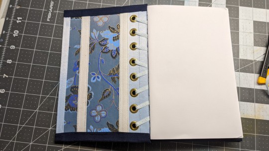
Experimental bookbinding!
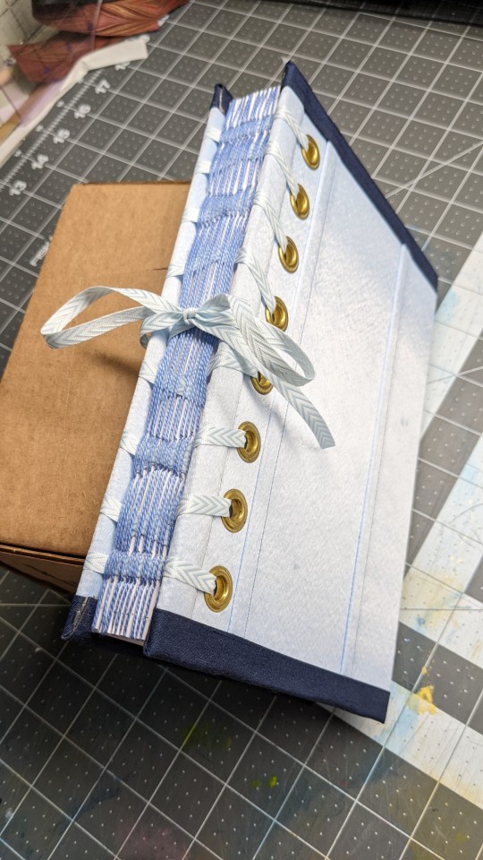
A couple of years ago there was a conversation in the Renegade discord about books styled after corsetry, and I thought it would be cool to model the actual construction after corsetry, not just the aesthetics. So,
Book pages are often held together by being sewn onto cords or tapes, which are then glued or tied to the cover boards
What if they were laced to the cover boards instead?
In this notebook, each section of folded pages is sewn individually. The sewing creates channels to thread the lacing through.
It took a couple of lacing attempts to get it to work. On an actual corset, the lacing would alternate being threaded out to in vs in to out, so that the corset would be able to lace completely closed. When I laced the book like this, the pages didn't stay in place--I needed the lacing to pull the pages towards the outside edge of the board at every pass through.
The pages are made of onesided graph paper, so they're blank on one side and gridded on the other. I plan to use this as a bookbinding planning journal. Technically, one could unlace the pages and replace them with a blank set when it's full.
The flat-felled seams and boning channels on the cover are purely decorative.
2K notes
·
View notes
Text
Trail Magic (Check Please!)

A gift for @ficcinghell! This Check Please fic was written AND typeset by @tiesthatbindery and features the frogs on the Appalachian Trail. I continue to love doing layered covers and mimicked the section of the AT that the boys hiked (Katahdin to around Allenstown).
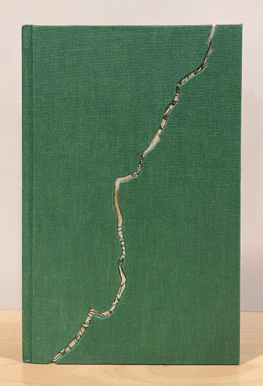

The original typeset was for folio size, but I wanted it to feel a bit like a pocket book you would have gotten in the 70s so I shrunk it down to legal quarto. My original plan was to paint the edges in bronze but the bronze paint failed miserably, so I trimmed it off and painted with green ink instead, which further contributes to that retro novel vibe.
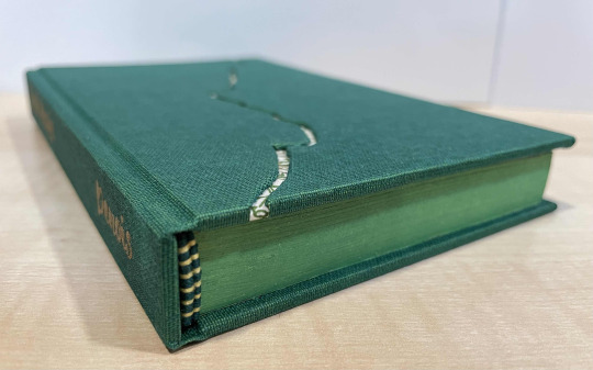
I used Lokta paper with a fern pattern for the endpapers as well as the underlayer in the cover.
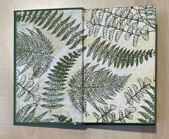
Denois' typeset was understandably perfect already, and I am very grateful I got to use it! The immaculate retro vibes are wonderful.

558 notes
·
View notes
Text
Copy Press Restoration Part 2: electric bugaloo
It will only let me post one video per so I am going to try a sort of reblog chain to get this all in here.
31 notes
·
View notes
Text
Earlier this week I reported on the very depressing for-profit fic pirating happening in certain corners of fandom—but (somewhat coincidentally, timing-wise) I also had the joy of reporting this story on fanbinding, and the work of the @renegadeguild! Featuring the words (and fanbinds) of the brilliant @celestial-sphere-press, @butterfingersbookbinding, and @fanboundbooks (who also talked about Renegade on the most recent Fansplaining episode).
Renegade's binders are strong proponents of the non-monetized gift economy—they truly embody the spirit of fanfiction, in my opinion, both in the communal way they share their work with fic writers and each other, and in the DIY way they approach making books:
There’s a strong parallel between the amateur, instinctive nature of fanfiction and the act of fanbinding. While plenty of fic is penned by formally trained writers, much of it is not. Tiffo, who binds as Fanboundbooks, likens the reverse-engineering involved in teaching oneself both activities. As writers, people try to figure out why stories work. Fanbinders collectively share the process of learning to turn that work into a physical object—tactile, clean, often beautiful. Fic is largely unencumbered by the forms and structures of traditional publishing, and fanbinders approach their work with the same spirit. “People will often say, ‘How do I do this?’ or ‘What’s the rule for this?’” Tiffo says. “The answer that we always try to throw in Renegade is, ‘This is what other people have done, but know that there is no rule to your book—you can make whatever you want.’”
It's a shame seeing people conflate the bad actors of the pirating situation—many of whom don't appear to be in fandom and seem motivated by pure profit—with the work of fanbinders at large, and seeing people scared to try out fanbinding because of the recent news. Not-for-profit fanbinding is just as legal as writing fanfiction, and I don't speak for all fic writers, but if someone ever bound one of my fics, I'd be so touched I would almost definitely weep. 😭
1K notes
·
View notes
Text
As promised! I wrote about the illegal fanbinding that's led to writers deleting their works recently, how that connects to the current pull-to-publish wave, and what happens when the rapidly expanding sphere of fic readers starts to get disconnected from *fandom*:
The ever-increasing reach of fanfiction has inched the practice away from text-written-in-community to a more traditional author-reader relationship—and the context collapse that’s come with viral works being treated like any other romance novel has spurred clashes between different types of readers with different sets of expectations.
In the past few years, fic authors across all corners of fandom have increasingly complained about shifting attitudes from readers who treat them like any other content creator, demanding the next chapter as you might demand your favorite influencer’s next video. But unlike on creative platforms like TikTok and YouTube, the fic writer doesn’t get revenue from their new installment.
We'll also talk about this in some capacity on the next episode of @fansplaining! (In contrast with today's episode, on the non-monetized, gift-economy practices of many fanbinders, whose hobby is also imperiled by the people selling and buying fic.)
7K notes
·
View notes
Text

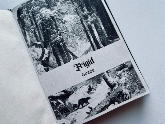

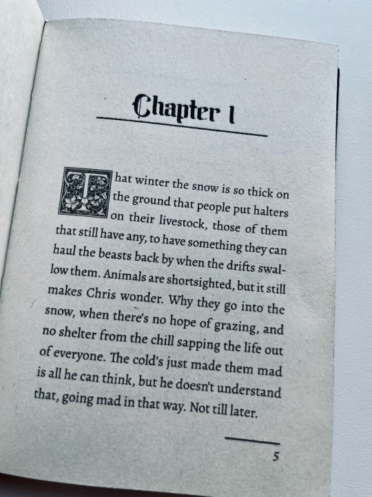
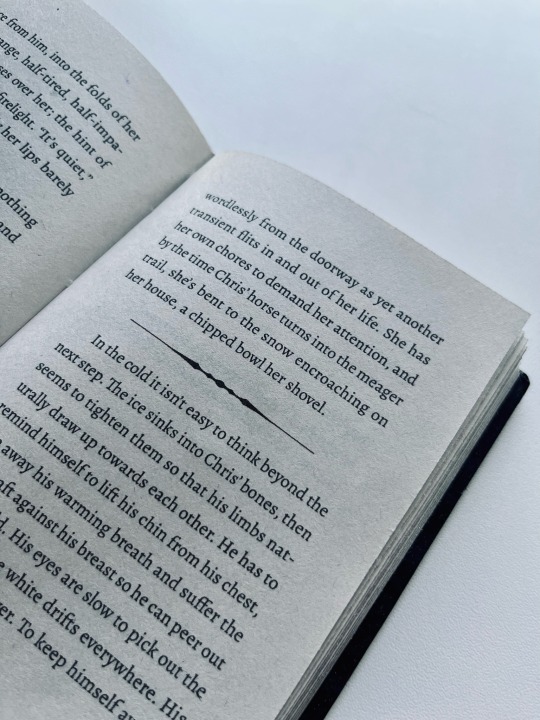
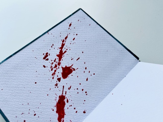
Frigid by Guede
This story has a delicious dark fairy tale vibe. It's something I'll very much enjoy rereading on a cold winter evening.
❄️ Lovingly waxed the hell out of the covers, so they have a nice subtle sheen;
❄️ Really happy with this title page, I cleaned up an illustration from The Pacific tourist (1876) for it;
❄️ I knew from the start I wanted some fancy drop caps, and imagine my delight when I found that the author uses a letter form Goudy Initialen font as a userpic! Of course I went with it as a little easter egg!
❄️ For the endpapers I went for a dramatic red acrylic splatter over very textured paper for that blood on snow feel, because I can't resist being a bit cheeky;
❄️ And to complete the overall winter theme I painted the edges a fun glittery silver.
124 notes
·
View notes
Text
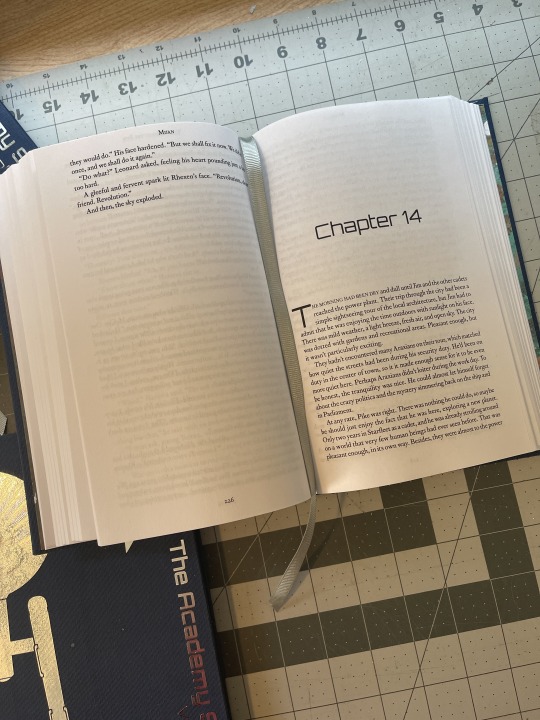
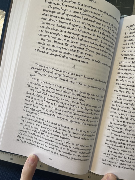
Bound: Mijan's Academy Series
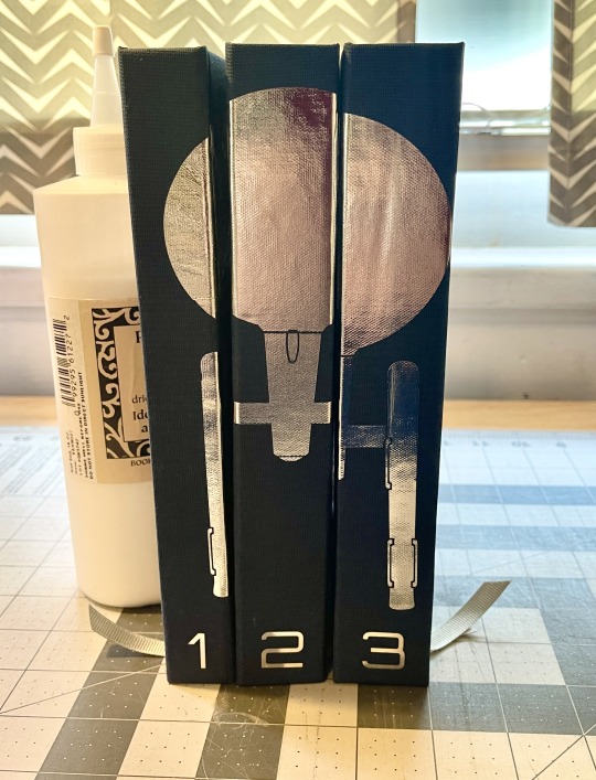


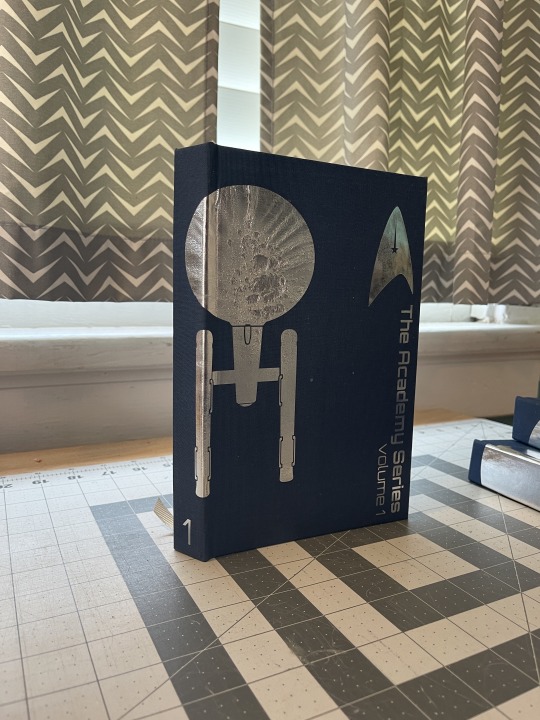
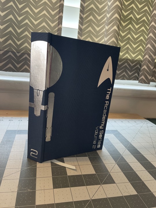
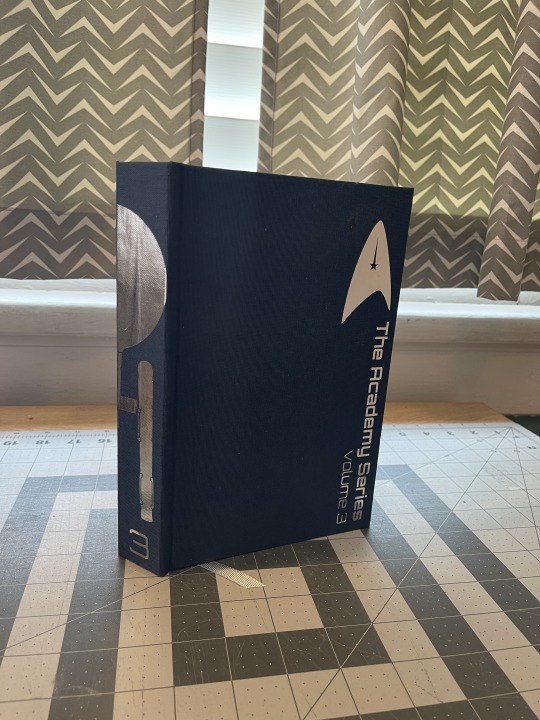
All done!
I spent a long time on this project, including typesetting an entirely different extremely long fic before changing my mind completely. It's a Christmas gift for my husband, who is a huge Star Trek fan. He loves to read, but fanfic? I don't know!
So with the help from those more knowledgeable than me, I chose this series of fics. It would have been 1000 pages in one volume, so I decided to split it into three to make it easier to read.
Except for the failure of the execution of the spine design (it looks a bit more abstract than I'd envisioned), I'm very happy with how these came out.
Body font: Corundum Text
Chapters, titles, drop caps: Orbitron
Section dividers: Trekbats
Graphics came from thenounproject.com: 1 2
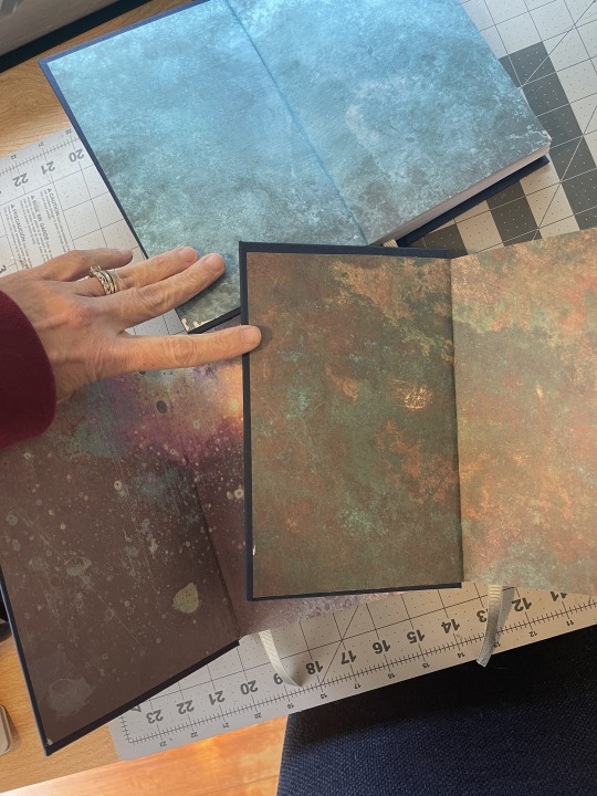
End papers: Craft Consortium Patina
132 notes
·
View notes
Photo

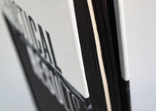
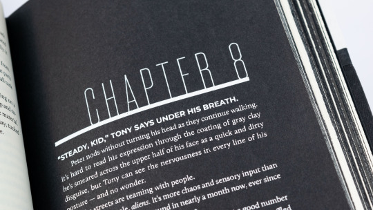
Practical Results by anonymous
This isn’t his bedroom - not the one at the compound, or the suite in Milan. Definitely not the penthouse in New York. In all honesty, it looks like the inside of the fucking Spaceship Earth ride at Epcot.
For design info / materials / binding process, read below the cut.
Keep reading
183 notes
·
View notes
Text
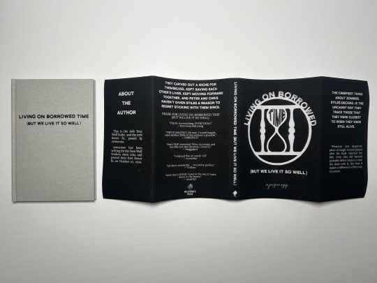


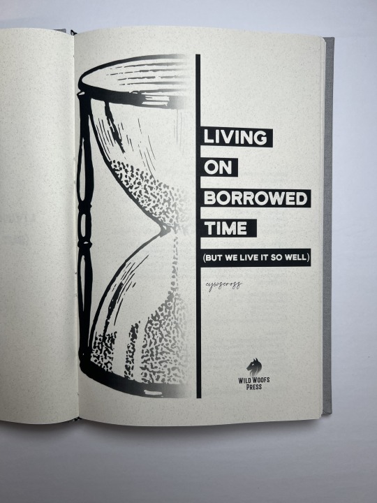


Fic: living on borrowed time (but we live it so well) by cywscross (cc: @cywscross / @stetervault)
Words: 23,943
fonts
title: Henrik
author name: Gatha Script
body: Lora
bookcloth • endpapers
110 notes
·
View notes

Text
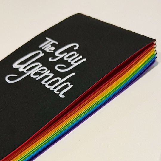

🏳️🌈 A long stitch notebook for a Secret Santa gift exchange at our local queer community space. 🏳️🌈
72 blank pages, 7x14 cm.
224 notes
·
View notes
Text
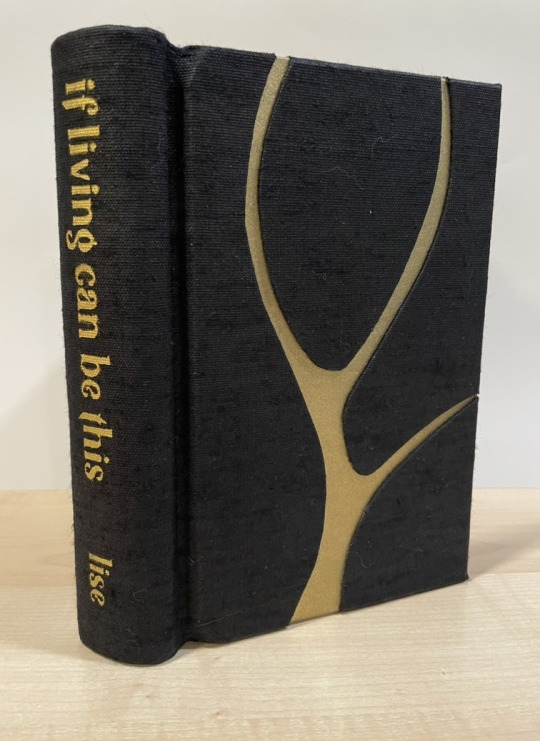
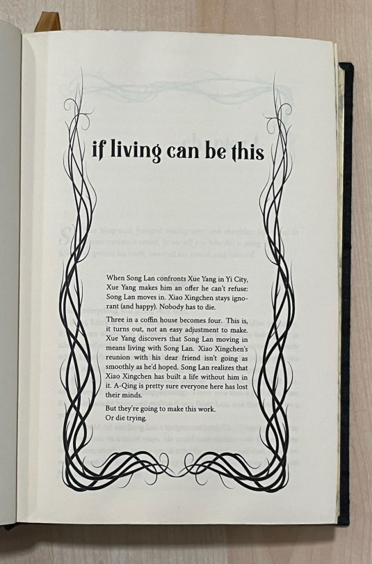
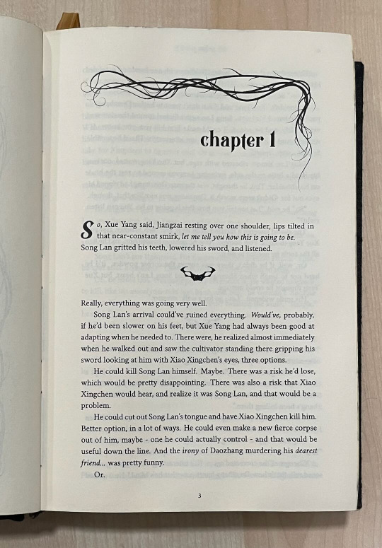
If Living Can Be This (MDZS)
If you asked me last year, after having bound a MDZS fic without knowing anything about the show/books, whether I would go ride or die for the fated main pairing with decades of pining, or a poly trio featuring a sadistic mass murderer and the two people he tortured the most, well... you can guess what I would have answered. But within a week after finishing CQL, I blithely ignored all the WWX/LWJ fic recs people had lovingly curated for me and instead read every single Yi City trio I could possibly find.
While there are many, MANY righteous sandwich fics near and dear to my heart, the one I keep coming back to is If Living Can Be This by @veliseraptor. She took those glimpses at what Xue Yang could have been and shifted the story just a little to the left and looked at how the Yi City arc could have gone in a very, very different direction, and all without "redeeming" Xue Yang or ignoring how dangerous he was and still is.
So when I got wind that @misanthropiczombie had requested it for this year's Renegade Exchange, I engineered my way into being her giftee (ie, begged the mods).

This is a chonker of a series; while the main story is around 74k words, with the sequels it was about 180k, which translated to 572 pages! Originally I was going to do a typical rounded andbacked cased-in binding, but then a fellow Renegadee mentioned springback designs, which have a "spring" mechanism that forces the book to lay very flat when open. For such a big book that is unlikely to be read while lying down in bed (I mean, do what you want but I am not responsible for broken noses), this seemed like a GREAT time to learn an entirely new binding technique in less than a month. :D But as you can see, it lays VERY flat.

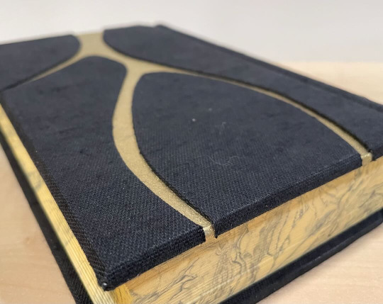
This is also the most complex cover design I've done so far - I used a vine motif for the typeset and wanted to emulate that in the cover, so after consulting with @celestial-sphere-press on her river bind cover, I cut out pieces of cover board for a moderately difficult onlay design.
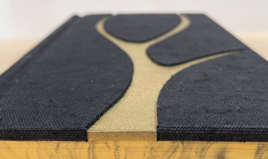
I went with black and gold as the overall theme and also did some suminagashi for the edges to match the marbled endpapers and because It's What Xue Yang Deserves. At the same time, the book cloth is very nubby and textured to reflect the austere life they're living in Yi City at that point.
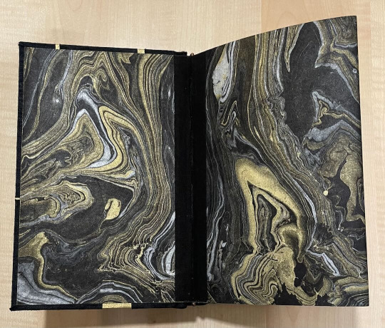
Because there clearly wasn't enough gold in this book, I added a fibrous gold flysheet to partly obscure the title page.

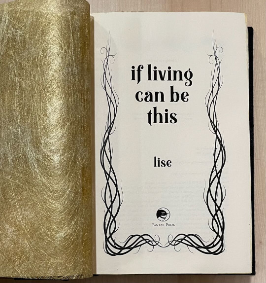
In one of the additional stories, Song Lan compares Xue Yang to a strangling vine that is aware that it could be ripped out at any moment. I used that as inspiration for the title and chapter ornaments. The text dividers are Jiangzai's hilt from CQL.
While the springback design was looooong, I did enjoy making it and may even do it again for mine and/or the author's copy! Or maybe I will cop out and just do rounded and backed cased in, we shall see. :D
Many, many thanks to the Renegade crew for supporting me during this bind. This one truly took a village and I would not have been able to do it without them!
391 notes
·
View notes
Text
Let's post another lovely fic I had the honor of binding for its author!
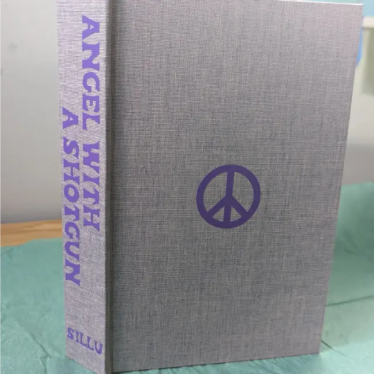
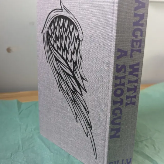
Angel with a Shotgun
By sillu | @silluuuu
This is a modern AU Soul Eater fic where Maka puts an ad on Craigslist to get a fake boyfriend and I'm sure you know where this is going...
~ * ~ * ~ * ~ * ~ * ~
I had so much fun incorporating all the phone and tech elements into the story.
As you might expect Craigslist played a central role so I made the cover page look like the CL main search page for the city the story the story is located in with the author's name appearing where the CL name typically would be. The scene break icon is modeled after the CL peace sign. I also used this for the image on the front of the cover and the light purple/white cloth for the cover is Duo cloth which I also chose to try to recall the soft purple of the semi transparent CL name in the ad.
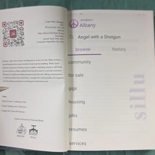
I researched and worked to recreate what a mobile Craigslist ad looks like to put it in the body of the typeset and I am really happy with the way it turned out! Many little boxes all needing to work together.
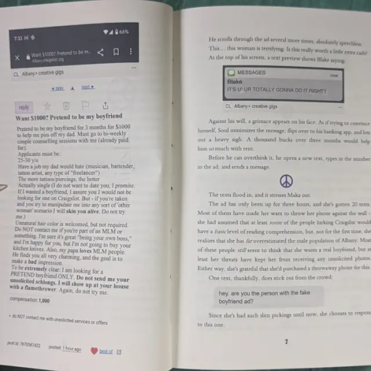
I used an iPhone message creator to create all the text messages. (My favorite bit of that was leaving just a smidge of the last text above the ones that were currently showing to help make it feel like looking at a phone)
Except for the text from Blake right when Soul looks at the ad. I wanted to show it was intruding on him still looking at the ad so I hand modeled that one to look like a pop up notification appearing over the ad.
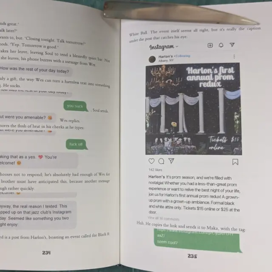
The Instagram post! Had to make an icon for the bar that was posting as well as design the post as well. I tried using a fake Instagram post maker but it wasn't working well so I just built that one in the typeset as well.
Chapter and book titles are Trader Joes inspired as there is a scene there that get called back to later one. There is a brief use of the iphone notes app so had to create that as well.
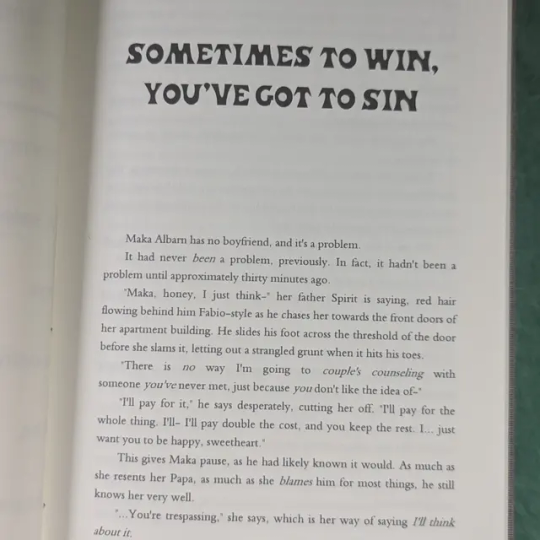
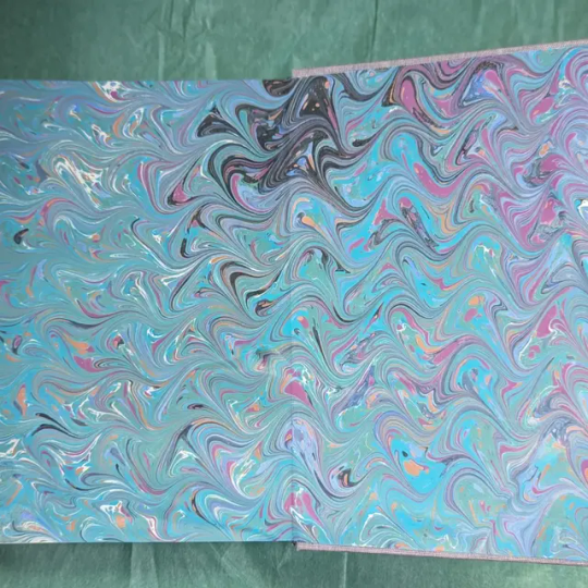
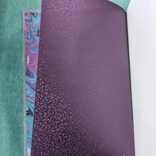
The end pages are some I marbled back in April at the Renegade Retreat as well as some shiny purple added to the inside so the painty fingerprints on the backs of the marbled don't show through.
Back cover image is a wing in monochrome and represents a tattoo in the story.
So many new fun things to try with this book!
136 notes
·
View notes
Text
so, you wanted to start bookbinding?
so @princetofbone mentioned on my post for "factory settings" about wanting to know more about the binding style that i used for it. so i thought i might make a post about it.
i was as terrible as i always am for taking in progress shots, but i can link you to the resources i used in order to make my book. i would also like to point out that "factory settings" is my 120th bind, and i have been doing bookbinding as a hobby for just over 3 years now. unfortunately this means some of the methods that i used for that bind aren't particularly beginner friendly, just in terms of the tools and methods i have used, but i would love to point you in the right direction when it comes to resources. i dont say this to sound pretentious which i fear i might come across, just so that youre fully informed. getting into this hobby is fun and rewarding, but it can definitely be intimidating.
with that caveat, heres a list of links and resources that i have used for bookbinding in general, with additional links to methods i used specifically in regards to this bind.
ASH's how to make a book document. it gives you a great introduction into typesetting fics (where you format the text of fics to look like a traditionally published books) and then turning them into a case-bound book (the style i used for "factory settings"). it is comprehensive, and explains how to use microsoft word to do your bidding. it was invaluable to me when i was just starting out! currently i use affinity publisher to typeset/format my fics for printing, but i only bought and learned how to use that after i had been binding books for a year and a half. i made some beautiful typesets with word, and some of my close friends use it still and design stuff that i never would be able to in my wildest dreams (basically anything by @no-name-publishing)
DAS Bookbinding's Square Back Bradel Binding. a great style to do your first bind in! this method requires, when making the case, to attach the cover board and the spine board to a connecting piece of paper, which makes it so much easier to match the size of the case to the size of the text block (your printed out and sewn fic). using this method is what allowed me to get much more accurately fitting cases, and made me much more confident with the construction of the books i was making. a well-made book is something that is so wonderful to hold in your hands!
DAS Bookbinding's Rounded and Backed Cased Book. This is the specific method that i used to create my bind for "factory settings"! even before i could back my books, i found that watching DAS's videos in particular helped me see how books were traditionally made, and i was able to see different tips and tricks about how to make nicer books.
Book Edge Trimming Without... i trim the edges of my text block using my finishing press and a chisel i have sharpened using a whetstone and leather strop with buffing compound on it. i follow the method for trimming shown in this video!
Made Endpapers. i follow this method for my endpapers, as i used handmade lokta endpapers, and they can be quite thin, but they look beautiful! i used "tipped on" endpapers (where you have your endpaper and then put a thin strip of glue on the edge and attach it to your text block) i used for a very long time before this, but these feel like they are much more stable, as they are sewn with your text block.
Edge Sprinkling. this is the method that i used for decorating the edges of my text block. but the principle is basically clamping your text block tight and then sprinkling the edges. i do not believe you need to trim the edges in order to do sprinkles on the edges, and that's what makes it accessible! i personally just use really cheap acrylic paint that i water down and then flick it onto the edges with my thumb and a paint brush.
Double-Core Endbands. i sew my own endbands, which i followed this tutorial for. that being said, it's kind of confusing, and this video is a bit easier to follow, but it is a slightly different type of endband.
Case decoration. i used my silhouette cameo 4 to cut out my design for "factory settings" in htv (heat transfer vinyl). i also used my cameo 4 to cut out the oval of marbled paper on the front, as i honestly didn't want to try my hand at cutting an oval lol. i also glued some 300 gsm card with an oval cut out of the centre of it onto the cover before covering it with bookcloth, to get a kind of recess on the cover. i then glued the oval of marbled paper onto the top of the recessed area once it was covered with bookcloth, so that it was protected. the images i used were sourced from a mix of rawpixel, canva and pixabay. a more accessible way to get into cover decoration is by painting on a design for your cover as described in @a-gay-old-time's tutorial just here. or even doing paper labels, which look classy imo.
physical materials. sourcing these will depend on your country. i am located in australia, and have compiled a list with some other aussie bookbinders of places to buy from. here is a great post describing beginning materials for getting started binding.
@renegadepublishing. this tumblr is great! its what got me started bookbinding, and being in the discord has been inspiring, motivating, and honestly just one of the best online experiences i have ever had. it is full of resources, and most people in there are amateur bookbinders, with a couple of professionals thrown in. the discord is 18+, and anyone can join!
i'm sorry this post got so long, but i hope that this has a lot of information for you if you would like to get started bookbinding. its one of the best hobbies ive ever had, and i genuinely believe i will have it for the rest of my life.
3K notes
·
View notes
Text
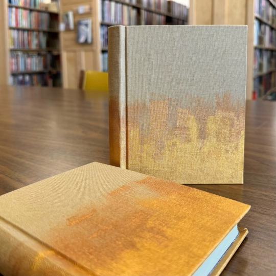
El Dorado and Peregrine by @nigeltde-fic
Very excited to finally have these two incredible stories on my shelves, and grateful to the author for having written them. Some extra glamour shots and writing below the cut like always
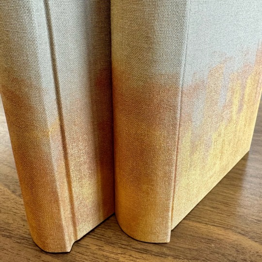
The bookcloth is plain linen bookcloth that I've painted with gold and bronze fabric paint and set with an iron. I struggled for a while to decide what materials this should be done with, and ran some experiments that all kind of blew up in my face lol. Sometimes the tried and true is such for a reason.

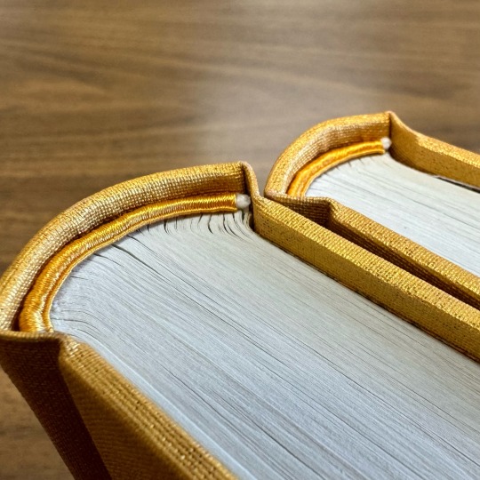
The top endbands are sewn with a single strand of satin finish cotton sewing thread, around a worsted weight cotton yarn core coated with PVA glue. The bottom, 'golden' endbands are sewing with a single strand of yellow polyester thread, so that it can be kinda shiny looking.
And a cheeky little video to show the insides, including original art. The fonts used were Century for the main body, and Calfine for the decorative. Thanks for lookin!
191 notes
·
View notes
Text
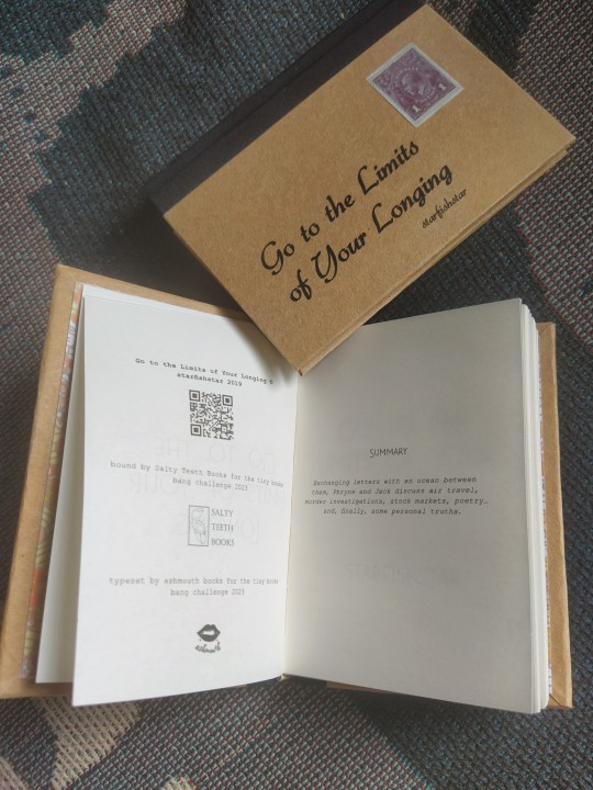
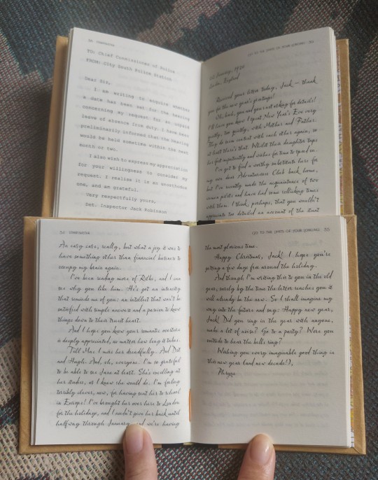
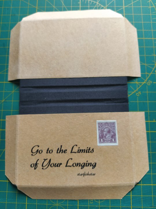
Tiny Books Bang 2023
Wheeeee so the Renegade Bindery server had a Tiny Books Bang challenge where there's a typesetter and binder exchange thing of books sized quarto and below, and I got a Miss Fisher's Murder Mysteries epistolary fic typseset by @ashmouthbooks so OF COURSE I HAD TO MAKE IT LOOK LIKE A LETTER. AN OCTAVO SIZED LETTER (I attempted to fashion the covers into an envelope closure but that took too much time and effort to pull off, so no)

Definitely did a 2-day deep dive into period accurate stamps, had to print out the stamp onto sketch paper, carefully sanded down the back side edges sit it sits nice and flush. Spine is just homemade black bookcloth. For the cover, I printed onto brown sugar paper, then gave it a layer of acrylic sealer before attempting to align it, poorly on one copy so I kept that one lol.
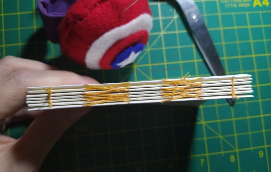
Inside, endpapers are these lovely chiyogami I bought a pack of a while back, and 78gsm cream paper. Made endbands by using the leftover chiyogami trimmings and gluing them around a core of leather.

Some in-progress shots:


Then I bubble wrapped it and sent it off nearly halfway across the world! Where it arrived safely! (was I mother henning the tracking link, maybe)
165 notes
·
View notes