
Last Seen Blogs

fruitbatz2000
arts go here

m0nsterartgarage
art and spark
life-in-my-brain
Fuckin Weird Brain I Got
dragoon-of-all-trades
The Demon's Dancer
Text
Rationale
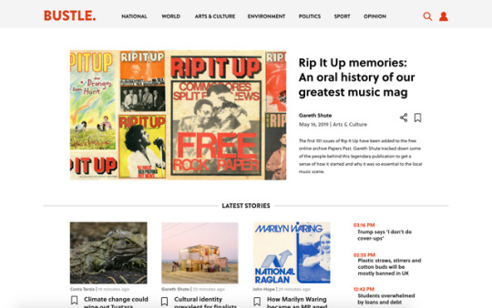
When negative & one-sided news worms its way into our feeds, emails, ads, and websites, it can make the possibility of doing any good in our communities feel impossible. The aim of Bustle is to rethink how we see news websites and the purpose they serve us, giving users tools to go further than simply reading passively. Traditional news websites can lack a two way dialogue and at times feel overwhelming due to the negativity some articles posess. This redesign aims to create a dialogue between the user and the topics that are being posted, connecting the user connected to their community, as well as give them a sense of active participation and help when it comes to the negativity that frequents common news websites.
Three buttons titled Get Educated, Have a Say, and Take Action, break this down into three easy sections that sustain the journey of those using the website and give them a purpose and action to do in their daily life. Get Educated aims to inform through context and histories, Have a Say aims to give people the encouragement to join discussions with people both likeminded and with differing perspectives, and Take Action gives the user different ways to apply themselves in ways relevant to the topics they’re reading about - giving them a sense of purpose and pride in their communities and a little bit of positivity hope when surrounded by negative stories.
0 notes
Text

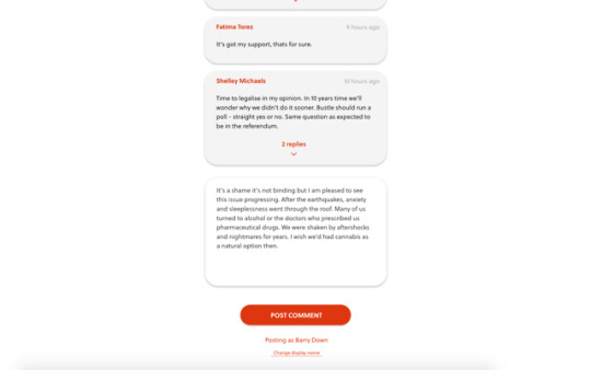
Original comment section (above) was quite disconnected and clunky. Didn’t flow well on the page, especially at full screen for a browser.

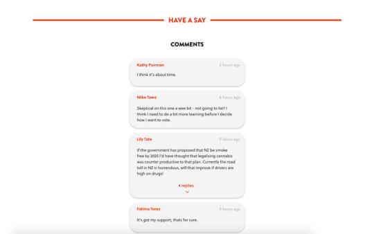
This alternative is much more streamlined. Because the author, date & time, and the comment itself are all in the same box, they feel cohesive and it’s very clear what comment belongs to who. When the author and date is outside of the comment box it starts to look disconnected and “floaty”.
0 notes

Photo


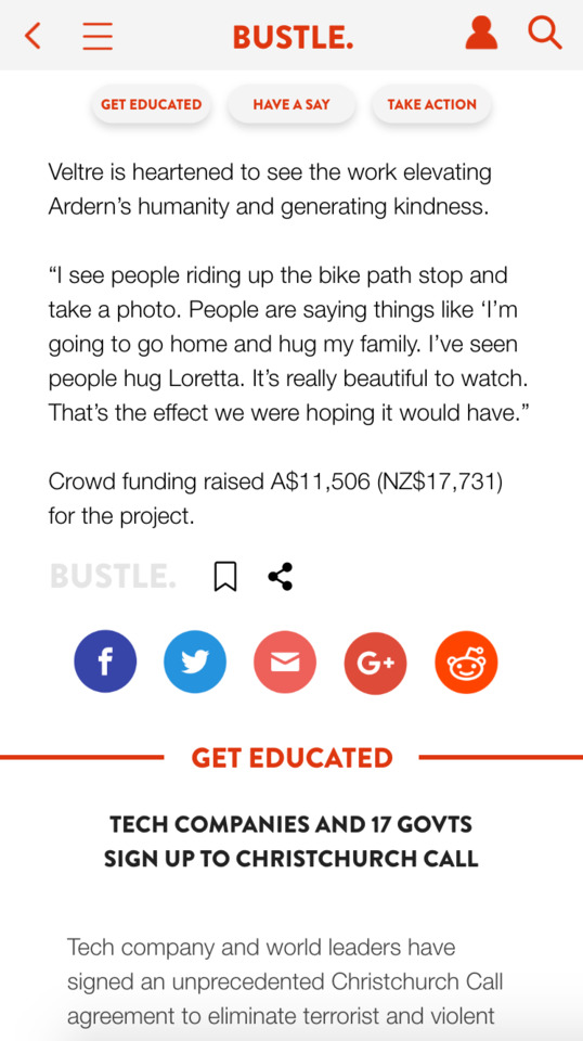
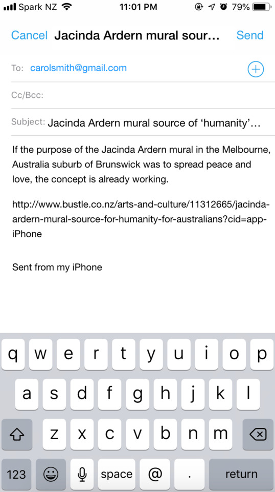
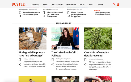
Week 6; refining Haiyans journey I added in her sharing the article with a friend by email as I felt like it had more of a resolution than just browsing. It also answers the need of her user persona to be a casual browser over arts & culture, and start up conversations with friend over articles by sending their favourites to each other. I’ve made the three buttons slightly smaller so that they take up less room than scrolling. I also added the category at the top of the article to give context.
0 notes
Photo
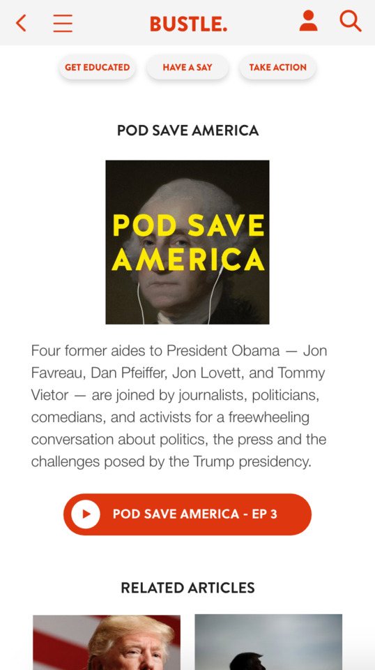
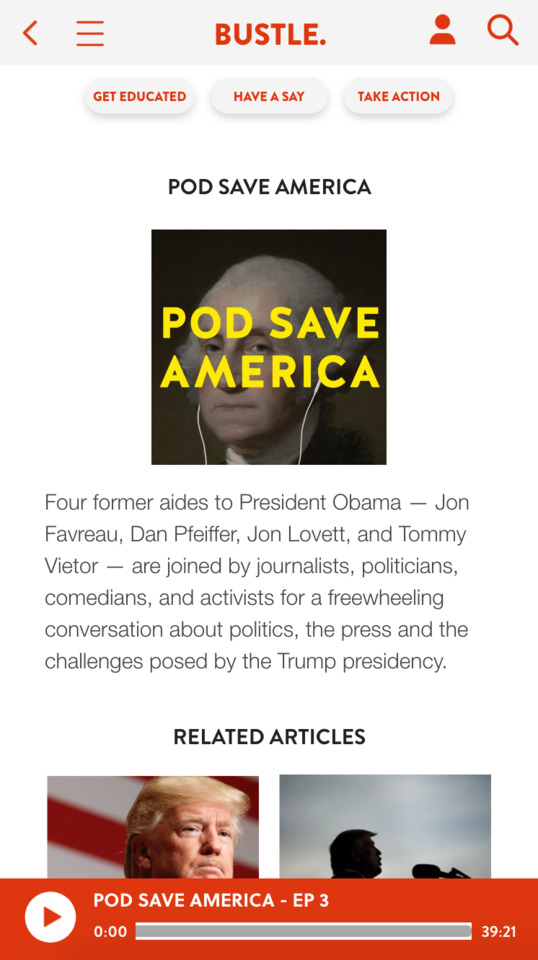
Ability to play the podcast and have it running while you do other stuff, much like Spotify or other music apps. good for multitasking, browsing, etc.
0 notes
Text
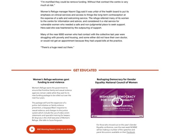
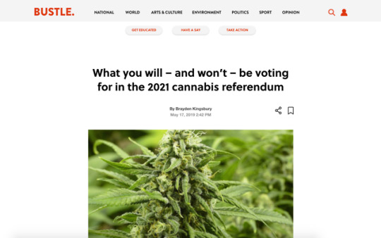
After some feedback from the second interim from a user test, I’ve decided to put the share and save button at the bottom of the article as well as the top. This makes a lot more sense as it follows the natural path someone would take to choose an article, read it, and then share or save it
0 notes

Text


Originally my menu had the four buttons - bookmarks, comments, discussions, events. I’ve decided to change the discussions button to suggested. A while ago I wanted to have comments as well as discussions, with comments being directly about the article and discussions being almost like reddit, where someone posts a discussion started and people can choose to join that discussion. In the end I deleted it as they were both too similar and I feel as though you can already do that with comments through the replies. The suggest button is also underneath the bookmarks heading when on that page, but as it’s hidden whenever you’re on another page on the profile I felt as though it was ok to put it in the main menu as well.
0 notes
Text
An idea for bookmarking - when someone bookmarks an article they’re given an option to go to their profile or keep browsing. Can be good because it makes people aware of where the content they’re bookmarking is going but could also be seen as an interruption or unnecessary step. Without it, though, it’s not very noticeable and it could be done easily by accident.
0 notes
Photo
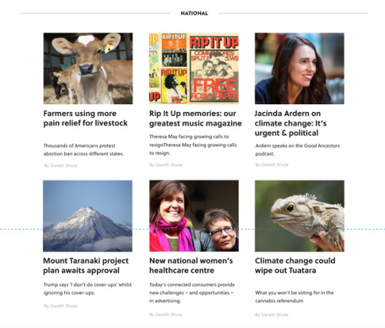

Before & After of national page.
The before looks a bit clunky and floaty. uneven line spacing, no structure or consistency, no icons.
Adding the icons and indenting some of the text makes it easer to scan, more visually appealing, and more professional looking. the two icons almost act as an anchor to the text. Ground it, hold it, etc.
0 notes
Text
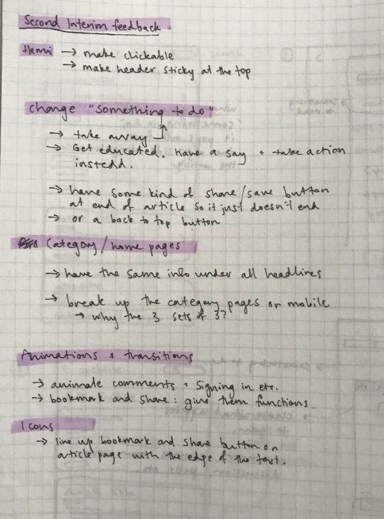
“Something to do”
Before:

I had the “something to do” section first, and then under that I had the three get educated, have a say, and take action sections. I was struggling to make this look good and how I wanted.

I decided to take away the “something to read” and “something to do” buttons completely and just have the three “get educated” “have a say” and “take action” which is a lot more simplistic and intuitive. It clears up the space and reads better when scrolling down as there’s less confusion over what section you’re in.
0 notes
Video
Home page mobile
In the desktop version the articles are placed in rows, whereas here they are stacked vertically. Only latest, popular, and more news (at bottom) will be on the home page. I’ve decided to keep all the categories in their own place, so that the home page can be a mix of these and seperate from individual categories.
0 notes
Text
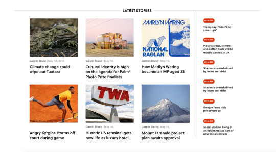
I decided to add an extra part to the latest stories that includes a vertical list of only article titles in chronological order. I found (through talking to other people I now) that some people prefer simple news titles rather than heaps of images. This would mean that people can see the 6 latest articles and then also a list from that day of articles that have been published
0 notes
Text

Bookmark page
Has a small description of the article as well as title and image. Small bookmark symbol in case the user wants to unsave an article.
0 notes

Text
I like the look of having a photo-heavy front page because I’m a visual person, but for the sake of user journeys and usability for lots of different people, the homepage has a section of categories down the bottom that simple list them. This means lots more info can get on the front page without it being to busy, loud, or in your face.
Also:

Adding an extra side bar of latest news makes it a lot more practical so that it’s not only about visuals but also lists, as some people prefer this layout to other, larger, more visual ones.
0 notes