
spaceplanninguru4u-blog
Here to share what i know
Currently a TA @ Parsons - Interior Desgin
51 posts
Don't wanna be here? Send us removal request.
Last Seen Blogs

aemondsbabygirl
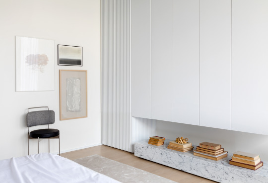
King With No Crown

wyattocean-blog
Unbetitelt

everlynoconnell
𝐦𝐲𝐧 𝐰𝐫𝐢𝐭𝐞𝐬

starcocrepeboi
Starco's Memes and Mashups


Photo

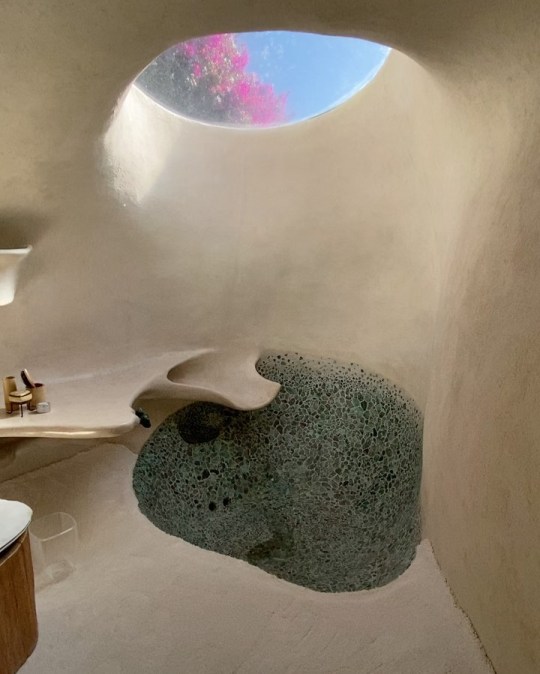
Checked into my jungle villa By Michutravel
5K notes
·
View notes
Text
How to create mood boards that inspire: 20 pro tips - Paul Watt
Learning how to create mood boards will transform your pitching experience. Mood boards communicate a designer's vision at the start of a project. They should be visually stunning collections of ideas, full of textures and images that paint a picture better than words alone. A mood board is the closest you can get to inviting someone to climb inside your creative mind.
It's crucial that your mood board is more than a confusing, messy collage. Instead, it should be a cohesive, beautiful expression of your vision. But how do you achieve this? We've put together a series of tips that'll let your inner creative genius sing by replicating your creativity on a fantastic mood board.
Have you got an awesome design portfolio to accompany your mood board at your next pitch? If you think it needs some work, we've got lots of portfolio examples to inspire you.
01. Look beyond the digital world
When putting together mood boards, it's easy (and therefore tempting) to just use images found online. But just because you're working on a digital product doesn't mean you have to stick to digital inspiration. Plus, you may be breaking copyright laws by using them.
For example, while working on the ITV news website, digital product design company Made by Many looked at copies of the veteran Picture Post magazine in order to express how powerful and effective an image plus a caption can be for telling a news story. Real world inspiration such as this can be a very powerful 'convincer' when putting together a board for a client.
02. Take pictures
Real-world inspiration is all around us. So use the camera on your phone to take pictures of everything you see that inspires you, whether that be a bird in flight, great use of typography on a sign, or the brickwork on a building. Or maybe it's just a little corner of your house.
They don't have to be great photos in the traditional sense – it's all about capturing thoughts, impressions, themes and feelings.
03. Curate what you include
Have you ever had the misfortune of going to a gallery exhibition and it just not doing anything for you? You weren't 'touched' by the exhibition or 'moved' by what was on show – and other similar emotive profusions. It's very easy to shove a load of stuff together and call it an exhibition; it's an absolute talent to curate threads and synergies between works and call it an exhibition.
When putting together mood boards, think of yourself as a curator rather than a collector, and try to introduce meaning and threads from one image to the next. It makes for easier interpretation.
04. Choose the right format
From the outset, establish how you mood board is going to be presented, as this will determine how you go about it and how much or little detail to go into.
An 'offline' mood board will generally be looser in style and could still be presented online, with some explanation, while a completely online mood board should be tighter and will generally need to work harder to convey a theme or style. Think about how a person viewing your mood board solely via email would view it.
05. Build things up around a large image
Whether your mood board is electronic or physical, the layout needs to give prominence to key theme images. You can then surround these with smaller supporting images that enhance the theme.
It's a subliminal trick. When someone sees a large image on your board in their heads they'll have questions about it – and they'll quickly scan the rest of the board to find answers for those questions. If you place smaller supporting images around the larger image they should answer these questions by clarifying the messaging given in the larger one.
06. Get tactile
When making a physical mood board, don't be afraid to get, well, physical. Traditionally, mood boards are made from foam board. Although cutting this stuff up with a scalpel and spray mounting cut-out images onto it can be a pain (especially if you're not dexterous with a blade), it's extremely effective as a presentation tool. The tactile nature of cut-out images glued onto boards enhances the emotiveness of what's being explained.
It may seem like an old-fashioned thing to do, but perception-wise it's a real ace up your sleeve as a designer. Just be careful with your fingers on that blade...
07. Incorporate your board into your pitch
Generally mood boards are considered to be separate to pitch or presentation work: they stand alone to show mood and tone. This is standard practice, but consider instead making them part of your pitch or presentation. Remember, you're trying to use subliminal visual tricks to make a client 'get it'.
Mixing mood board elements in with the presentation – rather than bolting them on at the end – can be an effective way of communicating your concept to the client.
08. Don't reveal it too early
It's important to make sure that a well-meaning project manager doesn't email an offline mood board ahead of the presentation 'so the client knows what we're presenting'.
For an offline mood board, it's far better to let it all sink in to the client's mind as you showcase it, rather than come armed with lots of questions before you even start.
09. Present your own mood board
In a similar vein, if your mood board is being presented to the client, try to be involved yourself. It makes no sense to have something that originated in your head being communicated by someone else, because that way meaning can become muddled in a Chinese whispers-type mess.
10. Keep things loose
Locking an idea or a style down in a mood board can be detrimental, as the client will feel shoehorned into going with a particular aesthetic. Keep everything a little loose and don't make everything look too final.
If you're using preview images from image libraries, don't worry about the watermarking on them – it all adds up to a 'hey look, we can change this, these are ideas' feel to the board.
11. Watch the audience
When you're presenting a mood board, watch the faces of those you're showing it to. Ignore any verbal client 'oohs and ahhs' but instead watch their facial and emotive reactions as they look around the board. This will give you a much more honest take on whether the board is doing its job and if they're reacting well or badly to what you're showing them.
You have to put these people 'in your mood', so ignore their mutterings and watch their emotive reactions.
12. Hone your mood board skills
Employees at branding agency Landor Associates use a form of mood board to showcase themselves to other members of the team. Individuals put together nine images in a 3 x 3 grid to give their work colleagues an insight into what they're like; their interests, passions, cares and worries.
If you ever want to test out your mood boarding skills, try this out and showcase it to your colleagues.
13. Text it up
Don't ignore the power of a few isolated words on a board. Well-chosen words can be fantastic show-stoppers and give your viewer pause for thought as they have to mentally read what's in front of them. Big, bold words juxtaposed together work very well at creating drama, tone and meaning for any project.
14. Make the theme obvious
Obscure references can be fun, but try to have a number of relatable items or 'touchpoints' in your mood board. You want to let others in, so being deliberately obtuse will earn you no points at all. It's easy to fill out a board with a pile of incomprehensible references; it's much harder to be clear and use imagery to sell your vision. But it's worth the effort.
15. Aim to spark an emotional response
Think a little bit left of centre if you're presenting a mood board to a client. What would give them a genuine emotive response? Real world objects are good for this. If you were inspired by the beach, bring in a shell. If your eureka moment happened on the train, bring in the ticket. This type of thing intrigues people's brains and gains that all-important emotive reaction.
16. Don't make presumptions
Expecting too much of the audience can be the difference between a successful mood board and one that's dismissed as being too cerebral. There's a danger of assuming they'll 'know what you mean' – chances are they won't. So if it takes a few more references, images or textures to get what's inside your head into a client's then add them in.
17. Test your mood board
Don't forget to test out your boards before you send them off. It's not a game of Pictionary, so if your testing audience have to ask too many times what an image means or why it's there, then it probably shouldn't be there.
18. Have fun
The whole process of creating mood boards should be fun – a refreshing break from the often tedious tasks of the jobbing designer. If you're not having fun then it's a sure sign you're going about things the wrong way...
19. Use mood boards to brief designers
Following on from the previous point, mood boards are a good way to brief a creative. Don't be afraid to go into detail. The mood board above was compiled for animator Tom Baker as a mood and style guide for creating cartoon versions of The Avengers TV series characters. Instead of relying on one example of a character, several types were found in many different poses, which gave Baker a clear take on the style and direction of the piece.
20. Speed up client sign-off
Mood boards shouldn't just be for pitches. Consider preparing mood boards to show other similarly themed projects, websites or functions before creating polished visuals.
'I'll know it when I see it' is a phrase that most of us are familiar with. But to hear this when finished artwork comes back from a client is gutting, signifying that it's back to square one. Using mood boards at different stages of the process can help you avoid this happening.
1 note
·
View note


Photo
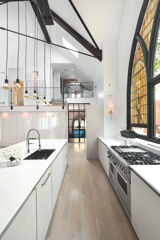
Church Conversion by Linc Thelen Design
15K notes
·
View notes


Photo
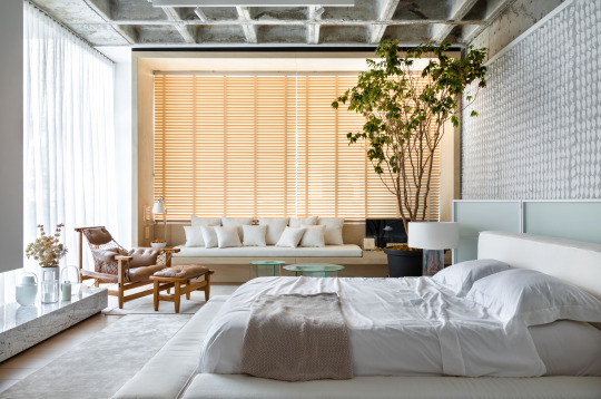


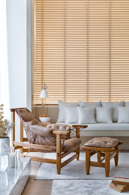
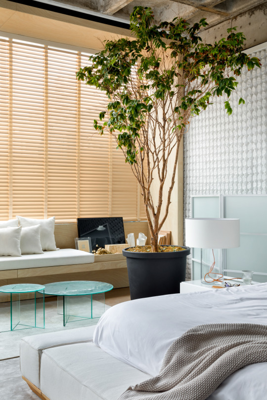
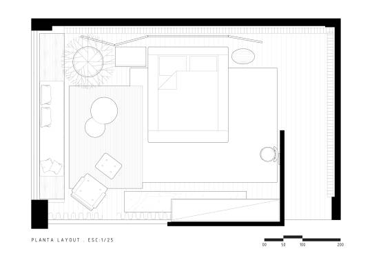
’Cloud Nine,’ Florianópolis, SC, Brazil,
Studio Gabriel Bordin for CASACOR SC
542 notes
·
View notes
Text
7 Rules of Interior Design
According to interior designer Michael Wood of IX Design, there isn't one magic formula to create the perfect room. Even an interior designer starts from scratch with each project, working with both the client and the space.
The key to a beautiful home isn't spending a ton of money on pricey furniture or designer fixtures. It's about making sure everything in your space works together.
Magic formula or no, 15 years of projects gives you some insight. So Wood shared his seven key principles of creating a great space, from where to start to what to avoid. The best part? Doing it right doesn't mean draining your checking account.
Live With It
"It's especially important for people on a budget to go slowly," Wood advises. "You literally have to live with these decisions, so it's not a good idea to rush into something and look back with regret." Even though it's tempting to finish an entire room at once, Wood emphasizes living with each choice before moving on to the next one. New couch? Let it sit (and sit on it) before moving it around the room or covering it in pinstripes.
How do you know if it's a good fit? Ask yourself two questions: 1) Does it make you happy? 2) Is it functional in the way it was intended?
It's also important to spend time at the beginning choosing exactly what you want. Wood says it's critical to nail down your vision for the room before you get started, because there's nothing worse than spending money you've worked so hard to save, and then regretting it.
Soften the Corners
Most things have 90-degree angles: rugs, tables, chairs, pictures. According to Wood, one of the ways to make a room more visually interesting is to "soften the corners," or mix in some pieces with rounded edges to avoid a succession of sharp corners around the room. "Throw in a round coffee table or a rug to make things more interesting," he recommends.
Never Buy a Set
"Don't go into the store and buy every piece in a set--it will look like you went out one afternoon and did everything," Wood cautions. According to him, people respond best to to blended, organic compositions of furniture. "It's like putting together an outfit," he adds. "It isn't about the skirt or scarf--it's about how it all comes together."
This goes hand-in-hand with living with your purchases. Everything you buy should blend together visually, Wood says, but shouldn't be too matchy-matchy. Taking your time amassing different elements in a room gives you a chance to evaluate how each piece fits before adding another, and to figure out if you need anything new at all. He continues, "Sometimes you can repurpose an existing piece, change up the pillows or just move the furniture, and that's enough."
Don't Over-Theme
"One thing I notice as a designer is that a lot of people want a particular look for a room, but go overboard," Wood says. It's all well and good to have a nautical room, but when you have only blue and white stripes, rope knot pillows and porthole mirrors, things start to look strange. "An affinity or look is one thing, but you appreciate the look of a room more when it isn't over-themed," he adds.
Choose the Right White
"If you're going to do white, you have to use the right white," Wood says. "There are a million whites out there. They can be pink, blue, or yellow, and once I found my favorites I stuck with them." His favorites:
•For a contemporary interior, crisp but warm: Benjamin Moore White Diamond
•For trim, a cooler feel: Benjamin Moore Decorator's White
•For warmer interiors: Benjamin Moore White Dove
And how do you find the right white for you? Wood recommends getting a small board and painting it with your potential white. Move it around your room to see it at different times and with different light. The board is better than painting on the wall, Wood says, because, "If you paint one square on one wall that faces south and love it, what about how it looks on the north wall at night?" The board gives you a chance to live with the color, because no matter how easy it seems to repaint, it can be a real pain!
Don't Fight the Architecture
"If you have really amazing moldings, that's one thing. But highlighting the cheap casing--the frames around doors and windows--from the '70s and '80s (by painting the walls a contrasting color, for example) is another. There's no need to make a room into something it's not," Wood explains. Of course, what you love about your home is entirely up to you, but it's like dressing for your body (which we've discussed here)--emphasize your best assets and play down your weakest. That way, you're giving the best impression of yourself to the world. "Only highlight something when you love it," he adds.
Start With the Box
Wood looks at every room in stages, starting with the biggest stuff first. "What is a room, really?" He asks. "It's a box." When putting a room together, start big and get increasingly smaller in your changes: the walls (the box), things attached to the box (light fixtures and trim), large furniture and so on. "Sometimes a client will say, 'I like this coffee table,' at the beginning of a project. I say, 'Great, but we're not there yet.' That coffee table will give me hints as to the overall scheme, but we don't start with the coffee table."
By Learnvest
0 notes
Text
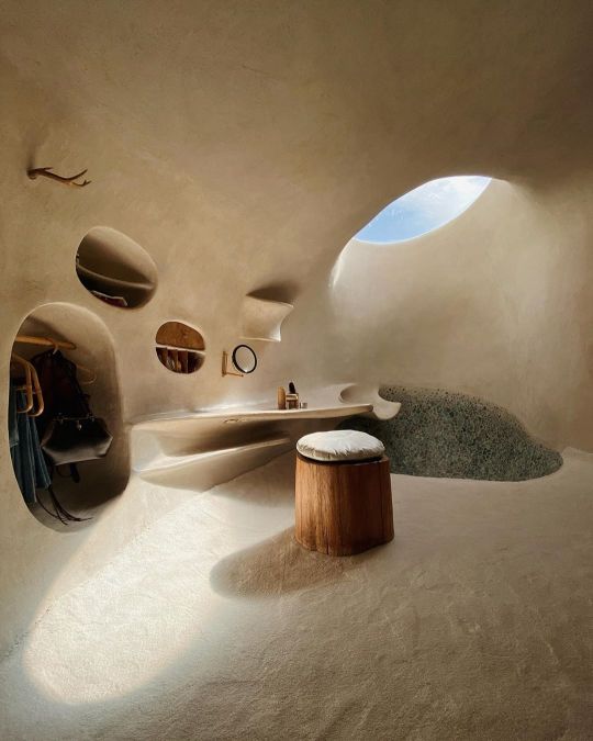
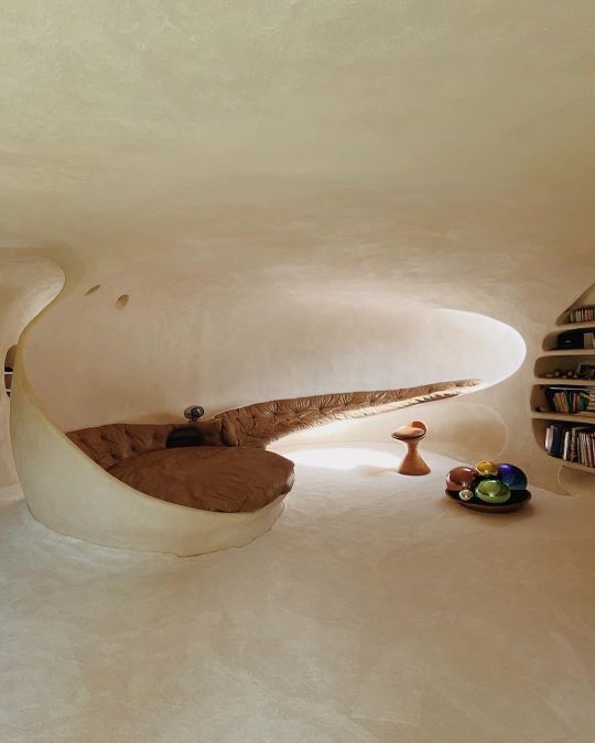
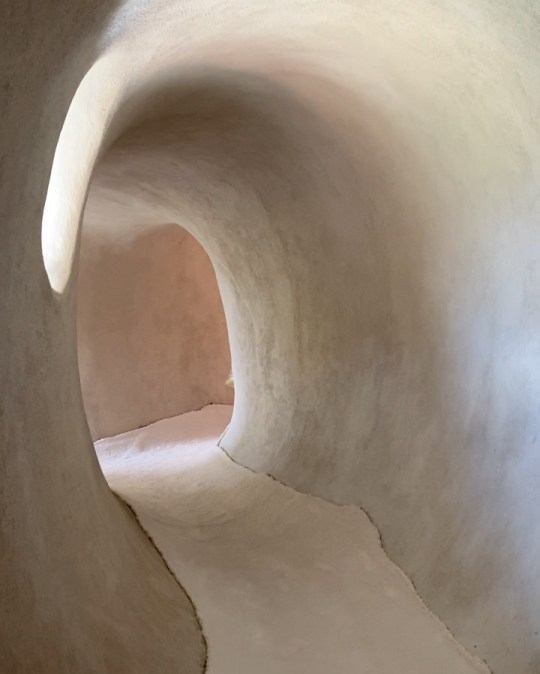
HOW TO CREATE DRAMA IN YOUR INTERIORS USING TEXTURE, SHAPES AND SHADOWS
The way that texture is used is quite unique. Layers of textures in varying depths create very interesting interiors, and walls that are textured, that throw shadows, as well as the use of large indoor plants that create such interesting shapes and of course, shadows again. In England, we think about how to light a space and maximise the amount of light in a space, but in sunny South Africa, you need to think about how to limit light in a space. It’s an interesting problem to have.
As always, there’s a few things that we can learn from design cultures that are different to ours. Not necessarily copying, but thinking about these elements and how we could potentially apply them to our homes.
When creating a dramatic scheme, you want there to be lots of contrast and shadows that move during the day.
Study and notice how different types of light reflect on different textures. A rough texture often throws a softer shadow compared to a sharp edge.
Using the same colour in a range of textures can make the colour look very different.
In a dramatic space, you want touch and sight to be very important, think about placing textures throughout the room that make you want to walk over and touch and feel them.
Limit the amount of texture used in a space, two or three contrasting textures is enough.
The more extreme the texture contrast, the more drama you will add to the space.
Think of texture the same way you would think about using colour – it’s equally important.
Think about the shapes of your furniture, do the shapes work together in the room?
Look at the shadows that are cast by the furniture/plants in the room, does it create drama? Think of using large plants strelitzia, palm trees, monstera deliciosa etc. to create very dramatic shapes that throw large architectural shadows.
Use oversized floor lamps or large tall plants to ‘lift’ your eye up in the corners of the room.
0 notes
Text
REASONS INTERIOR DESIGNERS SHOULD USE FENG SHUI
Although every interior architect and designer has probably heard something about feng shui, they may not realise that the basic principles of these ancient Chinese techniques can be used to promote mental health and wellbeing. Good feng shui can help create balance and positive energy within lived environments and truly assist planners and interior designers in the UK by helping build the positive house, garden and office environments which are most appealing to consumers. Use of feng shui in preliminary design studio concepts can also ensure better use of space and more welcoming, positive layouts.
Benefits of feng shui principles for interior design
Although feng shui is often dismissed as a pseudo-science today, it is recognised as a harmonious technique for design and does promote wellbeing. The term feng shui is translated as wind and water and principles are based on balancing energy levels and promoting the good energy, si chi. Appropriate use of colour, light, space and object or furniture placement can all help build levels of harmony and manipulate energy flow. In many ways, interior designers will appreciate that all these factors actually do impact upon what’s known as the ‘feel’ or ambience of any room.
Homes, offices and interior spaces that are created using feng shui principles can be much more pleasant to be in and do resonate with positive energy forces. One of the principal objectives in feng shui is to create positive vibes in every area, so this could be one reason people find feng shui interiors so pleasant. Understanding that all areas of the environment promote positivity means focusing as much attention on the garage and garden as on popular areas, like the kitchen and living space.
The front door or entrance to any interior is vital to good feng shui and should not be blocked or impeded in any way as this ensures good energy flow throughout any home. Clear viewpoints are also important for any good feng shui layout, so designers should take care to place furniture and objects with a low profile. This adds space and helps ensure positive energy flows are not blocked.
Mental health and individual wellness are becoming watchwords within all areas of life and feng shui interior design creates the kind of space to promote wellness.
Example of the use of feng shui within interior design projects
An example of the successful use of feng shui within a townhouse property would initially involve an overall plan for the home and garden. Use of colour and patterns is important within feng shui design and it’s important to continually bear in mind that “less is more”.
Colours such as earth and skin tones are popular in feng shui design, including creams, browns, dusky pinks or pale yellows. Different colours and tones can be used to create effective boundaries in open plan areas, while also promoting the flow of positive energy.
When it comes to the placement of furnishings, the following tips could help:
A solid bed head should be used and should be placed against a wall
Sofas, beds and desk chairs should never face doors
Keep the balance between practicality and aesthetics in mind at all times
Large works of art should not be placed above any areas where people will be lying down to relax as they can cause feelings of anxiety and unease
Natural shapes and forms are key to feng shui design principles, so there should not be any sharp edges on any furniture
Any art pieces featured within the interior should relay positive and calming vibes and images that conjure feelings of sadness or pain should be avoided at all costs
Feng shui aims to slow the energy flow within interiors, so it’s important to balance all objects and have an understanding of their placements in the room. Bulky objects should not be placed awkwardly or in front of windows.
Positive feng shui designs can include:
Plants in the bedroom, and pink flowering plants enhance romance!
Water features like fountains can increase levels of positive energy
Mirrors can also be used for effective feng shui layouts
0 notes