#and all three of our cats came out of the woodwork to square up around me. snooks who was honestly just the best no notes 10/10 cat
Text
Top 5 least favorite zoophobia character designs

-----------------------------------
Welp, got the positive list out of the way. Now yet me give you the list inevitably more people will like because everyone apparently likes it when I'm negative. Go figure. Vivziepop has a whole arsenal of character designs, and here are some of my least favourites. Same ground rules for my other list apply here. And first, some dishonorable mentions.
DM 1: Jack and Damian
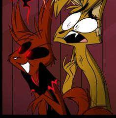
First things first, I don't hate the designs of the main cast. Yeah, they're simple compared to other designs in zoophobia, but, as I've said before, I like Vivz's more simple designs. But out of all the main cast, I disliked these designs the most for one reason. At least everyone else looked like their respective animal. Spam looks like a fox, Vanex looks like a cat, Kayla looks like a kangaroo, and Zill, despite the crazy colour scheme, looks like an unidentifiable creature. These guys? Damian is supposed to be this demonic jackal, but, if you look up jackal in Google Images, you'll notice that he doesn't really look like one. He looks more like some kind of wolf or fox. I don't mind the ears (hell, the horn-like, long ass ears could be his signature look ), or the eyes (he IS a demon ) but, fun fact, jackals have black ears, a black tail, and a distinct black patch of fur on their backs. Some liberties can be taken with colours, I suppose (I mean, we have a freaking purple cat in our midst, you think I'm drawing the line at the canines? ), but perhaps parts of his fur could be made darker in order to get him to resemble a jackal. Jack is a wolf/jackal hybrid, yet he looks more like a domestic dog or a rabbit. It's mainly his ears that cause the problems. Maybe give him more wolfish ears. Seriously vivz, what wolf or jackal looks like that?
------------------------------------
For this next entry, I shall perform my best Nicholas Cage impression. *ahem*
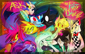
DM 2 : Most of the Party Dawgs
AAAAAAAAAAAAAAAHHHHHH! MY EYES! MY EYES! AAAAAAAAAAAAAAAAAAAAAAAAAAAAAAAAHHH!
*cough * Anyways, now that I've finished my hyperbolic reaction to the party dawgs, let me single some out. Koko, Mint, and Raven. Koko (aka the purple one with purple clothes) literally looks like a clone of Mint (the green one). The only differences between the two are colours, hair being parted on opposite sides, and slight clothing difference. And let's be honest, Raven literally looks like another Jayjay. But hey, at least their colours don't make my eyes bleed.
Now onto the list proper.
--------------------------------------------------
5. Tom

Look, to anyone on this site who wants to know what I think of Tom, he's just meh. There's nothing really that special about him. Oh, you're a lonely demon? It's not like we have someone in the main cast like that already. Oh, you can be something of a charmer and attract a lot of ladies? Hi Zill! And Tom's design isn't helping his case. He looks like a recoloured Bozzwick or a genderbent Ink. There's nothing really creepy or strange about his appearance. You could argue that his eyes are strange, but plenty of other characters have strange eyes, and Tom's eyes aren't even the strangest. He doesn't look demon-y. He looks like another edgy teen. And yeah, I might be a hypocrite here because I love Damian's male human design, but in his case it's kind of funny. I mean, it's just amusing to me that someone like Dame (who is also the anti christ ) looks like a hot topic addict. It's just so weirdly fitting it's hilarious. Same can't really be said for Tom though. ....
-----------------------------
4. Styx, Tentadora, and Jillian.

Three way tie! Whooo! Okay, but in all seriousness, I put these guys here because they all suffer the same problems. They need some adjustments to their designs and a change in colour pallets. Go back to ch 3 of zoophobia, and look at how much these guys seem out of place in hell. These three characters become a major distraction as your eye is immediately drawn to them instead of whatever more important scene is going on. Give them a colour pallet that helps them blend in a little more. Jillian, I feel, since the poorer parts of Hell are have a more Western feel, should have a more Western influence since that's where she came from. Maybe give her boots or a bandana. around her neck. Styx needs the most change since he looks like a recoloured Damian. Take the ears and tail away. Perhaps give him a more Victorian influence while keeping Tenta's western influence to represent their clashing personalities. Maybe give Tenta a hat or apron to make her look more like a member of Hell's staff.
3. Elijah

Look, I know a lot of people love his design, but Eli's design bugs me on a couple levels. Why? Well, look at some of the other snake characters that take on a bi-pedal stance, such as Gustav, Quinton, the Max brothers, and Castello. You might notice something. ...slightly different autonomy wise. Look, I appreciate that Vivz is making some of her characters look vastly different than others, but in this circumstance. ...why? Why does Eli get to have a more snakey influence? Shouldn't he resemble Gustav since their both snakes? Why does Eli get to have a snake head, but none of the other snakes do? I know, Dollcreep came up with Eli's original design, but Dollcreep came up with Gustav's original design too. There, we had the same problem with heads we do here, so yeah, this reflects on Dollcreep as well for inconsistency. Besides, Vivz could've fixed this problem while redesigning Elijah. As for the colour pallet, while yes, pink and white are overused in Vivz's characters, I'd argue it makes sense here with Eli being albino. However, I'd make the colours on his face and in his hair lighter. Albinos can't really keep pigments in their skin and hair, so it'd be impossible for Eli to be as... covered in pink as he is. Unless he, for some reason, constantly dies his hair and paints squares on his face. That would actually be pretty funny.
Damian : Eli, you've been in the bathroom for 2 hours, what are you doing?
Eli: Putting pink squares all over my body. As normal people do.
Damian : But...why tho?
Eli: Aesthetic.
-----------------------------------------
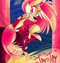
2. Jayjay

AAAAAAAAAAAH! MY EYE-- yeah, I'm not doing that joke again.
Look, I liked Jay in the Die Young video. Her colours weren't as saturated and they worked well together. Everywhere else? Not only do her colours clash terribly against each other, with a few exceptions, her colour pallet is always so bright it's actually painful to look at for more than two seconds. Her design in Die Young was just fine. It communicated exactly what it needed to about Jayjay. Not to mention it used contrasting colours in a way that was nicer to look at. Lesson here kids? Jay doesn't need a loud design. She needs and effective design.
Also, any Dollcreep fans who try to come out of the woodwork to say shit along the lines of "Dollcreep did it sooooo much better "
....no he didn't. Get off my front porch, you wannabe edgelords. I'm the non straight edge Lord of social ineptitude here!
And number one goes to......
-----------------------------------
1. Whitney
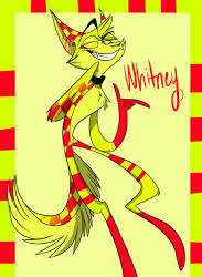
.....you know, if I didn't already use the Nick Cage joke already, I'd be hamming the shit out of it rn.
Look, I wasn't sure if I wanted to keep this dude on the list, since unlike the others, I dunno if vivz is still using him, and I didn't want to go after a character she may have abandoned, BUT JESUS ALMIGHTY.
This design actually hurts my head when I look at it. Take everything I said about Jayjay and stick it here, except times 100! The colours are far too bright, and clash horribly. ..to quote my buddy, @imviotrash when they first saw him, "What even is Whitney? "
I'll leave so I don't need to look at this much longer, but as usual, tell me what you think!
I apologize for wasting your time.
-ATOUN
Ps. Let me know your favorite or least favorite zp designs! I'd love to see what others think!
10 notes
·
View notes
Text
Weekly reflection 13-19 May 2018
I spent the weekend working non-stop on finalising all of my pinhole photographs so that they would be ready to be sent to the printers on Monday. Unfortunately, I underestimated just how much time it would take to clean all of the dust and scanner glass scratches off of the photos, so I wasn’t quite finished on Monday. As a result, I spent our 1:15-4:30 half-day in the studio finishing that up. I also decided to resize them from 5x7” to 4x6” for financial reasons, as 300 4x6” prints are only 10p each whereas 300 5x7” prints would be 21p each. Also, as there is a possibility that I might try to display all of the pinholes (both the positives and the negatives), on the outside of the camera obscura, it made more sense space-wise as well.
By the end of the day on Monday, I was able to print all of the images out onto A3 printer paper so that I could see 1) how they fit when simply plastered across the obscura, 2) so I could begin to get an actual visualisation of what they look like on the camera obscura and 3) so I could begin to assess and consider how best to display them for the exhibition and 3) So I could finalise which images to expose onto silk screens.
What I learned by doing this is that the wallpaper effect, whilst effective, also needs to be curated in a much more thoughtful manner than simply slapping them up – not that I really thought that would be an effective approach, but I thought it was worth a shot.
Anyhow, because of this discovery, I have decided that I definitely will not try to display all of the images. I need to see how they look and need to think about each individual portrait in terms of aesthetics, meaning and how they relate to my new theme of deterioration and fractured memory. Additionally, I also need to bear in mind the fact that there will be a lens poking out of the front of the Camera Obscura. As such, thought is required regarding how the lens will work alongside the pinholes that I eventually choose to display.
On Tuesday morning, as I was on the bus, I suddenly had an idea about how best to approach this…
I thought that it might look rather interesting to display the images in a smaller to larger spiral or simply an unorganised (but organised at the same time) expansion with the obscura lens as the centre, acting like an eye, which is exactly what a lens is, after all. How does the eye connect to the brain and how does the eye connect to our brain and how does our brain process what it sees? How do those images get stored? Why do some of them stay so poignant and strong whilst others fade away to nothing? And why do some of those images/memories suddenly reappear from the long forgotten ethers? What are the triggers? Why did some of my mother’s memories from her childhood and her time married to my father seem to stay with her until the very end whilst memories of myself and the rest of her children vanished into nothingness? This brings to mind a quotation from Margaret Atwood’s “Cat’s Eye” that I have thought about quite a lot over the past few years:
“You don’t look back along time, but down through it, like water. Sometimes this comes to the surface, sometimes that, sometimes nothing. Nothing goes away.”
That last sentence - “Nothing goes away” makes me think... Sure, but that doesn’t mean that memories, like time, resurface with true accuracy. Things often come back fragmented, twisted into a mixture of truth and fabrication, but we think that we are probably being accurate, even when we know that, logically, memory recall is rarely perfect and as such, inaccuracy is to be expected. We humans are so skilled at fooling ourselves, aren’t we?
Anyhow, back to Tuesday... I arrived at the college and began the day by printing out the four A3 images that I chose to convert into bitmaps for silk screens onto acetate. As there were no learning assistants available to expose the screens for me, I exposed the screens myself. I had spoken to the head learning assistant on Monday, and suggested that I do so when they told me I would need to wait until the afternoon to have them exposed by them.
The learning assistant told me that it would be alright for me to do the exposures myself given the fact that I have been present for so many tutorials about how to do it due to the fact that I have been working in the print room, and because I had been around for so many tutorials have coached several other students on higher-level courses (as well as one of the artists in residence) through the process from start to finish.
Despite being fairly certain that I would do just fine, but given that I had never done it before, I approached the exposure process with caution and decided to expose just one screen all of the way through from start to finish – exposure, cleaning of the emulsion, drying of the screen and a short run of test pulls to be sure it had worked out. The result was good, so I went ahead and did the next three in one fell swoop, exposing the screen one after the other and storing them in the cupboard until the cleaning stage.
They all turned out - success!! Now, if only I had had learned how to coat the screens with emulsion… Actually, given the demand on the limited supplies, it’s probably good that I didn’t learn how to coat the screens with emulsion because the temptation to do so would have been very strong, especially on Wednesday when I discovered that the screen I used for my self-portrait wasn’t properly cleaned by the people who are supposed to clean the screens, and as a result had the ghost of someone else’s work on one side of it which was very annoying because there are no other screens that I can use, nor is there enough time even if there were.
Anyhow, I ended up pulling prints from 8:30 AM until 5:00 PM on Wednesday and then again from 8:15 AM until 8:30 PM on Thursday. I was very into what I was doing and forgot to take breaks. As a result, the physical toll of what I had done was very apparent on Thursday evening when I discovered that I could barely sit down in the car on the way home. Whoops!
The negative physical aspect aside, I at least think that I might have a couple of useable images for the exhibition… hopefully, anyhow. I have brought all of the work home with me so that I can give it all a proper go-through in private and away from the chaos of the studio. That, and having the work out of the studios during hanging week when the painting and sanding is still happening is far safer than keeping them at the college as there is no chance of them being ruined if they are not there. Seems like a logical idea to me at any rate.
Which brings me to Friday - I still needed to get the hole drilled for my camera obscura, so with the whole “measure twice, cut once” idea in mind, I found a compass and re-drew the diameter of my lens on paper. The fit was very tight, but I had my Dremel with me to sand it out a bit to make it fit properly. I then drew the final, 71mm circle on the side of the darkroom.
As I waited for the required power tools to be acquired from the woodworking department, I took the opportunity to dismantle the inside of the darkroom. I then applied spackling paste to the holes that were created by the screws and eyelets that I used when it was still in darkroom mode. The lecturer who was helping me drill the hole came around noon to begin drilling out the hole. Unfortunately however, the jigsaw that the woodworking department gave them had two dead batteries, so we put them on charge and went to lunch. When I came back from lunch, the hole had been cut – magic! I then donned a mask an goggles and sanded the hole with my Dremel until the lens fit snugly.
As I had previously feared, there was not enough light despite the fact that I was using a lens, so I went to the equipment room to check out this odd, 3000 lumens LED light that the college has available for checkout. Alas, even with the additional light, it still was not working.
I returned the to the equipment room and began a search for a frame that I could use for my Plan B - which is rear projection.
After finding a frame, I made a screen from tracing paper and went into the darkroom to test it. To my surprise, I found that the image was only in focus when it was just a few inches away from the back of the lens, so I decided to repurpose the lid of one of the pinhole cameras that I made and cut a square out to create a screen. The first attempt with the box lid was too close, so I used the deeper, bottom side of the box which was perfect.
#Final Major Project#FMP#Weekly reflection#ual level 3 foundation#FAD3#DPFAD18#Art Student#ArtStudent#Crunch time#Edinburgh College#EdinburghCollege#UAL Awarding Body#UALAwardingBody#Photography student#Screen Printing#Screenprinting#Dremel#Exhibition preparation#Camera Obscura#CameraObscura
0 notes
Last Seen Blogs