#haaland is NOT being subtle
Text
Part 1

Part 2

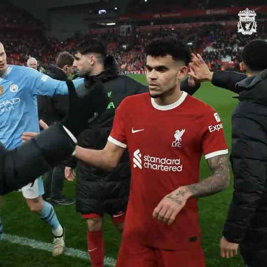


#haaland is NOT being subtle#staking his claim#old bestie vs new bestie#that clench at the end..#poor trent#trent alexander arnold#dominik szoboszlai#erling haaland#livmci
159 notes
·
View notes
Text
The emergence of Neo-Realism, Film Noir and the importance of Perspective: Bicycle Thieves and Call Northside 777
By Jack Muscatello
With rapid changes in Europe following the Nazi’s surrender in 1945, cinematic movements worldwide began responding. An interesting parallel emerged between Italian and American cinema, which mirrored each country’s location to the war. In Italy, the scene was much more chaotic and unknown. With the fall of the Axis Powers, a sudden gap in power contributed to economic hardship, experienced firsthand throughout the country. Italian cinema, likewise, became raw and personal, focusing directly on characters in despair who often turned to crime as a means to attain a marginally better life. In the US, however – victory was apparent, and thus the cinematic landscape was typically disconnected from any suffering at all. Characters were outside parties in crime conspiracies and mysteries, with the luxury of hindsight at their fingertips. No two films encapsulate this dynamic more than De Sica’s Bicycle Thieves and Hathaway’s Call Northside 777, both released in 1948.
In the midst of economic unrest and social instability, Italian filmmaker De Sica used the story of Bicycle Thieves to hone-in on a small neighborhood in Rome experiencing the gap left behind by Mussolini’s tumultuous collapse. As a means of representing the large population of displaced and struggling families in Italy, De Sica placed Antonio, Maria and Bruno at the heart of a narrative of misfortune, mischief and the art of “wrong place, wrong time”, which came to summarize many Italian “realist” films of the late-40’s. The oddly slapstick style of De Sica’s presentation of Antonio’s bike being stolen, along with the chase that follows for the rest of the film, matches an industry-wide attempt at connecting with more simple emotions in the midst of difficult subject matter. Though this effort had mixed results, the aptly titled “Neo-Realist” style embodied by De Sica and other filmmakers of the time touched on the daily struggles of the average family in a way seldom seen before. The surprising blend of humor and dark themes allowed the story to become more digestible, “… where De Sica’s clumsy characters tend to be portrayed in similar clown-like terms, but it is in De Sica’s own works that Vidor’s conflicting view of urban modernity comes to the forefront, in particular… in the irresolution of the unemployed bill-poster in Bicycle Thieves… these are characters who fight with a feeling of uncertainty, discontent and resignation” (Haaland, 42). For De Sica, moments of subtle humor work in his favor when showcasing Antonio’s descent over the course of the film. This harkens back to the idea of Italian Post-War cinema as highly personal, directly tied the character’s frame of mind and discontent with their place in the world. Opposite this exists the American philosophy for Post-War storytelling – removed, dissociated from the characters at the center of the conflict, and much more objective in its view.
At the helm of this stylistic endeavor is Henry Hathaway’s Call Northside 777, which observes a previously settled murder case in a new light, helping pave the way for a proper and truthful settlement of justice in a decision made at the height of Prohibition. In contrast to De Sica’s personal and subjective view into Antonio’s thoughts and perspective, the character P.J. McNeal is an outside observer looking back at the murder case with the convenience of hindsight and a mountain of old evidence. As America (socially and on the Home Front, at least) was largely isolated from the war effort, McNeal is over a decade removed from the case; and though he becomes emotionally attached to Wiecek’s innocence over the course of the story, his social status and personal life have not been impacted by the murder until now. This began a steady argument at the time for the meaning of “Film Noir” – is it about the criminals directly, or can it also be about the crimes in general (including those seeking to catch them)? For some, the film embodied a dissociated noir style, as, though it had the trappings of a noir film, its characters did not fit the bill for classic noir archetypes. To summarize this debate, “… there are differences between the two series. To begin with there is a difference in focus. The documentary-style picture examines a murder from without, from the point of view of the police official; the film noir is from within, from the point of view of the criminals” (Borde and Chaumeton, 20). Hathaway’s documentary style is the particular focus of this debate, as it very much centers the film in the “realism” genre convention. This, ironically, places Call Northside 777 closer to De Sica than the noir classics of the time, given its more authentic and less flashy presentation, much like De Sica’s work in Bicycle Thieves. However, the disconnect between McNeal and the case persists as a separation between Italian Neo-Realism and the “realist” films in Hollywood. The industry was still “Hollywood”, after all, and thus did not possess the same in-depth personal vantage point that De Sica and others in Italy experienced first-hand after the war.
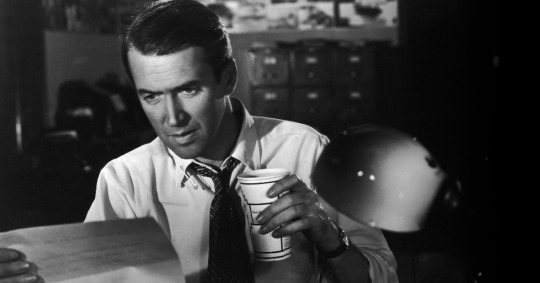
In this image, P.J. McNeal sits at his desk, more than a decade after the murder case was settled, examining evidence to find any proof of Wiecek's innocence.
0 notes
Text
Designing for Authenticity: How Four Progressive Minority Candidates Go Bold to Energize Their Campaigns
Originally published on the Campaign Workshop’s blog on October 1, 2018.
A decade after Obama’s historic win broke convention by galvanizing millions of disaffected voters to believe “Yes, We Can,” not many political candidates, from high-profile to local, have dared to be so visionary. Most candidates prefer the trite-and-true approach where their personality tends to take a backseat to a candidate’s level of patriotism in a splashy array of color and pedestrian stars & stripes motifs.
With the public’s distrust in government at a historic high, politicians should take note of the success of iconic brands like Coca-Cola, Nike, and Disney, who got hip to the success that comes along with staying true to their brand. In an era of information overload, being more thoughtful about a brand’s expression can go a long way in sustaining their powerful connection with audiences. Four progressive minority candidates use design to create dynamic campaigns that exude a fresh authenticity to set their bids for public office apart.
The Game Changer | Alexandria Ocasio-Cortez
The fourth-ranking Democrat in the House of Representatives and powerful 10-term incumbent, New York Rep. Joe Crowley, was out-hustled and out-maneuvered by Alexandria Ocasio-Cortez, a scrappy 28-year-old grassroots organizer/educator calling for a revolution. Hailing from working-class Bronx with third-generation Puerto Rican roots, this millennial political hopeful’s bid for the House was inspired by grassroots revolutionaries and political activists like Dolores Huerta and Cesar Chavez.
New York-based creative agency Tandem adopted this inspiration, ran with it, and fashioned it into a revolutionary-esque aesthetic bent on connecting to voters eager to shake up the establishment. Ocasio-Cortez’ natural presence is captured in photographer Jesse Korman’s portrait of her gazing upward with hope and optimism sparkling in her eyes as a true picture of positive, progressive change. Her self-assured gaze brims with cool confidence advanced of her years and informed the decision to craft the logo and typography at a forward-leaning angle. Ocasio-Cortez’ thoughtfully nontraditional color palette began with the Brand New Congress, the political action committee that supports Ocasio-Cortez. Its core hue of purple is also represented in her hope for bipartisan cooperation in red and blue coming together. Yellow aligns with the theme of positivity and excitement, while blue falls in line with Democratic tradition.
Being female, of Latino heritage and green to elected office — Ocasio-Cortez’s campaign’s DNA is embedded with her youthful exuberance and unapologetic appeal to multiculturalism from the inclusion of bilingual text in all-caps for legibility-sake to the effective speech bubble that frames Ocasio-Cortez’s long last name in an easily-recognizable shorthand reminiscent of Obama. This November, Ocasio-Cortez could be the youngest woman ever elected to the U.S. House of Representatives, if she goes toe-to-toe with Republican nominee Anthony Pappas in the general election and slays.
The Native Hopeful | Deb Haaland
After amassing a war chest of funds and defeating her five rivals two-to-one, Deb Haaland is well on her way towards being the first Native American woman elected to Congress in November. The former state Democratic Party chairwoman doesn’t shy away from incorporating powerful symbolism native to her heritage and community into her campaign branding.
With New Mexico’s ongoing troubles with brain drain, poverty, and income inequality hampering the state’s progress and year-after-year poor standing in national rankings, Haaland’s campaign stands out like a bright beacon of hope in a vibrant palette of calming turquoise and optimistic yellow. Incorporating the Zia sun symbol is an ode to Haaland’s Indian name and voters will recognize it from New Mexico’s flag. Representing the circle of life and perfect friendship among united cultures, such potent symbolism is a testament to Haaland’s ongoing defiance to the Trump administration while emphasizing her intention to defund the Immigration and Customs Enforcement agency.
A single mother who worked her way through law school, Haaland’s story is relatable and not only unites the tribal community behind one voice, she also resonates with a broad swath of voters. Native American disenfranchisement is an ongoing challenge in other states. With an ally in New Mexico’s Secretary of State Maggie Toulouse Oliver, Native Americans’ right to vote in the state is unhindered. Positioned as a welcome change on the horizon of change, Haaland’s “candidacy could finally give us a voice on the inside,” says Tara Gatewood, a member of the Pueblo of Isleta tribal community and Native America Calling radio host. “For us, that’s critical.”
The State’s Fixer | Spencer Danner
After nearly two decades, Nebraska’s incumbent Secretary of State John Gale retires from office this term and Spencer Danner’s robust campaign positions him as the candidate best suited to shake up the status quo. Standing out from the usual sea of red, white, and blue, Danner’s campaign bid for Secretary of State infuses the staid, oft-overlooked office with energy and excitement. Coupled with an elegant, attention-grabbing script, the delightful mix of typography in the state’s hues of gold and navy communicates what Danner will bring to the office in a beautiful and approachable way.
Featured in three engaging portraits framing Danner at an optimistic angle that captures his charismatic presence in a way that made Obama’s Shepard Fairey poster so popular, the overall look is a fresh approach to political branding that is unmatched in typical elections. As Nebraska’s state ambassador to the nation and the world, this office serves as the business arm of the state and is involved in everything from election oversight to youth civic engagement.
For offices like this one that doesn’t garner much public attention, Danner’s campaign is the perfect opportunity to educate voters on the important role Secretary of State is to Nebraska’s affairs while showcasing a vigorous candidate who will breathe new life into its mission.
The People’s Champion | Carlos Menchaca
As the first Mexican-American elected official in New York and Brooklyn’s first openly gay office holder, Carlos Menchaca is a trailblazer. Representing Sunset Park, Red Hook, and several other south Brooklyn neighborhoods, the young and energetic city council member is a tireless advocate for immigrant and worker rights, early and adult education, and a more progressive New York.
Menchaca’s infectious passion for his work and natural charisma is reflected in the typeface choices which convey feelings of approachability and friendliness. Grilli Type’s Walsheim, a midcentury sans serif with subtle art deco sensibility, helped to balance out the checkmark, a nod to Menchaca getting things done and the only visual carryover from Menchaca’s 2013 campaign. Inspired by the area’s notable vistas, the sunset-strip motif serves as an ode to Manhattan’s panoramic views and beautiful sunsets. Due to his sheer dedication to the revitalization of Brooklyn’s waterfront on the local level, the symbolism works to Menchaca’s advantage.
After championing the needs of battered Brooklyn neighborhoods in the wake of Hurricane Sandy, the community began to view him as a trusted ally who advocated for their welfare when the rest of the government ignored their needs. That unwavering dedication paid off in dividends with a 20-point margin win in the primary. A success that helped Menchaca snag a second term after securing 80% percent of the vote in the general election.
Conclusion
Political branding is delicate process prone to missteps and mistakes. In the wrong hands, one bad move or not planning accordingly can spell a campaign’s doom and often, the end of a candidate’s career. These four minority progressive candidates, from local to state-level campaigns, chose to stray from the patriotic pack by putting their personal stamp on their campaigns. In choosing not to play it safe, this intention quickly set them apart and introduced them to a new swath of voters still hungry for change and to be heard. These trail-blazing candidates are proving to their constituents that it’s not elected office that makes the candidate, but the other way around.
1 note
·
View note
Last Seen Blogs

dudewithabook
Untitled

zilluzion
zilluzion

k0dster
⋆ ݁ 𖥔☽𝔎𝔬𝔱𝔞☾𖥔 ݁ ⋆

skywstuff
caua

the-crustation-sensation
˗ˏˋ𝕿𝖍𝖊 𝕽𝖊𝖉 𝖕𝖑𝖆𝖓𝖊𝖙