#i really wanna do actual redesigns of these girls and not just random sketches
Text
Personal opinions and general character design critique regarding the Nymphs from Rayman (spoiler: they all suffer from having same face/body syndrome and the designers being too horny to consider other design elements)
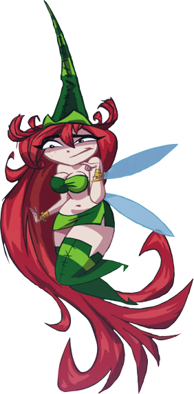
Betilla: I feel her origins redesign was a downgrade from her whimsical style in the first game, but I also do understand why they wanted to change her, as origins was meant as a reboot of the franchise and they wanted Rayman to be the only limbless in the Glade of Dreams. But since origins ended up not being a series reboot (with its plot only existing in code) and Rayman having skins/costumes who are meant to be different limbless characters anyways , changing Betilla drastically was already meaningless in the long run , much less the choice to make her be a basic hot nymph
Outside of it being impossible to Google her name in front of family , I personally don’t mind how she looks in Origins as the red hair contrasts really nicely with the greens, if you really wanna push some symbolism imagery here you can make arguments the red + green is meant to be reminiscent of flowers or berries. Ultimately though it is just a green bikini outfit with thigh highs and the only real connection to her role as the nymph of the forest/jungle area of the game is the colours, and maybe the odd stitch work pattern
Which is a bit of shame as you can easily replace the blue stars of her old design with an actual star-ish looking flower called Bletilla (literally one letter off from her actual name) or other flora
I don’t think the issue was they wanted to give Betilla a redesign that had sex appeal , I just think they went in the wrong direction with it. Considering that she played a large role in the old educational games and she was a sort of mentor figure to Rayman (if not just straight up his mother depending on one’s headcanons), they could’ve given Betilla a personality and sex appeal by making her a hot teacher type character (who may or may not count as a milf), hell give her signs of age like small wrinkles to really get the point across she’s older than most of the player characters, and she’s aged like spicy fine wine
Her design in the first game is adorable while giving her the vibes of a mature fairy god mother type mentor, but I don’t think it would work in the more modern Rayman games without some updated tweaks. It is pretty though and does has more personality than her origins design, and the other nymphs for that matter

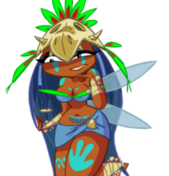
Holly: I like that there’s some actual details on her and some colour variation compared to her sisters, even if she’s 3 out of 6 nymphs whose main colour is some shade of blue
Besides giving her an outfit that isn’t a skirt and bra, I think her design could better reflect that her domain is the desert of dijiridoos by having some musical elements to her design. It’s kinda odd her tattoos/body paint (which do look good on her and her skin tone) don’t reference musical notes at least, wasted opportunity there
I have this issue with Edith and Annetta as well, but I’m a bit confused about why dead animals seems like a popular fashion choice for these ladies , especially since (in the origins game) none of the nymphs are shown as fighters (not saying they’re incapable, the game just doesn’t show them as such) and we’re not giving lore hints about it? I’ll talk more on this issue when I get to the other two , but it’s odd that Holly’s domain is populated by birds and she’s wearing a bird skull
Was it a nightmare and she kill it? Is it a beloved pet and she couldn’t part with them even after death? 🤷♀️
I can’t really think of any alternatives for her or the other two animal hat sisters atm, but at least it’s looks badass even if it doesn’t do much personality wise, so points for looking cool at least
Edith: Edith I think is the worst design of the sisters , hands down, no competition. I mean , what is there to really say about her?
“Oh we have a level based around a combination of spicy food and ice drinks with dragon butlers , how should we design this chick?”
“Just put her in red with a lizard hat”
Almost nothing about her design reflects her domain besides that she’s blonde and wears red , and that’s only half of the domain she’s meant to be part off. Her outfit pattern could’ve at least have some reference to the ice levels, or give her literally anything to connect her to those ice levels
I also don’t like how her hair is styled, the colour is fine but the shape looks ugly
Incredibly morbid Edith walks around with a dead butler on her head, especially considering the final boss/king of her level is also a dragon. Unlike Holly and Annetta, I can’t even give Edith credit for looking cool because it’s just more red on a very red and bland design
…… do you think Edith uses her corpse hat as a hand puppet?

Annetta: While I think it’s a weird choice to have nymphs of nature walk around with corpse head gear (much less ones of their domain’s general population) I think Annetta is the most justified of the nymph sisters to be wearing a hat made of a dead animal
Considering that her domain has a notable fishing population and she’s already dressed in fish scales, Annetta wearing a fish skull does actually contribute to showing the lore of her as a character and her connection to her domain. Unlike Holly and Edith , I don’t need to come up with some theory about their fashion choices when Annetta’s reflects already existing lore in origins (what little of it at least)
I personally do think the outfit looks ugly and plain uncomfortable, but I will give this design some credit for having one of the more visually detailed designs by virtue of her scales alone, and it actually makes sense for the nymph whose domain is the literal ocean to be in a skimpy outfit, even if her shell bra has to be glued on to her boobs
Unlike Edith’s outfit colour which is just red, Annetta’s has various shades of blues and teals that are reminiscent of the sea. It’s pretty I like it

Helena: Much like Edith there’s not that much to say here but what I can say is mostly positive
Helena’s a pretty standard design of “blonde chick in cool blues with white fluff details” and yeah that’s generic usually, but here I really like her. I think it’s how the fur and cloth looks textured along how her hair front is styled that makes her incredibly cute to me
Yeah, Helena is a simple but cute character design
Weird that a mountain nymph who has to live through cold weather wears a skimpy outfit with her bare thighs out , but I’m gonna assume that’s because she , much like her sisters, was designed to be sexy first and given aesthetics after they made the body model

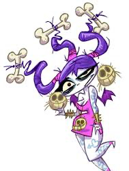
Fée de la Mort/VooDoo Mama/Big Mama: As cool as she looks, when compared to both her monster form and the other nymphs , you can tell she wasn’t planned to be one of them, especially when you look up Mamma Hite
I bring that up because while Fee has a good design, she is also a visual metaphor that reflects Origins’ identity: a failed series reboot whose plot was scrapped in favour of goofy extremism (or sex appeal in the nymphs case)
So about Fee’s actual design: I personally don’t like the pink used on her and would’ve liked her Nymph form to reflect the monster form besides the hair
probs to the fact she’s the only nymph with her own pose which already gives her a lot of personality , but the combination of her tattoos, bone jewellery and her baggy looking eyes really sells the fact she’s from the land of the livid dead and thus sticks out amongst the other fairies, even if you ignored the bat wings she has
visually she does work as a undead fairy of the underworld who likes to rock and roll, so job well done with that
I kinda do wish they stuck with the frog though

#rayman#Character design#Rayman nymphs#betilla the fairy#i really wanna do actual redesigns of these girls and not just random sketches
15 notes
·
View notes
Last Seen Blogs
slxxx03
xoxo individuality complex

zanephillips
chaotic

lxrx-m
The Artefact Archive

redkillaoficial
RedkillaOficial