#i would like to thank krita's perspective tool
Text
Tuesday Again No Problem 3/5/24
Pretty fallow week, but I was able to surprise myself with a few things. Rain World dominates this week's roundup, because I have brainrot (ha ha).
(I know I have a couple of new followers so I'll explain- this is a weekly media roundup series inspired by @girlfriendsofthegalaxy's post series of the same name.)
Anyway...
Listening
Mostly the Rain World soundtrack, again. The music is surprisingly good at helping me focus.
youtube
Reading
Fallow. :[
I'll get back to Ancillary Justice soon, I swear...
Watching
Mostly fallow, except for the occasional Rain World video.
youtube
Playing
Fallow again, unfortunately. I need to get around to finishing Artificer's playthough. Then I think I'll either move on to Hunter or Saint. I'm putting off Saint because I know it will be difficult and make me sad, but I would like to play it eventually. :,]
Making
This is the section that actually contains interesting things.
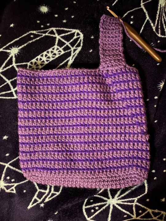
My Five Pebbles amigurumi is still on hold, because I'm busy working on a tote bag that I'm going to gift to a family member. Nothing too crazy.
The thing I'm happiest about is that I seem to have my drawing groove back, at least for now. I'd like to ride that wave as long as I can.
Earlier this week I was inspired to draw something based on my Rain World OC, Three Stars Above Clouds, in an attempt to explore their characterization a bit. What started as a simple sketch quickly turned into something more complex than I was anticipating, haha. Here's some closeups, the whole post is here.


In the process I got a bit of practice drawing landscapes, something I don't do often. I'm definitely not amazing at it, but I'm doing my best to learn.
I drew this in my sketchbook, inked it, and scanned it so I could color it in Krita. In the process I had to draw the perspective lines by hand, and I only learned after the fact that Krita has very versatile perspective drawing tools. Oops. It was worth it for the learning experience, I suppose.
People also left some very nice comments on this post, and I'm extremely grateful for that. I'm glad that people are interested in the things I make.
I'm working on another drawing that I'm going to post soon (probably later tonight). I'm happy to be drawing again; I feel like I was in a very bad year-long slump.
...
That's it for now, I'll check in again next Tuesday. Thanks for reading!
7 notes
·
View notes
Note
Hiya, just saw ur tags about using Procreate and I've been considering getting an iPad for art, would u recommend it / what kind of iPad do u use ? :) Btw ur art is great, you've got a great eye for colour !
HI IM SOOO SORRY IT TOOK ME SO LONG TO REPLY I never get asks so I never check my inbox shfkjsjd im so sorry but thank you for the COMPLIMENT! That’s so funny too because I feel like color is my greatest weakness :0 NOW here’s my iPad info!!
I love procreate!! I have the iPad Pro- I would specifically recommend this over the others only because the apple pencil charges magnetically on the side and I have some friends who have issues with their pencil dying more frequently with the pen you have to plug in to charge. If you draw a lot I’d also recommend getting as much storage as you can afford because I had some problems with procreate crashing before I expanded my storage, but if you keep your files organized and clean out once in a while you probably will not run into this issue. ALSO! I got mine used for about $350 but even that was a steal compared to what I’ve been seeing them going for. So honestly don’t break the bank for this thang, i use it in my professional work and it was worth it for me, but i have friends who use it exclusively for personal sketches and such who really like the mini! It’s smaller and even easier to tote around :)
I’ve used a buncha different art programs- started out with mspaint and then the free vers. of krita (which I LOVE if you’re interested in learning photoshop, it’s very similar and in my opinion kind of preferable to use??) and I used photoshop for free in art school! And now I use procreate :) it just kind of allows me to work a lot faster because I don’t worry about files getting corrupted, and the interface is just very clean. I also love the sketchbook (page assist) feature because it keeps my thumbnails and doodles organized! It’s not as… developed as photoshop but I specifically love the perspective tool- used it all the time when I was learning- and the animation tool! I’ve made some funky little gifs and animatics with it. Aside from procreate there are other programs you can get for the iPad, I have a 3D modeling program and I think there’s even a version of clip studio paint? Plus I watch YouTube while I’m drawing lol. Split screen feature is great for keeping references open while you draw! I hope this wasn’t all too much info, but I’m not like. Super great at being concise. I like procreate lmao and thank u again for the compliment :))
4 notes
·
View notes
Text
Art Feedback Session - Spookydoesstuff


"Our task was to make a mock intro to a show using our own original stories, either ones we had in the past or ones we made in class. I used Adobe Animate, which isn't very traditional for art to begin with.
I wanted something dramatic and more anime-esqe (inspirations being Persona 5's 2D animation, as well as the Cowboy Beebop intro.
The render itself didn't turn out as high quality as I had hoped, but that's on me for not figuring out how to render in a higher quality. With my time crunch (I had put off working on this until I had 1 1/2 days left, on top of a project for another class.)
I feel this could have been better? But I'm satisfied with it. I just wished someone had said something, even just asking about my characters (I dont generally ask here, at least about these specific ocs, just because I've had them so long and I want to give out more of their story through context and art. But in that class no one had seen them before and I would have loved explaining their story better than just 'alien cats')"
-- Spookydoesstuff

So! Let's start with the good. The color contrast is lovely, the bright red against the monochrome is a classic high tension color combo that really sells the adversarial stress of the scene. The characters themselves each have their own unique silhouettes, which means if you just filled each of the characters in with pure black and then showed me their reference sheets I could easily identify which character is which. The line work here is very crisp and clear, which for animation lends very well to streamlining and simplifying things. Your style itself applies very nicely to an animation style, again, thanks to its general simplicity will make the whole animation process much easier than a more detailed or complex style or design.
When thinking of areas of improvement, the first thing that is brought to my attention is expression. With the four-eyed cat in the second image, at a glance it's hard to see he's furrowing his brow a bit and his current expression comes across more as a neutral expression than a concerned, worried, or frustrated expression. I would recommend here adding a bit of emphasis on the expression with the eyelids or eyebrows so that it goes into the general shape of the eye instead of just above it or add a stylized eyebrow so it is more visible against the dark fur. Due to the thin line art, the line that marks where he's furrowing his brow is hard to spot.
Your art would also benefit from expression through body language! Cats, in particular, are incredibly expressive through body language. The ears in particular here are showing no emotion- Cats when anxious, scared, or angry will pin their ears back. Perhaps a bit more emphasis on bristling fur too- in the nape of the neck and the tail. Fluffing of tails is not just fear, but also aggression when raised high or thrashing. When curved it's fear. The nervous cat in the second picture might want to be keeping her head a little lower, as nervous cats will duck down, especially if submissive. Of course, since these are not standard cats, you are welcome to take these cat behaviors and alter them to your alien culture's standards! Go wild!
Also, look into playing with the line of action a little more. Even with characters that are standing still, exaggerating some curves in their body will add a hearty dose of personality. Plus, look into the 'law' of stretch and squish- I use the term law here loosely, it's more of a guideline.
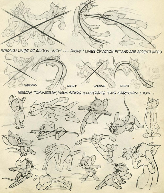
(Here are some image scans from a book called Cartoon Animation by Preston Blair, and there's a lovely tutorial on expressions from the comic Lackadaisy here!)
Next I'd like to mention the shading. There is a bit of an inconsistency between the way you shaded each character. Although lighting direction was ignored for style here, the particular techniques used for each piece should remain the same throughout each frame of an animation, each panel of a comic, or between related images in general. In the second photo, the highlights on the four-eyed cat almost looked like fur patterning, so maybe refining that highlight by making it a little darker would make it more obvious it was a highlight and not a change in fur color?
I think if you were given a little more time you would have managed with the shading, but still something of note to keep in mind for the future~
Finally I would like to address the environment... or the lack of it. The bright red background is lovely, especially in this grey scale-pop style of colors. My only issue is that it feels like they're floating in some red void- you have the darker red to denote the ground, but it doesn't feel very consistent with where the characters are placed and there's no shapes in the background to denote any kind of environment- no tree silhouettes, no building silhouettes, or any other objects that could denote where the characters are.

Above is an example from Persona 5 which kind of shows what I'm talking about. Looking at some perspective tutorials will actually show you a way you can manipulate the floor or gradients to help add some solidity to the ground. With this style I wouldn't even say you would need to add nearly as much detail to them as Persona 5's art- just some dark shapes and perhaps a gradient of sorts to give a sense of location to the scene would help.
Overall, wonderful job! My first impression was 'Oh hey this looks like something from Persona 5!' so you really got that feel you were looking for. You also immediately get a sense of relationship here- from an outsider's perspective with zero previous information on who these characters are or how they are related. You can clearly tell the four eyed cat is protecting the female cat in the back, and there's a sense of either accusation from the one-eyed cat or threat, and that the other two almost seem to be distressed as if they were once close to this character.
Keep up the good work, don't feel discouraged with the lack of feedback from your class. I really feel with a bit of practice in terms of expression and body language you can really make some great waves with your art! You have a great foundation.
In terms of art program recommendations, my wife and I both use Clip Studio Paint. You need the EX version for feature length animations unfortunately, but the PRO version is much cheaper and lets you do some very short animations however it is a very powerful illustration and comic tool as well. Krita is a totally free program that will let you animate as well and has a pretty robust illustration feature itself, but I'm not sure if it has anything specific for comic making.
A big thank you to Spookydoesstuff for being our first review and for being so pleasant to speak to! Please check out more of their art and their blog by clicking here to go to their tumblr!
6 notes
·
View notes
Text
of mice and artblock
So, midterms happened and I abandoned this blog for a while. But now I’m back, and I come bearing mice.
*
I’ve been really struggling with finding subjects I like to draw. I’m happy to work on skeleton studies until Judgment Day to better understand anatomy, but I know I need to balance “homework” art with “for fun” art, or else risk losing motivation for learning to draw -- and I’m so used to writing fiction at this point that no subject really appeals to me artistically unless it’s got 5,000+ words of story attached (or at least some narrative/character ideas, yanno -- something for my brain to pick at). The obvious solution is to draw concept art and characters from my written stories, but I feel really intimidated by that because I’m such a beginner artist that nothing I create now will do justice to the vision I have in my head.
I need art OCs and concepts – things that I will only draw art of, and have never written a story about. Stuff that doesn’t have to match a previously established, written story, and that I can change as I learn more and my skills improve.
I ended up drawing a bunch of mice.
This was initially just a whim. Human anatomy requires a lot of skill to pull off, especially faces and hands, but mice felt more beginner-friendly to me. Admittedly, I was going for a more cartoony style as opposed to photorealism, so if you’re looking at this from a realism perspective then these are pretty poor mice. However, I don’t feel ashamed of them, which I am taking as a good sign.
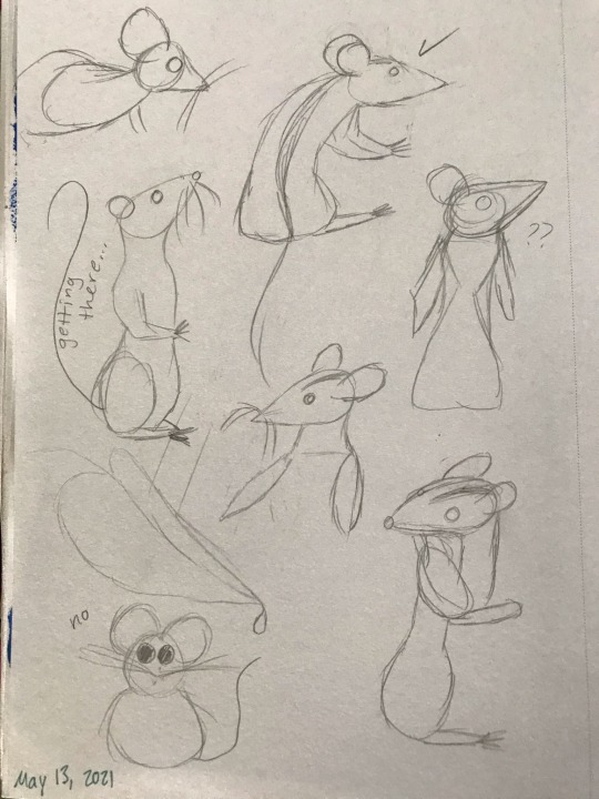
I kept drawing one mouse over and over. I ended up calling him Leo just because it was funny – “leo” refers to lions, but here Leo is just a little mouse. But of course, giving him a name (and a gender, incidentally) is the start of a story. Via a flight of fancy, I got it into my head that I wanted to do a painting of Leo trying to catch a big snowflake. I made some thumbnails of what I wanted the scene to look like, and then cut out a roughly 7 inch x 7 inch piece of watercolor paper from a big sheet that I had under my bed, sketched the scene in pencil, and then finished with watercolor pencils (and a white gel pen for the snowflakes). The process probably took 2.5 to 3 hours.
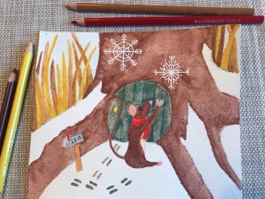
So, now the lore is that Leo is a mouse living in a little house in an old tree at the edge of the woods, and he wears a red scarf. I did not like this painting. It seemed over-saturated and the colors didn’t quite work the way I wanted them to. I ended up watching a tutorial on color theory, and decided to redo the painting using my newfound knowledge of color schemes. I used this color palette tool to get an idea of what kinds of colors would look good together, and settled on a complementary scheme with bluish green and brownish red.
And then, everything went wrong.
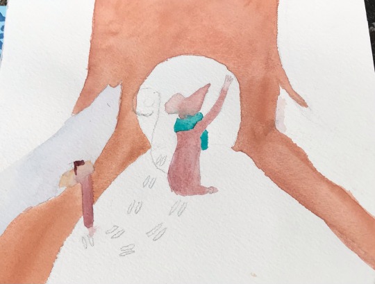
I tried to redo the painting, still working traditionally. I rushed the sketch because I was so eager to get right into working with color. This time, to avoid over-saturation, I used watercolors out of a pan rather than in pencil form. Mixing the colors in the lid of the pan took a really long time because I was so picky about shades, and because I continued rushing I didn’t allow the layers enough time to dry. Leo’s scarf (now green instead of red) bled into his russet fur, and the mailbox was the wrong shape, and I tried to erase a pencil line and created a dark blotch over an area that was supposed to be white with snow – and then I gave up.
I had downloaded Krita, a piece of digital drawing/painting software, a while ago, but hadn’t had any success using it because my desk isn’t big enough to accommodate both a laptop and my small tablet. Using my lap to hold the tablet was an exercise in frustration, and I knew so little about how digital art works that I just felt really overwhelmed and lost whenever I opened the program.
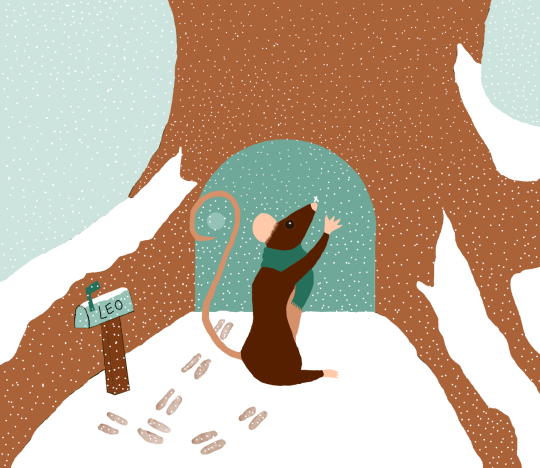
However, Krita (like most digital art software) has an undo button that I find very alluring, so I decided to try it again, now on a shiny new desk from Ikea that is actually big enough to support tablet and laptop together. I think just the space on the desk really made all the difference, but also I was determined to get this artwork of a mouse to a place where I felt satisfied with it.
I spent a solid 5 hours working on what ended up being a very simple colored drawing of a mouse catching a snowflake outside his little house. I barely blended anything at all, and there’s no light source that required me to shade anything – it’s just flat color. However, I really like these colors, and I think I did well (for an absolute beginner). I want to go back and add textures/shading to give an impression of depth, but I'm not sure how.
Leo – like all of my figures – feels really stiff, so I also want to work on gestures/studies of mice doing things. And, thanks to the popularity of mice as lab animals and pets, there are way more reference photos of mice than I expected! Most refs depict the house mouse, Mus musculus, but I did find the work of a wildlife photographer named Dean Mason who spent 15 years photographing harvest mice (micromys minutus).
Unfortunately, all of the prior artwork in this post I had drawn almost purely from imagination, and I think it shows. I studied two mice from photos in pencil, then erased the lines until they were barely visible and tried to do the fur texture in ink (with a dip pen, so there is some unevenness when the pen was extra inky).
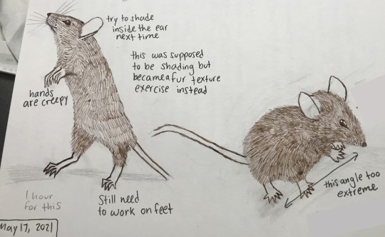
Left is my first attempt doing the fur texture. I was more cautious with layering pen strokes, so you can see the lines of strokes fairly evenly. Right is my 2nd attempt, where I was bolder with the pen. I like these mice more than the one I created in the digital painting; these ones (especially the right) feel more Beatrix Potter-ish, which is a vibe I like.
Do I want to go back and fix the anatomy in my digital art of Leo? Yes. I also want to take another stab at doing this piece traditionally, but this time, I'd go monochrome and try to do everything in brown. However, part of me is exhausted from drawing ten million snowflakes and does not want to relive that experience with a gel pen -- I've already done it once with a tablet pen, and that was enough.
I have a hazy, far-off goal of creating a comic of Leo having adventures with another mousy friend, but that’s so far in the future that it’s not worth spending time considering right now. In the nearer future, however, Leo’s friend might become a reality – I know he’s an albino mouse (name TBD) who either escaped from a drug-testing facility (I loved The Secret of NIMH movie as a kid) or else is a pet who was dumped into the wild by a human owner who no longer wanted him. Leo is outgoing and adventurous, and this friend is shy and cautious.
2 notes
·
View notes
Link
Hi guys! So, I decided to try my hand at drawing comics, and I ended up doing what I usually do. Which is, massively overcomplicate things, spend way too much time on the tiny details that would end up getting covered by text, and then end up nearly throwing my computer across the room because Tumblr decides that it doesn’t like my pictures.
Fuck you, tumblr. Fuck you very much.
(Also, anyone who knows a fix for the upload error thing? I’d appreciate it if you’d share it. I’d be extremely grateful!)
I spent a good week working on this, and it had been a while since I’d drawn in one-point perspective… so pardon any inconsistencies and glaring errors, I’m still learning. I feel bad, because I ended up tracing a photograph of a dumpster to get it looking right. But honestly, thank all that is good in this world for Krita’s line assistant tool. Enjoy!
23 notes
·
View notes
Note
Hi, i'm a guy trying to train myself and become professional, i just saw your work and really liked it so i wanted to ask you a question: What do you think is the best way to learn and practice : -Learning all the fundamentals one by one don't focusing on a subject in particular (like character design, environments, vehicles... ) - Or focusing on a subject and learning everything about it -Or maybe a mix of the two ?And also if you had 10h to practice how would you exactly do it ? Thanks :)
It mostly depends on your current skill level.
First, you have to decide what exactly do you want to do?... Character design or environment design or illustration or concept art? Pick just one, for the start. If you`re not sure, there are plenty of resources online for research to help you decide what suits you best. When you find which one you`d really enjoy working on, you`ll find the best tools for it and start (for me that's Photoshop & Wacom Intuos Pro Large - Paper edition), but you have other free software like Krita, Corel Paint/Draw, Autodesk, Art Rage, etc, and you can start with the smallest size tablet like I did- Wacom Intuos Small).
If you are an absolute beginner you can start learning the basics, like drawing random basic shapes using traditional tools such as graphite on paper, a sketchbook or similar. And do the same with your digital tools, try to draw the same things in photoshop.
If, however, you already have some experience, then you probably know what you want to do so you can focus on learning the software and get used to the tablet, collecting photo references, finding and trying out different brushes, etc.There are many free and paid online tutorials for everything you need and they can help a lot. Also, you can support artists by downloading their process tutorials, for example.
This is exactly how I did, which answers your second question with 10 hours practice. A lot of research, find what you love to do and practice daily. And I also asked a lot of questions to any digital art professionals that I could. I painted one portrait a day for almost a year and used my social media, especially my Instagram page, to share every day and keep track, sort of like a public diary. At first, I made direct copies, to exercise and get used to the software and the tablet without worrying about anything else (which is also something that can help), and then I tried to be creative and started doing more original work.
I`m sure, whether you are a beginner or have some experience, you can achieve a lot if you dedicate yourself to this 100% and work on it on a daily basis!
Good luck!
and please note that I only write this from my own experience and perspective, it doesn`t mean it the best thing to do or that its a rule of any kind, it just works for me.
5 notes
·
View notes
Last Seen Blogs

dutyandblood
Blood is everything

junjoumikorin
stay strong, mamiko(shiba)!
sootlikesapplejuice
dummb

mexcine2
Compelling Imagery
cgaquatics
Aquaticals