#let the accents fly having diversity is good stop being Northern about this
Text
.
#can some people PLEASE be fucking normal about southern actors speaking mandarin in dramas. on god#yes zeng shunxi has an accent. what about it. it's called being from a different region of the country#he's perfectly understandable and good enough to have been doing his own dubbing for years leave him alone#(granted. i can't hear his accent as much now because i'm used to it i think. but.)#complaining about cheng yi's accent tho is WILD like. he sounds quite neutral imo???#let the accents fly having diversity is good stop being Northern about this#also singling out the southerners like some northern actors don't also have to adjust their accents for their roles ffs#anyways this is incoherent but ugjfjfjdjsjsj#ashton originals
18 notes
·
View notes
Text
Euro 2020 jerseys, ranked and reviewed by group

Photo by Kirsty O’Connor/PA Images via Getty Images
These are what we’ll see when the best teams in Europe fight for a continental title
It’s been jarring when we consider that next year, there will be a World Cup without there having been a Euros the previous summer.
But that’s where we currently stand. The coronavirus pandemic stopped the entire footballing world in 2020, and the Euros were not the only casualty — but they may have been the biggest. Nevertheless, UEFA has decided to continue with their vision and carry out a bigger and improved European Championship.
Once envisioned as a grand celebration of its 60th anniversary, Euro 2020 has undergone a few notable changes. The biggest is that while it retained its name, it’s actually happening in the summer of 2021 after the Covid-19 pandemic forced it to be moved from the previous summer.
While the idea of hosting it in 11 different countries has endured, some of the specific locations have changed. The initial vision of having games played in multiple countries has undergone massive changes. Dublin, Ireland was set to host matches, but due to restrictions on attendance, they were removed as a host. Spain initially planned on inviting teams to the Estadio San Mames in the northern Basque Country. Instead, they’re moving those hosting duties about as far south as you can go in Spain — to the unused Estadio de La Cartuja in Sevilla.
But the grand vision — a tournament extending as far west as Sevilla, Spain and as far east as Baku, Azerbaijan — still remains. Teams are gearing up to play with the first match between Turkey and Italy set to kick off in Rome on Friday.
To fit the occasion, kit manufacturers are rolling out the best of what they have to offer. Some are beautiful, well-designed, and inspirational. Others need to be forgotten and sent to the dust bin of history located somewhere near the crushed hopes and dreams of the 2018 Germany National Team.
These are all my own takes. I’m reviewing them based on creativity, uniqueness, overall design, execution, and effort. I’ve bought a lot of kits in my day, reviewed a lot of kits in my day, and I try to find the best in each of them. I’ve even recently helped out a NWSL team with the launch of one of their jerseys, so if any teams in MLS or wherever out there want me in a focus group or to help with your jerseys let me kno-
*ducks flying tomatoes*
We’re going about this by group, because if I tried ranking them from 32-1 with commentary this would be a 4,000 word article.
So, let’s start in Group A.
Group A: Turkey, Italy, Wales, Switzerland

via FootyHeadlines
4. Turkey
These jerseys aren’t bad, but it’s something we’ve seen from Turkey before. There’s not much creativity Nike put in these kits, and so others who added more diverse details were put above this one.
3. Switzerland
Throughout this list, you will see me putting these Puma away kits toward the bottom. I do not like them at all. Having a random word mark in the middle of the shirt just naming the country seems lazy and uninspired. When you consider that they’re trying to symbolize the nation they play for, when their country crests already do that and are included in these kits, it seems unnecessary to exist. While I like the Swiss home kit, the away kit sinks it for me.
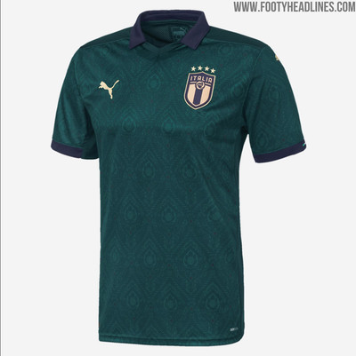
2. Italy
Again, this away kit is that Puma template and it’s awful. But, of all the Puma templates we will see here, this one might be the best executed. It hops the Switzerland kits because of Italy’s gorgeous third kit:
via FootyHeadlines
I’m a sucker for green and gold, so they slide up to No. 2.
1. Wales
Do I think these are the best kits on this list? Not necessarily, but they do have the least wrong with them. The sleeves on the home kit are fantastic and the green adidas stripes on the shoulder of the away kit tie in really well. Add to that Wales’s new, minimalist crest that was adapted after their last major tournament appearance, and I feel good adding it to the top of the list.
Group B: Denmark, Finland, Belgium, Russia
4. Finland
I’m a fan of the home kit. Incorporating the Finnish flag in the kit is a great way to incorporate some national pride into the shirt. I think the gold accents on both kits look great. But the away kit looks more like a Nike coaches polo than it does the away kit of a team making an appearance in a major tournament for the first time.
3. Russia
The home kit is an adidas template we’ll see later on this list and in our kit review for the Copa América. The away kit incorporates the national flag of Russia well, but the home kit (that doesn’t even incorporate a cool flag motif we see in the other template kits) knocks it down to third.
2. Denmark
The home and away kits are somewhat copy and paste from previous incarnations of Danish kits. Being red for the home, white for the away, and made by Hummel doesn’t come as much of a surprise. But what puts it at second for the group is the waveform graphic on the home kit and inside the collars of both kits. It’s the sound wave from home fans singing the Danish National Anthem before a game against Ireland in June 2019. That sweet homage to fans who haven’t been able to watch the team in over a year is a great nod to them and puts them here.
1. Belgium
Yes, the away kit is that same adidas template that Russia uses. The one thing I’ll give the Belgian one is the incorporation of two of the national flag colors on the cuffs of the sleeves. However, it’s No. 1 on this list because the red shirt might be my favorite home kit of the whole tournament. The paint brush-esque black lines add a cool texture to this kit and certainly stand out from other red jerseys we’ll see during this tournament.
Group C: Netherlands, Ukraine, Austria, North Macedonia
4. Austria
From one of the best kits at the tournament in Belgium, to one of the worst for Austria. The home shirt is nice, traditional and would normally see this team higher in this ranking. But the away kit is - to me - the ugliest jersey in the whole tournament. From the fact that it’s that awful Puma template, to the multiple little Austria crests in a style that went out of fashion in football kits after the 1994 World Cup, the black kit is a train wreck that shouldn’t ever be seen again.
3. The Netherlands
That sublimated lion on the home jersey is awesome, but the lines all over seem a bit over the top. The black and orange on the away kit looks amazing as well. Overall, a great effort from Nike that falls just short.
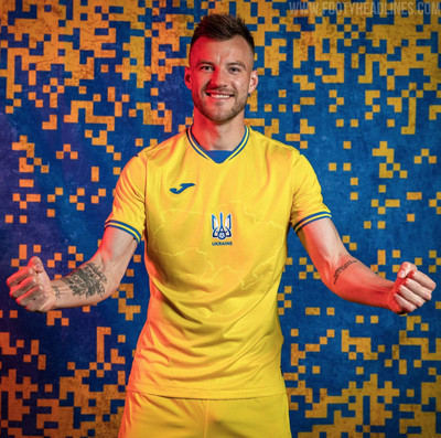
2. Ukraine
We were all set to post this list with Ukraine at third in this group. Little did we know the kits we THOUGHT were going to be worn were just a false front.
The two jerseys above are their away and third kits. I used them because in the press run for the kit unveiling, only Ukraine’s home jersey showed the whole front. That’s where the controversy comes in.
via FootyHeadlines
Look closely and you’ll see an outline of the map of Ukraine in the center of the kit. Anything stand out as being controversial? No? Let me highlight a part of the kit for you:

That part of the map on the kit circled in red is the Crimean Peninsula. If you recall in 2014, Russia annexed Crimea from Ukraine. The annexation and subsequent Russian invasion of the peninsula was met with international criticism. While the people of Crimea voted for their independence and then was adopted by Russia, Ukraine (along with most of the international community) disputed the legitimacy of the elections and recognized the land as Ukrainian.
Looking at the kit itself, I’m not a fan of putting the crest at an awkward place that makes the map look asymmetrical. If that moved to the upper left right over the heart, that’d be fine. The colors and accents are nice. But, more importantly, the sheer audacity to include a part of the country which may or may not be yours depending on who you ask is enough to put it at the No. 2 spot on our list.
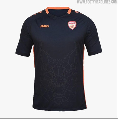
1. North Macedonia
Like their Dutch counterparts, North Macedonia also has the national team nickname, The Lynxes, represented by sublimated graphics. However, what puts them over the top is the fact that it’s clearer to see it on these kits from Jako. It helps that the home kit is a darker color than the Dutch orange kits. The motif carries over to all three kits North Macedonia has including this black third kit:
Group D: England, Croatia, Scotland, Czech Republic
4. Czech Republic
The home kit is very nice. The subtle lines on the front and dark blue collar and sleeve accents make this a great home shirt. However, the awful Puma template strikes again. In the pure epitome of laziness, this is the only shirt in the Puma template category that doesn’t have the name of the country written in its native language.
3. Croatia
Croatia’s home kits are always good and never change. The away kits, however, leave a lot to be desired. Their Nike kits from Euro 2016 were good and I loved their away kits from the 2018 World Cup. For some reason, these just don’t do it for me.
2. Scotland
Both kits look really sharp. I love the hoop pattern on the home kit and the sky blue color of the away kit looks amazing. Overall, well done from adidas for a Scotland team making their first appearance in a men’s tournament since the 1998 World Cup.
1. England
I’m not usually a fan of badges in the center of a shirt, but I think Nike got away with it in the home shirt. While it’s not seen here, the red numbers look really nice on the white background. The away kit seems really busy, but the design overall looks cool. I don’t like the fact that the World Cup winners star is the same color as both of the shirts, but it’s not enough for me to knock it down from No. 1.
Group E: Spain, Sweden, Poland, Slovakia
4. Slovakia
I know Slovakia hasn’t been to a lot of major tournaments recently, but I feel like I’ve seen this exact kit combination every single time. When I heard Nike were taking over Slovakia’s kit contract from Puma, I was hoping for some more variety in their color palate. But nope, white away kit, blue home kit. There’s red in your national crest too guys, you can use that as well.
3. Poland
They look good, but there’s nothing too special about them here. Sure, they have different collars, but is that really enough to diversify your shirt selection?
2. Spain
These are both nice looking kits. I like the pattern in the home kit and I like the bottom part of the sleeves on the away kit. It’s a great result from adidas, but there was one shirt that I thought put Spain in second place.
1. Sweden
Yeah sure, the home kit looks nice. The shirt itself is kinda boring but the collar and sleeves look really good together. Now, let’s talk about that gorgeous yellow-pinstripe away kit. It’s unique and simple at the same time. The stripes are small enough to make an impact, but not wide enough that they swallow the kit whole. Adidas did an excellent job on this shirt and that puts it here at No. 1.
Group F: Hungary, Portugal, France, Germany
4. France
This was the hardest group to decide, so let me be clear: I like all of these offerings. I have to pick the ones I like based on execution, effort, uniqueness, etc. So, I had to put someone in 4th and I went with France. The home kit looks really nice and that red stripe in the middle calls back to the 1998 World Cup home kit. But that white away kit seems pretty mundane. The two red and blue stripes on the side don’t make this seem any less like a white Nike t-shirt.
3. Portugal
I’ll be honest, I’m just not that big of a fan of that away jersey. I’ll give it points for being unique, but the size and colors of the stripes being backed by a mint green kit just don’t seem to work. At least Nike was able to give them a good home jersey to look forward to.
2. Hungary
Back in the Euros after a surprise run to the Round of 16 in 2016, Hungary comes out with some classy looking shirts. Their home kit has stripes inspired by the Danube River, which flows through the nation’s capital of Budapest. The away kit is clean, simple, and incorporates the colors of Hungary’s flag. Applause for adidas in making a kit the Magyars can be proud of.
1. Germany
Die Mannschaft went bold with their kit choices for this tournament. For the continental tournaments this year, adidas had the habit of having the cuffs of the sleeves tie in to the national flag (see: Colombia, Argentina, Russia, Belgium). For my money, Germany’s flag motif sleeves are the cleanest executed of the bunch. The pinstripes on the home kit look like they were drawn on with a Sharpie, so they lose some points there. But, that blacked out away kit wins it over for me. The team will have player names and numbers in white, which creates a stark contrast with the black stripes, badge, and stars on the shirt. Excellent execution here.
Let us know who you’re rooting for, and which kit you thought was the best, in the comments.
Jake covers Bayern Munich and German soccer in writing and via podcasting at Bavarian Football Works. He also reviews jerseys for SB Nation. He can be found screaming into the void on Twitter @jeffersonfenner.
0 notes
Last Seen Blogs

itmeansbutterfly
v.🌻

moonpeachmoth
Quantumplated

lonely3some
no one

lloydpark
Lloyd Park
lloydpark
Lloyd Park