tarasmediaportfolio-blog
john smith
my attempt at making a magazine
50 posts
Don't wanna be here? Send us removal request.
Last Seen Blogs
burxned
sweetest tongue, sharpest tooth
fabriceminel
Rat TOYS
choptop-vw
Untitled
queerlovesmerlinbbc
azqueeriphale
Photo
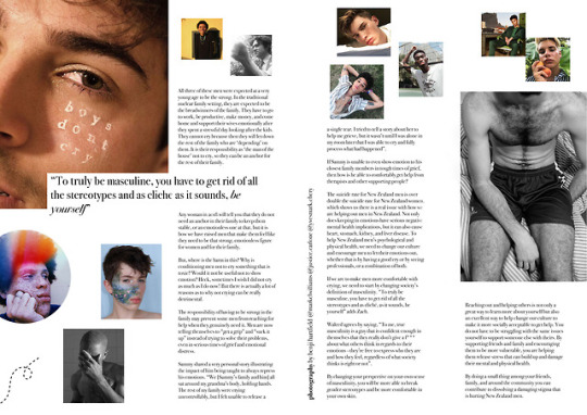
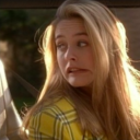
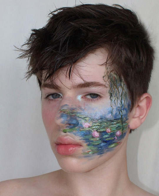
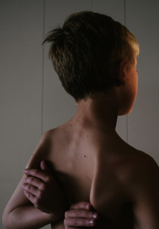
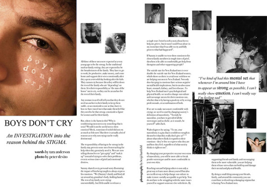
As you can see, these pages changed a lot from my digital dummy. I am really happy with the final outcome with these as I added a lot of my own personal touch to this page and got to experiment a lot with editing. I like the brightness of this page and I think it still flows well with my previous page. I think I used white space effectively to draw attention to the photos. I think this is also a very visually interesting page which may draw some attention away from the text but the text is also very easily readable and laid out neatly (despite the missions it took to get it perfect with me being unable to find the same font I used on my old computer). My margin is in a good place with credits for photos being used down the middle of the page which is a technique I got from renegade collective. I think the pull quote looks very nice on the left side covering the boys don’t cry photo. I personally think this magazine page looks very professional and is something that I would want to pick up and read myself. I think the photos on this page definitely target more of a younger audience due to the photos of more ‘feminine’ guys but I think using those pictures fit well with the conclusion of my article that talked about acceptance.
0 notes
Photo
Because of my computer issues I decided not to touch this with the fear of messing something up. I am already very happy with this so I’m not too upset about not being able to touch it. I think I used white spaces effectively and used a gutter. Although the white space below my headline is big, I think it’s necessary to prevent the magazine from looking too cluttered as pictures don’t really fit there and I don’t have much text to add. I think I used a lot of design features such as drop cap, gutter, margins, white space, photography, digital editing, bylines, etc. I am very happy with the final product
0 notes
Photo
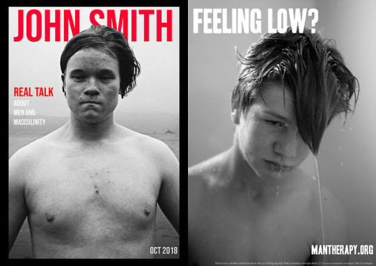
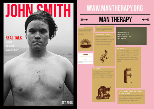
This is my final cover page and article. Due to me having computer issues I decided it was best to leave my cover article considering I only had a barcode to add, which isn’t necessary as some magazine are wrapped in plastic wrap with barcodes on them! I decided to use Benji’s photo on my back cover so that I wasn’t just screenshotting things from their website. I downloaded a font HEADOH for the font which is very familiar of other NZ mental health organisations. The dark themed photo + the question I think will draw those who really need help to the website. I chose mantherapy as I think they are a great organisation for those who are feeling low. In New Zealand thelowdown and depression.org aren’t great websites for educating those on what they’re feeling, how to fix it, or how to help it other than getting support from others. Although I think getting help from others is a good solution, it’s not the only solution and mantherapy does a great job of encouraging men to get outside, talk to a therapist, fix their eating and sleeping habits etc in a exclusively male space.
0 notes
Photo
To make this I screenshotted a rectangle from a border that I saw online and copied and pasted it to make the design shape I wanted, I did draw one line at the bottom of the loop
0 notes
Photo
(spoiler alert, still won’t be blurry)
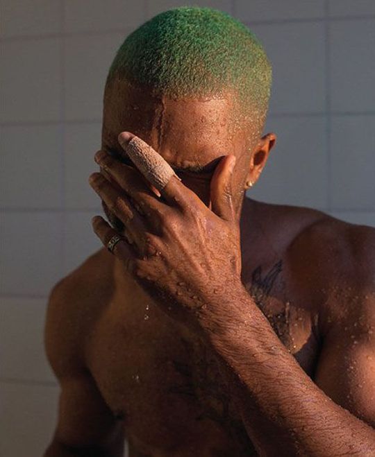
I changed this picture to black and white on photoshop and then added more magenta, green, and red tones to brighten up the picture a bit more so that it wasn’t so dark. Making it more grayscale’d made it look much better on my page than having it in colour as it didn’t fit with the rest of the images
0 notes
Photo
(won’t be blurry)
for this photo I flipped the photo as I had too many pictures facing the left and this looked better on the page when ti was flipped this way. I changed the background to a blueish colour that I took from the ocean, using the colour replacement tool, so it would fit better on my page as none of my other pictures had bland white backgrounds.
0 notes
Photo
(i promise again that it will NOT look this blurry when you print it out)
I edited this photo by using the elipitical marquey tool to crop it into a circle and flipped the picture horizontally. Then I went into adjustments and photo filter to add a cooler tone on the filter as the rest of my pictures were very cool toned while this has bright colours.
0 notes
Photo
(again tumblr zoomed in on this to make it more pixelated) in this photo I played with the exposure levels in order to make the picture a bit lighter as it was very dark on my magazine and did not fit with the rest of my pictures
0 notes
Photo
I edited this photo by adding a grainy filter on top to match the other photos in my magazine, it adds consistency within my page and it also looks pretty cool. To do this I went into filter and then add noise. (tumblr zoomed in a lot on the picture so it’s a bit blurrier than it does on my actual page)
0 notes
Photo
This is my front cover and back cover for my digital dummy. I think I made the right choice with the picture for my front cover as it is very striking. I put text to give further insight to readers about whats in the magazine and put October 2018 for my final hand in date. I also like the border around my cover as I think it makes it more professional and look more like a real magazine. I think putting the text behind his face also helps with this. I’m not so proud of my back cover as it is very rushed and is mostly just screenshots taken from another website. I tried to add more design features like the artwork (arrows) but I think I should also redo this. Some things I could add to my front cover is a barcode
0 notes
Photo
This is my third and fourth page for my feature article and my digital dummy. I am not very happy with this page, I ran out of time so wasn’t able to put a lot of effort as I would’ve liked and it is very much a duplicate of my old page. I definitely will need to put in more work to gain a higher mark, I’m not very proud of this page
0 notes
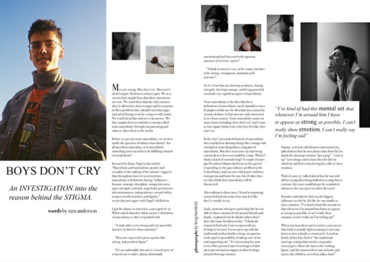
Photo
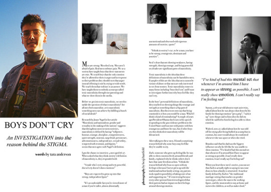
This is my first page for my digital dummy for page 1 and 2 of my feature article. I really like this page even though it is very simplistic. I was able to use a number of design features such as a drop cap, gutter, photographs, by line, pull quotes, and white space effectively. I think I did a really good job of making my magazine not cluttered, easy to read, included bite sized paragraphs. I also think my photographs that I got from Benji are very interesting and all have a similar colour scheme which makes my magazine flow together better and look like a complete piece. I think there is more work I could do on it such as adding page numbers
0 notes
Text
Difficulties
My laptop has completely died and after going to 2 different computer stores they both said the hardware was unretrievable. This means all my photoshop files and screenshots are all gone and all I have is what is on this tumblr and anything I have emailed to Mr Thrasyvoulou. This is very frustrating as I edited a lot of pictures so it will be hard to show the afters as they are minimised onto my magazine. I also may have to repurchase photoshop as this happened at the beginning of the school holidays so I won’t be able to do any work until I get it. I emailed Mr Thrasyvoulou who said I should leave some of my pages as is as there isn’t much I can do about it.
0 notes
Text
Design Conventions
For my magazine I plan to use
*Photographs*: I have gotten permission to use Benji Hartfield’s photographs as he has a range of photos that would suit my magazine. Using his photos would set the tone of my magazine and draw attention to my target audience.
*Borders*: I think using borders in my design would be good for my cover and to seperate important text from the other text in my feature article.
*By Line*: A byline will be used in my magazine so that the readers will know that I wrote my magazine.
*Drop Cap*: I will use a drop cap in my magazine to draw attention to the beginning of my feature article.
*Pull Quote*: I will use a pull quote to ‘pull’ readers into my feature article and grab their attention by saying something shocking or intriguing.
*Headline*: I will use a headline on my feature article to draw attention to my feature article. My feature article has more of a serious tone so for my headline I think I will just use the phrase ‘Boy’s Don’t Cry’ as it is very well known and something my target audience can relate to hearing.
*Font*: I am not very good at design and keeping consistency within design so after asking my friends who take subjects like photography and design, they recommended that I use san serifs as they are professional, neat, tidy, and easy to read. I can also keep consistency between my headline and my article by using a san serifs as there are many san serifs to choose from. My font size will also be kept at size 10-13 so it is easy to read and not too big or small on the page.
*Colour*: For my magazine I want to keep consistency with colour. I don’t want to use a lot of colour within my magazine to avoid colour clashes. By looking through Benji’s photos, a lot of colours are cool toned and grayscale so I will keep that throughout the magazine. I want my font to stay black and my background to be white.
*White Space*: I plan to use a lot of white space in my design to avoid clutter as I plan to have a lot of visual elements (photographs) but want to balance between the photos and throughout my magazine.
*Columns*: Columns in my magazine will give it a better balance to make sure words don’t go off the page and evenly are spread across the page.
0 notes
Photo
Mini Case Study: Renegade Collective
The focus of this magazine is to tell a range of stories that could have anything between ‘The one that got away’ and how social media changed someones business. I decided to use this magazine and this specific article as a case study because not only is the format of the magazine very similar to mine, a range of quotes from different people, anecdotal, etc but it also is very minimalistic but still has a range of different design features which is something I could learn a lot from.
The key design features of this magazine include: Photographs, Byline, Dropcaps, Pull quotes, captions, Headline and Masthead, body text, white space, and margins.
This specific article features a lot of photographs that pull in the readers attention. These photographs are lifestyle based to pull in the target audience of instagram users as this is an article about how social media helped a business grow. The arrangement of the photos is also something unique in this magazine which draws attention from the reader as there are a lot to look at rather than one big picture.
The headline is not particularly special or complicated but it’s simplicity and large font stands out.
The pull quotes are very unique with the boarder being a white box behind the text overlapping one of the photos. The font is also the same as the headline which makes it stand out for the reader. The body text is not that small and it makes use of a san serif as its font which makes it neat and easily readable. The article is broken up into bite sized chunks of text with lots of space and quotes to make easier for the reader to read. The layout of the text isn’t particularly neat or eye-grabbing but the attention of the graphics is meant to draw the readers in. The white space in the magazine also contributes drawing readers into the photographs and text.
All of these elements make this article a successful addition to Renegade Collective, adding a fun tone to the article to add entertainment. The target audience of this magazine is young adults to middle aged women. Although my magazine is targeted for boys I think I can take inspiration from the design features in this magazine as the designer obviously has an eye for design.
0 notes
Photo


I am not a design student so picking a font and keeping consistency while making it look nice is kind of difficult for me. I decided to talk to my friends to ask for advice for what sort of fonts they would use when making a magazine and they suggested using san serifs. I think this is a good idea as there are many san serifs so I can have different fonts for my title and for the writing in my article but still have consistency.
0 notes
Photo
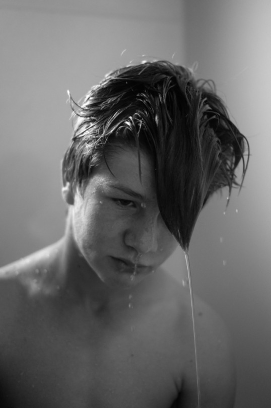
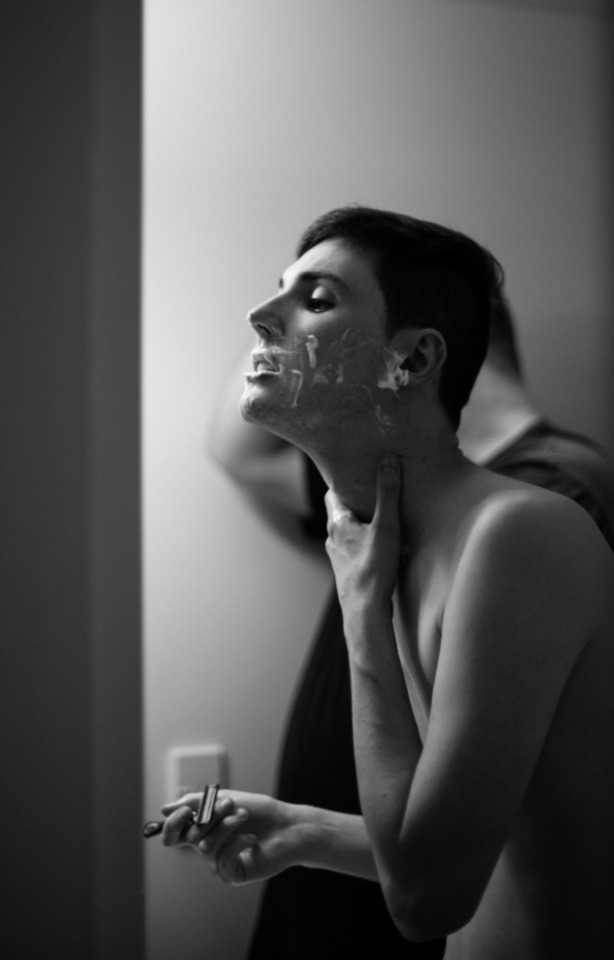
This photo has a bit of headspace for me to put my heading, it also has more room around the sides to put sub headings and a clear space to put my barcode. However, this photo has a lot of heavy emotions behind it which may deter my target audience because I want my magazine to be more fun and light
0 notes