
thornearts102-006
THorneArts102-006
Academic Graphic Designs
6 posts
Don't wanna be here? Send us removal request.
Last Seen Blogs

moby-manimal
Moby Manimal

depicspirit
The art of symbols
yeonhanlove
UNIQ WENHAN X SEUNGYEON

tulgaritas
Tulgaritas
withered-one
Withered-One
Text


Everything I’ve done so far this semester for ARTS 102-006! It’s been a really cool experience learning how to make graphic designs! I’ve even used my knowledge for personal projects for both my club and my work as well! I intend to use it for the future and continue to learn so I can be even more creative in my designs.
0 notes
Text

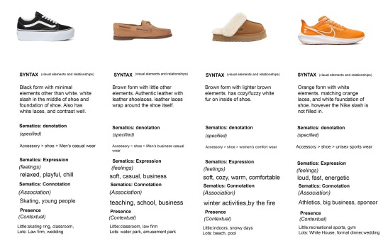
For project 5 we had to make a graphic that show-cased the perks of objects and the selling factor for each item. I chose some shoes and explained the Syntax, and the Sematics for Expression and Connotation in each image.
0 notes
Text

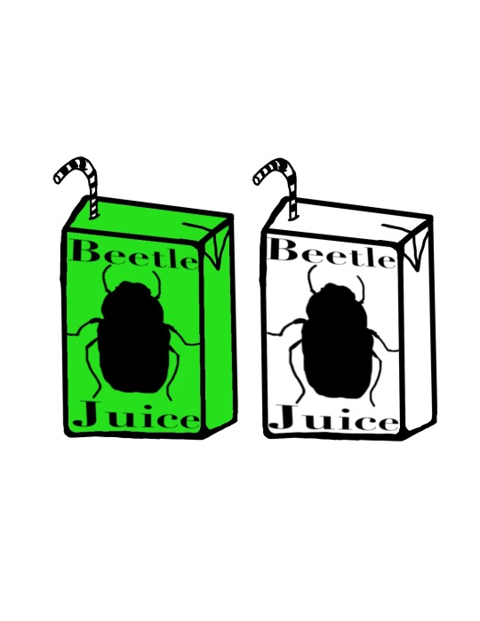


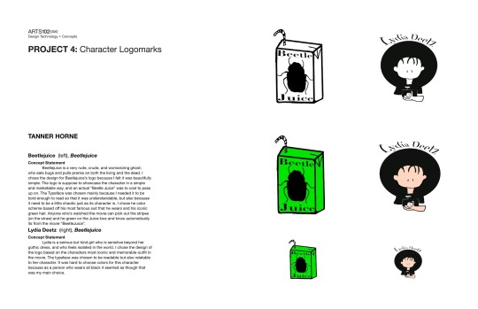
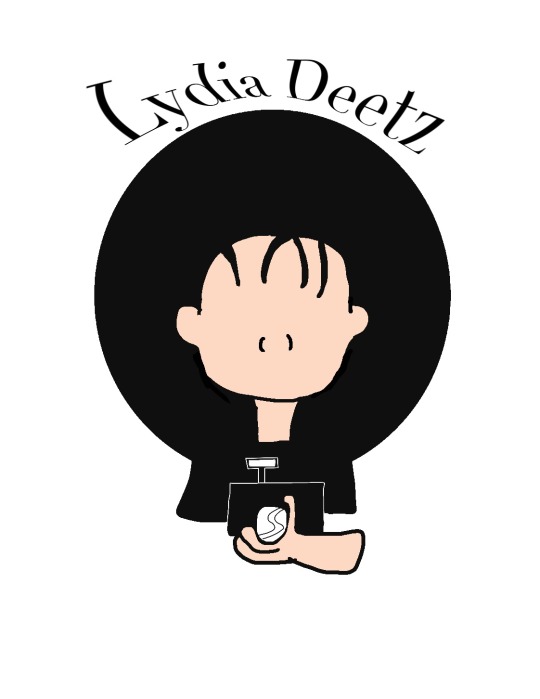
This project was focused on creating logo’s for well known characters in movies. The movie I chose was Beetlejuice, and the characters i chose were: Beetlejuice, and Lydia Deetz. The logo’s themselves had to be usable and discernible in both color and black and white. Ultimately I’m happy with the final product and hopefully can use this knowledge later on in life. The colors i used for Beetlejuice was based off of his famous suit attire, while Lydia’s design is more basic. She mainly wears all black, however she had definable props that help define her character, like her hat or camera for example.
0 notes
Text


Made a “Go Vote!” poster using famous inspiring quotes. Mine for example is using a quote made by William James. It’s interesting to me becauseI tried to make it clear- no matter what you do or what Job you have, you can still make a difference. Especially if that difference affects your country and fellow man.
0 notes
Text


THorneARTS102-006.tumblr.com
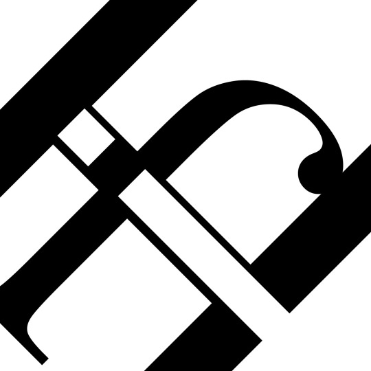
For my ART 102-006 Class we had to work on a project labeled- “Typographic Abstraction”. This was an interesting concept to complete because it focuses on the contrast of the images. While the design is simple, it still catches your eye as you wonder “am I looking at this image correctly?”
In the first image i only used the letters “DEF” from the alphabet, the second i used “HIJ”, and the last image i used “ABC”.
0 notes
Text
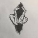
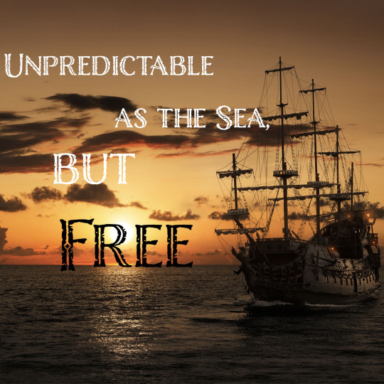
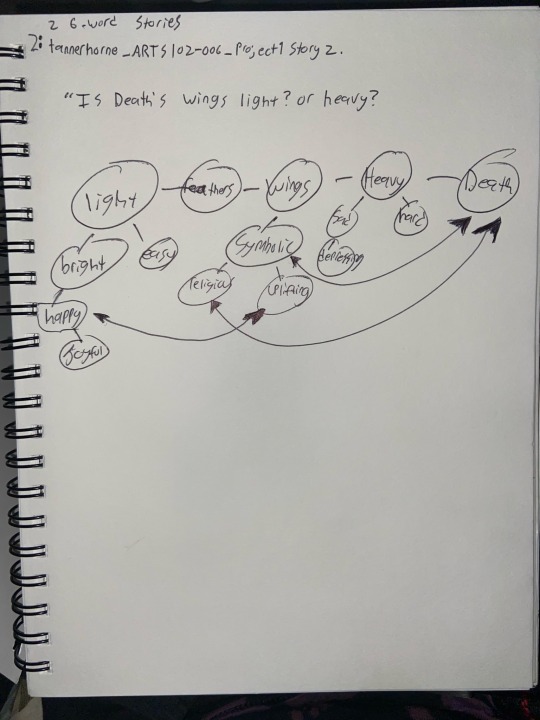
First Project-Six word stories
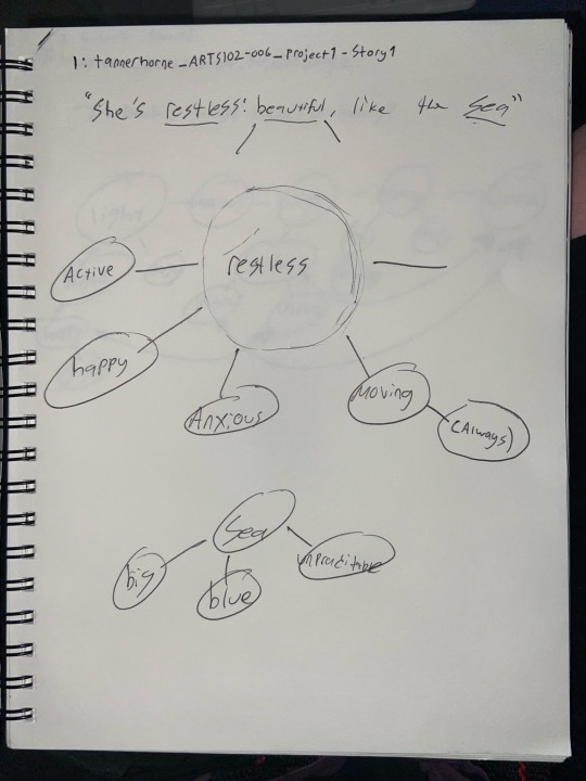


My thought process and final for my first project was interesting. The first picture (the Pirate Ship) was more inspired by the legend of Calypso and Blackbeard from Disney’s “Pirates of the Caribbean”. But as I wrote and thought about the story, and after looking through so many images to portray the “story”, I found that the similarities of a Ship and the Ocean itself had more in common than I realized. So, it turned into a story more based off the Black Pearl, than Calypso I suppose.
My second story was simpler. The idea that the personification of “Death” would have a hard time doing his function. So in came the idea to use the “Wing’s of Death” as a way of exposing just how ‘heavy’ or ‘light’ taking someone’s life would be. The words maps aren’t that exact but only because my brain doesn’t function at a normal speed.
#sixwordstories #graphicdesign #editing #writing #creative
3 notes
·
View notes