
three-years-of-animation
Anson's Animation Blog
10 posts
Don't wanna be here? Send us removal request.
Last Seen Blogs

guardianofchildhood
This Is A Blog

simonsaysso7210-blog
Untitled

coolerontheinternetdotcom
coolerontheinternet.com

oikwae
monki
Text
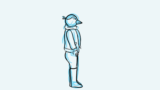
Year 4 Final Film - Fish

Concept art of Krill, the protagonist of the Fish (working title).
This year marks the final step for my animation course - creating my final graduation film. I started off this year having no clue on what to do my final film on. However, playing plenty of island survival games over the course of the summer had lent me a lot of inspiration towards creating a story with those themes - a young girl trying to survive by herself on sea. To start off, I sketched a few concept designs for the protagonist.
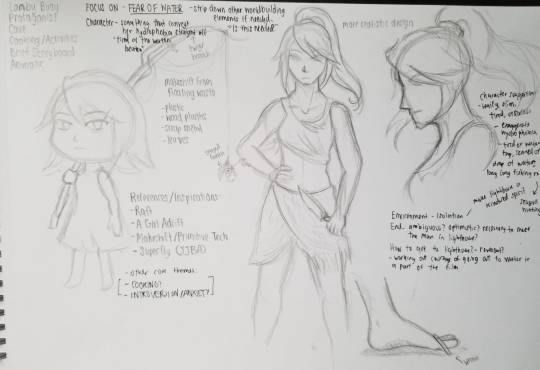
Not knowing the aesthetic I wanted, the initial sketches I had for the character varied in appearance. Appearing in the sketch above is a short, childlike design, and a more tough and anatomically realistic rendition. From the opinions of others, it was clear that both approaches did not quite suit the tone of the story.
Wanting to develop a film with personal meaning, the plot was originally going to focus on a lonesome, hydrophobic girl surviving on her own. While fishing one day, she finds a message in a bottle containing two things; a picture of a lighthouse, and a green, glowing rock., and her longing for companionship spurs on her journey to braving the watery depths. In the climax of the film, her boat gets capsized by a storm and she drowns, but the green rock she carried with her acts as a beacon leading her towards a large air pocket in a cave. In there, she finds the lighthouse isolated in a small cave, and from there she is able to gain her long-awaited companionship.
beginning concept:
-already wanted to make a girl on the sea
-originally wanted to make it sort of a personal story
-inspired by games like a girl adrift and raft, as well as jjba
-people said it was too much in one go
development art:
- at first was thinking either chibi character or realistic character
- both did not fit, went to hex maniac and tomoko as inspirations for “disheveled girl tired from the elements of the sea)
- after some concept drawing, the hoodie stuck
- skinny girl, wide eyes - think character was easily recognizable
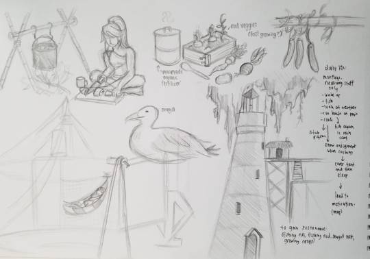
- was interested in a buoy, took a lot of inspiration from jjba’s superfly and raft from that
- another one was lighthouse in a cave, was interested in the juxtaposition between the lighthouse’s purpose as well as how the cave subverts the purpose
- film was set in a post-apocalyptic “waterworld” where people are reliant on seafood for survival. took some inspiration from waterworld and fallout for aesthetics
revised concept:
- girl is a bounty hunter
- wants fish
- buoy was thrown out as a concept art and instead went for a normal “rampong” (fishing hut)
development
- thumbnail storyboard (brainvomit)
- after some refinement, started to work on rough storyboard/animatic
0 notes
Text
I Don’t Want to Call it Home - External Project for SDI
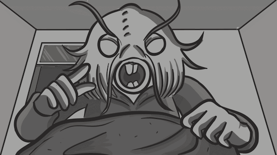
For the duration from early March to mid-May, I was working as animation help for a group of people producing a documentary for the Scottish Documentary Institute. Some more background information can be found at the end of the last post - this post will document some of the creative process that went into one of the scenes. Because of time restrictions with academic works and projects, I mainly focused on producing one scene for them that they required help with.
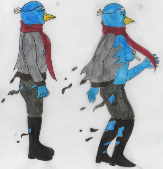
In this scene, the bird (Nisan) is getting harassed by men in the street, resulting in a metaphorical transformation where she is stripped of her clothes and briefly transformed into a burlesque dancer, to symbolize her objectification. Taking the six key frames the artist had provided me, I created a digital draft of the transformation (on a inconsistent framerate), and afterwards did the final outlines on TVPaint. I sent it to the artist and filmmaker for their feedback.
The feedback they provided me was that the animation was good, but the limbs needed to be longer, and the expression more sad. After this, I set about to transfer the digital version to traditional media, as requested by the artist and filmmaker so to match the aesthetics of the already-done animation.
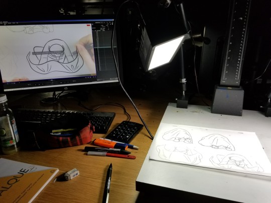
To transfer the digital animation to traditional, I had to upload an AVI of the animation onto the school’s computers with Dragonframe on it, to allow for easier tracing. I had first planned to trace it out directly using ink pen, but because my hand proved to be shakier than expected, I had to first draft out another version on tracing paper, and ink it afterwards. The next process was to erase the pencil work, which also erased the ink in the process, leading me to have to outline it once again. Overall, this scene required me to redraw the frames 4 times. I think I could have definitely optimized this process by printing out the scenes and tracing them on paper, since I had bad hand-eye coordination when it came to looking at the screen and drawing on paper. But this is an experience I will take with me if I had to do another project like this!


After cleaning up my sketches, I had to colour them in using a variety of inks and pens. For this scene in particular, I had to use diamine peacock blue ink, india ink, and felt pens. This was quite a time consuming experience due to my inexperience with painting with ink, or colouring in traditional for animations. The result of the colouring was quite nonuniform, but it was the kind of aesthetic they were looking for, as they wanted a handdrawn feel to the animation.
This was one of the more complex animations I have done, due to it featuring a constantly moving full body, as well as the complexity of the character design as well. Due to this, it was quite hard to keep a consistent appearance for the character, but I was overall satisfied with the animation of the character itself.
Unfortunately, my time with the group was short due to external circumstances in the way, but working on the documentary provided some good experience as to what I might expect working for a client.
0 notes
Text
Semester 2 Projects
This post will collate the Semester 2 projects of Year 3.
10x10x18
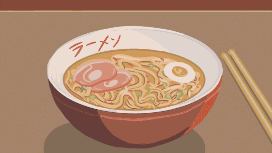
This project involved making one short animation film a day, for 10 days in a row. Since this project coincided with the Beano project, I supplemented some days in with Beano animations that I had done on that day. The other animations were brief and short play-arounds in TVPaint. I had a considerably easier time creating animations than last year, mostly due to the fact that I was now more used to animating digitally. One of the short films for 10x10x18 was called Ramen: A Tragedy. I was quite proud of this one despite the shortness of the film, so it ended up being showcased in the exhibition alongside the Beano film.
End of Year Exhibition
This project in particular was one that I was not very chuffed about from the beginning - due to my introverted nature, the idea of exhibiting my work to hundreds of strangers was not very appealing! Thus, the contribution I had towards the exhibition was quite minimal - things that needed done, such as searching for venues, organizing drinks, and making posters were all out of my expertise! Due to this, I am very thankful that my classmates tackled these preparation issues with aplomb.
The work I prepared for the exhibition was compiled of the preproduction for Beano, stills from the Beano short, and personal work from previous years. I gained a sense of accomplishment from seeing some of my best work gathered into one place! Although I left the exhibition early, I was happy that I had attended the exhibition as a first experience, at the very least!

Context Documentary - An Anecdote About Boobs
As part of our context course “Issues of Representation”, I was tasked with creating a documentary to supplement my context essay, which was on the portrayal of women in Japanese anime. The essay featured topics on sexualisation, commercialization, and the empowerment of women. As I could relate to these topics through a childhood memory I had, I decided to use this personal anecdote for my documentary. The documentary involves my retelling of the childhood memory, which was going to the DVD rental shop. In there, I saw a lot of anime DVD covers that involved titillating pictures of a female character, even though the context of the anime did not involve pornographic elements at all.
Because the documentary involved a childhood recollection, I decided to illustrate the documentary through use of chalk on TVPaint - chalk gave a very “amateur” aesthetic to the documentary that I feel hammered home the context of the recollection. To place emphasis on the boobs, I made it so that they were the only thing animated in the documentary. Needless to say, the animation in the documentary was quite limited due to time restraints and the need to place emphasis on the key topic. If I had more time, i would definitely have put in some more animation or some boiling for the documentary.

External Project (WIP - I Don’t Want to Call it Home
My ongoing external project involves working with the Scottish Documentary Institute on creating an animated documentary, titled “I Don’t Want to Call it Home”. This film documents the troubles of Nisan, a Turkish artist who must choose between staying in the politically restless Turkey, or leaving in favour of her artistic career while leaving her family and home behind.
At first, I was put in charge of cropping frames for Nisan, but was afterwards put in charge of animating individual scenes for them. As the film is still in progress, only test shots I have done were available for showing. So far, this project has proved challenging due to other academic deadlines and having to adhere very closely to the style of the original artist. However, this will definitely be easier after completing the school year, as this would provide me with more time!
0 notes
Text
Weeks 10 - End of Project
youtube
The finished version of Ivy and the Crumpet Caper!
I took a month’s stress break from animation up until January, which disrupted my proposed working schedule slightly. However, from the re-engagement point in January, it was clear that the only thing left to do was to finish the animating and colouring. During January, I had completed only roughly a third of the required animation, which meant that I had to really kick my gear up a notch.
ANIMATION
Making up 96 frames, this scene was the most time consuming to complete.
It was during this time where I truly realized the extra amount of time it would take to animate on ones instead of twos; everything took twice as long to animate, and although everything did end up very smooth, I felt that such smoothness was sometimes unnecessary. This was especially apparent in the scene where Ivy unmasks, with a total frame count of 96. Unlike the other scenes where it was a combination of ones and twos, this was done all on ones, which made it very time consuming to do. Still, I think the effort paid off for the most part!
REFERENCES

One frame out of the reference footage I used for the scene above.
A large part of animating was using real life references for animation. Wanting to achieve realism in my animation, I took some tips from the way Disney animators used to animate, which was by rotoscoping real life actors, or simply using their footage as reference for their animation. Thus, I got a reference model to act out most of the scenes I needed to shoot, and took quick bursts of snapshots rather than filming them.
Using this method, I was able to get a clear idea of how many frames I needed per action, while still being able to ensure that each action happened in a realistic time frame (not happening too fast or too slow). This took some pressure off of figuring out the duration of each scene, though in retrospect, I felt that this made me use my brain less in figuring out how to make each scene feel “alive” through more conventional animating techniques, such as stretch-and-squash, and exaggeration.
Of course, all of these references meant that I never had to use my initial shot list/dope list, with initial estimates for timings. I shall definitely remember that the next time I undertake a similar project!
If I were to revisit this project, I would have put more thought into how I could implement these methods in the animated short, which would definitely have fitted the wacky, comedic ethos of the Beano diegesis.
COLOURING
I often try to colour according to my references. In this case, it was more time-consuming than I expected...
During the early stages of the animation, I had played a bit with the colouring just to get an idea of whether or not my style of shading was viable. For my first experiment, I had coloured in a still shot of Ivy’s mom chastising Ivy, which was a relatively simple shot in terms of animation.
Completed scene of Ivy’s mom telling Ivy off. This was one of the first scenes to be coloured.
The staff from Beano had previously liked the aesthetics of the greyscale shading in the animatic, so I thought that applying the same colouring method should be fine.
Right?

This project was a real learning experience for me, especially in regards to the effort and time it would take to colour and animate manually. Due to the way I had drawn my frames, colouring flats by paint bucket was not a viable option, and the way I coloured shadows ensured that manual colouring was the only method. This meant that completing the project took way longer than it would’ve had I went with the flat colouring method. In the end, it was merely a challenge in endurance and patience. The end result was better than I expected, but I would probably not do it again!
EDITING
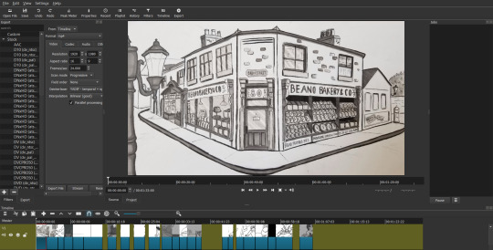
The ShotCut interface. Editing is as simple as dragging the file onto the screen and then placing it on the timeline. No importing needed!
Rather than using After Effects as I normally would with these projects, I opted to use the video editing software ShotCut instead, which was quite similar to the simplistic Windows Movie Maker, but with more editing capabilities. With ShotCut’s intuitive interface, editing the clips together was a simple affair.
Using ShotCut’s built in filters, I was able to make the animation more authentic to the silent film aesthetic by applying film grain, scratches, “dust” and artificial projector shaking onto the film.
MUSIC
Though I had initially come in contact with a soundtrack composer and a sound effects editor, during the animation process, I found that sound effects didn’t add too much to the animation. As a silent film, I felt that having no sound effects was still viable, and made the “silent film” more believable.
After the composers had finished with the soundtrack, a friend had suggested on adding crackle to the otherwise crisp soundtrack to make it sound more antiquated. I gave him the raw file to play with, and he returned a more compressed and noisy version of the soundtrack. This worked wonders in bringing out the aesthetic of the film!
FINAL THOUGHTS
This was a challenging project from beginning to end that demanded a lot of time and patience, but I can definitely say that I’ve learnt a lot from this hands on experience! Working for an external client definitely made my attitude a lot more serious towards animation, which helped my motivation to innovate my animation skills. Doing this project made me more confident about my animation skills, and also taught me a lot about what I could do (and what I shouldn’t do in more demanding time constraints!) for future projects. Given more time, I would have probably played more with post-editing software to give my animation a bit more edge, but I’m proud of what I managed to create during the allotted time!
0 notes
Text
Weeks 8 and 9
After I was able to sort out the animation for last week, I continued to animate. It was fairly simple going for the most part since I had nailed down the method I wanted to go about it. I played around with multiple scenes during these two weeks, and though I haven’t finished any concrete scenes, it did give me a better idea on how the future scenes may appear by experimenting with different aspects of the animation in each one.

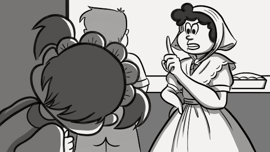
Ivy’s mom chastising Ivy for eyeing the goodies.
Since this scene was mostly static, it gave me the opportunity to play around with the colouring. For this scene, I employed basic shades of colouring, using a maximum of four or five tones. I plan to keep these tones consistent through the animation. I feel that these tones look pretty authentic to an old styled cartoon, and will try to use them as consistently as possible.
In this scene, I also played around with mouth movements. Because it’s a “silent cartoon”, I wasn’t sure how important “lip syncing” might be in the animation, especially if there is no spoken audio in it. Nonetheless, I looked up a guide for mouth movements, and copied them onto my scenes as a test.
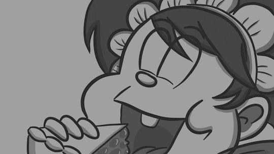
“Those who steal pastries will be met by the wrath of the Jabberwocky!”
The same applied for this scene, though with more pronounced different mouth movements.

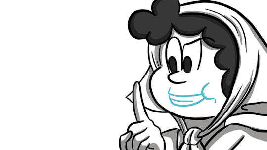
Mom putting down the pie.
This animation was done using references from real life footage, as well as the work in progress animation below.

Dad sneaking.
Following the feedback from Beano, I replanned the scene in which Dad is caught by Mom. A redone storyboard will follow...
The next two weeks after these scenes were dedicated to doing my context essay, including research and write-up. The weeks after that, unfortunately, were spent recovering from a cold...
Below are some screenshots of scenes that are work in progress.

Mom holding delicious cookies.

The oven.
0 notes
Text
Week 7
I spent the majority of this week being absolutely bamboozled by how I was going to animate it - since I hadn’t animated in a while, and every experiment so far has ended up with not very satisfactory results.

Like...what is this? Is she transmogrifying? It looks more like failed tween than any sort of realistic movement. I quickly learnt to reference after this.
After failing to animate a convincing movement of Ivy peering out from the wall, I decided to actually go and record some footage of the model re-enacting the actions in my animatic. Using the footage as a rough guideline, I was able to make the animation more realistic. However, I felt it was still missing something in terms of how she moved.

This was miles better, but the movement still felt janky and unrealistic.
Upon asking my classmates, I was advised to vary the speed of the movement (have it speed up in the middle while making it slower at the beginning and the end to make it more realistic), as well as ease out the movement at the end so that the animation doesn’t “snap”. Doing this instantly made the animation much better, and it also made me feel more confident in approaching the rest of the animation for this project.

Though not perfect, it was miles better from what I started off with!
Afterwards, I continued to obtain footage for animation. Midway into the week, I also discussed the project with my sound effects designer, who was going to experiment with distorting the soundtrack to provide a more “old” feel.
On Friday, Beano Studios gave me feedback for my animatic - while the majority of the animatic was good, I needed to fix some dialogue and some camera angles. Some issues that I’ll need to put more thought into would be redoing the shot where Ivy’s dad is caught in the act while Ivy escapes, and making a bigger transition to Ivy in the bedroom. I’ll be aiming to redo those scenes for next week!
0 notes
Text
Week 6
This week was a slow one. Instead of getting straight into animating, I decided to draw out two final versions of the backgrounds that would be used in the animation. Originally I wanted to do them in TVPaint since the animation would be in a digital format, but because it was harder to draw on, I opted to do them by hand instead.
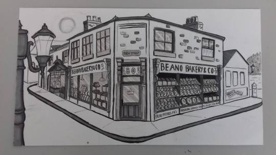
Exterior of Bash Street’s Beano Bakery. The reference picture for this shot can be found here.
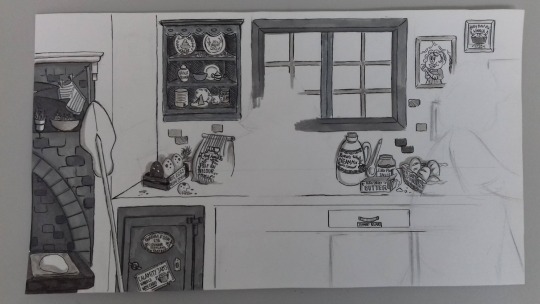
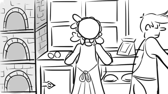
Interior of Beano Bakery. The blanks are left for the character animations. I took a page out from Calamity James and threw as many labelled puns as I could fit into this one background shot.
Practicing with ink brush pens and felt markers really helped this in regard, and I was lucky that I had experience with them before attempting to draw the backgrounds. I had intentionally left the opening shot without much shading so that I can edit them post-production (both day and night scenes are needed for the opening shot). Taking Beano Studio’s advice into mind about throwing in Easter eggs, I included many references to Beano in the backgrounds, such as the “80″ above the door to reference Beano’s 80th anniversary, and the ingredients and decorations in the Beano Bakery. With the way things are going, the rest of the backgrounds may be hand drawn as well, but I aim to do some compositing tests first to see whether this is particularly noticeable before carrying on with the rest of the backgrounds.
Alongside this, I animated a loop for the first scene (the mom rolling dough), though I may go back and redo this once I’m more settled with the animating process.
Outside of animating and drawing backgrounds, I did some refreshers with a classmate on how to composite on After Effects, something that will be very useful post-production. I also started to obtain footage from a reference model to make animation easier.
0 notes
Text
Week 5
Having revised storyboard according to Beano’s feedback, I created a simple animatic on After Effects accompanied with background music, courtesy of composes Drew and Ken. The music was composed with the styles of ragtime piano and gypsy jazz in mind, hence the heavy inclusion of guitar in the piece. I talked to later on in the week about possible distortion of the music to give it a more “old” feel to accompany the old aesthetic of the animation. I had also completed the script on Celtx, which was written in the style of a screenplay.

(Insert animatic)
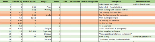
In preparation for the animation, I made a “dope sheet” on Excel documenting the number of scenes, duration in time/frames, checkboxes for each stage completed (lining, colouring, background, and so on), as well as additional notes. I thought this would help me plan out the animation more, and it indeed gave me a impression of the scale of the project. However, two weeks after, I found that it was little less of a guideline than I expected, as I found that my predicted frames needed for each scene fell short. Sometimes it’s just better to go straight into animating rather than try and plan it all out!
To make the animation seem more authentically “classic”, I was advised by Mike and Alan to look into vaudeville acts and Chaplin, so to get a better grasp of the style. I haven’t done so yet, but will hopefully do so when I have the time later on in post production! Mike also suggested finding a high definition quality of film grain to overlay on my animation during post production.

Later on in the week, I was starting to look into potential animation softwares to try out, since my ToonBoom trial had already expired. I downloaded Krita to play around with, but as the interface wasn’t too intuitive, I decided to brush up on TVPaint instead, as I already had the software on my computer. During the last few days of the week, I did some experimental animation to get back into the swing of things, and played around with the brush settings to emulate the style I wanted for my animation. (Two weeks into the future, I found that adjusting the stroke smoothing settings to 30% and accidentally clicking on the “grass brush”, which gave my pen stroke a grainy underlay, did wonders for my drawing.)
In my spare time, I refreshed myself on TVPaint by reading their PDF guides, played around with ink brushes to experiment with shading, and did some studying by reading Richard William’s “The Animator’s Survival Kit” and watching some of Aaron Blaise’s videos.
0 notes
Text
Week 4
On Monday, the whole class went to Dundee to tour the Beano Archives for research. In there, I was able to browse some old comics for research, which was definitely quite helpful in grasping more of Ivy’s character. After a short lunch break, we went to DC Thompson’s offices to deliver my pitch. My pitch was received positively, though I think asking for feedback earlier on definitely helped a lot. They gave good feedback on the costume design/research as well as the framing of the shots, and gave the go-ahead for the B&W silent film visual style I wanted to work with. This was an idea I had very early on, but again was hesitant because it went against the brief’s purpose. Some revisions I was advised to make was making the dad more prominent early on in the story so that the viewer wouldn’t be confused, more work on accentuating the Victorian setting, and making the ending more concise so that the punchline would be more effective.

Before: Exterior of Beano Bakery, with not much sky to represent time of day. Even with the blue colour (not apparent because of the B&W visuals in the final animation), the time of day isn’t very apparent.

After: A much wider shot of Beano Bakery, with more sky and more Victorian icons to represent the time period (addition of Victorian lampost and a Victoria carriage).
Before: Plain shot of parents baking, Dad not being very apparent.

After: More Beano Easter eggs in shot, and Dad stands out much more.

After: Addition of Dad opening the oven, which places more emphasis on his character, as we get to see a full frontal view of his face.
Following the production schedule, I aim to start on the script this week (using Celtx), revising the frames on Storyboard, as well as potentially doing some background work.
While I was revising my storyboard, I was advised by my classmate to look at some Calamity James, as it was quite notorious for background gags. Since I did not want to alter the storyline too much (due to time constraints), I decided to read Calamity James to get some ideas.
On Friday, I met up with one of my composers for this project. After going through the most recent revisions of the storyboard, he suggested that since I was going through with a silent black and white visual, he thought that a ragtime piano soundtrack would suit the animation more. Though the story does take place in a Victorian setting, ragtime piano (the most “iconic” style for silent films) suited the visuals more than actual Victorian music.
0 notes
Text
Beano Project, Weeks 1-3
Our external project of the year was to produce a one minute short for Beano Studios featuring at least one of their legacy characters. From the list that we were given, I chose Ivy the Terrible as my character.
WEEK 1:
Though the project had not officially started yet, I went about brainstorming some ideas for my project. One of my first initial ideas was having Ivy the Terrible in a Victorian setting - mostly because I was really enamored with the Victorian aesthetic, and also because I was interested in the idea of having Ivy unrestricted to one time era. Since Ivy’s character archetype is that of a curious, rambunctious child, which in itself is quite a universal character staple in narratives, I felt that her character would mesh well with any environment.
(INSERT NOTEBOOK PICTURES)
During the first week, I wrote down the basic plot of my story:
Ivy the Terrible and the Crumpet Caper
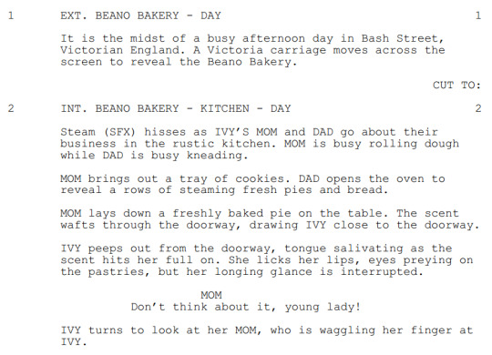
- Set in the Victorian times, Ivy's parents run a bakery. Every night, they bake tasty pies and treats for the upcoming day.- Hungry Ivy sees the treats being baked, and she sneaks out at night to raid the pantry.- Her parents wake up to find the pantry near devoid of food, and they are shocked. "Who has consumed our crumpets? Devoured our danishes?"- Ivy walks in, wiping the breadcrumbs off her mouth. "Good morning! What's for morning grub?"
- Her parents are displeased, and ask her what had happened to their baking efforts.- Ivy denies any wrongdoing. "It had nothing to do with me! It was the hungry Jabberwocky, the monster that pilfers pastries!"
- Her parents do not believe her tall tale, and send her off to bed that night without supper as punishment. Ivy is displeased. "You'd think they'd be more grateful to have a free food taster!"
- At night, Ivy is in bed, stomach growling, and a bigger appetite for pastries.
- Knowing that her parents will be keeping an ear out tonight, she straps her bedside dolls onto her feet to make sneaking slippers. "Guess Miss Cotton-Eyes and Baron Bunnysnuggles were good for something after all!"
- When she sneaks downstairs, the pantry door is padlocked and bordered off, but Ivy simply slips through the pet door.- Ivy licks her lips, practically being able to taste the sugary treats on her lips. But before she could pillage the pantry...
- "SCRUNCH! CRONCH, CRONCH!"
- A shadowy, monstrous silhouette is already hunched over some cookies, having a midnight snack and making a racket.
- Ivy slips out a gasp, and the shadow turns around, with large shocked eyes. It's the Jabberwocky!
- Ivy screams! And so does the monster!
- Ivy runs back to her bedroom, and hides under the blankets. There won't be any more midnight snacking after this!
- The Jabberwocky is revealed to be Beryl the Peril in large rags, who has fallen into the kitchen after a mishap involving a very sooty chimney. She sneaks off into the night with cookie jar in tow, happy that her bad luck had led to sweet gains for a change.
Using this story, I did some brief ideas of potential frames in my notebook, as well as general costume design for Ivy’s Victorian counterpart.
WEEK 2 (Official Start of Project):
(insert notebook pages)
On the start of the second week, the representative from Beano Studios, Craig, came to our school to brief us on the project. After the briefing, I sent my story to Craig and Alan to gain some feedback. During this week, I had also enrolled into a Latin course, which took up some of my time, though it was fun. I started progress on my storyboard on Storyboarder.

Storyboarder was very intuitive to use!
At the end of the week, I received feedback from Craig and Alan, who said that the story was good, though needed cutting down as the proposed story was too lengthy for the one minute time limit. Craig helpfully provided a revised, more streamlined story that still retained the original elements, and gave their heads up for the Victorian setting - something which I had been hesitant on given the brief’s purpose of “modernizing the Beano characters”. Though that was a relief for me, it meant that I had to scrap half the storyboard I had already made progress on.
WEEK 3:
One week before the pitch, I set about to finishing my storyboard, with shading and inking, as well as create some character sheets for Ivy, Ivywocky and her parents. Some background work was also done for the animation, including the exterior of the bakery. During the end of the week, I corralled all of my pre-production work into a presentation for the pitch, which also included a production schedule for the project.
During this week, I also came in contact with some composers who were interested in composing for the animation, and I aim to get back in touch with them next week.
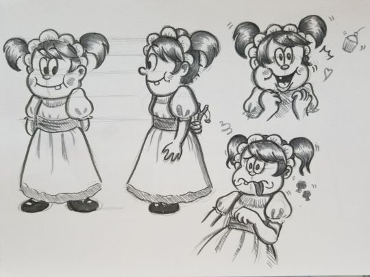
Ivy! Her character design was based off a higher class Victorian toddler.
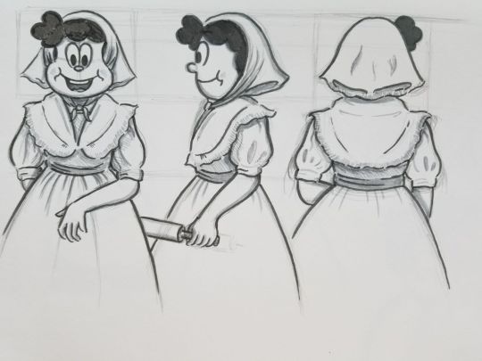
Mom. Her costume is based off a Victorian baker.
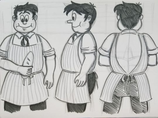
Dad’s costume, likewise, is based off a Victorian baker.
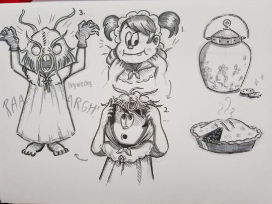
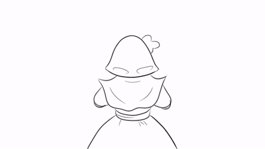
Ivy dressed up as the Jabberwocky. In the middle of the page shows me illustrating her putting on the hood to get a better idea of how I’d go about animating it.

Back view of Ivy and expression drawings of Ivy’s parents.

An early concept for the bakery, and concept art for Mom in pyjamas.

Proposed production schedule.
0 notes