
chronic art enjoyer +reader
3447 posts
Last active 3 hours ago
Don't wanna be here? Send us removal request.
Last Seen Blogs

annotatedgrief
plástico cruel

dailyspnpolls
Daily Supernatural Polls

bigbear1983
Untitled

paigumondus
I am straight up stuck on this site

amykimxox
Amy Kim xox💕


Text

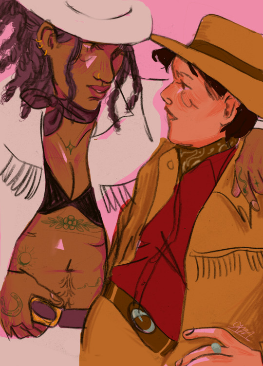
Source: Lesbian National Parks And Services Field Guide To North America - by Ranger Shawna Dempsey and Ranger Lorri Milan (illustrations by Daniel Barrow)
451 notes
·
View notes
Text

save me, jolyne, save meee
sketched this out on paper, scanned and touchpad-ed in photoshop, my fingertips have been erased ;-;
163 notes
·
View notes


Text
"At HarperCollins, a lot of attention and thought is given to deciding exactly what combinations of margin measurements, font, and layout feel most appropriate for the genre, and writing style.
But in a case of do-your-part environmentalism, designers at the publishing house have now standardized a series of subtle and imperceptible alterations to normal font style, layouts, and ink that have so far removed the need for 245 million book pages, totaling 5,618 trees.
Telling the story in Fast Company, representatives from HarperCollins, one of the four largest publishing houses in the world, explained that the idea first arose in Zondervan Bibles, HarperCollins’ Christian publishing division. Being that the Bible is 2,500 pages or sometimes more, saving ink and pages was not just an environmental consideration, but one of production costs.
A new typeface called NIV Comfort Print allowed Zondervan to shave 350 pages off of every Bible, which by 2017 had amounted to 100 million pages, and which, as Fast Company points out, would be four times higher than the Empire State Building if stacked.
The production and design teams then wondered how much they could save if they applied the same concepts to other genres like romance and fiction. Aside from the invention of the eBook, publishing hasn’t changed much in the last 100 years, and the challenge was a totally novel one for the teams—to alter all their preconceived ideas and try and find a font and typeface that resulted in fewer pages without being harder to read.
They eventually standardized 14 different combinations their tests determined were the most environmentally friendly, and which delivered an unchanged reading experience.
But the challenge didn’t stop there. Printed books, one might not know, are printed in large sheets which are then folded into sections of sixteen pages, meaning that Leah Carlson-Stanisic, associate director of design at HarperCollins, has to calculate the savings of space, words, and ultimately pages with the help of her team to fall in multiples of sixteen.
Nevertheless, they have been successful with it so far, and in the recent print run of one popular book, 1 million pages (or a number near 1 million that coincides with the 16 times tables) were saved.
“We want to make sure our big titles, by prominent authors, are using these eco-fonts,” Carlson-Stanisic said. “It adds up a little bit at a time, saving more and more trees.”"
-via Good News Network, April 4, 2024
--
Note: Great! Waiting to see this on the rest of their books and at the other big publishers!
Actually, though, it's worth noting that this may not come quickly to the other large publishers, because Harper Collins almost certainly owns that font - meaning that other publishers would have to pay HarperCollins in order to use it, on an ongoing basis.
More on publishing shit and more realistic solutions here below the cut!
What I'm hoping for and think is more likely is that this will inspire the development of open source eco-friendly fonts, which would be free for anyone to use. That would make it far more likely other publishers would adopt eco-friendly fonts.
I'm also hoping it would inspire other publishers to create similar eco-friendly fonts of their own.
Ideally, there would be a whole new landscape of (hopefully mostly open source) eco-friendly fonts. And/or to see calculations of the eco-friendliness of popular existing fonts, compared to each other.
If we could have a publicly accessible list of calculations for different fonts, including fonts designed to maximize eco-friendliness, I really do think that it would affect which fonts publishers choose to use. Here's why:
Most people in publishing are on the left (notoriously, actually) and really do care about the environment
People in publishing are plenty aware of these issues re: paper and trees, I promise
Shorter books means smaller production costs - and possibly smaller shipping costs as well, over time! So it would save them money too.
Eco-friendly fonts could also be combined with other measures for greater effect, such as bamboo paper (already in use for a lot of projects where page color/quality is more flexible) and thinner paper (aka paper with a lower weight) that uses less trees.
Don't expect books to all move to just one or two different fonts, though. Publishers and typesetters and font designers will innovate to create more options instead, though it will take longer. This is because different books really do use different fonts for various different reasons - one new font to rule them all isn't really a solution here.
"Every book is in the same font" may sound like a "whatever" deal to a lot of people, but as someone who works in publishing - trust me, it would actually make your reading experience worse, even if you could never quite put your finger on why.
345 notes
·
View notes


Text
"I wanted to say, I would rather have you for a little time than no time at all. I will remember you perfectly. My memory will touch your skin, your lips. The memory will hurt, but it will be mine."
—Marie Rutkoski, The Midnight Lie.
37 notes
·
View notes


Text


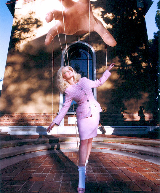


SYDNEY SWEENEY.
photographed by Amber Asaly for Who What Wear Magazine.
1K notes
·
View notes