
Last Seen Blogs
slytheriggs
𝔈𝔠𝔩𝔦𝔭𝔰𝔢
gldenveins
a little rhythm and a wicked feeling
sylvee0
sylvee0

officialatldiscord
All Time Low Discord
the-bentley
My Lot Do Not Send Rude Notes
Text
Evaluation
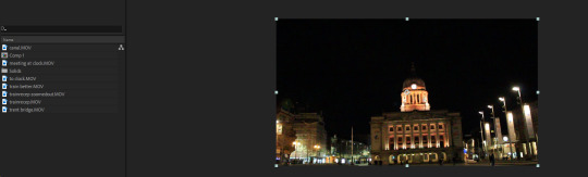
Final Piece again -
youtube
Successful?
I think that the final piece turned out most successfully as I think it appears interesting, fluent and colourful throughout the whole animation. I also think it does an ok job with taking the viewer around some of Nottingham’s most iconic places.
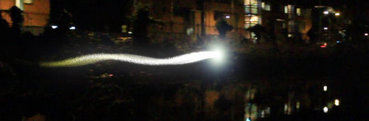
The colours added to the video help make it appear different and more professional as well as helping certain details standout such as the lights reflected in the water and the light in general at the train station.

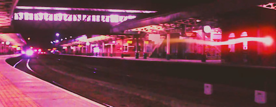
The final video could also be improved for example having a smoke trail behind the lights as this would make it more believable and realistic. The timing of some of the lights could also have had some more time spent on them so they appear more consistent unlike the red light at the train station.
Finally, the other thing that could have been improved is the actual quality of the video since at the moment in the final piece some detail is lost such as the clock face in the final scene.
What went well?
Changing the colour of the background using effects went well as this was probably the easiest part of the process and allowed me to manipulate the atmosphere to fit the music however I wanted.
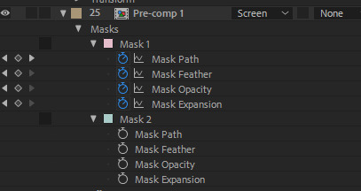
I also thought using the masks wasn’t that hard to do and allowed me to experiment with depth and position, however, looking back at the animation now and pausing in certain areas I could have done a much better job at masking and being more accurate but since the animation is so fast during the parts where masking is used its not that noticeable.

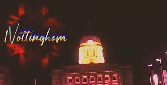
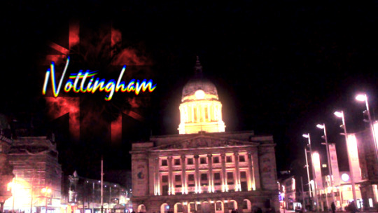
Creating the Union Jack explosion also went well since I thought that it was easy to carry out after creating the initial explosion. I also think that it’s the subtleness of the Union Jack which makes it more effective by it not overpowering the word saying “Nottingham”. The flag itself was also helpful as it provided a sort of line for the text to go on and helped me in choosing what size to have the final text.
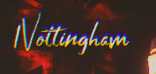
The final font of the text itself I think was chosen correctly since, in my opinion, it looks elegant and sophisticated to help fit the culturalist Nottingham society. The two final fonts that I was going to choose from were between “Shitter” and “Prisma”.
Shutter -

Prisma -
I almost chose the “Prisma” font but after giving it the same glitch effect I don't think it looked as good nor did it look like it fit the rest of the video behind it. It also changed the whole atmosphere to appear too eerie which is not what I was going for.
youtube
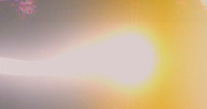
Finally, for things that I think went well I would say that the added larger lens flares that came over the screen during a beat when nothing else was happening.

I really liked this addition to the piece and think even more added detail like this would have made it look far more impactful and intriguing. The flare also helped emphasise the light glow and made it appear larger and more scintillating.
Without large flare -
With large flare -
What didn’t go so well?
Shooting the actual footage could have been better by maybe finding different areas in the same place with just more light so more detail could be visible. A camera that could have easier dealt with night footage could have also worked better but I think the noise was still reduced effectively anyway.
The light reflections in the water could have also been made to look more believable with perhaps an added ripple effect or changing the opacity, however, doing this may have slowed After Effects down even more which is one of the things I was trying to avoid.
One thing that particularly didn’t go so well which wasted a lot of time and made the final piece look worse was that when I duplicated the original pre-composed light layer and tried to add curves or other effects to that layer it wouldn’t apply to the whole of the light which I couldn’t find the reason for.
So in an attempt to try and fix this, I had to create a new shape layer and try to recreate the colour I wanted the light to be with a shape and have it cover the area that didn’t change colour along with it following the actual light.

For the final thing that I think could have gone better I would say the audio used in the video possibly being different, although it’s orchestral with a good beat to sync to along with a fast pace which is one of the ideas I had in the development stage, I think more of an intense sounding audio with a more silent finish would have worked better to let the word “Nottingham” have a bigger impact. I think I could have found music to suit this better idea in my mind but it would have probably been not royalty free.
If the music didn’t have to be royalty free I would have probably chosen audio more like this as I think it has more bounce and character to it.
youtube
If using this audio I would have made the animation longer by having a pause between where the lights meet and when the explosion occurs, the pause would be during the silence of the audio at 3:00 and the explosion would happen at 3:04 in the audio.
What have I learned?
During this project, I have learnt first of all to be more confident with a camera and how to record more effectively by trying different heights with the tripod and panning at different angles to best fit my idea.
During the digital process, I became a lot more confident with Premiere-Pro by using the adjustment settings to reduce noise and knowing how to save and export in a 4k format for YouTube.
For After Effects I experimented with the particle systems effect which allowed me to create appearances that I wouldn’t have known how to do before, the wave warp made me realise how much personality I could add to objects by changing the intensity. Also, I learnt how to make objects 3D which enables me to change the angles and positions more specifically to create a more realistic appearance.
The camera shaking and video stretching was another aspect I learned using After Effects which helped me change the mood and pace of the scene which was also useful.
Finally and in my opinion, the most useful thing I have learnt as mentioned already is figuring out how to mask in After Effects. I think that this would be really useful for future projects I might want to take on and therefore the most important thing I have learned during this project.
What would I do differently next time?
Next time I would probably plan more in terms of when getting a camera to record and knowing when to shoot the footage instead of recording it all on the same day in a rushed manner.
I would also just add more animation with lights and shapes to make the piece look more interesting, along with this I would choose audio that would have more character by it being able to react with the visuals more rather than it just being used to change location or have a flare come on screen.
0 notes
Text
Rest of the content
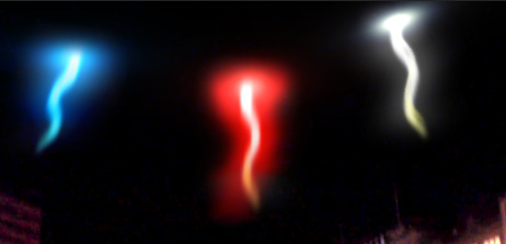
For the final collision of the lights, I wanted an explosion to emphasise the impact.
I wanted to incorporate the Union Jack in some form of the explosion as this is the main reason why I chose the colours red, white and blue for the lights. However, I couldn’t think of a way to do this without first creating an explosion then changing the blending options to appear as a Union Jack.
To do this I had to follow a tutorial as the explosion I tried to create by myself didn’t look very impactful. I also didn’t want to include any third party plugins either throughout the whole animation which I could have done for the lights. I decided against using plugins as I didn’t know if it would be allowed to be advertised by the YCA if it won as it wouldn’t be fully my own work.
Following tutorial for the explosion effect to get this result for my explosion -

I decided to render this explosion by itself and add it to the animation as a video to make it easier on the computer.
youtube
To create the Union Jack effect I imported an image of the flag onto the composition and placed it over where I wanted the explosion to be.

I then placed the video of the explosion above the Union Jack and changed the Track Matte of the explosion to the flag as well as changing the explosion blending mode from “Normal” to “Add”.

Doing this made the explosion blend into a Union Jack which I think looked effective and cool but caused it to lose its colour which again was the purpose of the light colours in the first place.
youtube
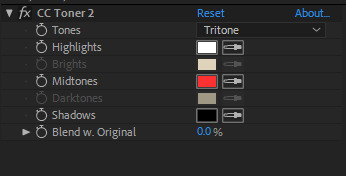
To semi-fix this I added a toner effect on the explosion layer to change the colour, I did try to add multiple toners to get the actual colour of the flag but I thought just red on its own looked better and that the black background colour wasn’t too far off dark blue anyway.
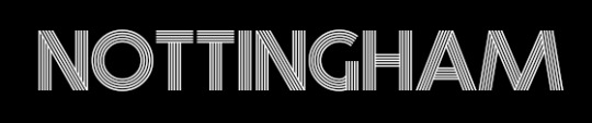
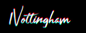
For the text, I went through all of the fonts I thought would look good during my thought process stage and thought that the font “Shutter” fit the piece the best.

The text scale was changed to go from 0 to 100 to give the impression that the word exploded with the collision.

The text colour was set to white with a radial zoom blur added to fit the popping out effect.
Next, the layer was pre-composed and a “Shift Channels” effect was added where the settings were changed so that only “Take Red From” was on whilst take from “Take Green From” and “Take Blue From” were set to “Full Off”.
The layer was then duplicated and then “Take Green From” was the only colour turned on. The layer was duplicated again and only “Take Blue From” was the only colour turned on.
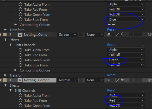


The top two blending modes were then changed from “Normal” to “Screen” making the text appear white again.


A wiggle expression of “3,7″ was added to each layer so that a glitch effect was created since the colours would follow each other.

I then synced the explosion of the video and the word to the collision and the audio.
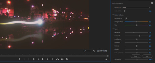
The final video was complete for After Effects but when rendered the quality looked low with some grain and visual noise so I went back into Premiere-Pro and imported the whole animation where the exposure and contrast were changed.
Before Premiere Pro -

youtube
After Premiere Pro -
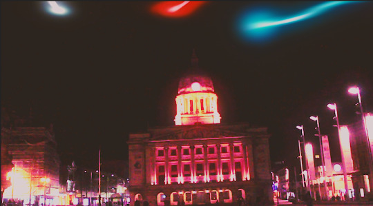
Final piece -
youtube
I was going to add sound effects to the piece such as a swoosh for the lights and an explosion for the shockwave at the end but decided against this as when they were added it felt distracting and didn’t allow me to follow the journey of the lights through Nottingham as easily.
Tutorial Followed for the explosion effect -
https://www.youtube.com/watch?v=JYbgjCR8PMI
Royalty free background music used -
https://www.youtube.com/watch?v=a4YUrTdsFCI
Font Used -
https://www.dafont.com/shutter.font
0 notes
Text
The content
Recording -
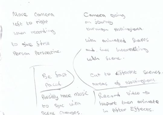
To start, I went out around Nottingham with a borrowed Canon 1300D and a Tripod to record the footage. I chose to record at night as this would allow the lights to stand out more and make the piece look more effective.
I would record multiple pans of each area in the direction the light would travel because if one didn’t look right for the video I would have several to choose from. My original idea also did consist of having an actual first-person view of the lights but decided not to do this as then I thought the animation would be too long and become less interesting. Doing this would also cause a change to where the lights would be travelling in the first place such as not flying over the water as this first-person view would be very difficult to get.
Premiere Pro -
After recording the footage I saw that it was darker than I would have liked so in an attempt to fix this I imported the footage into Premiere Pro and added a light over all of the footage which did in fact make it appear brighter but however made the noise more visible and ergo made the quality look lower.
Before -

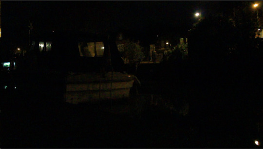
After -

I decided to keep the footage as it was as it lost some of its quality.
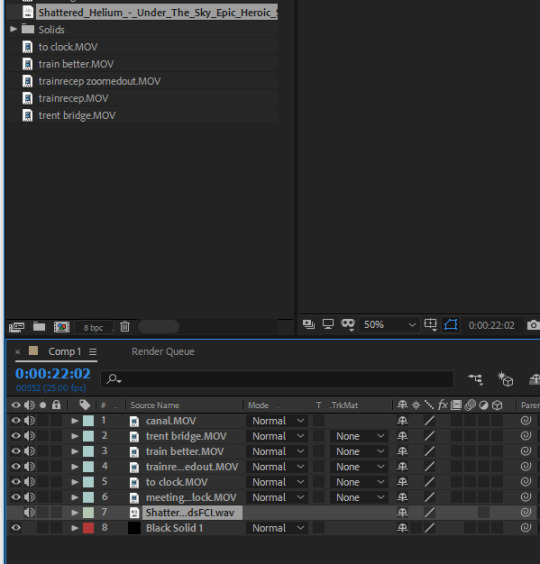
After Effects -
I then imported the footage onto a new composition in After Effects with the size set to 1280 by 720, I chose this size as it’s the standard size for a YouTube video which is also the way I would be submitting my submission to the YCA via a link. I could have made the aspect ratio at 1920 by 1080 which would make the quality even higher and still fit the YouTube size but decided against this as I knew the effects used in After Effects would already be straining on the computer and didn’t want to slow it down even more.
Importing videos and placing them on a timeline in After Effects -
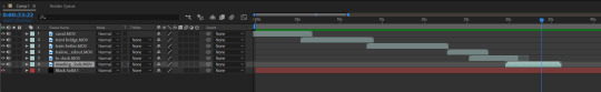
After importing the footage to the composition and relocating their lifetime positions along the timeline the piece so far looked like this -
youtube
Before actually starting to add my animated lights I did a practice run with a red line to give me a better understanding of the pacing of the animation. I could also use this line’s positions to get parented to by the actual lights so I wouldn’t have to animate the same positions again.
I also added trim paths to the line to see how it would appear as if it was travelling behind the boat which would make the animation look more believable and add depth, this would also make the animation look more complex which would gain appreciation in the YCA.
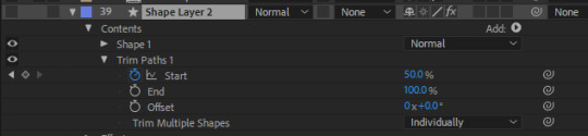
I later figured out how to use masking to create a similar and more accurate effect.
Experimenting with a shape to get an idea of the pacing and overall look -
youtube
At this point, since I had a good understanding of the next steps I was going to carry out I decided to look up possible non-copyrighted music to use in the video on YouTube. After researching and finally finding audio I wanted to use I copied and pasted the link and converted it to a WAV file which I then could download and import into After Effects.

I chose this audio as I thought it had good beats which I could use to change the location of the animation around Nottingham as well as having a final triumphant sound for the collision of the lights.
However, when I added the audio to the footage it made the piece seem really long and repetitive which made it lose some of the impact, so to fix this I time stretched the footage of each of the scenes from 100 to 50 making it twice as fast and a total of only 18 seconds long which helped emphasise the speed of the lights aswell as keeping interest. I then synced the new sped up footage to the audio.
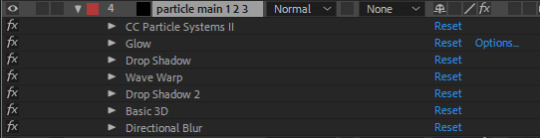
I then began to create my light by using various After Effects tools.
I created a solid layer then added my first preset called particle systems where I experimented with the settings to get the correct look.

I did end up adding an expression to the producer position to save time.

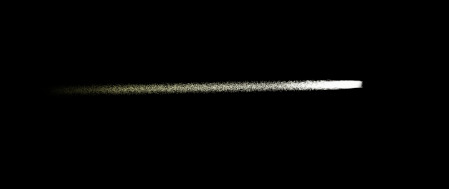
I then added more effects to add character to the light as well as making the animation look more fluent, these effects included a glow, two drop shadows, wave warp and a directional blur.

I then added a final lens flare for the head of the light and duplicated the light layer twice.
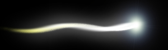
I played the animation with this light but it still didn’t look believable to me in terms of depth and angle as the camera wasn’t still and I didn’t take into account that the actual light angle would change also. To fix this I had to make the light head and light itself a 3D object so I could alter the angle and have it look less 2D as the light travelled further away from view.


I decided to also include a smoke trail to linger after the light travelled across the screen.
Creating the smoke -

I couldn’t get the smoke to look right as a wave warp was used on the light which would affect the smoke position. Aswell as this, I also couldn’t get the smoke to spread out and still look realistic as this would also have had to be a 3D object.
Overall, I did want the smoke effect but couldn’t find a way to make the smoke look believable or too distracting without a plugin so after multiple attempts I decided not to carry on with this step.
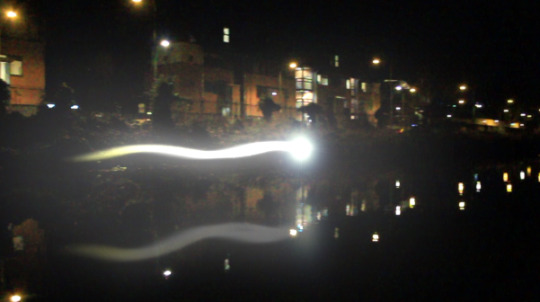
Making reflection in the water -
I pre-composed my light layer and then duplicated it where I flipped it vertically and lowered the opacity. I also had to change the position of the reflected light to move further away if the original light got higher like at the end of the first scene as this is how it would appear in real life.
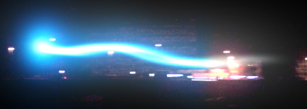
The first scene so far -
youtube
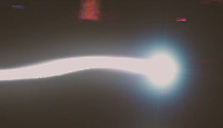
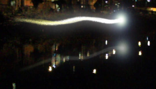
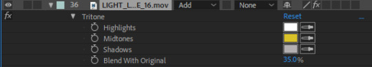
A large lens flare was added to the animation to go across the screen when there was a beat in the music to add interest and unpredictability. A tritone effect was also used on this flare to try and have it resemble the light that was travelling, in this case, the colours were mainly white with some yellow.

I was advised that the light could have looked brighter as it was the main piece of the project so a feathered white solid was added around the light.
Before -

After -
The background original footage looked plain and didn’t really compliment the light colour much so to fix this some tritone, glow and exposure effects were added.
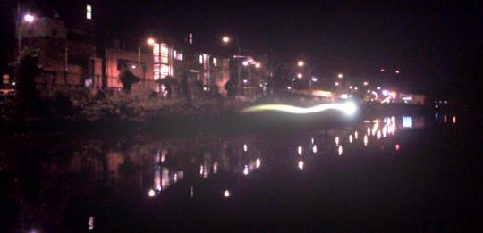
I then copied and pasted the light pre-composed layer again to the next scene and animated their scale, rotation and positions to travel the opposite way.

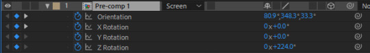
I added curves to the pre-composed layer to change the colour.

The piece so far -
youtube
The same was done for the next scene.
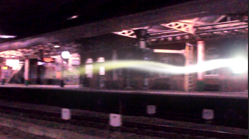

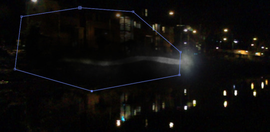
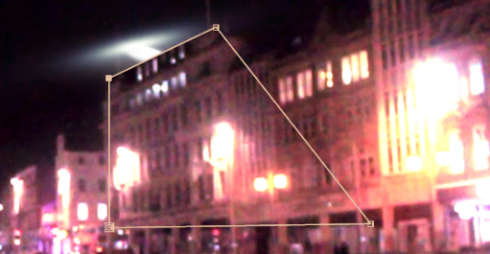
I wanted the light to travel up some stairs to link to the next camera cut being in the train station hall. To make the light travel up the stairs I had to use multiple masks with the mode set to “Subtract” and mask out the light where it would not be visible.
I used two masks, one being for the ceiling of the stairs and one being on the side as the light was travelling at an angle.
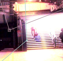
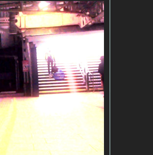
For the next scene, I had to use multiple masks for as there were multiple objects between the light and the camera. I had to mask out the first wall for the light to come into the scene, two people the light travelled behind and another wall which the light also travelled behind.
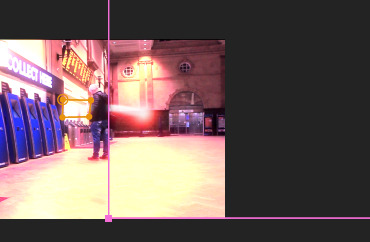
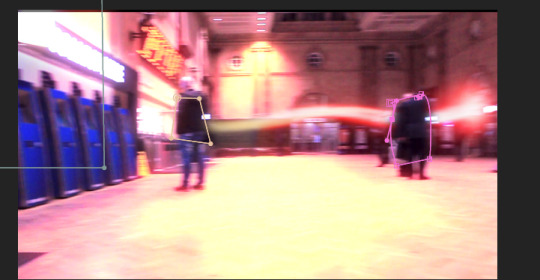

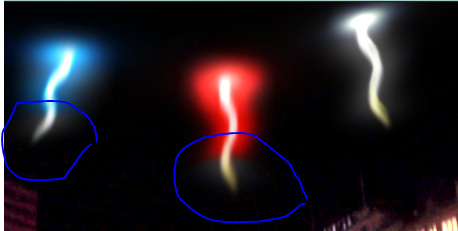
The final scenes involved all three of the lights coming together and meeting at the council house.
To make the lights look believable again this would have to be done by first changing the 3D angle as they would be above and far away from the camera to more stretched out as they became directly above the camera.
The mask tool was used yet again but this time for the buildings that the light was flying over.
Once the angles looked correct I duplicated the light layer to have a total of three lights where the positions and the directions were changed to make them appear as how they did in my plan.

I then copied and pasted curve settings to each corresponding light.

The final scene was created in the same way with the only thing changed being the angle, position and scale to have them collide.

0 notes
Text
My Process
My first idea was to create a lyric video including different shapes and effects to a song using After Effects. I chose the song of the UK entry for Eurovision as I thought it had a could beat to sync visuals to but also it’s a British song and therefore would relate to the Nottingham YCA. I decided not to go with this idea as it contained copyrighted music which wouldn’t be allowed as an entry as it wouldn’t be able to be advertised.
I’m glad I asked them about the music before putting more time into the piece that wouldn’t be acceptable. The final piece would of course looked better than this, it was just the first stage of the digital process where I was just understanding and experimenting with the beat syncing, objects to put around certain words and the colour scheme.
youtube
My next idea was to include either video or photographs of Nottingham for multiple reasons; one being that possibly going into a visual effects course and the other because when I was looking at previous winners of the YCA I noticed that there was a clear reflection of Nottingham in entries so I thought that doing something similar even though there was no theme would help my chances.
One of the previous winning entries that made an impact when making my decision -
youtube
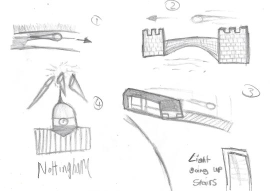
Sketches and development -
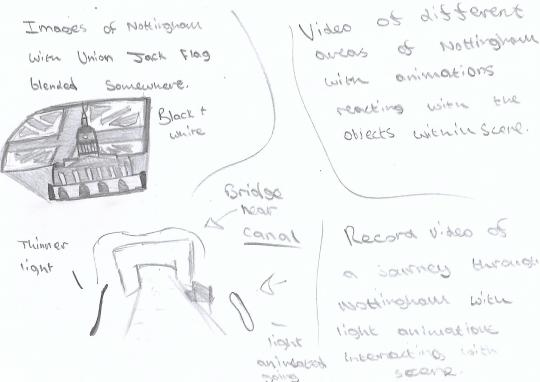
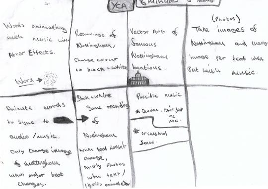
My first idea was to have a photomontage of Nottingham in black and white where I would have to take pictures of different areas of Nottingham.
Some of the images could also be edited for example to have a Union Jack in the sky above the council house.


After sketching the ideas about the photomontage I thought that it wouldn’t be that effective, especially if it was going to be compared to other students that actually do photography. So I changed my idea again to still focus around Nottingham but have the idea involve more digital software which I am more comfortable with which would help my work stand a chance of looking somewhat comparable to other entries in the same category.
I used the crazy eights tactic to come up with a final idea which I think could work which was then built on.
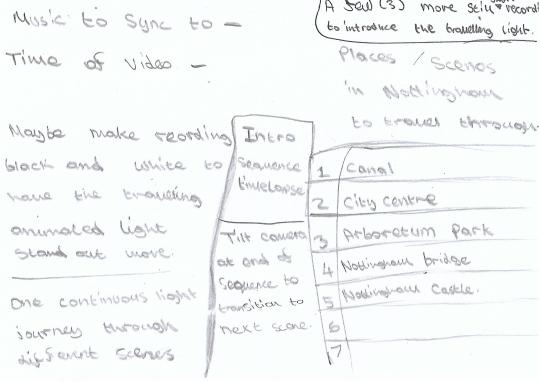
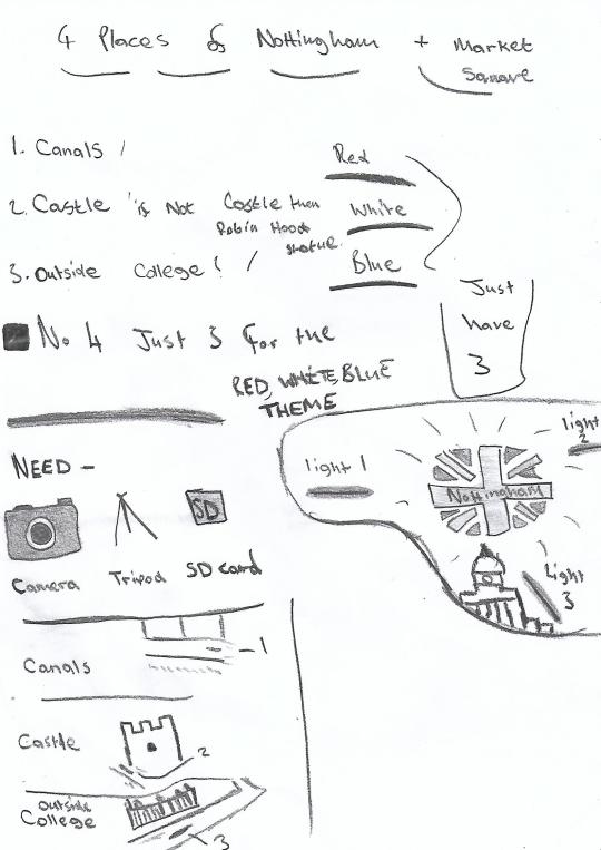
Once I had my idea, I began to think of different locations around Nottingham that I thought would look iconic. I didn’t think other similar entries would include areas of Nottingham that were this far from each other. I also thought that these first areas thought of would help show the size of Nottingham and have it be able to connect with a larger amount of people if an area closer to them was filmed, areas such as Trent Bridge in West Bridgeford and Wollaton Hall in Wollaton.
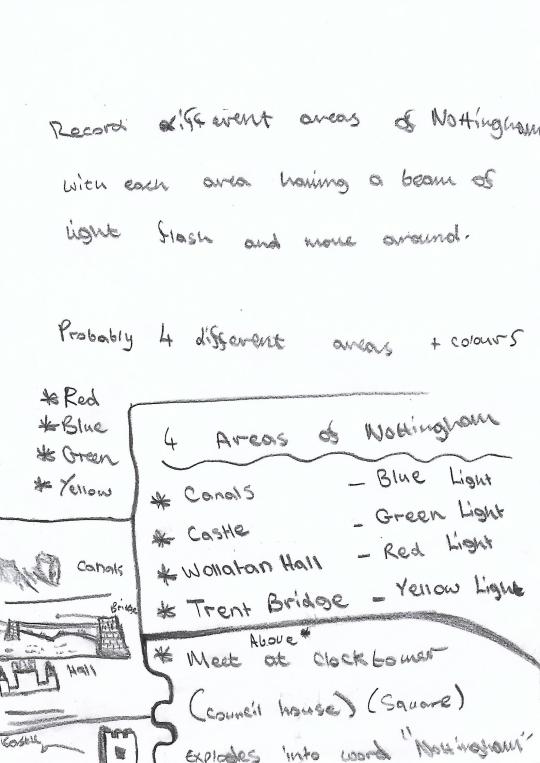
I then thought more about the areas of Nottingham to film and instead ended up just filming more of the areas in Nottingham city as I was running low on time and didn’t want to miss the deadline. I had also spent a lot of time on the other ideas and planning this one already.
I also thought about how it would actually be recorded with either through stills, pans or even both.
During the sketching, I also began to think of what kind of audio I wanted and ended up being pretty set on a dramatic orchestral sound as I thought it would have a bigger impact. I was also being biased when making this decision as I like this style of music which would help me be more motivated about the project.
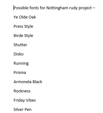
After finishing my sketches on the idea I was waiting for night to film my footage. During the waiting time, I browsed on Dafont.com for possible fonts which I think would look effective for my animation/video. I decided to do this during this time instead of later on in the process as I didn’t want to waste time when I would want to be focussing on just getting the visuals completed.

List of fonts I found that I thought would look effective.
Inspirations for the lights around Nottingham project -
vimeo
This was looked at for one of the possible styles of the lights and the collision explosion effect of the lights.
youtube
This gave me an idea of the pacing and flow of the lights along with syncing music.
youtube
This gave me the idea of certain camera panning angles, sizes and scales of the lights compared to the video footage.
0 notes
Text
Different Methods of working as a designer
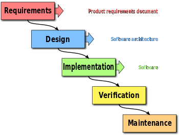
Waterfall -
The Waterfall method is thinking of and carrying out the process in more of a straight order starting with feasibility then carrying out the other stages such as plan, design, build, test, production, support.
Advantages -
Any Potential issue that is carried out in the piece would be noticed early on in the stage through research. The development process is also likely to be better documented since requirements and design documents are more heavily focused on. As this process is also linear people would often find it easier to understand and in turn, would make this method be more likely used in a team.
Disadvantages -
An issue with this process could be that once one idea has been fully carried out from the plan to the final production and presentation it’s very committing and risky as it could turn out that this is a piece that the client doesn't like and therefore the process would have to be carried out again from the start which would waste time and money.
Agile -
Using this method often includes short feedback loops where designs can be changed multiple times with no set piece leaving many options available with the ease of being able to change a design. The process involves creating multiple pieces that are not as thought out but are diverse and therefore having the option for one of them being what the client likes.
Advantages -
Working designs can be delivered at a quicker and consistent pace along with relationships between the client and the designer being stronger. As well this method gives the option for continuous improvement throughout any stage of the process.
Disadvantages -
The process is often more difficult to understand whether it be to the client or other people if the design is carried out in a team. Some aspects of the design or other ideas in general can be neglected which would be a waste of time. If the Agile method is carried out poorly this can cause inefficiencies in larger organisations.
Different idea development techniques -
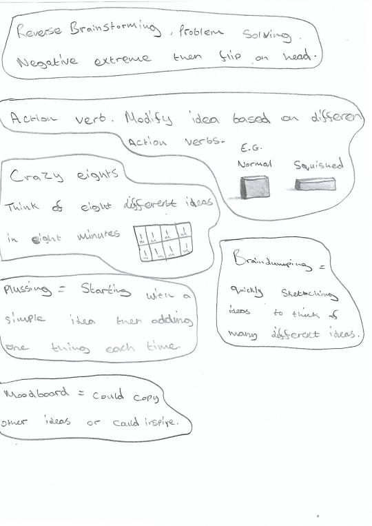
Crazy eights -
Crazy eights is a thought process that involves thinking of eight different ideas in eight minutes with each idea lasting one minute then having to be moved on, of that one minute generally 40 seconds is spent coming up with an idea then the remaining 20 seconds would be used as reflection time on the idea. Often these ideas involve quick sketches and or written thoughts. The task also tends to get more difficult when going through each stage as the obvious ideas tend to be already used up.
Advantages -
Some advantages include this method being very quick and easy to carry out as well as some ideas being created that would have never been thought of if this process hadn’t been carried out as it may have been more limiting.
Disadvantages -
The ideas are never really developed that well and thought of so a lot of potential ideas could involve problems, and since all of the problems are not well thought of this could lead to all of the possible ideas not being able to work which would overall just be a waste of time.
Reverse Brainstorming -
Reverse Brainstorming is a method of problem-solving by first doing the opposite of the objective to the extreme for example to make people healthier one extreme opposite could be to ban all fruit and vegetables, once thought of a few opposites just flip it again so, in this case, it would be to promote fruit and vegetables.

Advantages -
Thinking of ideas that would have never been thought of before. Easier to come up with ideas in the first place because finding problems is easier than finding solutions.
Disadvantages -
A lot of the problems that are reversed could end up just being impractical which would just waste time.
Brain dumping -
This Brain dumping method of idea generation is basically just sketching and writing out different ideas quickly without thinking about it much.
Advantages -
Doing this could lead to a lot of potential ideas to work on as well as not taking much time to do.
Disadvantage -
Braindumping could cause the person to go off topic without realising causing a waste of time.
Plussing -
Plussing is thinking of a really simple idea then adding one thing to it each time. This method could work particularly well in logo design as it could help keep its simplicity and allow the designer to experiment in easy to understand stages which could be shown to a client.
Advantages -
Plussing works better with more visual people as it would allow them to get a more thorough understanding of how something will turn out and allow them to be more specific with their idea since they’re just adding one feature at a time.
Disadvantage -
Plussing could take a while if the person is thinking of multiple ideas as this technique can be quite slow.
Mood boarding -
This method is the taking of other references such as images and text then compiling them all together into a collage.

Advantage -
This method doesn’t require much for actually coming up with ideas and allows the person to just pick out aspects from other people that they think would best fit their creative objective.
Disadvantage -
Doing this Moodboard method could cause copying to take place instead of taking inspiration which could be illegal.
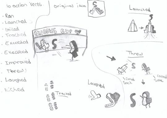
Action verbing -
This is done by listing and researching different action verbs that may or may not be related to the design then applying them to the idea. An example of this could be by using the verb “grow” some aspects of the design could be enlarged to create a whole different look.

Advantages -
Doing this allows the designer to become quite creative depending on the types of verbs they would like to use. This could also give more character to the idea and therefore making it standout.
Disadvantages -
Some verbs used could be very hard to incorporate and might not work that well with the idea.
My own crazy eights idea about a shoe company -
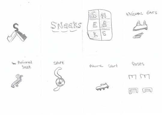
Developing my favourite crazy eights idea by listing action verbs then applying them.
I ended up coming up with two athletic mascots for the shoe company with their own personalities, so as a conclusion for my first time using the crazy eights method I would say that this turned out successfully with in my opinion a strong final idea.
Researching designer -
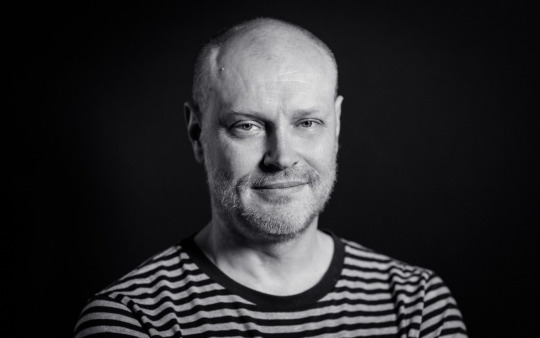
The modern designer I have chosen to do my case study on goes by the name Jonathan Barnbrook who is a British graphic designer born in Luton 1966. His most famous work would probably be an album cover for David Bowie called “pronounced Blackstar”. Before knowing David Bowie and Damien Hurst, he was best known for his type design where he designed Exocet which became the most pirated font on the web shortly after it’s release in 1991.
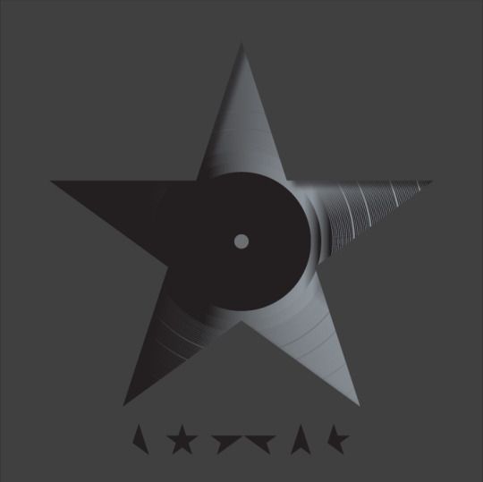
The way Jonathon Barnbrook usually comes up with certain typefaces is by rough sketches in his notebook the ideas are also not very exact as they are just from ideas or concepts he’s had. After the ideas had been drawn Jonathon would replicate these drawings digitally and try to get the right essence by adjusting them each time, this process is “painful” and by the hundredth time, the design could just look “ok” with it just building from there.
Jonathon Barnbrook also considers the context of what the typeface is going to be used for and tends to focus more on the emotions related to certain times or ideologies over historical accuracy.

I decided to research a second person. The person chosen is a VFX artist as I think the final piece could end up relating more to visual effects with motion instead of a still graphic design image.
VFX artist -
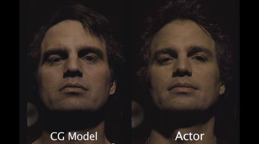
Joe Letteri is my chosen VFX artist to be researching on, I chose Letteri as he is one of the most famous and well-known VFX artists and supervisors as well as him being one of the most successful.
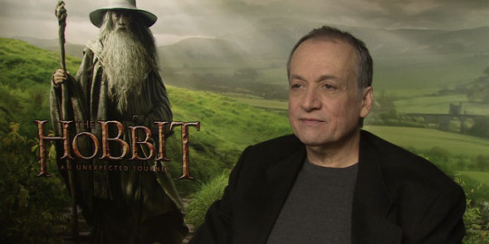
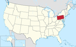
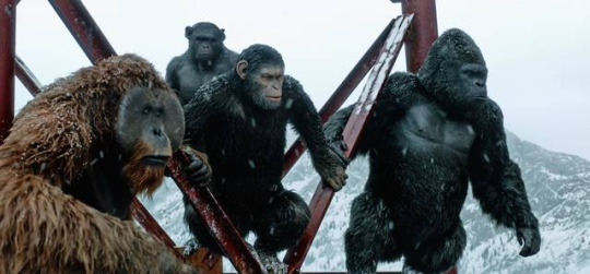
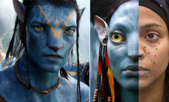
Letteri was born in Aliquippa, Pennsylvania, United States in 1957 and has been in the industry from 1989 to the present day. During this time he has won four Academy Awards, four BAFTA awards and four VES awards. He is also the current Director Weta Digital of which he joined in 2001. He has received several awards and nominations as a visual effects supervisor in some works like War for the Planet of the Apes and Avatar.
How he develops his ideas -
Letteri doesn’t tend to draw or paint his ideas that much but would focus more on the digital side of things using computers to develop and achieve the specific look he wants. He likes to “Understand how and why something happens, moves or works in the real world” and that he wants to “stretch the techniques and the technology” so he can apply this to pursuit realism.
He uses many different types of technical techniques with different software such as “ Imagemotion “ from Sony, “ Imocap“ from ILM, “ Face Robot” from Softimage and “Contour” from Mova. Effects would be constantly overlapped and removed whilst “looking at the strengths and weaknesses so you can tune which technique/s you use in the situation”. He would also intentionally look for problems and try and use the correct technique to solve the issue.
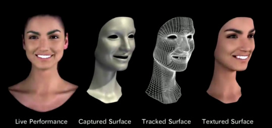
Imocap software -
Contour software -
Sources -
Waterfall - https://airbrake.io/blog/sdlc/waterfall-model
Agile - https://luis-goncalves.com/what-is-agile-methodology/
Crazy eights - https://blog.thiga.com.au/ux-design/run-crazy-8
Jonathan Barnbrook - http://www.barnbrook.net/about/jonathan-barnbrook/
Jonathan developing David Bowie album cover - https://www.itsnicethat.com/articles/jonathan-barnbrook-david-bowie-blackstar
Joe Letteri - https://en.wikipedia.org/wiki/Joe_Letteri
Letteri developing ideas - https://www.ibc.org/production/craft-leaders-joe-letteri-visual-effects-supervisor/3001.article
Letteri techniques and software - https://www.awn.com/vfxworld/joe-letteri-talks-digital-acting-and-3d-environments
0 notes