
Last Seen Blogs


Photo
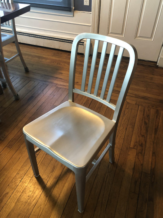
This is a chair that I have in my house. At the end of Wednesday’s discussion we talk about modernism and what defines modernistic art. I believe that this chair is a great representation of modernistic art. The textures, color, and shape of the chair portray this idealistic effect that this chair would not be found in a different time period other than todays. The structure of this chair is not for comfort but rather for a simple purpose. The chair is not embellished in any way such as that of a neolithic, Renaissance or victorian way. The texture of this chair is smooth and is made out of what seems to be a steel material. The lines of this chair represent the modernistic era that we live in today. The design of this chair is exactly what it needs to be. The chair is not defined by the shape it presents it is defined by the purpose of what it is meant to have.
1 note
·
View note
Photo

This is a table that was in my grandmothers home. I believe that this design is that of one that would be seen in the Renaissance Period. I believe this because as you look at the embellishing at the top edges of the table, you see fine grooves in the wood; almost as a rope like texture. As we work our way down to the legs of the table we find embellishing of a gold trim as well as the use of what looks to be that of a copper or metallic material. The legs are presumably a scroll type of leg. Protruding out of the scroll like legs of the table, you will see objects that resemble leaves. This piece of furniture is more so of an antique and the color of the wood is that of a cherry wood and resembles a classic period such as Renaissance. This table is most definitely not one that you would see everyday. The grooves in the table are precise and elegant.
1 note
·
View note
Photo

My cultural identification relies on designs such as this one to formally show that I am a part of the National Cheerleading Championship of UCA cheerleaders in the year 2017. Although this design is two years old, each year the design incorporates the same message to individuals who may not know what type of cheerleader I identify as.
This product is one that I wear to show that I am part of an organization that not only competes but travels around the world against other cheerleaders of the same level, lower levels and higher levels. On the back of the shirt there are lists of all of the cheerleaders that made it to nationals in the year 2017, as each year this accomplishment varies across the nation. This T-shirt was created by a company also known as comfort colors to give a sporty vibe off too individuals as well as a comfortable wear outside the realm of a uniform.
The significant elements of this search is the lettering, font, color and the material being used to symbolize what occasion this shirt would typically be worn to. This shirt depicts the environment or mood that may be portrayed when wearing it such as being worn informally. You most certainly would not walk into a high class restaurant wearing this shirt. I feel as though this shirt is more modern than other t-shirts due to the fact that it has a fine design system of lines and fonts within
1 note
·
View note
Photo

The object that I have chosen to discuss this week is a futon or mini couch. This is a three dimensional object. When you look at this photo on the screen of your computer you can say that the photo itself is 2D but the actual object in the photo is 3d. If we were to transition this 3D object into a 2D object the value of the object would be lost. The purpose of the object would also be lost. As a 3D object the futon serves a purposed of seating as well as opening up for storage purposes. Once we take away this three dimensional space the object just becomes a rectangle without any purpose at all. In order for this object to be shows as a three dimensional object in transition to that of a two dimensional futon, we must consider the dimensions to show the depths of the object and the space that it is occupying. We must be careful not to change the shape or size of the object as it has meaningful dimensions to show the thickness and what exactly the object will be used for. In order to reconstruct this image we must make sure that the lines in the photo show purpose. If the futon were to be created as an illustration the aspect that may be missing is where in the illustration the object starts and ends as well as where the positive and negative spaces can be distinguished to aid in what object the illustrations are trying to attest for. Media choice such as volume, color, size and shadowing will be most important while reconstructing an illustration.
1 note
·
View note
Photo
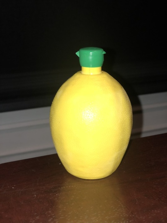
This is Lemon Juice. I consider this product to be a good design because it is small, and carries a plethora of lemon juice. It is also easy to hold. The inspiration of this design perceives that of a lemon due to the fact that it contains lemon juice. It is the same color and size as an actual lemon. If I was communicating the design to someone who had to create this container, I would most definitely state that the importance of this container was to be sure that the material of the container was easy to squeeze, a container that fits in ones hand easily, as well as creating a design where labels weren't necessary but having the object speak for itself about what is being contained inside. If I was describing this object to a prospective brand user who had never seen it before, I would explain to them that the need for this product is creating an easier accessibility to buying lemon juice without having to buy actual lemons. This is in a sense cheaper and will last longer than having to buy lemons every week. Individuals typically use lemon commonly as it is low in calorie and is a great source of Vitamin C, therefore, buying Lemon Juice gives users a vast amount of juice that will go a long way. The color of this product is that of an actual lemon and is yellow. The shape of this product is easy to hold and has a green nozzle, where the lemon juice will come trickling out. The bottle is manufactured to be easily squeezable, allowing individuals to use as much necessary. The container seems to be made out of plastic. The inherent and imposed constraints that I find within this product is the ease of production as well as the labeling. Manufacturers have to make the plastic container as well as filling each bottle with lemon juice and sealing them individually. Another constraint could be the fact that the product is not labeled or embroidered which could make it hard for someone unaware of what lemon juice looks like in a store presumably hard.
1 note
·
View note
Photo

This is the Dash Arctic Chill Blender. This blender is used to keep blended items cold on the go. After looking at this appliance it is clear to me that the design constraint here is the physical property of color or material used to manufacture it. This can be seen as an inherent physical constraint. This blender is made out of stainless steel to keep the smoothie or blended substance; after blending presumably cold. Now, think about this. How will you be able to see whether or not your smoothie or blended substance is fully processed?
In order to inspire others I would need to lead by trial and error. I would most likely place fruit, vegetables, and ice in this blender. Then, I would begin blending. While blending, I am going to question my viewers on whether or not they think my fruits, veggies and ice are finished processing. After this is done I will simply pour the substance into a glass. This will help me prove the point on how the material that was used to manufacture this item previously should have been something that was transparent and easy to see through.
My first step toward the design solution would be to substitute the stainless steel with a more transparent material such as plastic or glass. My second step would be to consider the fact that the name of this item is called the “Arctic Chill Blender”. Which means that I would have to take into accountability what is being advertised. I would then, combine two materials together to make a sleeve for this blender so that buyers can take the container of blended items on the go, as well as, remaining chilled. I will combine aluminum and silicone to create a sleeve for the outside of this container. The aluminum will be on the inside of the sleeve (keeping the substance cold) and the outside of the sleeve will be silicone (which acts as a grip for handling this item). My third step is to make sure to adapt the item to different locations such as, car holders, backpacks etc.. After this is done I would minimize the length of this object and maximize the width of it; entirely making this object shorter and thicker. I will then elaborate on the idea that this object can be taken on the go as well as being an easy and durable fit for customers especially those rushing places. While reviewing this product, I will also take into accountability the preferences some people may have on color patterns of the sleeves they are going to receive for their new appliances, making them more appealing. I will rearrange patterns and colors of the sleeves; creating grooves, patterns, and colors best fitting for each customer. This is my design process to REVAMP this item!
2 notes
·
View notes