Last Seen Blogs

thechaos-of-trouble
Никой никога.

fluuidity
infinite continuity

hatethemuso
Hip like the cool kids

abargaingardenerposts
A Bargain Gardener
Photo
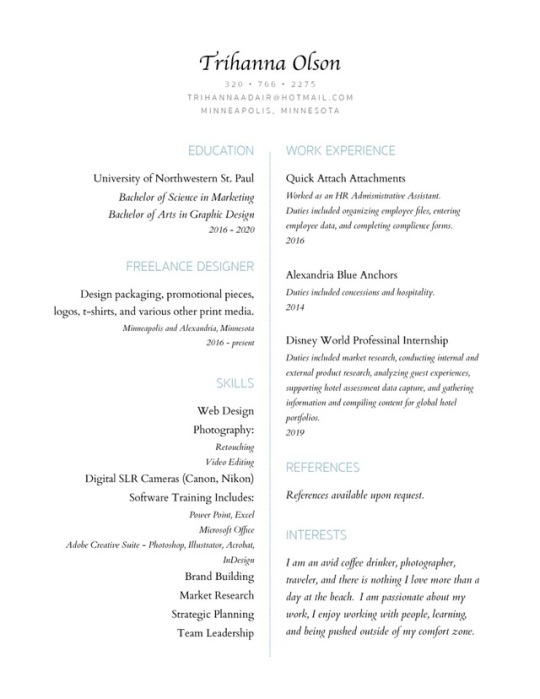
Week 7 & 8 Blogpost The Resumé For the resumé project I wanted to do something clean and simple. The most difficult part of making my resume was trying to come up with things to put on it. Other than that, I would say it was pretty challenging just trying to make all of the text look good. I did a lot of rearranging and messed around with font size quite a bit. I set my document to have 5" margins and ended up using 24pt, 15pt, 12pt, 10pt, and 9pt font size throughout the resume. My name at the top of the document is 24pt and I used the typeface "Apple Chancery". Below my name is my contact information and I used 9pt font size and the typeface "Sukhumvit Set" for that. I also used "Sukhumvit Set" for all of the headings but I used a 15pt font size and changed the font color to a blue color. Underneath my headings I used the typeface "Cardo" with a 12pt font size for each of the points. For the descriptions underneath the points I used the same typeface and font size but italicized the text. There were only a few lines of text, mostly for dates, where I used 10pt font size. Like I said, I wanted my resumé to be very simple so there isn't much other than the text. I added a dotted line down the middle of the document and made it the color blue to match the headings. I thought it looked nice and still kept it simple without making it look too plain.
0 notes
Photo
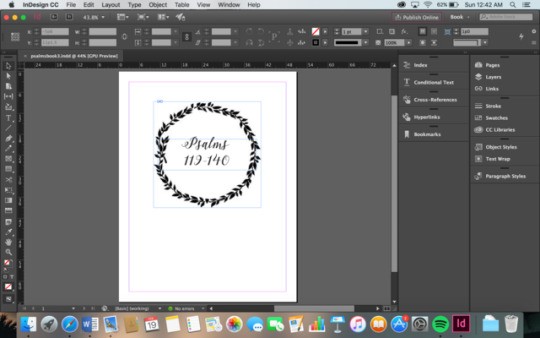
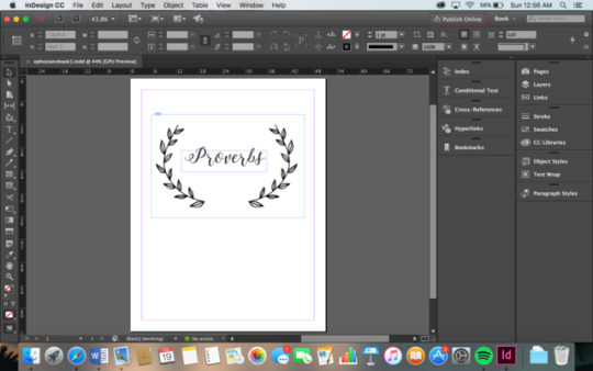
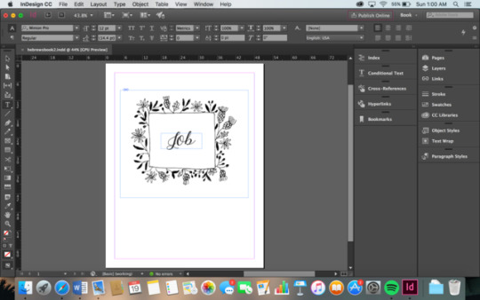
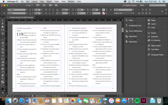
I am currently at the beginning stages of my book project. The books I have chosen are the biblical books Psalms, Proverbs, and Job. I'm pretty much finished with the covers of all three books; the designs shown in the screenshots are what I am planning on doing for the covers as of right now. The last screenshot is the format I'm using for the inside pages of the books. The typeface used is called "Cardo." I have only begun working on the inside of my Psalm book so I have quite a bit more work to do but updates will be coming soon!
0 notes
Photo
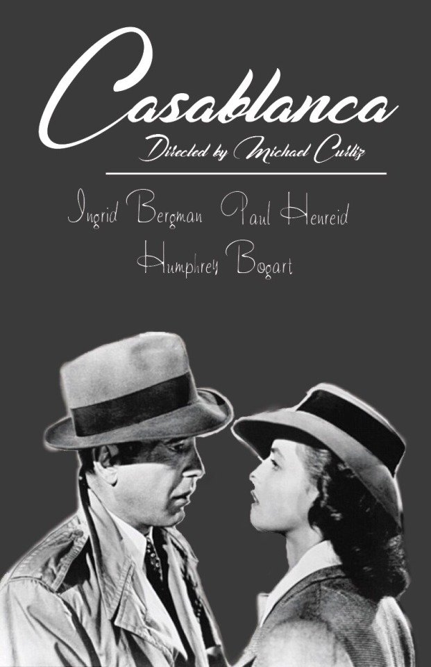
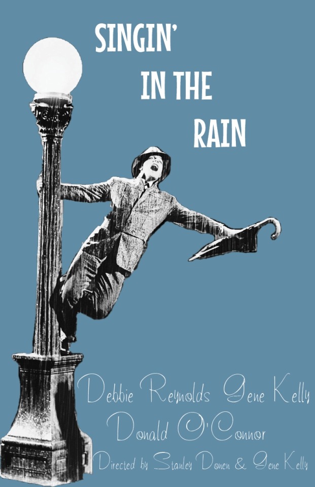
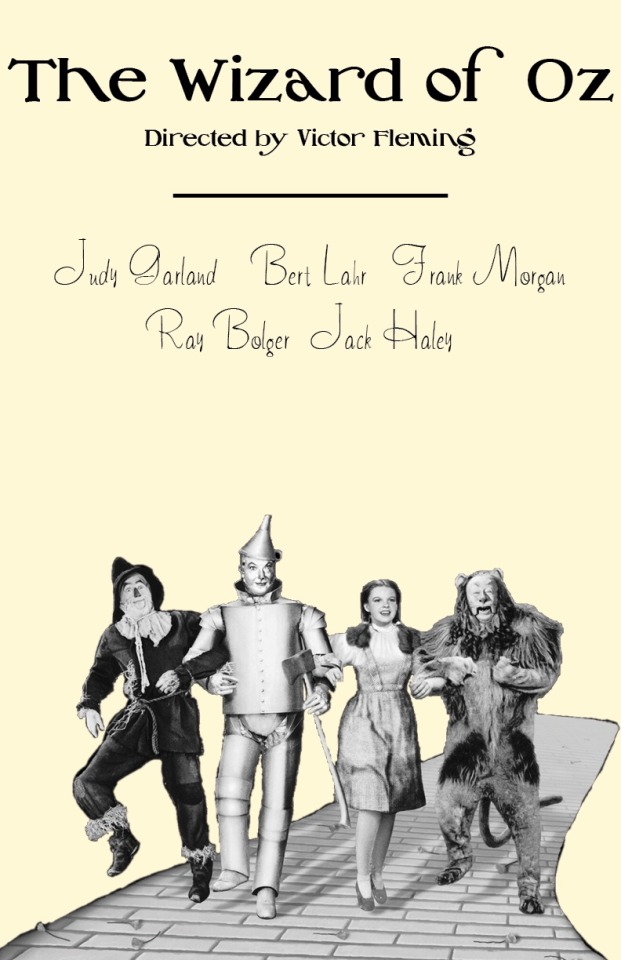
Typography Poster Project The three movies I chose are called "Casablanca," "Singin' in the Rain," and "The Wizard of Oz." They are all older films made in the 40's and 50's. For each of the posters I found the font, or a similar font, used for the production and I chose a picture from each of the films that I thought would be familiar to people who have seen them. I also included the title of the movie, the director(s), and the main actors in all of the posters. The font used in the "Casablanca" poster is called Casablanca Noir Pers. There were a few different fonts used for the original advertisements of this film and this font was one of them. I tried to find the original font used for "Singin' In the Rain" but I couldn't find it anywhere so I chose the font Mouse Memoirs to use for the title. It's not too similar to the original font, but I think it works well. For "The Wizard of Oz" I used the font Oz's Wizard. I'm not sure if this is the exact font used in the advertisements but it's very close! I used the same font called Tamarind for the actor's names. I chose this font because I thought it looked like a font that would be used in that era.
0 notes
Photo
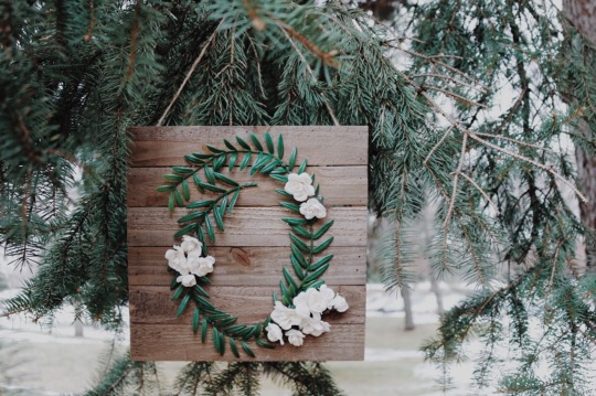
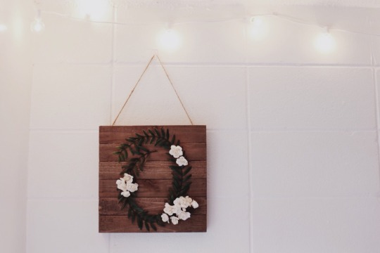
In the process of making my letterform project! I chose the letter “O” because my last name is Olson and the font I used is called “Hallelujah”.
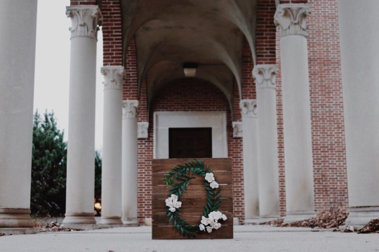
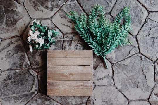
Step 1: Buy supplies
I went to Hobby Lobby to buy supplies. I got everything there, the leaves, flowers, wood, and glue. Altogether the total was around $25.
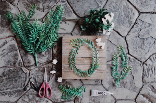
Step 2: Cut the leaves and shape them into your letter.
One of the most challenging parts of making my letter was actually cutting off the leaves from the whole bunch. I didn’t know that the bottom part of the stems were made out of wire so I had to use a wire cutter which was a little tricky. The nice thing about the wire is that it allowed me to curve the leaves into the “O” shape that I needed.
Step 3: Glue the leaves on the wood.
This part was challenging as well. The glue that I used is very sticky and doesn’t dry right away. If I could go back, I would probably use a hot glue gun instead.
Step 4: Take flowers from the bouquet and glue them to the letter.
This step was my favorite. The flowers on the bouquet actually popped off from the stem so I didn’t even have to cut them! I tried a few different arrangements with the flowers, but I finally decided on one and I’m very happy with the finished product!
0 notes