
veveshamhong
Veve Shamhong Illustration
Museum of the Self
57 posts
Don't wanna be here? Send us removal request.
Last Seen Blogs

painkillerpharmaceuticals
Untitled

snoxhoex
❄️🖤

elegantdelusionllama
Unbetitelt
kariac
Una insomne más

solsticeangel
Prince$$
Photo
I’ve begun to review my materials as the oil pastel was transferring onto different pages. I do prefer the texture which oil pastel gives however so perhaps I could scan in some swatches and collage them.
From this experiment I also think that pen works better than pencil as there is more contrast.
0 notes
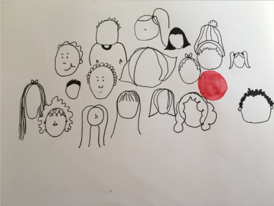
Photo

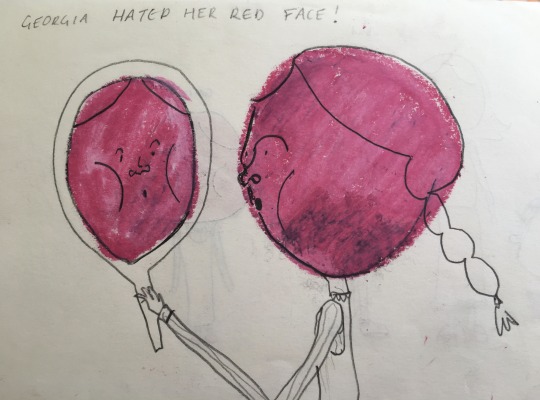


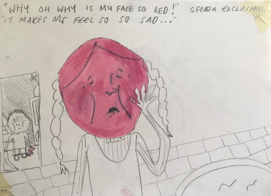
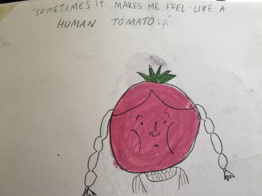
I’ve started to make a children's book about a girl with a red face. I like the contrast of the pink oil pastel compared to the rest of the sketches.
Although some of these images have a good composition (such as page 4) I do think that this could loo good as an animation.
0 notes
Photo

Illustration of my mum shouting at me - corona is making my household crazy! (A1) My mother was offended at this drawing of her.
0 notes
Text
EMMA STIBBON DRAWING WORKSHOP

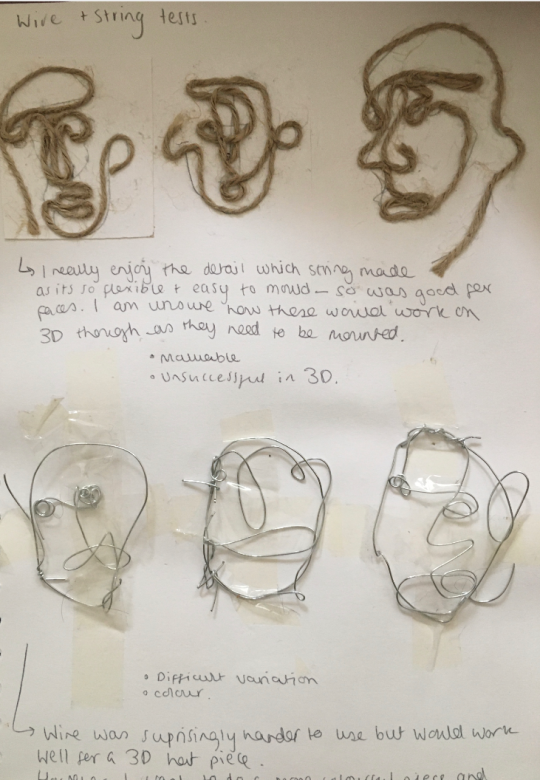
THESE ARE SOME TESTS THAT WE DID TO GET USED TO WORKING WITH INK. I FOUND THIS WORKSHOP PARTICULARLY USEFUL AS I ONLY REALLY USE INK FOR THE DARK QUALITY AND DON’T OFTEN WATER IT DOWN OR ‘PLAY’ WITH IT TO ITS FULL POTENTIAL.
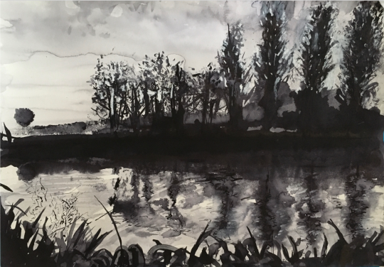
These two images of the scenery of near my home was done by folding the paper in half and pressing it together in order to get a ‘reflection’ in the water. I hadn’t thought of using this technique before Emma suggested it. It was fun to get out of my comfort zone.
I also used salt to absorb some areas of ink (see in the bushes of second image) as well as a dip pen (in reflection of top image) for finer details.

0 notes
Photo

Running From My Thoughts
I used mundane household food items to demonstrate my trivial fears of peoples opinions and my overthinking of situations.
0 notes
Photo
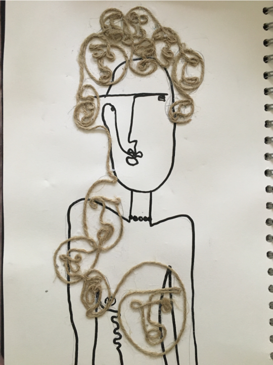


Alternative versions of my collage hat. These illustrations seem too remind me of Alexander McQueen’s hats (see bottom image).
0 notes
Photo

Tests from my sketchbook to create more multi-faced hats, inspired m=by the previous illustration.
0 notes
Photo

Developing my idea of conflicting opinions, I decided to design a hat where the many faces represent different beliefs. I think that this is a successful piece of communication as through being placed on the head, it relates directly to my thoughts. It is also not too literal.
0 notes
Photo

I decided to draw lots of faces overlapping each other to represent the many opinions which people have over politics. `I decided to adopt a quick style in which they overlap eachother to create a more chaotic feel.
I feel like I identify with the confused character in the centre left.
0 notes
Link

I have been looking at conceptual art in order to improve my own work as I enjoy it when a piece of art looks like one thing but is a metaphor about a much bigger issue - like how I wanted to use my indecisiveness about what to wear to speak out about my indecisiveness on who to vote for.
Cildo Meireles’ piece is a perfect example of using visual metaphors.
0 notes
Photo

I created a poster (top) and flag (bottom) to articulate my indecisiveness inspired by Bob and Roberta Smith.
I believe that the top image is the most successful as it looks like a protest poster from a rally yet its about my indecsiveness. To me this does achieve the subtle message regarding confusion over politics.
I dislike the aesthetic of the bottom flag but enjoyed my initial concept. I was originally thinking of making it say “I don't even know what to wear in the morning, let alone who to vote for!” but thought that this may be too literal.
0 notes
Photo
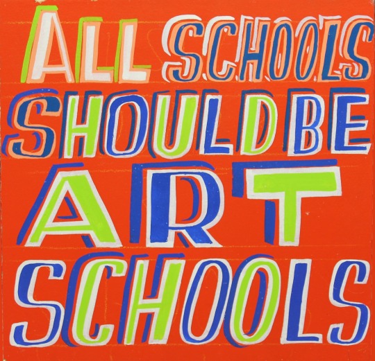

After my crit I decided to look at Bob and Roberta Smith’s work (top) to gain ideas over composition and how to make text stand out. This has inspired me to create colourful posters about buy indecisiveness and cluelessness over politics.
I also am a big Haring fan and like the way he makes the most of space through the use of marks and shape. I would like to incorporate this into my project.
0 notes
Text
Plan of action
I think that I would like to create some personal pieces about my view on politics. I often feel like I can’t keep up with politics and often feel scared to share my opinions in this field as I get intimidated by peoples strong views.
I would like to create pieces to embody this fear or lack of understanding of current affairs but I would like my work to be very discreet so that the audience doesn’t initially recognise that it is a political piece.
0 notes
Text
GROUP CRIT
Today we shared our initial starting points for the project.
I found this really useful as it gave me more direction for my project. After showing my initial poster design and explaining why I felt that it was unsuccessful it was suggested that I look at Bob and Roberta Smith or more protest art posters for composition ideas.
I was also asked if there was a particular subject that I am indecisive about or if I was focusing on indecisiveness itself.
I also do quite like the idea of making this piece political - I was thinking of perhaps making pieces about not knowing who to vote for but in an indirect way. This has given me a lot to reflect on within my practice for this project.
0 notes
Photo
PLAN FOR A POSTER
This piece is inspired somewhat by Deller’s brainstorming piece, I liked the sporadic energy of the piece and chose to mirror this through the use of arrows and text again.
Although this piece clearly evokes what I want it to, I’m not sure that the aesthetic of it is pleasing. I think that this could be more refined.
0 notes
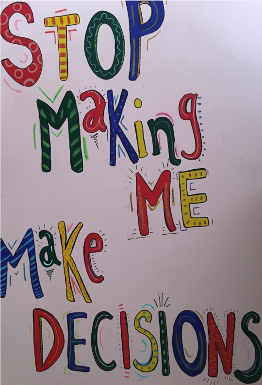
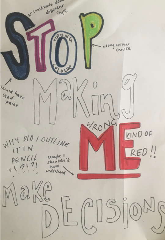
Photo

I decided to develop my idea of crossing out and created this piece that reads “Stop making me make decisions” numerous times and is crossed out.
I chose to lay this out in rows almost like a piece of writing from a school detention in order to demonstrate a sense of distress.
I think that this piece would be effective as a print or perhaps on a piece of fabric. I also like the idea of this being repeated on a very long sheet of paper.
0 notes