
webslingersguide
WIP: Webslinger's Guide to NYC
A blog to document the development and production of Webslinger's Guide to New York City, by Adam Stafford.
4 posts
Don't wanna be here? Send us removal request.
Last Seen Blogs

heybenhardy
💫💫
heybenhardy
💫💫

nemurii-the-sleeper
The Sleep Realm

in-lovewetrust
Dania

peskipixi
Peskipixi
Text
Concept: Photo-Op Call-Outs
Most folks who are familiar with Spider-Man know that Peter Parker is more than just a science wiz and a superhero- he’s also a photographer. In one of fiction’s most brilliant strokes of irony, Peter puts these skills to use by selling photos of himself in costume to J. Jonah Jameson, the publisher of the Daily Bugle and one of Spider-Man’s oldest adversaries.
With this in mind, some kind of call-out that incorporates spider-related graphics and highlights ideal locations for photography could be very useful as far as filling-out the book with unique content goes.
0 notes
Text
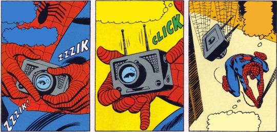
Spidey’s Swingin’ Map of Manhattan

Recently stumbled upon an article on Mark Ginochhio’s Chasing Amazing blog that features this spread from Amazing Spider-Man Annual Vol. 3 #1 by Sean Ryan and Brandon Peterson from 2014. (Note: Mark’s blog and book have become invaluable resources for this project!) This comic is new to me, depsite the cover art being an image that has been on my radar for some time. Should have picked up this issue sooner!
Pretty interesting to see the artist’s (Peterson) approach to both the map of Manhattan and it’s integration into the comic book page. It’s cool to see Spidey swinging through all of those iconic NYC locations (although swinging through a performance of what is presumably the Rockettes seems a little suspect. You better believe it’s going in the book). There’s a rigidly structured quality to the spread. To me, it kind of feels like we’re really squeezing on each of the smaller panels due to the size and location. There’s a much more dynamic version of this in my head.
Idea: If this sort of call-out motif were applied to a map in the book, perhaps that same map is repeated multiple times throughout the book, becoming a modular tool that allows me to highlight different moments for quick reference. There are probably some narrative opportunities here too. Could this even be applied as a table of contents format?
0 notes
Text
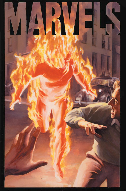
Marvelous Musings 001: Marvelocity by Chip Kidd
One of the gifts I was given this past holiday season was a copy of Marvelocity: The Marvel Comics Art of Alex Ross by Chip Kidd and Geoff Spears. This book is takes a very deep dive into the not only the work but also the life of one of the distinguished comic book artists ever. It was only a matter of time until I began stumbling upon insights that I feel could be useful in regard to Webslinger’s Guide.
In discussions about the early development of Marvels, a four-part mini series painted by Alex Ross and written by Kurt Busiek, the artist emphasizes the importance and symbolism of the superhero, specifically the original Human Torch. In describing his work on making that character believable on the page he reasoned, “how do I make a man really look like he’s burning? If I could get people to see that with fresh eyes, then I could reignite [...] an interest among a new generation.” With that in mind, he goes on to describe the potential graphic quality of the image of a burning man: “The primal aspect of a flaming form elevates the concept beyond the simplicity of a superhero, into something much more graphically impactful.”
Surely there’s something to be gained here, right? How can not only the character, Spider-Man, but the city of New York be elevated in a graphically impactful way?
0 notes
Text
Okay people, let’s do this one last time...
In 1962 Peter Parker was bitten by a radioactive spider in the lead story of Amazing Fantasy #15, an anthology comic book series bound for cancellation. In only 11 pages Stan Lee and Steve Ditko created one of the most enduring pop culture icons of the past century, one that maintains a firm grasp on the imaginations of children and adults alike.
Ask any Spider-Man fan what makes the character appeal to generations of audiences and you’re bound to hear something about how Peter Parker represents the every-man, making him very easy to relate to. Or maybe something about how the full-body costume and mask allows for a level of anonymity that defies age, race and gender, allowing anyone to see a reflection of themselves in the character if they so choose. And they’re not wrong- those are some of the character’s defining traits, further evidenced by the success of the recent animated feature, Spider-Man: Into the Spider-Verse. But there’s one aspect of Peter Parker’s story that is sometimes overlooked, despite it’s defining influence on the character. See, the thing that Spider-Man has that many superheroes don’t is a unique and vibrant relationship with his surroundings. Seriously- New York City is as intrinsic to Spider-Man as great power and great responsibility. From the skyscrapers that permit webswinging to the bodegas where Peter Parker shops, New York has always played a key role in the story of Spider-Man.
From here I’ll be documenting the design, development and production of Webslinger’s Guide to New York City: A comprehensive, illustrated guide book to the Big Apple for dedicated fans of Spider-Man! This blog will be the outlet for ramblings and inspiration, as well as highlights on the process of making the book. Let’s be honest, some of the stuff I write here will probably get printed cause I gotta have copy babyyyyyy! Anyway. I think the book will be cool. Kinda feels like I was born for this. Here goes nothing.
0 notes