
Last Seen Blogs
kleineaster
Waldbewohner

alikhan098
Untitled
yagmur-lar
Yağmur

univer-underfell
Underfell...?
theoiii-blog
in the land of gods and monsters
Text
2023.8.4-8.10 Portfolio typesetting
See the full portfolio at LEARN
0 notes
Text
Portfolio Layout Outline
After completing some of the finished products, I started to organise the layout outline of my portfolio. I'm going to divide the portfolio into four main sections: introduction, research, experiment, and outcome.
Cover
Second Semester
Aesthetic Homogenisation Appearance Anxiety
Aesthetic blindness
Visual experimentationSubject Change (Reasons)
What is beauty? Difficult to define Change of direction
Aesthetic blinders - imagination
Research
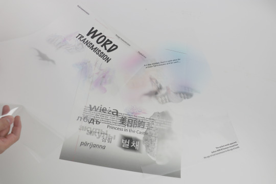
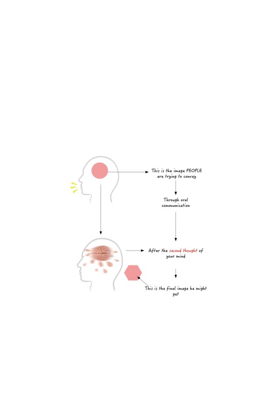
Human Dissemination of Information Research
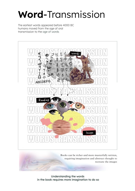
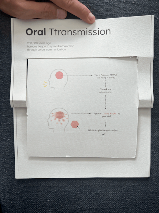
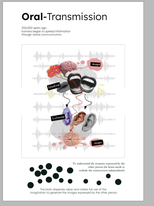
Oral communication Written communication
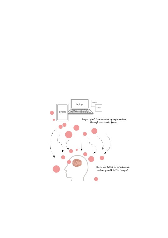
Invention of the Image Digital Age
Visual research (images, words)
The age of map reading
Oral Communication Collage & Process
Textual Communication Collage & Process
Images
Digital
Experiment 1: Installation Vision 1
Failure
Imagination affects Text Look at graphs
Mini-experiment (drawing graphs) -
Results (will be influenced)
Experiment 2: Spider Web Installation
Small Book Making
Card Design
Introduction to the principles involved
Structure test (aspect ratio height)
Card Adjustment Little Book Front Imaginative Change Module
Back Module
Print presentation
Poster Design
Stage 1 Oral Communication Concept
Layer 1 Layer 2 Layer 3
Concept Presentation
Stage 2 Text Communication Back Page
Layer 2 Layer 3
Concept Presentation
Stage 3 Picture Dissemination
Layer 1 Layer 2
Concept Presentation
Stage 4 Digital Age
Layer 1 Layer 2
Concept Showcase
Full Showcase
Installation Design
Too confined to the final result, visualising the pre
The general direction of the image
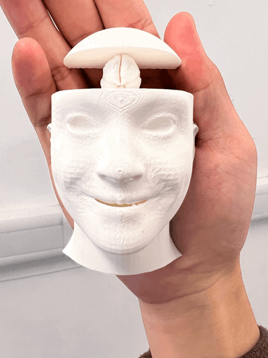
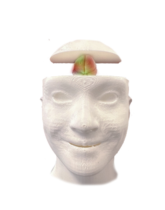
Visualisation of each stage (brain size changes)
First stage modelling
Second stage modelling
Third stage modelling
Fourth stage modelling
3d printing test
Exhibition board design
Screen Printing Failure
a0 paper printing posting
Head Colouring
Light effect production More lively
Finished product display
Overall display
0 notes
Text
2023.8.3 Poster & Card Photography
I booked a studio opposite the Museum of Scotland to photograph the posters and cards that had been printed. As my cards were white, I chose a small studio with a black background to photograph each card.


Since the poster has many layers, most of which are transparent, I chose white as the background for the shot.


0 notes
Text
2023.8.2 Installation darkroom shooting
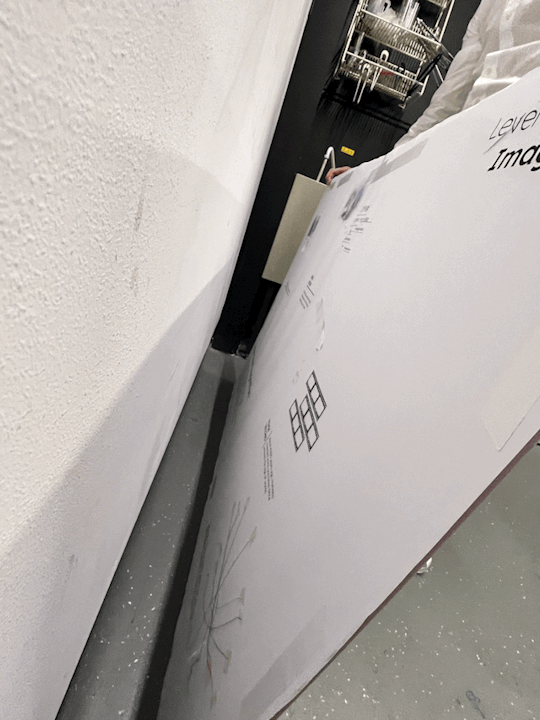
I made an appointment with the photo developing room downstairs in the ECA main building, my friend and I carried the installation from the 4th floor to the negative floor, it was very fragile as it was only glued together by a thin layer of glue, and some wrinkles appeared due to bumps during the transport.
My installation was not designed for hanging, so I had to stick double-sided tape all over the back of the unit to get it to stick to the top of the wall.


After finishing setting up the installation, I turned off the lights for the shoot.


However, because the background of the film was solid black, it made it almost impossible to see the introductory text and the image beyond the header, except for a few stages of the header.
So I went back into AE and adjusted the background colour from black to grey and adjusted the position of the "spotlight" and the overall brightness of the image was much brighter.

0 notes
Text
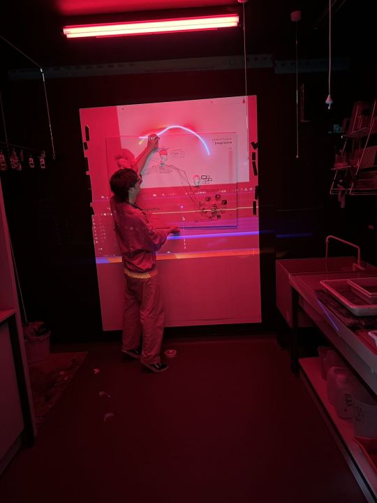
2023.7.31 installation video making
I rented a small projector from ECA's bookit, and I took the setup to the stairwell (since it's relatively dark there) and did a simple experiment by projecting the animation I made earlier through the projector onto the setup.
The video turned out pretty good, except that the trajectory of the light stream wasn't perfect. I took a vertical panorama of the installation, added it to AE, and followed the trajectory of the image to redraw the light flow.

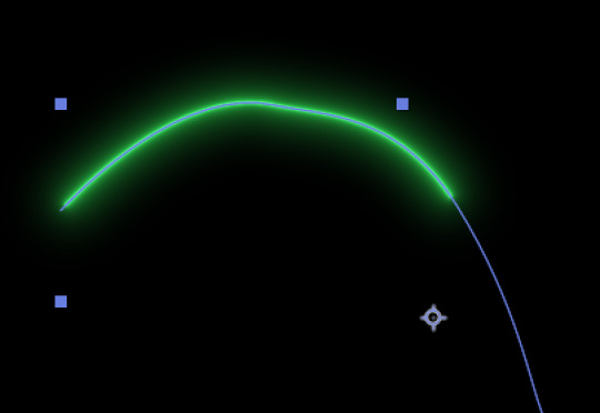
I set up the light stream trajectory in the last stage as a spiral, like a vortex, swirling into the brain of the person in the last stage.
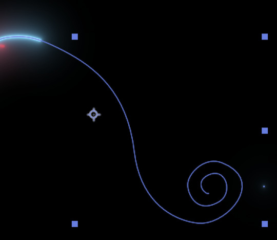
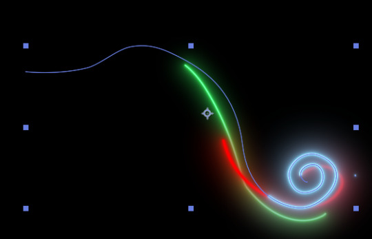
I also added a "spotlight" effect on the dots corresponding to each stage and adjusted their opacity so that they flicker over time.
Final video:
0 notes
Text
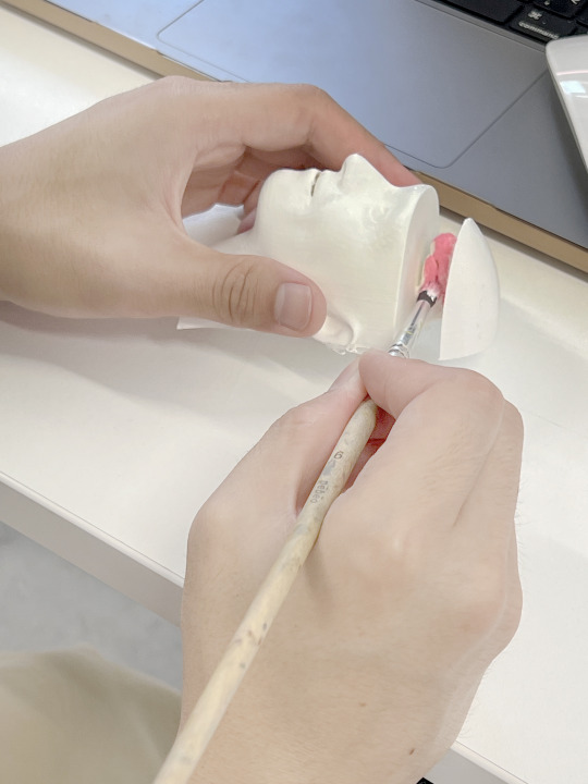
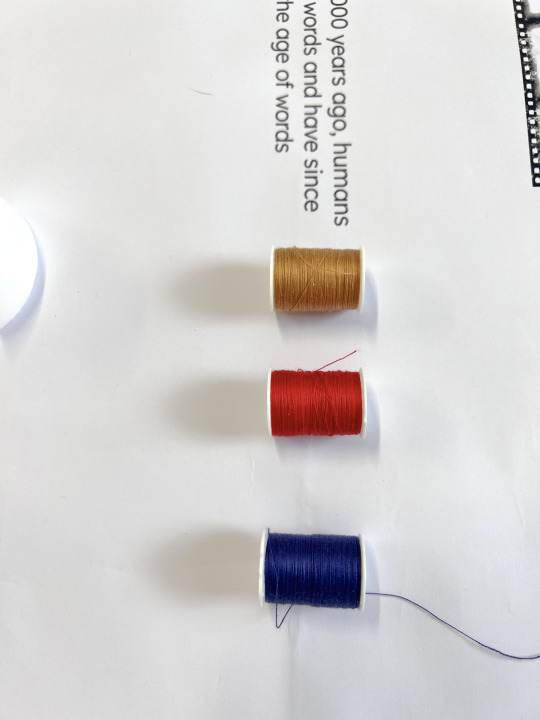
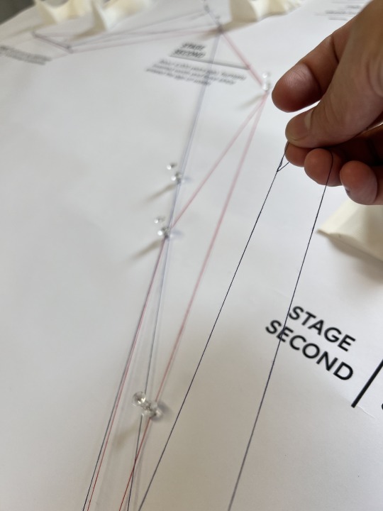
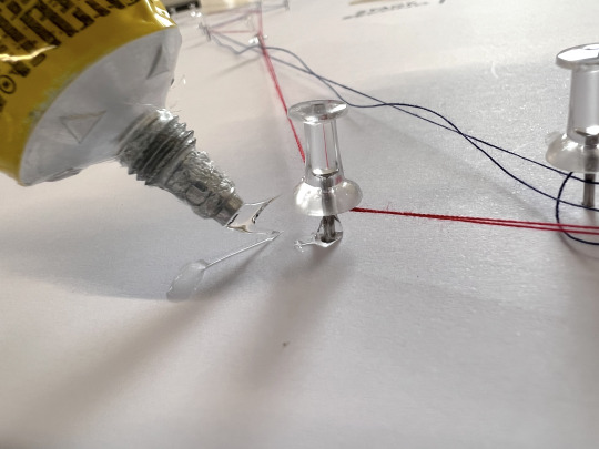
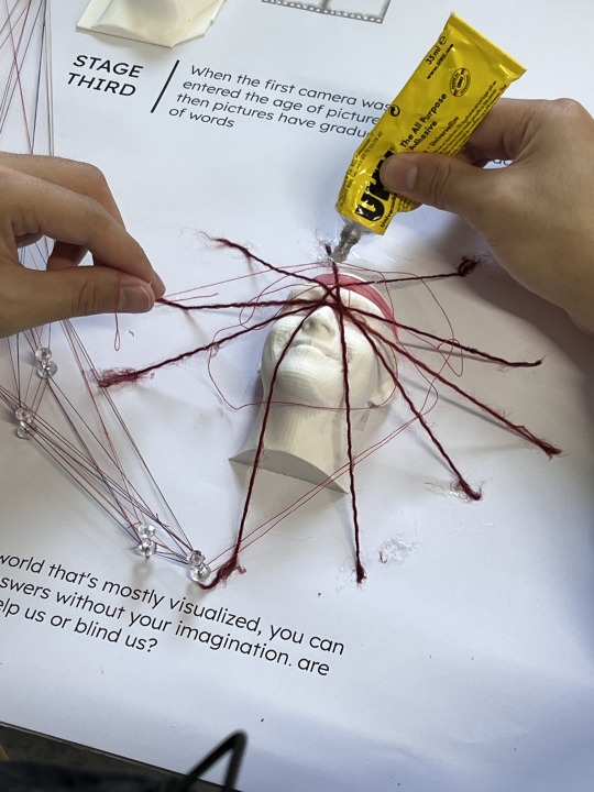
2023.7.30 Set installation up
After completing the installation backboard, I began assembling the unit. I found it difficult to see the size of the four stage heads in plain white, so I mixed red and white paint to create a pastel colour for the brains of each stage.


On the layout, I used pins to roughly depict the path, and then used red, blue, and yellow threads to wrap around the individual pins to form a threaded CHART.
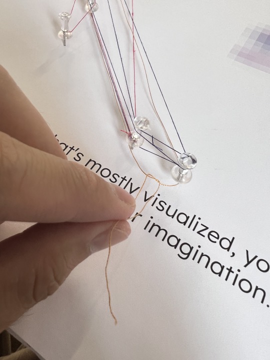
Finally, the head of each stage was gradually pasted on. For the last stage, I kept the same presentation as in the mid-term visual experiment, wrapping the head in a spider's web of red thread and adding a web software collage at the end of the "spider's web".

Final Showcase:

0 notes
Text
2023.7.29 Installation backboard printing
I sent my prepared background image to the screen printing studio and chatted with my tutor.


but the results I got weren't very good because I'm not a good candidate for screen printing in this case because:
It doesn't print the colours very well and there may be chromatic aberration.
The surface of the foam cardboard is relatively smooth, and the ink will easily smear on it.
There is also a gap between the two panels and it was therefore not aesthetically pleasing.
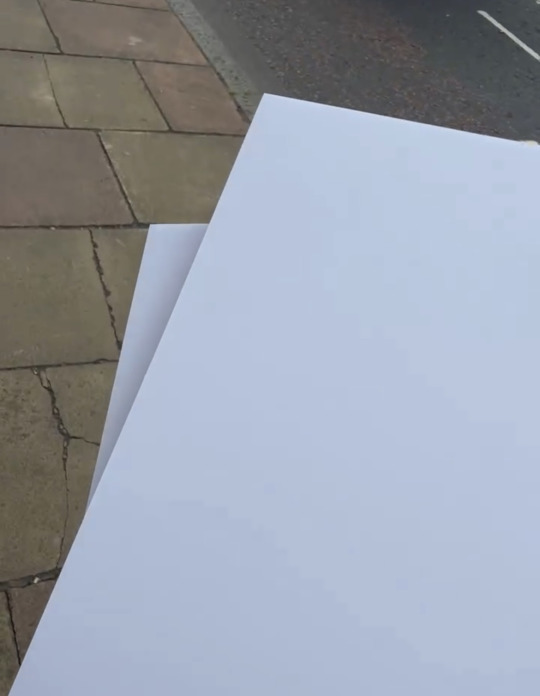
After being told that I had to change my printing method, I started to try digital printing. i uploaded my image in Print-it and chose A0 size for printing.
Once I received the print, I covered it directly onto the background board, which was not only more convenient but also covered the gap between the two boards.


0 notes
Text
2023.7.28 Installation backboard making
In order to build the installation to completion, so the first step was to design a backdrop for the installation. I bought two A1 white foam boards in Artshop, as A1 is the largest size they come in, and to create the A0 display board I had to glue two A1 boards together.
After stitching the panels together, I started to design the graphics for the exhibition, which should correspond to the four phases. I roughly positioned each stage in the software, and underneath each stage, I introduced an overview of the current stage in "Lexend" font, with a large space at the bottom left to introduce the theme of the project.
After completing the design of the display board, I booked an appointment for screen printing tomorrow to prepare the background of the display board to be printed onto the foam board via screen printing.
0 notes
Text
2023.7.27 Installation Video Production
After finishing the first two series, I started to focus my attention on the installation, as this is the main part of my final project. I started working on the effects video for the installation, and the idea I had in mind was quite simple - add a few streams of light that would flow along the first stage to the last stage to make it look more dynamic.
I used AE to create the line movement and added a "deep glow" effect to give it a strong external glow.
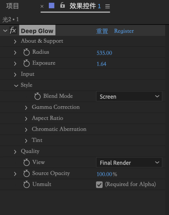

But since the unit is not fully built yet, there is no reference for a trajectory of movement, tomorrow I will finish building the unit and set the direction of the optical flow according to the position of the unit.
0 notes
Text
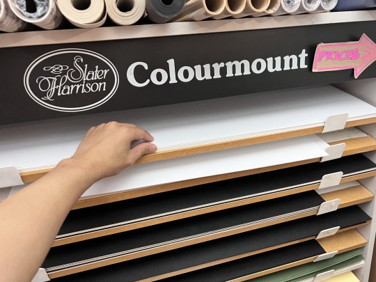
2023.7.26 Card printing
I laid out the cards for the four stages in the layout format I set up yesterday and sent them to print-it for printing on A5 card stock, as A4 card stock is too big for the 'cards' and the A4 product looks more like a poster.


Once printed, I cut and folded along the cut lines of the card. And finally finished this series.


0 notes
Text
Card typesetting
I transferred the first stage from the previous handbook to the "card", and on the top left of the front of the card I added the title and the introductory text for this stage, similar to the layout of the previous handbook, except that I put the collage from the second page of the book on the front, and on the back I put the vector introductory image of human communication (the image on the back had to be upside down, because it needed to be flipped).


I took A4 paper and typed up a small sample, and although structurally it looked fine, I noticed that in its folded state it looked very empty underneath, there were no elements, and the center of gravity of the whole image was shifted upwards.
So I tried to add some words and patterns at the bottom of the front of the card, I added a summary slogan under each stage and I designed some patterns as well, I tried to add some black balls under the card for each different stage, the more balls meant more imagination.

Then it felt like the black ball didn't go very well with the overall card and it looked very tangential. So I tried adding the Imagination element from the previous poster to the bottom of the card to replace the black ball.
I stretched the imagery element thin by using the liquefy tool to fit in with being able to fill in between the text.


0 notes
Text
2023.7.25 Card series: structures
I'm going to change the format of the previous handbook part 1 section, and instead of using the small book format, I'm going to make it into cards. As for why:
because it only has 4 stages, so it's 8 pages, and as a small book, it doesn't have enough weight.
the cards are relatively self-contained individuals that don't get mixed up.
the cards could do with some more interesting structural designs.
I found a lot of inspirations on Pinterest, one of them is that the card can be stretched and flipped, which can show the content of the information on the front and the back, so I am going to use the front side of the card as the basic presentation side, and make collage art on the back side (the flipped side).
I did some trial and error experimenting with the dimensions. I experimented with discarded form paper in the Chinese restaurant where I work part-time, and I first tried adjusting the width away from the sides at the vertical cuts.
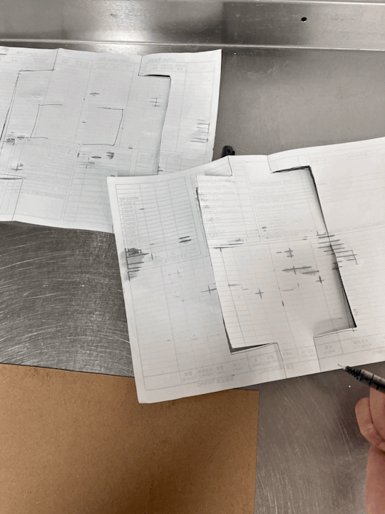
It was found that if the cut lines were too close to the sides on the inner layer, the flipped over image would extend beyond the overall frame; conversely, if they were too far away, the flipped over image would barely have enough room to show.
When I got home I took a4 paper and experimented with different margins.


After several experiments, I created a structure chart that works best for my card, and it allows enough room to show all the images when flipped.

The grey part is the cut line, and the grey line in the "square" is the warning line, it means that the image on the opposite side can't go beyond that line, otherwise, when it is rotated the image will go beyond the box.
0 notes
Text
Final exhibition poster production
I wanted to emphasise the damaged part of the model at the beginning, so I was going to use a torch to hit the wall with the light coming through the hole in the head . The location was chosen in my darkened room, and I stuck the model to the wall and adjusted the position of the light source in different locations for several shots.


Finally I chose one from the left light source, I put it into PS, darkened the background colour, brightened the area of the head crack, and stretched the imagery element through the liquefy tool to form a smoke state floating out of the head crack.

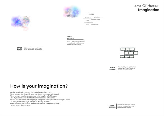
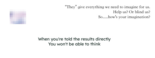
The name of my project is: How is your imagination?
My project brief is: When you are chatting with your friends, will you imagine what he said? When you are reading a novel, maybe your mind will be full of images . But if you see a novel that has been remade into a TV series, do you still remember the images you imagined when you were reading the novel? when visualizations fill your eyeballs, do you still imagine anything? So......how is your imagination?
Through layers of rhetorical questions, it makes the reader reflective and arouses the reader's interest.

0 notes
Text
Exhibition poster feedback
I showed my graduation poster to Mr Davey this afternoon and he thought I was very creepy and even a bit scary with this head. Suggested that I should choose a new head for the shot.
I looked at my first failure and although there was some damage to his head, the damage made it more unique and "artistic".

Of course the damage also inspired me, it was like an outlet for the brain and the imagination could just float out of that outlet.
I decided to use the head as the main object of the poster, focusing on the damages on the head.
0 notes
Text
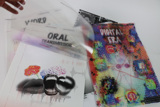
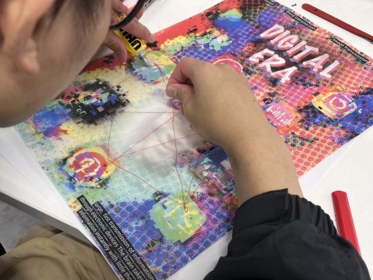
Digital Era poster
This stage will be similar in structure to the third stage. For the second level, I designed the entire colour palette to be blue, red, and yellow against a background of the digital electronic technology era. In order to relate to the last stage of the installation, I replaced the elements that bound the imagination with the products of the electronic age - software, and media. And in the centre of the poster, there is a hollow area in the shape of a human head.


I photographed the last stage of the head and added a small colourful layer of imagination to his brain and used it as the underlying subject matter.
I added some text around the header to explain that "his" imagination is being limited by some digital electronic software.
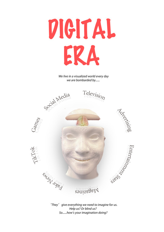
After printing, I attached red threads to the outer layer of the poster, forming a software "spider web" that echoed the final stage of the installation.


0 notes
Text
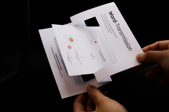
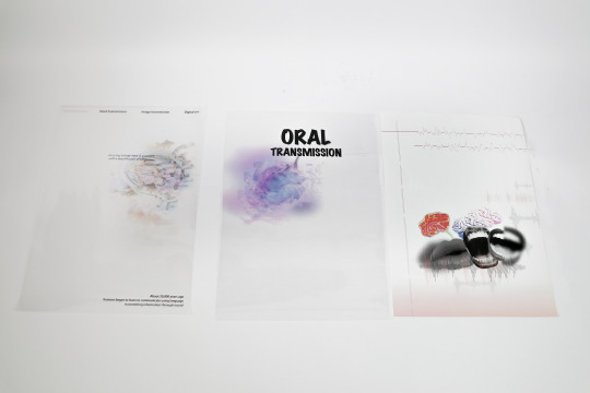
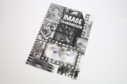
2023.7.25 Image Transmission
The nature of this stage is completely different from the nature of the previous two stages, the theme of the latter two stages is masking, so the second layer of the poster has to be designed as a blinding layer.
I was confused for a long time during the design process of this poster because I didn't know how I could show that the image is full of the visual world. At first, I tried to pile up some visual elements that represent images such as old photographs, magazine covers, and part of a comic on the poster, but the style was very inconsistent.
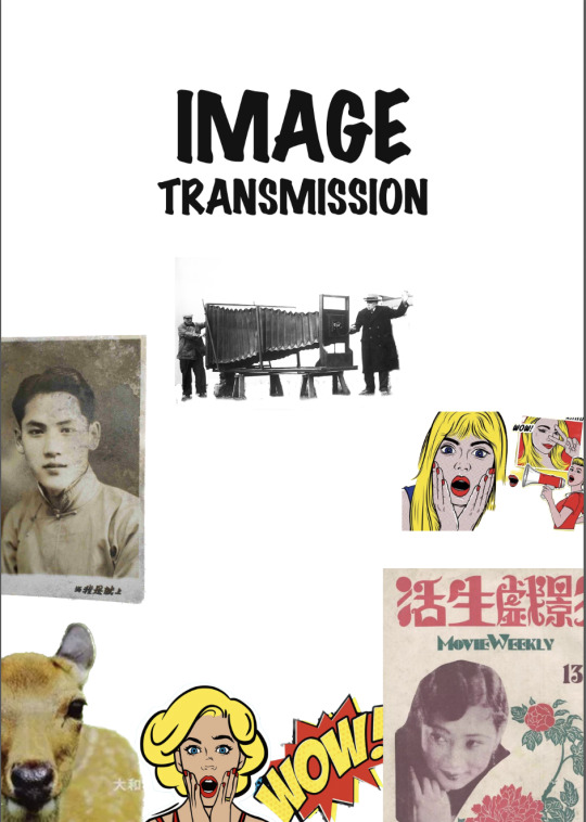
Then I came across a piece of work done by a friend of mine that had a filmic feel to it. The word "film" inspired me, as film is synonymous with cameras and pictures, and that was exactly what I needed for my poster.

For the outer layer of the poster, I filled the film with many images that represent "images", some old photos, black and white comics, magazine covers, etc. Of course, this film can also symbolise a cage, which locks people's imagination firmly. So I designed a film in the middle of the poster, with the film in a HOLLOW design, so that people can see the imagination inside the base layer from outside the "cage". I didn't add too much text to the outer layer of the poster, but put the text on the inner layer, so that when people lift the poster up they can read the text on the inner layer.

So on the ground floor, I put the eyes and the "imagination" collage in the "cage", and added some text below and above the eyes, so that when people lift the poster up they can read the text inside and reflect on it.

0 notes
Text
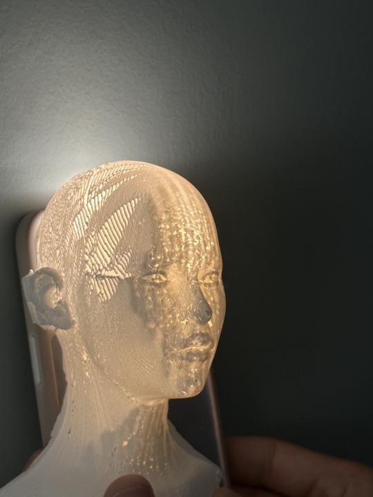
3d printing collection:
I received an email from ECA that my "header" was printed and it turned out pretty good with no visible damage.

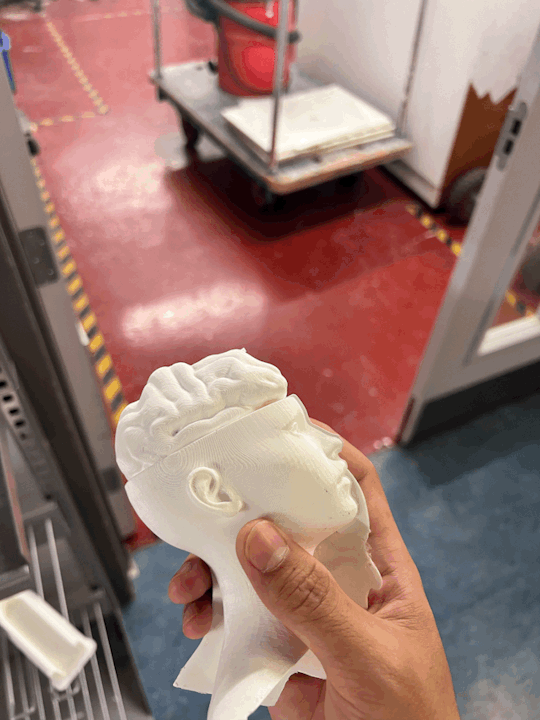


And the model is also very accurate and the right size.
0 notes