
Last Seen Blogs

rubyjnk
𖤐
ambrosaur
Reaction

omglydiapeters-blog
Untitled

maddieshubeck
MADDIE SHUBECK

shamrockdaddy
Untitled
Text
week11
After brainstorming, I looked at several photographers' websites on the subject of litter. Many of the stories they wanted to tell were related to the issue of plastic waste, marine pollution, environmental pollution, ecosystems and other litter issues. However, I felt again that what I wanted to convey was to pay attention to things that we don't normally pay attention to, and to the diversity of the waste that is spread around our towns.
For this reason, I would like to take more photos in the future.
0 notes
Text

week 10
①
This photo is unique in its framing. The part of the body that is not the face was cut off, and there are a few margins.
There is powerful image and impressive. And it gives a little bit frightening impression because she is not smile.
It reminds me of a picture of a dump truck in exhibition of Moriyama Daido. That picture also had a few backgrounds, and it was impressive.
②
This photo is characteristic in tis color. It’s darker overall and there is contrast of black and white.
A depressing image is felt because there are much black color. Also, the contrast makes it look very messy.
I remember the same black-and-white photo of Daido Moriyama with many cans piled up.
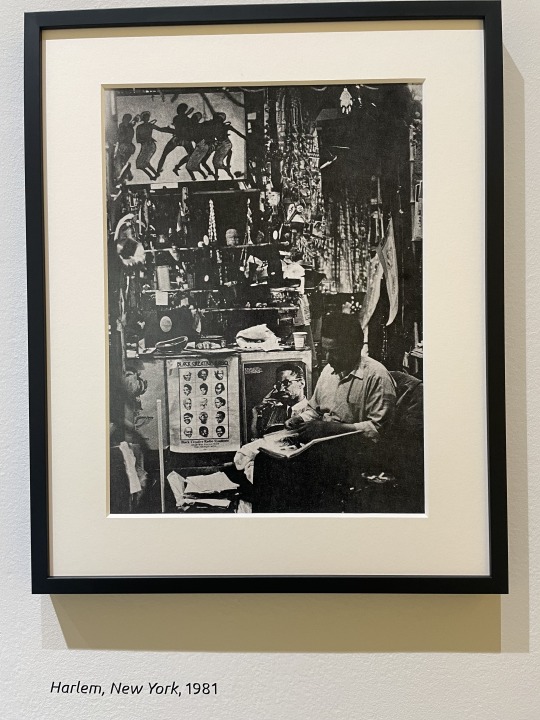
③
The key to this picture is the point of view. This photo was taken a little high level from his head.
Shooting from above makes him a little smaller, and his immaturity is expressed. Also contrast with clothing is impressive.
I remember photos of children in V&A museum.
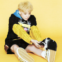
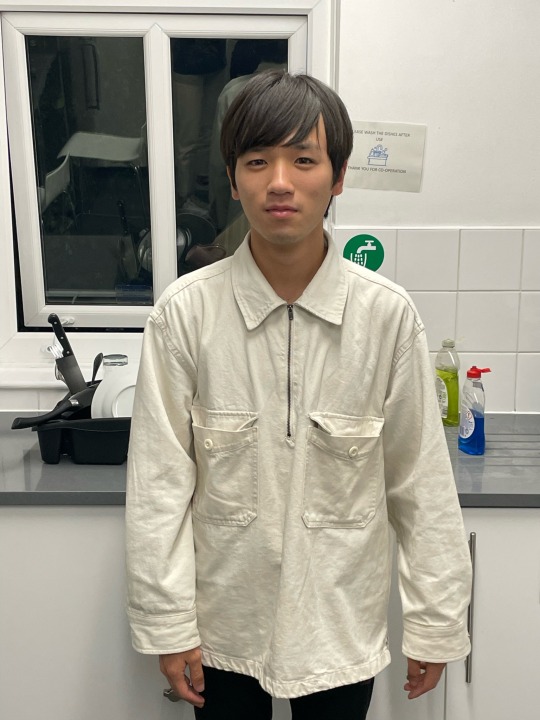
This photo shows everyday life. I chose the normal clothes because there is ordinary fashion more than special one in Francis' work. I used photographic attributes of light, point of view and background. I expressed light and shadow by focusing on one light and creating contrast. The left side is brighter and the right side is darker. This implies good and bad aspects of everyday life. Also, when comparing photos taken with several types of light, this photo has the clearest and most striking shape. With spotlights and ceiling lights, the overall impression was bright and blurred, while with ceiling lights alone, the entire front of the building was dark. In addition, I took a picture from low level, and I show powerful impression. Different perspectives were also most effective here. At eye level and upper level, the impression was a bit cheesy. Also, to represent everyday life, the background was not prepared and the miscellaneous appearance was kept as it was. Analysis of the photographs shows that there is a Shape with the head at the top and a Line that matches the shape of the body. It can also be said that Angle is a straight line from the centre to the face.
This way of cropping the photo gives the impression that it is no longer about everyday fashion, but more like a portrait. Also, the contrast between light and shadow seems stronger. There are no facial expressions, so it is impossible to read the feelings.
0 notes
Text
Week9
What are these photos of? What might link them?
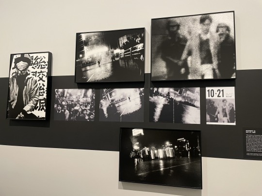
Demonstrators, police officer
anti-war movement
What is the message behind them?
The heroism and misery of these movements
How do you know this?
Comment and light in the photo
How do these photos convey the intended message visually?
The photo is skewed, blurry, or grainy
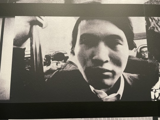
①
Explain why you chose this photo.
This photo was probably taken on a train, but I was curious as to why and how it was taken.
Describe how focus, contrast and composition are used in the photo, and what effect each of these attributes has.
This photo does not focus on the man's face, which takes up most of the photo. In contrast, the focus is on the people in the background, making it difficult to tell who is the main character.
Analyse the relationship between what you see in the photo and its message.
In the comments attached to these photos, it was written that there was a separation between reality and photos. It is true that this way of focusing cannot be said to be the natural way of looking at people.
Do you need to read the exhibition text to understand the message of the photo?
Yes, because I didn’t understand meaning without text.
Do you need to see the photo in the context of a series, or does this one photo convey the intended message on its own?
This one photo can convey the message, but it is easier to convey the message in a series.
Does the title help?
No
Does the style of the photo remind you of anything you have seen before?
It reminded me of crowded trains in Japan.
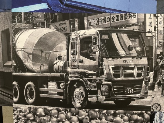
②
Explain why you chose this photo.
Other photos related to women were taken, but this one was different.
Describe how focus, contrast and composition are used in the photo, and what effect each of these attributes has.
A large, clear photo of the truck fills the entire frame.
Analyse the relationship between what you see in the photo and its message.
I think the roundness of the tank represents a message, a metaphor for the female image.
Do you need to read the exhibition text to understand the message of the photo?
I think the roundness of the tank represents a message, a metaphor for the female image.
Do you need to see the photo in the context of a series, or does this one photo convey the intended message on its own?
I think the roundness of the tank represents a message, a metaphor for the female image.
Does the title help?
Yes
Does the style of the photo remind you of anything you have seen before?
I remember an anime with vivid pictures.
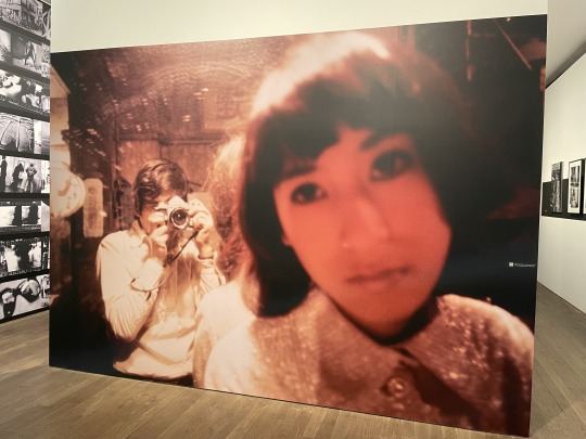
③
Explain why you chose this photo.
Because this photograph was the largest on display.
Describe how focus, contrast and composition are used in the photo, and what effect each of these attributes has.
The focus is not on the woman in the foreground, but on the photographer herself in the background. This shows that the main character is himself.
Analyse the relationship between what you see in the photo and its message.
As his colour photographs are rare, this one is considered to have special significance.
Do you need to read the exhibition text to understand the message of the photo?
The text revealed a few colour photographs.
Do you need to see the photo in the context of a series, or does this one photo convey the intended message on its own?
This picture alone conveys how valuable it is.
Does the title help?
Yas
Does the style of the photo remind you of anything you have seen before?
I felt like a couple.
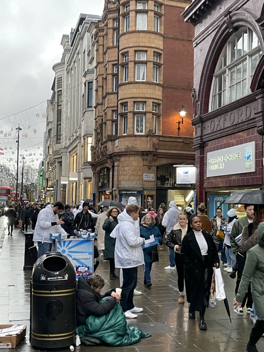
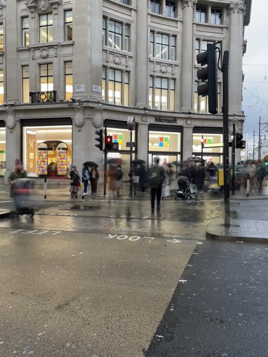
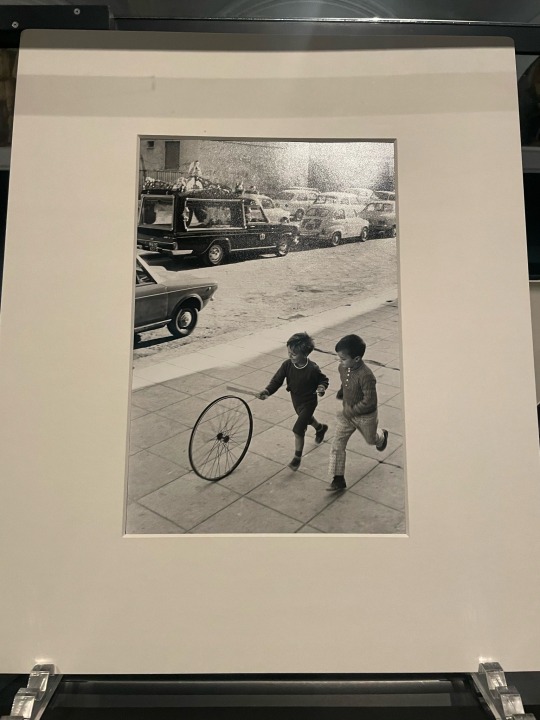
I took these pictures to show diversity. The Londoners are a diverse group of people of different races and lifestyles, and I think it's a bit hustle and bustle with a lot of people coming and going. This picture shows a very large variety of people: people handing out goods, homeless people in front of bins, people holding umbrellas, black and white people. In order to make it look crowded again, the photo was zoomed in a bit so that it did not spread out. The next photo was taken with a long exposure to show the rush of Londoners to cross the road even at a red light. On the other hand, I was also able to show the contrast with the people who were keeping to the traffic lights.
0 notes
Text
week8
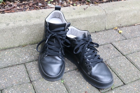
Daido Moriyama, Light and shadow
The composition of the image
SHAPE has a square in the middle with a slightly widened bottom. There is a line along the block and the angle is towards the toe. Colour and tone are lighter around the perimeter and darker on the shoes.
The use of light
Sunlight from the top left, slightly brighter overall.
What is the mood of the photograph?
Normal, but a little white overall, so there is a fantastic mood.
What is the photograph of? (Concrete subject: this is what you see in the image)
shoes
What is the photograph about? (Abstract subject: this is how you interpret what you see in the image)
I thought that these shoes might have been worn by men who did dirty work. I imagined that he wanted to represent the toughness and coolness of such people without using people.
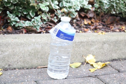
I practised on shutter speed and aperture. I had used a smartphone camera for my previous assignments, but this time I used my own SLR camera with different values for them. I felt that a slower shutter speed would make the overall image brighter and more illusory, as in the sample photo. These values were also set based on the amount of light reflected on the shoes. From the photograph of the plastic bottle, it was felt that by using a smaller aperture value, the difference in depth of field can be clearly defined and the object in the foreground can be emphasised. I also felt that it was more striking when taken from the side rather than at an oblique angle. I also found it difficult to take exactly the same pictures. As no two situations are exactly the same, such as the light or the background, I was reminded that each photograph captures a precious moment.
I'm going to do a series of photos of litter. After seeing ChloeJuno's collection of photographs, I thought that the photographs of litter gave me a sense of people's lives. I want to represent the stories of people living in London by photographing the litter on the streets of London. I am a little worried about the commonality of the photographs. I think only about food waste, only about waste in the park, only about waste in the bins, etc. I'm going to use the same composition. I thought it would be possible to slow down the shutter speed to brighten the overall image and make it a little more fantastic, or conversely, to use a flash to make the object stand out. Beyond this, I think you need to take your SLR camera with you and collect photos of rubbish taken in several compositions.
0 notes
Text
Week 7
Our team divide roles of each part. As a result, composition analysis and information analysis have become separated. And I couldn't comprehensively analyze a single photo. Therefore, I realized that by analyzing each image one by one and finally discussing the results of each analysis, I was able to capture the series well. Also, since my analysis of composition using photographic terminology was insufficient, I felt it was necessary to not only read the intention from the information, but also to review composition.
0 notes
Text
Week5
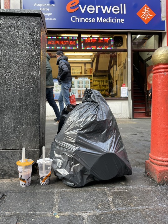
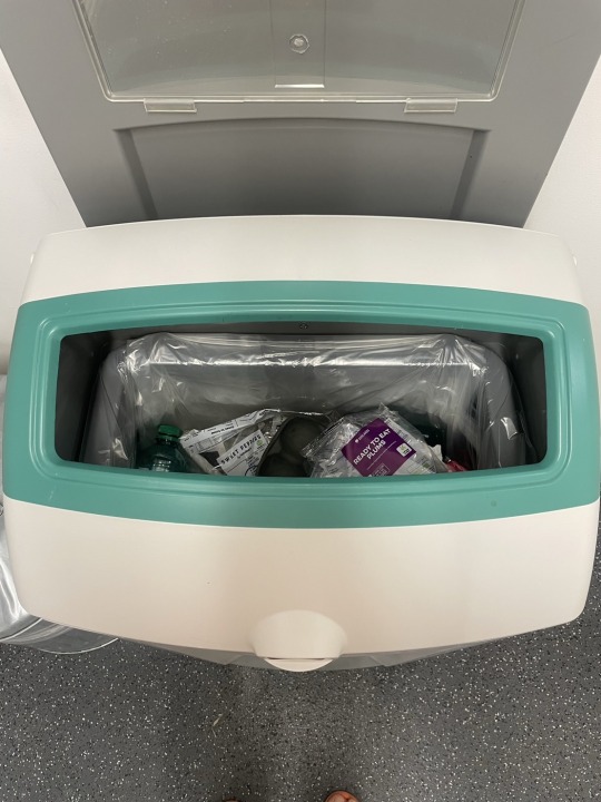
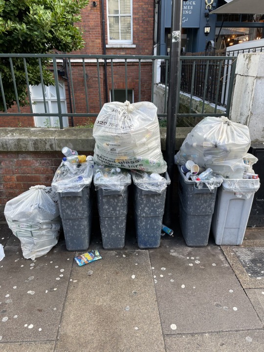
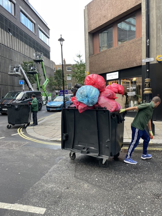
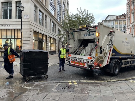
The main point I have chosen to focus on is litter. In the first picture, I took a picture of the litter on the side of the road in Chinatown. In the second one, this is a litter box in my flat. In the third one, this is where the litter is collected near Beker street. In the forth one, I took photos of the alleyway behind Soho where litter was collected and carried away. In the fifth one, this is a picture of litter being taken onto a vehicle. I wanted to tell about the beautiful people behind the ugly thing called litter. In our everyday lives we dispose of litter on the roadside or at home without thinking about it. But the streets are not full of those ugly things. It is because there are people who collect our litter and my message is that we should not forget to appreciate those beautiful people.
0 notes
Text
Week5
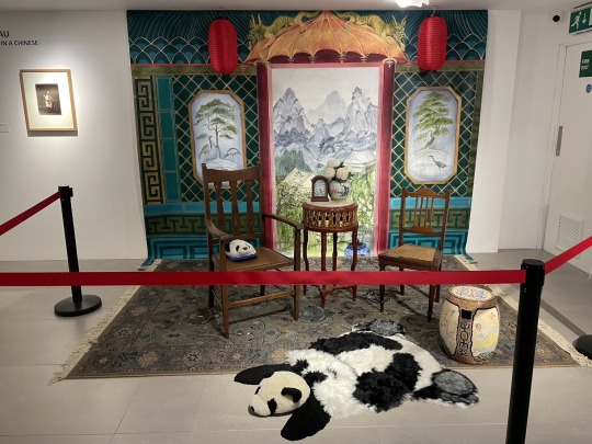
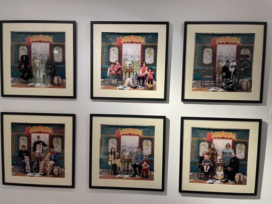
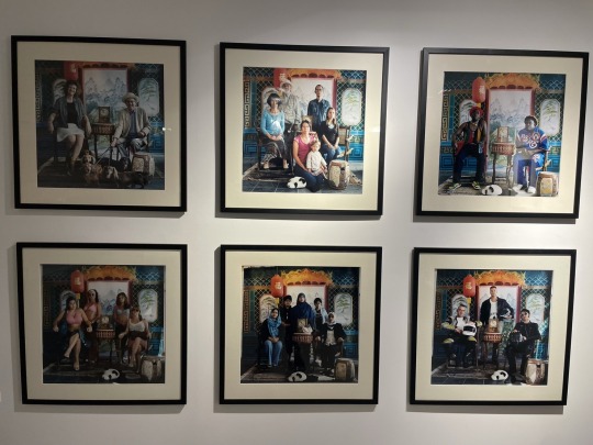
・ What is the artist trying to do/show/say with this work?
I think this artist try to show human diversity. In this photo, many kind of people were taken. For example, children, young men, elderly person, African, Asian, European, family, friends and so on.
・ What techniques is the artist using to convey this message?
Background and composition is same, so the differences between each of these people are highlighted.
・Do you consider these “good” photographs? Why / why not and what are your criteria?
In my opinion, these photo aren't good because these are non-natural. They looks like mechanical and not real. But because it is mechanical, it is superior when it comes to comparison.
・Do they convey the artist’s intended message? (How does your answer to this question relate to your answer to the previous question?)
I was conveyed the message because it is easy to understand about difference of people.
・What is the effect of seeing several of the images together as a series?
The photos in the same series are arranged in a row so that each can be compared.
・How does the written information change your understanding of the photographs?
The explanation states that it was recommended that they take their usual belongings with them. This differs from their first impression and reflects their Real.
0 notes
Text
Week4
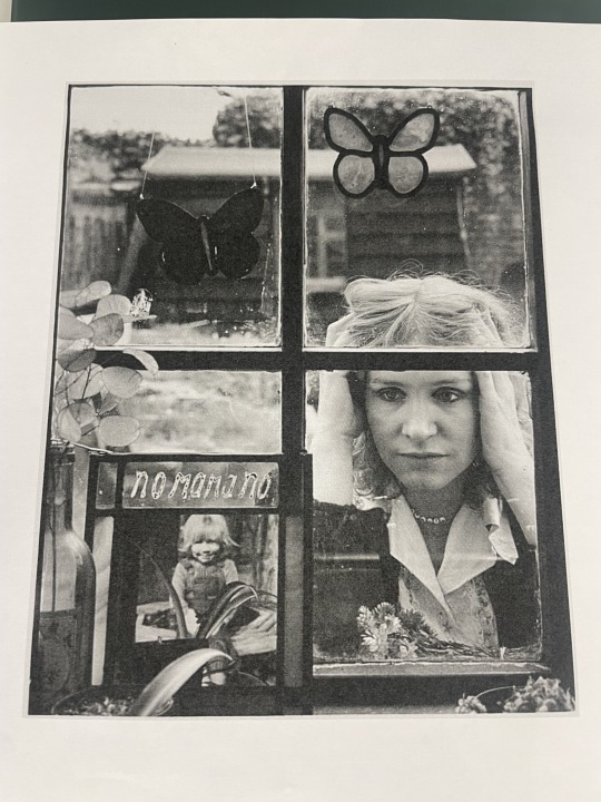
1.Describe the composition of the image
There are vertical and horizontal lines on the window frame. The photo frame and the outline of the woman are considered shape. There is an angle from the bottom left through the picture to the woman. Butterflies are one of the pattern. Point of view is same level as her.
2. How have light and tone been used and what effect does this have?
Above and below of the photo is dark tone. In contrast, center of the photo is light tone. Thereby woman face is emphasised.
3. How has focus been used and what effect does this have?
This is taken to focus on the woman's face and picture at a medium aperture. Eyes naturally move to the woman's face.
4. What does the pose/posture of the person depicted convey about him/her?
The woman make pose like having her head. I can feel the threat.
5. What is the most interesting aspect of the photo?
It is that woman can't look at photo. Because photo faces this side.
6. What is the mood of the photograph? What creates this mood?
I can feel something not good mood. Because baby is laugh but woman doesn't look like happy. And it is also interesting to note that women are outside.
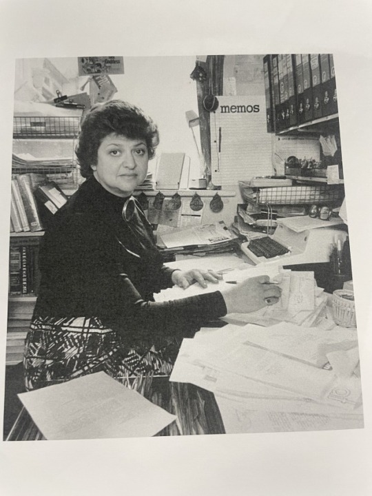
1.Describe the composition of the image
There is a slight horizontal lines on the window frame. The outline of the woman is shape. There is an angle from the bottom left and right to the woman. Typewriter and books are one of the pattern. Point of view is same level as her.
2.How have light and tone been used and what effect does this have?
Women's clothing is dark tone. In contrast, objects around her is light tone. Objests are emphasised so I can imagine her working very busy.
3.How has focus been used and what effect does this have?
This photo dosen't focus on one point at a widely aperture. It close to true perspective so there is an everydayness to this picture.
4.What does the pose/posture of the person depicted convey about him/her?
She is posing at work. I can feel also daily life.
5.What is the most interesting aspect of the photo?
That she is not overdressed.
6.What is the mood of the photograph? What creates this mood?
There is reality. Because there are many goods I use a lot and blurring is low.
The first and second photos were taken in the same way as the photos of the woman peeping through. The third photo was taken in the same way as the photos of the woman sitting in front of the desk. Overall, only the pose was able to capture the features of the photograph. The third picture was taken by bending over so that the point of view was at the same height. On the other hand, the first and second photos have a higher point of view than the sample. As for the focus, all the pictures were wide open and the third one was close to the sample, while the first and second pictures should have been taken with a smaller aperture value. In all the photos the subjects were smaller than the samples, so the photographer should have moved closer or zoomed in. Also, all the pictures were bright and should have been slightly darker with a smaller ISO.
0 notes
Text

Week3
This photo has a very small aperture size and the hole is very large. So depth of field is narrow and the background is blurred.
The point of view may be Becoming the subject because it seems like the object and the line of sight level are same height. The shape is triangle with the face as the top. There are vertical line of doll and horizontal line of table. There are not much contrast of light and tone and it has an overall non-bright white color.
The subject is greatly emphasized by reducing the aperture and blurring the background. I can recognize details and feel beauty of the doll. There is reality because it doesn’t have contrast of tone.
series
Most of the photos are of women's faces with serious expressions. There are also photos of plants, insects and scenery.
Many photos relates women but they don’t looks happy. I can feel kindness in photos of the hands and berries. So I think it shows various lifestyle of women.
Many photos have a small aperture and focus on one object. But photos which photographer wants to see the background like the picture of two men kissing is clear overall. Point of view is eye level. Shapes is various but many of them are triangles with top at center. A lot of light is shining from the front. The contrast of tone isn’t much but many photos a little orange color.
The common point is women.
Before I read information, I noticed about only women life. After I read information, I understood meaning of photos of buildings, spider web wall and two kissing men.
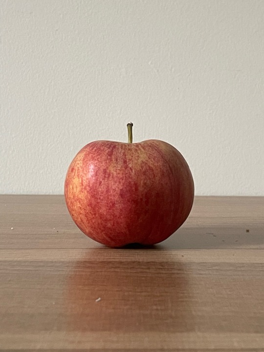
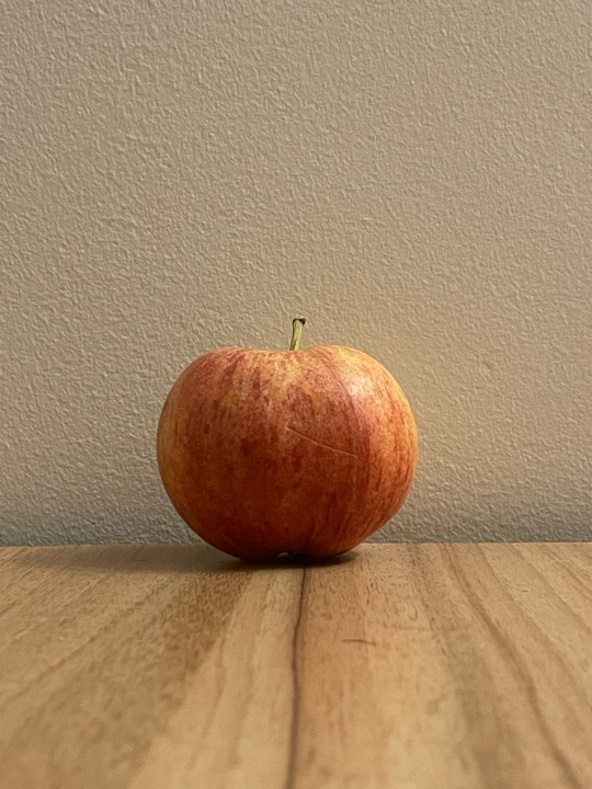
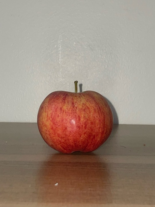
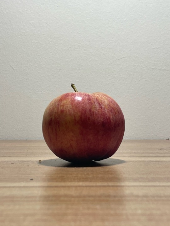
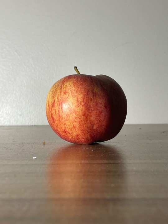
The first photo was taken using fluorescent room light. It’s the most common and doesn’t have huge character. Since the light is on the ceiling, it is diffused and the entire area is illuminated. The second photo was taken using natural light. This day is cloudy so the white light is diffused and hits a wide area from the window side. This photo is similar to first one but the colors are a little warm and the shadows look natural. The third photo was taken using orange light. I feel like warm and delicious. The fourth photo was taken using flash. The flash is the most white and easy to recognize shapes and color of this apple. But it looks cool and mechanical. The fifth photo was taken using desk light from above. Light rarely comes from directly above, so shadows and light reflections are a little unnatural. The fifth photo was taken using desk light from left side. It’s also unnatural but artistic because light and shadow are separated clearly. And I feel a little scared from these two photos because shadows are large.
0 notes
Text
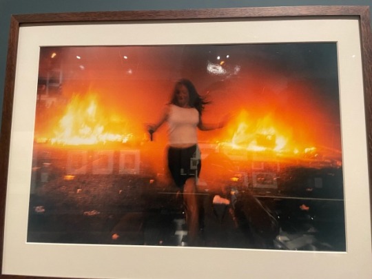


Week2
Vinca Petersen (born 1973)
Riot Girl
1998
The flame looks like it has a triangular shape. And the woman looks like a vertical line, and the two flames look like horizontal lines. There is no clear focus, but you can see a line of focus towards the flame. The cameraman's perspective is thought to be at eye level. There is a clear light contrast, the front is dark and the flame is a bright red.
These compositions emphasize the flames and have the effect of naturally guiding the audience's gaze. The blurring of the woman also gives a sense of urgency in this place.
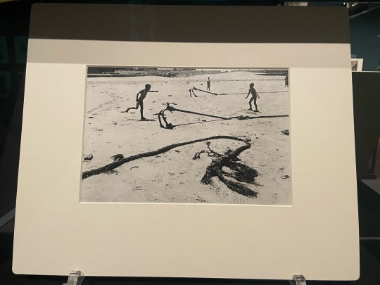
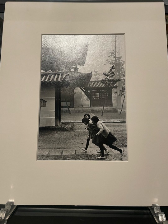
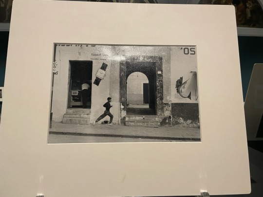
Henri Cartier-Bresson (1908-2004)
Palermo, Sicily, 1972
Puebla, Mexico, 1963
Kyoto, 1965
Spanish Morocco, Asilah, 1933
Andalucia, Seville, 1933
March Past on the 10th Anniversary of the Proclamation of the People's Republic of China, 1958
These photos show the daily lives of children in each country. The environment around the children is also captured.
The children in all the photos are lively and I can feel their innocence. I felt that it expressed happiness in everyday life.
They capture a moment in each scene, and there are not many commonalities in composition.
I felt that taking photos from eye level is the most common and makes the whole photo look good. Because they are at eye level, their eyes meet naturally and you feel a sense of intimacy. Taking a photo from above makes the subject appear smaller. Because I'm watching from above, I feel a sense of superiority, as if I'm stronger than you. Also, in the case of portraits, the face is close to the viewpoint, so it looks like the face has become larger. A photo taken from below is the opposite of a photo taken from above, making the subject appear larger. The subject looks strong and its presence is felt. As a result, I feel defeated and inferior. Photographs that “become the subject” depict the actual world that the photographer is focusing on. Therefore, I can feel like you are actually the photographer. Also, this photo has a sense of familiarity.
0 notes
Text
Week1
How would you describe Gideon Mendel’s approach to photography?
This photo focuses on people who have had unfortunate events happen to them.
What do you notice about the way he photographs people and place?
His photographs place people at the centre and people is not laugh.
He takes pictures in places where the unfortunate events actually happened.
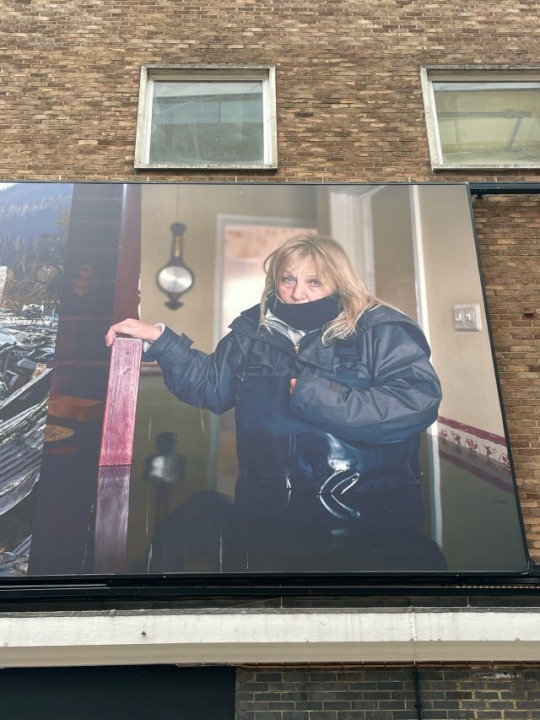
Describe what you see in the photo.
This is a photo of a woman whose house was flooded.
What do you notice about how focus, contrast or composition are used in this photo?
This photograph shows a woman in the centre of the picture at large and background is simply.
There is contrast because it was taken near women.
Describe what effect each of these attributes has.
Audience focus on facial expression and leaves an impression of people.
Analyse the relationship between what you see in the photo and its message. Do you need additional information to understand the message?
Message is that there is a house but she can’t live in the house.
I want to know surrounding situation.
Dose the style of the photo remind you of anything you have seen before?
war orphan
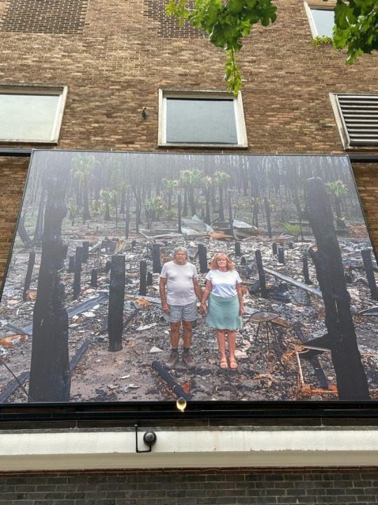
Describe what you see in the photo.
This is a photo of a couple whose house was fired.
What do you notice about how focus, contrast or composition are used in this photo?
This photograph shows a couple at the center of the picture at a bit small and it was taken widely from higher position than eye level.
There is not much contrast.
Describe what effect each of these attributes has.
They looks like burnt wooden pillar.
Analyse the relationship between what you see in the photo and its message. Do you need additional information to understand the message?
I feel the vanishing feeling of having lost everything.
It means the horror of the flames.
Dose the style of the photo remind you of anything you have seen before?
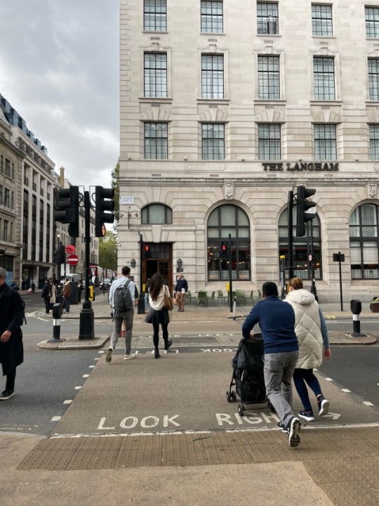
I took this photo while walking from school to the store. Location is Regent street and time is around noon. There are pedestrian crossing, buildings and people in this photo. I took this photo from chest height and I kept distance from subjects. There is not sunlight because it was cloudy. I focused on moving pedestrians. The reason which I choose this photo is because I felt that it was a typical London scenery. In spite of traffic lights is red, much people cross the street quickly. Even if the car doesn’t come, almost all people wait until the traffic lights turns green in Japan. But there are people waiting if you look at the back on the right in this photo. Because the signal on the vertical car roadway is green. It is difficult to judge when the pedestrian crossing signal turn green. But “Look right” mark is very kind.
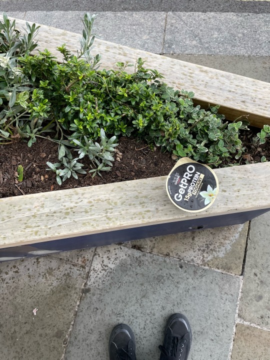
I took this photo while walking from the store to the restaurant where I work part time. Location is near Oxford Circus and time is around 2pm. There are a yogurt litter, a planting bed, a road and my foot. I took this photo from above and I kept a distance of about 40cm from subjects. There is not sunlight because it was rain. I focused on shape of subjects. There is not moving subjects and the focus is on the litter. The reason which I choose this photo is because I felt that there are different types of lines in this photo. For example, circle of the litter, diagonal line of the planter, and square of the road. And then some lines are not mechanical like grass and my shoes. I thought these different shapes and depths were very interesting. Also, I feel a little sad about the litter left there.
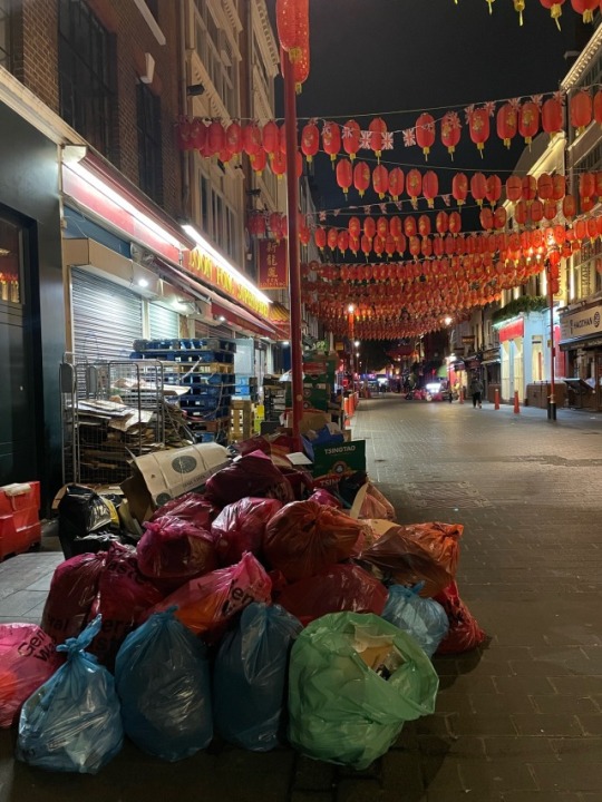
I took this photo while walking from the restaurant where I work part time to the bus stop after my part time job. The location is in the Chinatown and the time is around midnight. There are a lot of litter, Chinese lanterns, and buildings. I took this photo from chest height and I kept a distance from subjects. There is not sunlight because it was at night . I focused on Chinatown with no visiting people. The reason which I choose this photo is because the scenery contrasted with the daytime and I felt a lonely atmosphere. Chinatown is crowded with a lot of people during the day. On the other hand, there were hardly any people at this time, and there were only large piles of litter in the city. At night, Chinatown becomes a mess of litter instead of people. I found these very interesting and melancholy.
0 notes