charlie-ellott-viscom-blog
Charlie’s Work
Charlie Ellott's BCU Blog
61 posts
Don't wanna be here? Send us removal request.
Last Seen Blogs

funnythingshere0-blog
Funny Thing Here
mystic-moonscape
ֆȶʀǟռɖɛɖ ɨռ ֆքǟƈɛ 💝✨💫

femalecelebritybeauty
Beautiful Female Celebrities

almalaky
Al Malaky Royal

harddinosaurwombat
Untitled
Text
Enterprise: Evaluation
“In the module Enterprise of Graphic Communication we were tasked with the brief of designing and branding a festival of our own choosing. I decided to do a country music festival, because I figured it would be easier to design for something I can relate to and enjoy. I really enjoyed this module because I could get involved so deeply, and design something that I would enjoy personally. Here I will explain how I reached all my conclusions and what inspired my festival brand.
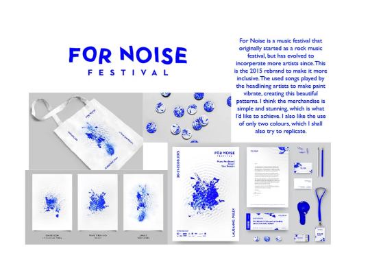
As every good project begins I start by researching into existing festivals. I found a number of powerful designs on Bechance that I loved, and I found inspiration in all of them. The one that spoke to me the most was a festival called For Noise. The designs are simple and stunning, which is something I wished to replicate in my own work.
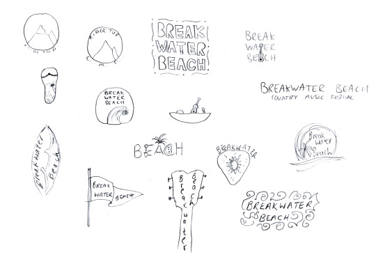
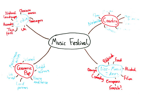
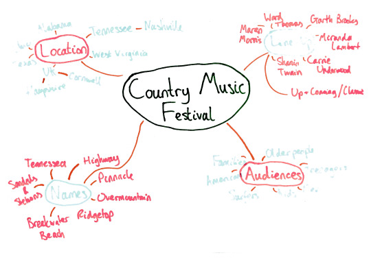
I started the design process by mind-mapping various ideas, for names, locations, genres and audiences. Originally I wanted to set a classic country festival in Nashville, Tennessee, the home of American country music. I came up with the name of Highway Festival, because highways in America are often mentioned in country songs. However when I discussed this with my peers and tutors, we realised that it sounds like a car festival, and doesn’t scream country at all. I therefore continued brainstorming, and decided to bring the festival to the UK, namely Cornwall. I found a quaint little beach in St. Ives called Breakwater Beach and instantly decided that it was the perfect name and location for my festival. I then began to mock up some more logo ideas for this new name.
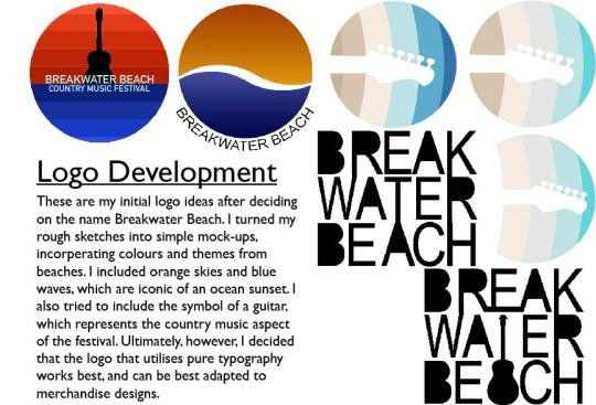
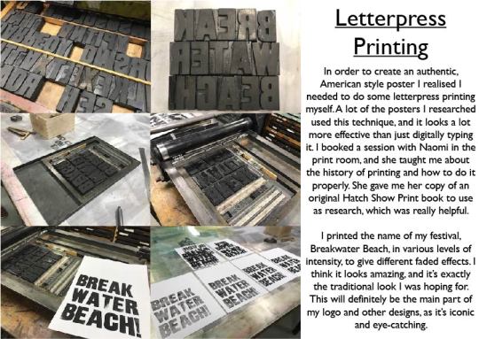
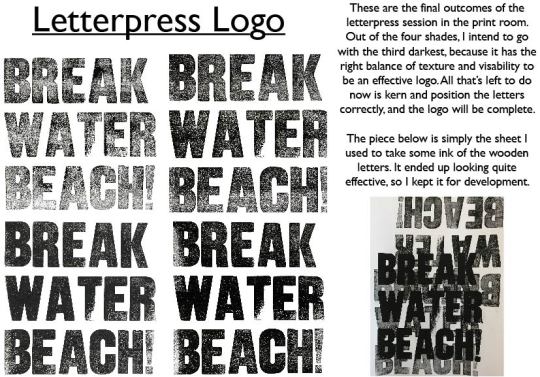
After I digitalised some of the logo ideas I decided to go with my favourite, which was a type-orientated logo that simply had the name on. It represents the classic type-based country posters, but also has a modern feel. However, it still didn't feel right, so I spoke to my tutors about where I could take it and they led me to discover the wonders of letterpress printing. I booked a session with Naomi in the print room, where she taught me all about the history and maths behind this legendary form of printing. I then printed my logo in a large, bold, sans-serif font, which looked absolutely amazing. I tried it in various levels of intensity, and then when I’d finished I put it onto the computer to position and kern properly. I now had the makings of a great logo.
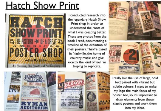
The next step was to incorporate this logo into poster designs. While I was in the print room Naomi taught me all about the Hatch Show Print company in Nashville, and even gave me her copy of a book about their history for me to research into. I loved all the poster designs, especially the ones with type going in unusual directions. This inspired me to create a completely type-based poster, with just the logo and other words going in different directions around the page. I used the font family of Gill Sans to make the body copy, as I felt the clean, crisp, modernness of the font perfectly balanced out the ruggedness of the logo. I also incorporated a sandy background with a slight driftwood background, to add the beach atmosphere to the poster. I only added a few of the headlining acts to the poster, in order to excite people and attract them to the festival. The full line-up poster is very similar, except it’s been rearranged and has more artists on. The colour scheme comes from the palette I created on Coolors using a picture of Breakwater Beach, so it’s completely natural and realistic. I’m happy with these posters; I feel that they represent everything I intended to get across, and sum up all of what the festival is about.
The next step was to create the merchandise, which is the part I found most fun. I simply used the colours from the palette and the wooden background from the poster to create plectrums, t-shirts, tote bags, postcards and wrist bands. I also put the line-up poster onto a beach towel, which I thought was the most thoughtful piece of merchandise. The plectrums are to be given out for free, as a souvenir.
The map was what I created next, and also what I found the hardest part by a mile. This was because all the ones I’d researched were for large venues with multiple events, whereas my festival was tiny, on just one beach. Therefore I decided to map out the roads in, to allow travellers to avoid getting lost and also find parking spots. The map is what I’m least happy with, as I feel it doesn't fit with the rest of the brand. This is what I’d make the most changes to if I were to attempt this brief again.
Finally, I decided to make a short gif for the festival, prompting the line-up. I used After Effects, a software I had never used before, to animate a wave washing up on a beach, dragging with it the logo and line-up. I’m very happy with this, and also very proud of it, as I feel I’ve created a successful gif with zero prior experience.
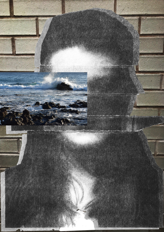
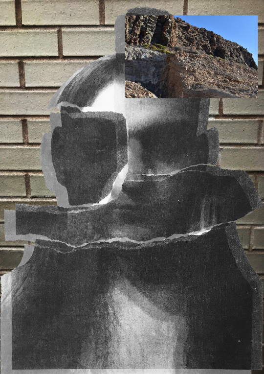
Alongside this brief we had to create an entry for the Secret 7” charity. Mine is for the song I Saved The World Today by Eurythmics, which to me talks about depression and mental health. My design shows that there’s often more behind a fake smile than meets the eye.
Overall I am very happy with my festival brand. I feel that I created a lot in the time given, and to a good standard. I could see it being a real festival, and definitely one I would attend. If I were to change anything, it would be the complexity of the map, or just the whole design in general. Despite this, I feel that I have shown imagination and risk when it comes to the design process. There was a lot that could’ve gone wrong, especially with the printing, but it all worked spectacularly. I also think that I’ve thought about the audience throughout the project, and made sure their needs as country music fans have been met and surpassed.”
0 notes
Text
Enterprise: Brand Guidelines
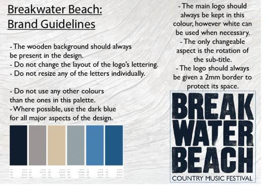
The colour palette and other specifications for my festival brand.
0 notes
Text
Enterprise: Festival Map
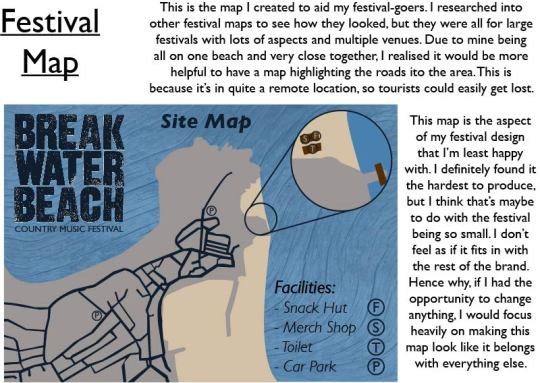
The map for the festival, guiding tourists to parking and other facilities.
0 notes
Text
Enterprise: Merchandise
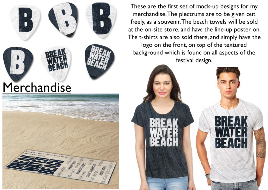
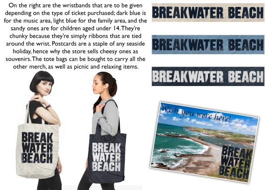
The merchandise to be sold in the on-site store at the festival.
0 notes
Text
Enterprise: Final Posters
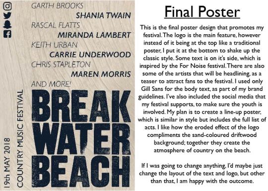
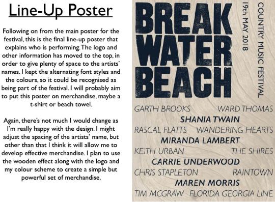
The final posters for Breakwater Beach Country Music Festival 2018.
0 notes
Text
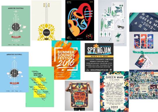
Enterprise: Poster Mocks
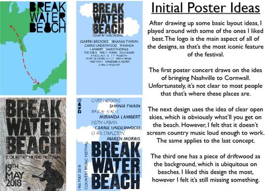
Here are some early mock-ups of possible posters that didn’t make the cut.
0 notes
Text
Enterprise: Brand Development
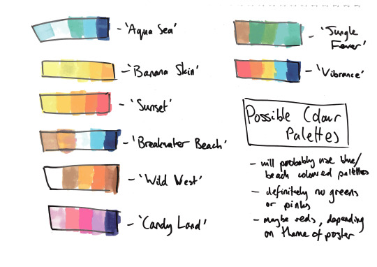
This is how I experimented with ideas to create the colour scheme and body copy for my brand.
0 notes
Text
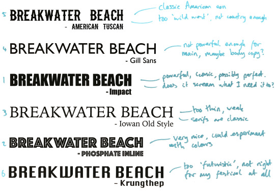
Enterprise: Logo Development

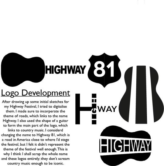
This is the development of how I created the logo for my country music festival, including research into Hatch Show Print company.
0 notes
Text
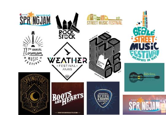
Enterprise: Festival Research
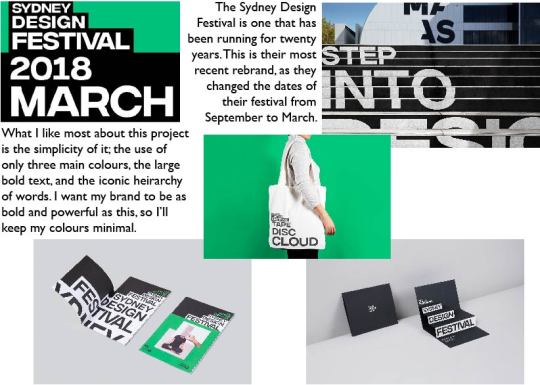
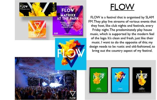
Some festivals I researched in order to inspire my own work.
0 notes
Text
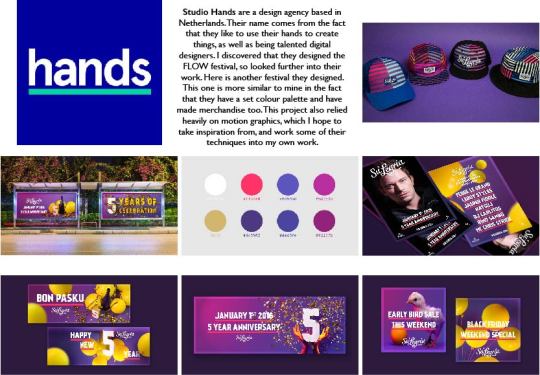
Enterprise: Competitor Research
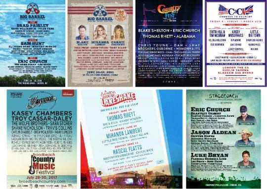
Research into other country festival brands.
0 notes
Text
Enterprise: Audience Profiles
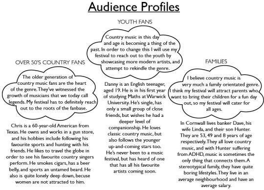
These are the target audiences that my festival is aimed out.
0 notes
Text
Enterprise: Mind-Maps
0 notes
Text
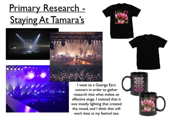
Narrative: Final Outcome
0 notes
Photo
0 notes
Photo

0 notes
Photo
0 notes