
paulandkarenartandlife
The Great Experiment
Paul and Karen
Art and Life
39 posts
Don't wanna be here? Send us removal request.
Last Seen Blogs

theskedaddling
Missing Miscellany

sectormight-blog
WHEN THERE'S A WILL.

irockinerd-blog1
irockinerd tumblr post

orderneedschildren
Order Needs Children

preciouspawsgifts
Dog Bandanas
Text
Fragments of Folkestone
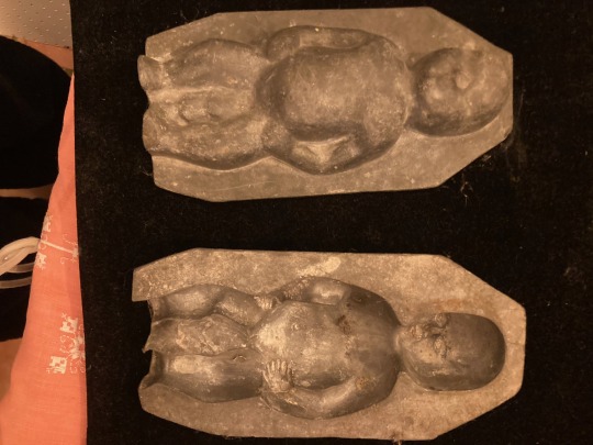
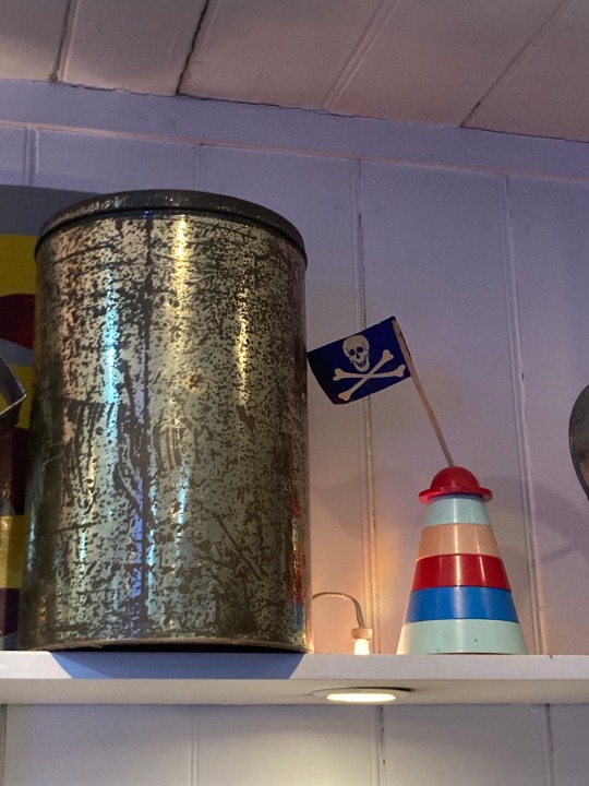
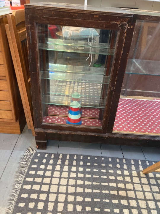
Fragments of Folkestone... Over the years we have been running our shop, we have happily become custodians of a few Folkestone souvenirs. Some we have passed on to new owners such as vintage posters and commemorative ceramics. Some, which are reminders of Folkestone's rich history of shopkeeping have been kept by us. From our own Old High Street, Rowlands Rock Shop was an institution long before our arrival in the street. When it closed, we could not house the extensive rockmaking equipment, but we were happy to find room for several well used cylindrical tins which were used to store sticks of seaside rock. We also saved a couple of boiled sweet moulds which are beautiful and immensely heavy!
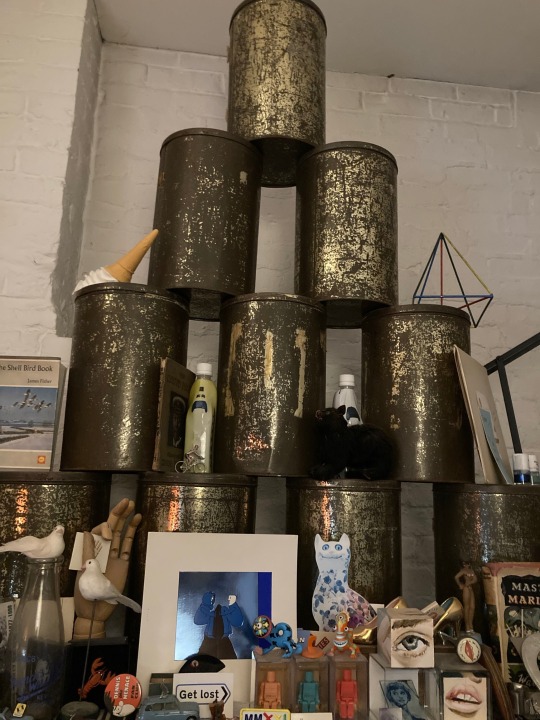

The old Joke Shop further down the street closed and we bought some of these sculptural stacking lighthouse toys.
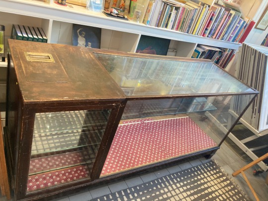
We are very proud to be the new custodians of an old haberdashery counter, which was used for many years at the Car Spares shop and had belonged to a previous family member. The pinging bell in the cash drawer was what sold it to Karen!
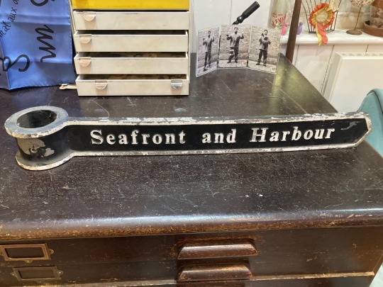
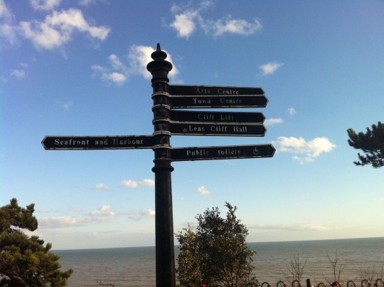
A while ago, when Folkestone council was replacing the signposting in the town, we managed to obtain three fingerposts no longer in service. I was asked if I wanted the whole lamppost, but declined!
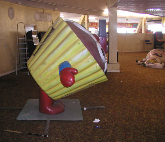
Sadly we had no room for any of the wonderful old amusements down at the Rotunda. This was my favourite...
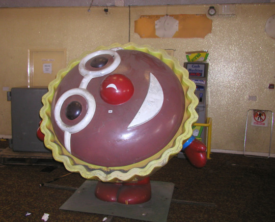
Blaze
0 notes
1 note
·
View note
Text
Living on the Edge...
When we first opened Rennies Seaside Modern in The Old High Street in 2005 we chose it as we loved the charm of the windy cobbled street with its mix of traditional seaside fare such as the Rock Shop and its link to the fishing community with its wet fish shop. Other shops included the much loved Moon Palace run by lovely Graham and Rose Fenton, Tribes, the joke shop and the Tattoo Shop, a really good mix. (Our first letterhead stated that we could be found between the Rock Shop and the Tattoo
shop.)
We were less keen on the hardcore pub, The Earl Grey, up the hill
where the squaddies would regularly turn out for a blood spattered rumble at the weekend. We were seen by our bookshop neighbour Nick Spurrier as ‘outriders of gentrification’.
We did not really know about Roger de Haan’s plans at all, we just saw it as a perfect place to settle. Many of the shops, galleries, bars, artists are only here now as a result of Roger de Haan’s vision for the town. The Triennial’s have put #Folkestone on the map.
We are the gentrifiers for what it’s worth!
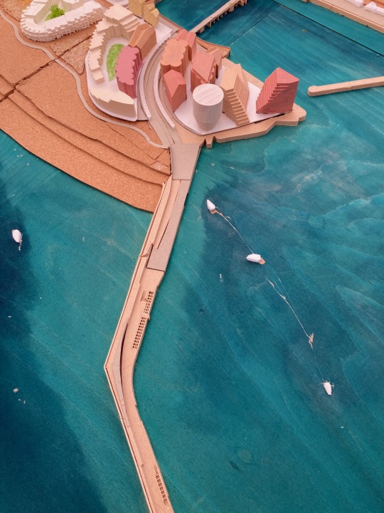
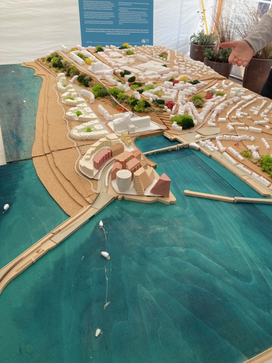
Well, here we are Summer 2023 and the plans for the final development of the harbour arm have been revealed.
Gosh, quite a display! Quite a response from the town.
This development of the car-parking area was always part of the plan. Was it envisaged to be so BIG, so dense?
On the plus side the designs are certainly interesting and will be well built for sure. The luxury flats on the beach look good, so we are confident that the build will be an excellent standard.
Obviously, this will not appear fully formed overnight. It may take many years and many a ‘twist twixt cup and lip’.
But it has planning permission and the council are thrilled to have the money coming into the town that they have woefully neglected over the years we have been here.
There is no doubt that this massive and dense ‘city scape’ development feels out of touch with the present time.
We trust that the time it will take to be built will involve many changes to the original concept thus presented.
In the meantime, The #GrandBurstin must be glowing in its new ‘heritage’ status ; )
0 notes
Text
Granny takes a trip in Folkestone
If you were lucky to live through the heady days of the Sixties in London - you may have ‘happened’ to spy the alluring painted facade of the boutique
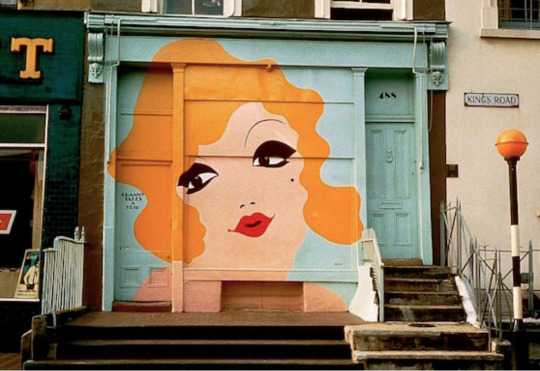
Now in 2022 Rennies are proud to reveal our ‘wrapped’ shop...


This is the work of Mary & Jiem the intrepid Franco Belge duo often to be spotted up a ladder or standing on a paint pot. Find them @jiemfolklines or @marylimonade or popping up in our shop from time to time! #mural #grafitti #naif
0 notes
Text
Art in Public (Scotland)

https://www.bbc.co.uk/programmes/m00124rq
BBC Scotland have made a film about the public art of Scotland’s New Towns during the 1970s. The film was presented by the actor, Mark Bonnar. Co-incidentally, Mark is the son of one of the town artists, and grew up amidst all this creative energy.
The recent events in Bristol and the taking-down of the sculpture of Edward Colston, the 17C slave trader, has prompted a lot of discussion about the role and status of public art in the civic space of our town and cities...
For most of history, public art has taken the form of figurative sculptures that commemorate the important rulers and military figures of the area. Generally, these sculptures were presented, raised on a plinth.
It was only in the middle part of the 20C, and at the Festival of Britain (1951), that artists such as Henry Moore proposed a new kind of public sculpture. The shapes became bigger and more abstract and came down from the plinth. The engagement with the work was more interactive and dynamic...
The possibilities of this kind of work were shown at the sculpture exhibitions in Battersea Park in 1951. The basic proposal, of moving beyond the representation of public worthies was enthusiastically taken up as part of the template of post-war reconstruction, and in the conceptualisation of the civic place-making of the post-war New Towns and the new, plate-glass, campus Universities.
The basic idea of the New Town template was to provide an updated version of the garden-city model proposed by Ebenezer Howard as a solution to 19C London’s problems of overcrowded living conditions. These conditions had been recognised by 19C social reformers as providing for both an economic and moral blight upon the poor. The arguments regarding the provision of modern housing for the poor have been presented in the historic documentary film, Housing Problems (1935)
https://vimeo.com/4950031
and also by Ian Hislop in his documentary series about 19C social reform https://www.bbc.co.uk/programmes/b00wkmh4/episodes/guide
The New Towns were an ambitious solution to build new communities and ease the problems of slum tenements and overcrowding in Scottish cities after WW2, particularly in Glasgow. Five Scottish New Towns were designated between 1947 and 1966. They were, East Kilbride in 1947, Glenrothes in 1948, Cumbernauld in1956, Livingston in 1962 and Irvine in 1966).
The towns each appointed a town artist and encouraged them to make small-scale interventions into the public domain...these took the form of concrete sculptures, totems and murals. Later, as the film describes, these works became the subject of various administrative arguments...In contrast, the response of the general public has been enthusiastic.
The English New Towns also followed the same template of open space and public art. Recently, public sculpture has come under threat from scrap-metal thieves...
There are many examples of modern sculpture as public art in London. The names of Henry Moore, Barbara Hepworth and Frank Dobson can provide a starting point for exploring these wonderful objects. The dinosaurs at Crystal Palace provide a different, but no less important, kind of starting point.
I should add that one of the things my parents gave to me, I understand now, was the sense of the sculptural potential of everyday objects. I think I got this, especially, from the loudspeaker my father had constructed from a cast concrete drainpipe. It stood on its end in the corner of our living room, with the speaker resting in its opening. The drainpipe was painted white.
I think it dated from my father’s Corbusian phase. A stage that all architects, of a certain vintage, had been through. My father had worked, in a very junior capacity, at the Festival of Britain. and later at Coventry, under the direction of Arthur Ling. The are murals by Gordon Cullen at Coventry, and all the buildings of the city centre seemed to fit together as a coherent and expansive expression of potential and possibility. I couldn’t possibly have understood all that when I left Coventry, aged 4. But, I must have responded to this idea because, here I am, sixty odd years later, writing about it and acknowledging its significance.
In Folkestone, where we live now, the provision of public art has been promoted through the Triennial. Over the last few years, the town has gone from having two pieces of public art - the statue of William Harvey (the 17C doctor who discovered the circulation of the blood) and the war memorial 1914-1918 - to having a broad selection of work by contemporary artists.
I’ve posted about some of them on my new pamphleteer site
https://paulrennie.rennart.co.uk/post/92437670595/folkestone-t2014-sarah-staton
and here is the link to Creative Folkestone
https://www.creativefolkestone.org.uk/folkestone-triennial/
It’s difficult to believe, but as recently as the 1990s, three was a fierce culture war about modernism and modern art in Britain. That has broadly been won in favour of modern art and artists. Thank goodness for that.
1 note
·
View note
Text
First party on the Harbour Arm? 2016

Seems a while ago now, that K celebrated her 60th birthday on the newly restored Folkestone Harbour Arm!
Sorry, if not many Folkestonians were invited - we didn’t know that many of you at the time and old friends and family took precedence of course.
It was a leap of faith as global warming had not yet come to our shores, so the date of Shakespeare’s Birthday was hopefully going to be warm enough...
It was a really great evening. All this was pre-instagramming, so we relied on wonderful Dave Hendley and friends to take the occasional photo as a record of events.
Music was live from the charming Dulcie May-Moreno. Astrid Goldsmith, now far too famous as an award winning animator of Mock Duck Studios, provided a screening for children sitting on hay bales behind a secret curtain in the undercover passageway. Delicious wood fired pizzas and tapas from Follies and drinks kept us fed and watered. The harbour carpark was empty, we had the run of the place. The weekend continued with aperos at Rocksalt, major family takeaway meal delivered to the Grand self-catering appartments.
Folkestone was an undiscovered jewel to many who were visiting for the first time. The Harbour Arm was showing its versatile potential as an exciting social space.
Here are a few photos...


0 notes
Text
Things I Like • Edward McKnight Kauffer • VAM • 2019
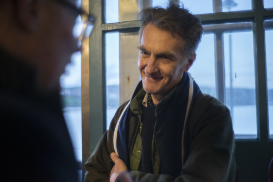
I’ve been invited to give a talk to the Art Society. I’ll be giving a short presentation about vintage headscarves. In readiness I picked out this scarf from our collection, by the poster designer, Edward McKnight Kauffer.
By a happy co-incidence, yesterday I was at the Victoria + Albert Museum, London, as part of a group looking at Kauffer material.
This meeting was a small part in the preparation for a big show of Kauffer’s work to be held in NYC, at the Cooper Hewitt.
Cooper Hewitt is the design collection of the Smithsonian, and has its origins in the teaching collections of the Cooper Union design school, established in 1858.
I love the way that creativity, teaching and objects come together in all this… our collecting, museum collecting and scholarship, and art school teaching. Lovely.
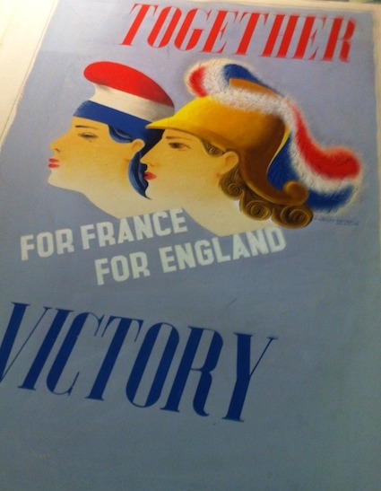
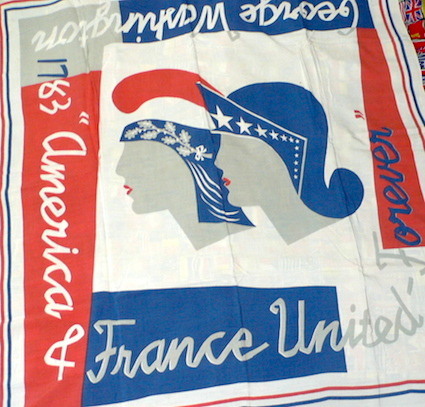
Our friends at the V+A had got out quite a lot of Kauffer material for us to look at. This included the poster artwork for an England and France friendship poster from the beginning of WW2, date 1940.
This is exactly the time that Kauffer, as a US citizen, returned to NYC…and the poster idea re-surfaces as a friendshio scarf between America and France, and America and England…and with the same idea of Marianne, Britannia and Liberty paired together. Beautiful.
There’s quite a space between these two versions of the same idea…the poster, made in London, is prosaic and static in presentation with old-fashioned type choices. The scarf, made in USA, is dynamic and with exploded and accelerated ribbon-script lettering. It’s a much more fashionable object.
The gap between these two designs is measured in the width of the Atlantic, but also in time and space…different worlds in fact.
I’ve just worked out that these scarves were made to be sold on board the big ocean liners; the Normandie and the Queen Mary for sure. And possibly at airports too.
It turns out that Kauffer’s partner, Marion Dorn, was a carpet and textile designer. It’s more than possible that she helped turn this idea into what it became. Marvellous.
2 notes
·
View notes
Text
Art + Life
There are a number of examples from history where, in Britain, people have combined art and life in interesting ways...
Bloomsbury - the Charleston template
Surrealism - the Penrose template
St Ives
Great Bardfield
Kettles Yard
I might also have a look at a historical precedent of a slightly different kind, the famous Batteau Lavoir in Paris
https://en.wikipedia.org/wiki/Le_Bateau-Lavoir
and I’d have to look at Warhol’s Factory and NYC in the 1970s...
0 notes
Text
Art in Public
I’m going to consolidate the various things I know about how art has moved beyond the gallery. Obviously, I come to it from an interest in the history of posters...but I also know about art in hospitals through my work with the Imperial Healthcare Charity, and I live in Folkestone and am in the middle of a great experiment of art in public space.
I’ve written loads about how art and design was used during WW2 to engage the public and how the Festival of Britain conceptualised an integration of art, architecture, design and experinece. Later, in the 1960s, the commercial market (fashion especially) used pop art and design to promote new lifestyles...
Here is a rough outline of what I want to do
01 Thematic Introduction
Art Beyond the Gallery (Lautrec)
Everything is Art (Duchamps)
02 London Transport- Art and Design Reform (Frank Pick)
03 WW2 - WAAC
04 Festival of Britain 1951
05 Pop Retail 1960s
06 Posters overview
07 Sculptures and New Spaces (Harlow)
08 Art in Hospitals
09 Art in Public Space 2000s
0 notes
Text
Art and Life in Eastbourne
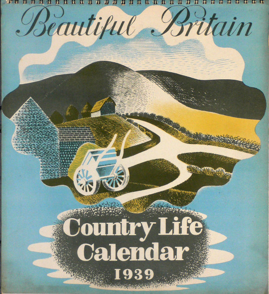
To the Towner Gallery, Eastbourne, for the opening of their exbition about Eric Ravilious.
Ravilious was an English watercolourist and designer who was born in Eastbourne and attended the art school there. The Towner has a substantial collection of Ravilous paintings and related maeterial.
The exhibition is bigger than Ravilious though, it shows his work in painting and design, along with similar work by his friends and contempories. The exhibition also celebrates the publication of a kind of group biography of these artists...
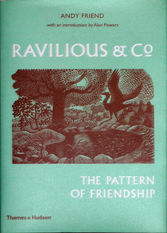
The pattern of friendship described connects Ravilious, through his contemporaries at the RCA, and through his neighbours in Essex, to a loose group of artists working across a wide range of media...
The exhibition provides a lovely insight into a kind of comfortable modernity pioneered through the combination of pictures, textiles, ceramics and books; art and life indeed.
The template for this kind of activity was Rger Fry’s, Bloomsbury Omega Workshops. The work of the Ravilious group is less crafty, and less self-conciously intellectual...it’s comfortable.
Another book which connects these kinds of inter-related artists’ lives is A Crisis of Brilliance by David Haycock. That book book told the story of a stellar generation of young artists at the Slade School before WW1...The artist Paul Nash had been part of that group and, later, taught Ravilous and friends at the RCA...
Eastbourne is close to the Bloomsbury country cottage at Charleston, and to the Surrealist farmhouse of Roland Penrose and Lee Miller.
If you want, you can even stay at the Ravilous Hotel in Eastbourne. Terrific.
0 notes
Text
The New (Neue) Line • Bexhill • 2017
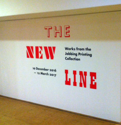
We’ve lent some posters to an exhibition of graphic design at the de la Ware Pavilion, Bexhill-on-Sea.
The exhibition comprises a selection of ephemera from VAMs National Art Library collection of Jobbing Printing.
In practical terms this is is a collectio of examples of ordinary printing, as distinct from fine printing. That doesn’t mean the printing isn’t good; it just means that no one was expecting it to be saved. It’s commercial.
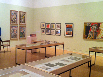
Because the collection was begun in the 930s, it has quite a lot of material that exemplifies the increasing use of mechanical reproduction in the elaboration of graphic design. There’s quite a bit of half-tone and typo-photo on view.
Further additions have been made to the display from the collections of our friends: Alan Powers and Brian Webb. We’ve loaned the posters that go on the walls around the exhibition.
The DLWP is the best place for this show. It is one of the few really top-drawer modernist buildings in Britain.
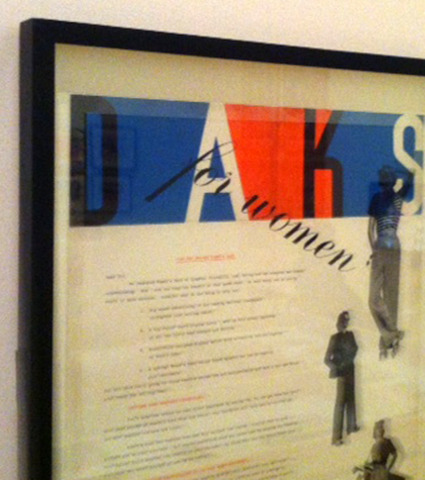
One of the graphic objects displayed is this advertising for Daks womens’ wear. It was designed by Ashley Havinden during the 1930s. Here’s are links to three of my previous posts about Daks clothing and fashion…
http://paulrennie.rennart.co.uk/post/129847540770/simpsons-of-piccadilly-sports-jacket
http://paulrennie.rennart.co.uk/post/111658632070/speed-and-suiting-daks-the-modern-sports-suit
http://paulrennie.rennart.co.uk/post/91450915275/katharine-hepburns-wedge-heels-speed-and-desire
I love the smart dynamism of the Daks style…
The exhibition combines environment, objects, style, and meaning, into a coherent and compelling lifestyle choice, for me at least.
We had a look at the exhibition on Monday. Terrific.
2 notes
·
View notes
Text
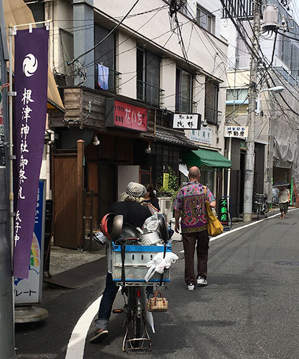
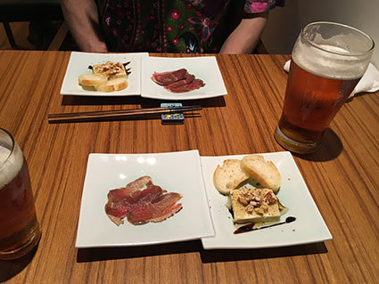
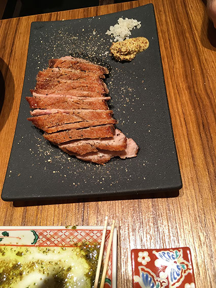
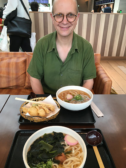
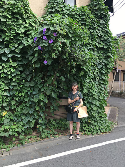
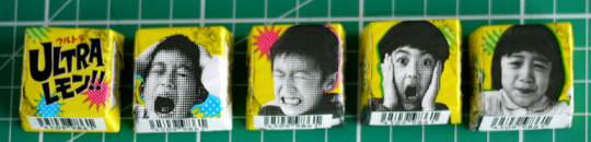
Impressions of Japan, Part One
As Philip Larkin said of China,
I'd love to visit Japan, if I could be there and back in a day…
But of course, it is it's very distance that makes it so different and yet completely confortable at the same time.
Orderly, clean, quiet, attention to detail, safe
and
incredible crowds, characterful narrow streets, and brutalist architecture.
Does that sound appealing yet?
It is another world and special too…
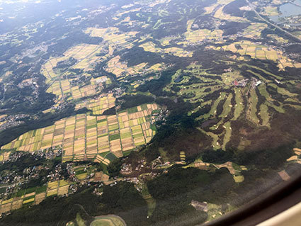
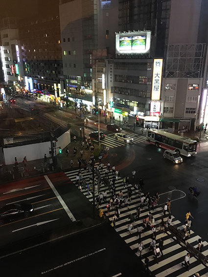
30 million people living in Greater Tokyo and it feels calm and peaceful.
How is this possible?
A prevailing sense of calm
Maybe because of a Buddhist sensibility.
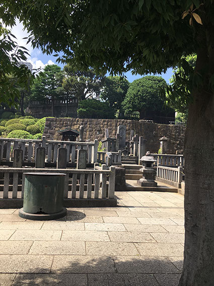
The calmest place we found apart from the Ronin shrine infused with heady insense, was the remarkable Lion cafe. Hidden amongst the steaming tawdry sex shops like old Soho on steroids. A haven within a dark gothic exterior since 1926. (no photography allowed!)
You enter the dark woody interior and are shown in whispers to faded velvet seats. Sipping iced coffee to the purest sound of Bach, playing out of the most refined sound system possible.
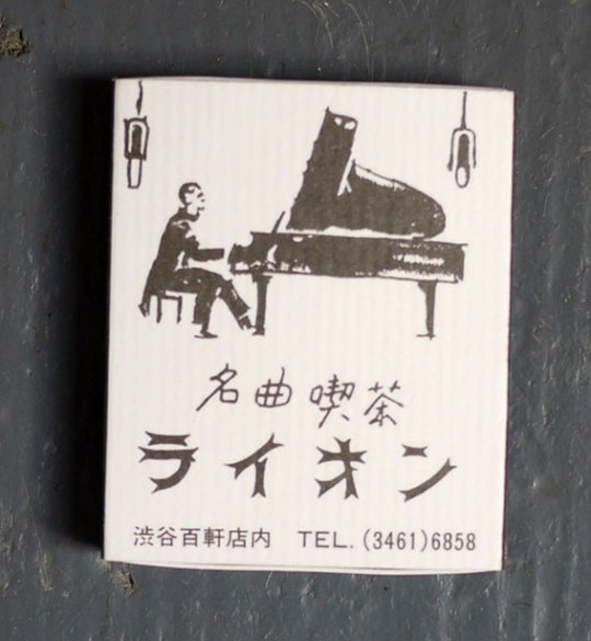
Bliss.
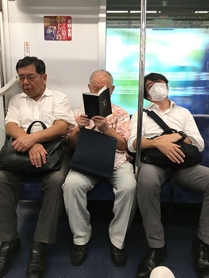
Polite respect for fellows
This is manifest from the quiet thank yous at all turns 'arigato gozaimas' is the one phrase every visitor needs to know. You will hear it several times on the metro tannoy, whether it is to ask you to respect fellow travellers by turning your mobile device to silent mode or to be careful on alighting the train. Travellers will move so you can sit next to your companion too! People queue to enter the train, without having to be shouted at to let passengers off first as in this country.
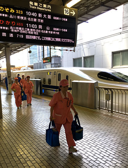
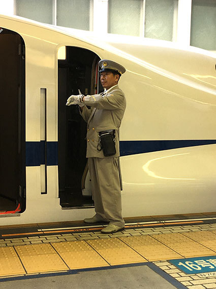
Also every profession appears to be valued and has its own order and routine.
See below the cleaners who board the Shinkansen prior to travellers boarding,
in their smart pink uniforms. One imagines that attention to workers safety is paramount.

Even the few down and outs looked like they had access to clean water and public facilities, but not certain what the welfare system is like in Japan.
Quiet prevails amidst all the bustle.
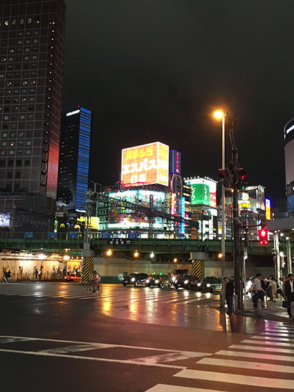
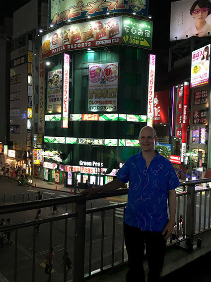
You can hear the recording of bird chirps as a train approaches. A cuckoo at one stop and a blackbird at another - I think this is for visually impaired to identify which stop? A few of the more central stations play a bizarre short blast of music, to id themselves, which ranged from the themetune to the “Third Man” to “Camptown ladies sing this song..” Generally there is no canned music in public places. Shibuya crossroads with its neon electric Blade Runner street lighting is an exception and exciting for that.
Cleanliness
This is a big issue. From the elaborate toilets that we hear so much about in the West to the vast number of proprietary goods that are available to ensure that Tokyo is almost odour free. In Summer temperatures of over 33 degrees this is certainly welcome.

Recycling is carefully adhered to and there is no litter anywhere.
The floors are spotless. The pavements aren't pockmarked by chewing gum.
Technology works
Air conditioning everywhere but it is silent and perfectly pitched at the most appealing temperature. This is not the experience in the US, where sleeping with air con on is impossible due to the rattling noise and also public areas are over air conditioned so it is freezing inside.
Of course the trains run to time apparently effortlessly stopping at the exact point on the platform!
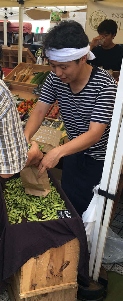
Diet and health
There are no overweight people in Tokyo. You understand why, as the food is prepared carefully, using excellent quality ingredients. Portions are just the right size.
If you see 'all you can eat' on the menu, a sure sign they expect tourists.
Never has ‘less is more’ felt more important - quality over quantity.


(Slightly worrying are the number of people who appear to have slight problems with mobility. Is this derived from a calcium deficiency?)
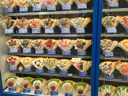
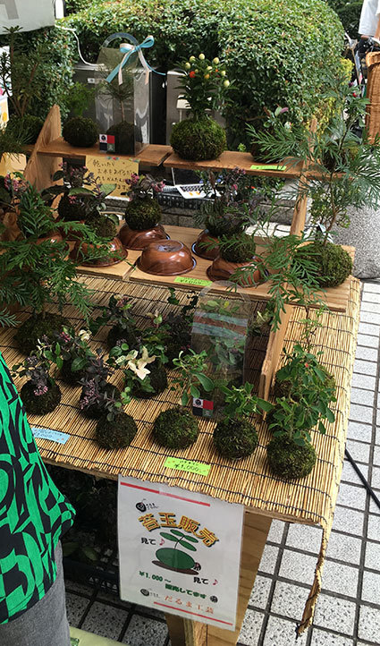
Who can not love the logic and beauty of the plastic replicas of food outside restaurants, within automats and even on department store counters to assist in the difficult decisions of what to order!


Environment and natural world
the brutalist concrete ‘shanty town’ look of much of the residential areas of Tokyo is reminiscent of the suburbs of Paris. These are continually renewed after the many earthquakes which hang over the national psyche. Against this backdrop, mainly connifer trees are planted and clipped to restrain their dense almost ‘primeval’ growth. The wealthier districts and business areas shoot up in massive buildings up to the sky. The scale is unimaginable to us in the west and even in the US.
Plants are cherished and nurtured.
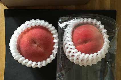
Quality and attention to detail
The system appears so carefully honed that I feel it could encourage great creativity, as one is not subjected to hours of sorting out day to day problems before embarking on your own path, but maybe the Japanese mindset and upbringing bring different hurdles.
As a slightly aspergic Westerner, I loved the routine and certainty that results from the daily routines. It was reassuring to see the same cheery face each morning making fresh Udon noodles in his ‘cabin’ space. (slightly disconcerted to see a different face one morning and no face on another!)

Display
Much of the ‘graphic design’ is not as we Westerners would appreciate, mostly calligraphic and therefore quite muddled to the Western eye.
But the pictorial information graphics are easy to understand, much like our own Victorian chapbooks for all. fabulous bubblegum colourways.
but the packaging is marvellous, again ‘attention to detail’ and occasionally something rather wonderful appears like this series of ‘sharp’ chocolates

and as for Japanese #railways - Paul will wax lyrical about these on his blog...!
and more on Cats and restaurants soon....
2 notes
·
View notes
Text
Regeneration is science fiction?
The Guardian’s recent article (cf. 28th August D Batty and 18 Nov 2015 S.Moore) - recently started a debate fest about the fears surrounding the ‘regeneration’ of our formerly neglected seaside town.
Personally, I had no idea what ‘challenges’ would face us when we moved our business from Central London, due to high rents, to Folkestone’s Old High Street. The first being the complacency of the local council.
The Old Town did not require cleaning, regular refuse collection. street maintenance, police patrol, public amenities as it was full of poor folk just trying to get on with their lives. No money, therefore No voice?
We are at an interesting turning point in the town’s fortunes. Many will accuse Sir Roger de Haan of concealing merely a property play under the guise of ‘regeneration’. This is short sighted. He is giving the historic town a new lease of life. Of course, it would be naive to think his input is not without personal gain, but thank goodness his motives are good.
He can through his property ‘empire’ at least make the built environment attractive and entertaining, vis a vis the Harbour Arm development and the Arts Triennial. It is up to the Council to come on board, which at last they appear to be doing, although the day to day maintenance issues continue....
Now, fears of ‘polarising gentrification’ are more complex.
Since, we have had our shop Rennies Seaside Modern, we have aimed from the start to be a local shop for local people, catering for all interests and at all price points. Sadly, there are some social issues which are harder to solve. How to address the packs of feral children, with no parental discipline? Local nightclub selling alcohol to underage kids. Our shop window was recently smashed by two 15year old white girls from families ‘known’ to the police.
Paul says it is nothing like a #kenloach film...hmmm
0 notes
Text
Out There...Our Art

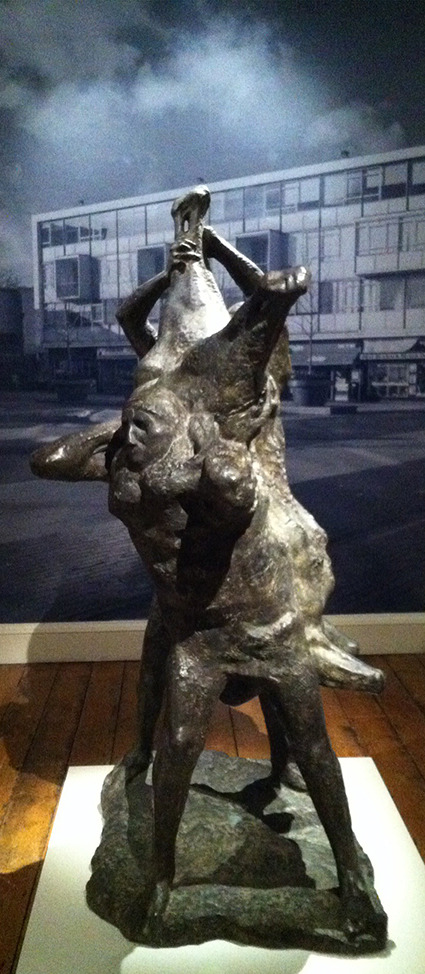
We were invited to the opening of an exhibition at Somerset House, London. The exhibition was of the public sculpture that formed part of the post-war iteration of modernism and reconstruction in Britain...
It’s worth saying that the circumstances of post-war reconstruction in Britain provided an all-too-rare opportunity to reconfigure the relationships between property, space, and the public. The template for this was provided by the snap-shot of the Festival of Britain in 1951 and by the more permanent elaboration of various new towns and civic centres - Harlow especially, and Coventry say.
Part of this template was a desire to move public sculpture beyond the usual constraints of VIP commemoration...The difficulties associated with this effort shouldn’t be underestimated...the forces of reaction are still contesting anything abstract and anything that may be understood as ironic or humorous...as well as all the costs involved.
If you’re interested, there’s a bit of a furore going on, right now, about a sculptural portrait of the railway engineer, Sir Nigel Gresley...although he is very important, not many people beyond railway enthusiasts have heard of him, or would recognise him. It is proposed to add a mallard to the sculpture...to help associate him with his most famous engine...The desire for gravitas (as a form of tidyness) in public space still seems to be very strong.
Then thre are the usual issues about costs and responsibilities attaching to things that belong to everyone...and the usual complaints about the undeserving ordinary citizens.
I’m with William Morris on this...if you believe art (of whatever kind) to be an emotionally elevating and intellectually stimulating thing, as wealthy people nearly always do; why not make it available more widely? It’s simple really, it’s better for everyone...
It’s amazing how many people are uncomforatble with the idea of sharing things with others...this exhibition is about the work being out there and being their (the general public’s) art. Actually, that doesn’t mean you can’t enjoy it. You simply enjoy it with others; it’s our art, our culture, and our society.
One of the most striking things in the exhibition was how, in recent years, these pieces of art have been the traget of criminal theft and vandalism...
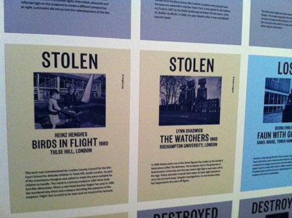
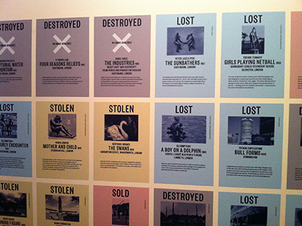
The exhibition co-incides with the listing of many of these works. That administrative process attaches very specific repsonsibilities to these works, which is good.
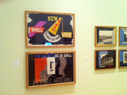
We’ve always been interested in art in public space...especially in art that turns into design - that’s posters, ceramics, and textiles...but also murals and tile panels etc. Back in the 1980s, we began to collect some of the posters and objects associated with the pre-WW2 version of this effort. This included London Transport posters and so on.
It’s fantastic to see this work more widely recognised as significant and interesting.
The artists, designers and public servants associated with this effort were the heroes of British (re)construction.
The effort to civilise our public realm needs to be continuous...and we need to move beyond private ownership as the default setting for these public goods.
0 notes
Text
BLAST FROM THE PAST no.3
have you noticed that colour around us is now totally 1980s…
from fashion to interiors. I never really liked pink, yellow and black with a smattering of turquoise green together, and as for spiky typefaces….
but of course loved the music and dressing up.
0 notes
Text
JMW Turner, Kenneth Clark, and Folkestone

I posted, before, about the re-opening of Folkestone’s harbour pier...Here is Turner’s famous painting of the harbour in Folkestone. The painting is a late Turner, from 1845, and belogned to Lord Clark.
The painting was sold at Sotheby’s, back in 1984, and made a great fortune. About 7 million GBP! That was when a million pound artwork was still exceptional. I was lucky enough to be involved in the sale of items from Clark’s collection.
Clark is best remembered, nowadays, for his pioneering work on TV at the end of the 1960s. Throughout his career, Ckark was a great advocate of the human benefits of art. He took the view, held by almost everyone who has art themselves, that art is enriching...but Clark also thought that art could enrich the lives of ordinary people, and that they didn’t need any special knowledge or training. This was quite a revolutionary idea...
Clark was also actibe in promoting various schemes, not elast the Arts Council, that facilitated this.
In a way, it is entirely appropriate that Clark, Turner, and public art, should all come together in Folkestone.
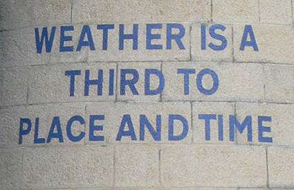
I was also struck by the connection between Turner’s work and that of Ian Hamilton Finlay...whose words are on the lighthouse in Folkestone.
0 notes
Text
Folkestone Harbour 2015


Here is the google map of Folkestone harbour. You can see that the pier, or arm, projects a long way into the sea. From the end of the pier, you get an amazing view, back, towards the town and its coastal landscape.
The good news is that the pier has re-opened after a long period of closure.
Better than that, the harbour has become an important space for the display of public art.
There is a tiny Tarcey Emin; Cornelia Parker’s Mermaid; Steve by Sarah Staton; and works by Ian Hamilton Finlay, Paloma Varga Weisz, and Patrick Tuttofuoco. To the west of the harbour and on the apron is AK Dolven’s myserious bell...
That’s a pretty good selection...if art can make a difference; we should see it here.
The opening of the harbour pier has provided me with my first chance to see Patrick Tuttofouco‘s Folkestone sign. This has been up since 2008, but it has only been visible from a distance. Close up, it is much more impressive.
The work is a large-scale, super(typo)graphic, and industrial-quaity, station totem. The letters are based on the historic link between Folkestone and the route of the Orient Express across Europe...each letter is based on something that Patrick saw, or experienced, on his journey alomg the tracks.


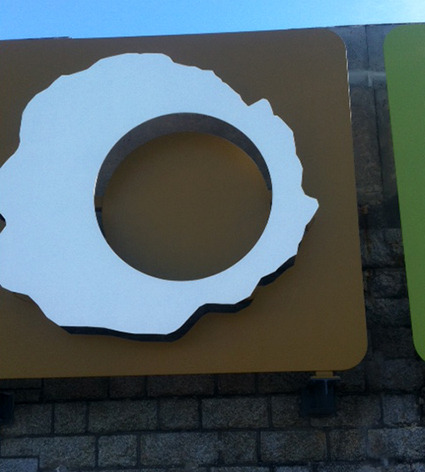
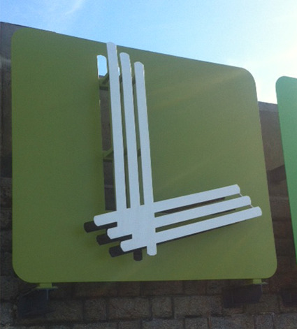
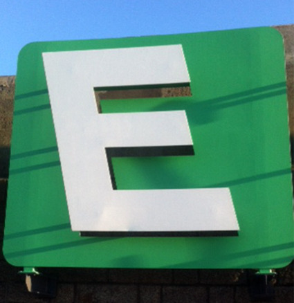

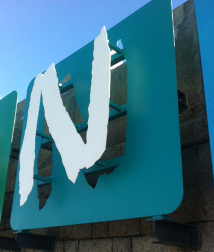
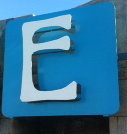
This is my kind of project...combining typography, railways, memory and feeling...If I were being picky, I would say that, close-up, some of the letterforms work better than others. Indeed, I’m not sure that the tyographic distinctions, and identity issues, between the different places along the route are made evident by this work...nevertheless, it is a most impressive piece in scale and sits very well on the pier.
Probably a B- overall, for this particular artwork.
I like the Viennese style E...
On the other hand, I think the whole harbour environment is world class...great environment and wonderful artworks and a brilliant restaurant. Definitely much more than the sum of its parts already.
Well done Folkestone.
Fantastic!
You can find out about Folkestone’s artworks, here
http://folkestoneartworks.co.uk/artists/
The restaurant is Rocksalt
http://rocksaltfolkestone.co.uk/
3 notes
·
View notes
Text
Renault 4 • c’est classique!
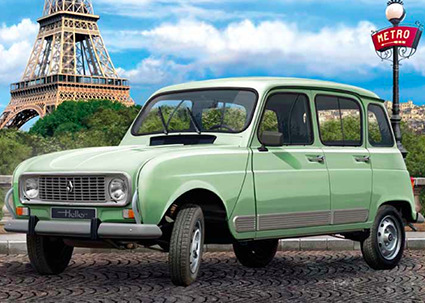
The French plastic construction kit company, Heller, (like Airfix or Revell) has just released a model of the Renault 4. Great, that’s our car!
It’s now officially a classic…Heller would only release a kit of something that had meaning and resonance in France. Between 1961 and the early 1990s, Renault sold millions of these cars…and they were familiar throughout the Francophone world. Weirdly, they were much less popular in the UK.
Here are some spreads from the instructions and paint spec.


I must admit to doing my fair of hobby modelling when I was young…but, I always bought the kits because of the great pictures on the box. I always loved the tech-style blue-print instruction visuals too, especially from a graphics point-of-view.
You can see images of our actual car, here
http://www.rennart.co.uk/renault.html
If you watch old Franch films, you can see these kinds of cars in the background…
3 notes
·
View notes