#8-bit-britt's artwork
Text
I'm so sad Britt not coming back why did she Block me?! Did Come back or What? 😭😡🙎🏾♀️
1 note
·
View note
Text
it's recapping obscure self ship time bc my yearly Whiplash replay and hyperfix has returned 👹
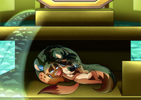
Spanx the weasel and to an extent, Redmond the rabbit from Whiplash (PS2 / XBOX) 💕
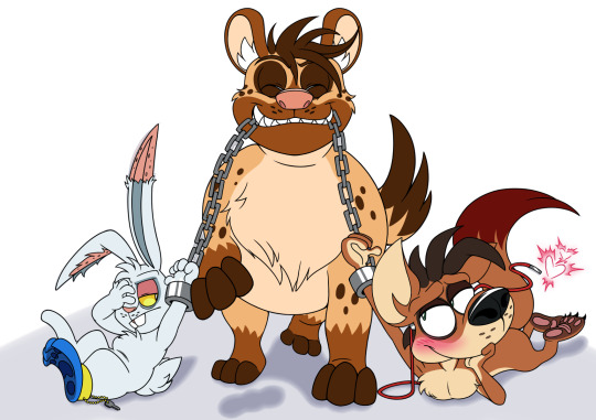
above artworks by @8-bit-britt ✨
my s/i, Jeff hyena, is a fanon (obviously) supporting role in their takedown of Genron, who they encounter as an exotic caged pet in the Executive area. speaks English like Redmond, inexplicably British like Lincoln the owl 😭 big appetite and a big laugh. a little intimidating to smaller animals but ultimately is a big goofball with strong morals who wants nothing more than to take down Mann with them!!
Spanx is immediately stupid smitten with him and his cheery attitude and his powerful jaws that help them take down staff, Jeff requiting this for his tweaked out quirky personality and rough determination to the cause. despite Spanx being mute, Jeff seems to understand him entirely and extremely quickly. Redmond is highly defensive and even protective of Spanx at first (i also ship Spanx and Redmond quite a lot, this is somewhat of a poly even if i don't consider Redmond an f/o of mine). Red doesn't trust that Jeff isn't trying to eat them, but after gaining their trust through aiding in kick assery throughout Exec, Redmond slowly warms up to Jeff and begins to understand Spanx's affections for him. while Jeff's love is mostly requited towards Spanx, there is some mutual warmth and affection between the three of them, even if Redmond's is expectedly full of sarcasm and dryness and cringe at Spanx and Jeff's mushy PDA that he sometimes gets dragged into - both emotionally, and physically whilst still in the chains lol :')
to explain the poly, Spanx has both Redmond and Jeff as partners. Redmond and Jeff don't consider each other partners persey but still appreciate each other and are close 🫶
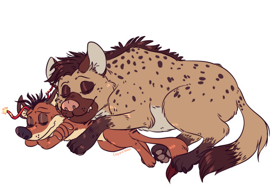
above artwork by @fluffyselfships (mod bun) ✨
#whiplash#whiplash game#self ship#fictional other#poly self ship#f/o#obscure f/o#whiplash spanx#whiplash redmond#hyena x weasel#genron poly
35 notes
·
View notes
Photo
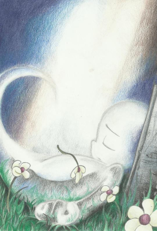
‘I Can Pretend, Can’t I?’
-
An old traditional piece I did back in 2013 that never made it to tumblr. I’m drowning in Casper feels again so I thought I’d share it here and it’s an old artwork I still hold fondly.
Song Inspiration: https://www.youtube.com/watch?v=I4vyfwGJ8FA
Original Post: https://www.deviantart.com/8-bit-britt/art/I-can-pretend-can-t-I-373671932
52 notes
·
View notes
Photo
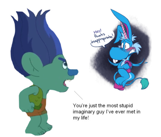
What happens if Branch really did have an imaginary friend called Happy?
I’m just trying to joke on you about that! 😂😂😂😂😂
Pls enjoy this! Happy the unicorn belongs to the Syfy TV series, Happy! And this artwork of Happy I found throughout my Tumblr dashboard belongs to @8-bit-britt.
#dreamworks trolls#ttbgo#trolls the beat goes on#happy#happy syfy#happy!#happy the unicorn#imaginary friend#my edits#branch meets happy#happy meets branch#what happens if happy the unicorn meets branch?!#syfy series#branch and happy#happy and branch#can you be happy branch#can you be happy with this newcomer?! hahaha#that's inapproriate
7 notes
·
View notes
Text
Virtual Sketchbook Entry #2
JOURNALING- The Principals of Design
- Unity and Variety- Contrasting principles where unity serves to unite the piece of work and variety strives to diversify the elements within it. In everyday life, we use these principles when picking out what to wear. We want the pieces of our outfit to perhaps have a certain degree of unity, so it has a cohesive look, but enough variety to not appear boring.
- Balance- The achievement of visual equilibrium, in so that the elements within a work appear well-matched. This can be achieved by repeating elements on both sides of the work or by asymmetrically balancing the sides with different elements of similar visual weight. In real life, I used this principle designing the wall my TV is on. I wanted it to appear balanced, so I have my TV on a stand in the center with tall, thin bookcases on either side. Small staggered bookshelves help balance the dark mass of the TV lower on the wall.
- Emphasis and Subordination- Emphasis is when the viewer’s eye is drawn to one specific focal point within a work. This can be achieved through light-dark contrast, size, and color intensity. Subordination is when the artist makes the other elements in the work less attention-grabbing so that we can focus on what they intended us to focus on. I like to think of setting a table for a dinner party. Your main feature (a roast turkey, or a ham etc.) is usually placed in the middle, maybe on a color placement to draw attention to it. Other elements on the tabletop will be smaller and dispersed so that your eye is focused on the main part of the meal.
- Directional Forces- This is how an artist directs our eye through their piece of work using actual or implied lines. Our mind connects the series of focal points as we are guided “through” the artwork. In a more practical setting, directional forces are used when designing homes. Is movement through the space achieved with a hallway? If it’s an open concept home, how is the flow of movement guided or directed? It could be through furniture placement or use of lines in the flooring, for example.
- Repetition and Rhythm- Repetition is the regular occurrence of certain elements in an artwork. This can be turned into a pattern (structured, all-over repetitions of elements) or rhythm (repetition of dominant and subordinate structures) within a piece of art. A real life example of using these principles is in landscape design. You can color block your flowers or you can use repeating focal point plants with subordinate ground coverings to create a rhythm as you visually travel along the front of the house, for instance.
- Scale and Proportion- Both related but slightly different, scale is the size of things in relation to one another, where proportion is the relative size of smaller parts to the whole. Scale might be thought of as the size of a room in relation to yourself, whereas proportion would concern what furniture you choose to put in said room, and how well it fits.
-------------------------------------------------------------------------------------------
WRITING AND LOOKING- KINDRED SPIRITS by Asher Brown Durand (Chapter 3.4, Figure 3.24 in textbook)
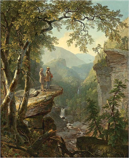
Recipe of elements within this painting:
- Depth from atmospheric perspective.
- Balance with the great space implied in the background by brightly illuminating details in the foreground and middle ground (the men’s figures, the rocks, the flora etc.).
- Unity is achieved through the use of an analogous color scheme.
- The painting appears more realistic by appropriate scaling of the figures in comparison to the broken tree in the foreground.
- Repetition of the colors and the shapes of trees (on the right side of the painting) help produce rhythm.
- Your eye also tends to move backward, up the stream to the waterfall, providing a directional force within the painting.
-------------------------------------------------------------------------------------------
CONNECTING ART TO YOUR WORLD
I have this one canvas print from Britt Bass Turner that I love. I can’t readily describe why it is that I love it so much. It’s nonrepresentational abstract- a smaller fragment of a larger work of hers. I was pretty broke when I bought it, but I so desperately wanted a piece of her work that I compromised with this piece from a scratch and dent sale she held. All I can tell you is that it makes me happy. I love her use of pastel tints alongside more intense bits of primary reds. The contrast of cool and warm hues. The dulled peaches and splashes of minty greens. Then there’s something about the punctuation-like twin marks of the deep shade of blue that I’m always drawn to. Needless to say, I will own another piece of Britt’s eventually. Maybe I’ll even save up for the real deal.
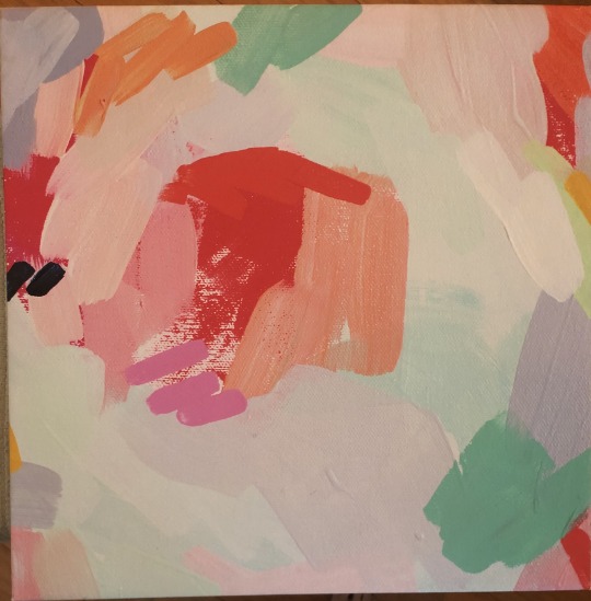
If I was to put a color scheme to my life, I think it would be various blues- from vapor tints to dark ocean shades- and deep greens. Calming and grounded. Dreamy yet earthy. Kinda along the lines of how I strive to be in my life.
-------------------------------------------------------------------------------------------
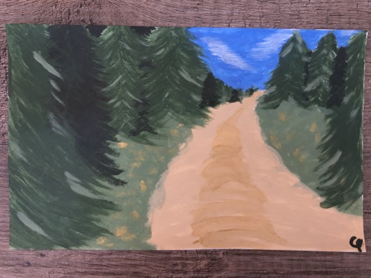
ART PROJECT- PAINTING
I’m fairly certain this is the first time I have painted anything other than a wall in over a decade. Probably since middle school art class- so maybe closer to two decades. This is not skilled art by any means, but it was fun. I’ve been wanting to do some abstract patterned pieces for our bedroom, so this was a good way to remind me what it was like to put a paintbrush to paper/canvas! I call this THE ROAD BACK HOME. 5” x 8”. Acrylic on index card.
-------------------------------------------------------------------------------------------
GROUP 5- PHOTOJOURNALISM- PHOTOGRAPHY AND SOCIAL CHANGE
These two photos, in my opinion, represent two very different time periods in American history that are very much interconnected. Although about 55 years separates these two photos (Bloody Sunday in Selma, AL- March 7, 1965 to the George Floyd Protest in Washington D.C.- May 30, 2020), they show a direct connect that spans time. Cause and effect. They represent a desperate need for social change- both then and now.
The second photo was taken May 30, 2020 at the George Floyd Protest in Washington D.C. I feel like this picture, along with hundreds of others will be iconic for the year we are living in. This is a time where issues like racial injustice, police brutality, and equal rights are cropping up after seemingly being put to rest almost 60 years ago. These protests have shown that we never got rid of these issues, we have just gotten good at suppressing them as a society. Despite this, we see a multiracial crowd there in support of the cause. Another detail I love about this shot is the fact that we see many wearing masks. The COVID-19 pandemic will be put into history books. This picture will stand as a witness for generations to come what a tumultuous year 2020 proved to be. And yet, in the face of injustice and isolation, qualities such as love and humanity still shone through.
0 notes
Note
Question to 8 bit britt, are there going to be anymore megasonic ships in the future? Cause I'm practically infactuated by this ship and yoyr artwork of them. I love your artwork of these two and i wish there could be more. But that's just me.
Oh of course! I’m really sorry things on this blog have been slow. I get caught up in several different fandoms and tend to lose track of things heh. But rest assured, there will be more art of these two.
6 notes
·
View notes
Text
How to Design a Logo [Step-by-Step Guide]
I think most of us can agree there are generic logos in the world that we easily forget, and then there are great logos that we'll always be able to recognize (even without the brand's name attached).
But what is it about a logo that makes you recognize it? What is it about the design that can elicit a memory or even a specific emotion?
If you're in the process of creating a logo for your company, you're in a unique position to make a powerful impact on how consumers perceive your brand.
Everything you do, say, and, display as part of your new business will tell your prospects more about your company's identity. It's vital to ensure from the beginning that you present a cohesive and clear statement regarding your company's message.
And while a logo may seem quite simple to create, designing a great one isn't always easy. It involves a lot of market research, a deep knowledge of your buyer personas, and thoughtful consideration of the principles of logo design. Often, designers find themselves creating many iterations of a single logo before getting it "just right."
So, where do you even begin to design a logo? Right here. We've broken down the nine key steps (with a few tips thrown in) you'll need to take to create a logo that not only you love, but your prospects will too.
How to Design a Logo for Free
Start With Your Story
Brainstorm Words That Describe Your Brand
Sketch Ideas Based on These Words
Test Your Top Sketches With Your Buyer Persona
Refine Your Chosen Sketch
Develop Your Logo's Layout on a Free Design Platform
Pick Versatile Color Options
Choose a Font
Ensure Scalability
How to Design a Business, Company, or Personal Logo
1. Start With Your Story
Companies are created to make money -- it's not the most poetic statement, but it's the one you need to start with. And in order to make a profitable business, you need to be able to sell yourself just as well as your product. Marketers today tend to agree that buyers connect much more strongly to stories than they do to the basic facts of your product. What does this mean to you? There needs to be some story in your logo.
Before you even think about what this logo will look like, take some time asking yourself what the story behind your company is. When we look at Coca-Cola, we don't see a brown, carbonated beverage -- we see polar bears and thick, white script letters.
Image via Coca-Cola
Step outside of what your company does and convey why you do it. That “why” is the root of your story, and it should come through in the color, shape, and typeface of your logo. If your logo were the title of a movie, what would it look like?
2. Brainstorm Words That Describe Your Brand
Now that you have your story, it's time to take your logo draft from story to setting. Open Thesaurus.com and enter a term that best describes your product into the search bar.
For example, if you're in the clothing industry, you might simply type in "clothing." You'd be surprised by how descriptive the synonyms are that appear. You can even click these results to start new searches and dig deeper as you zero in on the words that best capture your brand.
Image via Thesaurus.com
Find five to 10 words that describe not only what you do, but the why from the previous step. Each of these words can fit like pieces in a puzzle and help guide you to refining a concept.
3. Sketch Ideas Based on These Words
Armed with your why and a few keywords for direction, grab a pencil and paper and start sketching every idea that comes into your head. Allow each new concept to evolve on its own. Don't get frustrated if the first few aren't right -- keep refining, using previous sketches to influence the outcome of new ones. You might focus these sketches on a shape, the name of your brand, or both.
As you're sketching the concepts for your logo, keep these tips in mind:
Keep the shape simple. If you can sketch the most symbolic components in seven seconds or less, you're in good shape. You should absolutely avoid any popular clip-art artwork or generic symbols like a globe, star, or similar icons that people too easily identify from other places. These are easily forgotten at first glance. The more creative you are at this stage, the better your final logo. Your logo is what your consumers will remember the most. Be honest in this artwork.
Colors can either be your best friend or your worst enemy. You need to include color with your logo, but be selective on which colors you use. Be mindful of current color trends already being used today and in your target market. As a general rule, don't choose more than three colors. Choose a color or group of colors that will make you stand out from your competition. But please, for the love of marketing, don't use the whole rainbow!
4. Test Your Top Sketches With Your Buyer Persona
Once you've got a handful of different sketches on paper, take a step back and pick the top three concepts. Don't think too hard about this -- consider the designs your eyes keep going back to, and select them to show to others.
Share these drafts with your friends, family members, and a colleague you trust. If possible, bring these sketches to someone who best fits your buyer persona -- or your ideal customer profile. This gives you the most productive opinion on your artwork because it can indicate how customers will receive your brand -- not just the people close to you.
Be prepared for honest feedback and don't take any negative comments personally. These criticisms will only make your final logo better. Use their feedback to select one final concept to develop into a design.
5. Refine Your Chosen Sketch
Congratulations, you're well on your way to having an awesome logo! Once you've identified a sketch to run with, it's time to refine it and perfect the story you started with in Step 1.
To begin refining your logo, look back at the terms you identified when you first used Thesaurus.com in Step 2. Now look at your chosen sketch and ask yourself: Which terms does this sketch not yet capture? Use them to develop your sketch further, and add back the traits you liked best about the designs you didn't end up choosing for refinement.
6. Develop Your Logo's Layout on a Free Design Platform
Now, it's time to get technical and turn your paper drawing into a usable digital format. To bring this design to life, you have many free design platforms available to recreate your sketch in digital format. Here are a few free solutions:
Logo Crisp
Logojoy
DesignMantic
GraphicSprings
The platforms above can help you put your sketched logo in digital format, but bringing your concept to life for a business audience requires a bit of technical direction. One of the most important things to get right is the layout. Make sure all of your text and shapes are perfectly spaced and the logo itself is aligned with its surroundings.
Your logo doesn't have to be symmetrical, but it should be aligned in different contexts. Chances are, you will encounter situations when your logo sits against different vertical and horizontal borders, and it should appear even with these surroundings no matter how you might repurpose your logo and where you might publish it.
7. Pick Versatile Color Options
Your logo's color scheme might look great against the color of the canvas on which you designed it, but eventually, your logo will be placed on backgrounds whose colors you didn't start with.
Let's revisit our Coca-Cola example from Step 1. As you can see below, the company's logo can work across any colored can it sells.
Image by Jay Moye
Always be sure to have logo color variations for both dark and light backgrounds. That might mean only having to change the color of your font. Or, in some cases, you might have to change the color of your entire logo.
Create one of each option to make sure you're prepared when ordering promotional products that will display your logo. T-shirts, stickers, notepads, and coffee mugs are just a few of the many items for which you'll have different color variations of your logo.
8. Choose a Font
This is the time to combine text with imagery. If you're chosen sketch is primarily a shape or symbol, rather than text, begin to factor in the written name of your company. Consider the typeface this text will carry if your company name ever stands on its own without the symbol.
Believe it or not, your font choice can say a lot about your business. You can choose a font that's either serif (with stems on each letter) or sans serif (no stems) -- also known as classic or modern, respectively.
Stay away from generic fonts that come standard on every word processor. Some examples of generic fonts are Times New Roman, Lucida Handwriting, and Comic Sans. These fonts will only work against you and your company by making you less memorable.
9. Ensure Scalability
Logos are meant to represent your company on multiple platforms -- in print, on your website, on each of your social media business pages, and across the internet as your business grows. You want a logo that can be blown up super large for a billboard, but also scaled down for screening onto the side of a pen.
Every part of your logo should be legible, regardless of the logo's size.
Whew -- still with us? We know this might seem a little overwhelming, but take it slow and don't rush yourself. It's better to follow the process through to completion and end with a remarkable brand than to start over a few months later due to a design error or change of heart.
Once you've completed your logo, how can you tell if you scored a winner? Easy: Use our Logo Grader to assess the sustainability and effectiveness of your new logo.
Co-authored by: Rachel Begg, Julie Hruska, and Britt Schwartz
0 notes
Text
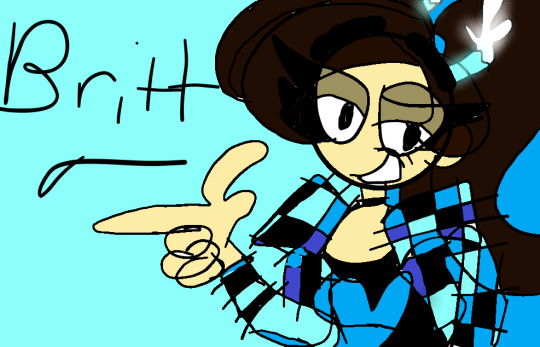
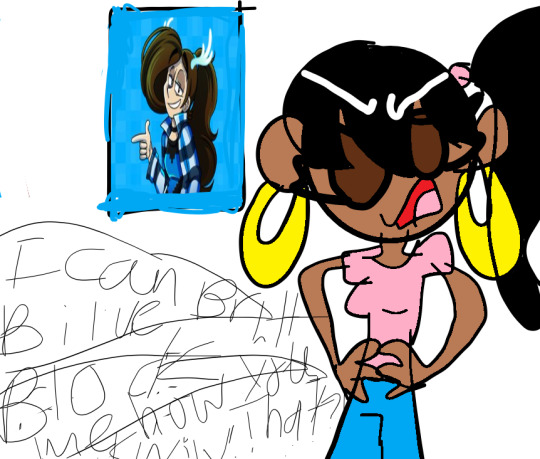
I draw Britt so pretty I hope you like it Britt 🙂
1 note
·
View note
Last Seen Blogs
llamas-in-costumes
llama llama
maples-wings
Maple

ahhmazing123
AHH!!

windcoke71
Best Managed WEBSITE HOSTING and Managed Web Hosti
findyourowntree
Find Your Own Tree