#and there is a lot of comedic potential when urban fantasy heroes interact with the normal world
Text
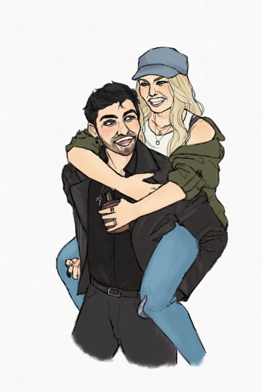
some captain swan honeymoon concepts…
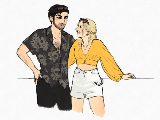
1) wearing cute outfits
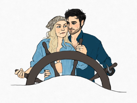
2) smooth sailing 💕
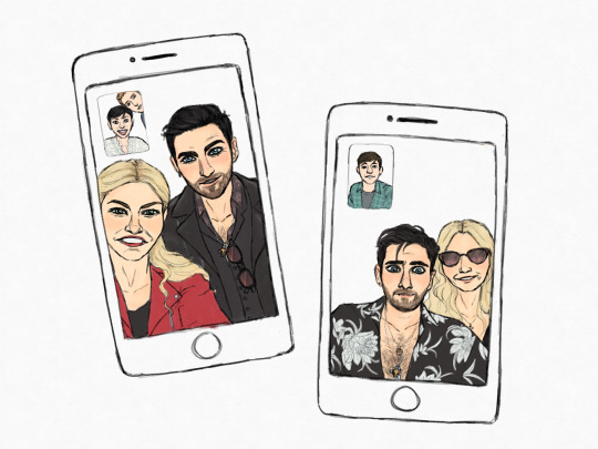
3) checking on Storybrooke on facetime a.k.a. what it looks like when Emma is handling the phone versus when Killian tries
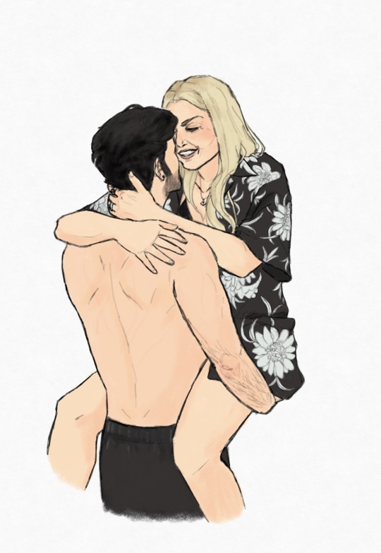
4) being cute and romantic
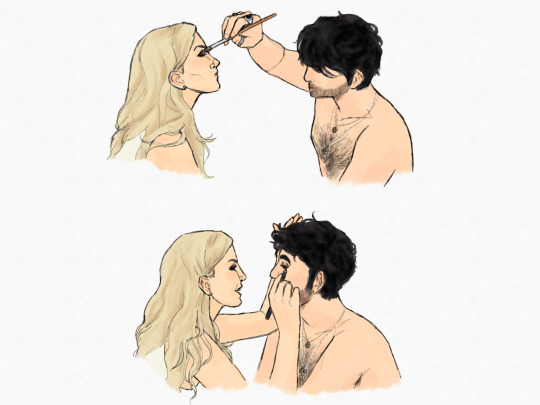
BONUS: doing each other’s make up for an evening out✨
They got there🥺
#ouat fan art#captain swan honeymoon#emma swan#killian jones#my fan art#captain swan#i imagine them taking the jolly roger and going on a cruise south along the eastern coast of america#marrying a guy with a real pirate ship has its perks you know#the fastest ship in all the realms no less#do they get a fun adventure in the bermuda triangle? maybe…#but i love the idea of them making several stops along the coast and killian exploring this strange modern world with emma as his guide#and emma being constantly amused by killian’s confusion#and in turn she becomes quite adept at sailing by the end of the trip#and there is a lot of comedic potential when urban fantasy heroes interact with the normal world#and have to figure out a way to talk about their lives with new people without sounding absolutely insane#but also just… captain swan being adorable and domestic and happy#cs fanart#nya draws
156 notes
·
View notes
Text
Comic Power Picks of the Week (9/13/2018)

[Help support this blog]
[See past Power Picks]
I ended up missing last week, for the record my picks would’ve been Immortal Hulk #4 and Border Town #1, but I’m back this week with a double feature spotlight on some independent comics.
MCMLXXV #1
(Writer: Joe Casey, Art: Ian MacEwan, Colors: Brad Simpson)
Picking up this book might be the best decision I’ll make all week, because this is the best first issue I’ve read all year. MCMLXXV, for those of you who can’t read Roman numerals, takes place in 1975, following the life of Pamela Evans, night shift taxi driver and enchanted lead-pipe wielding demon fighter. The full scope of MCMLXXV’s urban fantasy elements get hinted to be far reaching in a flashback to Pamela’s childhood where we see her face-to-face with a hoard of giant monsters. Establishing the potential scale of future threats works to the book’s favor. Pamela’s backstory and the tragedies that lie within it don’t get fully explained this issue. Her body language when she wakes up from the nightmarish flashback says enough.
MacEwan’s command of body language makes up one of the elements that helps give MCMLXXV its distinct mood. Aesthetics from gritty 70s cinema, like The Warriors and Taxi Driver, blend with bombastic action reminiscent of Jack Kirby’s 70s comics. Simpson’s colors delineate between the fantastical and grounded tones of the action. A neon aesthetic permeates the opening action beat of Pamela taking down a gang of mystic ninjas. When stuff like that is absent, the color palette tones down, though not completely absent with some distinct color choices like the red light of the radio booth of Pamela’s boyfriend, Prefect. Lines of action are clear and well communicated to the reader, exemplified by the fight Pamela gets in with common street gangs towards the end of the issue. Her actions guide the eye along as she works her way through the gathered gangs. The sound effects follow this same principle often following the same action lines as everything else. I couldn’t be more pleased with my decision to take a chance on this book and how its influences blend together makes it one of the most notable comics of the year.

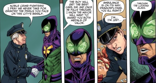
The Wrong Earth #1
(Writer: Tom Peyer, Art: Jamal Igle, Inks: Juan Castro, Color: Andy Troy)
The Wrong Earth is the flagship title of the newly-minted publisher Ahoy Comics about eras of superhero storytelling crossing and getting mixed up. Square-jawed, noble Dragonflyman and his teeth-grittingly grim counterpart, the Dragonfly, end up in each other’s universes during parallel encounters with their conceited archenemy, Number One. The conceit on its own isn’t new. Alternate versions of heroes crossing paths goes back to at least “The Flash of Two Worlds.” Using the setup to comment on the genre’s evolution has been happening since at least the early days of Vertigo Comics. What sets The Wrong Earth apart from those so far is that the genre commentary doesn’t denigrate one time-period to make the other look better. Within the first issue, Peyer’s representations of the lighthearted 60s and the bleaker “modern” (more like 90s and early 2000s) stories the respective Dragonfly(man)s feel like balanced takes on the faults and virtues of each. It’s a difference cemented by how each of them reacts to the arrival of the police in the aftermath of fighting their villain, where neither of them gets the reaction they expect out of the officers.
Igle, Castro and Troy’s work on the art communicates a lot through the distinct styles of each world, without a complete style shift from one to the other. The costumes the different versions of the central hero wear each demonstrate a key aspect of these aesthetics. Dragonfly’s costume, a Jim Lee-esque outfit contouring to show off his musculature, ironically less “realistic” than Dragonflyman’s, which has more visible fabric creases in it without the defined muscles. How events are framed between the two Earths gets does a lot of work to show the art team’s understanding of the eras. Events in the lighter “Earth Alpha” feel almost like a stage play with how the characters pose and interact with their surroundings. Grim “Earth Omega” gets a “cinematic” feel with harsher angles, dark shadows with muted colors and wide shots of events.
While the story of the parallel heroes in The Wrong Earth ends as the premise kicks into gear, there’s plenty within the first issue to recommend it in the back matter. The headlining story at twenty-one pages, the length of the average single issue, only makes up half the total page count of this issue. The other half includes interviews with the creators behind Ahoy as a company and The Wrong Earth in specific. There’s a comedic short comic about Dragonflyman’s sidekick Stinger written by Paul Constant with art by Frank Cammuso. Finally, there’s a three-page prose story by Grant Morrison about the adventures of a delirious pilot with illustrations by Rob Steen. As a company debut, Ahoy Comics has put a pretty good foot forward.
#MCMLXXV#The Wrong Earth#Comic Book Review#Comic Power Picks#Wit's Writing#Image Comics#Ahoy Comics#Joe Casey#Ian Macewan#Brad Simpson#Tom Peyer#Jamal Igle#Juan Castro#Andy Troy#comics#comic books#indie comics
21 notes
·
View notes
Last Seen Blogs

sb4k
Asian women. Preferably dominant. What's not to like...

artofnothin
the art of nothing.

teamcrm
Shivansh
hanofearl
perpetually cold feet

findbestbet
findbestbet