#gradedunit
Text
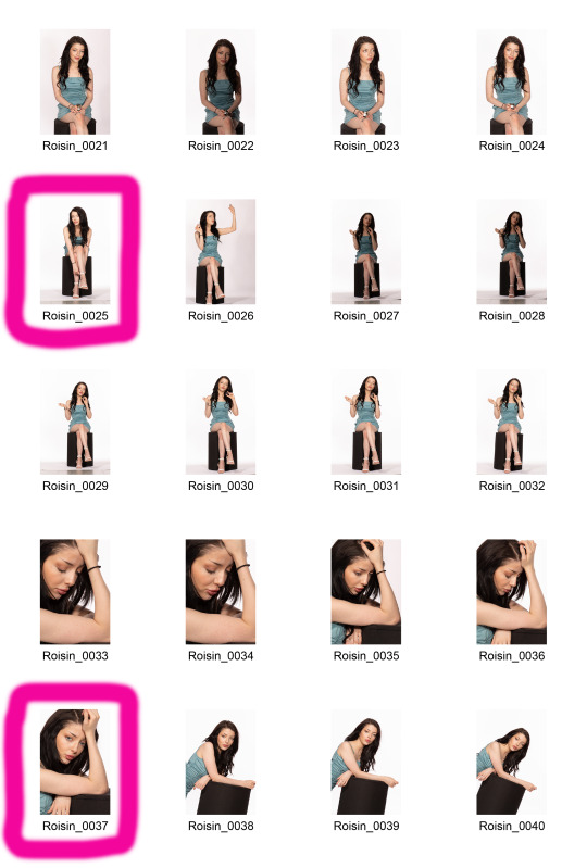
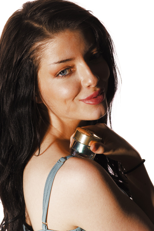
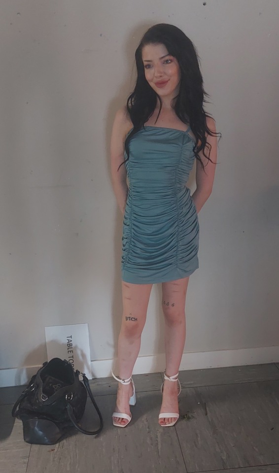
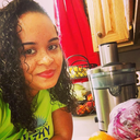
Graded Unit: Portrait IV (Roisin)
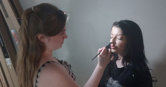
Studio editorial photoshoot with the Clean White technique, shot and conducted in the College photography studio with model Roisin Hodge posing in frame, wearing a teal coloured Shein designer dress, with white Boohoo high heels. MUA Ciara Johnston applied Roisin’s hair and makeup for this shoot. This shoot took place on Monday, May 22nd 2023.
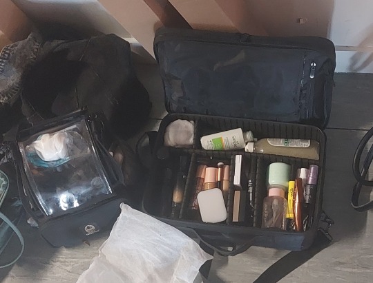
Roisin also posed with small jars of the skin care brand, Estee Lauder, partially turning our photoshoot into an promotional advertising shoot to promote Estee Lauder skin cream.
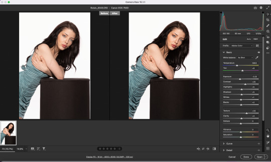
My final images were optimised, edited retouched and colour corrected via Photoshop. The colour look-up mask layer setting was applied to the images, using the filmstock_50.3 setting with a Saturation blending mode setting applied.
Originally, this shoot was just to help out Ciara for her personal project. But the images and shoot were so successfully shot, I decided to include a few of these images into my own project.
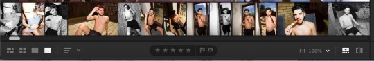
Contact Sheet


Final optimised images


Production


Post production


5 notes
·
View notes
Text
Shoots/Edits so far - CHECKUP Review
ALEXA - Approach daily activates of an international photography student
- Study/ Editing
- Shooting


CHRISTINE


WENDY


SHEENA


2 notes
·
View notes
Text
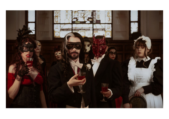
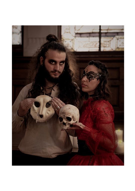
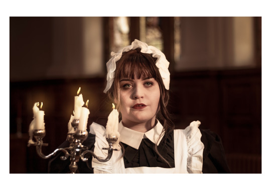
The Night Continues
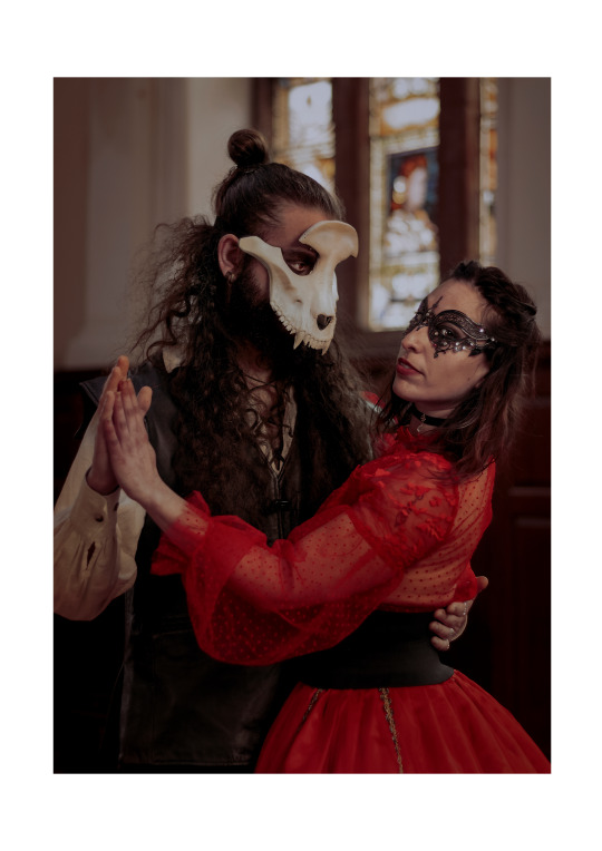


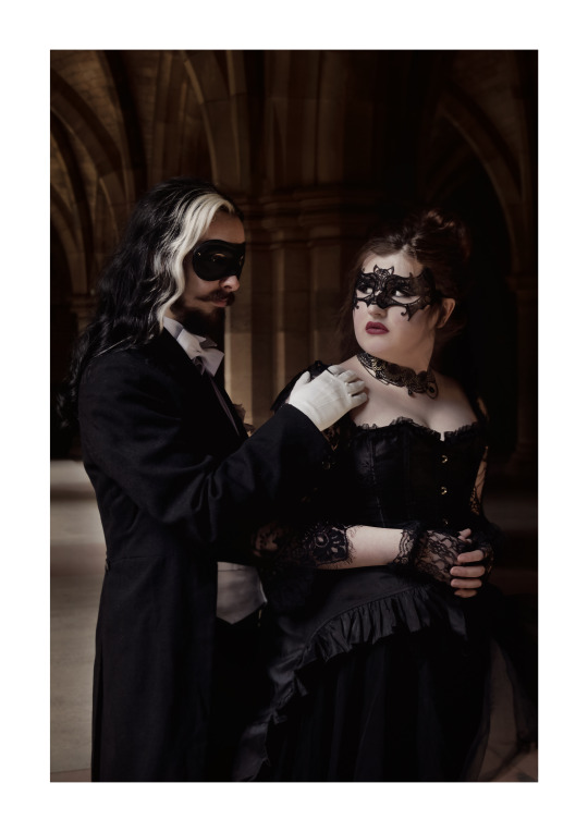
#masked ball#masque#vampire the masquerade#masquerade ball#death#grim reaper#devil#skull#lust#seduction#prince#masque of the red death#prince prospero#baskerville#hammer horror#glamour#masks#cityofglasgowcollege#HND1#gradedunit#dance of death
4 notes
·
View notes
Text
GRADED UNIT - PROJECT
To explain better my project I encourage you to check the link to my PLAN
https://drive.google.com/file/d/1ufBbqjxIhDujdclWhN9-6mWPrsvgv55-/view?usp=sharing
0 notes
Text
Personal Project- Evaluation
‘Behind the Walls’
For our ‘Personal Project’ we were given absolute creative and professional freedom. We were asked to use a minimum of 10 images of our chose. We had to make sure the images linked together and tell a story. We were also asked to print a minimum of 5 images at the end. In selecting my topic, I studied the different photographic genre that inspire me and that I wanted to explore further. I am always drawn back to documentary photography and I was already interested in a subject that I knew would challenge me and push me out of my comfort zone – Glasgow's Graffiti and street art. I researched and explored photographers within my chosen genre and subject that have enthused me, and I planned to incorporate
some of their techniques to develop my own work within my chosen project. My personal project style was documentary photography, and my subject was Glasgow's Graffiti and street Artists. I knew this would require me to try and engage with a community I did not know and make new connections with people who generally fly under the general public’s radar.
This was a personal challenge I set myself as well as a planning challenge, and a real push of my photographic skills. My strategy was to understand what I wanted my end
product to be and look like and what story I was telling. When this was fixed clearly in my mind, I was able to produce a broad plan but with the understanding that I would be flexible and spontaneous when required. In terms of my timescale, I needed to allow time to chat and get to know my
subjects and gain trust before even thinking of setting up a photo shoot with them. The first person I got in contact with was a man who goes by the name ‘Panda’. ‘Panda’ is the CEO of an art trail in Glasgow called Colourways Glasgow, promoting art in the streets of Glasgow, and he is also a street artist himself. I knew I would only get one chance to ensure a response and I spent a lot of
time planning this first contact. After establishing a link with ‘Panda’, he was then able to put me in contact with other street artists who may be interested in being part of my project. Although ‘Panda’ made that initial contact, I had to be clear in what my project
was about and reassuring to secure the other artists ‘buy-in’ to my ideas. I felt instinctively that in my planning it would be important to take things slowly and in stages. I was acutely aware that, although I am keen to show their faces, a lot of the artists do not allow this. I knew this would require developing trust and understanding and sensing their vulnerabilities first.
In planning my timescale, I allowed for several photo shoots of each artist in the hope of getting further ‘Behind the Wall’ of each artist. ‘Panda’ made me aware that street artists are contacted regularly for exploitative photos and therefore there is an inherent reluctance to cooperate with those outside their community.
With this information I spent some time securing ‘Panda’, ‘Frodrick’ and Mark Worst all Glasgow Street artist, for my Behind the Wall project. Accommodating and flexible were the watch words for carrying out this project successfully. The street artists work unusual hours, in unusual locations and their time keeping is very loose. I also broke my foot at the start of this project adding another dimension to my accessing locations, carrying equipment, and executing my photo shoots. Taking these issues into account I had to modify
my action plan, for example, I would not be able to take a tripod with me as I had my crutches to consider, I also needed to be quick with the images I was taking and the idea of a tripod would slow me down.
After several direct messages and meetings, I tweaked my action plan again as the artists opened up and allowed me more access to themselves. I wanted to capture more of their personal story in my images. Most of my adapted shoots went as planned but I had to alter again for my last meeting. I had already delayed it a day to accommodate the artist Frodrick, then on the day I was going to shoot the development of a piece of street art with him, the weather was such that he was unable to paint. I was disappointed but, in my planning, I knew this could be an issue and I was therefore able to chat to the artist and do an adapted shoot of him in front of work he had already completed.
It was important to me that I portrayed these artists authenticity and
personality and to do this I constantly needed to draw on the skills and knowledge I have learnt on my course helping me to consolidate everything. The project started to have a positive impact on my confidence and helped my successful outcome in showing the beauty behind their street art and ‘tags’,
and where many people are quick to judge and see vandalism, I see inclusivity and talent and wanted to show that in my work. I also wanted to show that street art is a journey that starts with ‘tags’ and progresses to street artists and mural artists like Mark Worst. I feel I have manged to tell their important story through my images. I also feel I was able to incorporate some of the
photographers I had researched for my approach essay in my work, like Martha Cooper more than just how she takes her images but more how she went about taking her images the approaches she used.
I feel I gained a lot more confidence in using natural light to light my pictures as all my images where outside a studio setting, I had to constantly change my camera settings to accommodate the light. I also had to make constant adaptions to accommodate the artists changing logistics, expectations, and access, which before would probably add extra stress but I learned to take it in my stride.
In conclusion I am delighted with my completed project. I knew at the outset that I had chosen a risky subject, primarily because most elements to it were outside my control. I feel I anticipated and succeeded in overcoming most of the issues that arose with my foot, equipment, weather, and my model demands. However, should have started my project sooner and shot over a longer timeframe. This would have allowed me to photograph murals from start to completion and get my prints ready sooner so that the artists could
write on them, which would have worked nicely. I did feel a time pressure and could not complete all elements I had included in my action plan. However, I have come away from the experience with a much stronger sense of the importance of the relationship between the subject, the photographer, and the setting. It is a complex relationship based on free communication and understanding the subject which directly affects what we see in my images. I want to continue this connection I have made with this exciting community
and continue my exploration of Glasgow graffiti and street artists behind the work that makes our journey around the city of Glasgow more interesting and colourful.
0 notes
Text
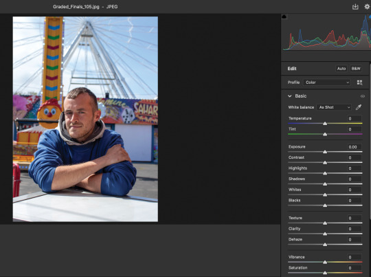
Graded Unit Optimisation
Throughout my optimisation process, I made black and white edits as well as regular colour edits on my best images. This was because I was unsure of which colour scheme would look best on my images and make them flow together. In the end I decided on colour for all of my images as I felt that black and white made some of the images look like they didn't have flash, which cramped the style of my project.
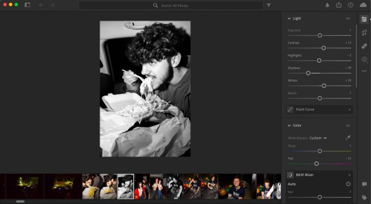
Here is an example of how I optimised a black and white version of my image, I also increased the clarity but it's cropped out in the screenshot as it's further down in the settings. This image particularly looked really nice in black and white, and the flash really pops, but this is not the case for all of the images.
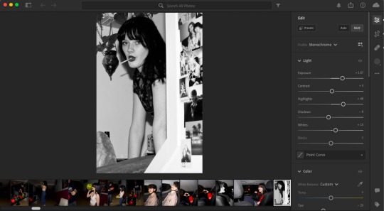
This is a good example of the flash not popping as effectively on a black and white image. The fact that some images looked great in black and white and others didn't, had a big impact on the consistency of my final images, which is ultimately why I chose colour.
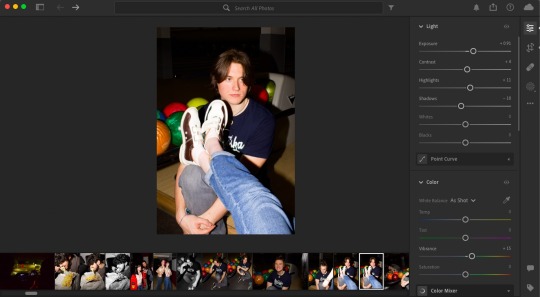
Here is an example of the optimisation settings I used on my final colour images. I also increased the texture slightly to +11 but again it has been cropped from the screenshot due to being further down the settings list. All of my final images had very similar optimisations done to them, nothing drastic - mainly just increased exposure, saturations and slight increases to texture/clarity/dehaze (depending on the shot).
0 notes
Text
Graded Unit Evaluation
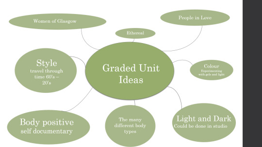
For the graded unit we were given full freedom to explore our own ideas and concepts and produce 10 final images as well as at least 5 printed finals. For my project I chose to do portraiture, as this is what I feel most comfortable doing. The theme I chose was the Seven Deadly Sins, I chose this because I felt it would give me a lot of creative freedom between shoots while allowing me to keep my images thematically linked.
While looking into similar shoots done by other photographers, I noticed that the majority of them chose to portray the sins in either a horror style, or a very theatrical style, while both of these styles work very well for the themes they are portraying, I chose to centre my interpretation of the sins around the perspective of a teenage girl. I decided to use the same model for every shoot, because I wanted to show how the same individual can be affected in different ways by different forces.
My first task was to plan out rough ideas for what each shoot would look like, I knew I wanted them all to have the same muted pink/grey tone to them, to keep them visually consistent, for this I bought a large pink bed sheet to use as a backdrop throughout. I also gathered props I would need for each shoot, which amounted to around £50 since I was able to make some of my own props, or use things I already owned. I then had to work out a location I could do all of my shoots, as both my house and my model’s house didn’t have the right amount of space to work comfortably. I ended up being able to use the hall at my local church as we have the keys.
Once I had planned my seven portraiture shoots I decided to have the last 3 shoots be still lifes that went with three of the sins, I chose to do gluttony, greed, and sloth.
I don’t think I would change anything I did throughout the shooting process, I feel I was well organised and that I put a lot of thought into each shoot, the only thing I would do differently is maybe trying to find someone to assist me with moving lights and sets around, as it might have made the process easier. As for the optimisation section I feel that I did everything well, and I wouldn’t change any of the edits I submitted.
I decided to print all seven portraiture finals, as I felt it would make more sense than just choosing five and leaving the other two out. I decided to just submit the three still life shots as digital files. My prints cost just under £60 from Deadly Digital in Partick, I chose to have them printed into a glossy paper, which I feel works well for my images, as I wanted them to resemble something you would see in a magazine spread.
Overall I feel my final images turned out really well, and I am proud of what I was able to produce in the time we were given.
0 notes
Text
Personal project Evaluation
0 notes
Text
Graded Unit: Possible Print Locations
Deadly Digital:
The Print Space:
Loxley:
Final choice:
I decided to get my final prints done at The Print Space, this was due to many factors but the main point being paper choice, price and time frame. I was extremely happy with the final outcome of my prints and I would definitely use The Print Space again!
0 notes
Text
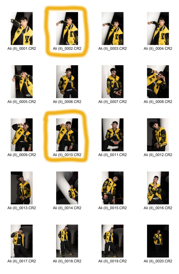
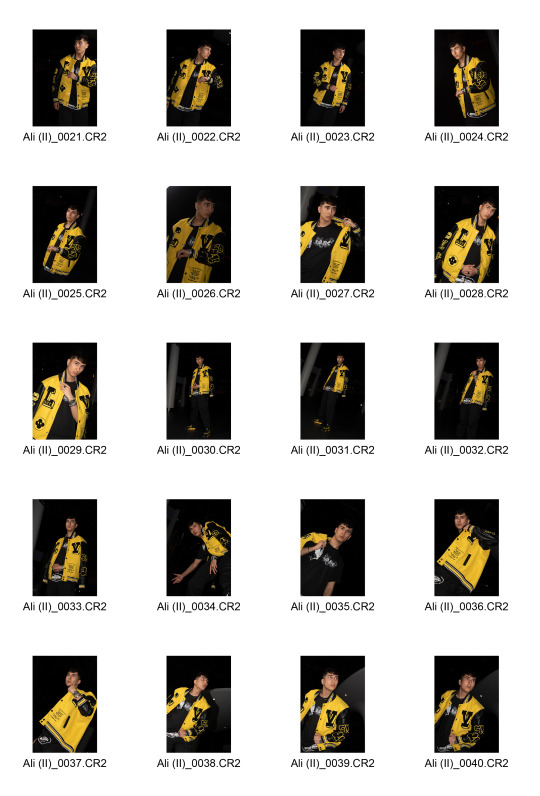
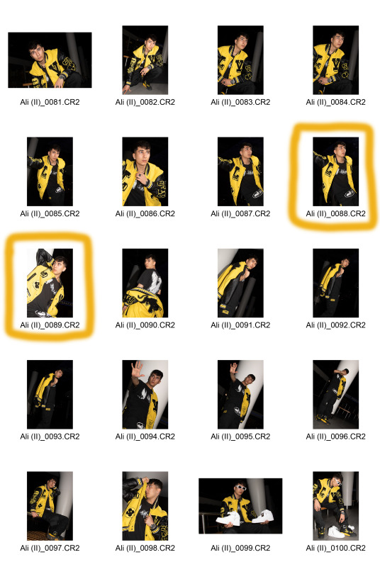
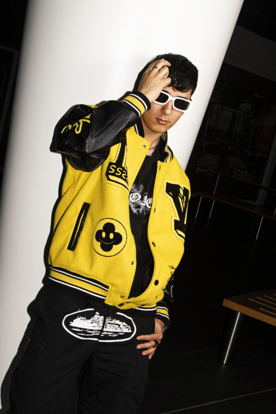
Graded Unit: Portrait III (Ali)
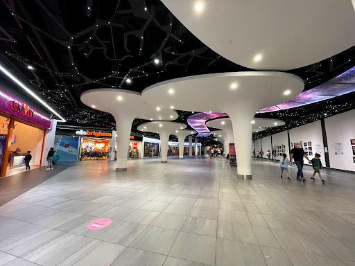
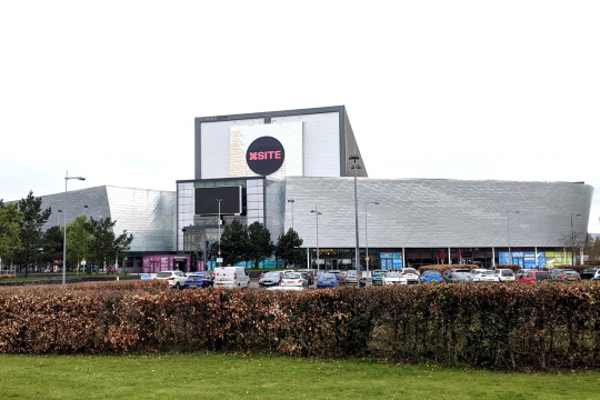
My third shoot for my editorial fashion Graded Unit project and my second collaboration with model Ali. Ali and I shot within the Xscape Amusement Centre, located in Braehead. We did not have a MUA for this shoot, we shot on our own. This shoot took place on Thursday, May 11th.
Ali posed wearing a yellow Louis Vuitton varsity jacket black cargo trousers, with black and yellow shoes and a black designer t-shirt to go with the outfit. We discussed the colours of yellow and black for his outfit weeks before the shoot took place.
Apart from people walking into frame and having to wait for the frame to be free, the shoot went well without any problems occuring.
I was very happy to be shooting inside of the Xscape Centre because I had booked up and requested permission roughly 5 or 6 weeks before I even found a model and a specific date to be shooting on. I selected this location area to shoot in because of the giant white support beams on the centre’s ground floor that really caught my eye, and thought these beams would look super cool in the images’ foreground for atmosphere and design.
The final 7 images were optimised, skin-retouched and colour corrected via both Adobe Bridge and Photoshop. The colour look-up mask layer setting was applied to the images, using the Kodak 5205, Fuji 3510 mask setting with a Soft Light blending mode appliance with a 75% opacity and a 50% fill applied.
Location of area:
Team photo:

Contact Sheet:


Final optimised images:


2 notes
·
View notes
Text
Graded Unit - Workflow digital
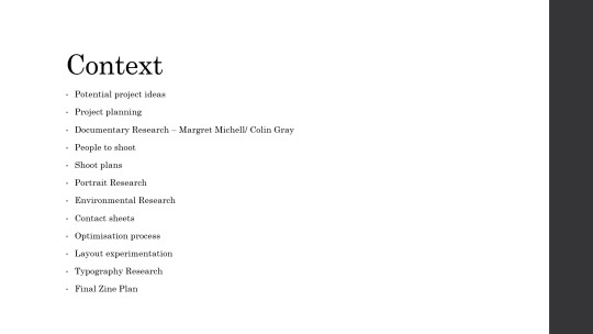


I will also be continuing my research upon
- Environmental Photography
- Layouts Zine / Exhibition
- Typography
0 notes
Text
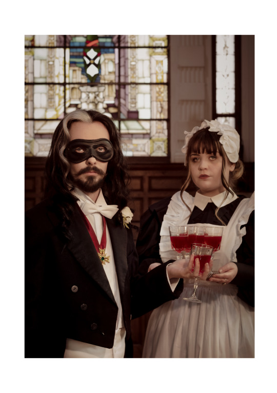
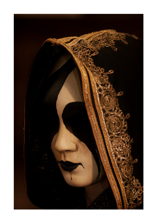
The Masque


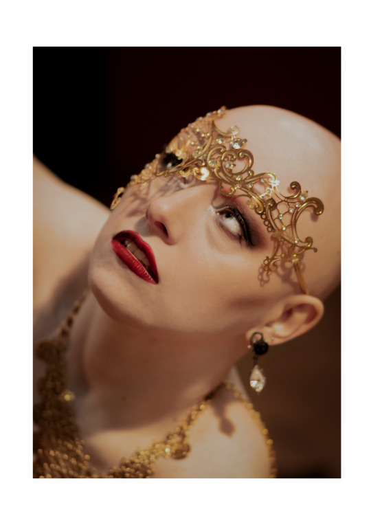


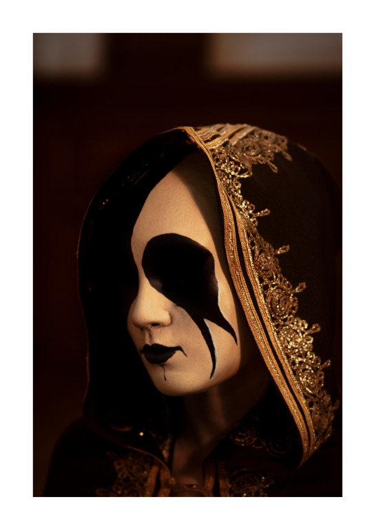
#HND1#gradedunit#cityofglasgowcollege#personal project#dance of death#masque#vampire the masquerade#masquerade ball#masque of the red death#hammer horror#grim reaper#devil#high society#masked ball#fantasy#photoshoot#gold
3 notes
·
View notes
Text
Editing - Graded Unit
I chose to make any adjustments and edits to my images by using Camera Raw. However I chose not to make to many changes as I was really happy with how the came straight out the camera.
0 notes
Text
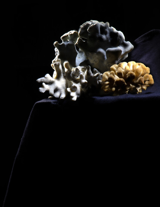
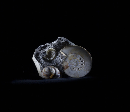
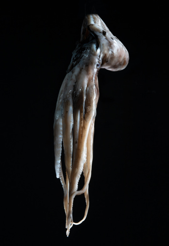
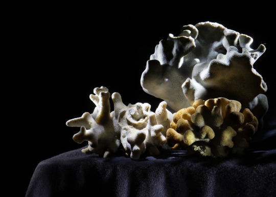
Graded unit evaluation
Introduction
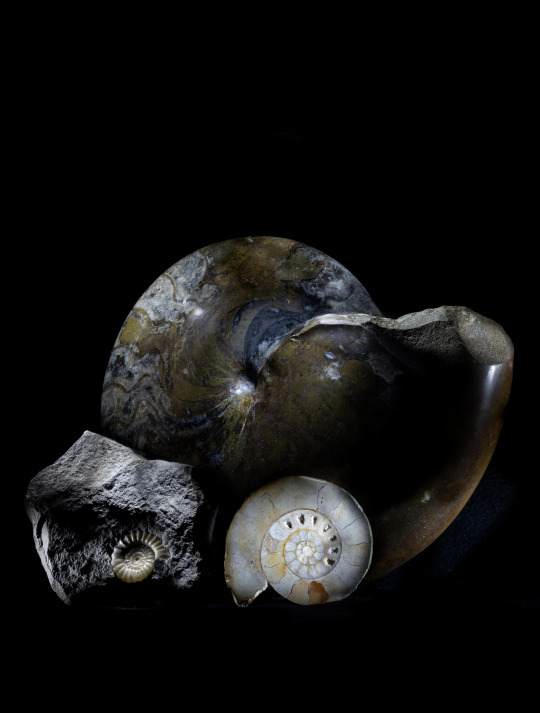
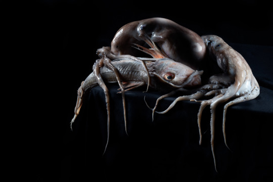
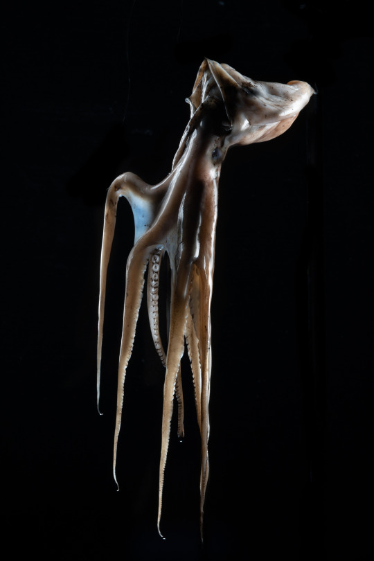
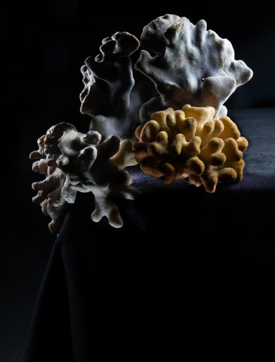
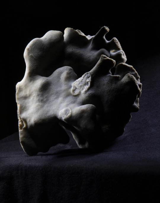
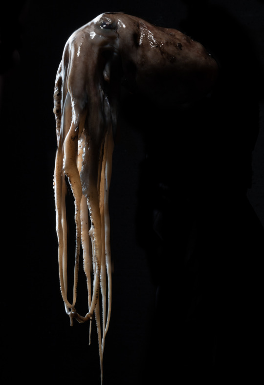
My photographic task was to create a series of 10 images of my own choice based on an idea that I come up with myself. I chose to go with the theme of deep-sea life. I tried to represent the archaic and transient nature of the seas by photographing studies and still lives of fossils, shells, coral and dead sea life. The planning of the task began with my approach essay that detailed my inspirations and my own plan for the project, here I looked at the photographers lieve prins, irving penn, hiroshi sugimoto, Annabelle breakey and Edward Weston. Next, I gathered resources for my project buying sea food like octopus, squid and gurnard as well as objects like coral pieces, fossils and shells. I felt that at this stage it was best to go for a wide range of objects and styles of image, both studies of individual objects and still lives.
main
In all the shoots I utilised light painting techniques that I had used in a prior task. the work of Harold ross was inspirational in this. The technique involves using a small light to create concentrated areas of detail on different parts of the objects being photographed, these captures are composited in photoshop to create a final image. All of the shots were taken in studio using a canon eos 6d camera mounted on a tripod and a range of generalist zoom lenses. A tripod is necessary for light painting to work, as each shot makes up part of the final image the only difference should be in the lighting used, you cannot reposition the camera or the object or the effect will be ruined and the inconsistencies will be obvious. In terms of the light sources, I mostly used a small torch and an LED light panel held in my hand and moved in a circular or linear pattern during the exposure. The exposures were usually from 2-4 seconds due to the weakness of the light sources used, this also allowed me to move the light source during the exposure, a technique Harold ross says is vital to creating soft light in light paintings. Over the course of the shoot several ideas were ditched or modified. I considered early on the idea that I could create elaborate backdrops for the images to enforce deep sea aesthetic, I ran out of time to do this but I feel like it was not a mortal blow to the project as a whole though it may have enhanced it. At one point I thought that purely shooting still lives was the way to go with the project however it branched out into a wider range of shooting styles, I feel that this was not necessarily negative as variety can be more interesting. In terms of the skills I have gained and developed, I believe that I have refined my use of light painting techniques and of photoshop compositing techniques. The light painting can be tricky to get right as you must visualise the end result of the shoot based on multiple incomplete and usually not very appealing photos, you must train yourself to think in the long term. My compositing techniques in photoshop seem like second nature now after the span of time I have been using them for. Technical aspects like Using mask layers and adjusting exposures to suit as well as creative ones like choosing the photos to add together have both advanced for me. I feel like my attention span in regards to photography has increased thanks to this project, the nature of light painting means that you have to be very patient, this is a very important skill for a professional photographer to have. I also had to develop creative solutions to get the objects to stay in place, especially the octopi which are about as possible as a lump of jelly, I used wire armatures mounted on metal poles to keep the octopi suspended and in a decent shape, spearing the octopus’s body with wire and positioning it to suit the shot. I feel like my work has been fairly cohesive aesthetically throughout the process of the shoot which hopefully shows when they are finally presented together
conclusion
In conclusion I think that my work was fairly successful. The one regret I have in regards to my project was that I managed my time very well at the start of the project, but let time creep away from me at the final stretch and will have to bring in my printed work late, this is, the moral of the story is that you need to keep an eye on all your projects like a hawk. Next time I would also try a wider variety of shooting styles and techniques. The idea of having a light source within the translucent body of the octopus was interesting to me and I really feel that I should have at least tried it. If I was to do the project again I would have used a wider variety of fossils, probably trilobites as they have an extremely interest shape and texture and they are relatively cheap, I feel like I should have done this. I would have also made use of more seafood types, especially more fish as I feel they are underrepresented in the project. I may have also made models of prehistoric fish and used them if time allowed, but this would have required much more time then was allotted to the task. The logistics of the project were unproblematic. All of my objects were small and easily carried, though my octopi had to be brought in freezer bags to avoid them rotting prematurely. As I had no human subjects in the project and I was not shooting on location I was not bound by other people’s timetables and thoughts on the project. This was ideal as it meant there was almost no stress from trying to keep someone else happy. The smell of rotting octopus was unpleasant throughout the project and I did feel nauseous at times but never truly sick. As I write this my prints have not come through yet, but I believe that they will be well presented and of good quality reflective of the amount of work I have put in.
0 notes
Last Seen Blogs
arkmommy
ARK Mommy

buffepel
buff apples

azaharatic-blog
Azahara TIC #EduPLEmooc
nekoandy
NekoAndy~♥

alphajen2463
AlphaJen2463