#new color palette so it's fresh on the eyeballs
Text

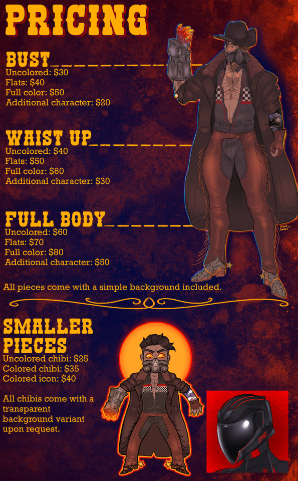
Hey y’all. Shiny new commission sheet for the shiny new year! Thank you to everybody who’s supported my artwork throughout 2023, whether that be by commissioning me or just interacting with my content. This year’s been a long one between family members passing, others family members becoming ill, and moving across the country in the middle of it all. Having a welcoming community to come back to amidst all the chaos made a huge difference, and still does. Throughout this year my art’s grown a lot with me, I’m happy to have folks to share that with.
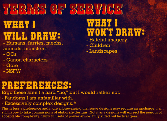
Starting out with 10 slots. Additional info [TOS, Pricing, etc] under the cut.
9/10

Y’all are more than welcome to DM me with any questions that may not be addressed in this post, I’m happy to clarify and discuss anything you’re not sure about. There will be a brief consultation prior to starting work on a commission for me to collect any info and/or references I may need.
Payment is taken up front through PayPal, CashApp or Zelle. Commission slots are first come, first serve. Once I start work on a commission, you’ll receive updates in stages [sketch, lineart, flat colors, shading, final check] so as to give plenty of opportunities for corrections or reasonable changes. Estimated wait times will be given during initial consultation.
#not to be corny but im really grateful for the community ive found myself in#moving into my own place in a month and i currently have 1 comm left in queue so!#im going to have a lot of time and availability for commission work :3#art commissions#artists on tumblr#comm info tag#i updated my sheet but didnt wanna keep reusing the exact same formatting#new color palette so it's fresh on the eyeballs
132 notes
·
View notes
Note
Hello! I just wanted to say I love your art and looking at your alphabet sketchbook brought me a LOT of joy
I really like how you do your compositions too (that’s something I really struggle with) and I wanted to know if you had any tips!
It’s okay if you don’t answer tho, thanks for brightening my day still :D
oh thank you so much, that makes me so happy to hear!!
for composition it's a lot of eyeballing and testing things out to see if they look/feel right. but here are some more specific tips!
i like to think of my compositions as a collection of differently sized shapes. sometimes 1 big shape with smaller variously sized shapes surrounding it, sometimes all evenly spaced shapes that are varying or similar-sized. keeping in mind the sizes of your elements, you can place them in a way that makes the page feel balanced
i also consider color! oftentimes i have some kind of color palette in mind and that can help you figure out a composition (like if you want a focal point to have a lot of color, and you want to carry that color around in smaller areas around the page, or if you want the colors to be evenly distributed around the page, etc.)
having a good balance of positive and negative space (sometimes i can go a little crazy with the collage but i think busy compositions can be fun too if things are placed purposefully)
try to eliminate tangents
remember the rule of thirds! it's not a rule you HAVE to follow all the time, but it's a good way to help you place where you want a focal point to go
this isn't really a tip, but the medium you work in can be inspiration for different compositions! if i'm working in something 3d like string or cut paper, it's going to challenge me to come up with something different than i might choose for a painting
in general, this is great project for practicing composition! every book is 26 different prompts, and i'm always trying new compositions to keep things fresh and try something new! they're not always super successful but it's great practice regardless, so i recommend doing something like this if you want fun practice! :)
and thank you so much for your kind message!!
3 notes
·
View notes
Link
fandom: MCU (Post-Avengers: Age of Ultron) (Post-Captain America: Civil War)
ship: Steve Rogers/Tony Stark
tags: Fluff and Angst/Angst with a Happy Ending/Character Study/Pining
summary: The thing about hating Steve Rogers is that it shouldn’t be easy - but it really, really is.
#stony#stony fic#stevetony#stony fanfiction#stevetony fic#my fics#holy shit this is long lol#congratulations to anyone who actually reads it#otp: together#long post
62 notes
·
View notes
Note
I've never written fanfiction (except one years ago that sucked) and I want to start getting into it. You are one of the best fanfiction authors I have read in a long time, or ever. Especially with your characterization, and writing platonic love/relationships. Seriously you are queen at those. Can you tell me how you go about understanding a character? Or just some tips? Also anything you have to say about writing platonic relationships? Random advice for new fic writers? I would be so thankful
Hey love, so first off, I’m so sorry for the lateness of this response. Life. Blegh. I wanted to give you a thorough response so bear with the short novel below xD
Thank you so so much for such a lovely compliment. Gosh! ♥ You’re making me blush. Now I want one of those sashes to wear and it says “queen” on it. And a crown. Oh yes, a crown absolutely! ;p
I think when it comes to understanding characters we always tend to gravitate to one we most associate with because it’s always easiest to write what we know. On the flip, we also gravitate sometimes to characters we really admire or want to be more like or just really, really like in canon and thus want to see them engaged in more adventures, but I do think we tend to like those characters for the above two reasons.
I’ve gotten pretty lucky with the VLD cast in that they’ve all, after a time, really just clicked in for me. Lance is obviously my favorite but I’m particularly fond of Hunk and also, surprisingly, writing Allura. Her dialogue and speech patterns tickle me pink. But in terms of trying to understand a character for writing purposes my best advice is to play 20 questions with them. Haha, bear with me.
When you’re getting to know someone the best way to do so is to ask them about themselves. It’s not just the answers though; imagine the way they would talk, gesture, their tone of voice (I’m a huge body language/non-verbal fanatic), etc. Then look at their answer. Start with basics and build a head canon or expound upon canon from there. Explain *why* to yourself that character particularly likes yellow (*cough Keith and sunrises with his dad cough*) and build a story. Then, when you’re writing go back to that palette you made and using it ask “what would ___ do in this situation?” The right answer isn’t always the first one. If you’re stuck, draft out a few ways to go about it and then compare. See which one “feels” right to you. And you have to remember, characters can change based on their situation. For example, Lance in Color is a very different Lance then you’ll find in Sin or Razzle Dazzle and definitely different then the one in A Name by Any Other because of what has happened in that story, but I think we’d all agree it’s still an in-character Lance (at least that’s the feedback I get from you guys~ ;p) The biggest thing is to find the “core” of a character and keep true to that. You can’t go wrong.
As for writing platonic relationships, I think it’s the same approach as any type of relationship. There has to be a connection between the characters and it doesn’t always have to be “good.” (i.e., siblings fighting, rivalries, etc.) but at the core they do have to care. It can be more of a surface caring – that’s a teammate – to start but what really makes a relationship something special is when there’s a deeper feeling behind it. And with a platonic relationship as compared to a romantic you aren’t necessarily so much as falling “in” love with that person but falling “with” love for them. If that makes sense? xD It’s not about appearances or superficial things like that. It’s about seeing them for the person they are beneath that and loving that person with all your heart because of those “core” attributes mentioned above.
With the VLD gang it comes so naturally to me for them to have these relationships and they sort of just fall in. I do disagree with the “space dad” moniker for Shiro and I think he would as well. He doesn’t want to be a dad; he’s got enough responsibility being team leader. He definitely fits more of the really responsible older sibling to me while Coran fills in the role of dad for me more, but more so for some than others depending on how they view one another.
If you’re starting out and want to write a good platonic relationship, I recommend starting with just a pair. Believe me, when you start throwing in three, four (cough, seven) characters it gets a little crazy to find a good balance. Pick two that you really think click and go for it. It doesn’t have to be a big complicated plot either to be an enjoyable fic. So long as the characters have *character* to them. That was my big problem with season four in that we had all this crazy awesome plot but almost no character development. Focus on that first and then tackle the plots and red herrings and twists and turns.
Um, any other random advice?
Write what *you* want to because that’s where you’re going to be most passionate.
On that note, write for *you*. That’s something I’m still trying to be better at. Write because you enjoy it; not because you want so many comment/kudos/etc. from others. That said, readers, please do comment if you like someone’s fic. It truly means the world ♥
If you get stuck on a scene try swapping the perspective; you can either keep it if you like it or it might offer you a fresh idea to go back to it. Or skip it for now and come back later; no harm in that either :)
Don’t be afraid to delete. I’ve blasted away whole pages when I go off on a different tangent (I write with almost no outline; a true pantser xD) and I know it’s hard to imagine all that time spent writing only to toss it, but sometimes you have to based on where your plot went. You can always save it in a spare word doc though if you did like it because maybe you can use it elsewhere in that fic or another one :)
I listen to music all the time and tend to make “soundtracks” for different fics. Highly recommend some good epic soundtrack battle music for any type of fight scene to keep those juices flowing!
Figurative language is your friend. While you don’t want to come off sounding like a sixth grader learning what a simile is, adding in good pieces when the situation calls for it really spices up a piece. With feeling!
This is for the reader/journalist/editor in me; please use paragraphs. Please please please. When starting new dialogue, paragraph. After 1-3 sentences depending on length, paragraph. Your readers and eyeballs will thank you.
Um, I hope some of that helps? Thank you again for the lovely comment and do hope to see you on site somewhere. Give a shout out~ ♥
#icyanswers#Fanfiction Advice#Writing#Fanfiction#Platonic relationships#gen fic#writing advice#am I qualified to be giving advice?#I feel too much like an adult#Oh. I am an adult#Oh dear#hope this helps!
16 notes
·
View notes
Text
All of the Glitter Makeup Inspo You Need This Holiday Season and Beyond
New Post has been published on https://www.claritymakeupartistry.com/all-of-the-glitter-makeup-inspo-you-need-this-holiday-season-and-beyond/
All of the Glitter Makeup Inspo You Need This Holiday Season and Beyond
By no means is glitter eyeshadow a new invention. In fact, up until pretty recently, it was totally out—the late ’90s and early 2000s were well behind us, and we had no intention of turning back.
Until now.
Enter New York Fashion Week—specifically, the Spring 2019 season. Everywhere we turned, we were temporarily blinded by the light reflections from someone else’s eye makeup. And to be honest, we’re not even mad about it.
From Oscar de la Renta and Prada to Elie Saab, all the greatest runways this fall featured some form of glitter eye makeup. One of our fave looks is the “barely there” shadow look. It’s subtle, so you won’t really blind anybody, but it’s got just enough sparkle to take your beat to the next level.
Below is a slideshow full of gorgeous, sparkly eye makeup looks you’ll definitely want to save and products you’ll want to hoard. They’ll provide plenty of inspo as you go out there and tackle the new season like only a true diva can—because how else do you plan to re-create these looks?
Barely There
This sheer, shimmery shadow makes for a perfect neutral look that you can take to work or play.
Photo: IMaxTree.
Complementary Colors
Pairing a sparkly gold lid with bright blue underliner is the perfect way to take your pop of color to the next level.
Photo: IMaxTree.
Stila Glitter & Glow Liquid Eyeshadow
Glossy and shimmery, this shadow will keep your lids looking super fresh all day long.
Glitter & Glow Liquid Eyeshadow, $24 at Stila Cosmetics
Photo: Stila.
Winging It
A bold, two-toned wing totally amps up your already-sparkly glam, especially when you use contrasting hues.
Photo: IMaxTree.
Say Yes to the Mess
This look couldn’t be simpler—it looks like you aren’t even trying, in a good way.
Photo: IMaxTree.
NARS Hardwired Eyeshadow
This glitter is super-shimmery. Your lids will be reflecting some major light!
Hardwired Eyeshadow, $22 at NARS
Photo: NARS.
Bold and Beautiful
Nothing draws the eye like a bold swipe of color—except, maybe, a bunch of sparkles.
Photo: IMaxTree.
Sequins of Love
If your eyes aren’t fully lined in glitter, we’re not interested.
Photo: IMaxTree.
MAC Shiny Pretty Things Shadow
This product comes in multiple shades… because one kind of glitter just isn’t enough.
Shiny Pretty Eyeshadow, $21 at MAC Cosmetics
Photo: MAC.
Less Is More
A super-subtle dab of pigmented glitter is totally the way to go. Go with a neutral metallic, like silver or gold, for the most versatile look.
Photo: IMaxTree.
Cutting Corners
Inner-corner glow, but make it glitter.
Photo: IMaxTree.
MAC Cosmetics Glitter Pigment
Loose glitter is super diverse. To make it stick, apply some vaseline or clear lip gloss to the area you want to sparkle.
Glitter Pigment, $22 at MAC Cosmetics
Photo: MAC.
Simply Studded
Eye-catching, but not glaring. We love her.
Photo: IMaxTree.
Do It for the (Holo)Gram
When the light hits silver glitter just right, it’s totally iridescent, making for a gorge look to brighten your eyes.
Photo: IMaxTree.
Anastasia Beverly Hills Eyeshadow Single
Mix and match your fave singles to create a totally customized glitter palette.
Eyeshadow Single, $12 at Anastasia Beverly Hills
Photo: Anastasia Beverly Hills.
Silver Belles
Silver looks great with a bold red lip—it’s definitely a look to consider for any upcoming holiday plans.
Photo: IMaxTree.
Pretty in Pink
A subtle rose gold looks great around the eyes, and reflects light toward them, making them totally pop.
Photo: IMaxTree.
Marc Jacobs Beauty See-quins Glam Glitter Eyeshadow
This hue is perfect for the inner corners of your eyes, as well as just below your brow bone—it’s basically highlighter for your eyeballs!
See-quins Glam Glitter Eyeshadow, $28 at Marc Jacobs Beauty
Go for the Gold
Layering gold glitter on top of virtually any color eyeshadow makes for a beautiful, complex color combo.
Photo: IMaxTree.
Sweet and Subtle
Dabbing a neutral metallic on the inner corners of your eyes makes you seem more awake. Plus, it’s sparkly.
Photo: IMaxTree.
Sephora Collection Colorful Eyeshadow
This glitter-finish eyeshadow is perfect for swiping on top of a coordinating matte for ultimate pigmentation.
Sephora Collection Colorful Eyeshadow, $8 at Sephora
Photo: Sephora.
Next slideshow starts in 10s
Literally Just 31 of the Prettiest Bullet Journals We’ve Ever Seen
Source: http://stylecaster.com/beauty/fall-2018-glitter-eye-makeup/
0 notes
Text
10+ Beautifully Designed Event Websites
Often the event website is an attendees first encounter with an event. It can cause the first rumblings of hype (or dread). The web designer’s job is to master the event’s aura before the event even happens, capturing the scene in fonts, colors, and design. These websites show us, uniquely, how to mold an event’s esthetic into something digestible, useful, and that accurately reflects an event’s story. Each person has a story, product, and business has a story—and so does each event. An event website acts as the storyteller and, if the story seems consistent and cool, then people will want to experience the story for themselves and attend the event. Here are the best and most beautiful event websites that function as great storytellers (in no particular order):
The Summit Dublin
No matter how awesome a website’s design looks, if navigating proves difficult and you can’t answer questions about the event in only a few clicks—something is missing. Summit Dublin’s website not only electrifies your eyeballs (you know, in a good way), but it answers questions you didn’t even know you had: if there are hotels—or, um, a casual castle—available for your stay. Plus, seeing Bono’s face immediately upon entering the website has to be one of their main selling points.
Air France Expo
The Air France Expo website is almost exactly what you’d expect from a French website, based on stereotypes of French style: minimalistic, chic, and sophisticated. In a way only the French can, they’ve made a website utterly sexy: the sleek fonts and color schemes, the elegant white space, and the gorgeous images that float gently onto your screen when scrolling. Even their copy has a sensual side: “We invite you into a world, suspended between the earth and the sky, to share passions and poetry from Shanghai to New York and Paris.” The Air France Expo’s website is just that—poetry.
#Digitized
#digitized’s website shows users how to take advantage of the recent phenomenon of the one-page responsive design. From its simplistic colors to the playful marker-drawn font, the design throws the site users into the event, inviting them to interact with the hip interface and look at all the talented speakers for the event, wearing sweet button-downs and trendy black, thick-rimmed glasses. And it’s awesome.
Brand New Conference
Far different than the Air France Expo or #digitized's website, the Brand New Conference website immediately shows its colors boldly—literally. If you want to feel like a technologic bad-ass, this web design will fill that void, using confident reds, blacks, and grays to bring chutzpah into the world of technology and brand identity. Bitmap-oriented, the “identity” for this year’s Chicago conference has to do with the early 1984 Mac OS and (graphic design font nerds, rejoice) the Chicago font for that operating system.
Converge Southeast
Brightly colored illustrations of wildlife? Sure, the conference takes place in South Carolina, but the immediate images aren’t quite what you’d expect for a tech event—making it unique and intriguing in its own right. The wildlife theme continues further down the page, where each “track” (design, gaming, UX, etc.) gets its own wild animal. The overall melding of wildlife and technology proves to be endearing but sleek, melding fun kitsch with simplicity.
Buses at the Brewery
If the name of the event isn’t enough for you, then maybe the cover image will make you jump out of your seat, into the sunshine, and over to the nearest beer garden. This website works its magic on users, packaging the experience so perfectly, you can almost taste the craft brews from its muted and quirky color scheme and retro fonts.
Tribecon
The design is clean and simple, but the best part of Tribecon’s website lies in its fun, friendly vibe. The contact section: “Hit us up.” The last speaker listed: “You.” And the events are listed as “awesome.” Their excitement is contagious, creative, and, well—awesome. Why aren’t we best friends with them yet?
Design Week Portland
Keep Portland Weird, right? Drag your cursor and scroll down slowly past the cover image to witness something…trippy (just do it…trust us). And, in truly Portland fashion, the website becomes beautifully minimalistic as you continue to scroll.
Circles Conference
Take the best design from your Pinterest board and Etsy wish-list to fuse the coolest, authentic, hand-lettered goodness that is the Circles website. Its vintage poster-y feel maintains a silky smoothness as you scroll down. The site is 100% fluid and cool—even the pictures of the speakers make you want to give them a high-five and grab a beer. The style highlights its trendy earthiness—beards, flannel, and all.
Image Festival
In a Zooey Deschanel, cutesy-yet-quirky kind of way, the Image Festival website (and all its gumball-colored freshness) has a big personality with text and bright colors, and it’s also super refreshing and forward-and different from everything else. This website showcases its fun nature in pops of color and funky fonts.
Sisense: Eureka
This event website for Sisense's Eureka conference makes sure to use the background loop video to their advantage. Seeing footage of previous Eureka conference helps the website visitor to envision themselves at the event. The remainder of the website holds true to the fundamental rule of simplicity as it uses few colors and does not use too much text.
Branch.io: Branchout
Not all event websites need to be flashy with impressive graphics. More than anything, the website has to resonate with the target audience and align with the event vision. Because Branchout is a conference focused on specific technical topics such as mobile fragmentation and cross-platform user experiences, the event website skips the fluff and gets straight to the point. By providing all of the previous year's event content on the homepage, this event website is a great example of designing with audience in mind.
Google I/O
Though Google I/O's brand name alone is enough to pull anyone into their event website, they still took much time designing a stellar website experience. Having an eye-catching countdown clock as soon as you enter the page helps to build up anticipation for the event. The weather widget overlayed on top of a beautiful image of the previous year's outdoor keynote session also does well to generate enthusiasm because attendees can expect to have similar great weather for this year's event.
Blockchain Nation: Miami
Sometimes the best design can come from the actual event setting. Since this blockchain conference takes place a beautiful beach city, the website takes advantage of this by including a breathtaking skyline image of Miami. The image goes will with the event brand colors as well, creating a visual harmony while still making the CTA button stand out.
Insurection
While the company putting on the event surely has its own brand, the event itself should have a standalone brand as well. In the case of Insurection, the industry event put on by the French insurance company April Group, the conference does well to stay in line with the overall April Group brand while also bringing its own aesthetic. The eye catching header banner with a diverse palette of colors and shapes makes the event homepage memorable for anyone who visits. Making sure that your event brand stands out through distinct visual elements will help it to stay top of mind of attendees.
Key Takeaways
These examples all exhibit strong qualities that can be replicated and implemented into your own event website. Though there a countless tips we can take from these examples, here are some of those tips distilled into key takeaways:
Make sure that your website colors, fonts, and visuals overall represent and cohesive and unique event brand that will be memorable to anyone who visits the site.
Less is more. Be efficient with the amount of words on the home page and let the design do the talking.
Keep your target audience in mind and make sure their questions and concerns will be addressed directly in the design/layout of the event website
Use images or videos from previous events as the homepage banner to have your website visitors envision themselves at your event.
Make sure the most important event details (date, time, venue) are viewable as soon as someone visits the event website
Mixing and matching the different tips and takeaways from this list of beautifully designed event websites will help you to create the perfect visual representation of your unique event.
For more awesome event resources, click the button below. Your brain will thank you.
from Cameron Jones Updates https://blog.bizzabo.com/10-beautifully-designed-event-websites
0 notes
Text
How To Create A TV Gallery Wall
Some say gallery walls are trending out in favor of larger scale art. Maybe. It makes sense that gallery walls on every wall (especially the ones with a ton of tiny frames) might feel a little less “new and fresh” these days. But I’d argue that a collection of frames hung together on the wall feels pretty classic if you stop and think about it. Watch Home Alone. They totally have a gallery wall going up their formal staircase in the foyer where Kevin sleds and hurls paint cans. But one spot I love for a gallery wall these days is actually around a TV. Why? Well, that big black box isn’t exactly gorgeous.
It’s often this hulking dark thing on an otherwise bare wall, so why not break things up and add a few other rectangular things to deemphasize it. It’s not like the TV disappears when you add a gallery – but at least you have a few other (prettier) spots to rest your eyes. And you can always turn on Planet Earth, since that makes any TV look like art in a nanosecond.
We first blogged about adding a frame gallery around our living room television, oh, FOUR AND A HALF YEARS AGO (evidence: here – also how funny is the “What Does the Fox Say?” reference – ah, 2013). Things have evolved A LOT in that room since then (hello paint!) and the gallery got a few tweaks (some new art there, some frame switches there) but it has pretty much stood the test of time. And since I get a bunch of questions every time we show a smidge of it on social media, this post is for everyone asking about framing arrangements, what to frame, how to hang them, and where we get our art. So let’s dive in, Planet Earth Style. I’ll be the whale if you’re that big school of tiny reflective fish.
Dealing With The TV
First, if you listened to last week’s podcast you heard that we got a new TV (the old and very faithful one now lives at the beach house, reunited with our old couch and it feels so good). We also decided to mount our new TV on the wall and used one of those in-wall power cord systems to hide the wire. That whole process only takes an hour or so and is SO WORTH IT. We’ve got an entire post dedicated to creating a cord-free TV wall if you’re interested in a step-by-step tutorial on that. That post also shows you how to hide a cable box if you have one. And if you’re looking to cut the cord, here’s how we did that.
But it’s not absolutely necessary to mount your TV to create a good-looking frame gallery around it. As you can see in the old photo below, we had ours resting on the media cabinet for years. But mounting it has definitely made the room feel more spacious and less cluttered. Also, we are BIG FANS of secondhand dressers as TV cabinets – this one is from a thrift store and we have a similar one in our bonus room from Craigslist.
Getting Your Frame Arrangement Right
Ok, now onto actually hanging your frames around the TV. There are a few methods you can use…
1. The Floor Method
Grab whatever frames you have on hand and want to use (or pick up new ones that you love) and lay them out on the floor, with a gap on the floor in the shape of your TV (measure it to get the correct amount of space). Then just move them around on the floor to see what layout you like. That’s how we created this very frame wall in our original post… back when our living room was overwhelmingly, mind-numbingly brown.
2. The Paper Method
This one is really easy too, and if you are worried you won’t like things once they’re up on the wall, it’s the one to try. Because it helps you visualize things right on the wall before you actually hang the frames. How? Use newspaper, brown paper bags, or even printer paper (taped together if you need to make a larger piece of paper) and cut them to the size of each frame you want to hang. Then you just tape them up on the wall using masking or painter’s tape, and move them around until you like the arrangement and are ready to put the actual frames up in place of the paper templates. You can see that method in use here in our last house where we created a frame gallery in the hallway. Less busy paper would be easier on the ol’ eyeballs, but you get the idea.
3. The Sheet Method
This is kind of a combo move of the two above. SHAROOOKEN! You arrange your frames on the floor, but on top of a large sheet of paper (like brown craft paper, red rosin paper, or even wrapping paper if that’s all you have). Once you reach the arrangement you like, trace each frame onto the paper – even marking the spot where each one hangs on the back – creating an oversized template that you can transfer right onto your wall. It’s best on small to medium sized frame groupings (like this one we hung in our last house) because you’re somewhat limited by the size of your paper roll, but this would totally work on either side of the TV (you’d make two in that case).
4. The Figure-It-Out-As-You-Go Method
You also can be a rebel and JUST HANG STUFF ON THE WALLS! I wouldn’t recommend going totally rogue and just making holes willy-nilly (although I’ve done that and spackling takes like three minutes so it’s not the biggest deal if you end up there). But if you break things down into sections it’ll help you stay on track. For example: start by getting the centering and spacing of the frames above your TV to your liking first. Then that’ll help guide the height and spacing of the frames to the left of the TV. Once those are set, you can match them on the right side.
How To Tie Frame Groupings Together
“Should I use all the same frames?” “Is there’s some sort of formula for mixing them?” “Should all of the art be black & white or all the same type of thing (all sketches, all photos, all paintings?)” Questions like this abound. So I’ll try to explain what works for us and why we typically end up there – although this is definitely one of those “we’ve seen it done so many different ways, there are probably a million ways to skin this cat” kind of things. Personally, we started with all white frames in here, and I slowly found myself craving a little more variety, so over time if I found nice light wood frames (like the two over the TV) or some pretty thin gold ones (like the five of those you see below) I slowly brought those in to mix things up.
But despite having different frames up there, these are three factors that help tie the arrangement together:
Mats! See how most of the frames above have white mats? That ties them together and helps your eye take them all in as one big “family”
Color palette! It might not be what you notice right away, but a lot of the art has similar tones – there’s a lot of green, blue, and pink. And again lots of white in the art and the mats too. Even the objects on the wall (the antlers and the faux turtle shell) are white, so nothing is too jarring and it all looks related, yet not super cloned and repetitive.
Spacing! A lot of times this is the thing that makes a wall feel off. If the frames are hung too far apart, they read more like a smattering of islands, too far away from each other to be viewed as a grouping. The ideal spacing for me is usually 2-3″ (any closer and they can feel clumped and crowded). Also remember to treat the TV like just another frame and try to mimic the same spacing around it. This can be tricky because the TV sits off the wall a bit and that depth can change the spacing depending on your vantage point. I try to step back and view things from the couch across the room, since that’s where everyone will be viewing it most frequently.
What Should I Frame?
Since our arrangement is a mix of frame types and sizes, we wanted the items that we framed to be a bit of a mix as well. Had this been a more gridded frame gallery using identical frames – like this one we did above the couch in our last house or down our old hallway – we probably would’ve kept the art more consistent too. But to give you a sense of the random mix we’ve hung here, I added some numbers to the next two photos so you can see we have up there, where we got things, and why we love ’em.
1. Family photos (one of me with our daughter and a similar shot with our son around the same age – the mat didn’t come with that frame, it came from another frame and I switched it out)
2. White faux antlers (these were black and I painted them white years ago, but now they sell them in white all the time – here are some similar ones and this set of three is awesome too)
3. Another family photo (this is one of our favorite wedding pics because it looks like we’re standing in a bush)
4. A little algae/anemone thing I painted (this one is cut off, as is the middle one above the TV, but you can see it if you scroll up to the photo before it. I just wanted something in those colors and did it quickly to throw it up “just for now” and it has been there for years – ha!)
5. A postcard from a local art exhibit (I loved the colors and the artist, so why not frame the postcard?!)
6. Photo of a succulent (this is a photo we took while shooting our second book – love the soothing colors and all that white space – here’s a link to it in our Society6 shop)
7. Original painting (this is one of my favorite Etsy artists who sells tiny original paintings & prints and I LOVE THEM!)
8. A book page (yup, this is from one of my favorite photography books by Gray Malin, who shoots beaches from above)
9. Another succulent photo we took and got printed (here’s the link to it on our Society6 shop)
10. A faux turtle shell by Nate Berkus for Target (this was from his very first collection there, memories) – here’s something similar
11. More family photos (on this side it’s John with our daughter and our son in basically the same exact pose – I switched a mat from a different frame into this one)
12. Another original painting (from the same woman on Etsy who did the one on the other side – so in love with her stuff)
13. Map with pins where we’ve gone (got the map on eBay, took out the glass of the frame and backed it with cork so the pins would stick) – here are some similar maps
14. Another postcard (from the very same art exhibit – gives the wall balance and it’s more of those blue/pink tones that reoccur, so it ties things together)
I talked more about my process for finding frameable “art” recently on Instagram too (on one of our trips to the beach house) so check out the video below for more examples of how we fill our frames without breaking the bank:
Also! Frame PSA! The gold frames you saw in that video are my very favorite, and they don’t hail from a fancy and expensive frame store – they’re from Target! They come with the mats, are extremely pretty, and come in a bunch of sizes (I have all three of these sizes all over our house and the beach house). And the artist from Etsy that I shouted out in that last video is Emily Jeffords, who recently got picked up by Minted! Love her stuff so much.
As for how we hang them, here’s a quick video that I made for InstaStories a little while ago (sometimes videos help more than a static pic):
So there it is, a full succulent-riddled detail-riddled rundown of our TV frame wall. If you’re still feeling like you don’t know where to start or how to approach this, my loving encouragement would be: JUST START! You can see from the video above that holes in the walls behind frames don’t even get seen! So if you hang something too low and have to move it up, it IS NO BIG DEAL. Even if you have to spackle a few holes, that is as easy as spreading butter on bread, and you know you can do that. I believe in you. May your walls be happy and your holes be hidden behind frames like mine, ha!
Oh and if you have a lower TV/media cabinet situation and are left with a big bare spot on the wall above it all, here’s what we did to fill that space in our last house. So easy and so cheap! And for more framing/art ideas, we have a whole archive full of ’em, so have at it!
*This post contains affiliate links*
The post How To Create A TV Gallery Wall appeared first on Young House Love.
How To Create A TV Gallery Wall published first on https://landscapingmates.blogspot.com
0 notes
Photo

How To Create A TV Gallery Wall http://ift.tt/2F8TWOI
Some say gallery walls are trending out in favor of larger scale art. Maybe. It makes sense that gallery walls on every wall (especially the ones with a ton of tiny frames) might feel a little less “new and fresh” these days. But I’d argue that a collection of frames hung together on the wall feels pretty classic if you stop and think about it. Watch Home Alone. They totally have a gallery wall going up their formal staircase in the foyer where Kevin sleds and hurls paint cans. But one spot I love for a gallery wall these days is actually around a TV. Why? Well, that big black box isn’t exactly gorgeous.
It’s often this hulking dark thing on an otherwise bare wall, so why not break things up and add a few other rectangular things to deemphasize it. It’s not like the TV disappears when you add a gallery – but at least you have a few other (prettier) spots to rest your eyes. And you can always turn on Planet Earth, since that makes any TV look like art in a nanosecond.
We first blogged about adding a frame gallery around our living room television, oh, FOUR AND A HALF YEARS AGO (evidence: here – also how funny is the “What Does the Fox Say?” reference – ah, 2013). Things have evolved A LOT in that room since then (hello paint!) and the gallery got a few tweaks (some new art there, some frame switches there) but it has pretty much stood the test of time. And since I get a bunch of questions every time we show a smidge of it on social media, this post is for everyone asking about framing arrangements, what to frame, how to hang them, and where we get our art. So let’s dive in, Planet Earth Style. I’ll be the whale if you’re that big school of tiny reflective fish.
Dealing With The TV
First, if you listened to last week’s podcast you heard that we got a new TV (the old and very faithful one now lives at the beach house, reunited with our old couch and it feels so good). We also decided to mount our new TV on the wall and used one of those in-wall power cord systems to hide the wire. That whole process only takes an hour or so and is SO WORTH IT. We’ve got an entire post dedicated to creating a cord-free TV wall if you’re interested in a step-by-step tutorial on that. That post also shows you how to hide a cable box if you have one. And if you’re looking to cut the cord, here’s how we did that.
But it’s not absolutely necessary to mount your TV to create a good-looking frame gallery around it. As you can see in the old photo below, we had ours resting on the media cabinet for years. But mounting it has definitely made the room feel more spacious and less cluttered. Also, we are BIG FANS of secondhand dressers as TV cabinets – this one is from a thrift store and we have a similar one in our bonus room from Craigslist.
Getting Your Frame Arrangement Right
Ok, now onto actually hanging your frames around the TV. There are a few methods you can use…
1. The Floor Method
Grab whatever frames you have on hand and want to use (or pick up new ones that you love) and lay them out on the floor, with a gap on the floor in the shape of your TV (measure it to get the correct amount of space). Then just move them around on the floor to see what layout you like. That’s how we created this very frame wall in our original post… back when our living room was overwhelmingly, mind-numbingly brown.
2. The Paper Method
This one is really easy too, and if you are worried you won’t like things once they’re up on the wall, it’s the one to try. Because it helps you visualize things right on the wall before you actually hang the frames. How? Use newspaper, brown paper bags, or even printer paper (taped together if you need to make a larger piece of paper) and cut them to the size of each frame you want to hang. Then you just tape them up on the wall using masking or painter’s tape, and move them around until you like the arrangement and are ready to put the actual frames up in place of the paper templates. You can see that method in use here in our last house where we created a frame gallery in the hallway. Less busy paper would be easier on the ol’ eyeballs, but you get the idea.
3. The Sheet Method
This is kind of a combo move of the two above. SHAROOOKEN! You arrange your frames on the floor, but on top of a large sheet of paper (like brown craft paper, red rosin paper, or even wrapping paper if that’s all you have). Once you reach the arrangement you like, trace each frame onto the paper – even marking the spot where each one hangs on the back – creating an oversized template that you can transfer right onto your wall. It’s best on small to medium sized frame groupings (like this one we hung in our last house) because you’re somewhat limited by the size of your paper roll, but this would totally work on either side of the TV (you’d make two in that case).
4. The Figure-It-Out-As-You-Go Method
You also can be a rebel and JUST HANG STUFF ON THE WALLS! I wouldn’t recommend going totally rogue and just making holes willy-nilly (although I’ve done that and spackling takes like three minutes so it’s not the biggest deal if you end up there). But if you break things down into sections it’ll help you stay on track. For example: start by getting the centering and spacing of the frames above your TV to your liking first. Then that’ll help guide the height and spacing of the frames to the left of the TV. Once those are set, you can match them on the right side.
How To Tie Frame Groupings Together
“Should I use all the same frames?” “Is there’s some sort of formula for mixing them?” “Should all of the art be black & white or all the same type of thing (all sketches, all photos, all paintings?)” Questions like this abound. So I’ll try to explain what works for us and why we typically end up there – although this is definitely one of those “we’ve seen it done so many different ways, there are probably a million ways to skin this cat” kind of things. Personally, we started with all white frames in here, and I slowly found myself craving a little more variety, so over time if I found nice light wood frames (like the two over the TV) or some pretty thin gold ones (like the five of those you see below) I slowly brought those in to mix things up.
But despite having different frames up there, these are three factors that help tie the arrangement together:
Mats! See how most of the frames above have white mats? That ties them together and helps your eye take them all in as one big “family”
Color palette! It might not be what you notice right away, but a lot of the art has similar tones – there’s a lot of green, blue, and pink. And again lots of white in the art and the mats too. Even the objects on the wall (the antlers and the faux turtle shell) are white, so nothing is too jarring and it all looks related, yet not super cloned and repetitive.
Spacing! A lot of times this is the thing that makes a wall feel off. If the frames are hung too far apart, they read more like a smattering of islands, too far away from each other to be viewed as a grouping. The ideal spacing for me is usually 2-3″ (any closer and they can feel clumped and crowded). Also remember to treat the TV like just another frame and try to mimic the same spacing around it. This can be tricky because the TV sits off the wall a bit and that depth can change the spacing depending on your vantage point. I try to step back and view things from the couch across the room, since that’s where everyone will be viewing it most frequently.
What Should I Frame?
Since our arrangement is a mix of frame types and sizes, we wanted the items that we framed to be a bit of a mix as well. Had this been a more gridded frame gallery using identical frames – like this one we did above the couch in our last house or down our old hallway – we probably would’ve kept the art more consistent too. But to give you a sense of the random mix we’ve hung here, I added some numbers to the next two photos so you can see we have up there, where we got things, and why we love ’em.
1. Family photos (one of me with our daughter and a similar shot with our son around the same age – the mat didn’t come with that frame, it came from another frame and I switched it out)
2. White faux antlers (these were black and I painted them white years ago, but now they sell them in white all the time – here are some similar ones and this set of three is awesome too)
3. Another family photo (this is one of our favorite wedding pics because it looks like we’re standing in a bush)
4. A little algae/anemone thing I painted (this one is cut off, as is the middle one above the TV, but you can see it if you scroll up to the photo before it. I just wanted something in those colors and did it quickly to throw it up “just for now” and it has been there for years – ha!)
5. A postcard from a local art exhibit (I loved the colors and the artist, so why not frame the postcard?!)
6. Photo of a succulent (this is a photo we took while shooting our second book – love the soothing colors and all that white space – here’s a link to it in our Society6 shop)
7. Original painting (this is one of my favorite Etsy artists who sells tiny original paintings & prints and I LOVE THEM!)
8. A book page (yup, this is from one of my favorite photography books by Gray Malin, who shoots beaches from above)
9. Another succulent photo we took and got printed (here’s the link to it on our Society6 shop)
10. A faux turtle shell by Nate Berkus for Target (this was from his very first collection there, memories) – here’s something similar
11. More family photos (on this side it’s John with our daughter and our son in basically the same exact pose – I switched a mat from a different frame into this one)
12. Another original painting (from the same woman on Etsy who did the one on the other side – so in love with her stuff)
13. Map with pins where we’ve gone (got the map on eBay, took out the glass of the frame and backed it with cork so the pins would stick) – here are some similar maps
14. Another postcard (from the very same art exhibit – gives the wall balance and it’s more of those blue/pink tones that reoccur, so it ties things together)
I talked more about my process for finding frameable “art” recently on Instagram too (on one of our trips to the beach house) so check out the video below for more examples of how we fill our frames without breaking the bank:
Also! Frame PSA! The gold frames you saw in that video are my very favorite, and they don’t hail from a fancy and expensive frame store – they’re from Target! They come with the mats, are extremely pretty, and come in a bunch of sizes (I have all three of these sizes all over our house and the beach house). And the artist from Etsy that I shouted out in that last video is Emily Jeffords, who recently got picked up by Minted! Love her stuff so much.
As for how we hang them, here’s a quick video that I made for InstaStories a little while ago (sometimes videos help more than a static pic):
So there it is, a full succulent-riddled detail-riddled rundown of our TV frame wall. If you’re still feeling like you don’t know where to start or how to approach this, my loving encouragement would be: JUST START! You can see from the video above that holes in the walls behind frames don’t even get seen! So if you hang something too low and have to move it up, it IS NO BIG DEAL. Even if you have to spackle a few holes, that is as easy as spreading butter on bread, and you know you can do that. I believe in you. May your walls be happy and your holes be hidden behind frames like mine, ha!
Oh and if you have a lower TV/media cabinet situation and are left with a big bare spot on the wall above it all, here’s what we did to fill that space in our last house. So easy and so cheap! And for more framing/art ideas, we have a whole archive full of ’em, so have at it!
*This post contains affiliate links*
The post How To Create A TV Gallery Wall appeared first on Young House Love.
0 notes
Text
How To Create A TV Gallery Wall
Some say gallery walls are trending out in favor of larger scale art. Maybe. It makes sense that gallery walls on every wall (especially the ones with a ton of tiny frames) might feel a little less “new and fresh�� these days. But I’d argue that a collection of frames hung together on the wall feels pretty classic if you stop and think about it. Watch Home Alone. They totally have a gallery wall going up their formal staircase in the foyer where Kevin sleds and hurls paint cans. But one spot I love for a gallery wall these days is actually around a TV. Why? Well, that big black box isn’t exactly gorgeous.
It’s often this hulking dark thing on an otherwise bare wall, so why not break things up and add a few other rectangular things to deemphasize it. It’s not like the TV disappears when you add a gallery – but at least you have a few other (prettier) spots to rest your eyes. And you can always turn on Planet Earth, since that makes any TV look like art in a nanosecond.
We first blogged about adding a frame gallery around our living room television, oh, FOUR AND A HALF YEARS AGO (evidence: here – also how funny is the “What Does the Fox Say?” reference – ah, 2013). Things have evolved A LOT in that room since then (hello paint!) and the gallery got a few tweaks (some new art there, some frame switches there) but it has pretty much stood the test of time. And since I get a bunch of questions every time we show a smidge of it on social media, this post is for everyone asking about framing arrangements, what to frame, how to hang them, and where we get our art. So let’s dive in, Planet Earth Style. I’ll be the whale if you’re that big school of tiny reflective fish.
Dealing With The TV
First, if you listened to last week’s podcast you heard that we got a new TV (the old and very faithful one now lives at the beach house, reunited with our old couch and it feels so good). We also decided to mount our new TV on the wall and used one of those in-wall power cord systems to hide the wire. That whole process only takes an hour or so and is SO WORTH IT. We’ve got an entire post dedicated to creating a cord-free TV wall if you’re interested in a step-by-step tutorial on that. That post also shows you how to hide a cable box if you have one. And if you’re looking to cut the cord, here’s how we did that.
But it’s not absolutely necessary to mount your TV to create a good-looking frame gallery around it. As you can see in the old photo below, we had ours resting on the media cabinet for years. But mounting it has definitely made the room feel more spacious and less cluttered. Also, we are BIG FANS of secondhand dressers as TV cabinets – this one is from a thrift store and we have a similar one in our bonus room from Craigslist.
Getting Your Frame Arrangement Right
Ok, now onto actually hanging your frames around the TV. There are a few methods you can use…
1. The Floor Method
Grab whatever frames you have on hand and want to use (or pick up new ones that you love) and lay them out on the floor, with a gap on the floor in the shape of your TV (measure it to get the correct amount of space). Then just move them around on the floor to see what layout you like. That’s how we created this very frame wall in our original post… back when our living room was overwhelmingly, mind-numbingly brown.
2. The Paper Method
This one is really easy too, and if you are worried you won’t like things once they’re up on the wall, it’s the one to try. Because it helps you visualize things right on the wall before you actually hang the frames. How? Use newspaper, brown paper bags, or even printer paper (taped together if you need to make a larger piece of paper) and cut them to the size of each frame you want to hang. Then you just tape them up on the wall using masking or painter’s tape, and move them around until you like the arrangement and are ready to put the actual frames up in place of the paper templates. You can see that method in use here in our last house where we created a frame gallery in the hallway. Less busy paper would be easier on the ol’ eyeballs, but you get the idea.
3. The Sheet Method
This is kind of a combo move of the two above. SHAROOOKEN! You arrange your frames on the floor, but on top of a large sheet of paper (like brown craft paper, red rosin paper, or even wrapping paper if that’s all you have). Once you reach the arrangement you like, trace each frame onto the paper – even marking the spot where each one hangs on the back – creating an oversized template that you can transfer right onto your wall. It’s best on small to medium sized frame groupings (like this one we hung in our last house) because you’re somewhat limited by the size of your paper roll, but this would totally work on either side of the TV (you’d make two in that case).
4. The Figure-It-Out-As-You-Go Method
You also can be a rebel and JUST HANG STUFF ON THE WALLS! I wouldn’t recommend going totally rogue and just making holes willy-nilly (although I’ve done that and spackling takes like three minutes so it’s not the biggest deal if you end up there). But if you break things down into sections it’ll help you stay on track. For example: start by getting the centering and spacing of the frames above your TV to your liking first. Then that’ll help guide the height and spacing of the frames to the left of the TV. Once those are set, you can match them on the right side.
How To Tie Frame Groupings Together
“Should I use all the same frames?” “Is there’s some sort of formula for mixing them?” “Should all of the art be black & white or all the same type of thing (all sketches, all photos, all paintings?)” Questions like this abound. So I’ll try to explain what works for us and why we typically end up there – although this is definitely one of those “we’ve seen it done so many different ways, there are probably a million ways to skin this cat” kind of things. Personally, we started with all white frames in here, and I slowly found myself craving a little more variety, so over time if I found nice light wood frames (like the two over the TV) or some pretty thin gold ones (like the five of those you see below) I slowly brought those in to mix things up.
But despite having different frames up there, these are three factors that help tie the arrangement together:
Mats! See how most of the frames above have white mats? That ties them together and helps your eye take them all in as one big “family”
Color palette! It might not be what you notice right away, but a lot of the art has similar tones – there’s a lot of green, blue, and pink. And again lots of white in the art and the mats too. Even the objects on the wall (the antlers and the faux turtle shell) are white, so nothing is too jarring and it all looks related, yet not super cloned and repetitive.
Spacing! A lot of times this is the thing that makes a wall feel off. If the frames are hung too far apart, they read more like a smattering of islands, too far away from each other to be viewed as a grouping. The ideal spacing for me is usually 2-3″ (any closer and they can feel clumped and crowded). Also remember to treat the TV like just another frame and try to mimic the same spacing around it. This can be tricky because the TV sits off the wall a bit and that depth can change the spacing depending on your vantage point. I try to step back and view things from the couch across the room, since that’s where everyone will be viewing it most frequently.
What Should I Frame?
Since our arrangement is a mix of frame types and sizes, we wanted the items that we framed to be a bit of a mix as well. Had this been a more gridded frame gallery using identical frames – like this one we did above the couch in our last house or down our old hallway – we probably would’ve kept the art more consistent too. But to give you a sense of the random mix we’ve hung here, I added some numbers to the next two photos so you can see we have up there, where we got things, and why we love ’em.
1. Family photos (one of me with our daughter and a similar shot with our son around the same age – the mat didn’t come with that frame, it came from another frame and I switched it out)
2. White faux antlers (these were black and I painted them white years ago, but now they sell them in white all the time – here are some similar ones and this set of three is awesome too)
3. Another family photo (this is one of our favorite wedding pics because it looks like we’re standing in a bush)
4. A little algae/anemone thing I painted (this one is cut off, as is the middle one above the TV, but you can see it if you scroll up to the photo before it. I just wanted something in those colors and did it quickly to throw it up “just for now” and it has been there for years – ha!)
5. A postcard from a local art exhibit (I loved the colors and the artist, so why not frame the postcard?!)
6. Photo of a succulent (this is a photo we took while shooting our second book – love the soothing colors and all that white space – here’s a link to it in our Society6 shop)
7. Original painting (this is one of my favorite Etsy artists who sells tiny original paintings & prints and I LOVE THEM!)
8. A book page (yup, this is from one of my favorite photography books by Gray Malin, who shoots beaches from above)
9. Another succulent photo we took and got printed (here’s the link to it on our Society6 shop)
10. A faux turtle shell by Nate Berkus for Target (this was from his very first collection there, memories) – here’s something similar
11. More family photos (on this side it’s John with our daughter and our son in basically the same exact pose – I switched a mat from a different frame into this one)
12. Another original painting (from the same woman on Etsy who did the one on the other side – so in love with her stuff)
13. Map with pins where we’ve gone (got the map on eBay, took out the glass of the frame and backed it with cork so the pins would stick) – here are some similar maps
14. Another postcard (from the very same art exhibit – gives the wall balance and it’s more of those blue/pink tones that reoccur, so it ties things together)
I talked more about my process for finding frameable “art” recently on Instagram too (on one of our trips to the beach house) so check out the video below for more examples of how we fill our frames without breaking the bank:
Also! Frame PSA! The gold frames you saw in that video are my very favorite, and they don’t hail from a fancy and expensive frame store – they’re from Target! They come with the mats, are extremely pretty, and come in a bunch of sizes (I have all three of these sizes all over our house and the beach house). And the artist from Etsy that I shouted out in that last video is Emily Jeffords, who recently got picked up by Minted! Love her stuff so much.
As for how we hang them, here’s a quick video that I made for InstaStories a little while ago (sometimes videos help more than a static pic):
So there it is, a full succulent-riddled detail-riddled rundown of our TV frame wall. If you’re still feeling like you don’t know where to start or how to approach this, my loving encouragement would be: JUST START! You can see from the video above that holes in the walls behind frames don’t even get seen! So if you hang something too low and have to move it up, it IS NO BIG DEAL. Even if you have to spackle a few holes, that is as easy as spreading butter on bread, and you know you can do that. I believe in you. May your walls be happy and your holes be hidden behind frames like mine, ha!
Oh and if you have a lower TV/media cabinet situation and are left with a big bare spot on the wall above it all, here’s what we did to fill that space in our last house. So easy and so cheap! And for more framing/art ideas, we have a whole archive full of ’em, so have at it!
*This post contains affiliate links*
The post How To Create A TV Gallery Wall appeared first on Young House Love.
How To Create A TV Gallery Wall published first on https://novaformmattressreview.tumblr.com/
0 notes
Text
How To Create A TV Gallery Wall
Some say gallery walls are trending out in favor of larger scale art. Maybe. It makes sense that gallery walls on every wall (especially the ones with a ton of tiny frames) might feel a little less “new and fresh” these days. But I’d argue that a collection of frames hung together on the wall feels pretty classic if you stop and think about it. Watch Home Alone. They totally have a gallery wall going up their formal staircase in the foyer where Kevin sleds and hurls paint cans. But one spot I love for a gallery wall these days is actually around a TV. Why? Well, that big black box isn’t exactly gorgeous.
It’s often this hulking dark thing on an otherwise bare wall, so why not break things up and add a few other rectangular things to deemphasize it. It’s not like the TV disappears when you add a gallery – but at least you have a few other (prettier) spots to rest your eyes. And you can always turn on Planet Earth, since that makes any TV look like art in a nanosecond.
We first blogged about adding a frame gallery around our living room television, oh, FOUR AND A HALF YEARS AGO (evidence: here – also how funny is the “What Does the Fox Say?” reference – ah, 2013). Things have evolved A LOT in that room since then (hello paint!) and the gallery got a few tweaks (some new art there, some frame switches there) but it has pretty much stood the test of time. And since I get a bunch of questions every time we show a smidge of it on social media, this post is for everyone asking about framing arrangements, what to frame, how to hang them, and where we get our art. So let’s dive in, Planet Earth Style. I’ll be the whale if you’re that big school of tiny reflective fish.
Dealing With The TV
First, if you listened to last week’s podcast you heard that we got a new TV (the old and very faithful one now lives at the beach house, reunited with our old couch and it feels so good). We also decided to mount our new TV on the wall and used one of those in-wall power cord systems to hide the wire. That whole process only takes an hour or so and is SO WORTH IT. We’ve got an entire post dedicated to creating a cord-free TV wall if you’re interested in a step-by-step tutorial on that. That post also shows you how to hide a cable box if you have one. And if you’re looking to cut the cord, here’s how we did that.
But it’s not absolutely necessary to mount your TV to create a good-looking frame gallery around it. As you can see in the old photo below, we had ours resting on the media cabinet for years. But mounting it has definitely made the room feel more spacious and less cluttered. Also, we are BIG FANS of secondhand dressers as TV cabinets – this one is from a thrift store and we have a similar one in our bonus room from Craigslist.
Getting Your Frame Arrangement Right
Ok, now onto actually hanging your frames around the TV. There are a few methods you can use…
1. The Floor Method
Grab whatever frames you have on hand and want to use (or pick up new ones that you love) and lay them out on the floor, with a gap on the floor in the shape of your TV (measure it to get the correct amount of space). Then just move them around on the floor to see what layout you like. That’s how we created this very frame wall in our original post… back when our living room was overwhelmingly, mind-numbingly brown.
2. The Paper Method
This one is really easy too, and if you are worried you won’t like things once they’re up on the wall, it’s the one to try. Because it helps you visualize things right on the wall before you actually hang the frames. How? Use newspaper, brown paper bags, or even printer paper (taped together if you need to make a larger piece of paper) and cut them to the size of each frame you want to hang. Then you just tape them up on the wall using masking or painter’s tape, and move them around until you like the arrangement and are ready to put the actual frames up in place of the paper templates. You can see that method in use here in our last house where we created a frame gallery in the hallway. Less busy paper would be easier on the ol’ eyeballs, but you get the idea.
3. The Sheet Method
This is kind of a combo move of the two above. SHAROOOKEN! You arrange your frames on the floor, but on top of a large sheet of paper (like brown craft paper, red rosin paper, or even wrapping paper if that’s all you have). Once you reach the arrangement you like, trace each frame onto the paper – even marking the spot where each one hangs on the back – creating an oversized template that you can transfer right onto your wall. It’s best on small to medium sized frame groupings (like this one we hung in our last house) because you’re somewhat limited by the size of your paper roll, but this would totally work on either side of the TV (you’d make two in that case).
4. The Figure-It-Out-As-You-Go Method
You also can be a rebel and JUST HANG STUFF ON THE WALLS! I wouldn’t recommend going totally rogue and just making holes willy-nilly (although I’ve done that and spackling takes like three minutes so it’s not the biggest deal if you end up there). But if you break things down into sections it’ll help you stay on track. For example: start by getting the centering and spacing of the frames above your TV to your liking first. Then that’ll help guide the height and spacing of the frames to the left of the TV. Once those are set, you can match them on the right side.
How To Tie Frame Groupings Together
“Should I use all the same frames?” “Is there’s some sort of formula for mixing them?” “Should all of the art be black & white or all the same type of thing (all sketches, all photos, all paintings?)” Questions like this abound. So I’ll try to explain what works for us and why we typically end up there – although this is definitely one of those “we’ve seen it done so many different ways, there are probably a million ways to skin this cat” kind of things. Personally, we started with all white frames in here, and I slowly found myself craving a little more variety, so over time if I found nice light wood frames (like the two over the TV) or some pretty thin gold ones (like the five of those you see below) I slowly brought those in to mix things up.
But despite having different frames up there, these are three factors that help tie the arrangement together:
Mats! See how most of the frames above have white mats? That ties them together and helps your eye take them all in as one big “family”
Color palette! It might not be what you notice right away, but a lot of the art has similar tones – there’s a lot of green, blue, and pink. And again lots of white in the art and the mats too. Even the objects on the wall (the antlers and the faux turtle shell) are white, so nothing is too jarring and it all looks related, yet not super cloned and repetitive.
Spacing! A lot of times this is the thing that makes a wall feel off. If the frames are hung too far apart, they read more like a smattering of islands, too far away from each other to be viewed as a grouping. The ideal spacing for me is usually 2-3″ (any closer and they can feel clumped and crowded). Also remember to treat the TV like just another frame and try to mimic the same spacing around it. This can be tricky because the TV sits off the wall a bit and that depth can change the spacing depending on your vantage point. I try to step back and view things from the couch across the room, since that’s where everyone will be viewing it most frequently.
What Should I Frame?
Since our arrangement is a mix of frame types and sizes, we wanted the items that we framed to be a bit of a mix as well. Had this been a more gridded frame gallery using identical frames – like this one we did above the couch in our last house or down our old hallway – we probably would’ve kept the art more consistent too. But to give you a sense of the random mix we’ve hung here, I added some numbers to the next two photos so you can see we have up there, where we got things, and why we love ’em.
1. Family photos (one of me with our daughter and a similar shot with our son around the same age – the mat didn’t come with that frame, it came from another frame and I switched it out)
2. White faux antlers (these were black and I painted them white years ago, but now they sell them in white all the time – here are some similar ones and this set of three is awesome too)
3. Another family photo (this is one of our favorite wedding pics because it looks like we’re standing in a bush)
4. A little algae/anemone thing I painted (this one is cut off, as is the middle one above the TV, but you can see it if you scroll up to the photo before it. I just wanted something in those colors and did it quickly to throw it up “just for now” and it has been there for years – ha!)
5. A postcard from a local art exhibit (I loved the colors and the artist, so why not frame the postcard?!)
6. Photo of a succulent (this is a photo we took while shooting our second book – love the soothing colors and all that white space – here’s a link to it in our Society6 shop)
7. Original painting (this is one of my favorite Etsy artists who sells tiny original paintings & prints and I LOVE THEM!)
8. A book page (yup, this is from one of my favorite photography books by Gray Malin, who shoots beaches from above)
9. Another succulent photo we took and got printed (here’s the link to it on our Society6 shop)
10. A faux turtle shell by Nate Berkus for Target (this was from his very first collection there, memories) – here’s something similar
11. More family photos (on this side it’s John with our daughter and our son in basically the same exact pose – I switched a mat from a different frame into this one)
12. Another original painting (from the same woman on Etsy who did the one on the other side – so in love with her stuff)
13. Map with pins where we’ve gone (got the map on eBay, took out the glass of the frame and backed it with cork so the pins would stick) – here are some similar maps
14. Another postcard (from the very same art exhibit – gives the wall balance and it’s more of those blue/pink tones that reoccur, so it ties things together)
I talked more about my process for finding frameable “art” recently on Instagram too (on one of our trips to the beach house) so check out the video below for more examples of how we fill our frames without breaking the bank:
Also! Frame PSA! The gold frames you saw in that last view are my very favorite, and they don’t hail from a fancy and expensive frame store – they’re from Target! They come with the mats, are extremely pretty, and come in a bunch of sizes (I have all three of these sizes all over our house and the beach house). And the artist from Etsy that I shouted out in that last video is Emily Jeffords, who recently got picked up by Minted! Love her stuff so much.
As for how we hang them, here’s a quick video that I made for InstaStories a little while ago (sometimes videos help more than a static pic):
So there it is, a full succulent-riddled detail-riddled rundown of our TV frame wall. If you’re still feeling like you don’t know where to start or how to approach this, my loving encouragement would be: JUST START! You can see from the video above that holes in the walls behind frames don’t even get seen! So if you hang something too low and have to move it up, it IS NO BIG DEAL. Even if you have to spackle a few holes, that is as easy as spreading butter on bread, and you know you can do that. I believe in you. May your walls be happy and your holes be hidden behind frames like mine, ha!
Oh and if you have a lower TV/media cabinet situation and are left with a big bare spot on the wall above it all, here’s what we did to fill that space in our last house. So easy and so cheap! And for more framing/art ideas, we have a whole archive full of ’em, so have at it!
*This post contains affiliate links*
The post How To Create A TV Gallery Wall appeared first on Young House Love.
How To Create A TV Gallery Wall published first on https://ssmattress.tumblr.com/
0 notes
Text
How To Create A TV Gallery Wall
Some say gallery walls are trending out in favor of larger scale art. Maybe. It makes sense that gallery walls on every wall (especially the ones with a ton of tiny frames) might feel a little less “new and fresh” these days. But I’d argue that a collection of frames hung together on the wall feels pretty classic if you stop and think about it. Watch Home Alone. They totally have a gallery wall going up their formal staircase in the foyer where Kevin sleds and hurls paint cans. But one spot I love for a gallery wall these days is actually around a TV. Why? Well, that big black box isn’t exactly gorgeous.
It’s often this hulking dark thing on an otherwise bare wall, so why not break things up and add a few other rectangular things to deemphasize it. It’s not like the TV disappears when you add a gallery – but at least you have a few other (prettier) spots to rest your eyes. And you can always turn on Planet Earth, since that makes any TV look like art in a nanosecond.
We first blogged about adding a frame gallery around our living room television, oh, FOUR AND A HALF YEARS AGO (evidence: here – also how funny is the “What Does the Fox Say?” reference – ah, 2013). Things have evolved A LOT in that room since then (hello paint!) and the gallery got a few tweaks (some new art there, some frame switches there) but it has pretty much stood the test of time. And since I get a bunch of questions every time we show a smidge of it on social media, this post is for everyone asking about framing arrangements, what to frame, how to hang them, and where we get our art. So let’s dive in, Planet Earth Style. I’ll be the whale if you’re that big school of tiny reflective fish.
Dealing With The TV
First, if you listened to last week’s podcast you heard that we got a new TV (the old and very faithful one now lives at the beach house, reunited with our old couch and it feels so good). We also decided to mount our new TV on the wall and used one of those in-wall power cord systems to hide the wire. That whole process only takes an hour or so and is SO WORTH IT. We’ve got an entire post dedicated to creating a cord-free TV wall if you’re interested in a step-by-step tutorial on that. That post also shows you how to hide a cable box if you have one. And if you’re looking to cut the cord, here’s how we did that.
But it’s not absolutely necessary to mount your TV to create a good-looking frame gallery around it. As you can see in the old photo below, we had ours resting on the media cabinet for years. But mounting it has definitely made the room feel more spacious and less cluttered. Also, we are BIG FANS of secondhand dressers as TV cabinets – this one is from a thrift store and we have a similar one in our bonus room from Craigslist.
Getting Your Frame Arrangement Right
Ok, now onto actually hanging your frames around the TV. There are a few methods you can use…
1. The Floor Method
Grab whatever frames you have on hand and want to use (or pick up new ones that you love) and lay them out on the floor, with a gap on the floor in the shape of your TV (measure it to get the correct amount of space). Then just move them around on the floor to see what layout you like. That’s how we created this very frame wall in our original post… back when our living room was overwhelmingly, mind-numbingly brown.
2. The Paper Method
This one is really easy too, and if you are worried you won’t like things once they’re up on the wall, it’s the one to try. Because it helps you visualize things right on the wall before you actually hang the frames. How? Use newspaper, brown paper bags, or even printer paper (taped together if you need to make a larger piece of paper) and cut them to the size of each frame you want to hang. Then you just tape them up on the wall using masking or painter’s tape, and move them around until you like the arrangement and are ready to put the actual frames up in place of the paper templates. You can see that method in use here in our last house where we created a frame gallery in the hallway. Less busy paper would be easier on the ol’ eyeballs, but you get the idea.
3. The Sheet Method
This is kind of a combo move of the two above. SHAROOOKEN! You arrange your frames on the floor, but on top of a large sheet of paper (like brown craft paper, red rosin paper, or even wrapping paper if that’s all you have). Once you reach the arrangement you like, trace each frame onto the paper – even marking the spot where each one hangs on the back – creating an oversized template that you can transfer right onto your wall. It’s best on small to medium sized frame groupings (like this one we hung in our last house) because you’re somewhat limited by the size of your paper roll, but this would totally work on either side of the TV (you’d make two in that case).
4. The Figure-It-Out-As-You-Go Method
You also can be a rebel and JUST HANG STUFF ON THE WALLS! I wouldn’t recommend going totally rogue and just making holes willy-nilly (although I’ve done that and spackling takes like three minutes so it’s not the biggest deal if you end up there). But if you break things down into sections it’ll help you stay on track. For example: start by getting the centering and spacing of the frames above your TV to your liking first. Then that’ll help guide the height and spacing of the frames to the left of the TV. Once those are set, you can match them on the right side.
How To Tie Frame Groupings Together
“Should I use all the same frames?” “Is there’s some sort of formula for mixing them?” “Should all of the art be black & white or all the same type of thing (all sketches, all photos, all paintings?)” Questions like this abound. So I’ll try to explain what works for us and why we typically end up there – although this is definitely one of those “we’ve seen it done so many different ways, there are probably a million ways to skin this cat” kind of things. Personally, we started with all white frames in here, and I slowly found myself craving a little more variety, so over time if I found nice light wood frames (like the two over the TV) or some pretty thin gold ones (like the five of those you see below) I slowly brought those in to mix things up.
But despite having different frames up there, these are three factors that help tie the arrangement together:
Mats! See how most of the frames above have white mats? That ties them together and helps your eye take them all in as one big “family”
Color palette! It might not be what you notice right away, but a lot of the art has similar tones – there’s a lot of green, blue, and pink. And again lots of white in the art and the mats too. Even the objects on the wall (the antlers and the faux turtle shell) are white, so nothing is too jarring and it all looks related, yet not super cloned and repetitive.
Spacing! A lot of times this is the thing that makes a wall feel off. If the frames are hung too far apart, they read more like a smattering of islands, too far away from each other to be viewed as a grouping. The ideal spacing for me is usually 2-3″ (any closer and they can feel clumped and crowded). Also remember to treat the TV like just another frame and try to mimic the same spacing around it. This can be tricky because the TV sits off the wall a bit and that depth can change the spacing depending on your vantage point. I try to step back and view things from the couch across the room, since that’s where everyone will be viewing it most frequently.
What Should I Frame?
Since our arrangement is a mix of frame types and sizes, we wanted the items that we framed to be a bit of a mix as well. Had this been a more gridded frame gallery using identical frames – like this one we did above the couch in our last house or down our old hallway – we probably would’ve kept the art more consistent too. But to give you a sense of the random mix we’ve hung here, I added some numbers to the next two photos so you can see we have up there, where we got things, and why we love ’em.
1. Family photos (one of me with our daughter and a similar shot with our son around the same age – the mat didn’t come with that frame, it came from another frame and I switched it out)
2. White faux antlers (these were black and I painted them white years ago, but now they sell them in white all the time – here are some similar ones and this set of three is awesome too)
3. Another family photo (this is one of our favorite wedding pics because it looks like we’re standing in a bush)
4. A little algae/anemone thing I painted (this one is cut off, as is the middle one above the TV, but you can see it if you scroll up to the photo before it. I just wanted something in those colors and did it quickly to throw it up “just for now” and it has been there for years – ha!)
5. A postcard from a local art exhibit (I loved the colors and the artist, so why not frame the postcard?!)
6. Photo of a succulent (this is a photo we took while shooting our second book – love the soothing colors and all that white space – here’s a link to it in our Society6 shop)
7. Original painting (this is one of my favorite Etsy artists who sells tiny original paintings & prints and I LOVE THEM!)
8. A book page (yup, this is from one of my favorite photography books by Gray Malin, who shoots beaches from above)
9. Another succulent photo we took and got printed (here’s the link to it on our Society6 shop)
10. A faux turtle shell by Nate Berkus for Target (this was from his very first collection there, memories) – here’s something similar
11. More family photos (on this side it’s John with our daughter and our son in basically the same exact pose – I switched a mat from a different frame into this one)
12. Another original painting (from the same woman on Etsy who did the one on the other side – so in love with her stuff)
13. Map with pins where we’ve gone (got the map on eBay, took out the glass of the frame and backed it with cork so the pins would stick) – here are some similar maps
14. Another postcard (from the very same art exhibit – gives the wall balance and it’s more of those blue/pink tones that reoccur, so it ties things together)
I talked more about my process for finding frameable “art” recently on Instagram too (on one of our trips to the beach house) so check out the video below for more examples of how we fill our frames without breaking the bank:
Also! Frame PSA! The gold frames you saw in that last view are my very favorite, and they don’t hail from a fancy and expensive frame store – they’re from Target! They come with the mats, are extremely pretty, and come in a bunch of sizes (I have all three of these sizes all over our house and the beach house). And the artist from Etsy that I shouted out in that last video is Emily Jeffords, who recently got picked up by Minted! Love her stuff so much.
As for how we hang them, here’s a quick video that I made for InstaStories a little while ago (sometimes videos help more than a static pic):
So there it is, a full succulent-riddled detail-riddled rundown of our TV frame wall. If you’re still feeling like you don’t know where to start or how to approach this, my loving encouragement would be: JUST START! You can see from the video above that holes in the walls behind frames don’t even get seen! So if you hang something too low and have to move it up, it IS NO BIG DEAL. Even if you have to spackle a few holes, that is as easy as spreading butter on bread, and you know you can do that. I believe in you. May your walls be happy and your holes be hidden behind frames like mine, ha!
Oh and if you have a lower TV/media cabinet situation and are left with a big bare spot on the wall above it all, here’s what we did to fill that space in our last house. So easy and so cheap! And for more framing/art ideas, we have a whole archive full of ’em, so have at it!
*This post contains affiliate links*
The post How To Create A TV Gallery Wall appeared first on Young House Love.
How To Create A TV Gallery Wall published first on https://aireloomreview.tumblr.com/
0 notes
Text
The Sunday Series Vol. 2
Last week was our first edition of our new ‘Sunday Series’, where our team shares one favorite find/highlight/moment of the week, and I’m excited to bring our second one today! This one has a bit of holiday spirit, an interesting article on internet trends, new makeup products and a good book. And in case you missed last week’s post, you can check it out here!
Julia- Last week on Instagram Stories, I got a little pre-excited for the upcoming holiday season and shared one of my newest (and most favorite) Christmas albums by Leslie Odom Jr. You probably recognize the name if you are a Hamilton or Broadway fan, as he played Aaron Burr in the hit musical. We are huge fans of his, so when Thomas shared that his new holiday album came out just a week ago, I had to go listen…and I haven’t stopped since. It’s maybe the best remake of some of the most popular songs of the season. I got chills when I listened to “Have yourself a merry little Christmas”, particularly at 2:17 when the beat changes. It’s so good and will instantly put you in the best holiday spirit and lift your mood! I loved that many of you shared with me that you, too, like to listen to Christmas music waaay before the season starts. A few people even sent me pictures of their living rooms fully decorated and presents already wrapped. Now that’s preparation! Since Halloween is officially over, I feel like I can fully embrace my holiday-loving self. Bring on all the festive songs and decorations! To celebrate, I wanted to share my ultimate Holiday Playlist on Spotify. These are the songs I’m going to be listening to on repeat for the next two months. And feel free to share any of your favorites that I might be missing in the comments below. I’ll be adding more over the next couple of weeks.
Thomas- I do most of my reading on Medium, I love that it’s become a platform for people to share their well thought out opinions, advice and stories. I read a lot of great articles but every once in awhile I read an article that opens my mind to something I’ve completely overlooked. This article did that for me. To summarize, the author, Nat Eliason, covers how ~10 years ago, the most popular websites were mostly searched based, but now they are mostly made up of social or entertainment sites. While it’s been a steady transition for anyone that’s lived during this period of time, basically everyone reading this, he points out that we’ve essentially gone through a rewiring of our brains because of this. The rewiring has been caused by what he calls the emergence of “junk food” media, media that gives quick dopamine hits, that have become the standard across these top sites. I personally think that it’s interesting to think about the fact that we got here all by market forces. These top sites are experts to say the least in data analysis, they know what content is and isn’t working and they have the power to make sure the most engaging content gets the most eyeballs on their platform. I’d love to know what you think about the article, make sure to read the whole thing (10 years ago I probably wouldn’t have had to tell you this) as he makes some of his best points and asks his best questions towards the end.
Laura- If you’re anything like me, you love a good routine, especially for skincare or makeup. But lately I’ve been little more intrigued by makeup than normal, which has sparked a craving for changing out some products. I think my problem with never trying out new beauty pieces before was a) my usual lineup worked well for me and b) I feel lost when figuring out how to incorporate new products into my current process. So here’s where I start small. This by Terry 3-in-1 eye pencil in Copper Crush – I stopped wearing eyeliner a few years ago because I never applied it well enough to really enlarge the look of my eyes. I recently tried this eye pencil as a liner (only on the top lid) right before I apply my mascara and it’s really brought a lot more attention to my eyes in the most subtle way. This Make Up For Ever matte highlighter in Ivory Highlight – was fairly inexpensive compared to the other options out there and my favorite part about it versus the competitors is the matte finish rather than a shimmery finish. I greatly dislike shimmer in my makeup because I want everyday wearability that works for the office, events, or date night. Lastly, my newest obsession is this RMS Beauty Lip2Cheek in Illusive. I love that it’s the perfect amount of color for any occasion, you can even add a little gloss to it if you want more glam, but the best part is it’s versatility. At the end of the work day my blush from the morning has already rubbed off and I don’t like having to carry my blush palette AND brush in my bag if I have impromptu plans. So this is perfectly small, easy to apply, and you knock out 2 birds with 1 stone – lip 2 cheek! I’d love to know some easy makeup additions you’ve been incorporating and loving too!
Margaret- One of my favorite ways to unplug is to read a hard copy of a book on a Sunday afternoon. I love reading all sorts of genres and varieties of storytelling. However, my favorite books are those that bring a fresh perspective. One book I’ve re-read many times is Love Does, by Bob Goff. Goff has lived a life of adventure and whimsy. His storytelling will first make you laugh, then make you think. Perhaps this snippet from the description gives the best glimpse of the read, “Light and fun, unique and profound, the lessons drawn from Bob’s life and attitude just might inspire you to be secretly incredible, too.” I recently found out his wife, Maria Goff, wrote her own book, and I’m looking forward to reading her story. Another great read is The Power of Habit by Charles Duhigg, which is a thought provoking book that combines hard data and strong narratives. Backed with case studies and a scientific approach to analyzing habit, Duhigg shares key insights I’ve personally applied to my life. If you have a great Sunday read to add to the list, I’d love to hear. As the holiday season approaches, it’s the best time to gift an inspiring book or add one to a holiday wish-list.
The post The Sunday Series Vol. 2 appeared first on Gal Meets Glam.
First found here: The Sunday Series Vol. 2
0 notes
Text
how to use face cream
As you grow more mature, exfoliation gets to be a lot more crucial that you the facial skin. Have a glycolic acid solution-unique creme, skin rub, or simply a retinoid gel to slough from the top rated level pf dead skin cells as well as to show you the fresh, glowing new complexion skin cells below. This can be done three or four times a week for the very best effect.
Locate a concealer palette that is included with two unique colors of concealer. This lets you mix a perfectly tailor-made shade that could burn flawlessly into your skin. Use tiny dabbing and patting motions to use the concealer more than crimson spots, shattered capillaries, and then for any other represents or discoloured locations.
Before you apply a fake suntan, be sure you take off excess frizzy hair at the very least 24 several hours just before carrying out this. You can shave or wax, but in order to get ideal results, you should ensure you wait around at the least 24 a long time following that. This would be sure that your counterfeit suntan is soft and also.
Use a several tablespoons of pleasant almond oils on your heated bath to get a soothing handle that may depart perhaps the roughest, driest skin sensing supple and delicate. Additionally you can utilize it sparingly to particularly dry and ruined hair - but only around the " or more above the comes to an end.
Whenever you report your nails, be sure to don't data file in only one track. This tends to get emotional stress on your own fingernails or toenails and make them weaken, end up being lean and break up very easily.
Eyeliner could add effect in ways that couple items can. Steady your elbow around the dining room table to protect yourself from creating blunders, then make use of an eyes pencil with a boring suggest draw on the series of modest dashes throughout the upper lash lines. Start using a smudging tool or sponge to combine the dashes to generate a individual brand.
For impression and eyeball-cracking open, beautifully curled lashes, utilize a heated up eyelash curler. In case you would prefer to work with a typical eyelash curler, you could make an identical outcome by offering your curler an easy great time of some mere seconds along with your hairdryer. This will aid to keep the curl and prevent smudging.
To make your mouth appearance bigger, make use of shimmery bright eyeshadow just higher than the cupid's bow in the heart of your top lip. Emphasizing this region of your respective mouth so that it grabs and echos the sunlight helps to create the false impression that the uppr lip is bigger than it truly is.
0 notes
Text
Ravina the Witch?
Cute characters behaving badly — that’s been Junko Mizuno’s MO since her professional debut twenty years ago. Her latest work, Ravina the Witch?, is more picture book than manga, eschewing panels and word balloons for glossy, full-color illustrations. The story it tells, however, is pure Mizuno: a young woman meets a witch, inherits her wand, and then wanders the countryside meeting depraved men whose hobbies run the gamut from S&M to binge-drinking.
There’s a little more to the story, of course, since Mizuno loves to embroider a simple narrative with odd details. Ravina, we learn, was raised by crows in a junkyard, impervious to human custom and language. Once exiled from her home — by eminent domain, no less! — Ravina uses her new-found powers to cure people of disease, embarrass a cruel tyrant, and make mushrooms dance. She also finds time to work as a dominatrix and do crossword puzzles with an enormous owl. Oh, and she serves time in the clink for being a witch.
Like many of Mizuno’s other works, Ravina the Witch? sits somewhere between fractured fairytale and feminist rumination. Mizuno clearly recognizes the way in which female healers are viewed as both powerful and dangerous; why else flirt with the idea that Ravina might be a witch, the quintessential symbol of dangerous femininity?
Yet Mizuno’s obsession with food complicates any understanding of Ravina as “feminist.” In almost all of her works, from Pure Trance to Ravina the Witch?, Mizuno’s characters binge, purge, and pop diet pills with abandon. Mizuno shows little sympathy for her food-obsessed characters, however; there’s an element of savagery in the way Mizuno portrays these women’s relationship with food that feels more like mockery than an indictment of broader social pressures. Ravina, for example, doesn’t just eat a meal; she gorges herself on animals, pies, and bottles of wine, with Cabernet-stained drool seeping down her chin. It’s not clear if Mizuno is showing us how the other characters see Ravina, or if Mizuno is celebrating Ravina’s obvious pleasure in eating, appearances be damned, but the cutesy imagery makes it hard to discern a message in these scenes.
Art-wise, Mizuno’s trademark Gothic kawaii style subverts the true horror of what’s she depicting; even the most ruthless characters have soft, round faces that belie their rotten natures. (Heck, she even draws cute maggots.) Her illustrations are framed by a pleasing assortment of adolescent notebook doodles, with flowers and eyeballs and curlicues filling the nooks and crannies of the page. Most strikingly, Mizuno experiments boldly with color, taking full advantage of the glossy paper with metallic paint that she applies in thick, textured patches and filigree patterns that make her images sparkle; readers who have only experienced her work in black and white will appreciate her sophisticated palette and stark, ebony accents.
Though Ravina the Witch? feels like a step forward for Mizuno’s artistry, story-wise it plays more like a remix of Cinderalla and Princess Mermaid. There’s nothing wrong with mining the same vein of inspiration to produce new works, of course, but when your storytelling approach is this mannered, there are only so many times you can trot out the same old schtick before it gets old. I’m not sure where Mizuno goes from here, but a gonzo sci-fi adventure or jidaigeki might give her fresh opportunities to stretch herself without rehashing the same once-upon-an-awful-time plotline.
RAVINA THE WITCH? • BY JUNKO MIZUNO • TITAN COMICS • NO RATING (MATURE THEMES) • 48 pp.
By: Katherine Dacey
0 notes
Text
Student Designers Create Winning Visual System in NFL Collaboration
Student Wing-Sze Ho bristles at the idea that his Fashion Institute of Technology (FIT) team simply created a “pattern” as part of a school-led competition to design for the NFL. His team, called Quicksnap, spent far too many hours devoted to the project to allow the final result to be lessened by the mere word.
“We didn’t make patterns. That made them something less,” he says, noting it was odd that the team felt so strongly about a simple word choice. “We designed a visual system that was supposed to work for merchandise that licensees need to sell. It needed to fit as small as a keychain and as big as a truck. It is a scalable visual system.”
Designs that formed the basis for the visual system created by team Quicksnap.
Ho wasn’t the only student working on this first-ever collaboration between the New York-based FIT, a SUNY school, and the NFL. Professors C.J. Yeh (also of HOW-award-winning studio Cynda Media Lab) and Christie Shin designed the project starting in spring 2016 before finalizing a contract with the NFL last summer. The project wasn’t part of a class, but an extracurricular competition student designers applied to join.
Overall, FIT selected 25 students from 11 different majors and split them into six teams. Ho’s winning team, for example, included four students in four different years of study and with four different majors, a cross-pollination of backgrounds that Yeh says was instrumental in fulfilling the vision of the NFL and Ho says was crucial in helping the team understand the many facets of creating this visual system across a wide variety of products.
The framework was simple: Don’t redesign any NFL team logos, but create visuals around all 32 logos to reach Millennials and Gen Z. “[The NFL] was looking for fresh ideas that really could speak the language of the new generations,” Yeh says.
Denver Broncos tote bag and New Orleans Saints lapel pin
With the teams walking through a guided experiential learning process—something in between a class and an internship—the fall kicked off with research on the NFL and team culture, which included plenty of in-person interviews.
Since the NFL works with roughly 200 licensees, everything from bedding to vehicles, “the biggest challenge for students was that this system had to be designed and made available to all these different products,” Yeh says.
New England Patriots throw pillow and Dallas Cowboys mug
To get the competition started, the teams made an early mockup for fashion, hard goods, soft goods and a unique application (anything from a skateboard to a surfboard). In the first round, all teams designed for the Pittsburgh Steelers, Seattle Seahawks and Miami Dolphins, a representative cross-section of colors, logos and culture. The round narrowed each team’s design concepts to one, allowing the FIT groups to then add the Cleveland Browns and New York Giants to the design mix. After teams received feedback they applied the design to 16 NFL teams. “Every single step, the student teams were given the same NFL clubs to work with,” Yeh says. “Each was planned to challenge them and see how adaptable the visual systems are.”
San Francisco 49ers patch
Quicksnap garnered the grand-prize designation from a panel of NFL-led judges, netting them $15,000 and the right to create a complete 32-team set made available to all NFL licensees. The team won’t simply hand over artwork, but offer a real sense of how the design applies across a variety of product. The second-place team, Sundrae, earned $5,000 and will complete a 32-team set, just like the People’s Choice award-winning team, Blitz.
“We entered this project with FIT with the hopes of exploring new ways to reach and engage with the NFL’s growing fan base by incorporating a fresh look into the products they already love,” says Rhiannon E. Madden, NFL’s vice president of consumer products. “The passion and dedication from the students far exceeded our expectations and the work resulted in exceptional, inspired and innovative approaches to compliment the NFL marks. We are so excited to see what our licensees do with the students’ designs this upcoming football season.”
New York Jets sneaker
Quicksnap’s design, Ho explains, offers something that is both new and recognizable. “It still belongs to (the team),” he says. “Sports fans are territorial, but it is something that is active and energetic enough that it would attract the attention of a group with the attention span of rabbits. It is ever-evolving, but conveys energy every time.”
During the process, the team had to adapt its design strategy, Ho says, creating an abstract approach when dealing with intricate logos and a less abstract approach when the logo wasn’t as detailed. Along the way, Quicksnap never deviated from the original color palette. “One of the main factors was the ability for (the system) to be recognized,” he says. “We didn’t want to throw away all that eyeball history. We had more room when it came to graphic shape.”
As the team wraps up the design on the final few NFL teams, Ho says they’ve already started to get anxious to see the work translated to the real world. “Most of the time in school we work on imaginary briefs for imaginary clients and I don’t think it dawned on us until we saw designs on mockup products that this isn’t a school project any more,” he says. “This is something that is going to be outside in the world.”
And it isn’t simply a pattern, rather an entire scalable visual system.
The post Student Designers Create Winning Visual System in NFL Collaboration appeared first on HOW Design.
Student Designers Create Winning Visual System in NFL Collaboration syndicated post
0 notes
Last Seen Blogs

somoo
ᓚᘏᗢ

guncelsporhaberleri12
Güncel Spor Haberleri

cryptidshadows
Cryptid Shadows

cbdsoins
Sans titre

cann3dbarf
👾1aua1👾