Last Seen Blogs
carolineisthekey
Caroline
sergiodarkwolf
Howl at the Moonlight
acessorios-fm
Day Acessórios
kittyp333
𝖕𝖆𝖗𝖎𝖘 ❖
Text
Rationale for Type Specimen & Kinetic Typography
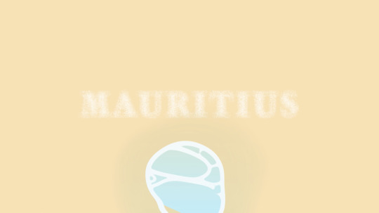
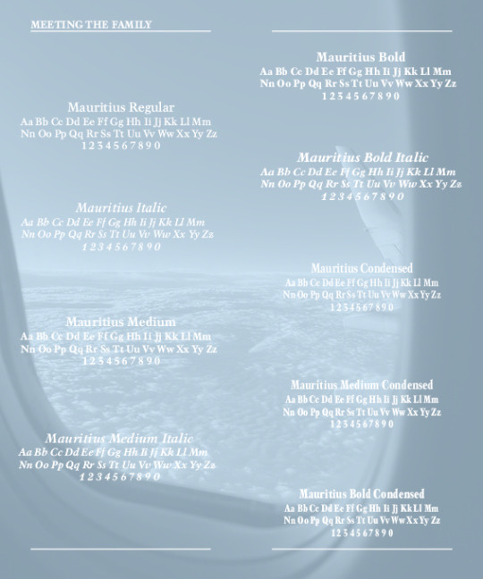
The typeface I selected is called "Mauritius" and was developed by Georg Trump. I chose it not only because it is named after my home country, but also because the serif style is classic and traditional. I also selected it because it includes nine different families that may be utilised in a variety of ways, including body and design typography. Initially, I chose Balloon URW because it had a wide range of families and reminded me of the summer aesthetics that Mauritius is known for as a popular summer destination, but after completing some experimentation tasks, I realised that I would struggle to use the font when creating the type specimen.
I faced a lot of difficulties creating the type specimen. I had a creative block for several weeks when I had no inspiration. To figure out how to arrange up my spreads, I looked for artist model examples of type specimen books on Behance. I chose the key layouts that many of the designers used, which included identifying all the families, including the alphabet in each family, and explaining the anatomy of the typeface. Due to my typeface is a serif, there are only so many typography experiments that can be done, especially in InDesign. Because my typeface is traditional and classic, I had to use Illustrator and Photoshop for some of my type experiments, such as the Pepeha page and the usage of the halftone effect to provide a vintage aesthetic to the images. However, the typeface experiments in the type specimen book were some of my most effective work. Another success was changing my colour palette during mid-semester break and using colours with meaning and connections to me and home, such as blue representing the location of Mauritius in the Indian Ocean, which is part of my Pepeha, and orange reflecting the cultural dancing of Sega, where the traditional clothing is vibrant colours that represent Mauritian-Creole.
My kinetic typography animation focuses on the theme of water to reflect Mauritius’s main features as a country and island. I struggled to find text animation’s that reflected each of the location on my Pepeha but after constructive feedback from peers and lecturer’s, I was able to develop my ideas further. Overall, I’m very happy with the work that I have produced this semester and I am excited to develop the skills I have gained from this course into my studies further.
0 notes
Text
Final Animation (05.06.23)
This is my animation where I made changes after receiving feedback from Kaitlyn. I made changes to my Le Morne animation where I removed the glowy effect. I originally chose the glowy effect to commemorate the freedom of the slaves and how Le Morne was their angel and protected/ sheltered them when they escaped. But after getting feedback, I realised that it was difficult to understand the text so I decided to do a reveal animation of my text. I also quickened my animation a little bit. Overall, I'm very happy with my animation as I was able to convey my place more and how my locations in my pepeha are important to me.
Analysis of my Animation

I wanted a wave animation to begin my video as I wanted to communicate how the beach is an important aspect of Mauritius and how Mauritius's main economic source of income is tourism as Mauritius is known for it's beach resort, torpical beaches and the extinct bird, the Dodo.
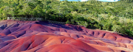
In this scene, I had the word "Mauritius" appear from behind the wave and I decided I wanted to dissolve the word into small particles to reflect the sand beaches as well as one of Mauritius's tourism attraction which is Chamarel 7 Coloured Earth that are small sand dunes of 7 different colours such as red, brown, violet, green, purple, blue and yellow. You used to be able to walk on the sand dunes but was later not allowed as the sand kept mixing together.

In this animation, I had the text animated to reflect the movement of the ocean to communicate how my ocean is the Indian Ocean. The image in the background is a photo I took when I went to the beach with my family when visiting Mauritius in 2019-2020, right before the pandemic hit.

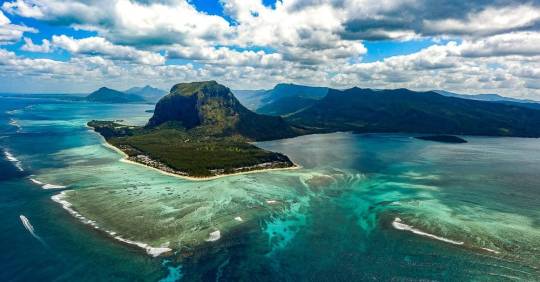
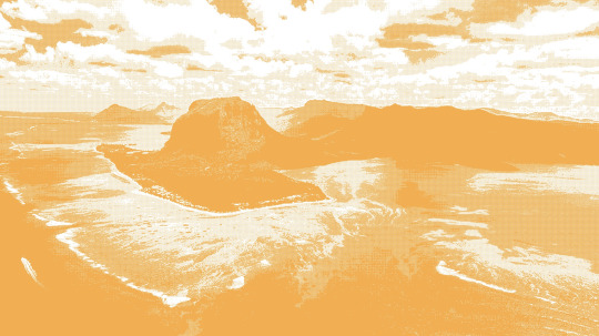
In this scene, I had the text do a reveal animation as I wasn't sure what text animation would reflect the history of Le Morne and it's key role in protecting slaves that escaped. The image was found online as when I visited Mauritius, the photos of Le Morne were taking in portrait and when I scaled it to the fit the screen in After Effects, it was difficult to position the image where you could've see the main features so I decided to find a landscaped image on Google. In this photo it also shows what Mauritius is known for which is the Underwater Waterfall Illusion, which is an optical illusion and it's caused when "sand and silt sediment moving under the influence of strong underwater currents"
This scene was introducing a beach photo in a wave-like motion as my theme for the animation was water and it's movement.
In this scene, I had the typeface done in a typewriter animation as I wanted to communicate the classic and traditional look of the serif typeface.
0 notes
Text
Animation Feedback from Kaitlyn Fernandes
On Sunday 4 June, I asked a peer to give me feedback on my animation after making changes from David's feedback and adding new features that focus on text animation.
"I like the overall colour scheme of the whole animation. I like the transition between each part and how the text links to the images and the main title. The only scene that I think need improvements is the one that says Le Morne is my mountain. I think the suggestion would be to not to put the glow filter or make the white exposed effect on the photo a little less as you can't necessarily read the text properly. Though I like the transition between the "O" and the circle animation to the next clip".
0 notes
Text
Wk 13- Final Animation (4.06.23)
I had to find a landscape image of Le Morne Brabant as the image I had was portrait and when I scaled it to find the animation, it was hard to get the main feature of the image. So I looked for a landscpae image of my image.
------------------------------------------------------------------------------
Once I had found the image, I used Photoshop and manipulated the image where I used the halftone effect and my chosen orange shade. I then included the image into my animation.
------------------------------------------------------------------------------
This is the completed draft animation of my kinetic typography. I made some improvements that David gave to me on Wednesday.
0 notes
Text
Wk 12- Animation (02.06.23)
This is my animation with my new features. I'm still adjusting the speed and order my animations should be going. I removed the audio's that I used before as the music wasn't working with the animation. I was planning on keeping the wave audio but I thought it would be weird to have one audio for one animation and the rest of the animation being quiet. For my mountain animation, I still need to add an image of Le Morne as I'm still trying what shade of orange to use on the image that blends with the blue.
------------------------------------------------------------------------------
Youtube Videos
I searched through Youtube to find liquid like animations that reflected the theme of water and these are some of the videos that I found. I did try to experiment with them and see how it worked with my previous animations. I also feel that the text animation could be done better so I'm going to continue exploring different ways to introduce the mountain texts.
youtube
youtube
0 notes
Text
Wk 12 SDL- Animation
I made some of the improvements from the feedback David provided. It took a while to make changes to the wave composition as there were so many different composition folders just for the short wave animation. I also added some more typeface animation and I used the locations from my pepeha to show more connection to Mauritius as these are the important locations that I relate to. I did research on the different locations that I mentioned in my pepeha so I can get inspiration as to how I can do typography motion. The locations I included in my pepeha was my mountain which is Le Morne, my ocean being the Indian Ocean and where I'm from which is Mauritius. I already did an type animation for Mauritius so I'm going to try do some type animations for Le Morne and Indian Ocean.
------------------------------------------------------------------------------
Research:
Le Morne
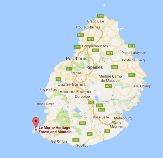
Le Morne or Le Morne Brabant is a mountain/ peninsula located in the southernwest tip of Mauritius. It's a World Heritage Site as the mountain was a shelter for runaway slaves and maroons throughout the 18th-early 19th century. The escaped slaves formed settlements using the caves the mountain provided and today the mountain symbolises the slaves fight for freedom, their suffering and their sacrifice.
Location of Le Morne on map (https://www.20000miles.pl/index.php/2016/08/29/le-morne-2/)
------------------------------------------------------------------------------
I decided to extend my video to 30 seconds (max) as I'm going to do type experimentation animations to focus more on the type animation as that was one of my improvements
0 notes
Text
Week 12 SDL (31.05.23)
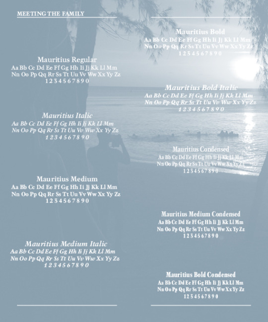
After class, I decided to finalise everything in my type specimen book where I finalised my cover for my type specimen, proof-read my paragraphs as well as make sure my designs are aesthetically pleasing and matches with my home of Mauritius. This is my final type specimen book pages and I also analysed each of my spreads/pages.

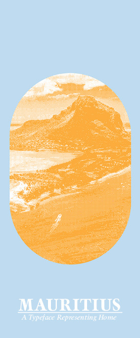
This is my final type specimen cover. I decided to revert back to my pre-formative cover page that was black and white but I changed the colours to suit the new colour aesthetics of my specimen book. I experimented with use of asterisk (Mauritius Bold Italic) and I laid it out as a way to direct the viewers eyes towards the hierarchy of my title and sub-title as well as pointing towards the edge of the page.

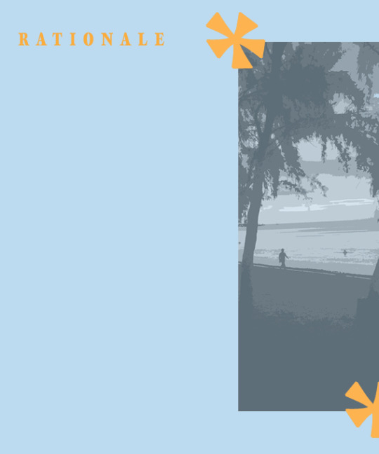
This is my rationale page. The difference between the summative and formative specimen book was re-writing my rationale and removing the stroke white line that I had on the "Rationale" title. I also removed the white border line that went around my image on the right as one of the feedback from the formative assessment was removing the white lines to simplify my designs.

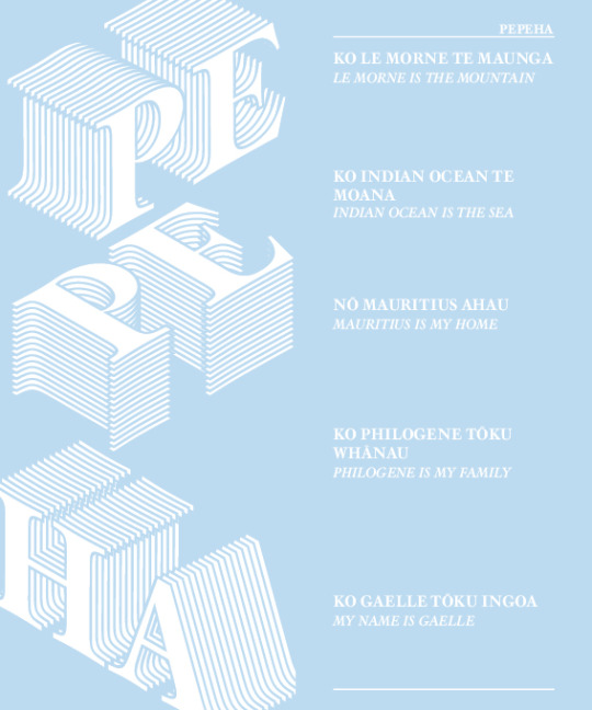
This is my pepeha spread and not many changes occurred on this spread apart from changing my english translation drop shadows to filled colour texts. Instead of having the typeface "Regular", I decided to use "Mauritius Italic".

This spread was an experimentation page that I did in my formative assessment specimen book but I decided to bring it back as one of the feedback that Emil gave me last week was to experiment with glyphs. I used the exclamation mark in the "Mauritius Medium Condensed" typeface. It reminds me of the board game known as "Backgammon".

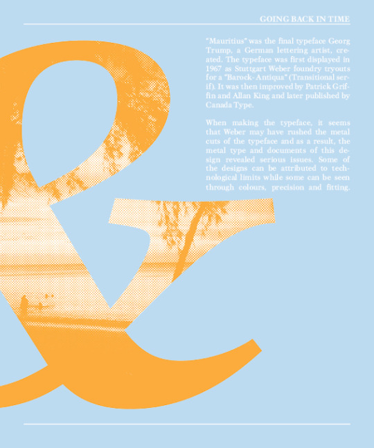
This spread I used photoshop to allow me to create the halftone effect using a beach photo I took when I visited Mauritius in 2019-2020. This spread gives history about the font.
This spread I included the alphabet of each of the typefaces and the image I used is a photo of a plane window and I used this image to make you feel as if you're travelling to Mauritius. I used the same colour in photoshop on the black and white image, however it was difficult to match the colour to the other pages. This was because everytime I changed the opacity or saturation to match the blue shade, it would be too light, making it difficult to read the white typeface.

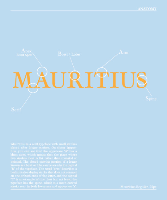
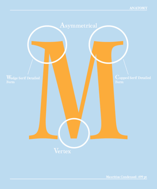
This is a basic anatomy of the typeface Mauritius. Not many changes occurred in this spread.

Compared to my formative assessment specimen book, this spread is more detailed as I did further research on what sort of serif detail form my letter "M" portrays.
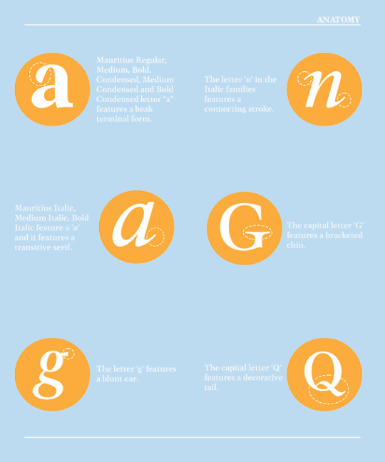
This is a new spread I added in my type specimen book where I went into further detail about specific letters that had unique features such as my typeface featuring two different sort of 'a'.
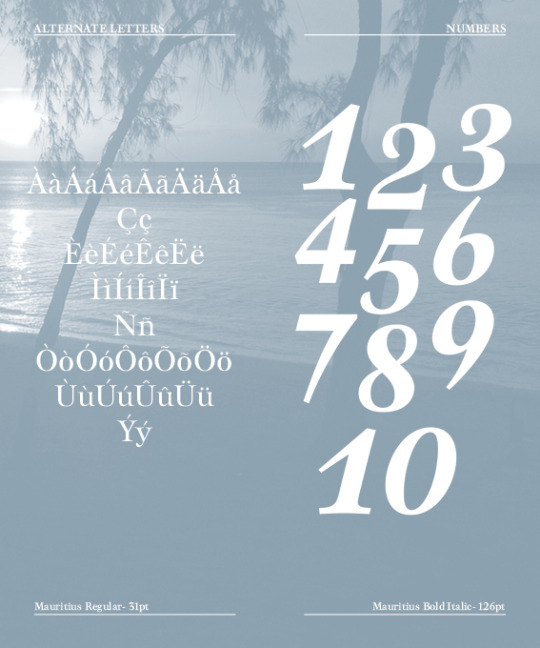
Because I had rearranged my pages to my specimen book, I decided to include a number page to show the features each number had and I used the typeface "Mauritius Bold Italic" as it more decorative and playful to experiment with compared to the other typefaces.
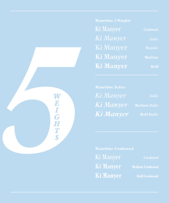
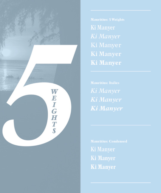
I experimented with the number 5 and adding the word "weights" to make it more playful which I did in Photoshop. A feedback that I received by Emil was mentioning the typefaces on the side so the viewer's can understand what typefaces I'm displaying.
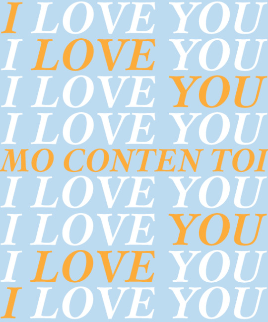
This is a similar experimentation I did in my formative assessment but I removed the strokes of the words "I LOVE YOU" and had it as simple colours and to link to the front cover, I used the same experimentation but had each word from the lines "I LOVE YOU" in the different rows to be orange to direct the viewer's eyes to the Mauritian saying of "I LOVE YOU" which is "MO CONTEN TOI". It's similar to French but Mauritian-Creole is more slanged than French.

I made no changes to my back cover as I like the simplicity of it and I mentioned the different languages the typeface supports.
Once I had finalised my type specimen book, I went on to Teams to find the powerpoint that showed me how to package/zip my type specimen and when I add my folder into Canvas on Tuesday 6 June, I'm going to make a comment that I made changes to my type specimen book as that was what David mentioned in class if we're resubmitting our type specimen book.
0 notes
Text
Full Draft Animation for Feedback (30.05.23)
I got feedback from David about my animation and these are the improvements that I need to do before my summative assessment.
Feedback:
Quicken animation
Don't focus on animation
Include more typeface animation
Darken wave shadow to make it more realistic of the wet sand
Darken the sand colour.
Not have text in the middle, play around with the layout
0 notes
Text
Rationale for Type Specimen (updated)
This is my updated rationale where I had to focus my rationale more on reflecting about how I felt about the paper (strengths and weaknesses) and giving a brief description of how the typeface Mauritius reflects a sense of place apart from the name. I decided to use aspects of my first draft that I did before final type specimen rationale for the formative assessment as well as include a short history note about the colonisation of Mauritius due to serif typeface. This is the link where I found the information about the history of colonisation in Mauritius.
https://blueconomy.govmu.org/Pages/Departments/Shipping%20Division/Short-History-About-Mauritius.aspx#:~:text=Mauritius%20was%20successively%20a%20French,unsuccessful%20in%20colonizing%20the%20island.
------------------------------------------------------------------------------
The typeface I selected is called "Mauritius" and was developed by Georg Trump. I chose it not only because it is named after my home country, but also because the serif style is classic and traditional. I also selected it because it includes nine different families that may be utilised in a variety of ways, including body and design typography. Initially, I chose Balloon URW because it had a wide range of families and reminded me of the summer aesthetics that Mauritius is known for as a popular summer destination, but after completing some experimentation tasks, I realised that I would struggle to use the font when creating the type specimen.
I faced a lot of difficulties creating the type specimen. I had a creative block for several weeks when I had no inspiration. To figure out how to arrange up my spreads, I looked to artist model examples of type specimen books on Behance. I chose the key layouts that many of the designers used, which included identifying all the families, including the alphabet in each family, and explaining the anatomy of the typeface. Due to my typeface is a serif, there are only so many typography experiments that can be done, especially in InDesign. Because my typeface is traditional and classic, I had to use Illustrator and Photoshop for some of my type experiments, such as the Pepeha page and the usage of the halftone effect to provide a vintage aesthetic to the images. However, the typeface experiments in the type specimen book were some of my most effective work. Another success was changing my colour palette during mid-semester break and using colours with meaning and connections to me and home, such as blue representing the location of Mauritius in the Indian Ocean, which is part of my Pepeha, and orange reflecting the cultural dancing of Sega, where the traditional clothing is vibrant colours that represent Mauritian-Creole.
------------------------------------------------------------------------------
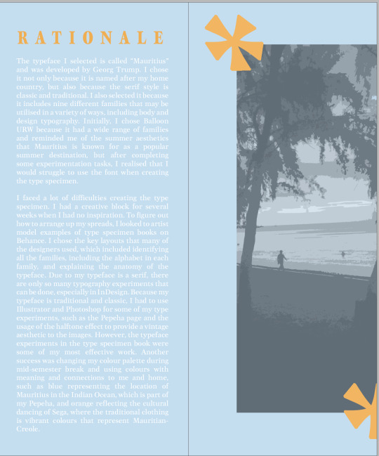
This is my rationale spread and to make the rationale have a better appeal to it, I removed the hyphenate option in the Properties panel so my words don't split in half when it reaches the end of the text box. I also changed my paragraph option to "justify with last line aligned left".
0 notes
Text
Kinetic Animation (29.05.23)
This is the completed animation with the second audio added to the animation and it took a while to find the perfect audio for the second part as many of the videos were very upbeat and it wasn't matching up with the rest of my animation but I finally found the right audio that works. I will be asking for feedback on my animation this Wednesday so I can get final feedback and improve it before handing it in, the following Wednesday (7.06.23). I also realised that I spelt a word wrong in my saying.
0 notes
Text
Mauricien Sega Instrumental Audio
I went on to youtube to find some instrumental music that are used in the traditional dancing of Mauritius and I found a few that I thought would work well as the second audio for the rest of the animation.
youtube
youtube
youtube
0 notes
Text
Updated Type Specimen (29.05.23)


This is my type specimen so far (as of 29.05.23). I made the changes provided my Emil last week such as removing the image from page 20 and mentioning the families of the typeface in page 21 so it's easy to identify. I did try to align the numbers in page 19 and I also experimented with the exclamation mark which I had experimented before in one of type specimen books that I did before mid-semester break. I did bring back some of old experimentations and I got rid of the drop shadows that I had used the in the previous type specimen book. These can be seen on the spreads of pg 6-7 and pg 22-23). I'm still working on my cover and rationale which is why my cover hasn't had any changes as I'm still experimenting different ways so it's appealing.
0 notes
Text
Kinetic Animation (29.05.23)
This is my completed animation (without full audio). I had an issue with my audio where at one stage, my audio was working and then, when I would place my audio into the layer panel, there would be no audio. So I had to watch a few youtube videos to help me figure out how to fix my audio issues. Once I had fixed my audio problem, I added my audio of gentle waves crashing against the sand to match up with my animation of my waves. I then decided to fade the audio out just before the typewriter effect starts so I can add a second audio as I thought it would be weird adding waves crashing throughout the whole animation as the animation don't really fit in with the audio apart from the first 6 seconds. I also added my chosen end credit that features the credit appearing from above and sliding down into position. My next plan is to finish my animation by adding my second audio to match the rest of my animation and get feedback on Wednesday 31 May before the hand-in date of the summative assessment (Wed 7 June)
0 notes
Text
End Credit Experimentation (Part 2 (26.05.23)
This is the second experimentation I did for my end credit which features the typewrite effect.
0 notes
Text
End Credit Experimentation (26.0523)
Even though I haven't finished my animation, I started trialling different ways my end credit would pop up and these are the two experimentations I trialled. I have to put my experimentations on different post panels as there's a limit of one video per post.
0 notes
Text
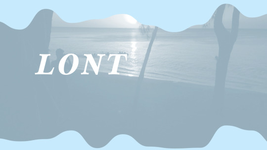
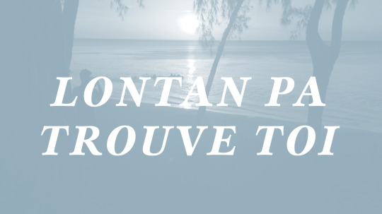
Kinetic Animation 26.05.23
I've been adding new elements/ features to my animation where I added the saying of "lonten pa trouve toi" in a type writer animation while my chosen orange image appears in the wave-like fashion. I also animated my text Mauritius that appears after the wave goes smaller, to dissolve which reminded me of the sand particles as the text disintegrates. I'm still having trouble between my colour changes.
Meaning behind the saying:
I chose the saying of "lontan pa trouve toi" as it means "long time no see" and I wanted to communicate how it's been so long since I've been back home and doing the type specimen and kinetic typography has allowed me to reconnect with my home, Mauritius and learn more about my whenua as well as revisit some photos I took years ago when I did go back and visit family in Mauritius.
This video showed me how to disintegrate my typeface by using the "CC Scatterise" in the Effects and Presets panel in After Effects.
youtube
0 notes
Text
Feedback on Type Specimen (25.05.23)
These were the pages that I had asked for feedback. My cover and my rationale are still work-in-progress. Pages 20-23 are blank as I wanted to ask if I should get rid of the 4 more pages or if I should do experiments.


Feedback:
Try match the image colours to the solid light blue colour on my other pages
Experiment with glyph experimentation
Remove image from page 18 as the image has no use when displaying the "5 weight" experimentation
Mention the typeface family in the page 19 so it's easy to identify the different feature of each of the family
Align the numbers in page 19
Closer to summative assessment, might need to get rid of some of the white lines on the pages
0 notes