
alixmcc
Film Blog
A silly little blog for silly little reviews.
5 posts
Don't wanna be here? Send us removal request.
Last Seen Blogs

thepixiepeach
The Weed Fairy

moseley-writers-group
Untitled
fuori-orario-film-posts
fUORI oRARIo

atelier-tiv
Atelier Tiv artworks

pawallday
La Femme Qui Rit
Text
Exercise 3: Pre-Production... the final project
The final project of this semester consisted of choosing a pre-existing scene from a film and then recreating it to as close a detail as we possibly could.
The point of this exercise I feel was to understand the components that contribute to a scene and how they work together e.g. lighting, framing, mise-en-scene, sound etc. and the importance these have on the overall outcome of a scene.
After a long discussion of what scene we were going to go with (our suggestions ranged from Get out to (500) Days of summer, quite a diverse and extensive list) and the logistics of shooting, we landed on the idea of shooting a scene from Damien Chazelle's La La Land, specifically the dinner scene.
youtube
[1.50-3.35]
My role for this was overall set design which included both costume and props.
Costume and prop list:

We didn't really have much trouble sorting out the roles as we all agreed upon different roles that didn't clash with one another's choices. The crew list is down below:
Director/editor : Daisy
Producer/AD/Production design : Me
Camera operator/DP : Tom
Production design : Olivia
Sound/Lighting/AC : Dean
When watching the clip we realised that the script itself didn't match up with the dialogue spoken within the scene to the point that it sounded completely different to how it was formulated on the script, so Tom made his own script that corresponded to the actual scene which helped us make it more accurate. The script is down below:


Now, we needed to cast two people, male and female to play Sebastian and Mia. Due to Olivia working on the production set up with me she went out to ask about potential castings for the roles. She reached out within our film group chat on Instagram and detailed that we needed a blond, male actor who was happy to play as Sebastian. We had a few replies from people so we had to narrow it down. We decided to cast Ethan who was very happy to hear the news considering he loves La La Land as well as Ryan Gosling lmao. So with a male actor hired all we needed now was a female actor. Tom let us know that he had a friend who was willing to take the role as Mia and so with that, casting was sorted and ready to go. (Big thanks to both Ethan and Toni for acting, we quite literally wouldn't have been able to film without them.)
All we really needed now was a location, this part was the trickiest in my opinion. We needed a relatively large space in order to construct the layout of the scene AND we needed a large, single window with see-through drapes. Something that is hard to come by as a uni student living in halls. Olivia suggested we use her grandparent's house which was honestly a god send because the room was near enough perfect for what we needed apart from the window aspect. In the end we knew we had to create our own window which worked out fine because it gave us the freedom to shift it about if we needed to for each shot.
Down below are some documents that my group contributed to the pre-production:


0 notes
Text
Exercise 2: Documenting a space
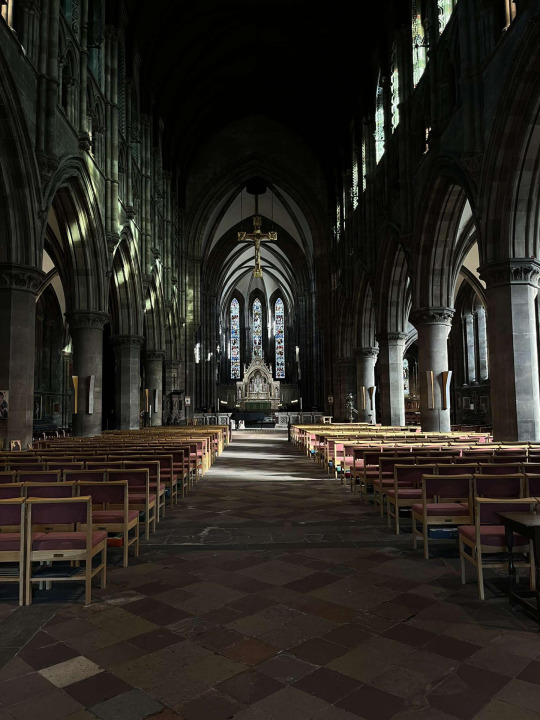
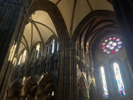
For the second exercise of the semester, my group and I were tasked with the challenge of capturing the 'essence' of a location within 8 consecutive shots. We chose a cathedral.
vimeo
SCOUTING THE LOCATION PROCESS:
This part of the exercise was fairly challenging. There were so many possibilities that we could've gone with, so many paths we could've gone down, it was hard to narrow the playing field. After a discussion with my group about different locations and the logistics of shooting we unanimously made a decision.
Originally the gang and I were going to film in a nifty little bookshop that was tucked away within central Grassmarket called Armchair books. The vibe in there was so peaceful and quiet compared to the bustling streets outside, something we wanted to capture. Sadly, due to the confined interior of the shop our request was rejected :( and so with that, our journey for a new location began, pressure was on.
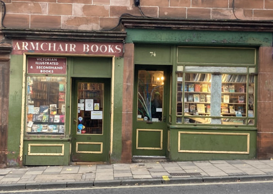
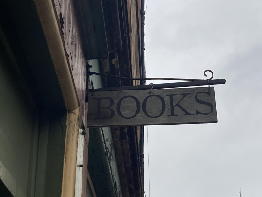
(R.I.P to armchair books, it just wasn't meant to be)
We perused the streets of Edinburgh for a couple of hours yet couldn't really find anything that was striking enough to make an 8 shot sequence out of.
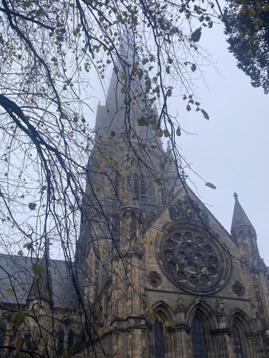
After an unsuccessful scout, Daisy and I were walking home to our accommodations when we spotted a massive structure in the distance and so as a last-ditch effort, we decided to check it out. And thank god (pun intended) we did because what we found was perfect. And so the location for the shoot was bagged.
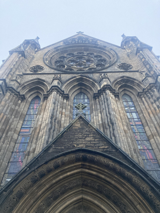
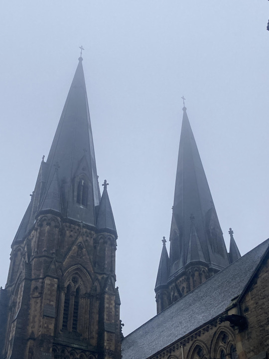
The Cathedral itself was comprised of typical gothic architecture that felt very overwhelming and had an ominous aura to it - the dreary weather contributed to this. With the rain hitting off of the stone walls of the cathedral and the wind rustling through the trees nearby, it gave a sense of frigidness and inhospitality, something we thought would be interesting to capture when filming a Cathedral.
Unfortunately Daisy and I were unable to enter the Cathedral on the day we found it so we couldn't get a good sense of the inside, we hoped (and prayed) that we could see the inside on the day of filming. We took pictures of potential shot ideas of the Cathedral and surrounding area to show the rest of our group to hear their thoughts on it.
Here are some shots ideas I took down below
PRODUCTION DAY:
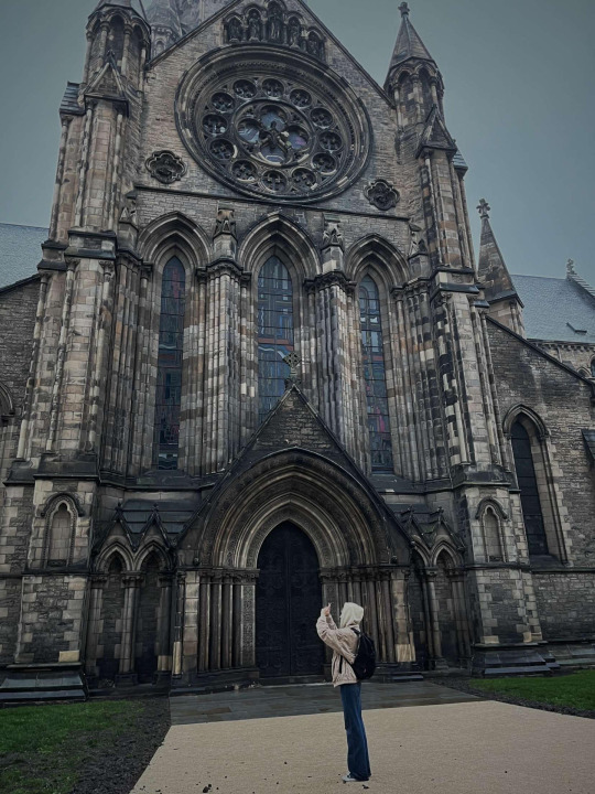
Surprise, surprise the unpredictable Edinburgh weather strikes again. Instead of the much anticipated rain that we had hoped for, there barely a cloud in the sky on the shoot day. This worried me as I thought it would take away from the dark atmosphere we were previously going for. However, I'm kinda grateful because in hindsight if the weather was bad I feel the image would've came out looking flat. Plus, it didn't really matter in the as in post-production we put a B&W filter over the exterior shots (this'll be explained later in the blog.)
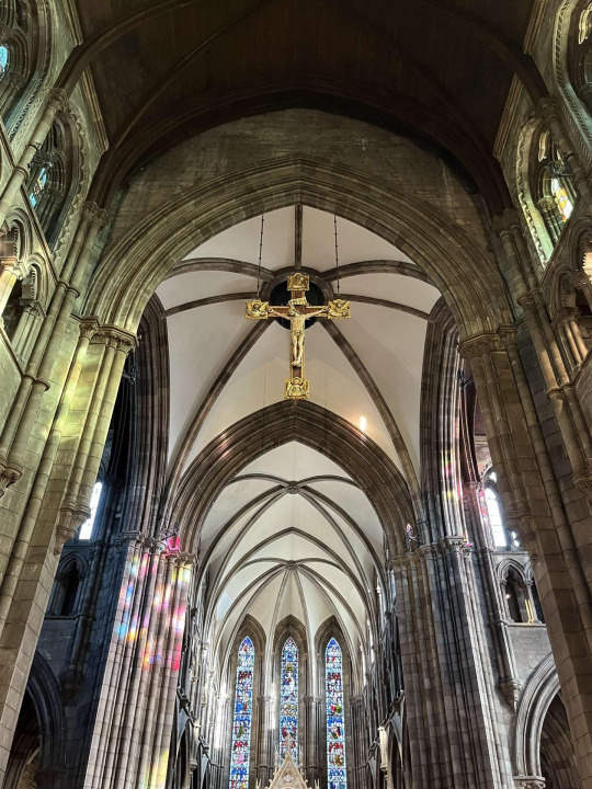
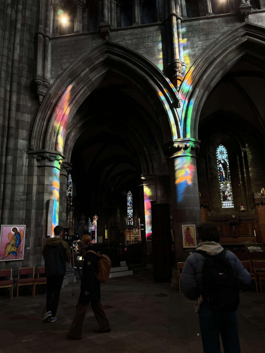
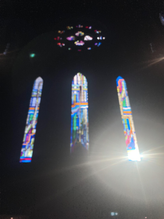
We were able to enter the cathedral that day so we decided to split into separate groups so as to quicken up the set up. Olivia, Tom and Dean remained outside to scout out the area and come up with more shot ideas. Daisy and I decided to explore the interior of the cathedral for some potential shots, get the overall vibe and also record some ambiance and organ music as we planned to overlay that over the top of the sequence for added atmosphere. (We ended up not using the live organ music due to recording issues.) Due to the weather being sunny outside, the colours within the stained glass windows really popped through within the cathedral which cascaded over the walls, it was really beautiful.
Here of some shots that I took for the interior segment of the sequence...
THE PRODUCTION THOUGHT PROCESS:
With such a divide of progressing from exterior to interior within 8 consecutive shots, we wanted to show this divide through use of colour. We used a B&W filter on the exterior shots to convey an unpleasant atmosphere, to imply that the outside world was bland and colourless. We coupled this with low angled shots to make the cathedral appear domineering to the viewer. Then, when we transition to the interior shots, it's full of colour and light to convey a sense of peace within the viewer.
This peace was also amplified through use of sound. Within the exterior shots there is a preacher who is passionately giving a speech about religion but when we transition to the interior shots the speech fades away to music which is slow paced.
OVERALL THOUGHTS:
I felt that the production value was very high quality and the order of the shots made a lot of sense to communicate the location's space. I did feel however, that maybe the stark transition from B&W to colour was a bit jarring and almost took the viewer out of the space but then again, that was kind of the point. Whether that was communicated well enough is subjective to the viewer.
The ending felt a little rushed to me and I don't know if that's because we had 5 exterior shots compared to having 3 interior shots or the shot duration for the interior were shorter, but I felt as though we could've either had more shots inside or let the 3 shots we had linger a little longer. This just goes to show how challenging yet effective the task was since we were constricted to 8 shots to convey a feeling.
All in all I found the experience to be incredibly enjoyable and I would say that this has been my favourite project I've worked on yet.
The Cathedral itself was amazing and even though I'm not a particularly religious person myself, you'd be silly not to appreciate how absolutely beautiful the architecture was. The atmosphere inside was insane and I'm glad I got to experience it with my group.
I really enjoyed brainstorming with my group and hearing their differing perceptions of what the location of a Cathedral feels like to them. Overall, I think we worked incredibly well and efficient since the shoot time for this really only took a couple of hours and those hours felt like minutes since everything was going so smoothly due to our communication throughout.
Also, big thanks to the staff who let us film there because if we couldn't... well let's just say it would not have been a very fun time for us.
0 notes
Text
I AM WHOLE - Bianca Poletti. A short review of a 'Short of the Week'.
Synopsis:
I am whole is an experimental coming of age story that circulates around the excitement and anxiety of losing your virginity. We follow the main female protagonist with her struggles of dealing with the pressure and expectations she feels from social media and her friends.
Firstly, wow just wow. The colour palette within this short is so complimentary to the 'rose-tinted' narrative and is just really pleasing to look at, the use of soft lighting makes the colour pop (especially the gold chain) and really attributes to the vintage film feel along with the interesting choice of 4:3 aspect ratio.


The fast paced editing really adds a lot of movement to the sequence which makes it quite jarring to watch especially when coupled with multiple close-ups - just thought it was really effective in demonstrating the stress the protagonist is feeling from the peer pressure she is receiving from her friends. The editing speeds up even more when we reach the climax (hehe) of the film showing that the protag has given in to the pressure and becomes addicted to the rush of attention.
It is clear to me that Poletti took direct reference from Under the Skin when using the pitch black background for scenes of intensity. It really allows the viewer to become detached from a sense of place, making them feel uneasy. This is especially effective in I Am Whole when the protag feels detached from her reality.


Under the Skin (2013) - Jonathan Glazer
Performance wise, the inner monologue to me was very reminiscent to the style of delivery in Euphoria with it's witty pessimism and cynical nature. The intimacy can really be felt between the couple through their body language which is impressive to me since they share no dialogue with each other but you can still tell they are infatuated with one another.
And finally, the soundtrack. I felt the choice of song couldn't have been more fitting, the distant and ethereal harp really contributed to the whole dream-like, romanticized vibe it was going for.
I realise now that this wasn't really a 'short review' sorry about that, I just thought the film was all in all pretty swanky.
Here are some shots I thought deserved some honourable mention:


0 notes
Text
Language of the lens summary
The key optical aspects of a lens will include:
Perspective
Compression and expansion
Soft/hard
Contrast
THE LENS AND THE FRAME -
The usage of a different lenses can dictate how layers of meaning and emotional context are added to the shot and how a slight alteration may affect that predisposed meaning. It is the goal of the lens to avoid image flatness when it's not a conscious choice, lenses should be able to create depth within a scene with components of props and selective focus in the foreground, midground and background (FG,MG,BG).
Lens perspective:
A key thought when choosing an appropriate lens is deciding what the audience get to see within that frame. Human vision (including peripheral) spans around about 180° so a 50mm lens would be considered "normal" vision - a normal lens is considered to be when the focal length equals the diagonal of the receptor. You may decide to use a wider lens to reveal more of a scene or conversely, a tighter lens to either zone in on particular objects or hide parts of the shot.
WIDE LENSES AND EXPANSION OF SPACE -
Wide lenses:
A wider lens will mean that depth perception is exaggerated as the subjects and objects within a scene will look further apart, creating a jarring/disorientating experience for the viewers. Wider lenses may be used to create a sense of space as objects within the BG may appear smaller and characters appear to be further away from each other, making the location seem bigger than it actually is.
Deep Focus:
Deep focus is when you make everything that's in the frame (FG,MG,BG), allowing the viewers eyes to wander the shot and not feel pressured in to looking at a particular object or action. A prime, historical example of this would be Citizen Kane.

Citizen Kane (1941) - Orson Welles
Compression of space:
Long focal lenses, otherwise known as telephoto lenses make the background appear as though they are closer to the subject, it compresses the space. This compression can be used to create a claustrophobic space due to the closeness of the background, it also intensifies action sequences as the movement in the BG seem exaggerated, allowing the space to feel full of action.
Telephoto lenses can be very practical in the sense of shooting dangerous stunts. For example, if the camera is placed correctly, a speeding bus that's barrelling towards an unassuming cyclist may seem as though it's missed them by mere inches when in reality, the cyclist could be meters away. This is because the long focal lens distorts the sense of space by making it seem cramped. Down below is a scene from Tinker Tailor Soldier Spy to show the effects of using a telephoto lens.

Tailor Tinker Soldier Spy (2011) - Tomas Alfredson
Manipulating Perspective:
Focus is used primarily for story telling as focus tends to guide the viewers eye to a particular thing within the frame.
Depth-of-field (DOF) is a product of focal length, aperture and sensor size. A lack of depth-of-field (DOF) can be used to create selective focus. Selective focus can imply drug influence or madness within intense scenes. Selective focus can be a problem when a scene has two or more actors in the same shot but at different distances, if there is not enough light to have a higher f/stop, the focus can only really settle on one actor.

Selective focus within Wolf of Wall Street (2013) - Martin Scorsese
Rack focus is the most standard way to shift focus within a scene, a quick way to shift the viewer's attention to an object within the scene - usually this object will be in the foreground. It may also be a way to reveal certain information in a scene non-verbally. One fatal flaw to using rack focus is that some lenses need to 'breathe' when changing focus, meaning they appear as though they are changing focal length when shifting focus.

Rack focus within Lady from Shanghai (1947) - Orson Welles
A couple of golden guidelines for focus:
Focus always goes to the person speaking
Focus should be on the person facing the camera/most prominent within the frame
Focus goes to the person experiencing the most dramatic or emotional moment - this may overrule the previous focus on person speaking principle
If in doubt, focus on the actor with the lowest call sheet number - this will be provided by Camera Assistants.
IMAGE CONTROL AT THE LENS -
Filtration: Modern lenses are sharper than ever but sometimes an image should be soft, to convey a sense of beauty and intimacy. Diffusion filters is the most common and accessible solution to achieving this image, however it's not the only solution. Reflectors and gels may also create a softer image.
Soft lenses: the use of older lenses may also be used by filmmakers to create a more authentic soft image if filters are not doing the image justice. There is an optical coating on lenses to prevent internal flares and reflection, older lenses have a degraded coating meaning it creates a softer image.
Note - Lens flares occur when light hits the lens. To avoid this, use matte boxes and lens shades if a flare is unintentional.
LENS HEIGHT -
High angle: if the camera is above eye-level than the subject will appear to be dominated within the frame as they are reduced in size. It can be used to show a character's inferiority or to reveal a large structure.
Low angle: low angle does the exact opposite of high angle. The camera is below the eye-level of the subject, making them appear dominating and foreboding. Little of the background is shown in a low angle shot as the subject takes up most of the frame, this is useful for hiding information from the viewer.
Dutch tilt/Canted angle: this is when the camera is not level, creating a sense of disorientation and unease within the viewer.

Inception (2010) - Christopher Nolan
0 notes
Text
Exercise 1 - Framing and Composition
The framing and composition of a shot can heavily impact how we perceive things within the shot - so I'd say it's pretty important to understand what differing shot styles entail.
I've seen many a film where central framing has been used religiously (I'm looking at you Wes Anderson) and it can have many different effects given the context of the shot and shots following. I find that central framing is commonly used to create a sense of symmetry and harmony. When you surround a character with background equally distributed on both sides, you immerse them in that background, creating a strong connection between them and their environment.

Moonrise Kingdom (2012) - Wes Anderson
Central framing can also be impactful in the sense that all attention in the shot is on them (due to leading lines) meaning they are quite literally centre stage. This is useful in establishing that a character is significant or to reveal a crucial plot point.

2001: A Space Odyssey - Stanley Kubrik
Rule of Thirds is your bog-standard framing composition used in almost every film. It's an effective way to frame the elements in the scene so that the resulting image is much more visually captivating to the audience. It can be used to lead the eye to significant objects or actions within the third, making it more natural to perceive.

Queen's Gambit (2020) - Scott Frank
Central framing and Rule of thirds were styles that my group and I explored through our first given task of the trimester. We had to film two identical sequences of shots in both frame composition styles and compare and contrast them.
'Fresh Lobster' Group 11 production project -
Central framing
vimeo
^My debut as an "actor"...
Rule of Thirds Framing
vimeo
Although I view central framing as the more 'stylistic' choice, I personally find that rule of thirds framing fit best for the sequence of shots that we used. I thought that the framing in the close-ups of the cabinet doors opening and closing especially were effective as it gave nice leading lines to the shot, which allowed viewers to naturally draw their attention to the subject and their actions.
1 note
·
View note