
antonyad3
Tonya Mazaeva
Visual Communication Level 6
411 posts
Don't wanna be here? Send us removal request.
Last Seen Blogs

natforprez
I'm your problematic fave

bollywood-movies-for-you-blog
Bollywood News

princejohndlos-blog
John Lloyd Dabalos

taehyungtr4sh
└|∵┌|

green--y
Eldritch Abomination
Text
How do you know when it's UPF?
I looked at this article, hoping that it would guide me toward visual similarities in UPF packaging, however, it only touched on ingredient lists.
It was still helpful in a way that I could analyse the links between how ultra-processed the product is and the messaging on the packaging. A lot of the time when there are health claims, there are additives. Because once again, no-one needs to explain to people that apples are healthy.
0 notes

Text
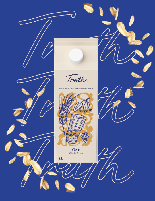
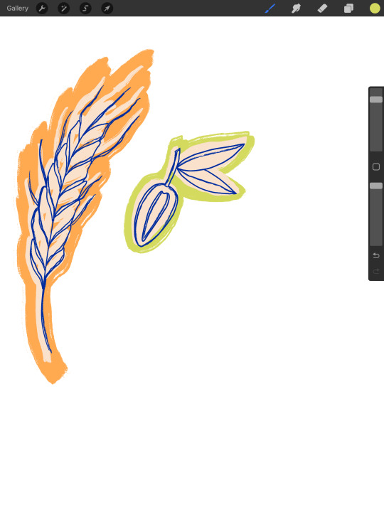
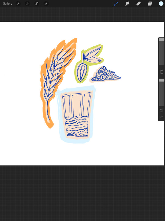
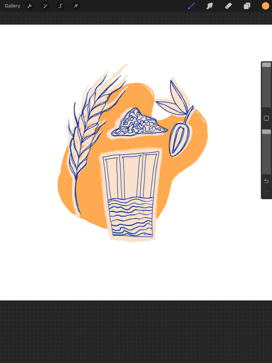
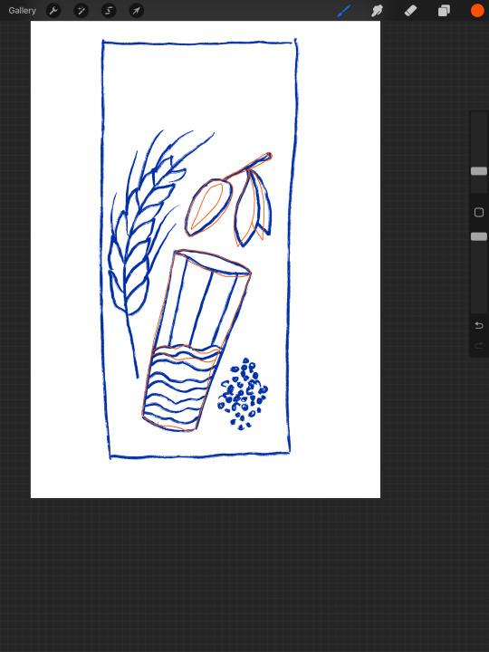
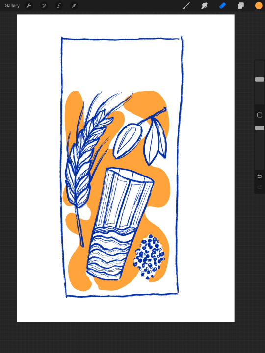
Illustrations

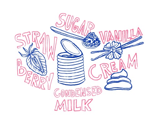


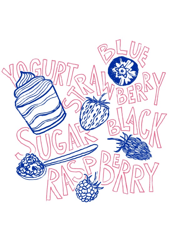
I continued creating illustrations for other products like bread, ice cream, crisps, oat milk and yogurt.
0 notes
Text
Studio Day / feedback
From Rich:
Good idea for the front and back being dual
Look at how other brands disrupt the market - Burger King mouldy whopper
What do I need to include on the packaging?
I can make the packaging less disruptive and focus on loud advertising instead
think about sustainability and materials used, what would my audience like to see?
Notpla - disappearing packaging
I don't have to use particular materials, but mentioning what is planned to be used is worth it
From Emily:
'we never use these ingredients' / 'others use these'
decide what is the main touchpoint where I will showcase the bad ingredients, doing it on the food packaging might be a bit off putting
is it gonna scare customers or intrigue them (play with colour)?
typography might make it less intimidating
facts on the side
graphic elements instead of illustrations - arrows, waves etc
keep the colours and visuals relevant to the product
explain only 1-2 bad ingredients, this needs to be done because the process is more interesting. Otherwise its confusing why there's a canister of petrol on there
'what you didn't know'
add texture to the logo and product name
disruptive but not scary
1 dominant bad ingredient per packaging - this will allow me to have a variety throughout my products without repetition
Having conversations with my tutors allowed me to look at my concept from a different perspective and define the best approach.
0 notes
Text
Feedback from peers
make the colours more pastel for the natural ingredients
Make 'we don't' stand out rather than 'these ingredients'
highlight 'we don't'
make the UPF ingredients look more poisonous
place what ingredients are used on the back of the packaging
I can even use a sleeve to reveal what's underneath (good ingredients)
0 notes
Text
Illustrating additives / Double sided packaging
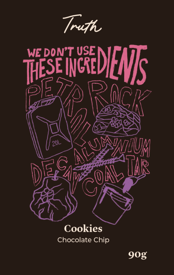
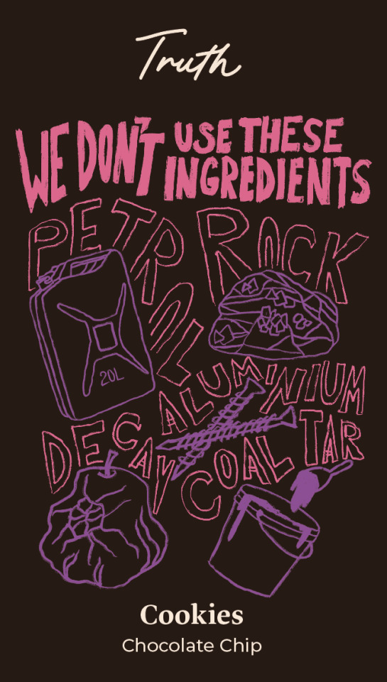


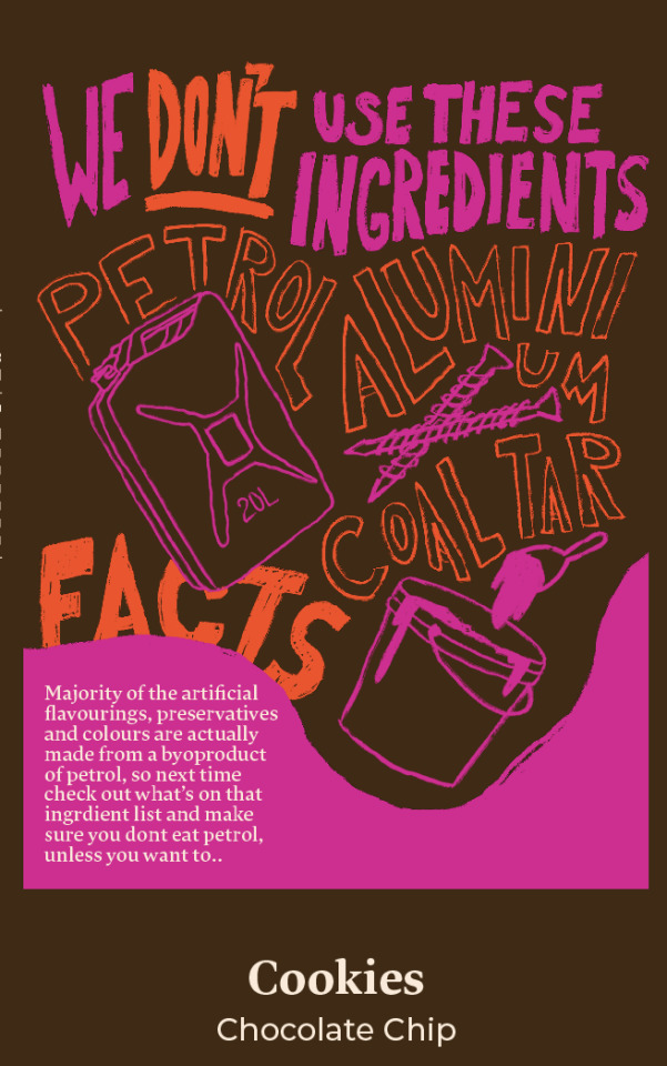
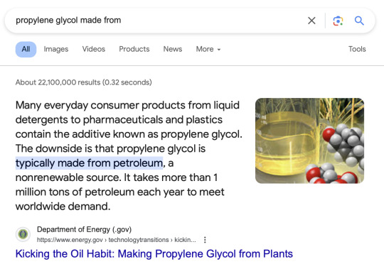
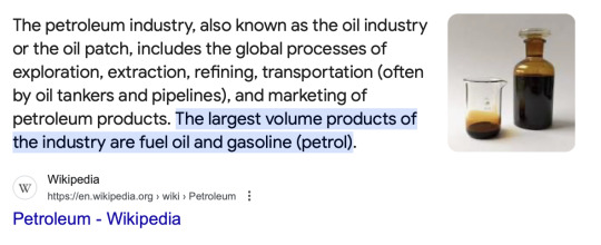
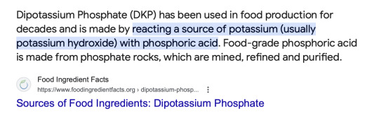
After conducting thorough research into the origins of common additives, I discovered unsettling truths. Many colorings, flavorings, and preservatives derive from petroleum and coal tar, while some raising agents originate from phosphorus rock. Additionally, certain agents are manufactured from aluminum and ammonium (released in the process of rotting).
My approach aimed to expose these additives by delving into their fundamental ingredients. Rather than simply stating "we don't use flavorings, genetically modified crops, soy lecithin, etc.," which may not fully convey their nature, I evoked a sense of disgust and understanding in customers.
To still make it appealing to customers and be able to sell my product without putting people off, I decided to make it double sided, where the front and the back are identical visually but show ingredients that are and aren't used. This way, they can be placed on a shop shelf randomly to communicate the intended message.
I believe I effectively approached this visually, and moving forward, I plan to further develop illustrations and gather feedback from tutors and peers to refine my approach.
0 notes
Text
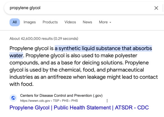
Synthetic Ingredients / What are additives made of? / How do they harm us?


I opted for a different visual approach, aiming to illustrate the harmful ingredients excluded by this brand while calling out other brands for their additive usage. My research, including insights from Chris's interview, highlighted a lack of awareness among consumers regarding these additives and their chemical processes. As Chris stated, "UPF isn't food; it's an industrially produced substance" (2023).
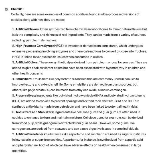
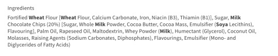
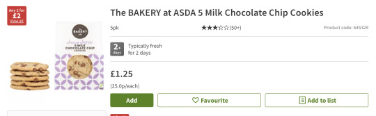
To address this issue, I decided to delve into the common ingredients used in the products my brand offers and investigate their origins and potential harm. Beginning with cookies, I searched ASDA's website for ingredient lists and conducted research on each additive's composition and health effects.
Across the board, these additives undergo extensive chemical processing, often involving toxic components. Despite originating from natural sources, the end result is far from natural. Upon researching each ingredient, I consistently found links to adverse health effects, including heart issues, obesity, and fatigue, especially with excessive consumption. Given that the average UK diet comprises 80% UPF and each product contains multiple additives, the risk of excessive consumption is alarmingly high.
0 notes
Text
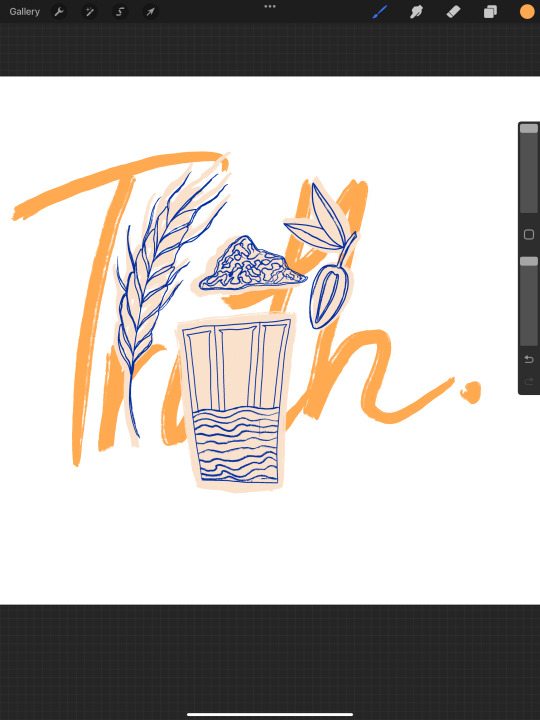
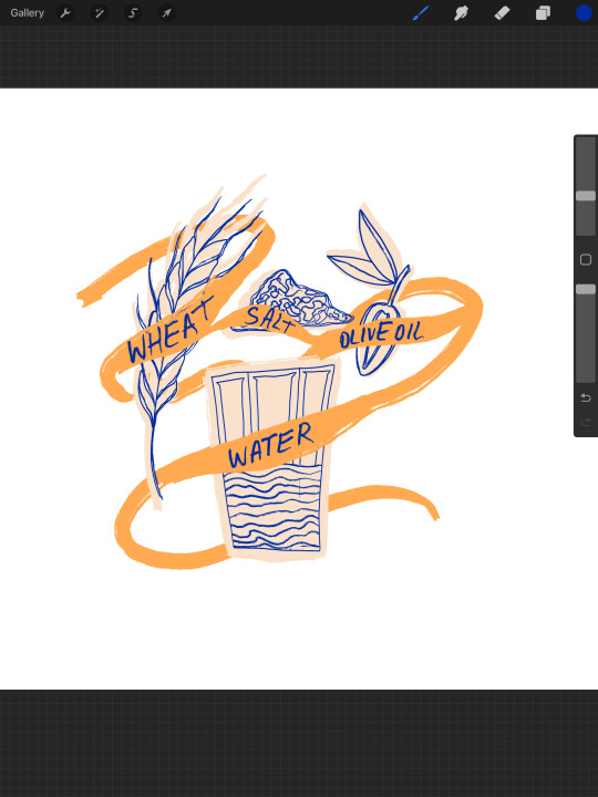
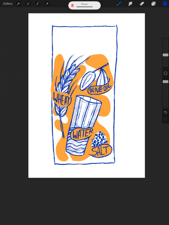
Layout design / Illustrations


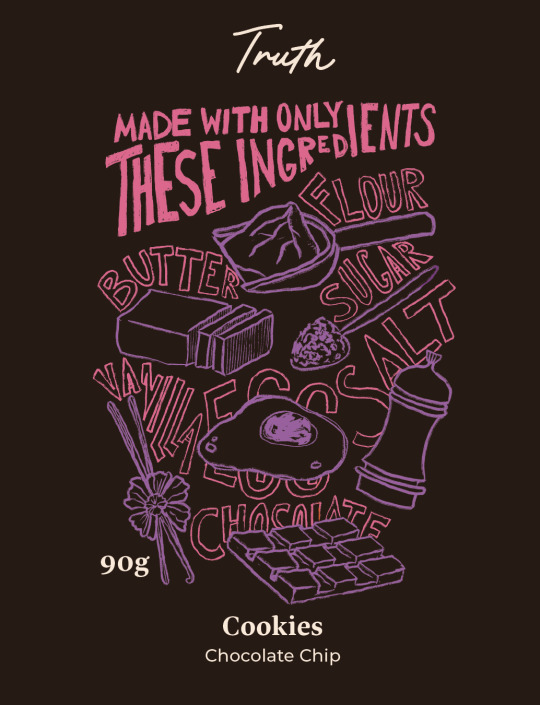

I switched to a different product, finding that it often sparks new ideas. This time, it led me to enhance my illustrations with handwritten text. This addition not only completed the look of the illustrations but also addressed the challenge of incorporating ingredient names. The previous method of using "made with these ingredients" in caps didn't grab attention, so I opted for a handwritten style, which improved the hierarchy and felt more connected to the illustration.
Next, I began experimenting with colour, selecting brown and purple for the cookie packaging, as these are the two main colours associated with the product.
0 notes
Text
Advertising assets


I started brainstorming ways to showcase the product, and this was my visual experiment for an adshel or Instagram ad. The concept centered around using the product as the focal point, with the main ingredient serving as a supporting visual to demonstrate the product's primary source. Additionally, I incorporated the branding by repeating the logo in the background.
Although I experimented with adding illustrations, I found that they cluttered the asset, so I opted to keep it clean and simple.
Another issue with this experiment, is that it lacks the necessary messaging about healthy produce and natural ingredients, so more development is needed.
0 notes
Text
Dr Chris van Tulleken / Interview / UPF

there are now health claims on healthy products, no-one needs to explain that broccoli is healthy
real food doesn't need added vitamins
this isn't food, its an industrially produced substance
if you get rid of poverty, you will get rid of around 60% of diet related diseases
making real food affordable and available
resisting addiction is impossible, you need to go on a journey from being addicted to being disgusted, that's how you fall out of love with ultra-processed food
love and disgust are neurologically close in the brain
every ingredient in upf does you harm in some way
the height difference in kids aged 5 that eat upf and the ones that don't is 9cm; 'you can't have physiological differences without neurological', meaning that these kids are also behind in their brain development
give people resources and let them decide
you need to build a sustainable form of activism
While I gained valuable insights from reading Chris's book, watching his interview provided even deeper understanding of the ultra-processed market and his perspectives on promoting healthier food choices. The interview offered numerous insightful points, which I've listed above, and I found plenty of valuable takeaways to apply to my own work.
One key lesson I took from the interview is the importance of honesty and transparency in advertising and messaging. Rather than dictating how people should live their lives, the focus should be on providing them with information and alternatives to encourage healthier choices. This approach respects individuals' decisions and allows them to make choices that align with their own values. This also makes them feel more in control of their life, which improves their overall happiness and gives a sense of achievement.
0 notes
Text
Academic Support / Library
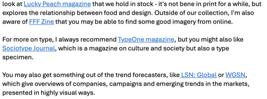
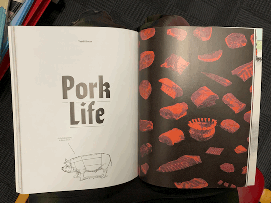

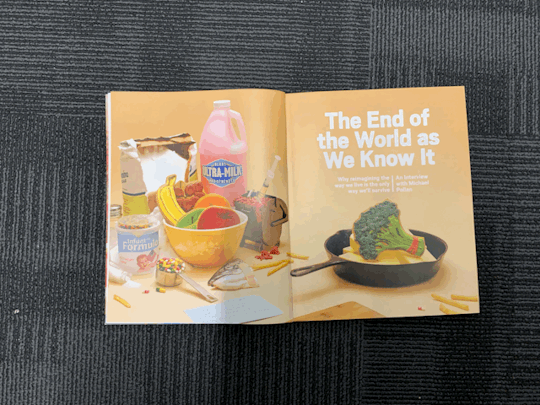

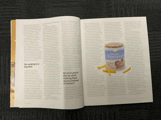


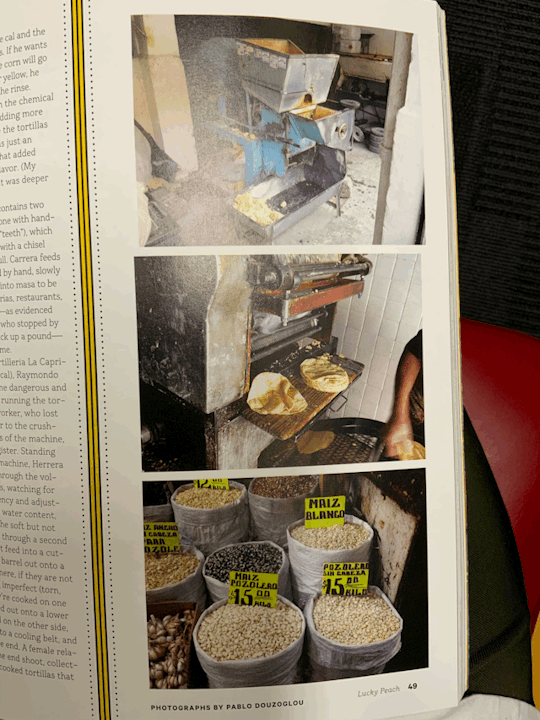
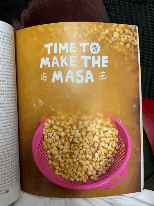
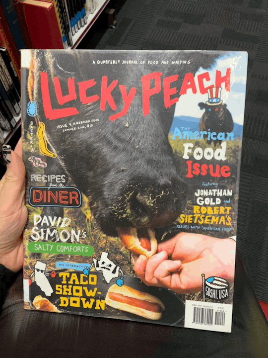


I discussed my project with Suzi and asked about available library resources on the food industry and typographical examples that effectively integrate images and text. She recommended looking into Lucky Peach Magazine, which I found really inspiring. The magazine features a bold array of visuals and thought-provoking articles centered around food. I was particularly drawn to the photography and the magazine's ability to convey complex topics through imagery.
The typefaces used in Lucky Peach Magazine struck me as disruptive yet organic. Some of the imagery was especially impactful, such as the depiction of a cow being fed hot dogs, which evokes a sense of absurdity as it confuses the viewer. However, when you think about it, humans, while also being animals, happily eat unnatural stuff. Another striking image from the Apocalypse issue portrayed vegetables in a bowl, but they were merely icing drawings on cookies, which highlights the prevalence of artificial substitutes in our food.
These visual metaphors resonate deeply and offer valuable insights. They prompt reflection on our choices and behaviours, and stress the importance of being aware.
0 notes
Text
Procreate sketches and experiments


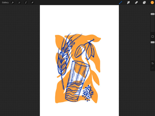


These are all the experiments and visual styles that I have been playing with.
0 notes
Text
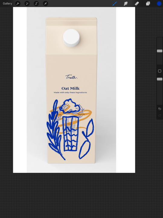
Layouts


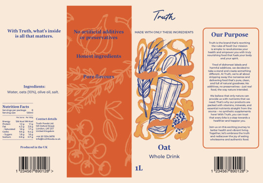

Today, I focused on refining the packaging layouts for all four sides. I revisited my initial sketches to develop them further, aiming to enhance the overall visual aesthetic. Additionally, I crafted a paragraph outlining the brand's mission, which emphasises its dedication to prioritising customers over mere commercial success.
However, there are still areas that require refinement. I plan to improve the illustration style and add additional marks or patterns to make the packaging more visually engaging. These adjustments will help elevate the brand's presence and better connect with its audience.
0 notes
Text
Pattern in use
This could work as a business card or website background.
0 notes
Text
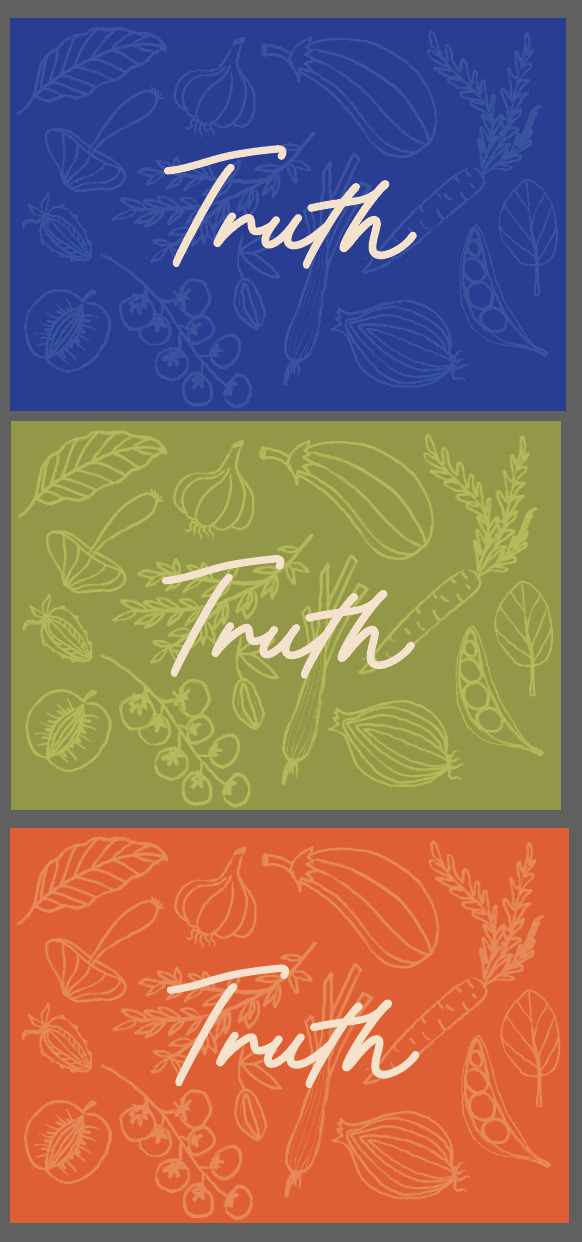
Pattern
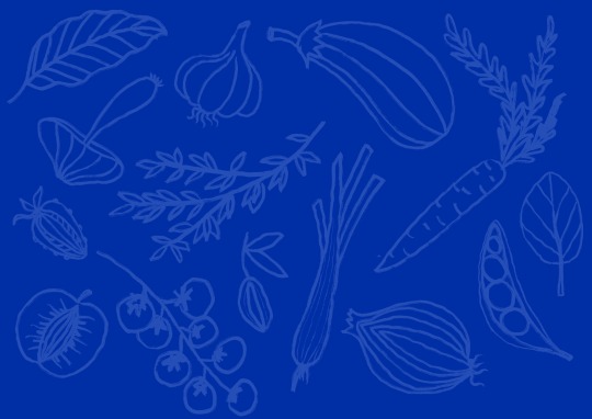
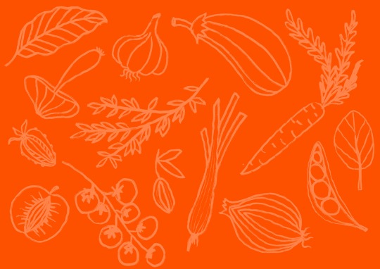

I'm currently exploring a pattern or visual element that can unify the brand across various touch points and elevate its visual appeal.
While I'm satisfied with the current designs, I feel the need to incorporate additional ingredients like flour, salt, sugar, pepper, etc. This adjustment will help clarify that the pattern represents the diverse range of ingredients in the products. It will also distinguish it from the impression of a vegan brand that is currently created by the emphasis on vegetables and fruits.
0 notes
Text
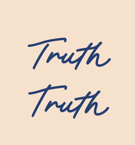
Secondary logo / Submark

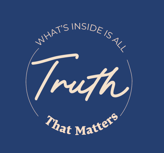

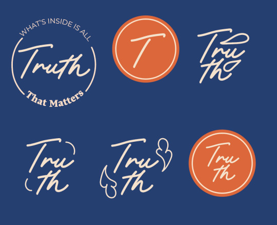

After settling on the primary logo, I delved into logo variations that could serve different purposes such as social media, stickers, and website branding. My focus was on utilising negative space and rounded shapes to convey authenticity, openness, and honesty, which are core values of the brand.
0 notes
Text
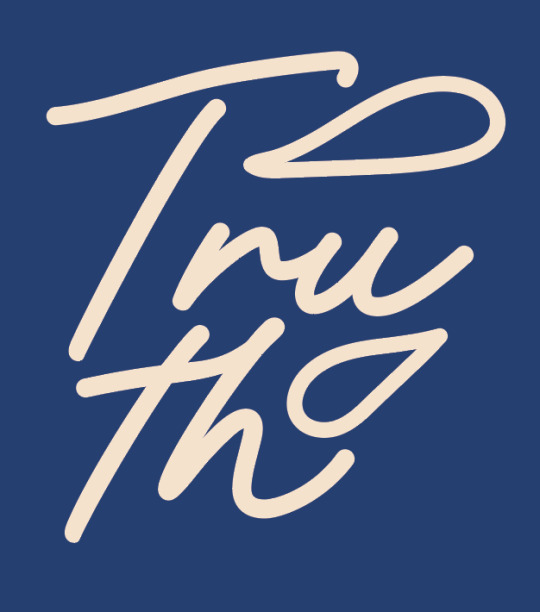
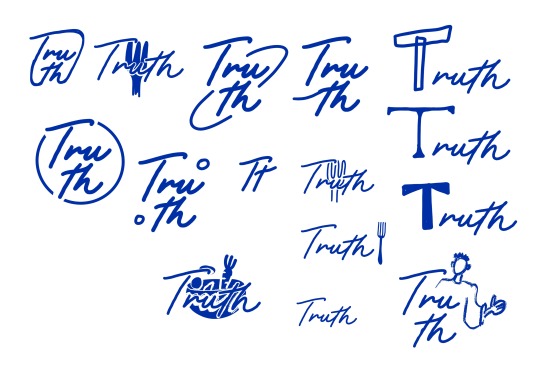
Logo development
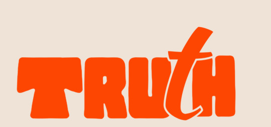

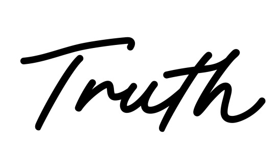

The previous logo, while handwritten, appeared too inconsistent and lacked the clean aesthetic that aligns with a brand promoting pure and healthy living. To address this, I explored script fonts that allowed for more defined shapes and combined them with the existing logo.
By connecting certain letter shapes, I achieved a smoother and more cohesive logo, conveying a sense of flow and connection. Additionally, I elongated the stem of the letter "T" to increase contrast and enrich the logo with a greater sense of confidence compared to its original, condensed appearance.
0 notes