
aubethangribble
AUB Vis Com
AUB Visual Communication 2022-25https://ethangribble.viscomaub.co.uk
126 posts
Don't wanna be here? Send us removal request.
Last Seen Blogs


noblefallsrp
Welcome to Noble Falls...

tortoise-of-potatoes
Madame Tortoise
justspadez
Tactical Himbo
tortoise-of-potatoes
Madame Tortoise
Text
Term 3 Unit Briefing :
Wednesday 10th April:
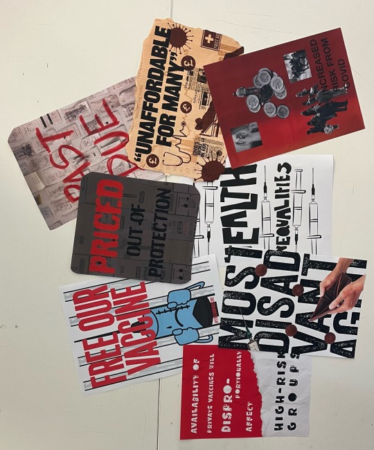
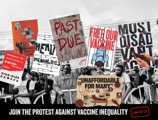
Today was the launch of our next unit brief which includes us creating the brief for ourselves, we have a hand in on the 3rd of May for our final brief idea we create and then from there we have to complete the brief we created. This was followed by a workshop where we were given an article at random and made to create a campaign to spread awareness, ours was about the cost of purchasing the covid vaccine through pharmacies, and how it was too expensive and stopping the poor from receiving necessary health care. We decided to do posters and then collectively produced them into one poster showing them used within a protest.
0 notes
Text
D&AD Project
Tuesday 26th Feb, Social Media Posts and Website Landing Page
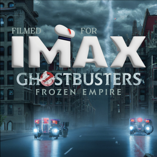
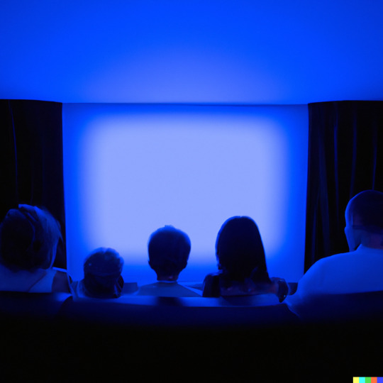
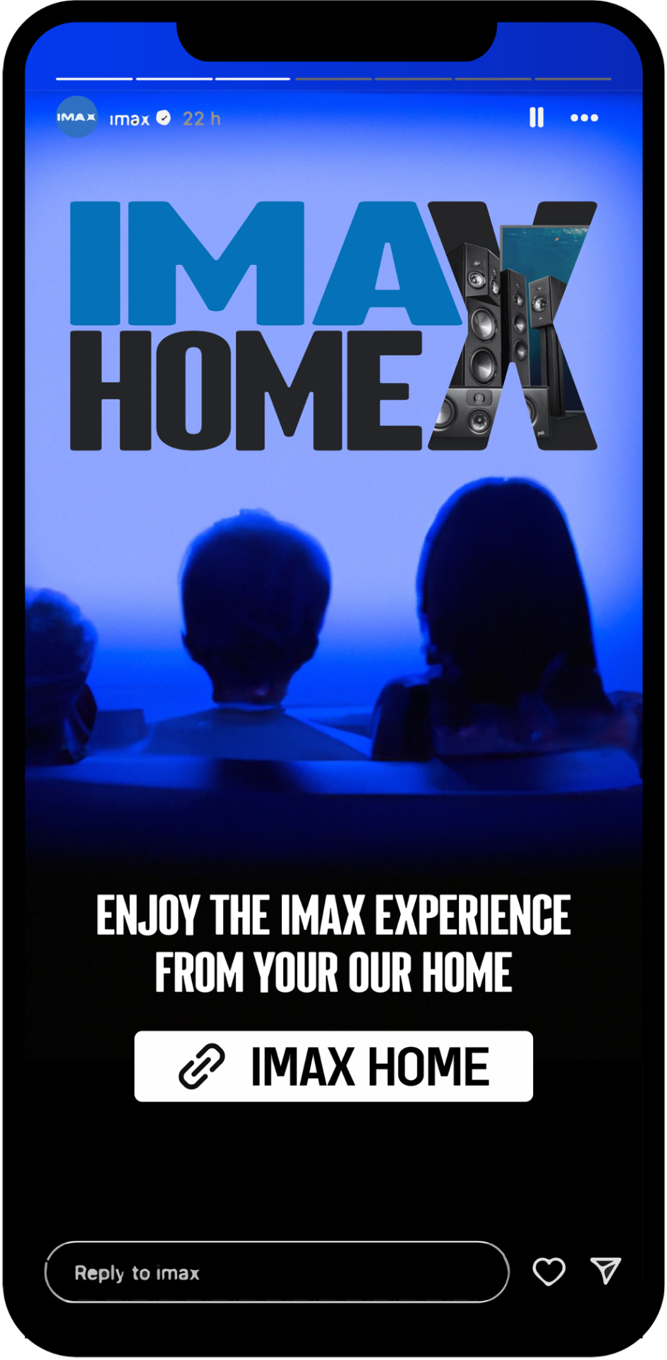
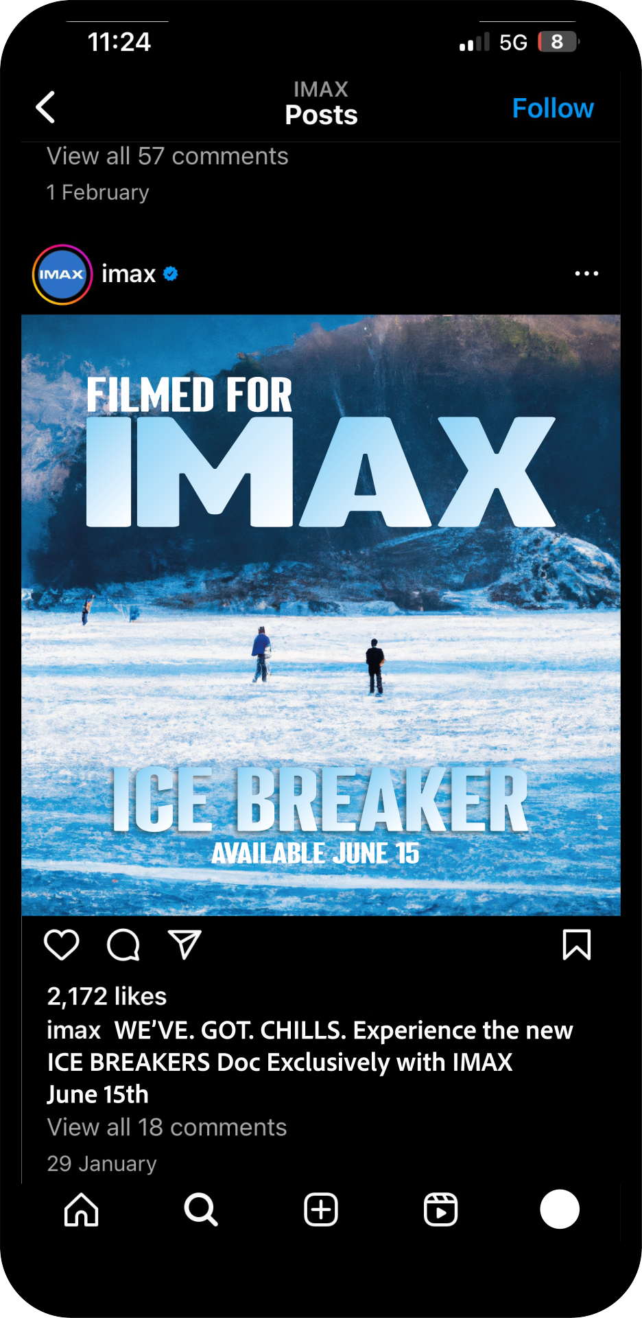
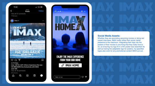
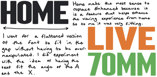
Creating the social posts was fun as I could play around with the idea of creating a fake movie or documentary to promote my logo within a post as that's one of IMAX's stand out features. I originally created the image above for the upcoming ghostbusters movie but I was told that I wasn't allowed to use real movies within my work so I created "Ice Breakers" instead as a documentary to fit along side the AI image I created using DALL-E and use the logo as a block of ice as that also fit well with the idea of using the logo as a part of the post. Creating the Instagram story post was also simple as I used the other Ai image I generated and it was as simple as just using it to promote the IMAX HOME features and shop, so I included a instagram link and a family watching a blue tv screen as it would fit the logo too.
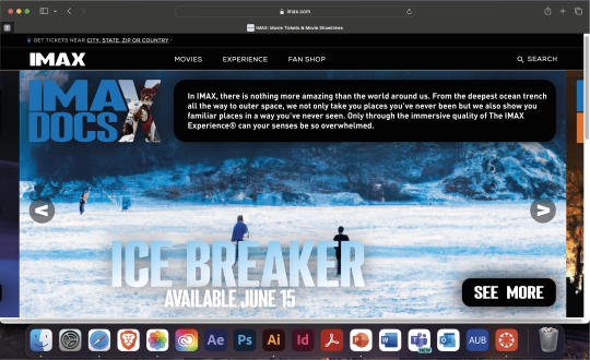
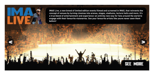
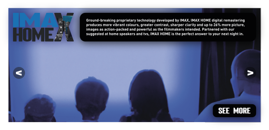
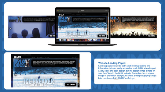
Using the Ai images from the previous social media posts as well as two new ones for Live and 70mm, it was easy to create my landing pages as I wanted them simple in terms of an imagery background and then just a simple description of what each genre is and does. I kept the "ice breaker" promotion in there as on the original max website they promote their films and docs so I felt that was necessary to keep. I used a very basic layout and effects used to make them, I used a drop shadow on the logo and the two boxes and kept the original max menu bar at the top as suggested by Jazzy. Im please with how they came out but I think they do look very rushed and not as clean and theme fitting as the rest of my work as I was pushed for time as the landing page was something that I hadn't really planned to create as I thought it was optional but that's my mistake.
0 notes
Text
D&AD Project
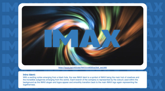
Monday 25th Feb, Final Ident:
I used iMovie to add the sound "borealis" to the background as I felt it was similar to the background of the original and it works very well with the background and exported it and into After Effects again to add the slogan.
I then created the expanding slogan using the transformation above, it was simple to create as it is the same one I had learnt last year with the technician Ben, its just setting anchor points for scale and position at where I want the words to begin and end. The same effect was needed for all of the other slogan sentences so it was easy to just copy and paste them onto one another. I then moved onto creating the rest of the Ident which is about showing off the new logos. I started with the same transition as the slogans but with the plain logo which was as simple as copying the previous ones except the logo stops at the centre of the page and not fading away. I then added all of the other logos and centred them all and adjusted the length of the composition so that the logos switched between each other for around 5 seconds. Finally I chose to end my ident with what I had sketched for the middle of my ident as I wanted to end the ident with my logo which is similar to the original. To create this I added my version of the logo that just says "IMA" and the one that just says "X" and lined them up perfectly with the last logo that appears on the screen. I then used the simple anchor points on the scale and position to change the size of the "X" to fit the logo and change the position of the "IMA" to fit perfectly together to form my final "IMAX" logo. I am very happy with how it came out and I am impressed with how I was able to learn so much form the tutorial and from the practise this has given me. My one hate is the the quality, throughout the entire editing process my laptop kept running out of disk space so it took a lot of saving and deleting to end up with this video which evidently has seriously affected the quality of the outcome which really annoys me but it isn't something that I can fix without recreating the entire thing. I am happy enough with the way I was able to finish it despite the struggle, you can watch the full final video here:
youtube
0 notes
Text
D&AD Project
(This is the other version as I cannot upload two videos on one post)
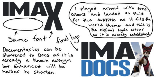
As well as creating the background I have decided to change the colour of the "IMA" in the logo to the original blue colour, the same as the "DOCS" subtitle, because I feel with it being that shade of black I had used it would become merged into the background too much and get lost. looking back at my logo designing, I wish I had tested out the colours more as I think the blue does look better than the black.
0 notes
Text
D&AD Project
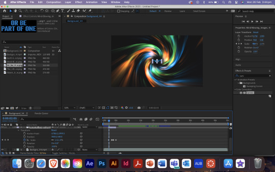
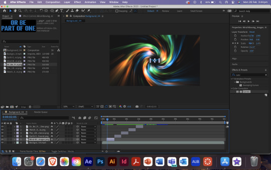
Friday 23rd Feb, Ident Background:
Above is the Glowing version of the background I had created using the tutorial linked below. I was extremely lucky to find a tutorial on how to create almost exactly what I was hoping to use, it was very helpful in teaching me new skills and refreshing my mind on the stuff we had learnt last year in second term for my "Pick, Pack, Sell!" video advert. I have uploaded the screen recorded video of my creative process on my YouTube channel linked below when I will also upload the final Ident. I did have to adapt the way the other creator made theirs as I wanted three colours within mine instead of the two they had used, this was simple after learning more about the program I just had to do everything three times instead of two. I have two saved versions (the other will be on the next post) to chose from as I can't decide whether or not to use the one with the added "CC Glow" effect or not so I am going to get feedback from others and decide from there.
youtube
0 notes
Text
D&AD Project
Wednesday 7th Feb, Ident Background:
The current background used is this blue galaxy/mist theme with a black or navy back and lighter blue sparkles and lines to show movement, then at the end scene it is just the background and logo without the lines but with the addition of Saturn like rotating rings. Their background is very nice, and I think that it really works well when wanting to show off their high-definition ability. I like the lines and the way they are using them to show motion as it reminds me of the way Star Wars show ships going at lightspeed and I think I will also want to use something like that as in my storyboard I want to have my logo and slogan appear from the background to the foreground. I think I will go for a more spirally look rather than the way they already do it. Below is a sketch of what I think my background could look like. Colour wise I think I will go for a multicoloured spiral of the colours I have used for the logos but if I am unable to do that because of lack of skill then I think I will just go with the basic blue. As well as this I think I am going to stick with the original slogan used by IMAX as it works very well already, and I don’t feel it's something that needs to be updated of adjusted.

0 notes
Text
D&AD Project
Monday 5th Feb, Ident Mind Map and Storyboard:
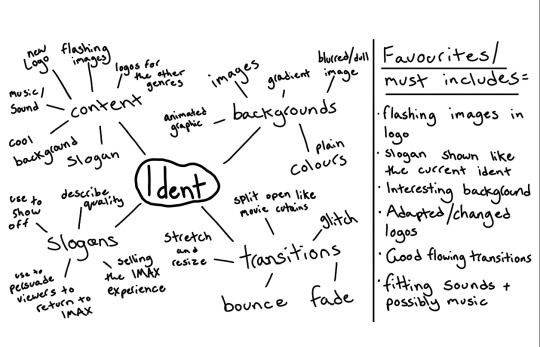
Following up from my research into creating a new logo for IMAX, I have created a mind- map for idea creation and discovering what I want to include in my ident. There are some things I have included from the current ident that I know I want to include; this includes the slogan that appears at the start, imagery that is included within the IMAX LIVE logo I really like so I want to use that and sounds and or music in the background that fit the vibe and theme. This has helped me to figure out what I want to include which is going to help when it comes to creating a storyboard.
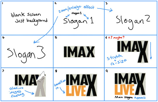
Following on from my mind map and my research I decided that sketching out a simple storyboard to start out my creation of my ident would be the best move. I have marked in blue the transitions and any editorial decisions to make it clearer for myself and make it easier for me to recreate. I have gone with a very basic idea as I am using this brief to improve my After Effects skills and am trying not to put too much on my plate. I want to have my logo show up at first as the basic flat image I have created and then a transition occurs that allows me to then show off my others and I think this will be a good push for my skills to improve. My next steps are to research into what backgrounds and what slogan I want to use.
0 notes
Text
D&AD Project
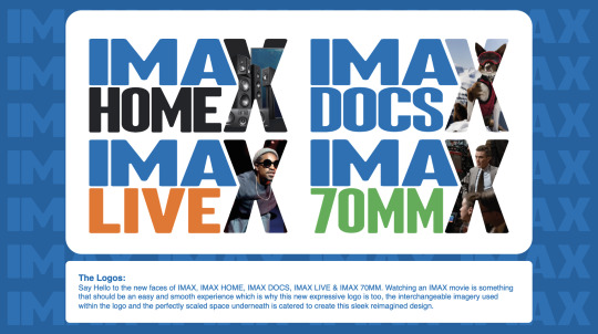
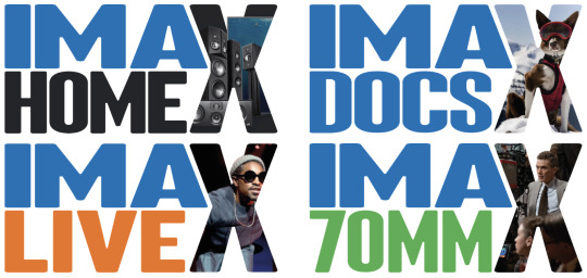
Final Logos:
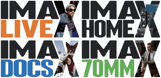
Above are the final versions of my logos, they were all created using the same method of taking an image from the max website and creating a layer mask using the letter X in the font "Sherman" and adding it to the logos I had already created. I think they have come out well and fit the theme and style I was aiming for.
0 notes
Text
D&AD Project
Saturday 3rd Feb, Finalising Logos:
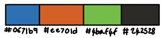
For the logo for "Docs" I went with the old logo colour blue shown above as it fits the theme and it would work well. I chose to go for the original live colour in the end which I feel is a good option for the same reasons the blue works already for the “docs” sub-genre. For the other two it wasn’t as simple as they did not already have set colours or anything around the IMAX space that would help aid me into my decision. I went with the shade of green #4baf4f because I went with the theory that it makes the most sense to choose a colour somewhere within the range from the two that I had already cemented (#0671b9 and #ee701d) and I feel this has worked out well and I am very happy with my choice. The final colour was a lot easier to choose as I decided to go with a colour that fit with the shade of black that all the recommended home cinema products, that IMAX promote, come in and I feel this works very well.
0 notes
Text
D&AD Project
Sunday 28th Jan, Logo Ideation:
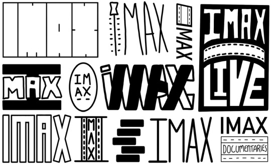
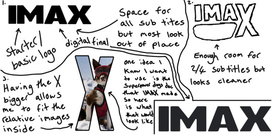
Before I create the ideas for how I will create the separate logos for each of the other subgenres I wanted to create a new logo for IMAX. This made the most sense to be because It although it is already very simple, I think it could be improved especially if I am going to want to use it in the rest of my logos going forward. Here are the results of my sketching, I created them all individually by taking elements of my knowledge of film for example the obvious usage of film reels in some of the logos. These are extremely rough and although logos do always look a lot better when fully designed and rendered, I feel there are some here that already look promising. My one issue is looking at the logos and figuring out how to adapt them to the other sub-genres.
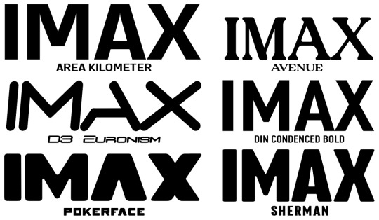
Another option is to keep the IMAX logo as it is and just adapt around it, or simply just change the font which I feel might possibly be the best option simply based on how attached to their logo they seem to be. Here are some experiments looking into the word IMAX in other fonts, the original logo uses the font “Microgramma D OT Bold”. I have used ones which I already have in my font book as I already had some fonts in mind, but I used the preview feature to see what it would look like and chose to showcase the best ones. My favourite is Pokerface, Avenue and Sherman. I feel Sherman is a good option because it is a bolder and more curved version of the original logo but if I was to use it, I would lower the height and kerning more so it was in the same aspect ratio as the original logo.
0 notes
Text
D&AD Project
Saturday 27th Jan, Other Companies:
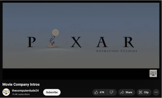
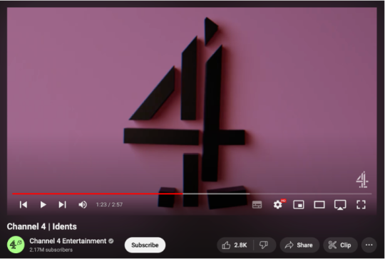
The All 4/Channel 4 Ident is the most famous ident in UK television so I thought this would be very good to look at as well as some popular movie company idents through these two YouTube videos. Channel 4 use a mixture of real-life videos with motion graphics over the top or some form of animation, my experience with motion graphics and other progressive forms of communication is very low so I don’t want to push myself too much so the purely animated and flat motion graphics will be used for inspiration. The thing I like about the Channel 4 ident is the way they can manipulate their logo in an infinite number of ways to create endless amounts of introductions to tv and films, this is an idea I want to take on board with my outcome. Another I like is the Pixar ident, which involves a gradient background with a flat text with a drop shadow to produce a 3D affect until the lamp comes in and jumps on the “I” to create the iconic intro. The short snappiness of this ident is something I will be using because I know as a regular consumer how annoying idents can be if they drag on for too long, but at the same time it cannot be too short that you can blink, and you miss it.
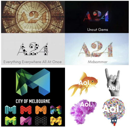
Adaptive Branding: It can also be defined as flexible identity, where the designer or company can constantly adapt and change the look and feel of the identity in relation to the context of its newest product or time of year e.g. a switch in theme for Christmas. Shown on the right is a couple of examples as to what my view of adaptive branding, the city of Melbourne example being one of my favourites. This was created for a past D&AD brief from 2010, and I find its adaptability very inspiring for my work, this silhouette allows for endless amounts of outcomes for branding of the city and is something I will be using as inspiration in my work. Aol’s is slightly different as it is simply just a logo placed on different backgrounds which come together to make the final logo which I included as I also like this idea, like the IMAX Live logo I could also do it reversed and have the image inside. My favourite adaptive branding of recent times is A24’s way they adapt the same logo for every film they create. This is the best example for this brief as they are a studio that have created some of the best and most popular films of the past three years and so this is a company and style I will be using heavily as inspiration for my project.
0 notes
Text
D&AD Project
Wednesday 24th Jan, Posters, Social Media and Ident:
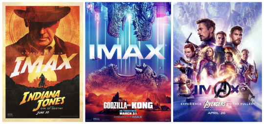
Posters: IMAX love to include their logo/name in clever and fitting ways on the posters that the company use to promote the movies that were filmed using their technology. As they are special posters made just for the promotion of the fact the film is filmed with IMAX the logo is meant to be bold and stand out. I feel like if I use a poster to promote my idea It would probably be best to use it in a movie theme instead of a poster just promoting IMAX as a brand.
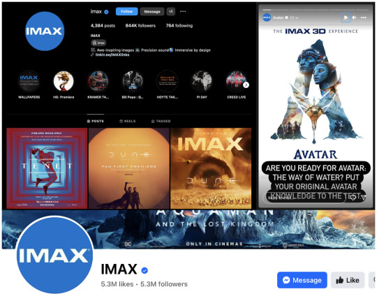
Social Media: Their social media account for Instagram is laid out very simply in terms of a lot of their main feed posts are just Smaller square versions of the movie/production's posters. I feel this does work well as it gets right to the main point of “look at our incredible titles in which we offer the best experience” but it definitely could be improved upon. They don’t post Instagram stories very often but when they do it is often also movie posters, interviews with the actors or poll votes themed around the latest releases. I also investigated their Facebook account which they update their header image regularly with an adapted image poster for the latest release, and often post reminding people of what is coming soon and showing off their movie's nominations. I feel the way they use social media is very outdated as other than through Instagram stories they don’t really involve themselves with the audience as much as they so if I choose to use social media posts to promote my idea, I will probably take this into consideration.
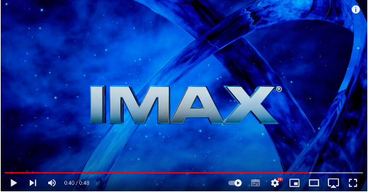
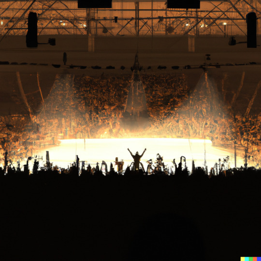
Ident: An Ident is a short animated or film clip used at the start of a cinema showing to identify the movies studio or channel. IMAX has always used an on screencountdown in their idents with the most recent one being “10, 9, 8, 7, Mind blowing images, 6, 5, Earth shattering sound, 4, 3, The ultimate movie experience, 2, 1, Watch a movie, Or be part of one, IMAX.” They use a bright blue galaxy background and chrome text on top which I feel works really well as a galaxy and a chrome affect is possibly the best way to show off the incredible detail and how high definition IMAX are able to produce in and blue is the main colour of IMAX so that also makes so much sense. Its hard to improve this but what I would do is create one that is adapted to the specific move that is being shown, for example this one would be incredible for a movie like Avatar and if one was to be made for Indiana Jones, which I know is offered by IMAX, I would instead of a galaxy I would maybe use a dusty road or jungle type of look. I really enjoy when studios and companies adapt based on their product instead of producing a product that is adapted to them.
0 notes