
canarysage
edit help
author of photopea for dummies and maker of okay-ish psds.
77 posts
Don't wanna be here? Send us removal request.
Last Seen Blogs

fatherlandnewyork
Fatherland New York
strawbearyhoney
be good, stay cute, i love you!

gyilmaz3064-blog
Safiş'in Sevgilisi ❤️

huymanhsneaker
Sans titre

Note
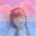
HOW. DO YOU TURN PSDS INTO LUTS.. GH i feel kinda like a dumbass for not knowing in my 3 years of photoshopping experience please educate me
FINALLY! I CAN TEACH SOMETHING AND LOOK COMPETENT ON HERE! OKAY OOMFIE:
Open up your psd. I have an old one from my first blog opened up here (scrolled to the bottom of my psd folder and found the most tolerable psd)
Go to File and Export Color Lookup. I go for the default settings usually.

3. Boom! You have a new color lookup. It doesn't work until you actually import it though. Open up a color lookup layer.
4. Hit the down arrow, to the right of the list. You won't have a list like me if you haven't imported new lookups.
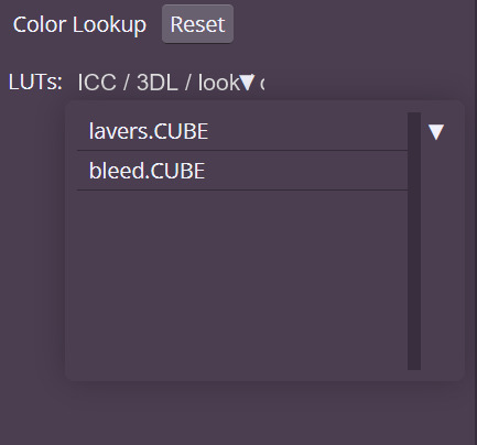
5. Load it in. Done. 👍🏽

4 notes
·
View notes
Text
good to know! keep an eye out for that in the future :3

i’m not sure when exactly i’ll do this, if i do, but:
7 notes
·
View notes
Text
i’m not sure when exactly i’ll do this, if i do, but:
#ʚɞ — chatting.#they’d be simple of course. but i think reply icons should be more personalized so a template could help
7 notes
·
View notes
Note
how do you use the pattern layer… it confuses me

hi anon! it can be a little confusing at first, so i’ll do my best to explain:
okay i don’t like any of photopea’s default patterns (they are, put bluntly, like super ugly) so i typically upload my own. what pattern you upload doesn’t necessarily matter but it’s helpful to look for seamless patterns so as to avoid it being choppy.
so, first open your pattern image in photopea and then go to edit > define new > pattern. if you’re on mobile you’ll need to scroll a bit to find define new
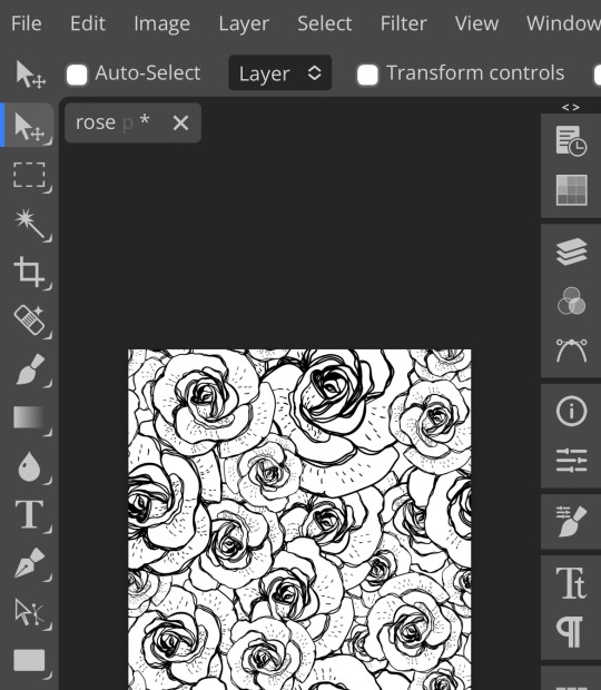
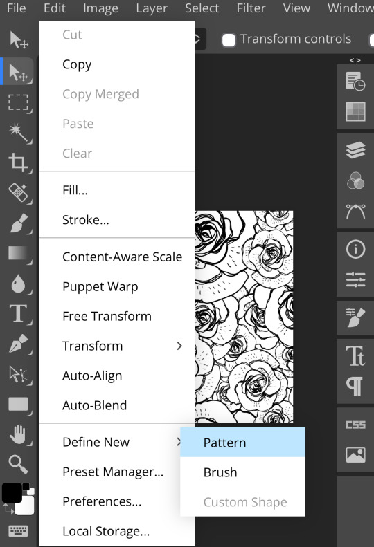
once you’ve defined a new pattern, you can start your project and add a pattern fill layer (found in layer > new fill layer > pattern fill)

click the gray arrow on the side of the square showcasing your current pattern to access others
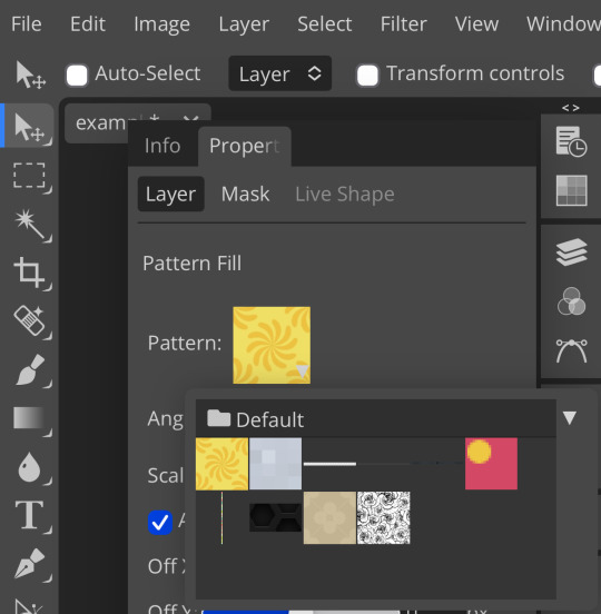
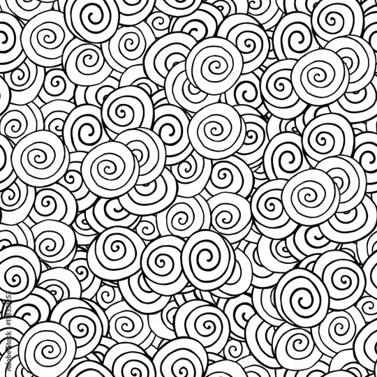
you can see the rose pattern i used at the bottom right. click on that. the pattern fill screen should now look something like this:

now you can mess around with the scale, angle, placement, etc. adjust it to your liking!
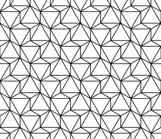
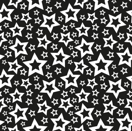
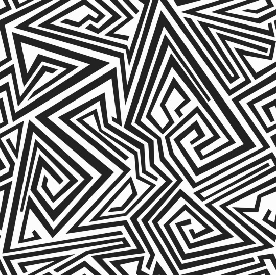
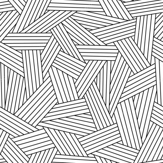
that’s basically it. you can add as many patterns as you want, mine just don’t save because i use photopea in an incognito browser. here are some of the patterns i use:


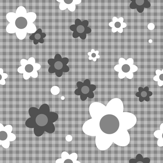

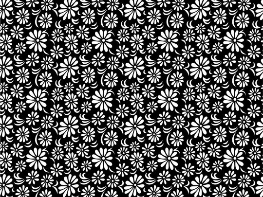


i hope this is helpful! if you have any more specific questions, feel free to ask me, and feel free to just mess around until it looks right. have fun!
yours truly, canarysage
21 notes
·
View notes
Note
I LEGITIMATELY love your psds so much they're so helpful!!!

YAYYYYY I’M GLAD YOU LIKE THEM!!!
0 notes
Text
hi. go buy esims for gaza. go preorder a kufiya from hirbawi. buy insulin for palestinian diabetics who need that help. if you live in the states use this to email your reps (this takes maybe 5 seconds to do). check out this massive list of resources where you can educate yourself in a meaningful and actionable way even if you don't have the financial means right now. from the river to the sea palestine will be free. 🇵🇸🇵🇸🇵🇸
82K notes
·
View notes
Text

contrast - why it is important in editing
contrast is an element in any sort of design, from edits to artwork, and its importance doesn't waver regardless of what kind of design you are creating.
so why exactly is it important? it helps to not only organize the elements in your edit, but also to help distinguish the different parts. contrast helps draw your eyes to the more important aspects of the edit (typically the character). if everything blends together, then the edit stands out less.
its also important to note that contrast isn't *only* created using differing colors, however i will be explaining color contrast and how it can affect your edits in this post. contrast can also be created using size, texture, shape, etc.
the color contrast in different edits will differ depending on the theme you are going for, however no matter the theme of your edit you still want to be able to differ the focus point (your character) and your background. that tends to be harder in lower contrast edits because there is less of a difference in color values.
there is also issues when a lack of color contrast in an edit prevents visually impaired people from properly being able to see what you are creating.
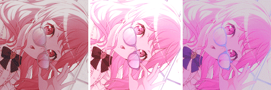
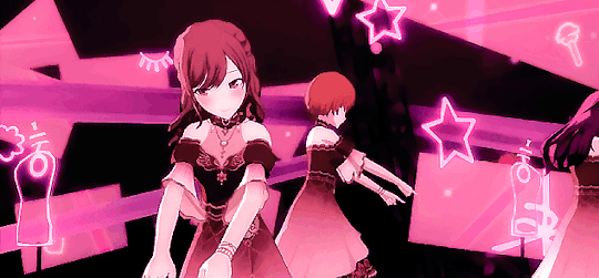
so how can we go about implementing more contrast in lower contrast colorings? there are a few simple ways to do it. i'll be using kasumi as an example
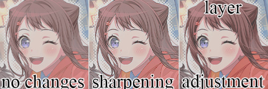
i've created a very low contrast psd and slapped it on kasumi. as you can see with the no changes version, the colors blend together very much because of the lack of color contrast.
the easiest way to fix this (and without changing the colors) would be to sharpen the image. this creates bolder lines on the character and helps kasumi stand out a bit more from the background.
another option would be to simply adjust the layers. on the third kasumi all i did was add two adjustment layers and i created a bit more contrast.
so whats the best solution to fixing the problem? well in my opinion, it'd be both sharpening *and* adjusting the layers.
it maintains that low color contrast look, while also still making it so you can see kasumi.
there are multiple ways to add contrast using new adjustment layers, here's an example of three i could think of off the top of my head. curves, b/c (brightness/contrast), and levels.
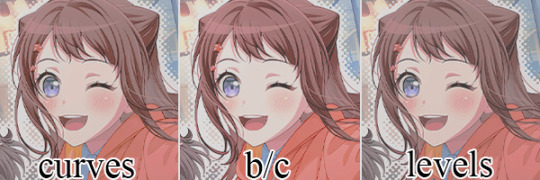
using curves can be either quite complicated or quite easy depending on your goal and understanding of it. for creating (or removing) contrast, its pretty easy!

by dragging the top pin to the left, you can easily create more contrast
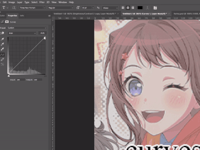
by dragging the top pin down, you can remove contrast

by doing it in the middle you can create a sort of mix of both.
brightness/contrast is pretty straightforward, just up the contrast value using the contrast bar. usually when i up the contrast i tend to turn the brightness down a little bit as well.
using levels is also relatively straightforward! by adjusting this bar you can easily add or remove color contrast.

you can use just one of these methods, a new method, or mix them! anything works! experimentation is a part of editing, it helps you to learn what works best for you. my guide is not an end-all fact book for how you *need* to do things, but rather advice and tips to help you get better and to make your designs look more appealing.
remember that it's all in good fun! if you have any questions or comments about my post, feel free to send me an ask or toss it in the reblogs and i will answer the best i can. happy creating!
32 notes
·
View notes
Text

gradient maps - literally just my thoughts
if you've been on editblr at all you're bound to know em. in this post i aim to share my personal thoughts and critiques on gradient maps, as well as possible ways to utilize them in your works
disclaimer that this post is *not* targeted towards anyone in any way, shape, or form! i'm simply stating my opinion. if this is how you like to edit that's perfectly okay, and you don't have to change that
i'll begin by explaining some issues i personally see with them.
i find that a lot of edits seem to just use the gradient map itself without any other changes. this becomes an issue when people are creating gradient map edits that have very low contrast as it prevents people who are visually impaired from being able to see your edits.

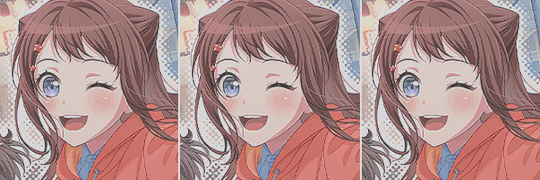
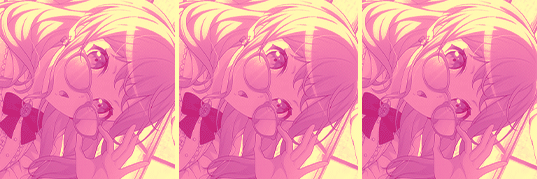
something as simple as changing the blending mode you use can easily help you use a gradient map much differently. in each blending mode variation i used only *one* layer and simply just changed the mode and level of opacity.
gradient maps can be *very* useful in edits, and using different blending modes with those gradient maps opens up opportunity to more interesting colorings. below i have examples of psd colorings ive made all using gradient maps in different ways
while it is undoubtedly true that not every editor uses photoshop or photopea or a program that has the kind of adjustment layers those programs use, most do have gradient maps. so it makes sense why a lot of editors would rely a lot on them.
some of the blending modes i personally find the most useful (and used myself in the above colorings) would be: divide, soft light, multiply, luminosity, and color.

with divide you have to make some... kind of ugly gradient maps. but when you switch the blending mode to divide and set down the opacity a bit it turns out looking really nice! with divide its important to note that your gradient map will be using the *inverted* colors of the color scheme you're going for. that is why the gradient maps will look strange
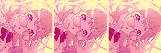
soft light is much more subtle in the way it colors your image, therefor the gradient map you use may want to be very dramatic in the colors it uses. the soft change in color is perfect for when you want a more subtle change to more closely bring the different colors of the edit together. if you want a more dramatic light, its sibling hard light can do that job for you.

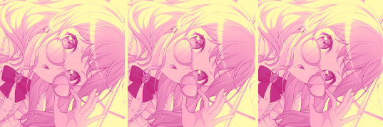
i find multiply works better with darker colorings, i usually lower the opacity while using it as well. i tend to use a broader range of dark to light colors in the gradient map i'm using with multiply
luminosity can either have a very dramatic, or very subtle effect depending on the colors you use. i encourage you to play with this mode a lot! it can create some interesting effects that i don't really know how to describe
color does as it says it does! it changes the colors of the image to the colors on the layer. it doesn't change the saturation of the colors, however. it's essentially like if you hue-shifted them. you can use this to create very drastic changes in color, or to establish what colors you primarily want to be in your coloring
i don't really have much else to say other than to have fun with it! i just pointed out different ways to use gradient maps as a tool for your editing, if you decide to follow my advice or not is totally up to you. if you have any questions or comments feel free to shoot me an ask or throw it in the reblogs and i'll answer to the best of my ability. happy editing!
20 notes
·
View notes
Text
hello and welcome to sweetsundazed! a blog geared towards helpful constructive criticism, tutorials, and resources.
my pinned post has a link to my carrd, but for simplicitys sake ill link it here, too. please read it before interacting!
may i have a promo?
@cactiflowering @p1nk-sugar @otoripink @ashenscion @diaflan @didlivio I DOTN KNOW WHO ELSE TO TAG UMM
22 notes
·
View notes
Text
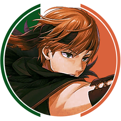

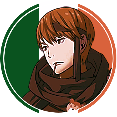
hey what pride flag is that ?! ... WAIT!
irish gaius icons for anon ?! + reblog and credit if using
psd by canarysage
11 notes
·
View notes
Text
hi, it's ambrose coming through! you might even know my url already from a certain blog 💖 i promise i'm normal though! my notes have been dry for a bit and i was wondering if i could get a promo? urm, please read my dni first!
feel free to ask to be untagged + reblog if not tagged :: @ideallyadored, @circuswhisprs, @ghostflora-s, @ashenscion, @didlivio, @gloombears...
17 notes
·
View notes
Note
Hello, I'm not sure if you've ever gotten an ask like this before, but could you add identifying titles to your Photopea for Dummies tutorials somewhere before the Read More button? So, something like "PSDs as written by a dummy"? It makes it easier to differentiate between all the similar looking posts. Thank you!

sure thing! i went and added titles to all the posts. tbh when i started this series i didn’t expect to make so many, so i didn’t format it in a way that was conducive to a multi-part series lol
2 notes
·
View notes
Text
Do not interact with me if you interact with keroppikiss 🥰
20 notes
·
View notes
Note
OH FUCK I MISSED THE TAG thank youuu that’s so sweet
;; some people have such crazy good and impressive editing styles it leaves me :OOO . some of my favorite blogs are @ideallyadored (love !! the headers with moving text specially !!! they impress me so much) @pwupsicle (ur pixels... ur graphics... i love em !!) @canarysage (very helpful ;; ur blog is such a huge help!!!) n @toranekooo (uwahh ;; the style is so...). there's really impressive people in the community !! all the graphics and edits are gorgeous ;;;
atte . someone not in editblr that wanted to gush about their favorite blogs
also op ur so sweet too ;;
NO, you're super sweet!! A lot of people in editblr are super talented!!
{ @ideallyadored @pwupsicle @canarysage @toranekooo }
11 notes
·
View notes
Note
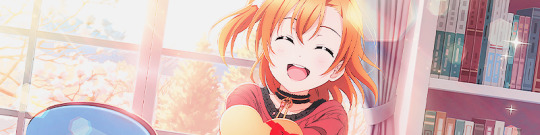
hello tumblr user canarysage author of photopea for dummies... do you have any tips for replyicons... ( person who has tried and failing at making them )

NOT REALLY TBH. how you do replycons depends on the vibe you’re going for and everyone’s are pretty different. i would suggest making them long though, because otherwise they take up a truly obnoxious amount of space on mobile. mine are 600x150 but you can double that if you want them higher res!!
also it’s nice to have a nice variety of expressions when making reply icons. i like to label mine when i save them so they’re easier to find—ex this one is labeled ‘canarysage replycon len happy’ so i can just search for ‘canarysage happy’ and pull it up :3 you also want to make sure you don’t have so many things going on that you get distracted from the character
there are also reply icon templates you can find made by the rp community!! make sure you follow the creator’s rules when using of course.
if you need some inspo you can check out roseysekaiarchive (that’s me!!) OR you can request some from me on @ashenscion (depending on the source you prefer)
#sorry this isn’t helpful i feel like replycons are something that should be personalized LOL#anon#ʚɞ — tips.
8 notes
·
View notes
Note
@canarysage always makes PSDs with deep, rich colours which i think brings such an interesting colour to some prsk charas that otherwise feel bland or samey between cards
@canarysage!!
3 notes
·
View notes
Text

Hello! May I get a promo? This is a confessions blog, but specifically for positive confessions. I made this since I saw a lot of toxicity, and I wanted to combat it!
Please read my pinned post for more information!
Tagging! Feel free to reblog even if you aren't tagged, and let me know if you wish to be untagged.
@ideallyadored @tarnishedpride @diaflan @magicparade @otoripink @kaoharu @lucentnova @cherryshh @artistrydoll @canarysage
82 notes
·
View notes