
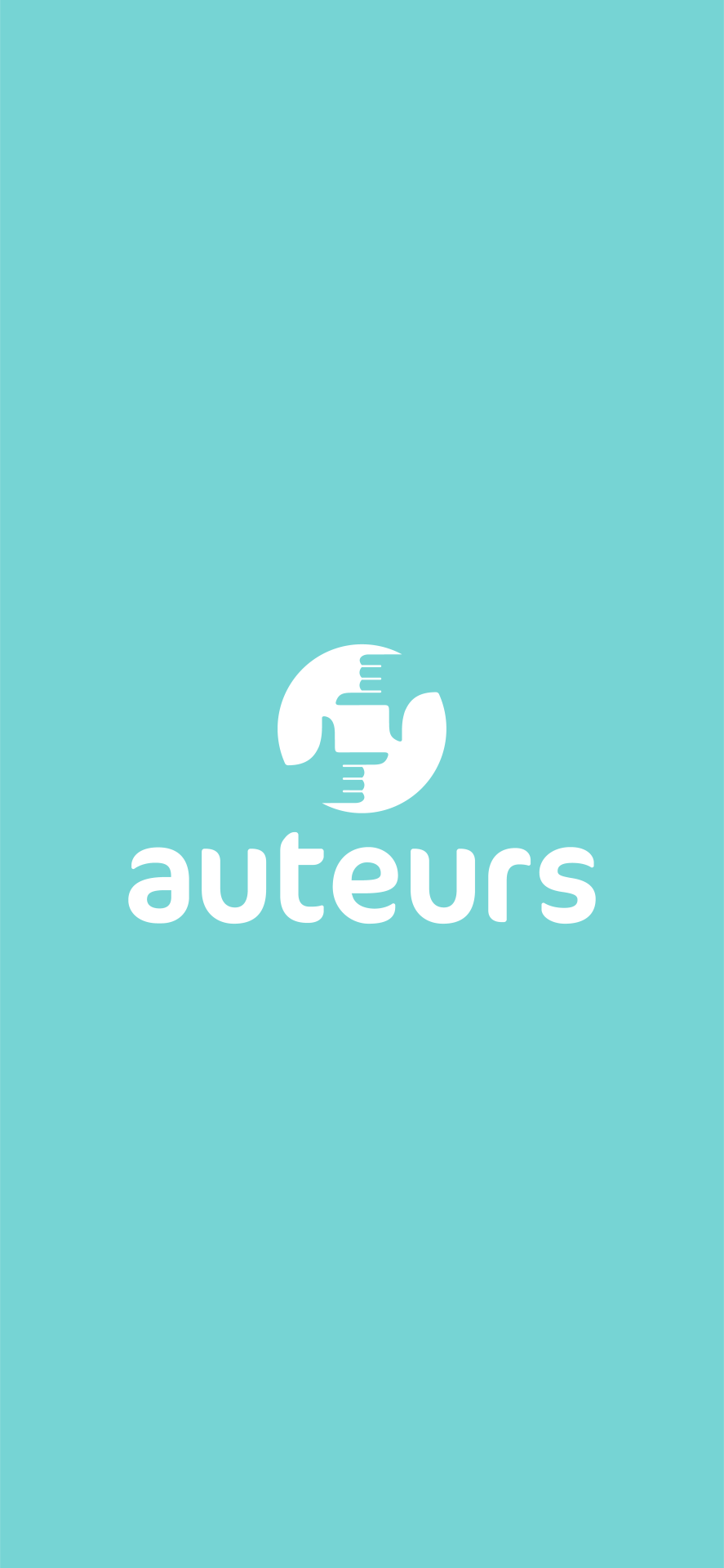
charliepipedesigner
Charlie Pipe
AUB - Visual Communication - Final Year
434 posts
Don't wanna be here? Send us removal request.
Last Seen Blogs
dommy-nurses
Dommy Nurses
jjmaybanks
@witcherz

twiggy-ink
twiggy (feeling cool and normal)

jjfsdds
제목 없음

beautytaxi5
无标题
Text
Self-Reflection - Major Project
General Thoughts
Creating my app was an exciting, yet tumultuous journey. Researching the topic of film and cinema amongst young people has provided a lot of valuable insights into the challenges and opportunities that exist in this industry. Developing an app concept that can encourage young people to engage with films more critically and thoughtfully, while also enjoying the social aspects of cinema-going, has been a rewarding process. However, the beginning of this concept was a difficult scenario because I had to change my idea during the fifth week of this unit. Therefore I was forced upon myself to think quickly about what I want to produce for my project. On the other hand, I am happy that I decided to change to my final piece because it enabled me to realise how I can relate a passion into a medium that felt necessary for my intentions in visual communication.
Challenges
One of the challenges in this project was creating a cohesive and appealing brand identity. For example the choice of the fox mascot and the rounded font for the logo were carefully considered to appeal to young people and to convey a sense of approachability and friendliness. Then the choice of pastel colours and a clean, minimalist design for the app screens were also essential in creating a visually appealing and user-friendly interface. I also consider the UI design to be challenging, but there was enough research for me to understand the basics of app design in order for me to produce my work on a new software in Adobe XD. Despite the process of designing each screen being tedious at times, I really enjoyed conceptualising new ideas throughout the process in order to provide a strong concept around education and film in particular.
Time-Management
As for the independent project management, the majority of my deliverables were balanced in terms of time. I kept up-to-date with the process books and the blog which benefitted me a lot in the early stages in order for me to focus on the app for a while in the later stages of this unit. In regards to the app itself, I could definitely have worked quicker if I followed certain rules of app design. I think this is especially the case for the margins, grids and guides because I based a lot of the interface layout decisions on the naked eye. Then again, as a first experience of designing an app, I think I produced a well considered body of work that clearly reflects the amount of engagement I had in this project.
Conclusion
The combination of UX/UI design, illustration, and branding was a combination that I really enjoyed producing conceptually and visually for this project. Using my love for film and cinema, and applying it into an app was an enjoyable experience that I would like to develop on for the exhibition show. Despite the set backs in the early stages of this unit, I managed to stay focus on providing an idea that relates my work into a practical solution where I was able to showcase my ability to develop, analyse, and define a solution in relation to visual communication.
0 notes
Text
Final App Screen Recording - Major Project
This is a screen recording of the app prototyping, where I have gone through all of the screens that have been made for the app. There is also a link where you can find the interactive XD file:
0 notes
Text
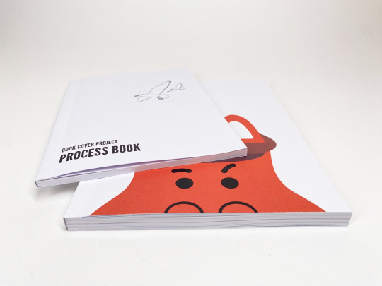
Process Book Photos - Major Project
I took a bunch of photographs of my process books in the photography studio, resulting in these being the best shots that I took. I edited the brightness of the photos on Photoshop show that they can be visually seen better.


0 notes
Text
Final Deck - Major Project
I have designed a deck that shows the final branding framework which effectively communicates the app's unique identity, purpose, and features to the target audience (15-18 year olds).

First Slide
Having the brand logo nest to a pair of interface mockups will act well as a thumbnail to display what the project is, especially when it goes on my portfolio.

Second Slide
A brief summary helps to explain the primary purpose of the app and who it's targeting. I used the dark sky theme from the UI design in the app to keep a consistency with the cinema aesthetic.

The Mission
This slide helps to establish the purpose and intentions of the app. The target audience would be able to understand the overall objective of the app and how it can benefit them, which can also help to create a connection between the user and the app as it highlights the values and the reason why it was created. Furthermore, I have implemented a tilted back mockup of the lessons screen as the UI designs are presented in chronological order in relation to the user on the app. Rounded square have also been used throughout the deck as it was a key visual feature in the app.

Our Values
The title of this slide is written in a first person perspective as if it was made by a group of people because 'auteurs' is a platform that represents a collective of people, which would convince individuals to join a group of like-minded people. In regards to the slide design I switched the background and card colour so that there's a variety of different visuals to look at.
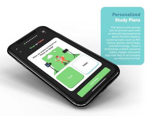
Personalised Study Plans
Although I haven't designed a set of authorisation UI designs, the users are still able to create their own personalised study plans depending on the intentions of each individual. I've used one of the question UI designs as an example to support this brand principle.

Achieve to Succeed
With gamification being one of the unique selling points of this app, it felt necessary to dedicate one of the deck slides to this aspect of the service, especially considering the fact that there are multiple elements of this type of service. Using flat smart phone mockups felt the best for displaying gamified interfaces across the slide.
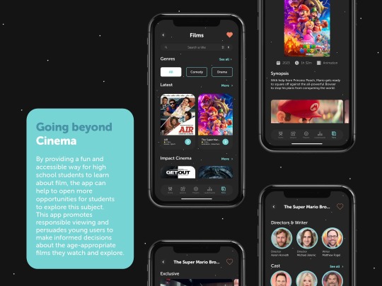
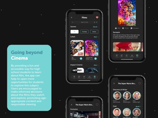
Going Beyond Cinema
It felt necessary to use the black background with the stars to set the cinema aesthetic for the films screens. I displayed the main films page alongside an example of a film description, with The Super Mario Bros Movie being a film that I watched in the cinema during this project.

Rewards for Progress
This aspect of the app is something that I have always considered ever since I contacted Fox Rogers about my idea because he mentioned the importance in allowing users to earn something for every main aspects of the app; such as the lessons, tasks, challenges, project-making, achievements, etc. To allow the young learners to earn points to exchange for exclusive real-life content is a motivational way to persuade users to learn about this subject area on a fun, accessible platform.
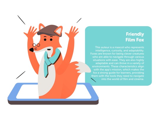
Friendly Film Fox
The mascot is one of the most important elements of the app because the fox is a representation of the values and the mission for the platform. A gender-neutral fox also makes the app inclusive for all genders who are interested in film. Although the fox may be wearing stereotypical film director clothing such as the flat hat and scarf, it is still friendly and interactive enough for the audience demographic within the target audience.


Branding Framework
I've decided that I'm going to combine the branding framework deck (which I analysed in a previous blog post) into he final deck for this project because the deck serves as a celebration of the project and the visual identity of the app, and therefore it feels relevant to implement the conceptual approaches of the UI design. Having said that, it was then a matter of where it will be placed in the deck. As a result, I wanted to begin the branding framework after the fox mascot slide because that's when the consistent body paragraph descriptions end, and it wouldn't clash in between the brand principle slides.

Mockups
Finally, I wanted to end the deck with either a conclusion or a set of mockups on one slide. This slide can also serve as a thumbnail but I wanted to showcase the landing page so that the users know how the app would look from their initial experience.
Conclusion
This deck clearly displays the body of work I've produced for this project, and how the conceptual approach is useful for the chosen target audience. I've tried to consider the layout and presentation of each slide so that it's cohesive and consistent with the brand identity. Depending on how much time I have left from now until the final deadline, I will consider designing other UI designs that may be important for users to know what features are also made for the service.
3 notes
·
View notes
Text
Box Photographs - Major Project
I have taken photographs of my box for the physical items I am handing in, including my two process books (MP and Book Cover Project), both of my sketchbooks, my notes book, and the printed book cover with crop marks and bleed. All of my other work is digital.


0 notes
Text
Final Deck (Branding Framework) - Major Project
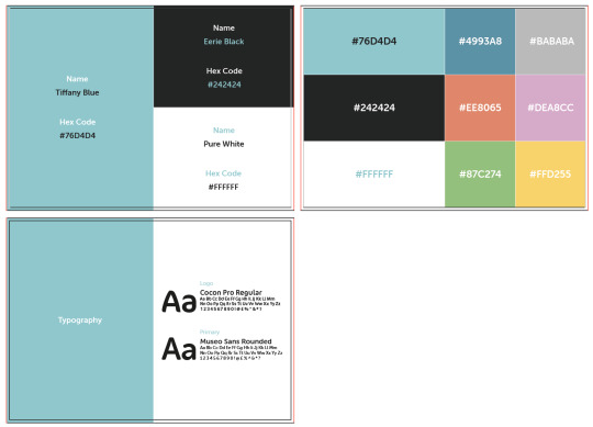
I have designed a deck that clearly displays the branding framework of my app, which involves the app's visual identity, typography, iconography, colour palette, digital card designs, and the UI buttons.

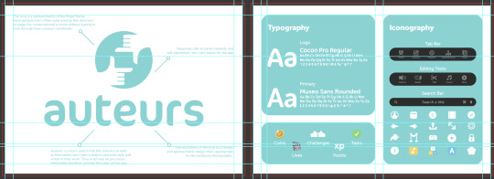
Logo
I went into detail about the conceptual and contextual meaning behind the logo and icon design for this app. I used the line and circle from the filters screen in the app as arrows to point to the logo.

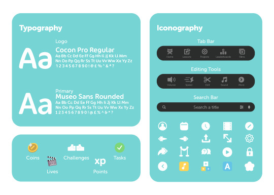
Typography & Iconography
I placed the typography and iconography on the same deck slide to show the consistency of the branding framework of the app. Additionally, I've used turquoise rounded squares from the app so that the branding framework is compatible throughout the deck. I showcased the two main fonts that were used for my app, including the logo and primary typefaces. I believe that these two fonts work well as a pair because they're both can be rounded and adjusted to a specific thickness as a method of typography hierarchy in the app. Then I organised my icons on the right side of the slide, which features the tab bar, editing tools, and search bar icons, along with the other icons that I had designed and used throughout the app.
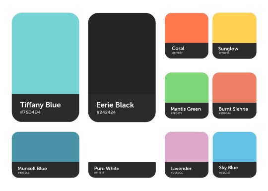
Colour Palette
Using the card designs from my app, I displayed the colours that I had used, with the turquoise and black colours being the primary focus. Then the secondary colours have been placed underneath, and other colours I had used within the app's visual design has been placed on the right.

Digital Card Designs
Using the same card layouts from the second deck slide, I presented my digital card designs that had been changed in terms of shape and size throughout the app. The lessons cards felt the most important to showcase first since the app is primarily for educational purposes. I made the size of the rewards and films cards the same size since they're the same design. As for the right side of the slide, it felt necessary to display the task cards in it's own square card, with the cast and crew cards being placed underneath.

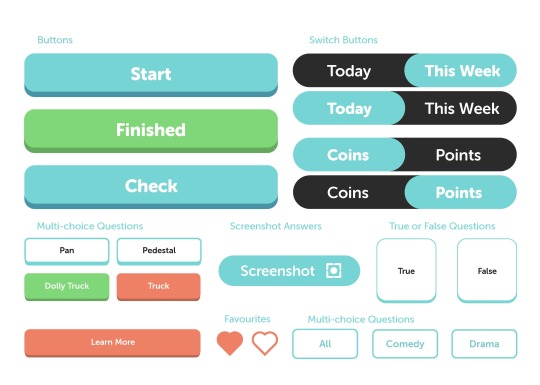
UI Buttons
It felt important to showcase the buttons I had designed for the app because it's an important UI feature that allows users to navigate through the platform. I haven't placed all the physical buttons on this slide because there are some small circular buttons on the typography and iconography slide.
Conclusion
Now I need to think about the mission and values of the app, highlighting the app's commitment to educating users about film and promoting conscious decision-making. The deck should also include mockups and examples of the app's interface, showcasing its features and functionality, such as the rewards system, leaderboards, and lesson plans. I will decided afterwards whether I should combine the branding framework deck with the app's narrative.
1 note
·
View note
Text
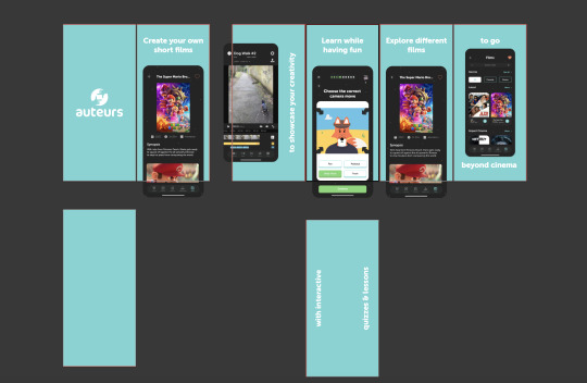
Final Social Media Story Ad - Major Project
This is a mockup of the 10 frames in my 15-second story ad that would promote the app on various social media platforms such as Instagram, Facebook, and Snapchat; where my audience demographic would be able to see the promotion of the app. Stories have a largely active user base, which makes it the ideal medium to advertise the service to my audience.
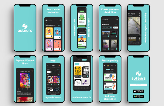
In my storyboard I've promoted a few key features of my app with smartphone mockups and short sentences that can grab the attention of digital users. The general layout is very basic because the template size is very narrow and minimal, which is okay for this type of advertising since the story ad allows for the app to be showcased in a short and attention-grabbing way. The app features (including the lessons and quizzes, project-making, films, and rewards) are in the same order that the individual on the app would see when they use the platform. I used the turquoise colour for the background because it's bright and can easily attract the smart phone user when they're in any environment. It also allows the dark app mockups to stand out in contrast to the bright colour palette. Additionally, the social media platforms allow for targeted advertising, which means the ad can be shown to users who are most likely to be interested in the app, based on their age, location, interests, and other factors. This can lead to more effective advertising and a higher return on investment for the promotion campaign.
Conclusion
I will attempt to animate this video ad when I have finished this project after the deadline, so that I can promote the app properly in my portfolio and during the graduation show.
0 notes
Text
Refining Final Deck - Major Project
I've been exploring different ways to provide a comprehensive overview of the entire project; including its purpose, target audience, unique selling points, branding, features, and benefits.


Deck Layout
I've been a bit indecisive with the layout of my final deck for this project because there are so many ways I can present the different visuals features. I want the deck to be appealing to the target audience while applying the branding framework of the service. It also serves as a reference point for any future clients (if this concept was applied within the professional industry). In terms of the layout of the deck so far, I'm implementing my app design into different phone mockups, and then I'll be writing my own brand narrative for auteurs, including the main principle of the app, the mission, brand values, and other important features.

Mockups
Initially, I was using an old set of smartphone mockups because I couldn't find any up-to-date mockups. However, I was recommended by my course rep to search on Graphic Burger, where I managed to find a set of iPhone X mockups with 9 different angles. At first I was finding it difficult to edit the mockups on Adobe Photoshop because I didn't know how to apply new smart objects into duplicated layers. I was copying and pasting the phone mockup and screen smart object which would make the mockups clone, so I asked my technician for advice. He showed me where to create a new smart object, which would then allow me to showcase different app designs.
Conclusion
I will look at the branding framework of my app in order to determine the visual presentation of my final deck. I can also navigate back to my contemporary research into other apps and services to spectate how those concepts were presented.
Bibliography
Skovran, A. (2017). iPhone X MockUps – 9 Angles. [Online]. Graphic Burger. Last Updated: 20 September 2017. Available at: https://graphicburger.com/iphone-x-mockups-9-angles/ [Accessed 3 May 2023].
0 notes
Text
Final UI Designs - Major Project
I have designed the key features of my app, which will be used in my final deck that explains the principles of the brand and the platform for to the target audience. The designs in this post are just some examples that have been designed for the app.

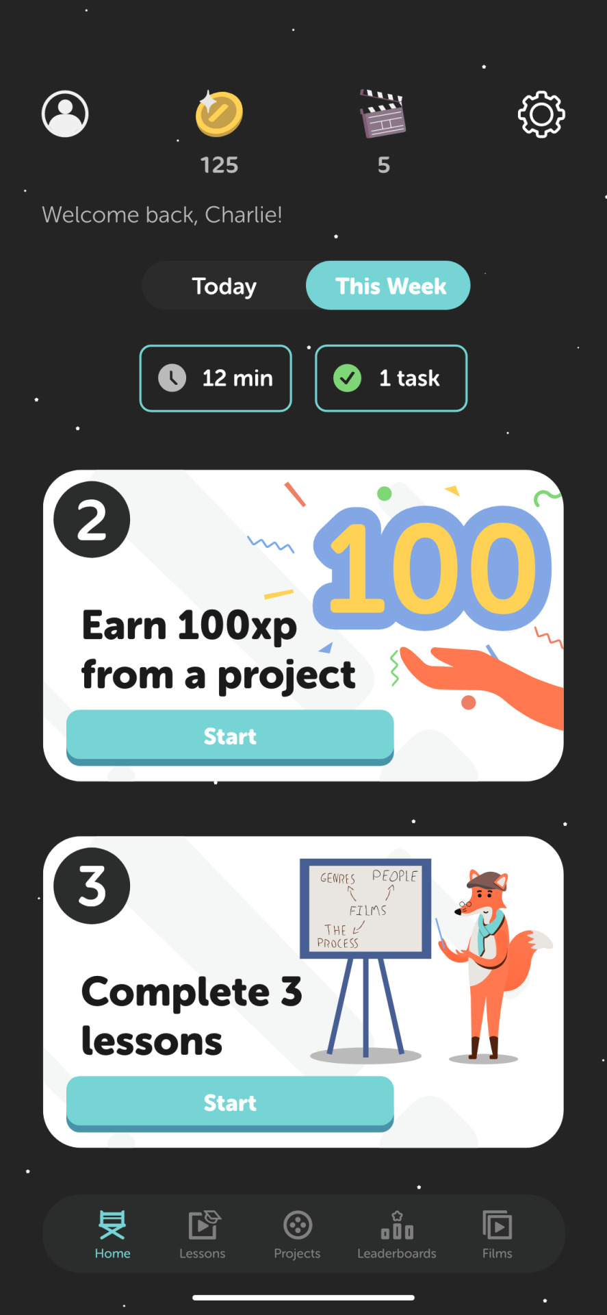
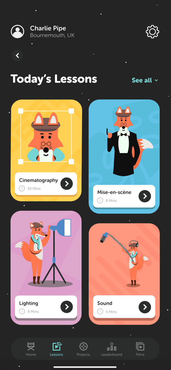
Landing & Home Screen
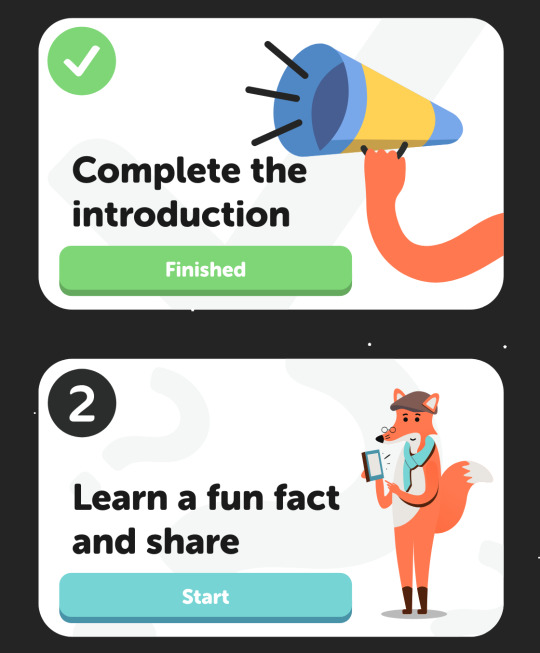
When the user first opens the app, the logo will appear in the centre. Since there is no option to set a timer for the transition from the loading screen to the landing page on Adobe XD, I've prototyped the interface so that when the user taps on the screen it will fade to the home page. This is where you'll find the essential elements off the platform, including a set of icon on the top of the screen (profile, coins and points, lives, and settings). At the bottom of the screen you'll find the tab bar, which serves as a quick access to different sections or features of an app. Since the app allows users to earn rewards for using the app's feature through the gamification service, I have designed task cards on the home page as an easy way to suggest users what to do first on the platform. Each task may take different times to complete so I made a UI button that allows users to switch between daily and weekly tasks, in which a reward is in place for completing these.


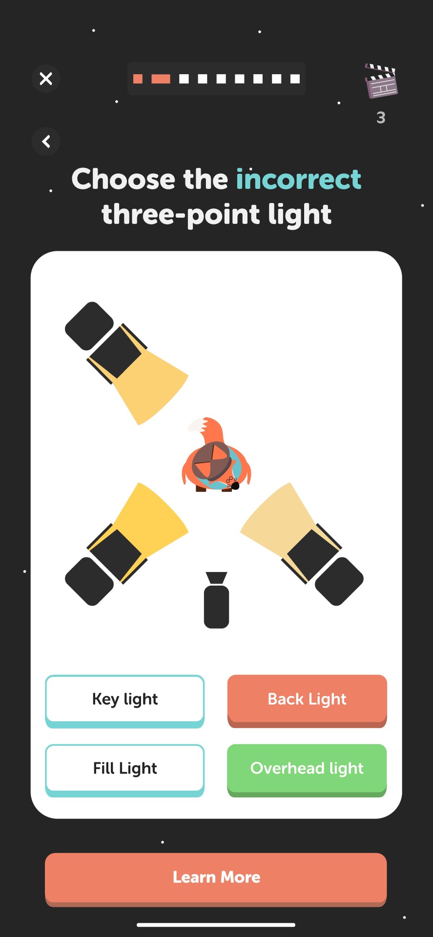


Lessons & Quizzes
This part of the app is what makes the service unique because the educational aspect has been designed to be fun and enjoyable, rather than a burden on the learners. There are three examples of the different types of questions that may be asked to the learners. Each of them have a unique illustration of the fox mascot to interact with the interface in a way that makes the learning more memorable. For instance, the lighting question UI designs show the correct answer being picked, and the wrong answer. I used my research into UI buttons to indicate the correct and incorrect answers using green and red. In addition, the summary of each answer acts as a revision card. I highlighted key words within each sentence, as well as an option to screenshot the card so that learners can look back on the answers as part of revision for academic individuals.

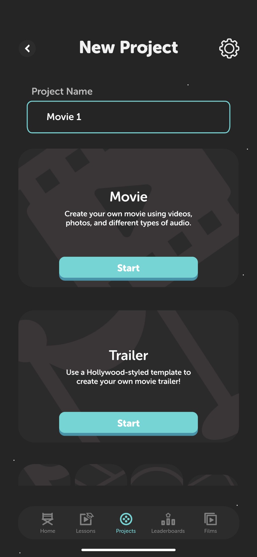

Projects
The film-making allows users to create their own projects with gamified motives, persuading consumers to use different editing tools as a way to develop their skills for future purposes. The first screen will show the projects that are either complete or currently being edited on the app. Using the finger frame icon in the brand logo, I designed a 'new project' button so that the users have unlimited amount of times they can create a project. When you click on the button, the screen will slide left to a screen with options for video templates. This encourages different types of film or video makers to use the app (whether it's for academic reasons, content creating on social media, or producing a short film). Once a template has been selected, the user is taken to the editing screen where they have access to different tools to make their project. In regards to the gamification aspect, it is possible to use an AI system to determine the points and coins they earn. AI could be used to evaluate factors such as technical proficiency, creativity, and adherence to film-making principles, but it would be difficult for an AI system to evaluate subjective elements such as storytelling, emotional impact, and audience engagement. Therefore it might be possible that there are people who can evaluate and provide nuanced feedback, similarly to YouTube.


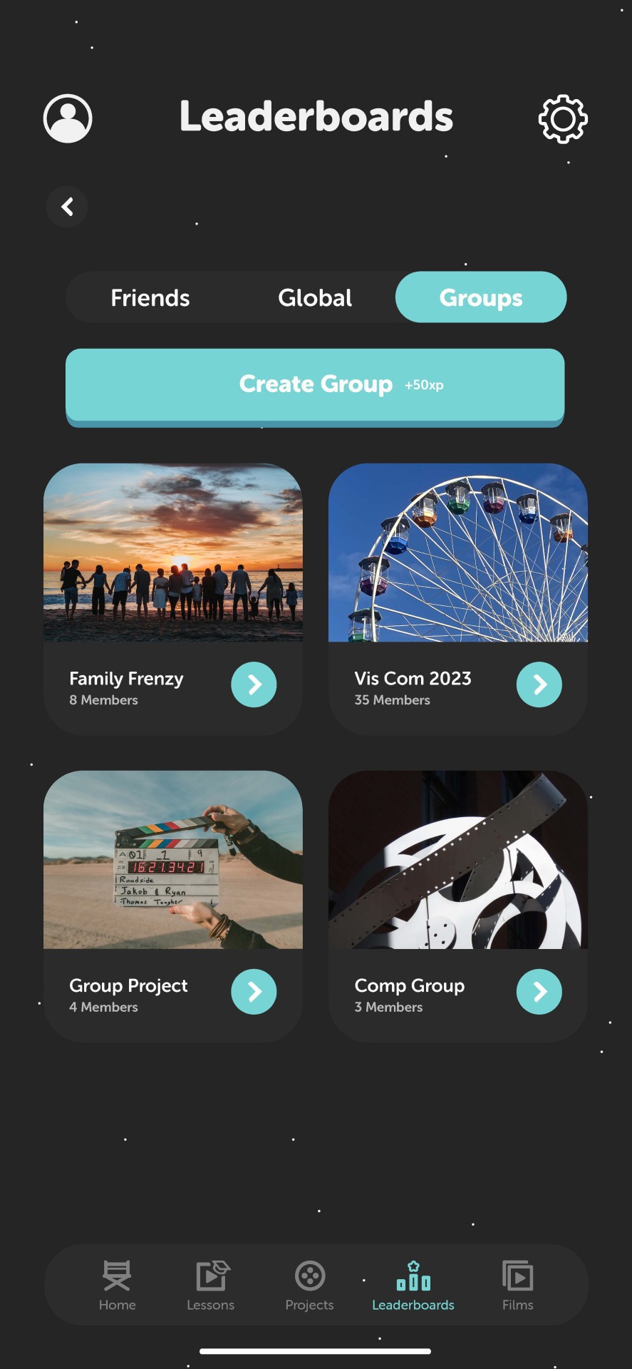
Leaderboards
Having three different leaderboards can give users motivation to participate in quizzes and film-editing challenges by showing how they rank compared to other users. Whether that's with friends, globally, or in groups such as classrooms and teams, the leaderboards will help create a sense of community and friendly competition among users while promoting learning and creativity. I designed a podium for the top three highest ranked users on the platform, as well as the top 10 who can be seen if you scroll through the positions.

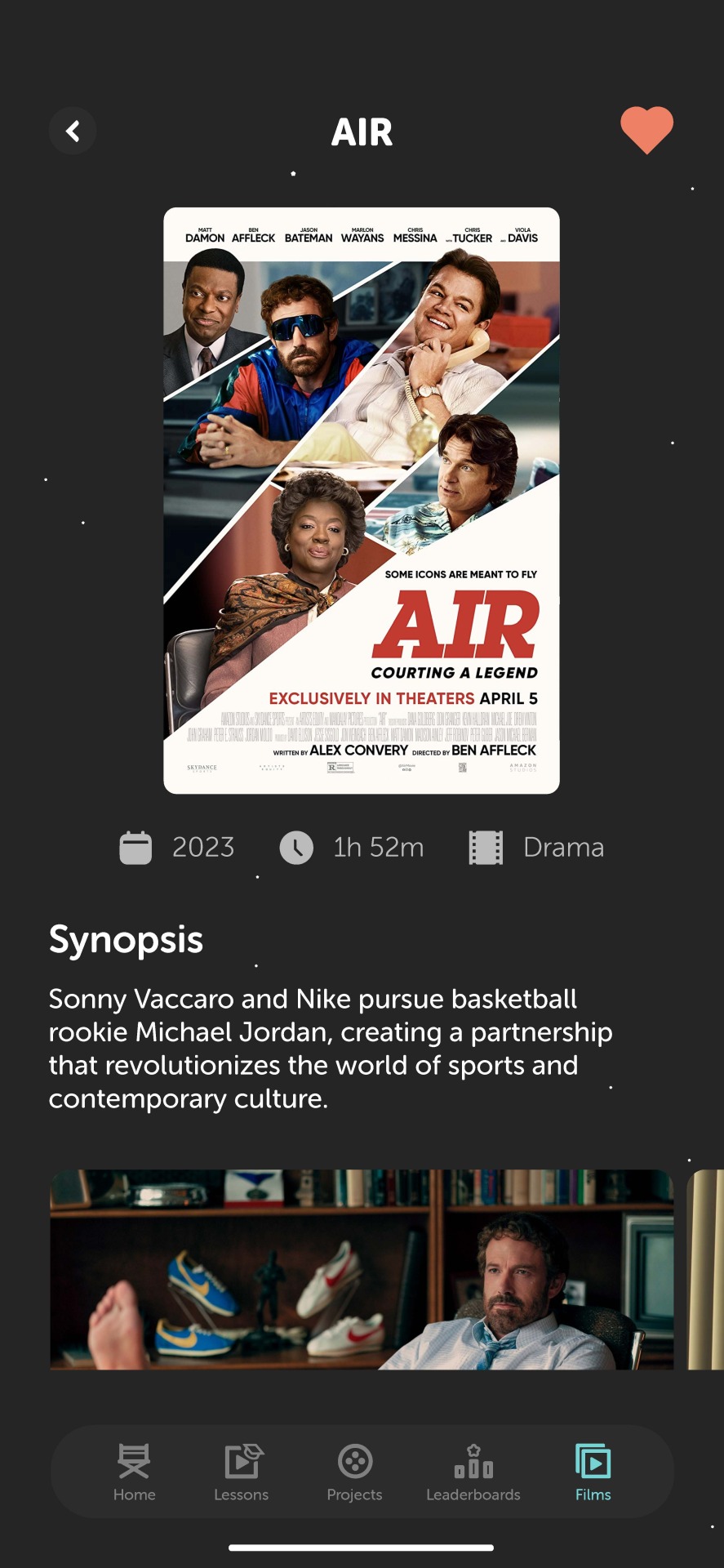

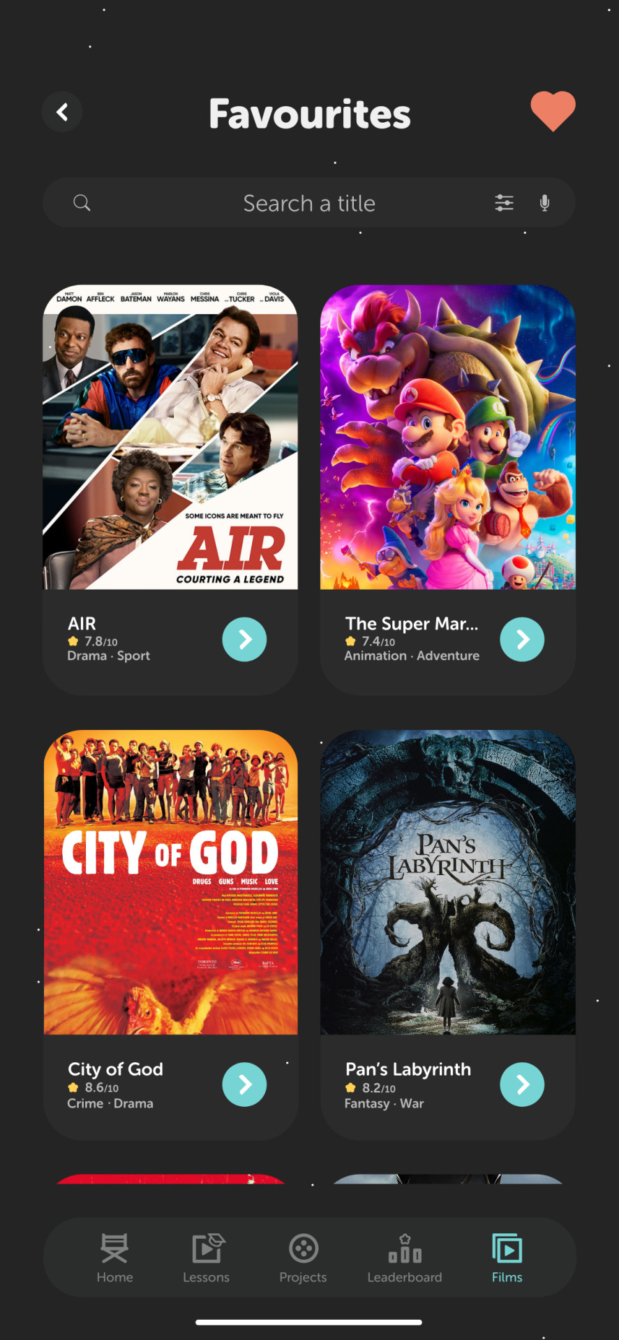
Films
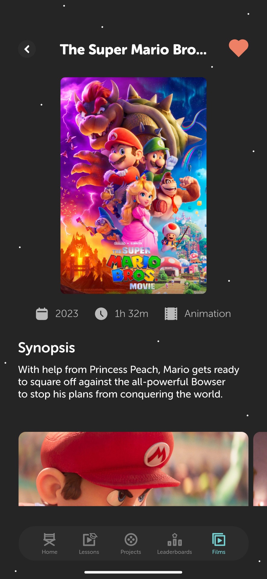
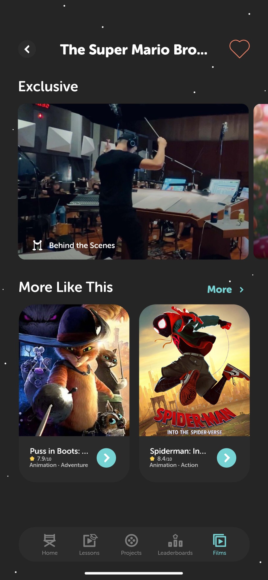
Users are able to search a specific film title where they can find information about that film, whilst being able to have their own favourites list that keeps the films all in one place. Moreover, the filters icon in the search bar makes it easier to find that specific film through the selection of genres, rating scores, age restriction, directors, and the general organisation by default. As for the individuals films I've used two examples from my primary research at ODEON Cinema. For the Super Mario Bros Movie, for instance, the screen showcase the movie poster along with the year it was made, the length of the film, and the genre. Then you can scroll through a collection of shots from the film (since it would by copyright to have the whole film on the app), for film-makers to take inspiration from the techniques that have been used. As you scroll down, there are circular cards to show the cast and crew members (that would be clickable if I had time to design a UI design for this part of the app). Users can also leave reviews and see other people's opinions on the films. Finally, the bottom of the screen will have exclusive behind-the-scenes content that allow users to know what it's like to be on set for a film product, in addition to interviews and trailers for the film.


Profile & Achievements
This is where the owner of the account can change their profile picture and see details of their progress in terms of completing tasks, challenges, lessons, and achievements. It felt important to show the screen time on the app because it can promote responsible use and helps users to monitor their usage habits. As for the achievements, you can see your own progress, in addition to others who may also be completing the same achievement. This is a gamified aspect that can motivate young learners who like to collect achievements or badges in video games, as a method to promote a fun learning platform. You can click on the achievement badge to show the details about the award, and also being able to share this information on other social media platform to persuade others to download the app.


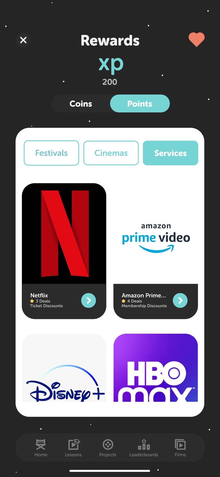
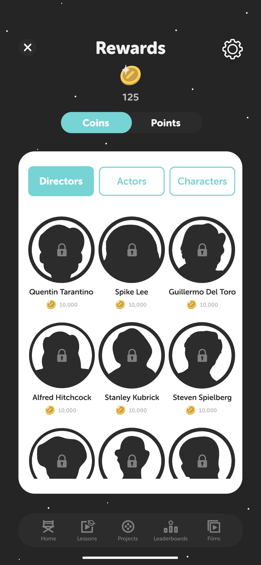


Rewards
Using a similar layout to the films screen, there's a list of coins and points rewards after earning a certain amount. Film and cinema-related content can be very expensive, especially for the younger audience, therefore the points you earn can be used to earn discounts, codes, and deals for festivals, cinemas, and streaming services where people can benefit from using the app to financially help themselves. Then the coins are used to unlock different avatars of directors, actors/actresses, and famous film characters. These can be used for the user's character profile, which means that they won't have the option to choose a picture from their smart phone photo gallery cause they can easily use a photo from an online source. All the locked avatars will appear as silhouettes until they have been paid individually using the in-app currency.
Conclusion
Considering the fact that this was my first project designing an app, I am very happy with the final outcome because I was able to use my research and inspiration from contemporary work to design an app that serves the purpose of providing a gamified platform for young users about film and cinema. I believe that visually it feels like film and cinema with the dark interfaces and stand-out UI features. The fox illustrations bring interactivity to the platform so that it's memorable and stands out in the market place. There are improvements that can be made for the graduation show, in addition to more UI designs that will clearly show the majority of the concept.
0 notes
Text
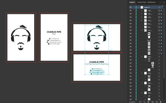
Development of Personal Business Cards - Major Project
After my initial business card designs, I realised that I should rebrand myself as a designer because the design of my logo didn't fully reflect me as a designer since it was a vectorised illustration style. Therefore I went on Adobe Illustrator to draw a simple portrait of myself that is a clear representation of myself.


0 notes
Text
Development of Filter Screen - Major Project
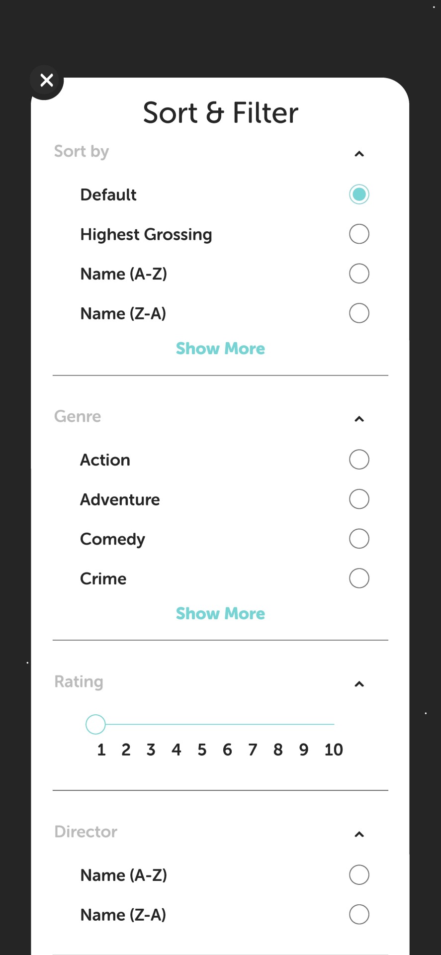
When users are looking for a film to discover on the app, they may want to filter the search results based on specific criteria such as the genre, the year of release, the director, the language, the rating, and other factors. This also stems from my research into age ratings, since it's important to allow users to search for films based on their specific needs and preferences.
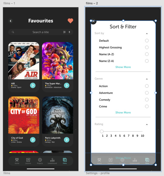
Design Layout
I couldn't find a lot of preference for filters from contemporary services in relation to film, so I designed my own version based on the most relevant aspects of film. Filter screens are often different in terms of layout in comparison to the rest of the app. So I used the white square shape I've used in other designs to display the filter options. It felt appropriate to include the basic options such as 'default' and 'highest grossing' first since these are the most popular options for most services. Then I copied and paste the text and shapes to type out the different film genres in alphabetical order. There are a lot of genres to choose from, so I'm giving the user the option to 'show more' with a button using the turquoise primary colour. This shows continuity in the branding framework of the brand. After that, I wanted the age rating to be the next filter option for the user because I'm targeting 15-18 year olds, who fit in the demographic for high demand in film rating across digital platforms (according to the ITV X article I analysed).
Prototyping
The prototype should be interactive and allow users to easily toggle between different filter options and to see how the results change. Therefore I'm going to make the filters screen slide down when it's closed since the cut off point for the vertical scrolling is at the bottom of the screen.
1 note
·
View note
Text
Initial Deck Designs - Major Project
I'm going to design a deck for my project, showcasing the branding framework of my app, as well as the UX/UI designs that will be supported by small descriptions about each feature.
Branding Framework
I started designing the deck on Adobe Illustrator, which I then transferred to Indesign since that is the best software for layouts. The branding framework will include a few elements from my project:
Brand Identity - Name, logo, tagline, and a general visual style of the app.
Brand Positioning - Referring to the unique value proposition of the app and how it stands out from other competitors in the market.
Visual Assets - This includes any imagery, graphics, or video content that will be used to support the branding and marketing efforts for the app.
Brand Messaging - Key messages that the app wants to communicate to its audience, as well as any messaging hierarchy or priorities.
Brand Voice and Tone - The style of language and communication that the app will use to engage with its audience.

As shown in the screenshot above, I designed some iPhone mockups using downloadable templates from a website. Using these different iPhone screen mockups I can play around with the layout of text and visual features off the app in order to state the intention of the app.
0 notes
Text
Refining UX/UI Design - Major Project
As I've been designing the app on Adobe Xd whilst looking at the contemporary sources I explored in my research, there are small details that have been changed throughout the app screens.

Wording
It's important that I use the right wording for the users to progress through the app so that coerces the users to continue using the app for the primary purpose of learning. For example I have displayed a screenshot of a 'true or false' question about mise-en-scène. When the user answers the question, they are taken to a brief description about the subject area of the question. I decided to choose the phrase 'learn more' instead of 'read more' because the word 'learn' feels more welcoming as part of the platform's primary purpose.
0 notes
Text
Development of Storyboard - Major Project
Using Adobe Illustrator I designed simple layouts for an Instagram story promotion video for the app.

Designing the Mockups
I started off with an iPhone 14 mockup I found on a website that specialises in digital mockups. I took away the smart phone borders because I wanted to just show the app designs using the rounded squares as the mockup. I exported my art boards from Adobe XD into a PNG, which then I placed into the Illustrator file. I then used the clipping mask tool to place the app design into the rounded square.
Shot Layouts
After that, it was a manner of playing around with the layout of the mockups and text to make the video visually appealing using the limited space. What I have designed so far is based on the initial storyboard sketches; simple but still implies the concept of the app. I used the turquoise colour for the background since it's the primary colour of the brand. Therefore it would make the app stand out in comparison to its competitors since there is a limited amount of educational apps based around this subject area. I've also decided to make the text white so that the dark app designs can stand out in contrast to the information that's provided.


1 note
·
View note
Text
Final Critique (26/04) - Major Project
In my final critique I showcased my app on Adobe XD, some designs for my deck, the process book, and my portfolio visuals.
App Design
Firstly I spoke about the progress I made from my previous tutorial (19/04), in which I mentioned about some of the key points that were made last week that I had (and hadn't) implemented into my app. My tutors was satisfied with the work I had done, and now it's just a manner of finishing the functional app.
Final Deck
Then I showed my Adobe Indesign file of a deck for the branding framework and the app promotion. My tutor suggested that I make two different presentations; one for the branding framework, and the other for the app's intentions. This would possibly be able to display one of the presentations in my portfolio, and another for the graduation show.
Process Book
Considering Brioney is an expert at book design and typography, she was pleased with the layout of my book. There were only two visual elements that were mentioned as suggestions for change. The front cover was displaying the logo for the app as a placeholder for the meantime. My tutor suggested that I draw an illustration of the fox mascot as a fun and interactive way to be introduced to the book. The other comment was about the title pages being too close to the inside margin. If the titles were placed on the inner left margins then it would be easier for the reader to find the contents.
Portfolio
Unfortunately I was unable to show my portfolio website because of the slow internet, but I mentioned that I put six of my visual communication projects in the portfolio. I also mentioned the initial business card ideas I had designed.
0 notes
Text
Initial Storyboards - Major Project
For my app I plan on designing a video to promote the in-app features and to provide a visual demonstration of its benefits. Storyboarding is a helpful way to draw and organise each shot, which involves the timing, transitions, potential diegetic and non-diegetic sounds, and camera movement.

It doesn't feel necessary to design a complicated video to promote the app for a few reasons. Firstly, I believe that showcasing the in-app visuals can be supported by text that states the intent of the service. I also think that a video can be easily shared on social media platforms and other channels, which can increase the app's reach and visibility to a wider audience.

The sketched ideas I have displayed on this blog are very simple layouts that clearly target the difference audiences within the demographic (cinema-goers, aspiring directors, creative learners, content creators, and filmmakers). The first and third examples are for an Instagram story template, which would be narrow and limited in terms of layouts for the text and app mockups. However, this is fine especially considering I have over a week left until my final hand-in. This means that I can design a digital storyboard for the hand-in, and the potentially make a video for the graduation show.
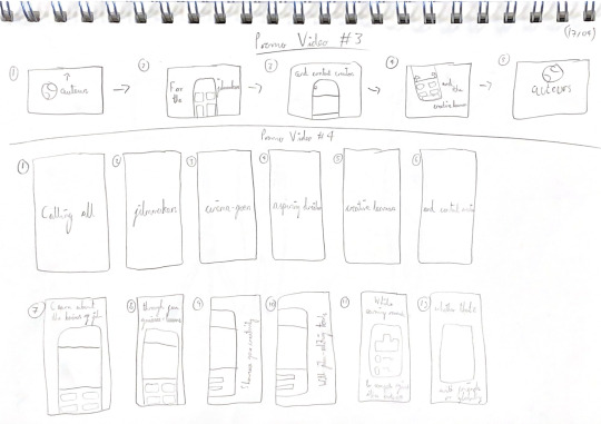
Conclusion
Developing easy storyboard templates for the promotion of my app has helped me to highlight the different groups within my target audience. These initial ideas will also help me during the development of the digital storyboard-making, where I can take inspiration from each sketch.
0 notes
Text
Development of Illustrations - Major Project
I have been meaning to develop on the illustrations for a while, but I prioritised other visual elements on the app because I wanted to make sure that I designed a service that was working functionally, which included the hierarchy of text, card layouts, iconography, and prototyping/animating the app.

Mascot/Character Designs
Drawing different illustrations of the fox mascot will make the experience of using the app a lot more enjoyable if there is someone or something to guide the target audience through the learning process so that it's memorable and useful for situations where the subject area is required. In my latest tutorial (19/04), my head tutor mentioned the importance of a gender-neutral character because it will promote inclusivity, and it ensures that all users will feel welcome and represented. Therefore I had to change the design of the 'mise-en-scene' character design so that I can break down gender stereotypes and avoid reinforcing gender norms, which will be important for certain users who do not identify with traditional gender roles. Additionally, I wanted to replace the boring 'lighting' and 'sound' illustrations with a more appealing design with the mascot involved. Using Adobe Illustrator, I used the pen and shape tool to draw an ezylite soft box light and a boom operator microphone as a representation of the equipment that's used in a professional environment.

Card Designs
I wanted to add extra detail to the cards because it didn't feel like the mascot designs were enough, especially if these are going to be seen frequently by the users. Therefore I drew some film-themed icons for the background. For example, I drew a vector icon of film tape for the cinematography lessons/quizzes (as shown in the left screenshot above). I also designed some for the Home Screen cards, in which I typed out a question mark and exclamation mark and expanded the text into an object so that I could use the pathfinder tool to fit the shape into the card.
0 notes