Last Seen Blogs
jiubilant
lore-friendly big sandwich

studiotreart
Senza titolo

stevn187
Untitled

diaperman92
Diapermans Blog
heliosharbour
HeliosHarbour's cabin
Text
Final Magazine
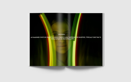
Write against final magazine mock ups and explain your design choices and reflect on how you have integrated Dystopia into the designs.
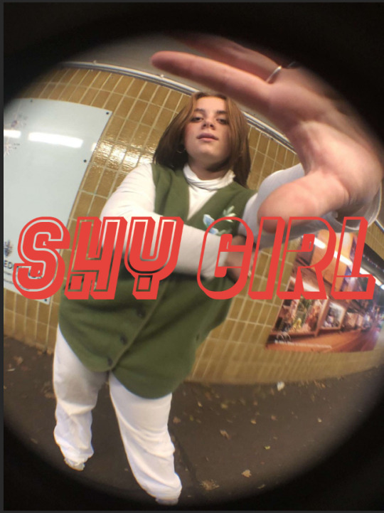
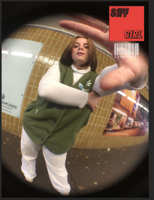
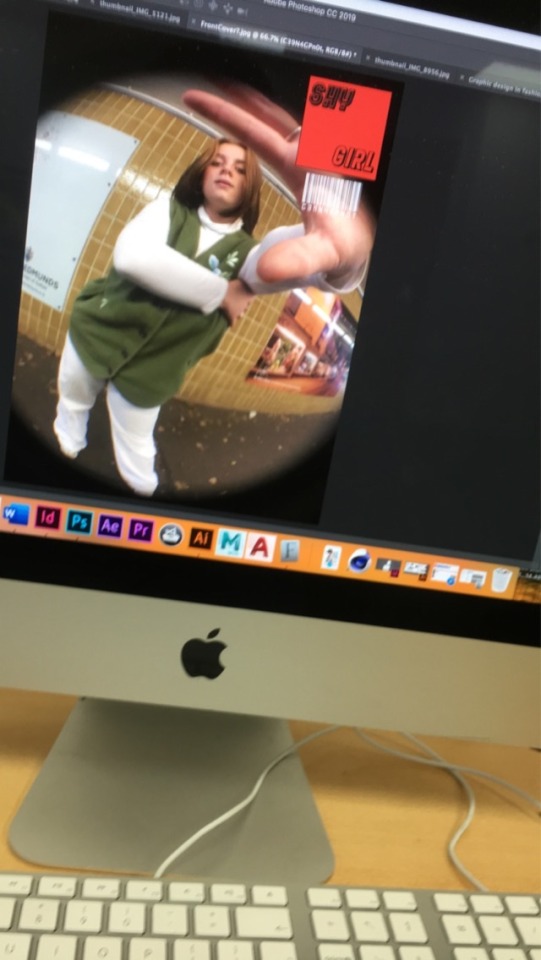
When taking the front cover picture, I knew it had to be the sole purpose it would catch someones eye. The use of the fish eye lens makes it all that much better with the stretchy type of effect on my models hand, I also had a rough idea that the logo would sit there as it looks like she’s showing you my branding type thing, which I really like.
- Does your magazine successfully visually communicate the theme of utopia or dystopia? How?
I feel like my magazine successfully visualises Dystopia because I feel my photos portray my version of an imagined state, however looking back on how I put it together, I wish I used a better range of colours through my photos and also used a variety of different angles to better portray the illusion of my imagined state for Dystopia.
I also integrated a dark colour palette to create a very mysterious tone.


0 notes
Text
Henry Scholfield

Henry Scholfield is a Canadian videographer. He started out directing street style music videos on the UK grime scene for artist such as Dizzee Rascal, Kano, Professor Green and Wretch 32. He continues to make killer videos for some of the biggest urban artists. ‘Boasty’ by Wiley, featuring an epic who’s of the music industry’s most recognisable artists and the amazing ‘Vossi Bop’ by Stormzy have both upped the ante in grime video visuals. ‘Vossi Bop’ netted Best Video and Henry won Best Director at the 2019 UK MVA’s and he’s been nominated for both categories again this year.
Stirring away from the Grime scene, Henry has directed some stunning videos for Billie Eilish, Rosalia and Dua Lipa, with his video for her song ‘New Rules’ winning a D&AD Pencil and breaking viewing records on YouTube, racking up 2.2B views!

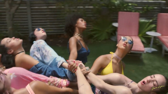
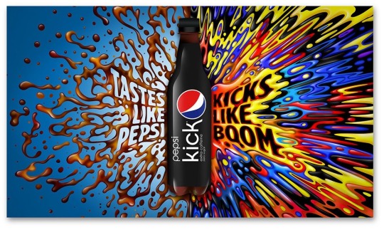
His work is charged with energy, innovation and bursts with creativity. His swift, flowing camera moves, stylised choreography and standout art direction that set him apart, positioning him as a master of short form. In adverts, Henry has echoed the pace and fluidity of his promo work, working with clients like Barclaycard, Budweiser, Gojerk, Pepsi, Google, Converse, Stella Artois and many others. In 2018 he won a Lion at Cannes for his brutal Red Cross film called Rules of War.
These my favourite videos and shots that Henry has directed.


0 notes
Text
Alex Trochut

Alex Trochut is a graphic designer who was born in 1981 in Barcelona, Spain. After completing his studies at Elisaia Escola Superior de Disseny, Alex established his own design studio in Barcelona before relocating to New York. Through his design, illustrations and typography practice, he has developed an intuitive way of working that has resulted in his expressive visual style.
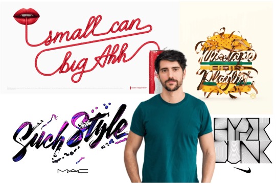
Alex has worked across disciples to bring life to design solutions tailored to meet the concerns of each client. He’s worked collaboratively with a range of clients traversing from music, fashion, editorial and beyond : from developing a visual language for bands like The Rolling Stones, Arcade Fire and Vampire Weekend to expressively communicate a new product or direction for companies like Coca-Cola, Nike and British Airways. He’s also helped develop engaged editorial for publications such as New York Times, The Guardian and Esquire UK.


0 notes
Text
Tuesday & Wednesday and based outcomes.
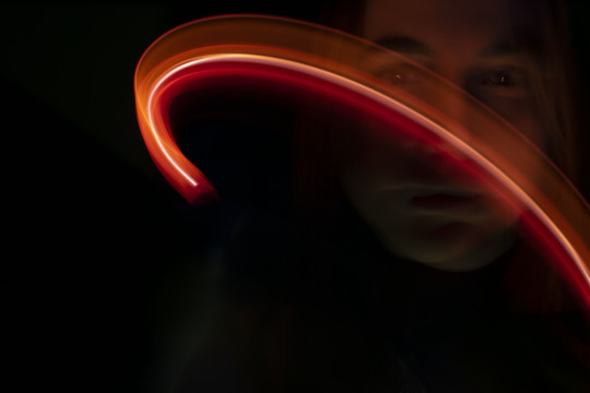
On Tuesday we had a lot going on. We were able to do two different photo shoots. One with Coloured Gels and another with Light Pens. I’ve never worked with Light Pens, let alone heard of them. At first I didn’t quite know how to use them until I had the idea to focus more around the face as the camera only captures a glimpse of the light, having a smaller area to focus on might work better than trying to get pictures far away of the light going everywhere all over the body. These were the first few outcomes I got.


And these are the ones I took after my idea. They came out much better than my first few. I like how distorted it makes the face.


This is my favourite from using the Light Pens. To me it looks like it belongs on a Star Wars poster or it reminds me of the ring around Saturn.
On Wednesday we were allowed to create anything we wanted with our recent photos, with any materials we would like. I knew when told about this lesson, that I wanted to do something hand based with thread and sew into some photos like we did in our previous project. I’d taken this photo (below) from our photo shoots on Tuesday. I thought it would look nice if I drew it and sew in this parts of her hair that are visibly red. I also took another idea from our previous project and decided to draw it in the style of Luke Dixon. The sewing part was tricky and intricate but I like our it turned out


I got this idea off Pinterest, when looking for inspiration on Monday night. I thought the ripping and tearing (the two images below) of the paper was a good idea, but I wanted to take it further. I found some matches in my living room, that we use to light candles, and thought burning the hole in the paper would have a really nice effect. Thankfully I was allowed to produce this idea at college, but it had to be done outside. It took a long time to get the outcome I wanted because it was very windy but I got there in the end and was estatic with the outcome. I loved it so much it made an appearance in my magazine.


0 notes
Text
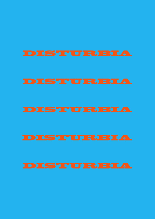
Projection Outcomes
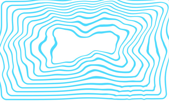
On Monday (23/11/20) we created some edits to use to project onto walls for another photo shoot for our magazines. I got inspiration for this first one off Pinterest and though it would reflect well off the wall. I decided to liquify it to make it more mysterious and to make it stand out just a bit more.


The ‘Disturbia’ project is my favourite, I love the contrast of the two colours. I think the photos came out the best for this projection.


I really wanted to use a blend as a projection, because I saw photography on Pinterest that looked really good. I think I’ve done a better blend than this but it still worked well.

I added this projection in last minute just to spice things up. It’s of a cabbage flower that I also used in my previous milk bath photography shoot. I think it gave a nice effect in the photo.


0 notes
Text
Jessica Walsh.
Jessica Walsh is the founder and creative director of ‘& Walsh’ (andWalsh.com). She lectures about design at creative conferences and universities internationally. She teaches design & typography at The School of Visual Arts in New York City. Her work has won numerous awards from most major design competitions, including Type Director’s Club, Art Director’s Club, SPD, Print, New York Festivals, among many others.
She’s also been awarded Forbes ‘30 under 30 top creatives, designing the future’ and Ad Age’s ‘Top 10 visual creatives’. Jessica’s work has been featured in several books and magazines, clients include: Museum of Modern Art, The Jewish Museum, Institute of Contemporary Art Philadelphia, Levis, Adobe, The New York Times and The School of Visual Arts.
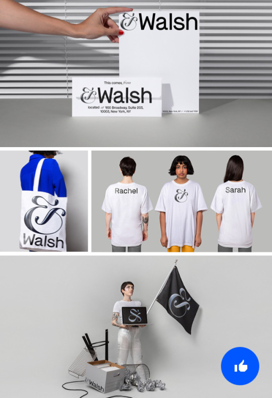
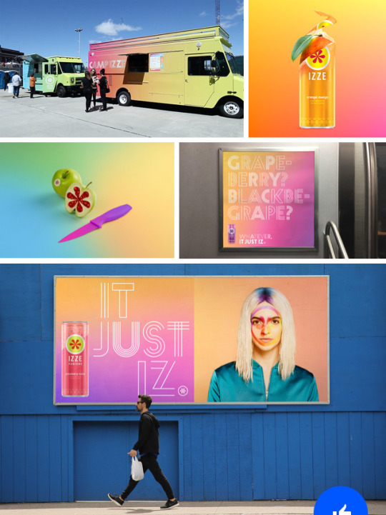
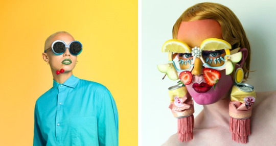
These are some of her branding that she’s done that has caught my eye.
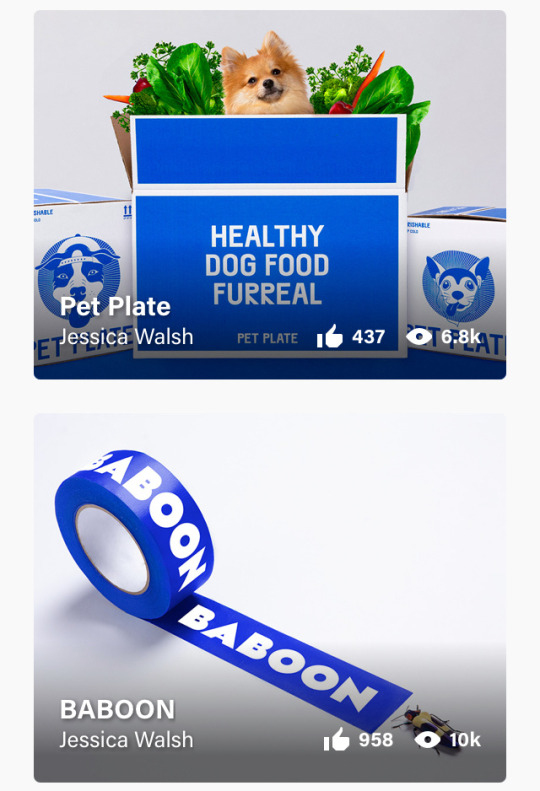

This one in particular caught my eye. The colours are so vibrant and in your face I love it. This is an ad for Izze Fusions that she’s put together for a drink targeted for the Gen-Z audience. The idea of colourful body paints and having a food/drinks truck is so genius. This visuals are really selling the product for me.


0 notes
Text
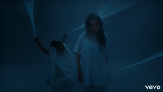
Nadia Lee Cohen.
Nadia Lee Cohen is a photographer, film maker and self-portrait artist. She’s heavily inspired by cinema, Americana and Britain particularly, in the 1060′s and 70′s. Her photographs and films are veritable visions of saturated, surreal dreamscapes.

In 2011 Lee Cohen attended the London College of Fashion and began studying photography. She sites Hitchcock’s The Bird, David Lynch's Blue Velvet, Harmony Korine’s Gummo, John Water’s Pink Flamingo and Stanley Kubrik’s The Shinning amongst her initial inspiration.
Drawing upon the duality of the female form, fine art photographer and film maker Nadia locks our optics upon the twisted paradise that lurks within her mind, exploring the paradoxical standoff between strength and fragility within womankind.
Nadia has worked with some of the worlds most exciting brands and artists from MIU MIU to A$AP ROCKY. She has been interviewed by Canal + and Vogue, and a lot of her work has been featured in magazines like I-D Magazine, Vice, New York Times Magazine, Indie and many others.
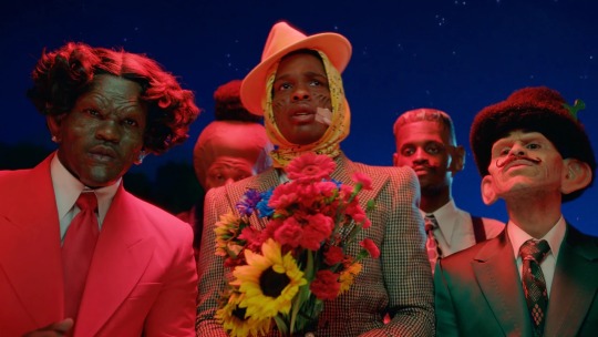
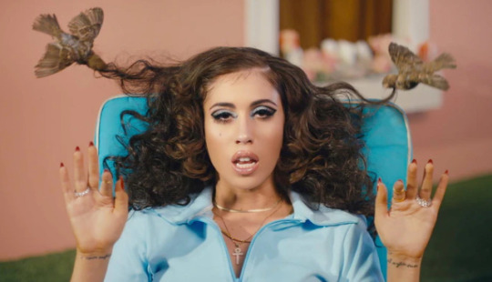
These are her videos for A$AP ROCKY’s ‘BABUSKA BOI’ music video and Kali Uchis ft. Tyler The Creator & Boots Collins ‘After The Storm’ music video.

This is her advert for the beauty cosmetic company MAC. The advert is called ‘DESTINATION FABULOUS’.
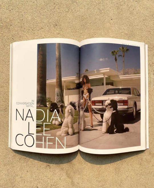
This is the few pages she features in, in a 2021 edition of Vingt Sept Magazine.

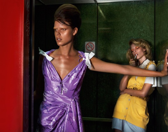
These are just to show off different stuff she’s done.


2 notes
·
View notes
Text
Edda Gimnes
Edda Gimnes is a fashion designer who has been labelled as one of the 10 ‘Fresh-Out-of-Fashion-School Designers to watch’ Edda Gimnes has gained a massive name for herself within the fashion industry. Since graduating from London School of Fashion, her bold pieces have been worn by the likes of Lady Gaga, Gigi Hadid and Cardi B.
Edda has been showcased in both museums and art installations, she has combined fashion and innovation through partnerships with Mircosoft, Epson, Max Mara Group and Disney.
The Designer draws by her non-dominant hand to create a fun and vibrant expression. Many of her pieces manifest from small illustrations that are enlarged, printed onto canvases and turned into functioning garments or accessories.
When looking through all her collections, I couldn’t pick just one garment or accessory that I liked, I liked at least one thing from each collection.

This is a jacket and bag really caught my eye in her Spring/Summer 2020 collection. The colours really match well. I love the brighter colours on the buttons and pockets of the navy blue jacket, those are what caught my eye. (the colour of the buttons and pockets.)


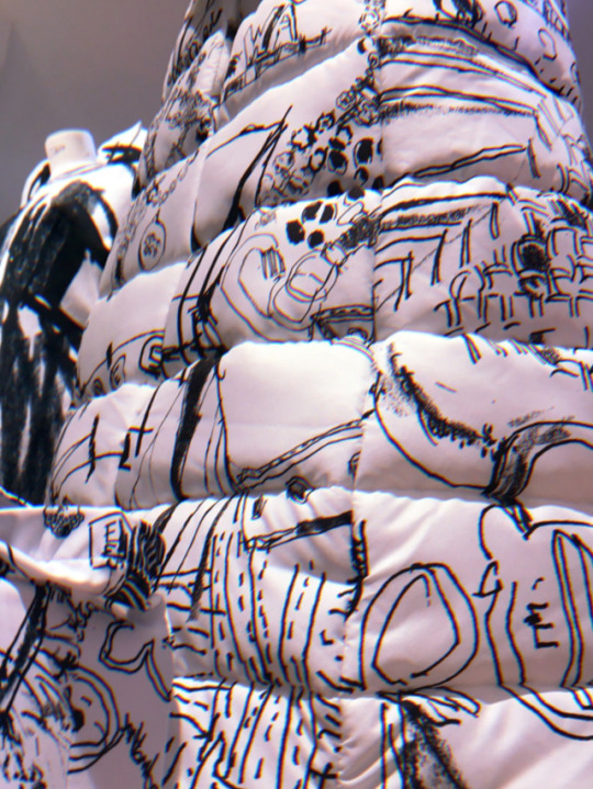
I think overall this is my favourite collection. I love the drawings one this fabric in this collection. This pair of thigh high boots are amazing. The patterns on the boot really work well with the white background. Those shoes paired with the same patterned puffer coat would be such a nice outfit. These are both apart of the Autumn/Winter 2019 collection.

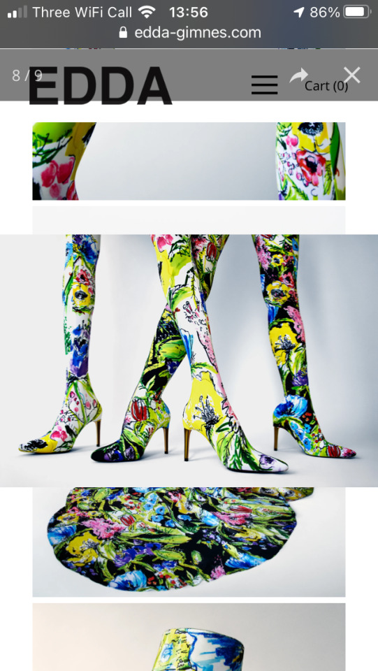
From Edda’s Spring/Summer 2019 collection I love these dresses. I love the models wearing them, I think the model on the left her skin looks flawless matched with this dress, she just looks beautiful. Again with the thigh high boots, I really like the patterns on these ones. They’re very vibrant and bold which I like a lot. I would love to wear them.
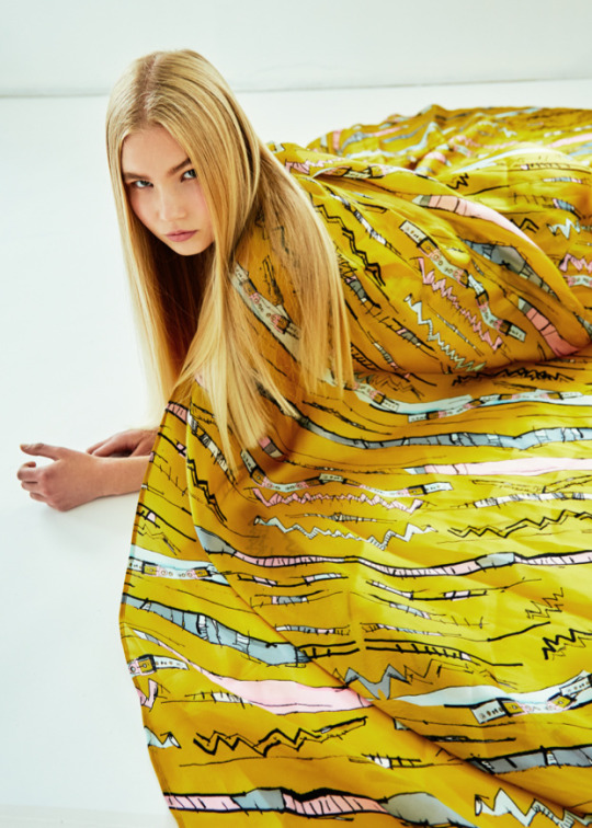
I love the pattern and colours on this so much. The light pink and blue patterns are so simply on the mustard coloured fabric it just works so well. This is from her Spring/Summer 2018 collection.
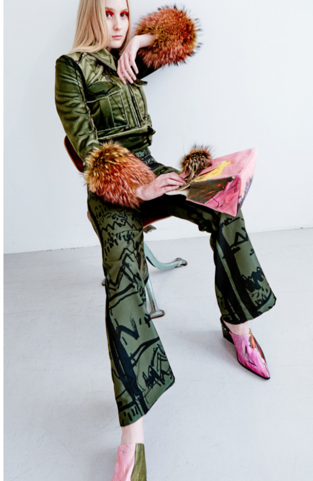
For me this is her best from Edda’s Spring/Summer 2017 collection. I absolutely love the puffy, fluffy end of the sleeves. It’s such a nice and simply touch that really puts the outfit together. The handbag and shoes that match is a good idea too and I feel like the colour of them both is the same as the fluffy sleeve end. The jacket and matching trousers are lovely on there own. I really like the black drawings on top of the dark green fabric. I would actually wear those trousers, that’s how much i like them

And her first collection from 2016. Overall I think the photo shoot for this collection is really creative as well as how the model’s are dressed. I really like this outfit, the hat makes a very bold statement. This collection reminds me of stick drawings that I’d draw as a kid. Which is a good thing, it’s nostalgic. The top with those trousers is such an nice outfit, that I wouldn’t mind wearing.
0 notes
Text
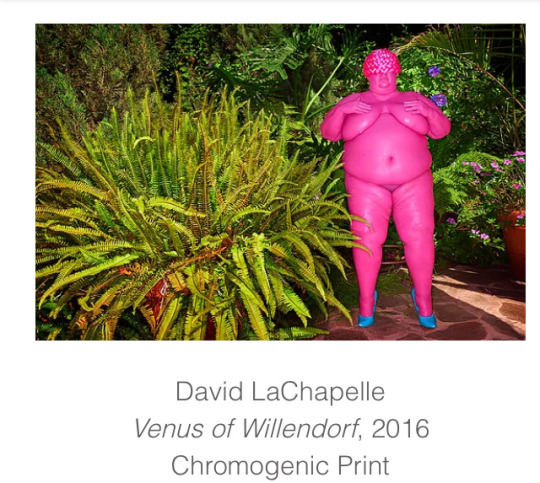
David LaChapelle

David Chapelle attended high school at North Carolina School of Arts. Originally erolled as a painting, David began to experiment in the medium of photography developing an analogue technique of hand-painting his own negatives to achieve a sublime spectrum of colour before processing his film.
At the age of 17, LaChapelle moved to New York City, following his first photography show at Gallery 303 where he was hired by Andy Warhol to work at Interview Magazine. David began to expand the vernacular of photography. His staged tableau, portrait and still life work challenged devices of traditional photography interest. By 1991, The New York Times predicted ‘LaChapelle is certain to influence the work of a new generation...in the same way that Mr. Avedon pioneered so much of what is familiar today.’
In the decades since, David has become one of the most published photographers throughout the world with an anthology of books including LaChapelle Land (1996), Hotel LaChapelle (1999), Heaven to Hell (2006), Lost & Found and Good News (2017). Simultaneously, his work has expanded into music videos, films and stage projects. His 2005 feature film, Rize was released theatrically in 17 different countries.
This are his most recent independent pieces.


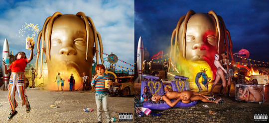
I’m actually very familiar with an album cover he lensed for Travis Scott. David worked with Travis to create the iconic Astroworld album cover.
These are a few other collaborations he’s done with other celebrities and brands.


0 notes
Text
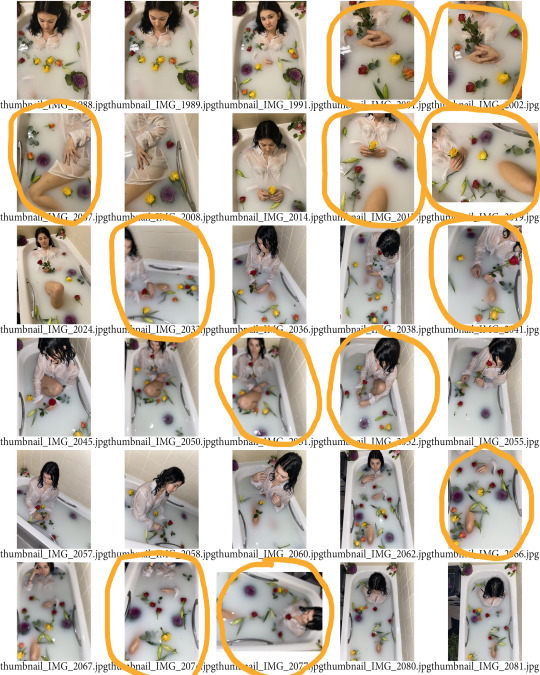
Contact sheets from offsite shoots
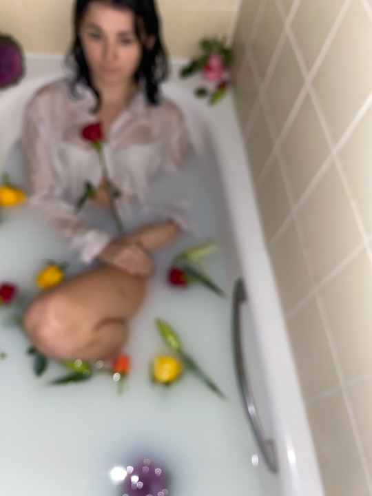
These are all my images from two separate offsite shoots I organised. The first one is my milk bath idea that I’m so happy I was able to bring to life. I used my sister for this idea. I had a few poses to reference but after a while I just let her do whatever made her feel comfortable. Also after a while I turned the bathroom lights off and put the phone flash one to see what type of lighting it would create for the images. In the contact sheet I did this after the 11th image and it made a big difference. Some angles were hard to get because of the position of our bath but I managed to get some I was happy with.
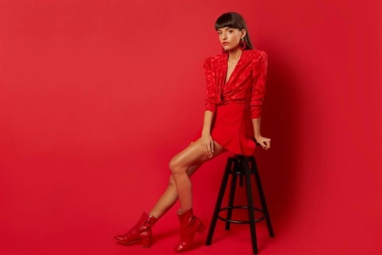
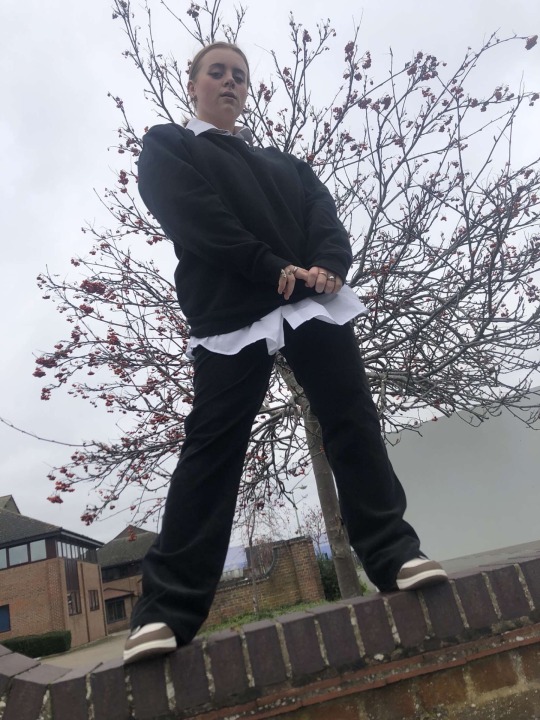
The other set of photos are mainly fashion/styling based shoot with a friend of mine. Before meeting up I picked the three different outfits I wanted her to wear. We walked all over town for different locations to take photos. We messed around with a lot of poses for her to do and they all worked well. The outfit I liked the most was the big puffer jacket with the black jumper and white shirt underneath. I think it really worked well with the theme and the background of the image.

0 notes
Text
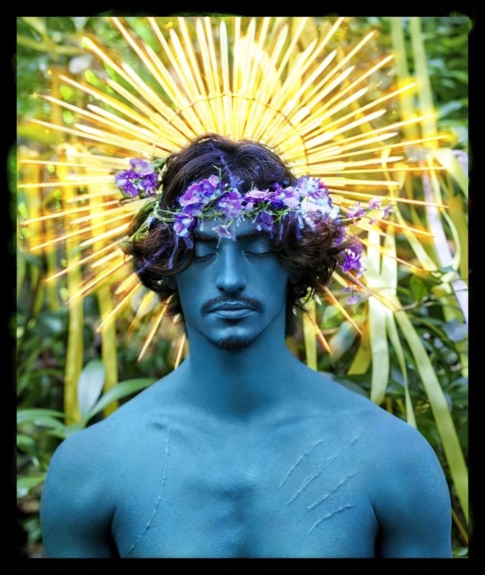
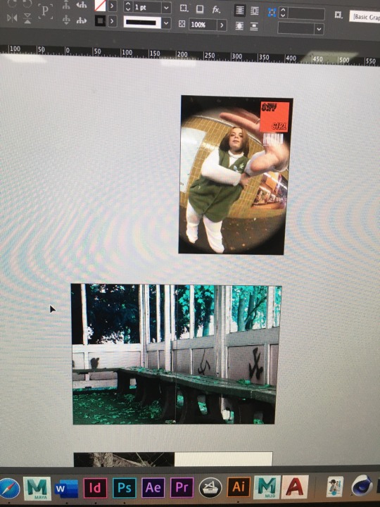
Different logo ideas.
I knew when told we had to create a logo that I wanted something that stands out, I also knew when I looked at this photo again that I needed it as a front cover. I love both the hand positions and how this photo wasn’t serious, like we were just experimenting with poses and it came out as one of my favourite photos from that offsite shoot, a couple of weeks ago.
Out of all these colours, with this font, I prefer the pink. I think that it stands out much more than the red, white and black. I love this font. I’m not sure why but it gives me cowboy vibes and I really like it.
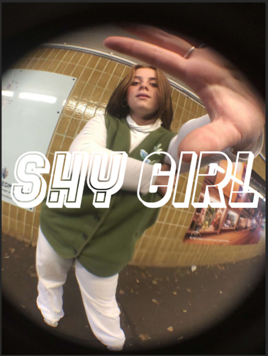


Like the other pink font this one below is really nice. I think the baby pink really compliments the black edges around the top, I like the star I added and the position of it on the photo, it’s not in the way of the image, which is obviously convenient.

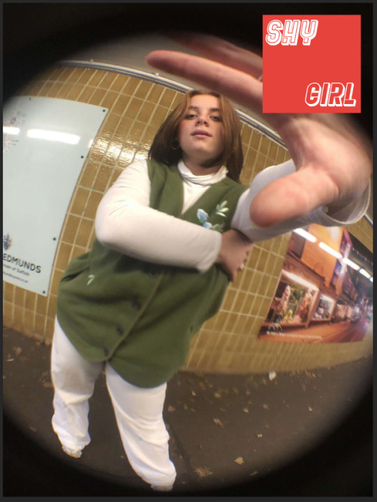
Half way through creating my logos and seeing how they looked on this photo, I decided I wanted to incorporate shapes into it in some way. I do like the white font on top of the red, but I felt there was something missing. It’s nice but it could be better, if that makes sense.
This is my overall outcome, I like the colours and black font and outline of the shape. I think the bar code makes it look way more professional. I love love love this front cover, I’m so proud of myself that I was able to produce something like this.
0 notes
Text
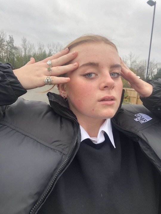
My favourite photos from two separate photos I’ve done during this offsite week.


0 notes
Text
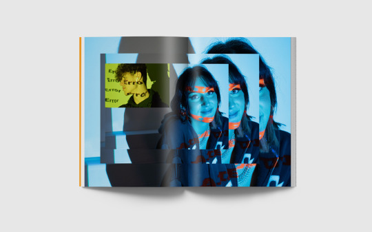
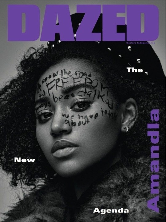
DAZED & CONFUSED
Dazed & Confused, now commonly known as Dazed, is a bi-monthly British alternative and culture style magazine launched in 1991 by Jefferson Hack and Rankin. It covers music, fashion, film, art and literature and became a lighting rod for cultural provocation and a movement, growing into the agenda - setting publishing powerhouse Dazed Media.
Today Dazed Magazine continues to champion radical fashion and youth culture, defining the times with a vanguard of next generation writers, stylists and image makers.
These are how the old covers were laid out. At one point they had an idea to have DAZED on the front and CONFUSED on the back, but confused was upside down and written on the opposite side of the page. Creators had half the entire magazine placed the right way around and the other half upside down and in an alternative style to the first half. I can’t find any examples online unfortunately. But I think this concept is amazing. It really puts them apart for other magazines.

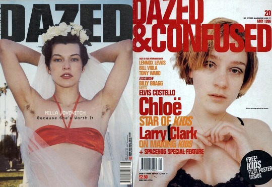
What I like about DAZED is that they change their title colour to contrast the aesthetic of the cover photo. These are the best that have caught my eye. I love how they’ve constrasted the colours of their outfits with the colour of the logo.


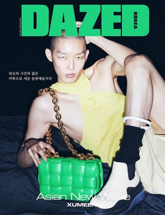

I think that Dazed is one of the most influential independent fashion and culture titles in the world. These are some covers that I really like


0 notes
Text
Steph Wilson
Steph Wilson is a photographer, videographer and in her free time- a painter based in Brixton, London.
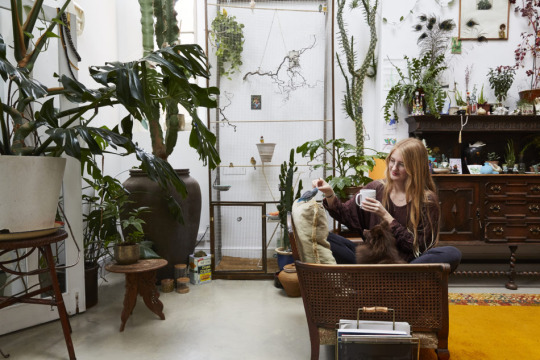
She has more than 600 plants in her old church studio. She’s fascinated by nature and animals and uses it as core inspiration for her work.
Clients and publications she’s collaborated with are Nike, Dazed & Confused, Mulberry, W Magazine, XL, Warner Music, Tiffany & Co, Vogue Italia, I-D, British Journal of Photography and many more.
A lot of the work she produces involves nudity and it’s because she likes to use that topic in photography to make fun of it. To make fun of the things that aren’t socially acceptable in this line of work. Her symbolic references are very bold.


2 notes
·
View notes

Text
Today’s Foiling lesson
The aim of today’s lesson was to produce a series of prints using foil techniques, to enhance our photos for our magazines. There are three different approaches we used for Foiling.
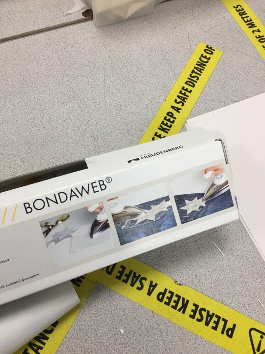
BONDA WEB is one I enjoyed using. It’s an iron on glue that produces accurate graphic shapes. When using BONDA WEB I cut out the letters of my magazine name and placed them onto my photo with the rough side of the paper facing down and the smooth side facing up. Then I used an iron to stick them in place. I removed the BONDA WEB paper to reveal the glue before using the foil.


When using the iron press to get the colour off the foil and onto the picture, the colour side of the foil must face upwards for it work. This (below) is an example of where I used BONDA WEB.

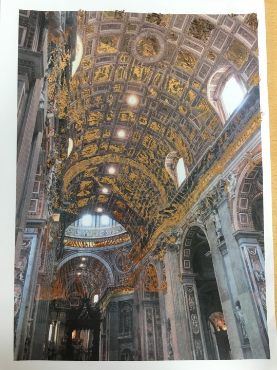
Brush on glue is the second way to foil and it’s considered the more “freer” approach. The glue must be fully dry before ironing on any foil. I got my inspiration from Gustav Klimt’s ‘Glistening Golden Phase’ work, with the portrait of Adele Bloch-Bauer’s 1. He used gold leaf and other coloured foil, using it to fill in the different shapes in the background. I decided it would be a nice way to fill in the background of the photo I took of a chapel in Rome. The picture has a lot of dark colours and I thought the copper coloured foil would really stand out against those dark colours. I think this is the best foiling technique for me and my best outcome from the lesson.
The third option to use for foiling was to photo copy your chosen photos and the foil would stick to the dark areas of the photo. I didn’t have time to do this technique but it seemed like a cool concept.
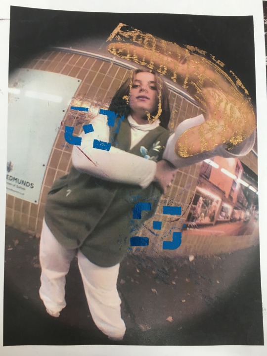
This photo below, was a mix of the glue and BINDA WEB technique. I like the copper covering the hand but I think the blue graphics ruin it.
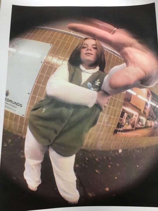
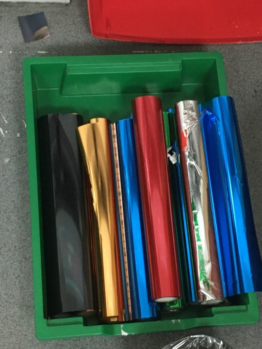
These are the original photos before I started foiling them, along with the different colour foils we could use.

0 notes
Text
Photoshoot On Tuesday we were given free reign to do any type of photo shoot we liked. I chose to go outside because I wanted to create a different vibe than the studio


0 notes