cilletje
comforting sounds
it's hard to make sense· just another sideblog ·
13438 posts
Don't wanna be here? Send us removal request.
Last Seen Blogs
twilighthooves
The Nerdiest Nerd of Them All
elektroskopik
Elektroskopic Punk

bryanherb
Gay Travel
bonesbearingssoc
Bones Bearings
franckruiz17
franck ruíz ☁️
Photo
Theme 03: Capricorn by @freddie-mercurys
Preview / Download
Features:
single column theme
top bar and pop-up navigation
adjustable post width and sizes
customizable font choice and sizes
dark mode button available
responsive for mobile and desktop devices
Credits:
base code - @seyche
icon fonts - phosphoricons
css photosets - @annasthms and @eggdesign
npf photoset fix - @glenthemes
custom audio player - @annasthms
dark mode button inspired by @altindie
tippy.js tooltips - atomiks
fade in effect - cory laviska
remove tumblr redirects - @magnusthemes
responsive iframes - @nouvae
smooth scroll - gblazex
custom like and reblog button inspired by @shythemes
time-ago plugin - @bychloethemes
Please do not remove credit or steal parts of this code. Please message me if you have questions or encounter problems with this theme.
413 notes
·
View notes

Text
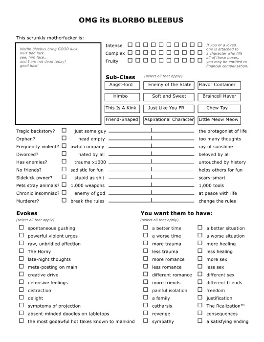
i made a character sheet. free to use as you wish, feel free to change whatever you want XD open source ass thing. spent all of ~maybe an hour on it.
Credit: the text in the insert-image box comes from this video, and the text for the top three lines (intense, complex, fruity) comes from this post. The actual image was made with the free NBOS character sheet creator, which is a sort of dated but free and solid text-layout sheet maker intended for ttrpg style character sheet creation.
41K notes
·
View notes
Text
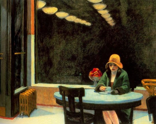
girls and the inherent loneliness they have felt all their lives
6K notes
·
View notes
Photo
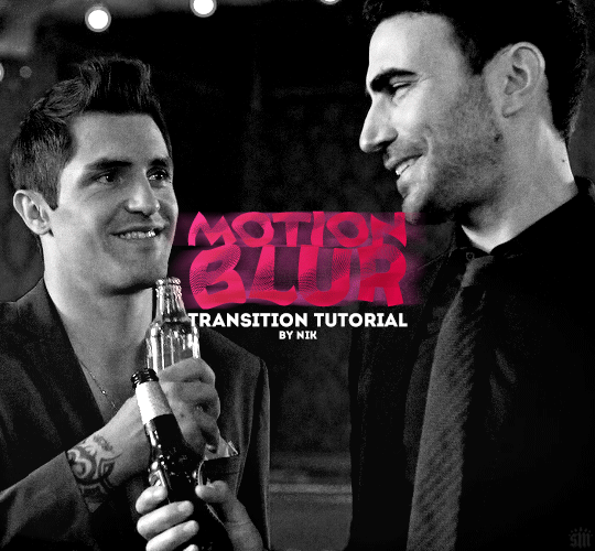
HOW TO: Do a Motion Blur Transition
Using Timeline or Frame Animation
Hi! Someone asked me for a tutorial on the transition effect in the second gif of this set (also featured in this set and the text on this set). So, here it is! This is one of the easiest and least tedious of the gif transition effects in my opinion — and I’m going to go over how to do it both in Timeline and Frame Animation (using the screencap method). Disclaimer: This tutorial assumes you have a basic understanding of gif-making in Photoshop.

Keep reading
762 notes
·
View notes
Text

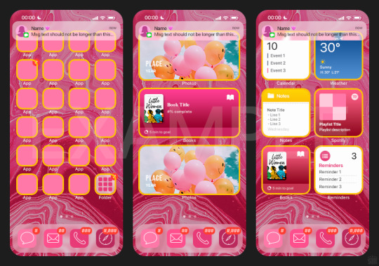
HOW TO: Make an iPhone Layout
+ Downloadable Template
Hi! I've gotten a few messages asking for a tutorial on my iPhone gifsets — but instead of only doing a tutorial (that would probably be triple the length this one already is), I decided to turn my layout into a template with all the bits and bobs! In the "tutorial" under the cut, I'll share everything you'll need, a free template download, and quickly go over how to use this template. :)
Disclaimer: This template uses Video Timeline and this tutorial assumes you have a basic to intermediate understanding of Photoshop.

PHASE 1: THE ASSETS
1.1 – Download fonts. These are the fonts used for all assets I've included in my template:
– SF Pro or SF Pro Display (Regular, Medium, Bold): Either version works, they look nearly identical. You can download directly from https://developer.apple.com/fonts/ or easily find it via Google
– Bebas Neue: Free on Google Fonts, Adobe Fonts, and dafont
– Times New Roman (Bold): Should be a default font in Photoshop

Make sure to download and install any of the fonts you don't already have before opening my template. That way, once you open the template file, all the settings (font size, weight, spacing, color, opacity, etc.) are as intended.
1.2 – Download my template.
Before you use my template, all I ask is that you don't claim or redistribute it as your own and that you give me proper credit in the caption of your post. Making these iPhone gifsets takes me a longgg time and turning this layout into a template took several hours too.
DOWNLOAD TEMPLATE VIA KO-FI ← This template is completely free to download (just enter $0), but if you feel inclined to tip me, I appreciate you! 💖
BTW this template also includes some of my frequently used icons!
NOTE: If, for some reason, you open the template and see the pop-up shown below, click "NO" — otherwise, the fonts will be all messed up:
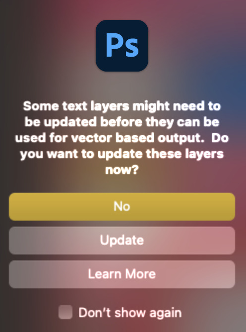
And if you see this triangle with an exclamation point by a text layer, don't double-click it — it'll mess up the font as well:

PHASE 2: THE GIFS
I'm just going to briefly go over gif sizes and my recommendations. Also, keep in mind when grabbing your scenes, you'll want all of these gifs to be the same amount of frames.
2.1 – Background Gif: 540 x 540 px.
I recommend this size so you have a good amount of visibility for the gif behind the iPhone wallpaper. I also recommend making this black and white (or in my case, black and white with a slight blue tint — idk I just like the way it looks) so the wallpaper coloring can stand out.
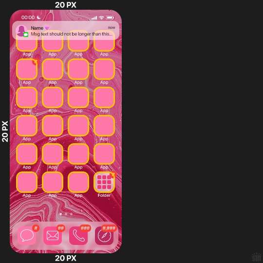
2.2 – Wallpaper Gif: 230 (w) x 500 (h) px.
Keep in mind the very narrow dimensions of the wallpaper! And also keep in mind that you'll have a bunch of apps and widgets covering the image. I try to use wide shots (or layer my clips into looking like wide shots). Also, keep in mind your color scheme for your set and your character's aesthetic! I tend to focus on one or two colors for the wallpaper.
I usually position the wallpaper to the side with 20px bumpers, so there's lots of space to see the background:
2.3 – Large Photo Widget Gif: 201 (w) x 96 (h) px.
2.4 – Small Photo Widget Gif: 94 x 94 px.
PHASE 3: THE TEMPLATE – "IPHONE" FOLDER
In this section, I'll try to quickly walk you through how to use this template and some bits that may require extra instructions. I'll be going through each folder from top to bottom.
3.1 – Status Bar.
Time, Service, and WiFi are pretty self-explanatory. In the Battery folder, you can use the shape tool to adjust the shape layers labeled "Fill (Adjustable Shape!)" to customize the battery level.
3.2 – Message Notification.
Again, these are pretty self-explanatory. I've already masked the circle for the contact photo, so you can simply import any photo and use the transform tool to shrink it down. The circle is 24x24 px. If you don't want to use a photo, there's another folder called Default Initials.
If your message text can't fit the text box, the message should end with ellipses which is how iOS caps off long texts.
3.3 – Blurred Banner (IMPORTANT)
This folder is easy to miss because there's only one placeholder layer in there. On iPhones, the area behind a banner notification and the dock get blurred (including the wallpaper and any apps).
What to do: Make a duplicate of the apps in Row 1 and/or widgets that intersect the message banner, convert them all into one smart object, apply a Gaussian Blur filter (Radius: 3.0 pixels) on the smart object, and move the smart object into this masked folder!
(There's another masked folder in the Wallpaper folder for the dock which I'll go over in that section.)
3.4 – Apps
Turn off the yellow guide if you don't need it to keep things aligned and turn off layers you don't need by clicking the eye icon. Replace the "App" placeholder text with your app name, change the color or gradient of the square to compliment your color scheme, and add your custom app icon overlay!
If you can't find an app icon you need from the ones I provided, flaticon.com is a great resource. Also, if you can only find the filled version of an icon, check out this tutorial for how to make any text or shape into an outline.
Also, each app folder has 4 notification bubble options (1-4 digits). Again, you can toggle these on and off as you need!
3.5 – Big Widgets
I like using these when my wallpaper has A LOT of negative space to fill. I included the Photos and Books widgets in my template, but there are lots of widgets available on iPhones. You can check some of the other ones I've done here, or if you have an iPhone, simply try adding some widgets to your phone!
There are also widgets bigger than these, but they would take up half of the phone screen which is why I don't use them for these edits.
3.6 – Small Widgets
The only thing I'll say about these — because they're pretty straight forward — is there are a lot more weather themes than I included in my template. Also, if you set your character's phone to evening, the weather widget will show a dark background (sometimes with stars), so keep that in mind.
Speaking of, I've included Light Modes and Dark Modes for, I think, every applicable widget.
3.7 – Page Dots
These barely perceptible dots indicate that your character has more pages of apps than shown in your gifset (so if an anon tries to come at you, you can just say "it's on the next page of apps" /j /lh)
3.8 – Dock
Again, the dock has notification bubble options and I've included the default app designs, custom filled designs, and custom outlined designs for iMessage, Phone, Email, and Safari (there's also a FaceTime alternative if that's how your character rolls). These are usually the apps people keep in their Dock, but this is fully customizable too. So, if your character is, like, super obsessed with Candy Crush or something and needs it in thumb's reach — you can put it in the dock.
3.9 – Wallpaper
This whole folder is masked already to a 230x500 px rounded rectangle.
Inside, you'll find another "Blurred Portion" folder for the area behind the message banner notification and the dock.
What to do: Duplicate your gif layer and place it in this folder, remove any sharpening filters, and apply a Gaussian Blur filter (Radius: 3.0 px). Be sure to add any coloring/adjustment layers ABOVE this folder and your original sharpened gif layer.
PHASE 4: EXPORT
We made it!
I hope this template makes it super easy for you to recreate this layout! If you decide to try it out, feel free to tag me with #usernik.
If you notice anything wonky about the template, kindly let me know so I can fix it! And if you have any questions about how to use this template, please don't hesitate to send me a message! I just ask that you try to be specific in your question so I'm able to answer you the best I can!
752 notes
·
View notes
Text
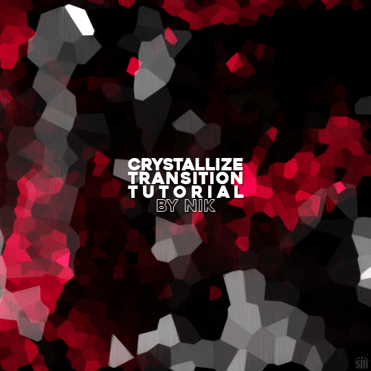
HOW TO: Do A Crystallize Gif Transition
Hi! I was asked to explain how I did the transition effect in this gifset, so here's a quick tutorial! Disclaimer: This tutorial assumes you have an intermediate understanding of gif-making in Photoshop using Video Timeline and requires the use of keyframes.

PHASE 1: THE GIFS
1.1 – Determine how many frames you need.
Since you need at least 2 scenes for a transition, consider limiting the amount of frames you'll use per scene. For a transition between 2 scenes that's 540x540px, I would recommend no more than 30 frames per scene (for a final gif that's 60 frames). Even that may be pushing it depending on your coloring. Just be sure to consider the dimensions and colors of your gifs in relation to the amount of frames to keep your final gif under Tumblr's 10MB limit.
1.2 – Import frames, crop, resize, convert to smart object for Video Timeline, color, blend, etc.
Do this as you normally would! If you need a tutorial for the basics, here's my tutorial. :) Please note, the methods in this tutorial only work with gifs that are converted into smart objects in the Video Timeline workspace.
Tip A: I recommend using scenes where there's a lot of one color (or scenes where you can manipulate it to look like that). The crystallize filter on a gif creates A LOT of movement that can feel a bit chaotic. Having your gif be primarily one color reduces the eye strain a bit imo.
Tip B: I like how this effect looks with blended scenes because it allows me to use different "crystal" sizes (more on this in Step 2.2). Check out the USERGIF Resource Directory for plenty of blending tutorials!
1.3 – Move all your gifs into one document, group into folders, and arrange.
Once everything's in one doc, keep everything organized in a group folder! I have just two scenes, so that's Folder 1 & 2. Within those folders are the gifs I blended, which I labeled by gif color. Then, simply drag Folder 2 so it continues right after Folder 1. (Make sure none of your adjustment layers from Folder 2 accidentally affect Folder 1! You can do this by clipping your adjustment layers to match the length of the gif as I did, or using clipping masks.)
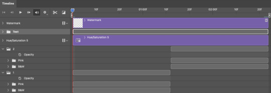
(Ignore that lone Hue/Saturation layer lol. I decided last-minute that I wanted my gif to lean more pink than red.)
PHASE 2: THE FILTERS
2.1 – Duplicate each scene.
We're going to use opacity keyframe animations on these duplicated scenes that allow it to go from "normal" to "effect" and vice versa. The filters will only be applied to the duplicates. In the screenshot below, all of my duplicates are highlighted:

2.2 – Apply the Crystallize Filter.
Above your sharpening settings, apply this filter by going to Filter → Pixelate → Crystallize. On the pink gifs, I made the crystals bigger (cell size: 45), and on the black and white gifs, I did a cell size of 25.
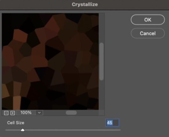
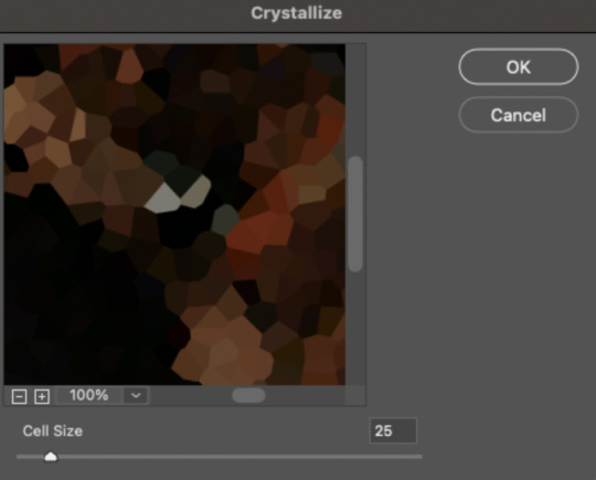
The different sizes help break up the uniformity of the crystals imo, creating more of a mosaic-like look, which is what I wanted to match my gifset concept.
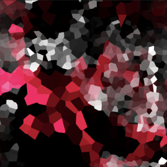
2.3 – Apply the Oil Paint Filter (Optional).
Filter > Stylize > Oil Paint. Here are my settings (they're the same for both crystal cell sizes):
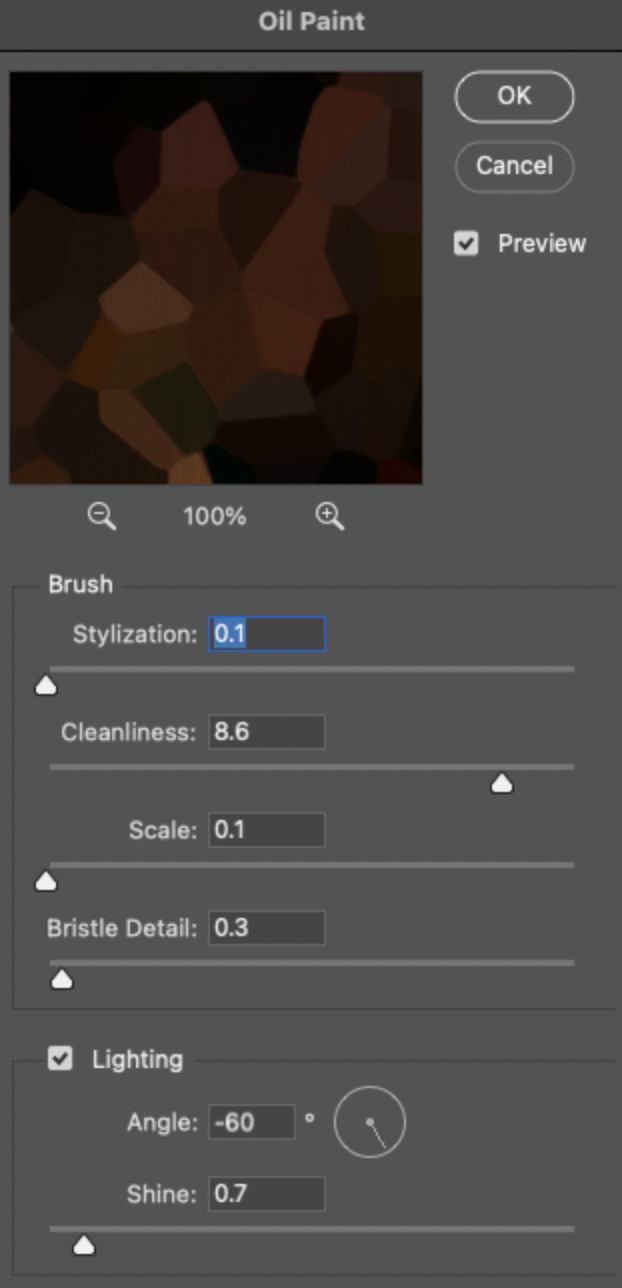
Brush – Stylization: 0.1, Cleanliness: 8.6, Scale: 0.1, Bristle Detail: 0.3
Lighting – Angle: -60, Shine: 0.7
This filter helps soften the cells a bit while adding some texture (left: no oil paint; right: with oil paint):

2.4 – Repeat steps 2.2 & 2.3 on all duplicated scenes.
PHASE 3: THE KEYFRAMES
3.1 – Add opacity keyframes.
The very start and end of each scene needs an opacity keyframe set to 100% opacity. Move 0.09 seconds from each of those points, and place another opacity keyframe, this time set to 0% opacity. We're basically making the crystals fade in and out. Please reference the screenshot below for keyframe placement:

If you need more info on opacity keyframes, check out Phase 2 from this fade transition tutorial I did on usergif.
3.2 – Repeat step 3.1 on all duplicated scenes.
All the keyframes in Folder 1 should line up exactly and all the keyframes in Folder 2 should line up exactly!
PHASE 4: THE DUPLICATES
4.1 – Convert back to Frame Animation.
If you're not sure how to do this, I've written out the steps here. I rec the action linked in my general gif tutorial which I shared earlier!
4.2 – Delete duplicate frames.
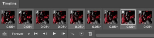
Whenever you use keyframe animations, you'll get duplicate frames. That's just how it works, unfortunately. If you follow my steps exactly (specifically the 0.09-second spacing, which follows my tried-and-true 0.03-second rule), you'll have a total of 12 duplicate frames exactly — 3 duplicates per keyframe section. Just manually delete them! You can spot the duplicates by eye, but with this spacing, it's usually the 2nd, 5th, and 8th frame for each transition section. The selected frames below were my duplicates:
If you want to learn more about why there are duplicates and the math behind it all, I explained it in more detail in this ask.
4.3 – Export and you're done!
I hope this tutorial helps! Let me know if you have any questions :)
273 notes
·
View notes
Text
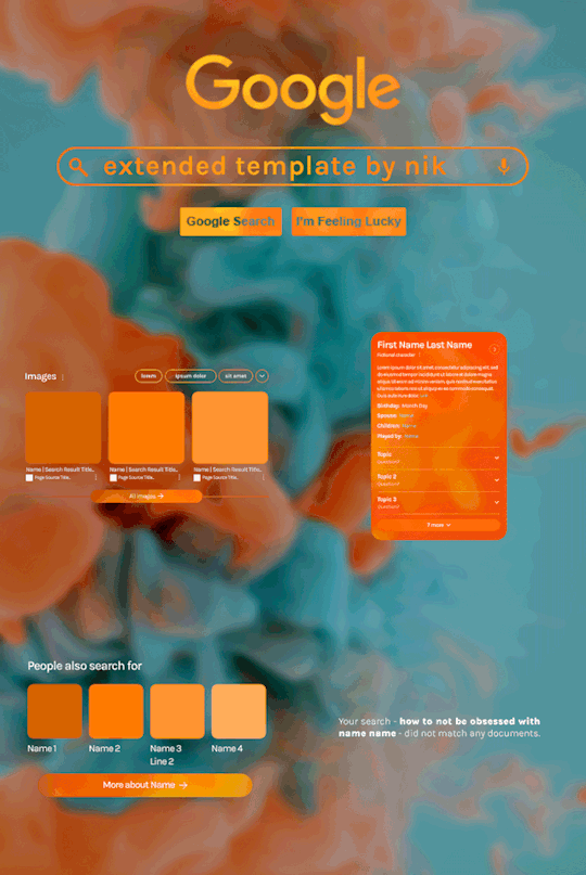
Hi! I've been asked for a tutorial on my new Google layout, originally seen here and here. So, to make it easy, here are FOUR free templates! All I ask is that you give me proper credit in your caption if you use my template or take inspo from my design. Enjoy! :)
Get the NEW Google templates free via ko-fi! (Donations appreciated but not required <3) Includes PSD templates with pre-made layer masks, shapes, and animations, plus tips for the following designs:
– Image search results
– Biography
– Related searches
– Animated "no search results"
Additional resources:
– My original animated Google search overlay tutorial & template
– Karla Google Font (this is the only font used)
– Background via Unsplash

446 notes
·
View notes
Text
i'm trying rly hard to be not in a bad mood but some things in this world and my life are kind of bad
712 notes
·
View notes
Text
i love morning time on tumblr its like we are the only ppl awake in a big house downstairs in the kitchen
61K notes
·
View notes
Text
it’s so insane we have to just keep showing up for work. no matter what is happening globally, locally, personally, you’re supposed to show up and act like the formatting on a report is actually really important and demands your attention.
25K notes
·
View notes
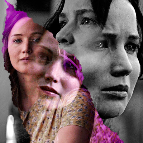
Note
hi, your latest edit for thgweek24 is absulutely stunning and i thought if i can ask if you can make a tutorial about the ripped gifs/paper effect? if not, that's okay! have a nice day <3
RIPPED PAPER EFFECT TUTORIAL
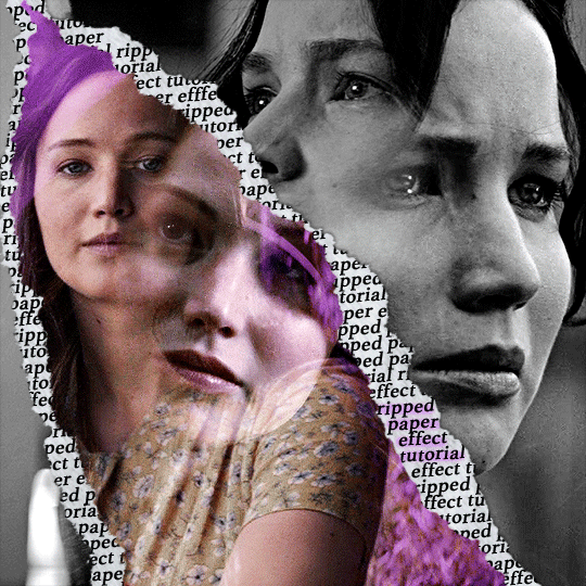
hi! thank u :D (thgweek set referenced)
below the cut are the steps that i took to create this effect. this tutorial is very screenshot heavy and assumes some basic knowledge of photoshop and giffing.
i do my best to try and explain my process so hopefully this is helpful! if you have any questions, please don't hesitate to ask.
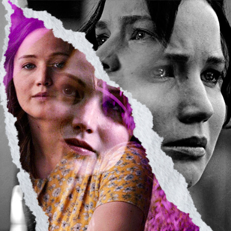
STEP 1: Choose and arrange your two gifs
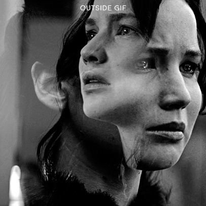
with this specific use of the ripped paper effect, there's one gif on the "outside" of the rip and one on the "inside." in this example, the outside is the b&w and the inside gif is the colored:
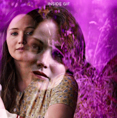
for me, the outside gif determined the positioning of the inside gif and the position/direction of the rip. as can be seen, outside gif has a lot of space on the left. therefore, i knew i was going to position the subject of the inside gif more on the right so i could create the rip without hiding too much of the b&w gif.
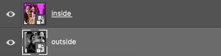
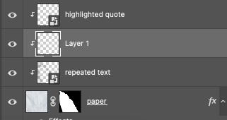
next, you want to arrange the inside gif on TOP of the outside gif. your layers panel should look like this:
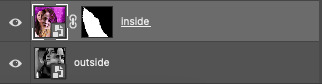
STEP 2: Creating the ripped effect
here comes the fun part! in order to create this effect, you're going to need torn paper brushes. here and here are some packs you can download (w credit to owner).
next, create a layer mask on your inside gif. you're going to use the brush of your choosing as an ERASER. then, you can play around with the size and angle of the eraser to create the look you want. this is what the gif and the layers panel now look like:
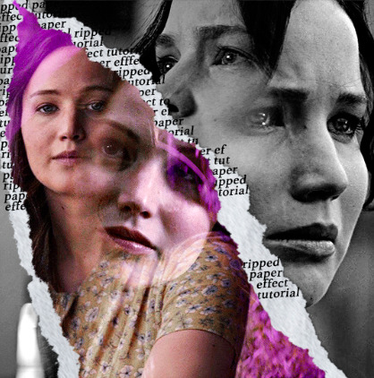
STEP 3: Adding the paper
in order to add the paper around the edges of the inside gif (where the text goes), you now need to download a paper texture. i found mine on google by searching "paper texture png."
place the paper png IN BETWEEN your outside and your inside gif. this is what everything should look like:
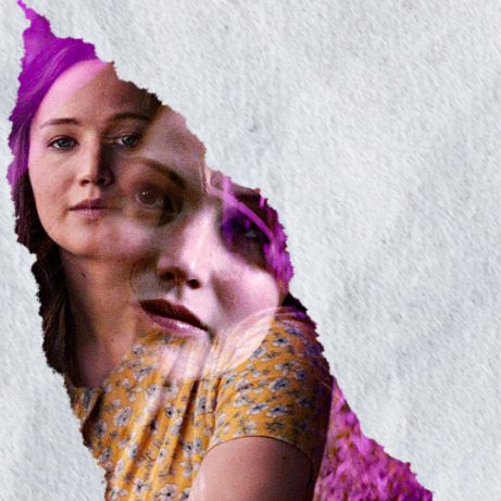
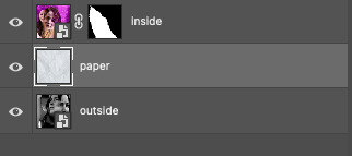
now, similarly to what you did in the previous step with the inside gif, you are going to create a layer mask on the paper layer. using an torn paper brush as an eraser, you will erase the paper, creating the shape you want.
be sure to leave enough room for whatever text you want to be on the paper. also, i suggest making the rips of the paper different from the rips of the inside gif so it looks more organic.
here is what my gif looks like after erasing the paper:
optional: add a drop shadow on the paper layer (right click -> blending options... -> drop shadow)
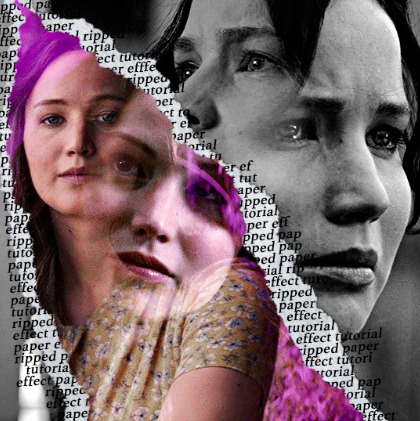
STEP 4: Adding the text
first, you want to identify the space where you will have room to place your full quote within the paper. if there are no spaces, you can always use your brush/eraser to modify the layer masks.

next, add a layer on top of the paper layer (and below the inside gif). select the text tool and start typing your repeated text!
because you can see which text is hidden by the inside gif and what is on top of the paper, a shortcut i use is the "tab" button and only type words that will be seen.
type the repeated words around the quote you want highlighted:
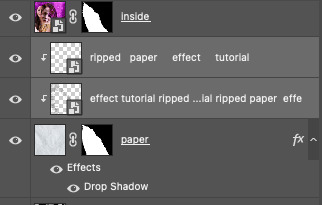
now, in order to contain the text within the paper, convert the text layers into smart objects. then, create a clipping mask on both layers (right click –> create clipping mask). this is what your layer panels should look like:
with that, your gif should now look something like this, with the text contained inside the paper:
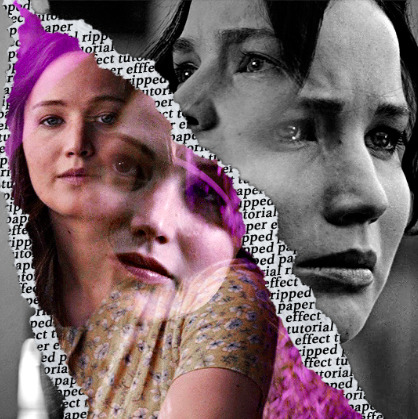
STEP 5: Highlighting the quote
as you can see, it just looked like a bunch of words. so, in order to highlight the quote you carved out in the previous step, add a new layer below the layer of the quote you want highlighted:
now, use a round brush (softness around 10-15% and opacity at 70-80%) with the color of your choice to highlight the words you want.
and there you have it!
i hope that this made sense and was helpful! if you have any questions or clarifications, please don't hesitate to ask :)
144 notes
·
View notes