cinespring15
Cinematography S2015
Instructor: Jun Oshima
152 posts
Don't wanna be here? Send us removal request.
Last Seen Blogs

juvellianthebee
Juvel 🍉
occaisional-chunkens
CHINKINS

lie--ame
Lee's random stuff

onemillyyun
Onemillyyun
swagaquarius
reign
Video
youtube
Here is a more experimental video I made for another class implementing some of the lighting skills I’ve learned. It does have some technical difficulties.
0 notes
Video
youtube
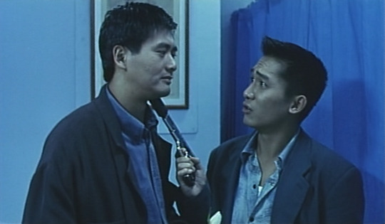
I was Inspired by the colors in John Woo’s movie “Hardboiled. I used a blue filter, and messed around with the levels and contrast.
0 notes
Photo

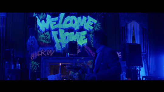
While many aspects of The Game‘s visual aesthetic seem commonplace for Fincher (desaturated colors, prevalent dimness) The Game might also be his most visually distinguished film since Alien 3; the movie makes surprising use of color in one particular scene.
Surprising is the key-word. Everything up to this climactic moment in the film has been handled with Fincher’s moody restraint, then suddenly, as the protagonist enters his room to find it vandalized, the entire visual aesthetic seems almost inverted. The sequence is appropriately dim, but is marked by extremely vivid colors.
This is new territory for the protagonist, he begins understand that the rules have changed for his situation; and so do we, the audience through, this unexpected lighting que.
0 notes
Photo

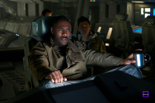
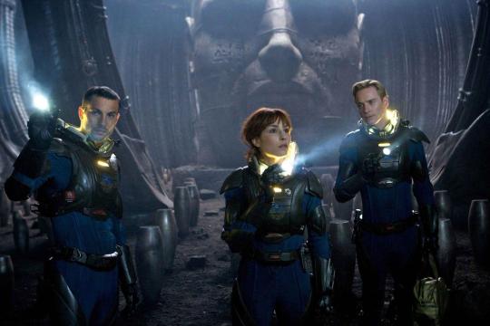

While a lot of academic conversation and Hollywood gossip is devoted to the mythos that Ridley Scott meticulously plans the visual execution his films, people seem to ignore how much of an actor’s director he can be at times. While some actors have famously bashed his direction on set (namely Harrison Ford on the set of Blade Runner), many others have praised the freedom he gives his actors, often allowing them to develop their characters beyond the screenplay, and allowing them the use of improvisation.
The integrated lighting of Prometheus reflects this aesthetic; often lighting is incorporated directly into the props and costumes, like the helmets the actor’s wear and the computer monitors throughout the picture, allowing actors to move around the set and act free of complex marking.
Additionally much of the lighting, while quiet moody, is provided by blanketing the set in consistent fill-glow. A technique not dissimilar to High Fidelity’s manner of cinematography, which also freed up actors’ performances.
1 note
·
View note
Photo

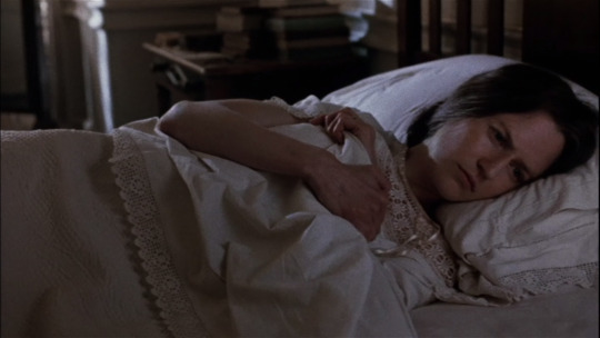

As discussed before, one of the most distinctive elements in The Hours cinematography is the use of different colors to distinguish the three different eras. Each color is not only an indicative of who’s story we are seeing at the moment, but they also makes sense within the narrative. Warm colors for suburban live of Laura Brown, colder colors for Clarissa Vaughan in New York City and greens for the countryside were Virginia Woolf is. Each color selection matches the settings.
While the color palette is meant to make a distention between the different stories, camera movement and composition are used to emphasize their underlying connection. For example, the film introduces its main characters the same way. There is a pan to the right and that ends showing the character lying in the right side of bed.
Camera movement is very prominent in the story and gives the sense of now only moving through spaces but also moving through time.
0 notes
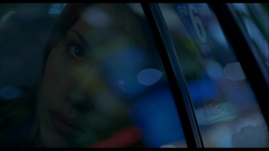
Photo

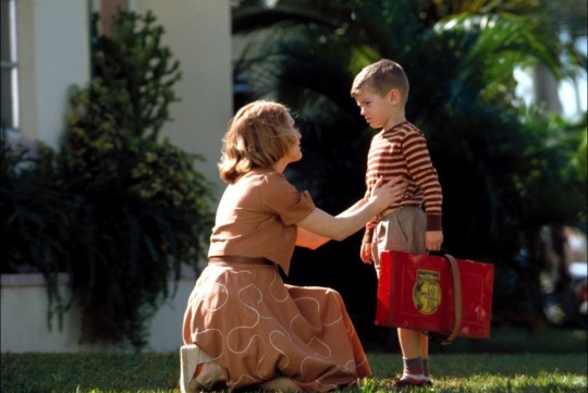
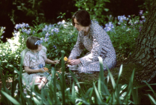
The Hours effectively uses color and light to convey the 3 distinct time periods in the film.
The contemporary story in new york, uses blues and greys to show the heartbreaking pain and solitude felt by Richard. As an artist he has a deeper understanding of the world and I feel that this portrait photo depicts that insight perfectly. I really like the the natural key light used in his face, brings out a deep emotion connection he has to the world.
The warm colours in 1960s LA, juxtaposes well the happy and perfect American dream with the quiet internal torment of Mrs. Brown, who gives the impression that everything is fine. Warm lighting is used in this era again to convey what a warm happy family is supposed to look like.
The happy and beautiful greens and purple of foral England in the 1940s is also used to contrast Virgina Wolf’s internal torment. Soft light is used to reflect the gentleness of the English landscape where Wolf resides.
0 notes

Video
youtube
This is inspired by colours in lost in translation. Mostly blue, but some night lights adding hint of reds/purples. etc.
0 notes


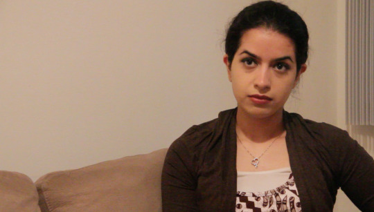

Video
youtube
Talking head Interview Aisha
0 notes
