clousiart
LOVE HONEY
Art Blog.
REQUESTS ARE OPEN
170 posts
Don't wanna be here? Send us removal request.
Last Seen Blogs

smason041
Untitled

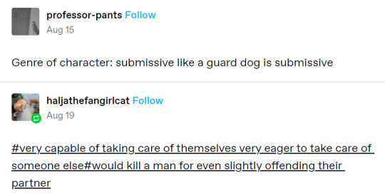
unbreakable-and-unchanged
Still standing after all these years.

labbromancer-blog
Brucies Lab
yeris
prev. lucybaird

tsunekoshi
tsuneko
Text
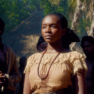
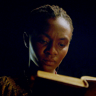

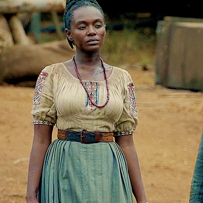
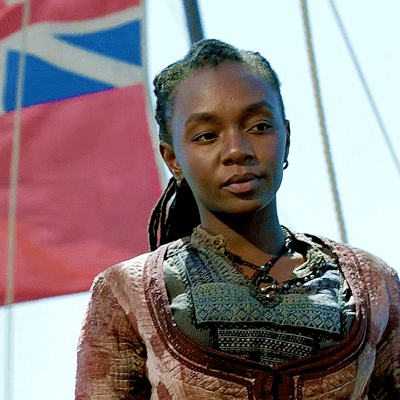
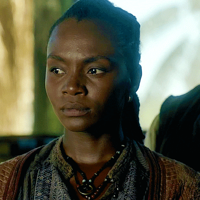
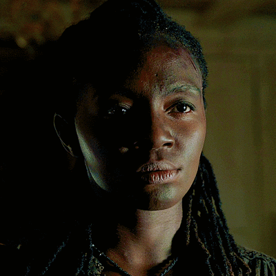

Black Sails Anniversary Week
Day 3: Favourite Character - Madi
"When I speak, my men listen, and they do what I say."
348 notes
·
View notes
Note
Your designs are pretty sick🔥
What advice would you give to a beginner in character design?
Thank you! My advice is based on my personal experience and thought process. Theyre not rules.
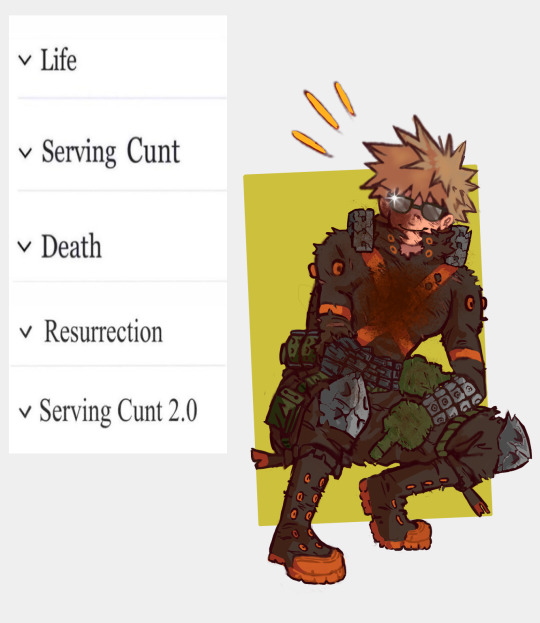
ADVICE FOR CHARACTER DESIGN;
-Stay honest to yourself: Drawing what you believe is popular might be the path to a lot of likes but not to a uniquely recognizable body of work. Draw what you want to see in the world. Draw the character you wish existed but can't find anywhere, because someone else wishes it too. I love what I design and you should love it as well. It also helps with the disappointment lack of likes might bring
-Concept over technique: Get your idea across. I'm around 60% satisfied with my current art technique but I push those insecurities aside because my desire to show my ideas surpasses it. If you have something to show, show it now. I've been drawing for years and I always feel like I'm not ''good enough'' to design what I want to design, but I have to push through. You will never feel fully ready, so might as well do it now.
-Focus: If you have an idea, focus on it and let the rest of the design highlight it. It makes your designs sharp and recognizable.
-Color: Careful! Don't restrict yourself but know that 2-4 colors are more than enough to make a design work. Sometimes it's the simplicity and contrast of your chosen colors that make it stand out
-Patterns: A little cheat to make your designs pop! If they feel too simple, add a pattern to a textile or a flat surface. Anything that fits the themes of the character. Careful! If you have a very detailed area that you wish to be the focus, try to avoid random patterns.
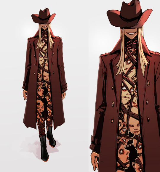
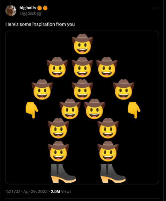
Here's an example.
Honesty: I'm not worried about how it looks nor who it is nor where the inspiration came from. It looks cool therefore it exists
Concept over technique: Scratchy lines, minimal rendering, rough details. As long as it's readable, it's passable
Focus: The concept was a bunch of heads stacked together to make a cowboy. Plus shoes. Everything else (the hair, the jacket, the face) are made to highlight the concept without stealing the attention from it
Color: Black, brown, yellow. Warm colors for a character in an arid enviroment.
Pattern: A pattern in THIS particular case would steal away from the focus of the stacked heads. No pattern needed here
I hope it helps!
Thanks and have fun in your character design journey!
605 notes
·
View notes


Text
"I beg your pardon, but are you asking me to believe that Anne killed eight men, risked her life, utterly destroyed both our reputations, to say nothing of the damage done to her relationship with me, to remove you from that tent, and that she did it all because she secretly wants to fuck you?"
[video description: Jack's monologue (transcribed above) cuts to a montage of Max scenes set to Bodak Yellow by Cardi B. /end description]
473 notes
·
View notes

Note
hello hi!!! grfhvhghr i am in love with your artwork so much you cant believe-- i wanna ask if you have any tips on how you lineart and colourpick?? no pressure to answer tho, have a great day/night!! again, love your art <33
hi!! thank you for your kind words!! since i got asked about these a lot, im answering this for all the other ask asking about lineart and colour tips too! You can see some previous post here.
also i could only give out tips that work for my drawing style - which is heavy lineart / colours pop up the line (believe it or not it's American comic book style. ppl cant understand why my art doesnt really look like usual anime/ Asian webtoon style, even though it is still clearly anime / Asian webtoon style, but when i told them it's because im drawing these by studying American comics, no one believes it either lmao.
i do study but i do my own things too, so most of my art inspo is really unexpected to ppl, but they r really where i learn things from, cuz i dont even go to art school TT_TT).
Changing the brush size will help you achieve thick/thin lines better without having to put pressure on your wrists. Keep your hold relaxed and let bigger brush size give you the thick strokes.
I like messy sketch, to me the sketch is just an outline shape to fill details in when i do the line, it also gives more freedom to wriggle as i draw! cuz i dont really plan out everything from the start, just wing it as i go, so a lot of my work is actually very spontaneous.
that leads to this point: when you do the lineart you should start deciding which colour style you want from it to adjust the details amount. the ink shadow blocks in my art aren't there randomly, i adjust them to best complement the shape language and colours.
for piece where i want the line/shadow to...idk hit (?), the colours are almost flat with textured brush adding depth to them, so the inking is the shading, thus there are more details in the lineart / ink blocks.
for the video above and piece like this where i want the colours to be clear and pop out, the use of ink blocks are minimized and i do the shading during colouring process. but! the ink blocks can still make some places pop very nicely! just use in moderation!
when doing the base it's good to keep the colour on the left side of the colour wheel (low saturation), but as you do shading and lighting, try to spread out evenly so it won't look washed out.
toggle around with hue and saturation slider as you go! the key is always adjusting! you're making hundreds of decisions at once, being conscious of your choice in why a line or a colour should be in a certain way will help improve your process a lot! (i think you can tell which art i turned off my brain and just draw for stress relief ........ which is also a valid way to draw and sometimes the result might surprise you! but for more serious stuffs i try to be aware of most of the move i make. it's problem solving, yeah?)
i find that one way to keep your art from appearing too...yellow in the end (which is sth that haunted my ass for a long while) is always aim for cold tone, so if you accidentally make it warm either way in the end it won't be too warm (and yellow :cry:)
well that's all the stuffs i can think on top of my head. sorry i can't give more advice on colour picking cuz it's sth i don't really know how to give advice on???? i think my colours now are still pretty lame haha........ if there are still any questions i'd gladly answer within my ability, though im very slow to answer ask ( i do read and be happy at all of them tho!)
293 notes
·
View notes
Text

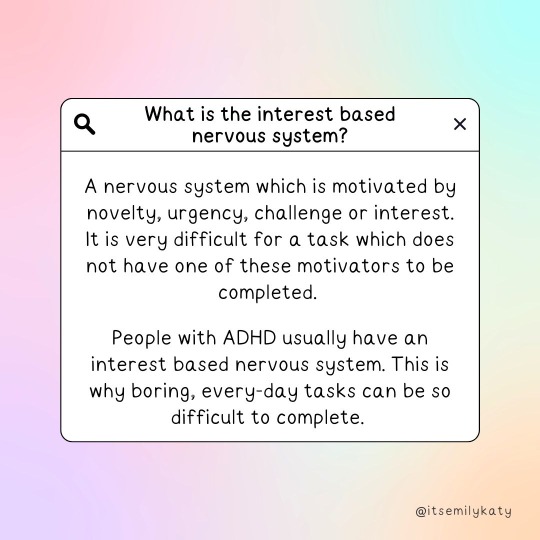
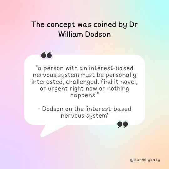
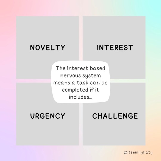
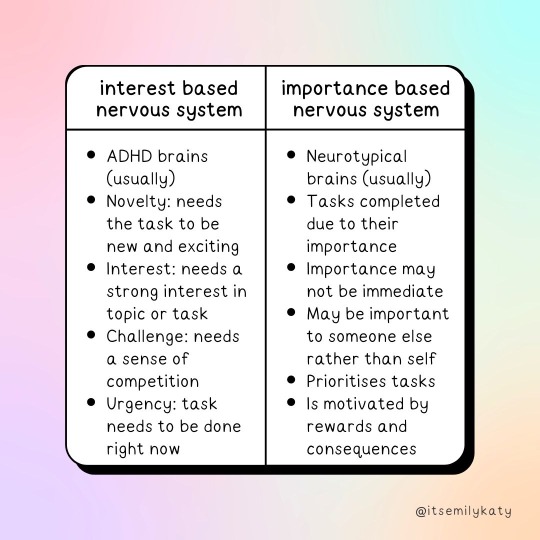

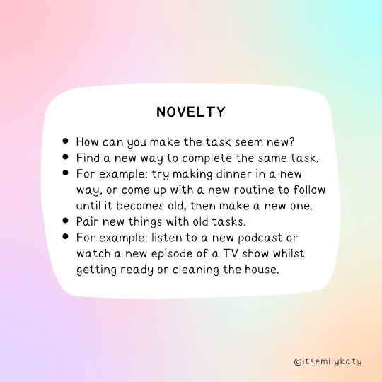
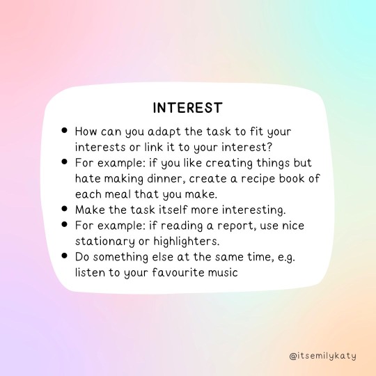
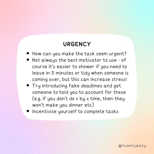
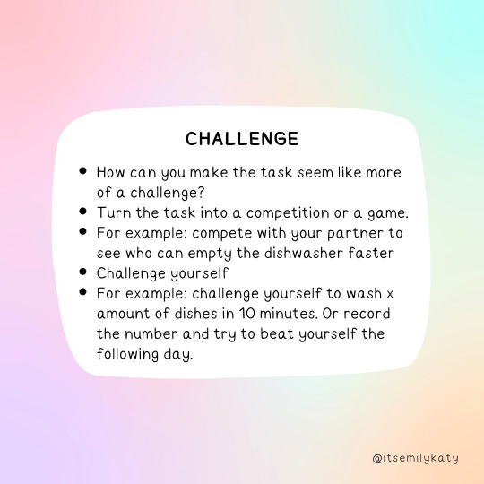
ADHD and the interest-based nervous system
by ItsEmilyKaty
Twitter | Instagram | Blog
#challenge one is the one that works for me lil#lol#a bit like lets win against that bitch from yesterday#the bitch from yesterday being me
354 notes
·
View notes
Note
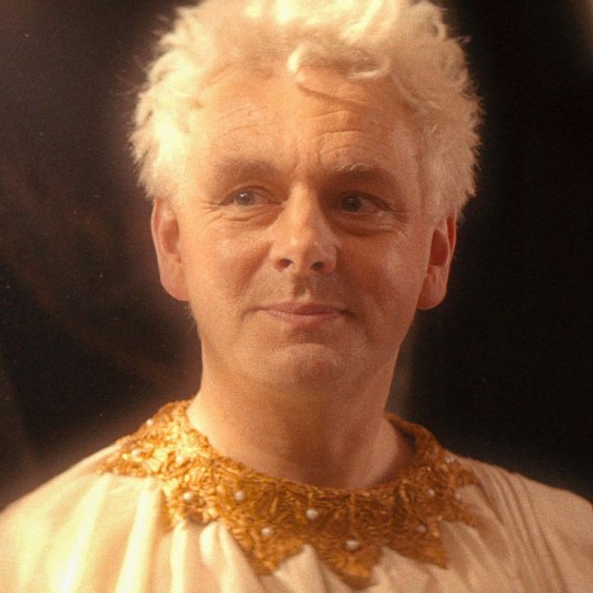
Hi! I noticed at the start of season 2 of good omens Crowley's wings are darker after he learns what is planned for the universe, is just my overthinking and shadows or a sort of sign of Crowley's "loss of faith"?
It's a thing we worked on very hard.
5K notes
·
View notes
Text


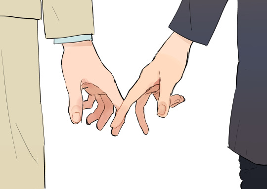
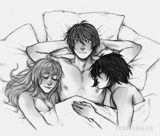
collection of posts for a very specific dynamic
130K notes
·
View notes
Text
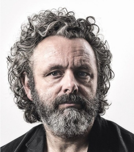
We always talk about how David Tennant manages to pull off the duality of Crowley's look (the switch from angel to demon) and generally change his entire appearance for the different roles he plays but me personally, I am just SO baffled at how they manage to turn Michael Sheen into Aziraphale

7K notes
·
View notes