demsgroup-blog
GROUP I
Brendon,Giuseppe,Ieva,Katarzyna,Lauren,Lottie,Tayla
84 posts
Don't wanna be here? Send us removal request.
Last Seen Blogs
ruubesz-draws
Procrastination
cannibal-stag
i think i’ll eat your heart

animeditsstuff
𝖆𝖓𝖎𝖒𝖊𝖉𝖎𝖙𝖘

englishlup1
Learn English Online - Free English cours
gmrstudios
the gmrstudios repository of doubt


Text
Display.
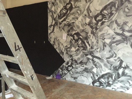
The wall paper was more of a challenge than we had anticipated. We came up with a solution.
Use mirrored shelving for those who needed and use black wall space for those who needed the wall. The out come of this was a lot better than we could have ever hoped for.
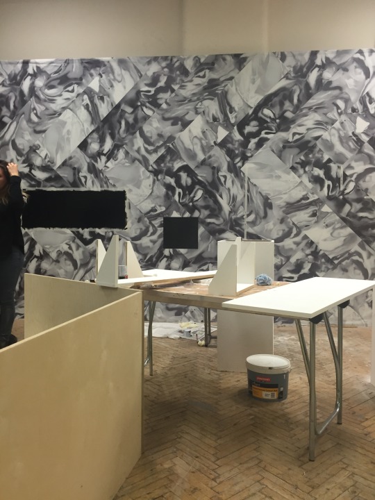

A final example of one of the shelfs being used.

Lauren.
0 notes
Text
Display.
As all the work approaches the end, we all needed to consider how the work was going to be displayed. The other two groups were slightly ahead so we needed to catch up. The running theme for all of us was technology. Incorporating technology as a theme for the display just seemed to gimmicky so we worked on creating something simple, much like the website and publication.
To display our work well we needed to evaluate the space we had, look at the light paths across the room and work out if we want our work on the walls or hanging. The building is difficult as it is listed which means very little can be done to the interior. From our meeting we made a plan.
Who needs what?
Lauren, Tayla, Kate - Shelf or plynth.
Tayla, Brendon, Giuseppe, Ieva- wall space.
We initially wanted to use the wall space which faces you when you enter. But after looking at the area and considering how much wall space we need, we needed to regroup and make another decision.

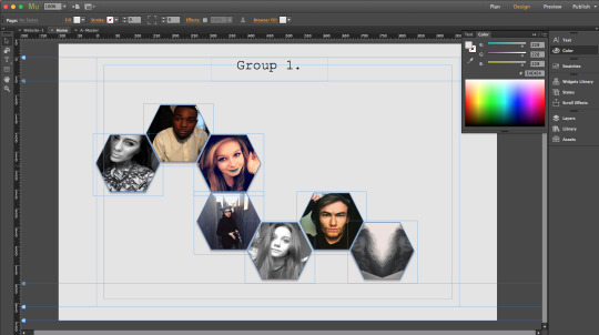
After speaking to the other groups we decided to use the wall space along the side of the room as shown. (Group 1) This space will be challenging as there is existing wall paper and black paint.

Lauren.
0 notes
Text
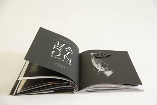
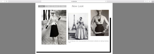
The Publication.
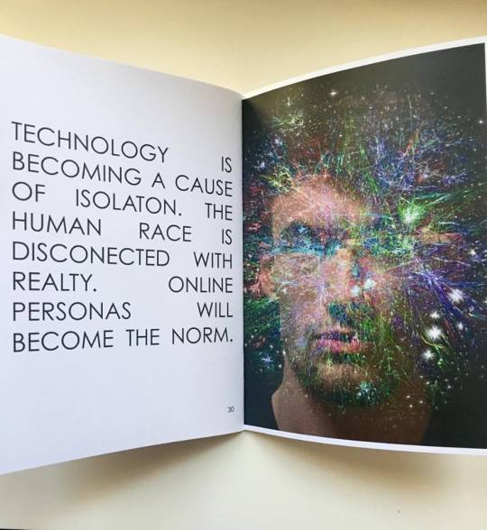
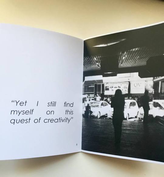
Taking inspiration we wanted the book to display our work in a classy and sophisticated way. Selling us all to the viewer as good artists. Throughout the book you will find inspirational quotes about the work, the script from black mirror which runs through the whole book and clean bold imagery showcasing our final works. We are all really happy with the outcome of our work.


Lauren.
0 notes
Text
Publication Layout.
After considering the theme and background for the publication layout we then looked into what we would want the book to look like a display book more than one filled with text. We wanted to showcase our work.
Two precedents we looked at are;
Herring and Herring:
The layout of this book is simple. We like how the text is bold and makes more of a statement about the imagery rather than an explanation.


Programe: This program Lauren had. Again like Herring and Herring the imagery is the focus of this booklet.
If we can make our book as bold and as clear as these two, then we will be happy.
Lauren.
0 notes
Text
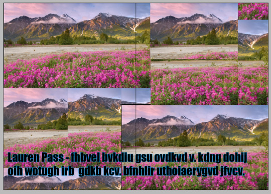
Publication: Background Imagery.

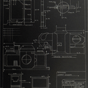
When creating our Publication and Website we decided that we wanted to use a galaxy themed background to make the book have a sci-fi twist, much like black mirror. However, once we reviewed the idea in our group tutorial we discussed that it looked too futuristic and a little clique. We then looked at the idea of using a technical drawing similar to the style of a blue print.
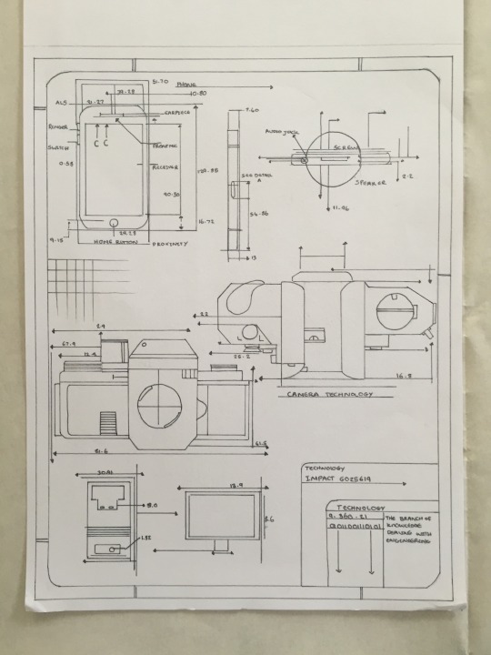
The images are all drawn to scale and consist of a camera, mobile phone and iPhone. we chose these gadgets because they are the key items of technology that are most used throughout the project. We studied the use of phones in White Bear. We are all using photography to take images of our final pieces and members of our group are going to display their work on a screen.
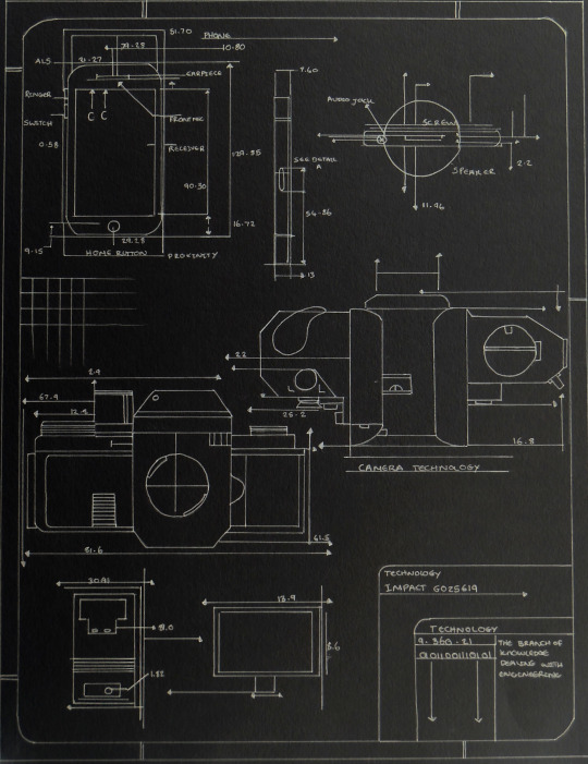
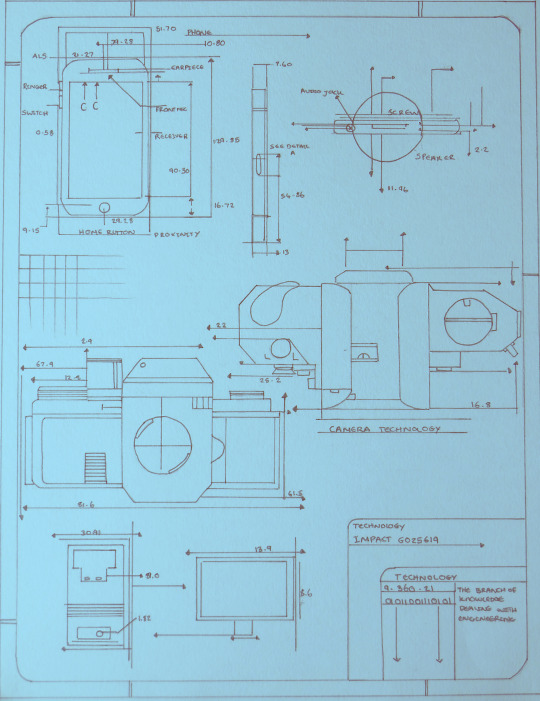
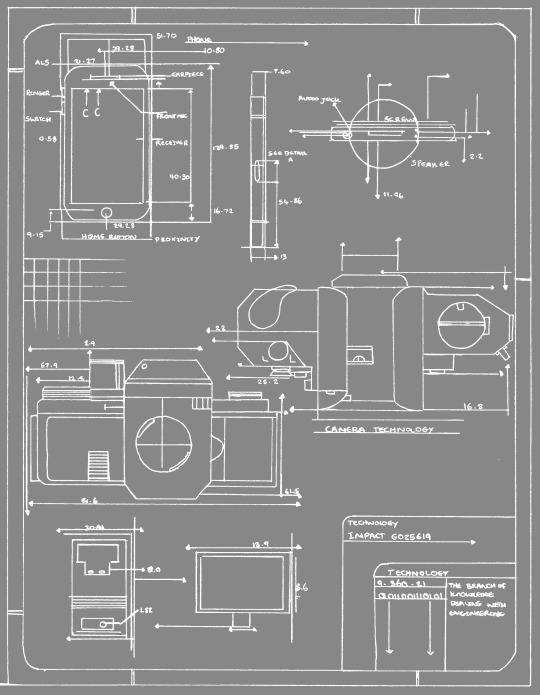
Lauren drew out the technical drawing toying with the colours and different options that we could have. After having a small group discussion we decided to magnify sections of the drawing to make the image look more obscure and interesting. In addition to this we chose to keep the background grey as the blue and black seemed to bold and clashed.
I think this is the best background for our work and links the projects together without touching on each individual project. It links our work together by the technology tools we used to create our work.
Lottie, Lauren.
0 notes
Text
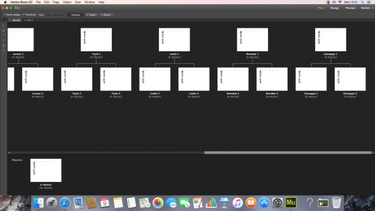
Website Developing imagery.
The website group (Ieva and Kate) met to make a start on the final version of our group website. After talking to the rest of the group and looking at different examples of websites, we decided on a layout far simpler than our previous website’s mock-up. We stuck to a white background and black text, using a serif (DubielPlain) for headings and a sans-serif (MyriadPro-Cond) font for body text, as we felt they paired well together.
We started off by creating a simple layout on the master page:


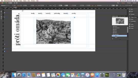
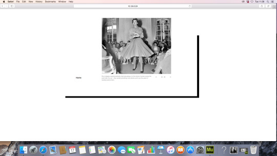
We then went on to the home page, where we placed a simple slideshow template, into which we will later on insert photographs of our group’s work.
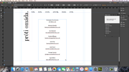
We spent some time working on the contact page. We inserted everyone’s name and BCU email address, however we felt it looked too plain.

After spacing them out, we liked the layout more, but we still felt it was too plain.
We downloaded a variety of scribble-like page dividers, and tried them out in different ways:

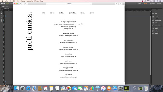


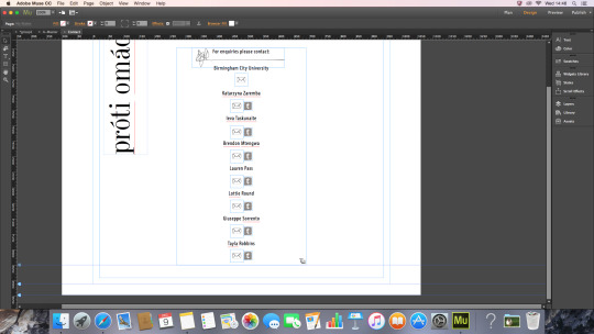
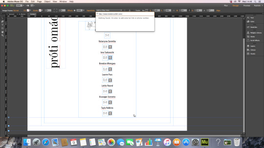
Once we picked the divider we felt looked best, we found an envelope icon which was drawn in a similar pencil-like style, and began placing them under everyone’s names. We then linked the icons to everyone’s email addresses. To do so, we had to highlight the envelope icon, go to hyperlink in the toolbar and type “mailto:(email address)”.


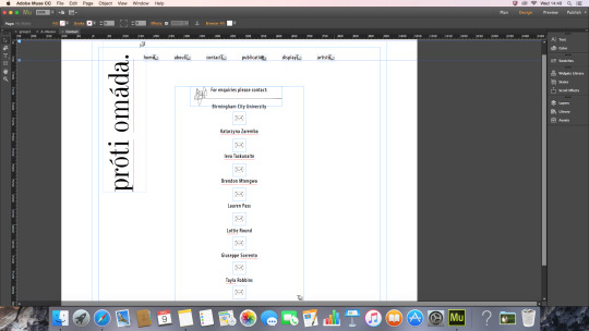
After adding all the email addresses, we decided to also add links to everyone’s personal tumblr’s. Once again, we found a tumblr icon drawn in a similar style, and linked them to everyone’s tumblr pages by going to hyperlink and typing the link.

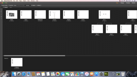
Below is the breakdown of all the pages we have added to the website. We have a home page, an about page, a page to showcase our publication, one for our display, a contact page, and an artists page, which will have all of us on it. These pages are all on the menu bar. We also made pages for each individual person, which is then split into two sub-pages. The idea is that once on the artists page, the viewer can click their chosen artist, and go to their page, on which they will be able to select to see either the artists written piece or physical piece.


0 notes
Text
Group Name Discussion.
When creating the publication and Website we came to the conclusion that we needed a better group name. Going buy “Group 1″ was simple and “Dem’s group” wasn’t very creative.
We thought about what we wanted our group name to do. We wanted it to relate to everyone’s project and be unique. We wanted it to demonstrate that we are creative and simplistic at the same time. We don't want anything to seem tacky. After a discussion and throwing several names on the table we decided on omáda mía which is Greek for group 1. Our tutor Demitrios Kargotis is Greek and we thought by relating our name to him it will unite all our work together.
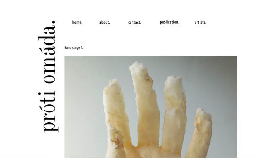
However, when we showed Dem the name he stated that it wasn’t quite correct and actually said “One Team” He suggested that we change it to próti omáda which actually mean “Group One”
Our Group Name is:
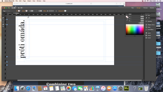
próti omáda
Lottie
0 notes
Text
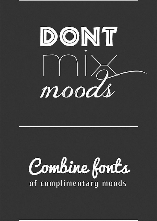
Font Pairing Guide.
Once we had looked into some references we decided we wanted to keep our fonts simple for both the publication and website. We realised that in this magazine the font’s were very different however seemed to sit nicely together. After a discussion with Dem we came up with 3 fonts to use
Dubiel
Corbel
Myriad
In addition to this up with a few alterations to each font such as the space between letter and the width and length of each letter.


Lottie.
0 notes
Text
Further Experimentation. Website.
Ieva and Kate decided to do some experimenting with Adobe Muse. Developing the ideas of how the pages could look.
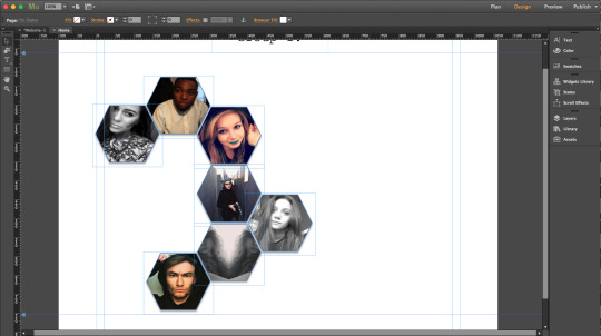
We decided to try using a galaxy photo for the background, in relation to the Sci-Fi theme. We thought that experimenting with a space image might look interesting. We used the each of our group members’ photos placed in hexagons that would work as menu buttons to go to the page of their own work.

(image taken from: http://entropymag.org/the-poetics-of-space-outer-space/)
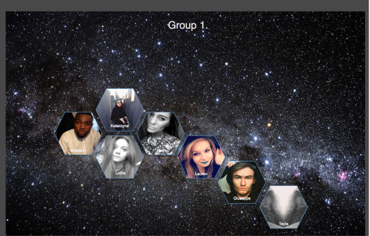
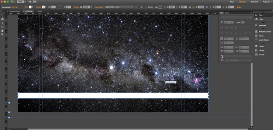
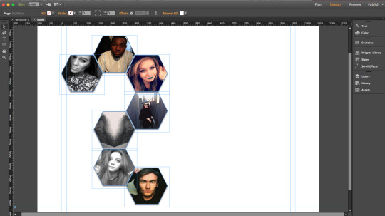
We didn’t think this worked well as there was no context, so tried adding some more information and in order to make it easy to see decided to add some white stripes on master page.


On the 1st page we should have:
ABOUT: who are we and why are we working together.
PUBLICATION: add photos about publication we are making.
DISPLAY: add some photos of our final display.
CONTACTS: the contacs of each group member.
These will be buttons with will take the user to the pages on which the information will be.

We also tried the layout using a plain background, keeping the same photos and information buttons. This didn't worked as well as the one with the space image as it looks a bit too empty.

0 notes
Text
Experimenting with Adobe Muse. Website.
Talking with the girls from the publication group we decided that we should follow the shape of the hexagon that we used while making piece of furniture through this project as well. We came out with the idea that web group and publication will do some designs and then we will design what works best and what doesn’t.
***************************


0 notes
Text
Adobe muse workshop
The program we are going to use to make a website is Adobe muse, so we had a workshop with Sam in order to be able to do it.
During the workshop we learnt how to create pages, titles,menu, add music, videos, photos,slideshows. Also to work with A-Master to add the theme,background or wall-paper that will go through all pages of website.


0 notes
Text
Website Research.
https://www.thebestdesigns.com/
About The Best Designs
“The Best Designs is a curation of the best of web design and their designers, featured for design excellence. Thousands of designers, students and business professionals visit regularly to see new work, upcoming trends or design inspiration.”
Examples:
Circles Conference 2016
Designer: Burciaga & Co.


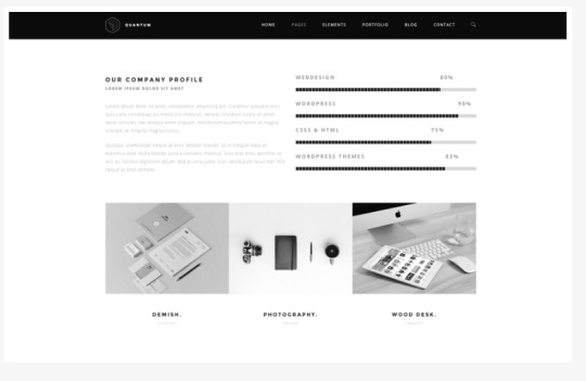
Quantam Business WordPress Theme
“Quantam is a modern, black & white styled theme. This theme offers sections for Services, Testimonials, Portfolio, Blog, About and several page elements as well. Quantam is great for businesses and creative agencies. View screenshots below.”


0 notes
Text
Website Research.

BEHANCE
https://www.behance.net
Any artists worldwide can publish their work here, adding it to “creative field” that makes easier to search only what the person is interested in.
Another way of search can be colours or tools used.
Colours of the page are communicating well (white, grey,black,blue), should work with them in our website.

10 of the most creative online contact pages
http://www.creativebloq.com/web-design/creative-contact-pages-11121406
“A good contact page must be accessible, informative and above all creative. It can be difficult to make the mix work but these 10 examples have done just that. Featuring cats, clouds, and underground cartoons, you'll find it difficult not to contact these designers!”


0 notes
Text
Website Research.
Stuart sent us some examples of collaborative websites so we could get a good idea of how to start our website and develop it.
Here are some bits we liked from some of them:
http://temporarystedelijk.com
The menu buttons with names of the artists are moving together with the viewer through all page.

http://howtoworktogether.org
I would expect the background with patterns make the page look too busy, but in this webpage the colour boxes and different typeface look really great.

http://autoitaliasoutheast.org
Information in this page is well presented. Photos, videos and links with a bit of text gives the primary information and if the person is interested can look further just pressing on the photo.
The idea of showing if the project is just released or made in the past is also useful.


http://www.qubik.com/zr/
Really minimal and images are great placed, but information of pieces of art is missing.

http://www.cabinet.uk.com/index.php?table-of-contents-1
“Table of contents” looks unusual as reminds more of a book than a webpage.

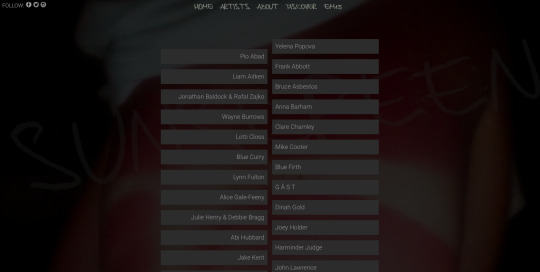
http://sun-screen.uk
Menu page looks very interesting with transparent composition of work by different artists. Easy to find information. Organized creatively and comfortably.


0 notes
Photo
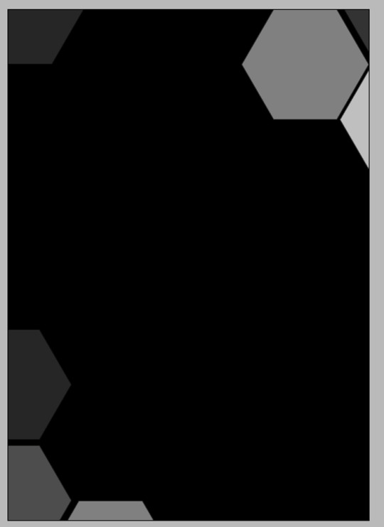


Second attempt. Publication.
Feedback from initial design:
General interest in the use of the hexagons as well as the placing and layout of the pages.
Liked how the blue was incorporated into the design however felt that the blue should have a stronger connection to technology eg. have them look more like wires etc
The page colour should be a darker grey or even black
What I have done to accommodate this feedback in this design:
Changed the page colour to black
Added a few hexagons to the front cover leaving plenty of space in the middle to allow for the logo
Blue edging around the hexagons has been given a glow effect creating a more technological look.
Tayla, Lottie and Lauren.
0 notes