Last Seen Blogs
diana-diamond
no blood! no bone! no ash!
foxesandmagic
Just Story Ideas

c-hwonae
★! Mxla

nerosmind-nerosmind
Nerosmind

earthly-chairs
Untitled
Text


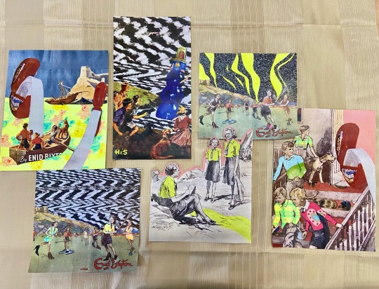
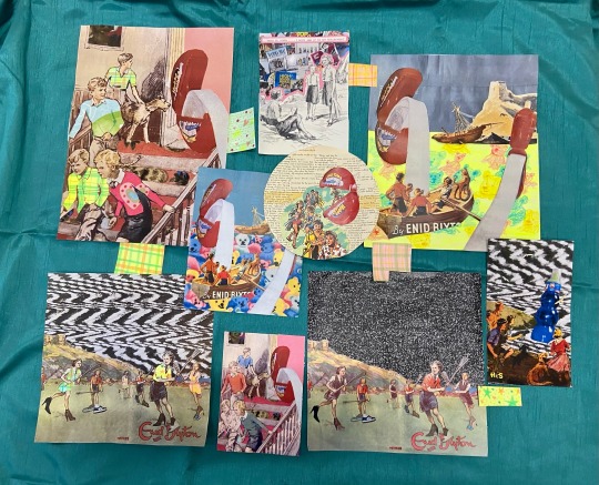
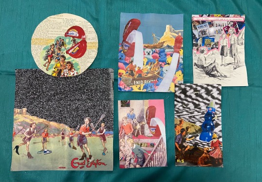
I would choose this group of arrangements to display as a collective. I think they have a balance of all the elements in the images: textile, neon, packaging, the original collages as well as the manipulated copies. I am very pleased with the out come of this selection as I think the clash of the two eras mixes in such a bizarre way that it makes sense.
0 notes
Text


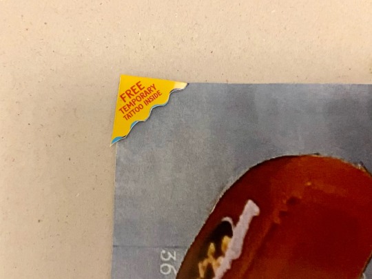
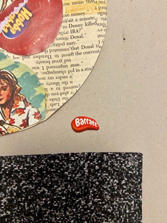

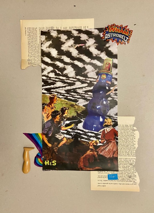
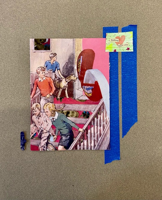
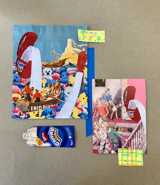
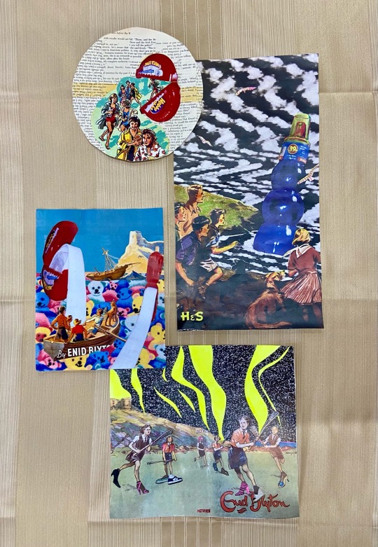
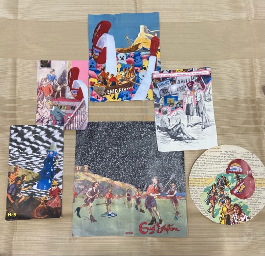
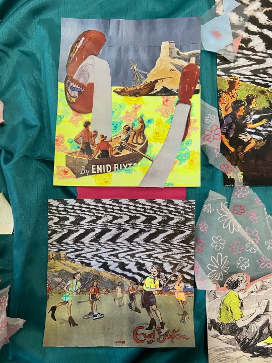
I really enjoyed the outcome of the experiments with the added packaging and items. I think the smaller items such as the red ‘Barratt’ logo and barcodes added the most to the arrangements as they felt like hidden parts of the image that you had to look to find.
I was also pleasantly surprised by the use of the quality street wrappers. I particularly liked using the yellow plastic as I felt it connect well to the neon sections of the collage. The overlay of colour on the collages created interesting effects to the images as it altered the tone of the sections covered.
By adding the barcodes and pieces such as the ‘WHAM ASTROBELT’ it made the arrangements feel like an advertisement or a magazine cover.
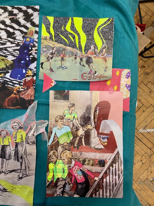
I also added some of the pencil drawings I had previously done of my nostalgic objects. I thought they gave arrangements a nice contrast between the high saturated collages with neon colour and the black and white drawings.
0 notes
Text
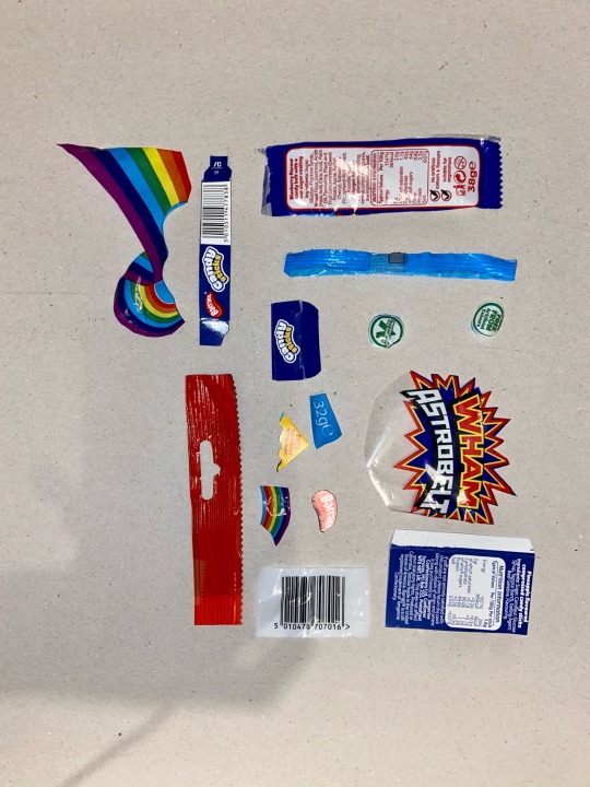
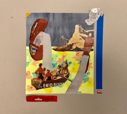
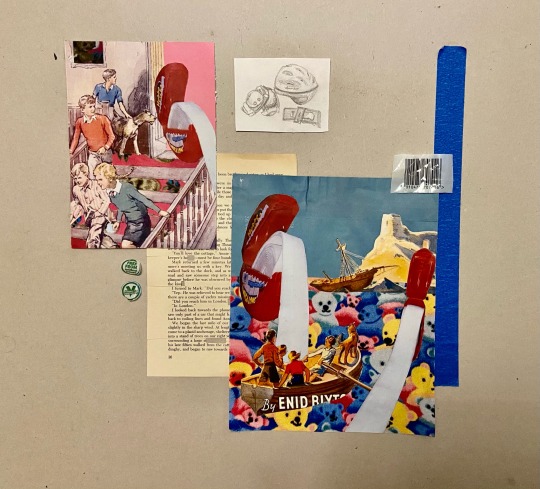
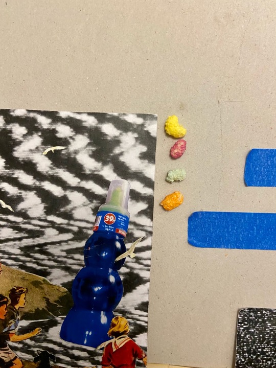
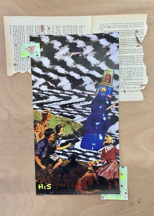
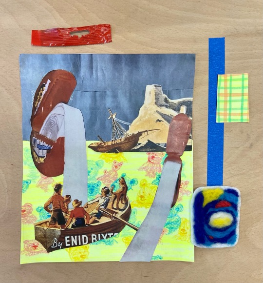
I wanted to try and incorporate more glossy plastic items into the collages as-well as elements of the sweet packaging. I cut out areas of branding, ingredients, nutritional value and barcodes form various packaging. Some of the thinner plastic shapes began to curl up, so I cover there back in tape then cut the excess. This made them less flimsy and reduced the curling.
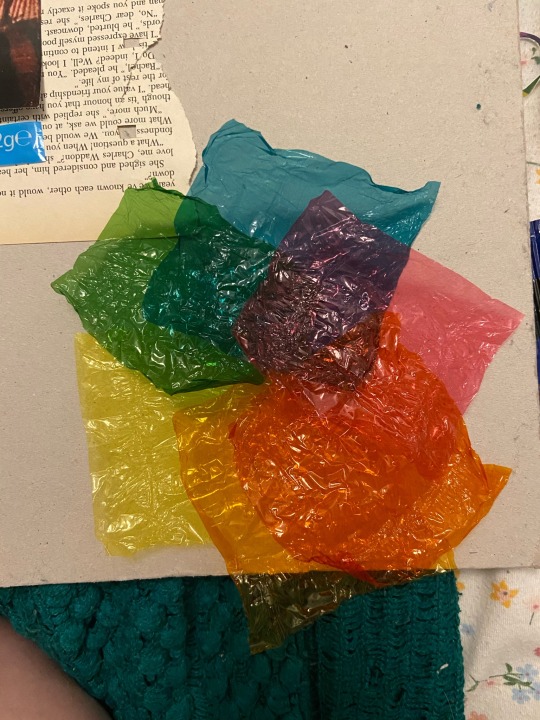
I found some transparent quality street wrappers, I thought these would be good for overlaying onto images and could act as a good way to connect two areas of the collage.
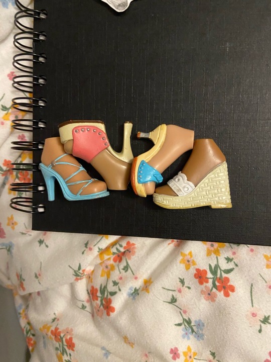
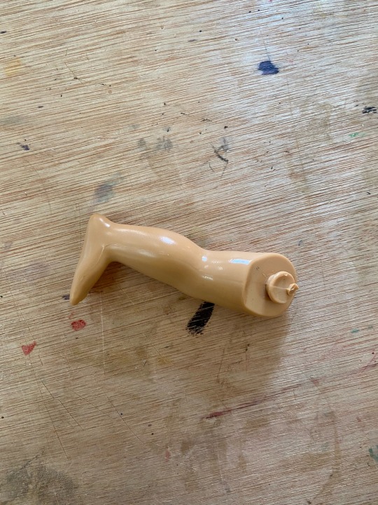
I also gathered some of the plastic bratz feet and a doll leg. I couldn’t cleanly remove any of the brats or barbie legs as their joints were more complicated to detach. Instead, I used this leg from a toy styles on a younger child. The simplistic and more atomically correct design of the leg is more reminiscent of older era dolls.
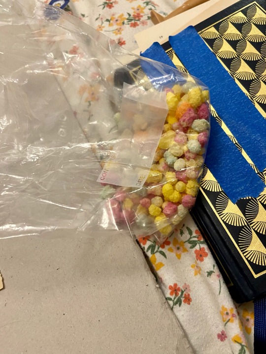
I save a few of the rainbow drops into a plastic bag. I thought it would be interesting to incorporate these into the collage arrangement some how.
0 notes
Text

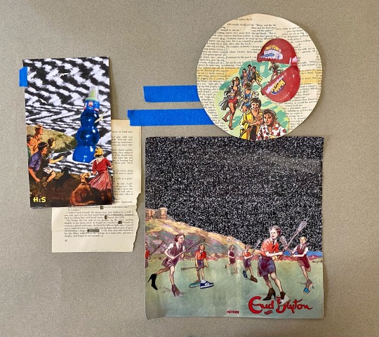

I tried the arrangements on a wooden board. I liked this as a background as well as the brown paper. I found the wood worked better with the organza fabric. I really liked the layers visible through the organza, the book pages and wood held a similar tone which worked well when brown through the patterned fabric. I also tried to be more ambitious with the lines of blue masking tape.
0 notes
Text

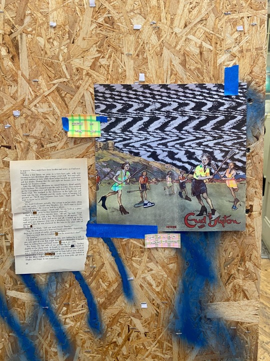
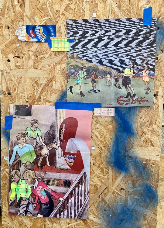
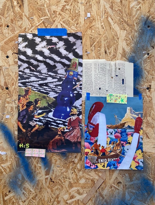
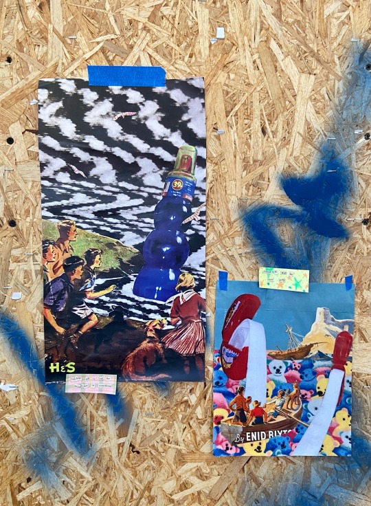
These images were arranged on a chip board stand.
I found it much harder to arrange the piece on this board as it was vertical, so each piece had to be held up some how. This meant I have to use more tape than I would of necessarily wanted to. Although, I did manage to fold over some of the tape to use it as a double-sided tape on the smaller objects.
I chose to arrange some of the larger collages on this board as it gave me more space vertically. After I’d gotten used to using the A2 sheets, I found the width of the board too restrictive.
The chip board didn’t work as well as the brown paper, as it gave the pieces a much more urban/industrial aesthetic compared to the cleaner and more vintage brown paper. I was interested in seeing wether the contrast of aesthetics between the imagery and the graffitied chip board would create an engaging contrast. I wondered wether it would compliment the culture clashing that was already taking place in the imagery. The blue spray paint did compliment the deeper toned collages to an extent. However, the busy texture of the chipboard along side the blue spray paint meant there was too much fighting against one another in the arrangement. I much preferred the brown paper.
0 notes
Text


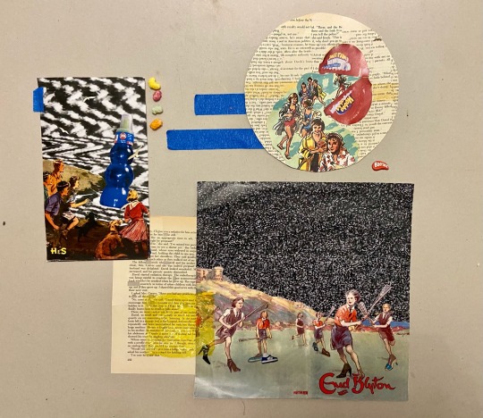
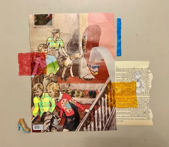
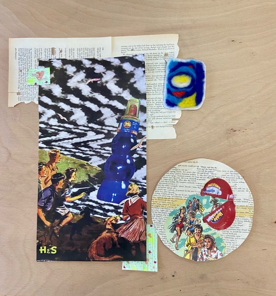
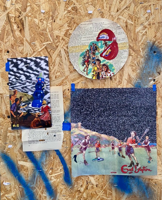
I experimented with this brown paper as a background and decided to simplify the arrangement a of the collages. I incorporated the neon quotes I had made which accented the colours of the collages well.
I also used book pages and a roll of blue masking tape the add boarders and block out areas of space. This helped to create more balance images and add interest.
I used book pages that I had cut out words and lines from for the neon quotes. This gave the pages more character. This worked better than perfect sheets of paper, as a clean sheet appears too crisp and straight whilst breaking up the background and the collages.
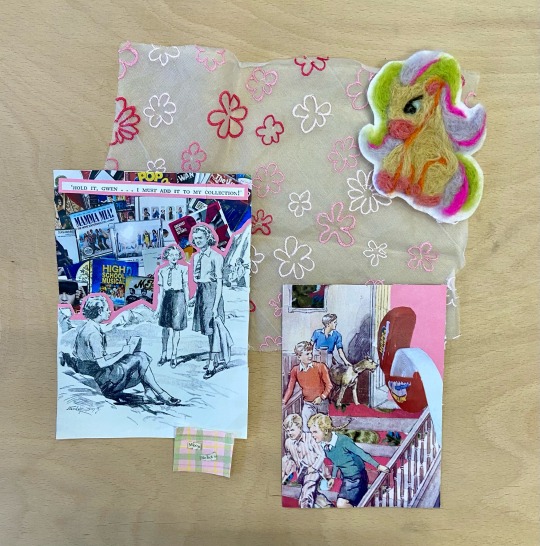
I was really pleased with the use of the felted shapes as I think they add a good amount of texture and shape to the arrangements.
I also began to include more texture in the form of pieces of glossy packaging. As I took these photos in the studio I didn’t have the packaging of the sweets with me so used a cello tape packet for these pieces. I’d like to try these arrangements with more types of packaging and also include some kind of plastic toy or object.
0 notes
Text
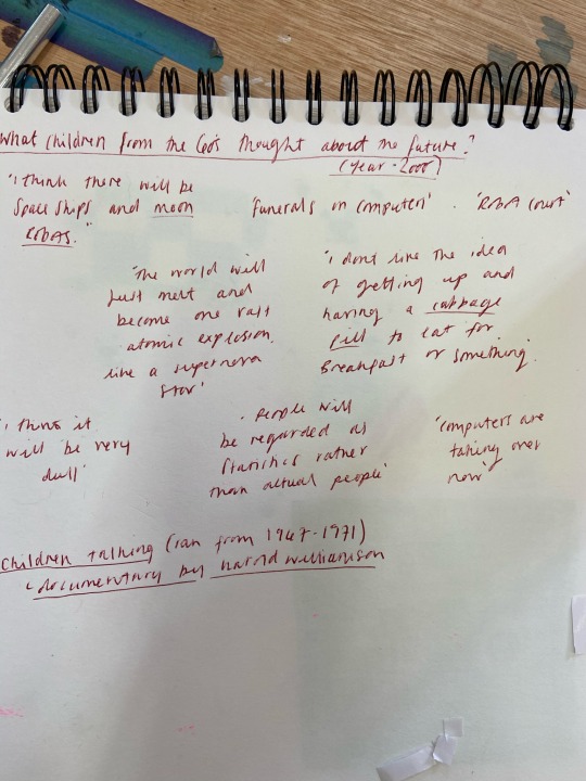
The interviews with 1960s children about the future:
youtube
0 notes
Text
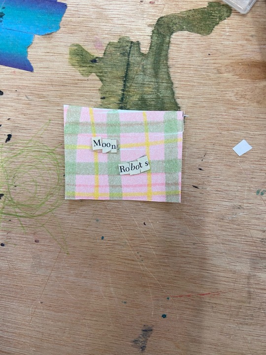
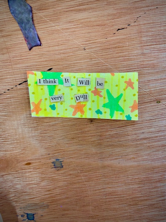

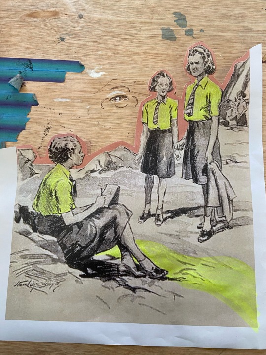
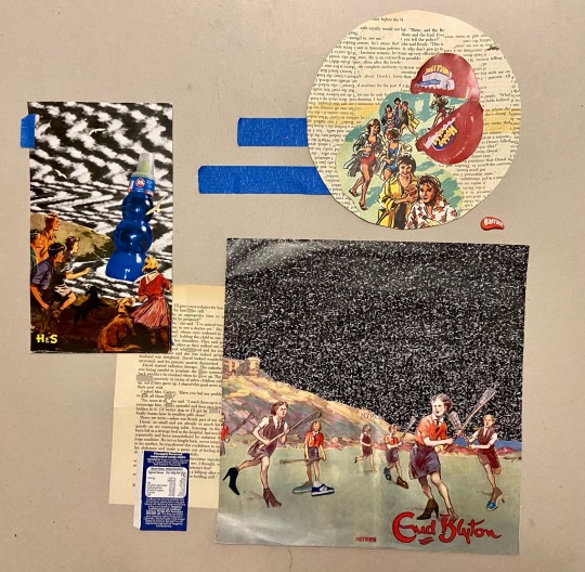
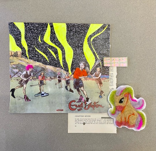
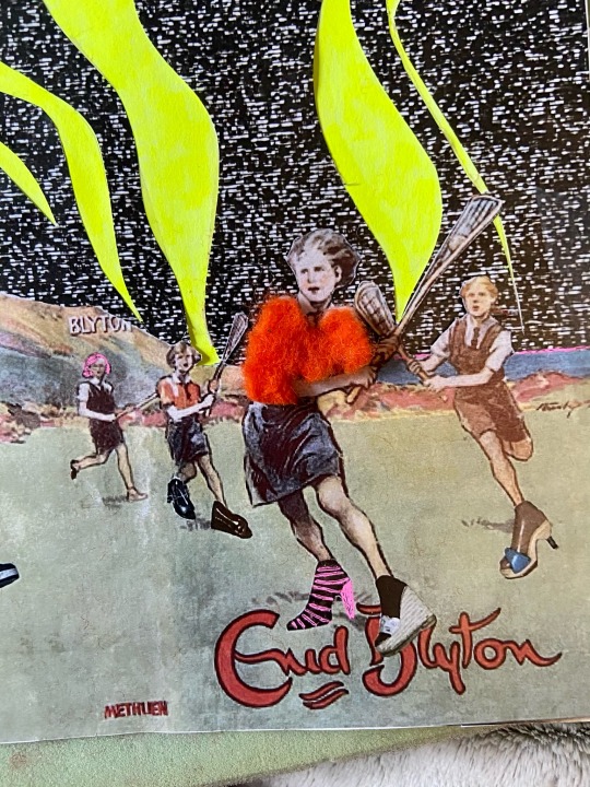
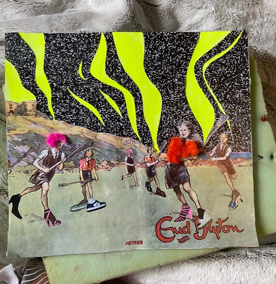
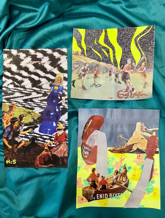
I had begun creating the collages where the children were interacting with the sweets as though they were aliens. This gave the impression that the images could come from some kind of comic book or sci-fi series. It posed the question of how 50’s era children would react to seeing these objects from the future? I had wanted to include some more text into the images, as Blyton is one of the worlds most famous children’s authors. I remember I had seen a video in which a group of children from the 60’s asked about the future. I decided to use some of these quotes and pair them with the neon patterns I had made with the highlighters.
0 notes
Text
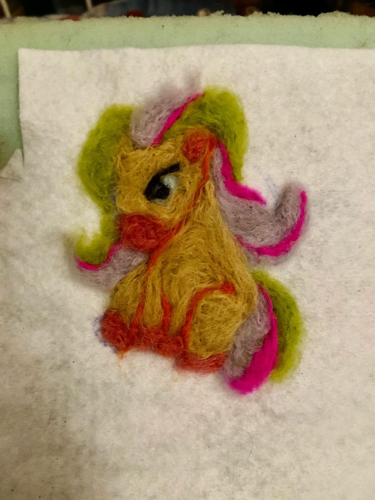
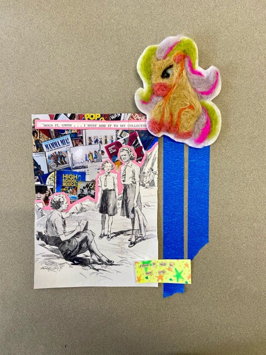
After needle felting the small pieces of clothing I decided the felt some large pieces. I chose to felt a version of a Bratz pony and a candy stick box. The pony went a lot better than the candy box as I think it’s more recognisable. I thought these combine with the arrangements of the collages would be interesting as they would as more organic angles and texture to the arrangements.
0 notes
Text

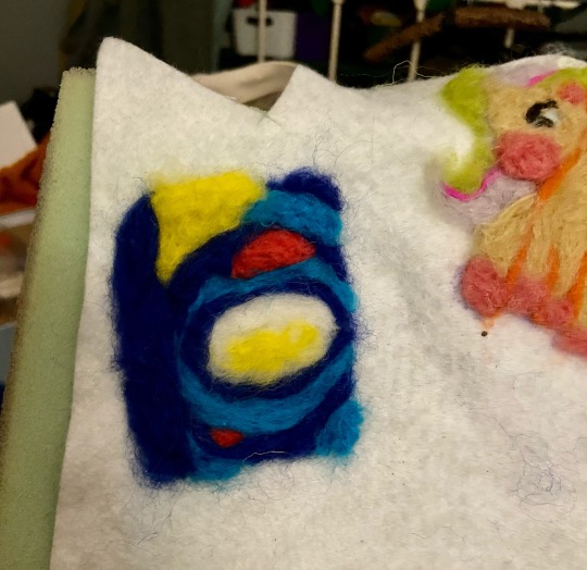
I made these small felted items to go onto this collage. I liked the more 3D outcome of the felted pieces, however, as they were so small I found them hard to attach and keep together in there original shapes. I attached them with double sided sticky tape as glue stick would not connect the fibres to the paper.
0 notes
Text


I attempted some arrangements on this striped shiny beige curtain. I found the pleated stripes to be distracting as a background. Again, my arrangements felt to large and busy. However, I found the contrast of the beige and neon to be interesting as they are not usually seen together. The beige colour of the curtain gave the pieces a much more greying old fashioned look compared to the green curtain which brought out the bright colours much better.
0 notes
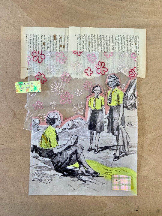
Text

I began to incorporate textiles into the arrangements, using the material scraps and sheets of felt. I also included the squares of neon pattern I made with the highlighters. Again, I think the arrangements worked better once I began simplifying them.
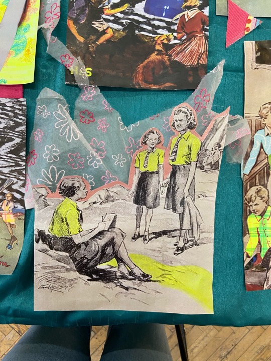
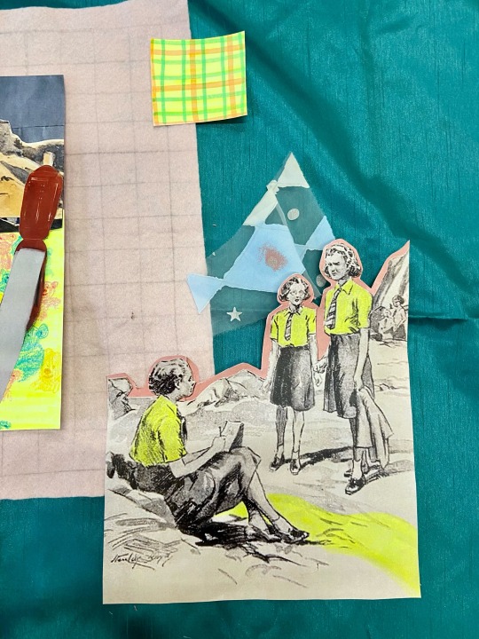

I particularly liked the combination of fabric and collage on these last few arrangements. The neon yellow and pale pink felt compliment each other against the green curtain. I also liked the patterned floral organza behind the cut out image of the 3 girls.
0 notes
Text

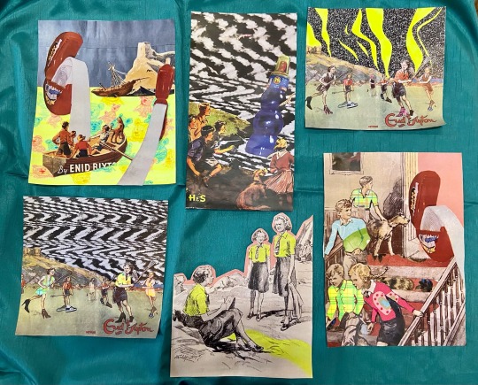
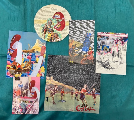
I first began by laying the green curtain out on the table and placing out all of the collages. I tried to separate the collages into groups: originals, neon, and the larger copies. I think the collages looked good against the green, however, I think I was to ambitious in the layout and they would work better in smaller pairings/ groups.
0 notes
Text
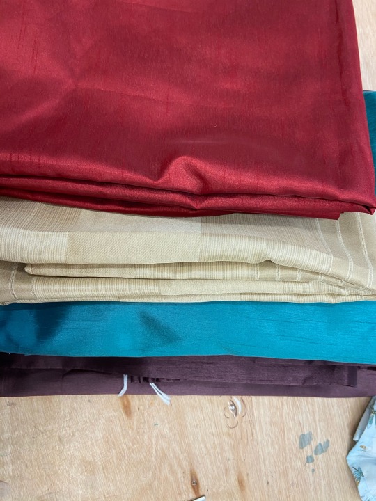
I got these old curtain of my nan as she no longer needed them and offered me the fabric. I thought that they would work well as a background for displaying the collages. I remember the set of red curtains from the room I used to stay in as a child round my nans, which links well to the nostalgia of my childhood.
0 notes
Text


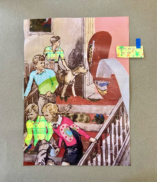
I used a scalpel to cut it the sections of the character clothing. I then took sections of patterned fabric / neon highlighter and placed the underneath. This helped change the tone of the image as it distorted the characters rather than just the environment.
0 notes