
funsayflutter
Techchia
All about flutter develoment
15 posts
Don't wanna be here? Send us removal request.
Last Seen Blogs

neverwouldforgethowwemoved13
Hey Tay, you're a BOSS

damnthosecoolranchdoritos
Sam I Am

blogro294
blogro

nix-draws
Nix-Draws
Text
Flutter Buttons with example

Hello, Flutter Dev’s today we will discuss Flutter Buttons with example. As everybody knows that Button is the basic and famous element in building any application. Buttons are the most useful and powerful element used in every application. Jumping from one page to another, submitting the user information, performing actions and functionality are the basic functions that button does. Here Flutter Buttons have the same functions with different types. Flutter has introduced different types of buttons with amazing UI and their specific uses.
Following are the Flutter Button types:
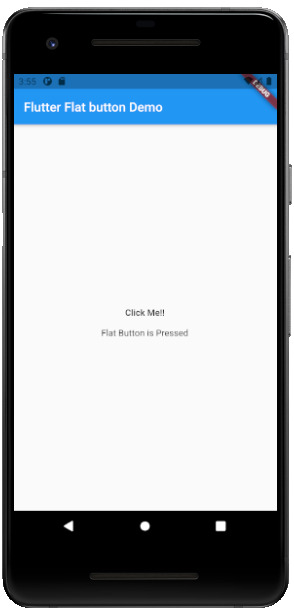
Flutter Flat Button:
It is a basic level button in a Flutter. The flat word itself says that it’s a flat button without any kind of decoration. This makes it really very basic. Generally, a flat button is used in a dialog box or toolbar where it can be used with some other widgets. In addition, it has two important and required properties. One property is the child property and another is onPressed(). Where the child property shows that the flat button contains another widget or component in it. And onPressed() property lets the user know what action is processed. Talking about the decoration Flat buttons has no color and the text in it has black color. The button color can be changed as per the requirement of the application.
import 'package:flutter/material.dart';
void main() {
runApp(MyApp());
}
class MyApp extends StatelessWidget {
@override
Widget build(BuildContext context) {
return MaterialApp(
title: 'Flutter Demo',
theme: ThemeData(
primarySwatch: Colors.blue,
),
home: MyHomePage(title: 'Flutter Flat button Demo'),
);
}
}
class MyHomePage extends StatefulWidget {
MyHomePage({Key key, this.title}) : super(key: key);
final String title;
@override
_MyHomePageState createState() => _MyHomePageState();
}
class _MyHomePageState extends State {
String _value="";
@override
Widget build(BuildContext context) {
return Scaffold(
appBar: AppBar(
title: Text(widget.title),
),
body: Center(
child: Column(
mainAxisAlignment: MainAxisAlignment.center,
children: ,
),
),
);
}
}
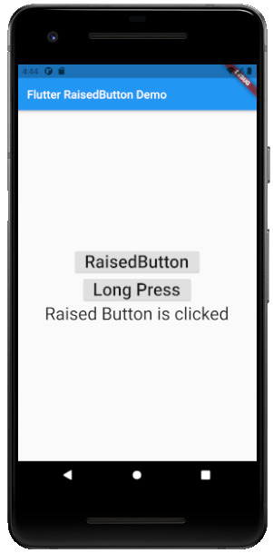
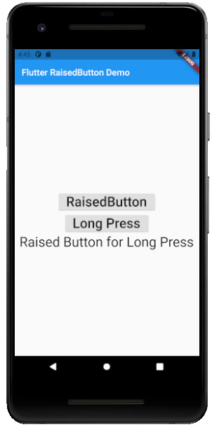
Flutter Raised Buttons:
Raised Button is a material-designed button that is rich in its looks. It is nothing but the same as the Flat button but has many differences. It has an elevation that increases when the button is in action. However it is rich in looks, we can change its color, shape, behavior, the color of the button. In addition, we can change it when it is in disabled mode and the animation time for the button. The most important thing for the Raised button is that if we do not specify any callback function then the button is in a disabled state.
It has following callback functions:
- onPressed(): When the button is pressed the onPressed() comes in action.
- onLongPress(): This function fires the event after holding the button for several seconds. In short, after a long press.
3) import 'package:flutter/cupertino.dart';
import 'package:flutter/material.dart';
void main() {
runApp(MyApp());
}
class MyApp extends StatelessWidget {
// This widget is the root of your application.
@override
Widget build(BuildContext context) {
return MaterialApp(
title: 'Flutter Demo',
theme: ThemeData(
primarySwatch: Colors.blue,
),
home: MyHomePage(title: 'Flutter RaisedButton Demo'),
);
}
}
class MyHomePage extends StatefulWidget {
MyHomePage({Key key, this.title}) : super(key: key);
final String title;
@override
_MyHomePageState createState() => _MyHomePageState();
}
class _MyHomePageState extends State {
String _value='';
@override
Widget build(BuildContext context) {
return Scaffold(
appBar: AppBar(
title: Text(widget.title),
),
body: Center(
child: Column(
mainAxisAlignment: MainAxisAlignment.center,
children: ,
),
),
);
}
}
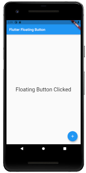
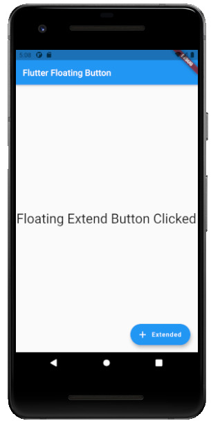
Flutter Floating Buttons:
Float Buttons are the circular buttons at the bottom of the screen in any application. The floating button is also famous as the Floating Action Button. This button is much popular among applications. Floating buttons contain Icons that express the behavior of the action that the button will fire. For example, the Floating button can act as a navigator like a google Maps navigation button. Another instance is the adding and subtracting button on the screen. Flutter says to have at least one Floating Action button on a single page.
Following are the types of Floating Action Button:
- FloatingActionButton: It is the basic Floating action button with one child widget inside it. It is a must to have the child widget.
- FloatingActionButton.extended: As the name suggests that it is an extended version of the Floating Action Button. It is extended due to extra parameters like label with the child widget. In addition, this makes the Floating Action button more attractive.
3) import 'package:flutter/material.dart';
void main() {
runApp(MyApp());
}
class MyApp extends StatelessWidget {
@override
Widget build(BuildContext context) {
return MaterialApp(
title: 'Flutter Demo',
theme: ThemeData(
primarySwatch: Colors.blue,
),
home: MyHomePage(title: 'Flutter Floating Button'),
);
}
}
class MyHomePage extends StatefulWidget {
MyHomePage({Key key, this.title}) : super(key: key);
final String title;
@override
_MyHomePageState createState() => _MyHomePageState();
}
class _MyHomePageState extends State {
String _value='';
@override
Widget build(BuildContext context) {
return Scaffold(
appBar: AppBar(
title: Text(widget.title),
),
body: Center(
child: Column(
mainAxisAlignment: MainAxisAlignment.center,
children: ,
),
),
floatingActionButton: FloatingActionButton(
onPressed: (){
setState(() {
_value = "Floating Button Clicked";
});
},
tooltip: 'Demo Floating Button',
child: Icon(Icons.add),
),
// floatingActionButton: FloatingActionButton.extended(
// onPressed: (){
// setState(() {
// _value = "Floating Extend Button Clicked";
// });
// }, label: Text('Extended'),icon: Icon(Icons.add_outlined),)
);
}
}

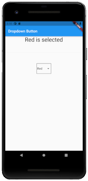
Flutter Drop Down Button:
The dropdown button works as simple as a dropdown widget in Flutter. It creates a great visual appearance on the screen, where the user can select the element from the given dropdown. Flutter uses a material design that gives an awesome look and feel of widgets. So for dropdown, this material design for a dropdown button contains a dropdown box showing the selected item from the dropdown list and an arrow button. This arrow button will open the dropdown list on its click event.
import 'package:flutter/material.dart';
void main() =>
runApp(MaterialApp(
home: MyApp(),
));
class MyApp extends StatefulWidget {
@override
_MyAppState createState() => _MyAppState();
}
class _MyAppState extends State {
List _colorItems = ;
List _dropdownMenuItems;
ListItem _itemSelected;
void initState() {
super.initState();
_dropdownMenuItems = buildDropDownMenuItems(_colorItems);
_itemSelected = _dropdownMenuItems.value;
}
List buildDropDownMenuItems(List listItems) {
List items = List();
for (ListItem listItem in listItems) {
items.add(
DropdownMenuItem(
child: Text(listItem.name),
value: listItem,
),
);
}
return items;
}
@override
Widget build(BuildContext context) {
return Scaffold(
appBar: AppBar(
title: Text("Dropdown Button"),
),
body: Column(
children: ,
),
);
}
}
class ListItem {
int value;
String name;
ListItem(this.value, this.name);
}

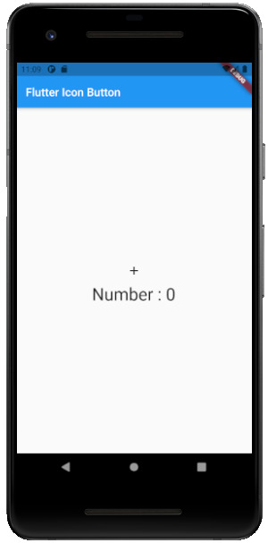
Flutter Icon Button:
Icon buttons are simply the material-designed button. Which has the picture printed on them. As designed by material, so it has a cool look and feel. This button is simple like an Icon widget. But the icon is on the top of the button. That is why a user can click on it to perform an action.
import 'package:flutter/material.dart';
void main() {
runApp(MyApp());
}
class MyApp extends StatelessWidget {
// This widget is the root of your application.
@override
Widget build(BuildContext context) {
return MaterialApp(
title: 'Flutter Demo',
theme: ThemeData(
primarySwatch: Colors.blue,
),
home: MyHomePage(title: 'Flutter Icon Button'),
);
}
}
class MyHomePage extends StatefulWidget {
MyHomePage({Key key, this.title}) : super(key: key);
final String title;
@override
_MyHomePageState createState() => _MyHomePageState();
}
class _MyHomePageState extends State {
int countNumber = 0;
@override
Widget build(BuildContext context) {
return Scaffold(
appBar: AppBar(
title: Text(widget.title),
),
body: Center(
child: Column(
mainAxisAlignment: MainAxisAlignment.center,
children: ,
),
),
);
}
}
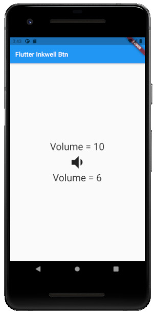
Flutter Inkwell Button:
This material-designed button is specially designed for the touch response of the user. Inkwell button is generally used for adding splash ripple effect. This creates a great look and feel. Even the gesture feedback is so good.
import 'package:flutter/material.dart';
void main() {
runApp(MyApp());
}
class MyApp extends StatelessWidget {
@override
Widget build(BuildContext context) {
return MaterialApp(
title: 'Flutter Demo',
theme: ThemeData(
primarySwatch: Colors.blue,
),
home: MyHomePage(title: 'Flutter Inkwell Btn'),
);
}
}
class MyHomePage extends StatefulWidget {
MyHomePage({Key key, this.title}) : super(key: key);
final String title;
@override
_MyHomePageState createState() => _MyHomePageState();
}
class _MyHomePageState extends State {
int _volNumber = 10;
@override
Widget build(BuildContext context) {
return Scaffold(
appBar: AppBar(
title: Text(widget.title),
),
body: Center(
child: Column(
mainAxisAlignment: MainAxisAlignment.center,
children: ,
),
),
);
}
}

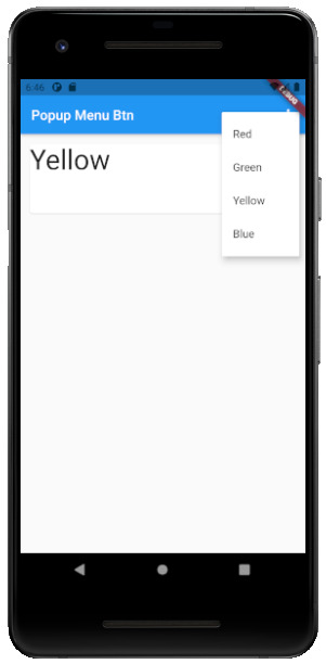
Flutter PopupMenu Button:
This button is on the Menu Bar of the screen. It is also designed my material which shows the pop-up list after clicking the three dots at the corner of the menu bar. This button contains text and an image. And about behavior, the list disappears as soon as you select an option from the list.
import 'package:flutter/material.dart';
void main() { runApp(MyApp());}
class MyApp extends StatefulWidget {
@override
_MyAppState createState() => _MyAppState();
}
class _MyAppState extends State {
ColorList _selectedOption = options;
void _select(ColorList option) {
setState(() {
_selectedOption = option;
});
}
@override
Widget build(BuildContext context) {
return MaterialApp(
home: Scaffold(
appBar: AppBar(
title: const Text('Popup Menu Btn'),
actions: ,
),
body: Padding(
padding: const EdgeInsets.all(10.0),
child: ColorCard(option: _selectedOption),
),
),
);
}
}
class ColorList {
const ColorList({this.code, this.value});
final int code;
final String value;
}
const List options = const ;
class ColorCard extends StatelessWidget {
const ColorCard({Key key, this.option}) : super(key: key);
final ColorList option;
@override
Widget build(BuildContext context) {
return Card(
child: Container(
width: 400,
height: 100,
child:Text(option.value, style: TextStyle(fontSize: 40)),
),
);
}
}

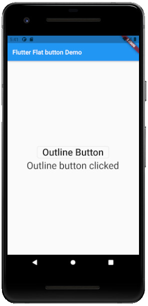
Flutter Outline Button:
The outline button is as same as the flat button of flutter. But the difference is the border that the Outline button has. The border of This button is completely dependent on the shape property of the button. It can be either a rounded rectangle, square, circle, or any other shape that is customized.
import 'package:flutter/cupertino.dart';
import 'package:flutter/material.dart';
void main() {
runApp(MyApp());
}
class MyApp extends StatelessWidget {
@override
Widget build(BuildContext context) {
return MaterialApp(
title: 'Flutter Demo',
theme: ThemeData(
primarySwatch: Colors.blue,
),
home: MyHomePage(title: 'Flutter Flat button Demo'),
);
}
}
class MyHomePage extends StatefulWidget {
MyHomePage({Key key, this.title}) : super(key: key);
final String title;
@override
_MyHomePageState createState() => _MyHomePageState();
}
class _MyHomePageState extends State {
String _value="";
@override
Widget build(BuildContext context) {
return Scaffold(
appBar: AppBar(
title: Text(widget.title),
),
body: Center(
child: Column(
mainAxisAlignment: MainAxisAlignment.center,
children: ,
),
),
);
}
}

Read the full article
#buttons#buttonsinflutter#dropdownbutton#extendedfloatingbutton#flatbutton#floatingbutton#flutter#flutteranimationtutorial#flutterbutton#flutterbuttons#flutterdropdownbutton#flutterflatbutton#flutterfloatingbutton#flutterforbeginners#fluttericon#fluttericonbutton#fluttericons#flutterinkwellbutton#flutteroutlinebutton#flutterpopupmenu#flutterpopupmenubutton#flutterraisedbutton#fluttersdk#fluttertutorial#fluttertutorialandroidstudio#fluttertutorialandroidstudioforbeginners#fluttertutorialfirebase#fluttertutorialforbeginners#fluttertutorialforios#fluttertutorialfromscratch
0 notes
Text
How to update Flutter 2.0

Hello Flutter Fellows, today we will see How to update Flutter 2.0. We all were waiting for Upgrading Flutter 2.0 and Flutter has now come up with Flutter 2.0 on March 30, 2021. It has many features and fixes that the previous version was having. Let us know about the new features and fixes of flutter 2.0.
It is better to see the video side by side
Highlights of Flutter 2.0:
-
Flutter Web -
Flutter’s web support has changed from beta to steady channel. With this stable delivery, Flutter pushes the reusability of code to the next level with the support of the web platform. Instead of an HTML renderer, Flutter added a new CanvasKit-based renderer. We’ve also added web-explicit highlights, such as a Link widget, to ensure your application running in the program feels like a web application.
-
Sound Null Safety –
Sound null safety strengthens the sort framework by recognizing nullable sorts from non-nullable sorts. This empowers developers to forestall invalid blunder crashes, a typical justification application to crash. With this feature, we can prevent crashes of our application on production. Combining the null checks into the system type which are caught while the development.
-
Desktop –
For additional desktop-specific functionality, this release enables command-line argument handling for Flutter apps. So that basic things like double-clicking on a data file in the Windows File Explorer can be used to open the file in the app. Flutter has also worked hard to make resizing much flexible for both Windows and macOS, and to allowed IME (Input Method Editors) for international users.
-
Platform Adaptive Apps: Flutter Folio Sample –
Now that Flutter supports three platforms for production apps like Android, iOS, and the web and three more in beta (Windows, macOS, and Linux), a natural question comes ahead of that: how we write an app that adjusts itself well to multiple different form factors (small, medium, and large screens), different input methods (touch, keyboard, and mouse) and different devices (mobile, web, and desktop)? To answer this question Flutter commissioned the Flutter Folio scrapbooking app.
Folio is meant to be a basic example of an app that would run well on multiple platforms from a single code base
-
Google Mobile Ads to Beta –
Google Mobile Ads SDK for Flutter is a brand-new plugin that provides inline banner and native ads, in addition to the existing overlay formats. This plugin combines support for Ad Manager and Admob, so it doesn’t matter what size publisher is user, this plugin can be adjusted to your situation.
-
New iOS features –
A few iOS widgets have been added to the Cupertino design language implementation for a better look and feel.
New CupertinoSearchTextField gives the iOS search bar UI. In addition to the highlighted work for iOS, Flutter is continuing to research performance improvements for iOS and Flutter in general when it comes to shaders and animation widgets.
-
New widgets: Autocomplete and ScaffoldMessenger –
Two additional new widgets:
- AutocompleteCore – It represents the minimal functionality required to get auto-complete functionality into your Flutter app.
- ScaffoldMessenger - It was created to deal with a number of SnackBar-related issues, including the ability to easily create a SnackBar in response to an AppBar action, creating SnackBars to keeps between Scaffold transitions, and being able to display SnackBars at the completion of an asynchronous action, even if the user has directed to a page with a different Scaffold.
-
Multiple Flutter instances with Add-to-App –
This feature is called Add-to-App, is the smartest way to reuse Flutter code on both mobile platforms while still preserving the existing native codebase.
-
Flutter Fix –
Flutter Fix is a combination of a lot of things. Firstly, there’s a new command-line option to the dart CLI tool called dart fix that. It knows where to look for a list of deprecated APIs and how to update code using those APIs. Secondly, it’s the list of available fixes itself, which is combined with the Flutter SDK as of version 2. And finally, it’s an updated set of Flutter extensions for the VS Code, IntelliJ, and Android Studio IDEs that know how to expose that same list of available fixes as quick fixes with little light bulbs that will help you to change the code with a click of a mouse.
-
Flutter DevTools –
Flutter DevTools is a tool is used for debugging Flutter apps, Flutter has renamed it to be Flutter DevTools when it’s debugging a Flutter app. Once you’ve got DevTools running, new error badges on the tabs help us to track down specific issues in our app. Another new feature in DevTools is the ability to easily see an image that’s has a higher resolution than it’s displayed, which helps track down extra app size and memory usage. To enable this feature, enable the Invert Oversized Images in the Flutter Inspector.
However, to upgrade the Flutter 2.0 you have to follow the below steps:
- Go to your Flutter SDK folder.
- Then open the flutter_console.bat file
- After that, type $flutter doctor command.
- If the $flutter doctor command executes with proper signal
- Then type the $flutter upgrade command.
This command will start downloading the upgrading version of Flutter that is Flutter 2.0. You will see the below result when it updates Flutter 2.0 successfully.

Read the full article
#Howtochangeflutterversion#Howtorunflutterupgrade#Howtoupdateflutter#HowToUpdateFlutter2.0#Howtoupdateflutterpackages#Howtoupdateflutterplugininandroidstudio#Howtoupdatefluttersdkversion#Howtoupdateflutterversion#Howtoupgradeflutter#Howtoupgradeflutter2.0#Howtoupgradeflutterversion
0 notes
Text
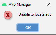
Fixed: Unable to locate abd
Hello flutter dev’s, today we are going to have look at how we Fixed: Unable to locate abd error. It is said that it is the key point of the developer to resolve not only errors but also to solve warnings. In the same situation, we have seen an error. While running the emulator or android virtual device. It was the scenario that when we clicked the play button on AVD manager. It showed an alert message. However, the process continued to run the emulation or AVD. But still, the alert message popping up every time while running the emulator is irritating. Thus, we will remove this error with the following steps. That we have tried on our system and we have got successful.
Steps how we “Fixed: Unable to locate abd” error:
- Create a new Flutter project. If you are new to flutter please read the blog to create your First Flutter Application. After the creation of your project go to the AVD manager.

- Click on the play button to run the Emulator.
- Then you will see the following alert:
- Then to resolve the error, go to SDK Manager. In setting section select Android SDK.
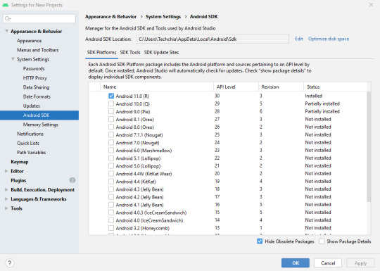
- Click on “Edit” near “Android ADK Location” box. You will find below screen.
Here it will update the Android SDK with the missing SDK components.
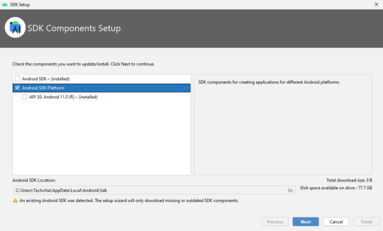
- Then after that, click next.
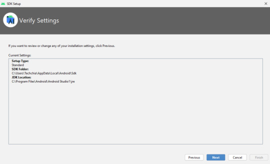
- Again, click next, you will get below screen as result:
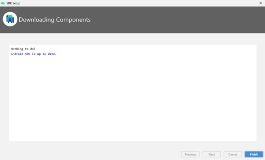
- Finally click Finish.
Reason why the error Occurred:
This is how we will remove the alert message. We have resolved the error, but do you know why this message pops up. The reason is some of the SDK components were missing in the SDK folder and while running the emulator, the AVD manager searches for the missing components. Therefore, it throws an alert message. This is why we need to update the SDK folder through the SDK manager from Android Studio. Guy don’t forget to connect internet; it won’t show the missing component message.
Read the full article
#avdmanagerunabletolocateadb#avdmanagerunabletolocateadberror#download#fixunabletolocateadb#fixunabletolocateadbfix#flutteradbunabletolocate#flutterunabletolocateadb#unabletolocateadb#unabletolocateadbandroidstudio#unabletolocateadbflutterandroidstudioerror#unabletolocateadbfluttererror#unabletolocateadbinandroidstudio#unabletolocateadbmacos#unabletolocateadbwindows10
0 notes
Text
Fixed: Size problem in flutter

Hello flutter dev’s, this blog is about the Fixed: Size problem in flutter. As we know flutter is all about widgets. From all of these widgets in the previous blog, we discussed the Flutter row and column widget. But while practicing these widgets we came across an issue. This issue is about the Sizing issue of widgets. Lets us see what is the actual sizing issue?
Size problem of widgets
The most important note is that Row and column widget works with the visible available part of screen. And if they exceed the visible available space then a yellow and black striped pattern appears on the edges. You can have this issue with horizontal main aix or vertical main axis. Then don’t worry this error is nothing but a warning. This warning tells you to adjust your widgets. In short, it says if your widgets are more than 3 then use ListView or if your widgets are 3 or less than 3 then adjust widgets size.
Expanded widget
This is the solution for the above warning. An expanded widget simply allows you to adjust and fit the widgets according to the visible size. It divides the widgets according to the flex factor.
Constructor:
Expanded({
Key key,
int flex: 1,
@required Widget child
})
It expands the child widget that can be arranged according to the widget's main axis. Remember it has a @required parameter which means it has to be included.
Code:
import 'package:flutter/material.dart';
void main() {
runApp(MyApp());
}
class MyApp extends StatelessWidget {
// This widget is the root of your application.
@override
Widget build(BuildContext context) {
return MaterialApp(
title: 'Flutter Demo',
theme: ThemeData(
primarySwatch: Colors.blue,
),
home: MyHomePage(title: 'Flutter Row Layout'),
);
}
}
class MyHomePage extends StatefulWidget {
MyHomePage({Key key, this.title}) : super(key: key);
final String title;
@override
_MyHomePageState createState() => _MyHomePageState();
}
class _MyHomePageState extends State {
@override
Widget build(BuildContext context) {
return Scaffold(
appBar: AppBar(
title: Text(widget.title),
),
body: Center(
child: Row(
mainAxisAlignment: MainAxisAlignment.spaceEvenly,
children: ,
),
),
);
}
}
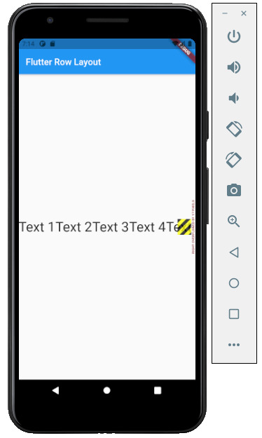
Following screen shows how the error appears on the app:
Here is the solution that Fixed: Size problem in flutter:
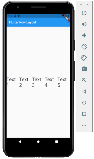
Here you can see, the ListView has 5 elements with a horizontal main axis. These 5 elements on the first screen show warning with yellow and black striped pattern edges. And when we add the above code for these elements. The yellow and black striped pattern edge is disappeared. Hence, we have Fixed: Size problem in flutter.
Read the full article
#dividetilesmethod#flutterandroid#flutterApp#flutterchallenge#fluttercourse#flutterexpandedwidget#flutterexplained#flutterfreecourse#flutterfullapp#flutterfullcourse#fluttergettingstarted#flutterintroduction#flutterios#flutterlistviewbuilder#fluttertutorial#fluttertutorialforbeginners#flutterui#flutterwidgets#googleflutter#linebetweenwidgets#overflowerrorflutter#renderflexoverflow#thegrowingdeveloper
0 notes
Text
Flutter Tooltip with example
Hello Flutter Dev’s, here we will discuss the flutter tooltip with example. Previously we have seen a text widget that was one way to provide information to the application user. However, in this article, we will discuss another method to display additional information. This additional information can be the functionality of interacting widgets. In short, this second widget allows us to display additional information to the user.
For example, if an input box is given in the form fields. And wants to display the input pattern that needs to be accepted by the application. Another example can be the Button. Buttons such as IconButton, FloatingActionButton, as well as PopupMenuButton has a built-in parameter to have a tooltip. As we all know that widgets are the main key point in a flutter design. Hence to show this additional information flutter has a Tooltip widget. So, let’s have a look at the Flutter Tooltip widget:
Flutter Tooltip Constructor:
Tooltip(
{
Key key,
@required String message,
double height,
EdgeInsetsGeometry padding,
EdgeInsetsGeometry margin,
double verticalOffset,
bool preferBelow,
bool excludeFromSemantics,
Decoration decoration,
TextStyle textStyle,
Duration waitDuration,
Duration showDuration,
Widget child
}
)
Flutter tooltip constructor has a mandatory or you can say required parameter called message. This message contains the string that provides additional information for the particular action. Previously we have seen the text styling in our previous blog of a text widget, the same text styling can be used for styling the text in the tooltip. And another important property is Duration. Duration plays an important role. It decides that for how long does the tooltip must be displayed to the user.
Code:
import 'package:flutter/material.dart';
void main() {
runApp(MyApp());
}
class MyApp extends StatelessWidget {
// This widget is the root of your application.
@override
Widget build(BuildContext context) {
return MaterialApp(
title: 'Flutter Demo',
theme: ThemeData(
primarySwatch: Colors.blue,
),
home: MyHomePage(title: 'Flutter Demo Home Page'),
);
}
}
class MyHomePage extends StatefulWidget {
MyHomePage({Key key, this.title}) : super(key: key);
final String title;
@override
_MyHomePageState createState() => _MyHomePageState();
}
class _MyHomePageState extends State {
@override
Widget build(BuildContext context) {
return Scaffold(
appBar: AppBar(
title: Text(widget.title),
),
body: Row(
mainAxisAlignment: MainAxisAlignment.start,
children: ,
),
);
}
}
Output:
The above example shows the flutter tooltip when hovered on the HQ button (IconButton). This gives the information that the HQ button is nothing but a button and has click functionality. Hence, this is how the flutter tooltip works. To make work this tooltip remember that the tooltip on web view appears as soon as we hover the button. But in mobile, we need to press the button for a long to appear on the tooltip. That is called as Long press.
To run the above same code, please visit my gitHub: here
Read the full article
#flutteraccessibility#flutterandroid#flutterApp#flutterapps#flutterdevelopers#fluttericonbuttontooltip#fluttericonography#fluttermobileapp#flutterscreenreader#fluttertips#fluttertooltips#flutterturotial#fluttertutorial#fluttertutorials#flutterwidgettutorials#flutterwidgets#tooltip#tooltipflutter#tooltipmessages#tooltipwidget#tooltipwidgetflutter
0 notes
Text
Flutter Buttons with example

Hello, Flutter Dev’s today we will discuss Flutter Buttons with example. As everybody knows that Button is the basic and famous element in building any application. Buttons are the most useful and powerful element used in every application. Jumping from one page to another, submitting the user information, performing actions and functionality are the basic functions that button does. Here Flutter Buttons have the same functions with different types. Flutter has introduced different types of buttons with amazing UI and their specific uses.
Following are the Flutter Button types:
Flutter Flat Button:
It is a basic level button in a Flutter. The flat word itself says that it’s a flat button without any kind of decoration. This makes it really very basic. Generally, a flat button is used in a dialog box or toolbar where it can be used with some other widgets. In addition, it has two important and required properties. One property is the child property and another is onPressed(). Where the child property shows that the flat button contains another widget or component in it. And onPressed() property lets the user know what action is processed. Talking about the decoration Flat buttons has no color and the text in it has black color. The button color can be changed as per the requirement of the application.
import 'package:flutter/material.dart';
void main() {
runApp(MyApp());
}
class MyApp extends StatelessWidget {
@override
Widget build(BuildContext context) {
return MaterialApp(
title: 'Flutter Demo',
theme: ThemeData(
primarySwatch: Colors.blue,
),
home: MyHomePage(title: 'Flutter Flat button Demo'),
);
}
}
class MyHomePage extends StatefulWidget {
MyHomePage({Key key, this.title}) : super(key: key);
final String title;
@override
_MyHomePageState createState() => _MyHomePageState();
}
class _MyHomePageState extends State {
String _value="";
@override
Widget build(BuildContext context) {
return Scaffold(
appBar: AppBar(
title: Text(widget.title),
),
body: Center(
child: Column(
mainAxisAlignment: MainAxisAlignment.center,
children: ,
),
),
);
}
}

Flutter Raised Buttons:
Raised Button is a material-designed button that is rich in its looks. It is nothing but the same as the Flat button but has many differences. It has an elevation that increases when the button is in action. However it is rich in looks, we can change its color, shape, behavior, the color of the button. In addition, we can change it when it is in disabled mode and the animation time for the button. The most important thing for the Raised button is that if we do not specify any callback function then the button is in a disabled state.
It has following callback functions:
- onPressed(): When the button is pressed the onPressed() comes in action.
- onLongPress(): This function fires the event after holding the button for several seconds. In short, after a long press.
3) import 'package:flutter/cupertino.dart';
import 'package:flutter/material.dart';
void main() {
runApp(MyApp());
}
class MyApp extends StatelessWidget {
// This widget is the root of your application.
@override
Widget build(BuildContext context) {
return MaterialApp(
title: 'Flutter Demo',
theme: ThemeData(
primarySwatch: Colors.blue,
),
home: MyHomePage(title: 'Flutter RaisedButton Demo'),
);
}
}
class MyHomePage extends StatefulWidget {
MyHomePage({Key key, this.title}) : super(key: key);
final String title;
@override
_MyHomePageState createState() => _MyHomePageState();
}
class _MyHomePageState extends State {
String _value='';
@override
Widget build(BuildContext context) {
return Scaffold(
appBar: AppBar(
title: Text(widget.title),
),
body: Center(
child: Column(
mainAxisAlignment: MainAxisAlignment.center,
children: ,
),
),
);
}
}


Flutter Floating Buttons:
Float Buttons are the circular buttons at the bottom of the screen in any application. The floating button is also famous as the Floating Action Button. This button is much popular among applications. Floating buttons contain Icons that express the behavior of the action that the button will fire. For example, the Floating button can act as a navigator like a google Maps navigation button. Another instance is the adding and subtracting button on the screen. Flutter says to have at least one Floating Action button on a single page.
Following are the types of Floating Action Button:
- FloatingActionButton: It is the basic Floating action button with one child widget inside it. It is a must to have the child widget.
- FloatingActionButton.extended: As the name suggests that it is an extended version of the Floating Action Button. It is extended due to extra parameters like label with the child widget. In addition, this makes the Floating Action button more attractive.
3) import 'package:flutter/material.dart';
void main() {
runApp(MyApp());
}
class MyApp extends StatelessWidget {
@override
Widget build(BuildContext context) {
return MaterialApp(
title: 'Flutter Demo',
theme: ThemeData(
primarySwatch: Colors.blue,
),
home: MyHomePage(title: 'Flutter Floating Button'),
);
}
}
class MyHomePage extends StatefulWidget {
MyHomePage({Key key, this.title}) : super(key: key);
final String title;
@override
_MyHomePageState createState() => _MyHomePageState();
}
class _MyHomePageState extends State {
String _value='';
@override
Widget build(BuildContext context) {
return Scaffold(
appBar: AppBar(
title: Text(widget.title),
),
body: Center(
child: Column(
mainAxisAlignment: MainAxisAlignment.center,
children: ,
),
),
floatingActionButton: FloatingActionButton(
onPressed: (){
setState(() {
_value = "Floating Button Clicked";
});
},
tooltip: 'Demo Floating Button',
child: Icon(Icons.add),
),
// floatingActionButton: FloatingActionButton.extended(
// onPressed: (){
// setState(() {
// _value = "Floating Extend Button Clicked";
// });
// }, label: Text('Extended'),icon: Icon(Icons.add_outlined),)
);
}
}

Flutter Drop Down Button:
The dropdown button works as simple as a dropdown widget in Flutter. It creates a great visual appearance on the screen, where the user can select the element from the given dropdown. Flutter uses a material design that gives an awesome look and feel of widgets. So for dropdown, this material design for a dropdown button contains a dropdown box showing the selected item from the dropdown list and an arrow button. This arrow button will open the dropdown list on its click event.
import 'package:flutter/material.dart';
void main() =>
runApp(MaterialApp(
home: MyApp(),
));
class MyApp extends StatefulWidget {
@override
_MyAppState createState() => _MyAppState();
}
class _MyAppState extends State {
List _colorItems = ;
List _dropdownMenuItems;
ListItem _itemSelected;
void initState() {
super.initState();
_dropdownMenuItems = buildDropDownMenuItems(_colorItems);
_itemSelected = _dropdownMenuItems.value;
}
List buildDropDownMenuItems(List listItems) {
List items = List();
for (ListItem listItem in listItems) {
items.add(
DropdownMenuItem(
child: Text(listItem.name),
value: listItem,
),
);
}
return items;
}
@override
Widget build(BuildContext context) {
return Scaffold(
appBar: AppBar(
title: Text("Dropdown Button"),
),
body: Column(
children: ,
),
);
}
}
class ListItem {
int value;
String name;
ListItem(this.value, this.name);
}
Flutter Icon Button:
Icon buttons are simply the material-designed button. Which has the picture printed on them. As designed by material, so it has a cool look and feel. This button is simple like an Icon widget. But the icon is on the top of the button. That is why a user can click on it to perform an action.
import 'package:flutter/material.dart';
void main() {
runApp(MyApp());
}
class MyApp extends StatelessWidget {
// This widget is the root of your application.
@override
Widget build(BuildContext context) {
return MaterialApp(
title: 'Flutter Demo',
theme: ThemeData(
primarySwatch: Colors.blue,
),
home: MyHomePage(title: 'Flutter Icon Button'),
);
}
}
class MyHomePage extends StatefulWidget {
MyHomePage({Key key, this.title}) : super(key: key);
final String title;
@override
_MyHomePageState createState() => _MyHomePageState();
}
class _MyHomePageState extends State {
int countNumber = 0;
@override
Widget build(BuildContext context) {
return Scaffold(
appBar: AppBar(
title: Text(widget.title),
),
body: Center(
child: Column(
mainAxisAlignment: MainAxisAlignment.center,
children: ,
),
),
);
}
}

Flutter Inkwell Button:
This material-designed button is specially designed for the touch response of the user. Inkwell button is generally used for adding splash ripple effect. This creates a great look and feel. Even the gesture feedback is so good.
import 'package:flutter/material.dart';
void main() {
runApp(MyApp());
}
class MyApp extends StatelessWidget {
@override
Widget build(BuildContext context) {
return MaterialApp(
title: 'Flutter Demo',
theme: ThemeData(
primarySwatch: Colors.blue,
),
home: MyHomePage(title: 'Flutter Inkwell Btn'),
);
}
}
class MyHomePage extends StatefulWidget {
MyHomePage({Key key, this.title}) : super(key: key);
final String title;
@override
_MyHomePageState createState() => _MyHomePageState();
}
class _MyHomePageState extends State {
int _volNumber = 10;
@override
Widget build(BuildContext context) {
return Scaffold(
appBar: AppBar(
title: Text(widget.title),
),
body: Center(
child: Column(
mainAxisAlignment: MainAxisAlignment.center,
children: ,
),
),
);
}
}
Flutter PopupMenu Button:
This button is on the Menu Bar of the screen. It is also designed my material which shows the pop-up list after clicking the three dots at the corner of the menu bar. This button contains text and an image. And about behavior, the list disappears as soon as you select an option from the list.
import 'package:flutter/material.dart';
void main() { runApp(MyApp());}
class MyApp extends StatefulWidget {
@override
_MyAppState createState() => _MyAppState();
}
class _MyAppState extends State {
ColorList _selectedOption = options;
void _select(ColorList option) {
setState(() {
_selectedOption = option;
});
}
@override
Widget build(BuildContext context) {
return MaterialApp(
home: Scaffold(
appBar: AppBar(
title: const Text('Popup Menu Btn'),
actions: ,
),
body: Padding(
padding: const EdgeInsets.all(10.0),
child: ColorCard(option: _selectedOption),
),
),
);
}
}
class ColorList {
const ColorList({this.code, this.value});
final int code;
final String value;
}
const List options = const ;
class ColorCard extends StatelessWidget {
const ColorCard({Key key, this.option}) : super(key: key);
final ColorList option;
@override
Widget build(BuildContext context) {
return Card(
child: Container(
width: 400,
height: 100,
child:Text(option.value, style: TextStyle(fontSize: 40)),
),
);
}
}
Flutter Outline Button:
The outline button is as same as the flat button of flutter. But the difference is the border that the Outline button has. The border of This button is completely dependent on the shape property of the button. It can be either a rounded rectangle, square, circle, or any other shape that is customized.
import 'package:flutter/cupertino.dart';
import 'package:flutter/material.dart';
void main() {
runApp(MyApp());
}
class MyApp extends StatelessWidget {
@override
Widget build(BuildContext context) {
return MaterialApp(
title: 'Flutter Demo',
theme: ThemeData(
primarySwatch: Colors.blue,
),
home: MyHomePage(title: 'Flutter Flat button Demo'),
);
}
}
class MyHomePage extends StatefulWidget {
MyHomePage({Key key, this.title}) : super(key: key);
final String title;
@override
_MyHomePageState createState() => _MyHomePageState();
}
class _MyHomePageState extends State {
String _value="";
@override
Widget build(BuildContext context) {
return Scaffold(
appBar: AppBar(
title: Text(widget.title),
),
body: Center(
child: Column(
mainAxisAlignment: MainAxisAlignment.center,
children: ,
),
),
);
}
}
Read the full article
#buttons#buttonsinflutter#dropdownbutton#extendedfloatingbutton#flatbutton#floatingbutton#flutter#flutteranimationtutorial#flutterbutton#flutterbuttons#flutterdropdownbutton#flutterflatbutton#flutterfloatingbutton#flutterforbeginners#fluttericon#fluttericonbutton#fluttericons#flutterinkwellbutton#flutteroutlinebutton#flutterpopupmenu#flutterpopupmenubutton#flutterraisedbutton#fluttersdk#fluttertutorial#fluttertutorialandroidstudio#fluttertutorialandroidstudioforbeginners#fluttertutorialfirebase#fluttertutorialforbeginners#fluttertutorialforios#fluttertutorialfromscratch
0 notes
Text
Flutter Web: easy way
Hey Flutter Dev’s, Flutter Web: easy way blog explains how to install flutter for web development. Many web developers are happy that flutter has finally released a web development SDK. In previous SDK web, developers were upset as the SDK was only supporting mobile development. Now it’s a great satisfaction for web developers. Flutter provides various widgets with awesome UI features. In addition, the widgets are lightweight. These lightweight widgets make web applications superior. So, to make web developers happy flutter has upgraded Flutter SDK. This upgraded Flutter is nothing but the same SDK with web support. It is easy to make the setup for those who know how to set up Flutter for mobile. But if you want to know the mobile development setup also then you can refer to my previous blog “Mobile setup installation blog”. However, we can have the setup for a web application.
To set this Flutter Web, you must follow the below steps:
- Install the Flutter SDK for your suitable operating system from Flutter's official website.
- To run the web application, one must need a web browser. Flutter has chosen its debugging browser as default. This browser is called the Chrome browser. As all developers are very much familiar with this browser. Therefore, no need to explain in detail. If you don’t have a chrome setup, please install it from the link.
- This step is optional but for those who are a newbie for them, this step is important.
Read the full article
#beginnerwebdevelopment#dartweb#dartwebapp#dartwebdevelopment#flutter#flutterandroid#flutterbeginner#flutterforweb#flutterforwebapplication#flutterforwebdeveloper#flutterforwebsetup#flutterforwebsite#flutterhowtostart#flutterinstall#flutterios#flutterrun#fluttersetuponwindows#flutterstart#fluttertutorial#flutterweb#flutterwebbeginners#setupflutterinvscode#setupflutterwindows#setupflutterwithvscode
0 notes
Text
Flutter Web: easy way

Hey Flutter Dev’s, Flutter Web: easy way blog explains how to install flutter for web development. Many web developers are happy that flutter has finally released a web development SDK. In previous SDK web, developers were upset as the SDK was only supporting mobile development. Now it’s a great satisfaction for web developers. Flutter provides various widgets with awesome UI features. In addition, the widgets are lightweight. These lightweight widgets make web applications superior. So, to make web developers happy flutter has upgraded Flutter SDK. This upgraded Flutter is nothing but the same SDK with web support. It is easy to make the setup for those who know how to set up Flutter for mobile. But if you want to know the mobile development setup also then you can refer to my previous blog “Mobile setup installation blog”. However, we can have the setup for a web application.
To set this Flutter Web, you must follow the below steps:
- Install the Flutter SDK for your suitable operating system from Flutter's official website.
- To run the web application, one must need a web browser. Flutter has chosen its debugging browser as default. This browser is called the Chrome browser. As all developers are very much familiar with this browser. Therefore, no need to explain in detail. If you don’t have a chrome setup, please install it from the link.
- This step is optional but for those who are a newbie for them, this step is important.
Read the full article
#beginnerwebdevelopment#dartweb#dartwebapp#dartwebdevelopment#flutter#flutterandroid#flutterbeginner#flutterforweb#flutterforwebapplication#flutterforwebdeveloper#flutterforwebsetup#flutterforwebsite#flutterhowtostart#flutterinstall#flutterios#flutterrun#fluttersetuponwindows#flutterstart#fluttertutorial#flutterweb#flutterwebbeginners#setupflutterinvscode#setupflutterwindows#setupflutterwithvscode
0 notes
Text
Flutter Gestures with example
Hello flutter dev’s, here we will discuss Flutter Gestures with example. Generally, it is important to have easy interactions between user and application. In short, any application without gestures is incomplete. In everyday life, every user has devices that interact with them. Therefore, any application that interacts with humans in few taps makes the application more attractive. These gestures can be anything such as Tap, drag, and slide.
Flutter gestures types:
Flutter gestures have two categories of layers. These layers are the bridge between application and user gestures.
Pointer:
A pointer is a primary layer for the flutter gestures. This layer holds the raw data from the application point of view. It includes the events. In addition, these events inform which event has been fired. Events such as tap or mouse click.
Pointer has 4 types of events that are more popular:
- PointerDownEvents: This event simply detects the location on the screen. In short, it detects the fingertip touch.
- PointerMoveEvents: As the name suggests, this property detects the moving location from one end to another end.
- PointerUpEvents: This event detects that the user’s finger is up from the surface of the screen. In summary, we can say it catches the event when the user releases the screen surface.
- PointerCancelEvents: This event helps us when any pointer interaction is canceled.
Code:
import 'package:flutter/gestures.dart';
import 'package:flutter/material.dart';
void
Read the full article
#flutter#fluttercardwidget#fluttercoding#fluttercupertinoexample#flutterdart#flutterdatatable#flutterexamples#fluttergoogle#flutterindonesia#fluttermaterialcomponents#fluttermaterialshadow#fluttermobile#flutterscrollcontroller#fluttersdk#fluttertabcontroller#fluttertutorial#fluttertutorialforbeginners#fluttertutorials#flutterbeginners#fluttergesturedetector#flutterio#gesturedetector#gestures#googleflutter#tutorial
0 notes
Text
Flutter Scaffold drawer
Flutter scaffold drawer is implemented with primary material design visual layout structure. Scaffold class is important as it provides APIs for showing drawer, snack bar, and bottom sheets. For generating a multipurpose mobile application, we use a scaffold. In addition, we can say that scaffold contains mostly all the elements that a flutter application uses. We will have a look at the scaffold drawer constructor and its properties.
const Scaffold({
Key key,
this.appBar,
this.body,
this.floatingActionButton,
this.floatingActionButtonLocation,
this.persistentFooterButtons,
this.drawer,
this.endDrawer,
this.bottomNavigationBar,
this.bottomSheet,
this.floatingActionButtonAnimator,
this.backgroundColor,
this.resizeToAvoidBottomPadding = true,
this.primary = true,
})
Here scaffold widget explained using basic drawer example:
- appBar - It is an important part of the scaffold. appBar is the top horizontal bar on the application. Without appBar property, the scaffold widget is much more likely incomplete.
- body – The body appears below the appBar section. It is behind the drawer as well as floatingActionButton. If resizeToAvoidBottomInset property is set to false, then the body doesn’t resize when the on-screen keyboard appears on the screen. This widget appears at the top left of the screen by default. And in between the top appBar and the bottom part of the screen.
Read the full article
#flutterbasics#fluttercourse#fluttercrossplatform#flutterdrawer#flutterforbeginners#flutterinkwel#flutterinkwell#fluttermaterial#flutternavigationdrawer#flutterscaffold#flutterscaffoldtutorial#fluttertutorialandroidstudio#fluttertutorialandroidstudioforbeginners#fluttertutorialapp#fluttertutorialforbeginners#fluttertutorialforbeginnersandroidstudio#fluttertutorialforios#fluttertutorialios#flutterwidgets#scaffoldclass
0 notes
Text
Fixed: Size problem in flutter
Hello flutter dev’s, this blog is about the Fixed: Size problem in flutter. As we know flutter is all about widgets. From all of these widgets in the previous blog, we discussed the Flutter row and column widget. But while practicing these widgets we came across an issue. This issue is about the Sizing issue of widgets. Lets us see what is the actual sizing issue?
Size problem of widgets
The most important note is that Row and column widget works with the visible available part of screen. And if they exceed the visible available space then a yellow and black striped pattern appears on the edges. You can have this issue with horizontal main aix or vertical main axis. Then don’t worry this error is nothing but a warning. This warning tells you to adjust your widgets. In short, it says if your widgets are more than 3 then use ListView or if your widgets are 3 or less than 3 then adjust widgets size.
Expanded widget
This is the solution for the above warning. An expanded widget simply allows you to adjust and fit the widgets according to the visible size. It divides the widgets according to the flex factor.
Constructor:
Expanded({
Key key,
int flex: 1,
@required Widget child
})
It expands the child widget that can be arranged according to the widget's main axis. Remember it has a @required parameter which means it has to be included.
Code:
import 'package:flutter/material.dart';
Read the full article
#dividetilesmethod#flutterandroid#flutterApp#flutterchallenge#fluttercourse#flutterexpandedwidget#flutterexplained#flutterfreecourse#flutterfullapp#flutterfullcourse#fluttergettingstarted#flutterintroduction#flutterios#flutterlistviewbuilder#fluttertutorial#fluttertutorialforbeginners#flutterui#flutterwidgets#googleflutter#linebetweenwidgets#overflowerrorflutter#renderflexoverflow#thegrowingdeveloper
0 notes
Text
Flutter Database: persistence data storage
Hello flutter devs, this blog is all about the flutter database: persistence data storage. Every new application must be having an organized data. However, to organize these data, we use various databases. Moving towards databases, it is important to know the basics. If you are new to flutter please refer to my blog to create the First Flutter Application. And if you are not then let's go. So, in a flutter, there are several packages that can organize the data. Following are the two most famous packages used in a flutter:
- sqflite: This package is used to handle as well as manipulate SQLite database.
- firebase: This package is used to handle as well as manipulate the cloud-hosted NoSQL database.
Therefore have a look in details about these sqflite Flutter database: persistence data storage
SQLite is one of the popular databases that is used in most applications. So, to use SQLite as database flutter uses sqfLite plugin. This plugin is known as flutter database. This is because Flutter SDK doesn’t support direct interaction with SQLite database. This plugin allows the following functionalities.
- Create/Open – This functionality uses openDatabase method
- Execute – This functionality uses the execute method
- Advanced query methods – This functionality uses the query method
For example, we will create a flutter project for understanding Flutter Database: persistence data storage.
- Firstly, you need to need to update the pubspec.yaml file.
Read the full article
#flutterbasics#flutterbasicstutorial#flutterdatapersitence#flutterdatabase#flutterdatabasetutorial#flutterfirebase#fluttergoogle#flutterkeyvaluedatabase#flutterkeyvaluepair#flutterpersistencedata#flutterpersistentdata#fluttersavedatalocally#fluttershared_preferences#fluttersharedpreferences#fluttersharedpreferencesexample#fluttersqldatabase#fluttertutorial#flutterwidget#opendatabaseflutter#sqfliteflutterexample
0 notes
Text
Create First App: Flutter
In this blog, we are going to learn how to Create First App: Flutter using android studio. If you are new to flutter you can go through my previous blog: Flutter Installation For Windows.
To create First App: Flutter, follow the steps:
- Open the Android Studio in your system.
- On opening Android Studio, you have to choose “Start new Flutter Project”.
- Then select Flutter Application from below screen:
After that you need to fill following inputs:
- Project Name: Write your desired Application name.
- Flutter SDK Path: The flutter path where your flutter SDK folder exists
- Project Location: The folder location where you want to store the created Application
- Descriptions: Any description that shows a summary of your Application
- In the next screen choose the company domain name for example techchia.com or for local projects you can give any domain name for example xyz.com
- After that click finish. It will take some time to load the screen. On the other hand, you will see the Application with minimum resources loaded on your screen.
.idea: This folder contain all the configuration related to Android Studio.
.android: This folder contains the Android project information. It means when the flutter code is compiled into the native code, it will be included in the Android project. Therefore, the result will be a native Android application. For example, when you create a flutter project you need Android Emulator to run the project.
Read the full article
#createaflutterapp#createmobileappusingdart#dartandroid#dartandroidstudio#firstflutterapplication#flutterandroid#flutterandroidstudio#flutterdart#flutterfirstproject#flutterhelloworld#flutterhelloworldapp#flutterhelloworldexample#flutterrun#fluttertutorial#fluttertutorialforbeginners#howtocreateappsinflutter#iosandroid#learnflutter#runappsinflutter#runappsinflutterusingdart#runhelloworldinflutter
0 notes
Text
Flutter Plugin Not Installed
My fellow flutter devs, I have seen many flutter beginners facing the error Flutter Plugin Not Installed While Installation Of Flutter on windows 10 operating system. It becomes very boring when we search for a particular answer and we found related information but not what we expect. Here I have found the exact solution for the issue.
Follow the below steps to resolve the issue: Flutter Plugin Not Installed While Installation Of Flutter:
- Open your command prompt. After that run $flutter doctor command. As a result, you will find below screen:
- Next open android studio and then File ->Settings ->Plugin. Here in Marketplace search flutter in search bar.
Here I have already installed the flutter plugin, so it is displaying installed. Otherwise, it will show you install. And when you hit to install the flutter it will ask you to install dart plugin with it as follow:
You need to say install so that the dart plugin will also get installed as well as the Flutter plugin. If this pop-up does not appear you have to just repeat the same process as we have done for a flutter. Below screen shows the process for the dart plugin:
You must restart your IDE after all these steps. Therefore, restart you IDE to work smooth as other editors.
- Now again run the $flutter doctor command on command prompt, you will find below screen as a result:
If you do not find that your restart does not show the same result. Then you must try the following commands on the command prompt:
Read the full article
#dartflutter#dartlugin#dartpluginandroidstudio#dartpluginnotinstalled#fixflutterplugin#flutter#flutterinstallation#flutterinstallationfailed#flutternotworking#flutterplugin#flutterpluginandroidstudio#flutterpluginnotinstalled#flutterpluginnotinstalledandroidstudio#flutterpluginnotinstalledfix#fluttersdk#fluttersdkpathandroidstudio#fluttersetup#fluttersetupforwindows#googleflutter#installflutteronwindows10#plugin
0 notes
Photo

techchia.com -
Hi there techchia.com is the website which has awesome flutter development code example and explanations for each example with beautiful UI creating concepts.
3 notes
·
View notes