Last Seen Blogs
tgcf-fanon-exposed
tgcf-fanon-exposed

tiktok-trends-blog
TikTok Trends

amanpreetkaur1
Amanpreet Kaur
themasterkoschei
The Never Ending Drums

pgmdress
Pgmdress
Text
“Facts are facts, but stories are who we are, how we learn, and what it all means”
0 notes
Text
Movement Intentions
Just thought it was worth popping on and talking about the movement in this animation. I wanted it to feel old, like watching on a tv that might stop recieveing broadcast at any moment. I wanted it to feel like you accidentally got stuck with your grandfather telling you stories about his childhood, and showing you photos. I wanted it to feel like those old photo projectors I remember pulling out as a child.
I also wanted to use a combination of movement to keep the fluidity of the poem going. due to the point above, I used a combination of typewriter style text animation and smoother effects such as fading out, or handdrawn. Handdrawn was a bit time consuming, but once i learnt how to do it it was super helpful. Having never used After Effects before this class, these last 6 weeks have been a massive and exciting learning curve for me.
0 notes
Text
Exporting with Media Encoder
Until I reached my final version, I had been exporting simply through After Effects, as it was quicker and I had no requirement to do otherwise. Something key that I noticed when exporting with media encoder was the size of the file was smaller without loosing quality, which is definitely helpful to know for future projects

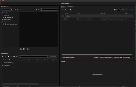
I also learnt the difference between MP4 and MPEG4:
the terms “MP4” and “MPEG-4” do not mean the same thing. MP4 is the digital container file and MPEG-4 is the standard for encoding the video content within MP4 files. The video content inside an MP4 file is encoded using the MPEG-4 standard.
0 notes
Text
Progress Update: 1
As I automatically save and export for my own sanity, I figured I may as well also upload to here so that you can see the development of my project as I go.
0 notes
Text
Handwritten Effect
youtube
This video was a really useful tutorial on how to create a handwritten effect in AE. I used it several times in my animation as it worked well with the tone of my speech and also worked well with my typeface, Lullaby Regular.
It is handy that I am familiar with the pen tool due to previous experience with Illustrator last year.
0 notes
Text
"Vintage Photographs" Final Illustrations
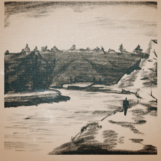
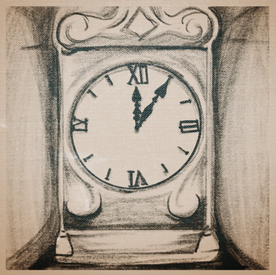

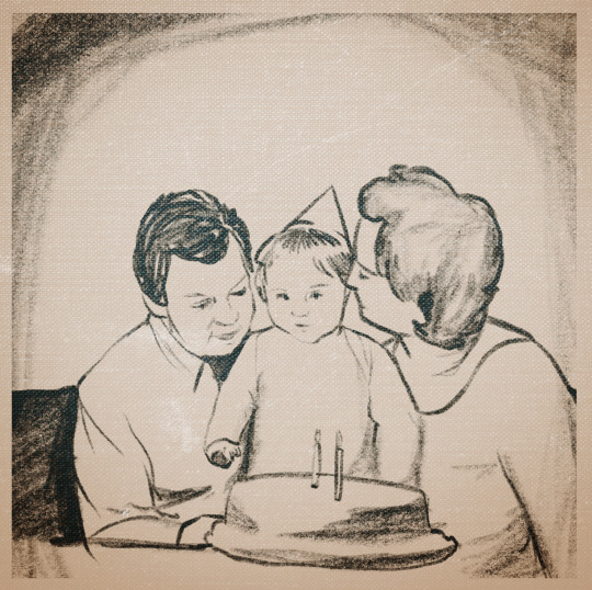
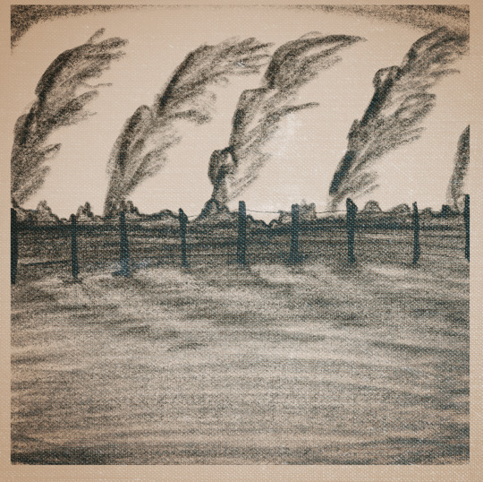


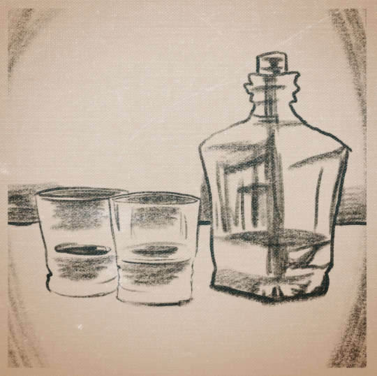
These illustrations all related individually to a unique line of text from Sam Hunt's poem. I used reference images and a 6B brush in photoshop to quickly sketch them out, and then overlayed effects such as texture and vingette to make them feel older. From there I imported them into AE
0 notes
Text
Sam Hunt Books
A bit lackluster for inspiration, I found some books with poems of Sam Hunt's in them. I like the feel and want to incoporate this type of design.


0 notes
Text
Week 12: My Credits
Director/ Producer: Macy Taylor
Typeface: Lullabies, Adobe Fonts
Sound Design: A still morning at Collingwood Beach, Golden Bay, New Zealand. By Simon Gray
Tui recording by Tdes
VO: Sam Hunt 2012
Sound Effects: Freesound
Production Date: June 2023
0 notes
Text
Yellow, Sam Hunt (Dick Frizzel)

Handwriting is like Lullabies, I really like how my type nods to this kind of artwork, and sort of the tone and saturation of the colour as well.
Media
lithograph on Arches 88 paper
Description
The work is incribed with a poem called "Yellow" by Sam Hunt.
Credit Line
Collection of the Sarjeant Gallery Te Whare o Rehua. Gift of Muka Studio, 2011.
0 notes
Text
Design for Still Frames: Initial Blocking
Something that is important to me throughout this process is to have well laid out type alongside the animation. I wanted to make sure each composition worked well beyond simply moving nicely. I created this as a low-investment feel of how this concept would work out.
0 notes
Text
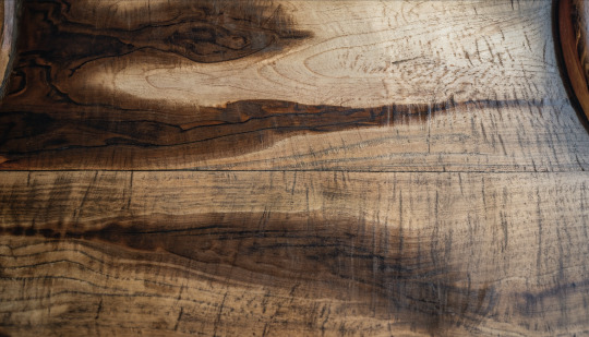
Potential Background Iteration
I considered using this wood grain background, but ultimately (with my own critical thinking and feedback from peers) decided a simple background was better for contrast, business, and readibility.
0 notes
Text
Week 11: Feedback
George
remember type is your focus
need to actually do the animation (test so far is not good)
like Dick Frizzel art- good starting point!
Leslie
showed her both options for storyboards, she said leaning towards photos
if you are going for the nostalgia, vintage feel, consider masking text to make it feel like it's handwritten (watch tutorials below)
General Feedback
regularly watch it back at full size
don't use too many typefaces
make sure you're not going too literal
don't be afraid to use ease in/ ease out
make sure the timing of your text lines up perfectly with the words spoken
maybe put more words on screen to make it not move to fast
0 notes
Text
Week 11: Type Effects
Remember to apply motion blur when needed!
My text effect! Made with 'Tea Leaves' in Curves and Spirals. I had to adjust the length of the effect which was a challenge to adapt key frames. I really like the possibility of these but I don't plan to have this replace my actual animation.
Below I have attached screenshots of how to discover effects in Adobe Bridge. Bridge is really great because I can preview how the effects look before I drag them in, and I can also see the length of the effect so I know where to add it. I mostly learnt how to do this from the videos on Canvas, which I watch before class so I can be prepared.


0 notes