
jaygraphicarts3
Jay Graphic Arts — Year 2 FMP
28 posts
Don't wanna be here? Send us removal request.
Last Seen Blogs

sulsulpie
sulsulpie

manlykaks
Pussy, anal and all the dirty sexy thoughts.

ao3feed-dadzawa
AO3 Feed Dadzawa

auctiondeal-blog
Auction My Deal
Text
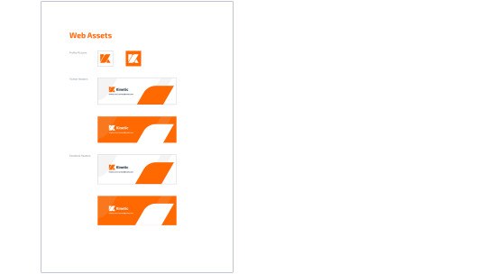
Final Practical Development—Product Advertisement
For my last final outcome, this is where the collaborative aspect of my project is shown.
Collaboration
After discussing ideas with a range of peers amongst the class, I started to feel like my project was lacking a specific product to apply my outcomes to. As well as this. the ‘Kinetic’ brand had no examples of work they offer which meant that it would be harder for an audience to associate the branding with how it would be used. My peer, Jake, was in a similar position but he had a clear idea of his products but nothing to apply them to. He created a series of skateboard graphics using Greek mythology as the subject and rough collage as the process. However, he hadn’t yet applied the graphics into any context other than just being on a skateboard, so we chose to combine our concepts and make the skateboard series an example of ‘Kinetic’s work.
Exhibition
Due to the collaborative element of this outcome, Jake and I decided the product advertisement will be the primary outcome for the exhibition instalment. The exhibition is a collection of the entire year’s final pieces from graphics, photography and fashion/textiles. Because of this, there where multiple things we had to consider in terms of the surroundings of how the work would be viewed. The first one being the arrangement of the television for the animation, the skateboards and the contact information we decided to add.
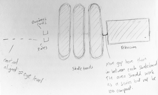
We wanted the advertisement to prompt the viewers of the exhibition to look at the contact information to the left, so I chose to have the end slide to indicate where they were. This wouldn’t have been possible without planning the space beforehand.
Process
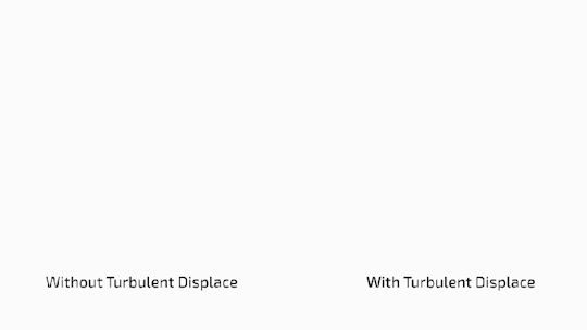
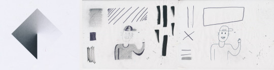
The first step was to add the logo reveal to the start and apply the music we decided to use. Next, I showcased the skateboards in a series, introducing the name of the series and starting to implement more of the hand-rendered aesthetic that is present in the skateboards themselves. For this, I used the turbulent displace effect I used in the logo reveal as well as using textures from the skateboard designs inside the text by using ‘alpha matte’. I also created an animated texture by using ‘levels’ and ‘black and white’ adjustment to a newsprint texture which I then offset to make the effect of the flickering scratches.
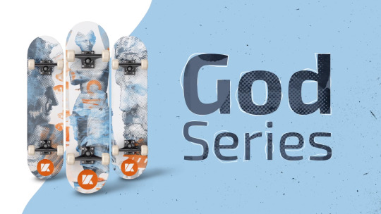
The next stage was showing the designs individually. I used similar visual language to the rest of the animation to keep it consistent. Lastly, I added the information at the end. Because we planned to place the contact information to the left of the skateboards and television, I used left facing arrows to prompt the audience to look in that direction. Being surrounded by a large range of other peoples’ work, I wanted to put importance on the contact information to avoid it being overlooked.
Because I was using a song, I found it easier to work out the timing of this animation as I had specific beats to synchronise the motion to. This was done by adding markers on the After Effects timeline and making the keyframes start/end at these points. I also made the start and end frames white to make the video loop seamlessly.
Below is the final outcome:
youtube

Review
Whereas the logo reveal featured no hand-rendered qualities, I believe the video advertisement does so more effectively. I implemented it more so in the advertisement because the skateboard designs featured a similar look with the rough collage techniques that Jake used. One thing I also think Jake and I both did well is communicating the brand identity consistently. Jake kept his designs to just blue and orange and used the colour and placeholder sections of the brand guidelines to use the logo correctly on the boards. If I were to redo this again, I would look more into expanding upon the sound and implement more hand-rendered techniques. Initially, I wanted to make a longer video for an outcome, but due to time constraints, I wasn’t able to. I realise now that the advertisement works better when it is shorter and more concise.
0 notes
Text
Final Practical Development—Logo Reveal
Because ‘Kinetic’ is a motion design agency, an animated logo reveal will reflect the brand and what it provides. I also wanted to experiment with digital animation, because it is an area that I want to expand into in the future. It also allows me to present the modern aesthetic which links to what my own future will look like.
Storyboard
The first step, in a similar way to the way I gathered ideas for the logo, was sketching rough concepts for how the logo would animate. I wanted to represent the process behind making and animating the logo. This is where the adobe tool icon idea stemmed from.
Icon Animation
Firstly, I imported the logo into After effects and converted it into paths. I then made orange squares on each point of the logo (before it was rounded). I did this so I could animate the corners rounding at a later time. I then went to illustrator to illustrate the icons I would use in the animation: the pentool, the hand icon and the paint fill icon.

I then imported these into after effects and began animating them constructing the logo, starting with the outlines. The first step was to animate the points in with the pentool icon to reflect how the pentool creates a path. To do this, I used a mixture of position keyframes to control where they were and what time they moved and scale keyframes to make them appear smaller quickly to portray a click.
I then used the outlines of the logo and added an effect called ‘trim paths’ before animating the outline to appear when the pentool points were made. After the outlines were fully complete I added a circle with a repeater effector on the inside to signify that the path had become a shape.

Once this was done, the next icon—the hand icon would then be animated in to curve the 4 corners that are curved in the final logo. Although I made the logo with circles and the shape builder tool, I felt like the action of rounding the corners would fit more with the way the pentool introduced the shape of it.

The last part of animation the ‘K’ icon was to convert it from outlines to fill. For this, I used the paint bucket fill icon. Although this isn’t how you would usually convert outlines to fills in an Adobe software, in my opinion, the paint bucket imagery can be easily understood by the audience. I animated the icon in the same way as the pentool and hand icons. Using position keyframes to control where they entered and left the frame and using scale keyframes to present the ‘click’ effect. To make the paint filling up the logo, I used a circle scaling up to fill the space with the effect ‘turbulent displace’. This converted the circle into a distorted shape which closer resembled how paint would fill up the space.
Once all of the animation parts were finished, I then offset the construction of the three parts of the logo to make it look more like a sequence rather than it all happening at the same time.

Type Animation
To animate the type, I started by tracing the wordmark with individual paths by using the pentool. Following this, I used ‘trim paths’ to animate them entering. I pre-composed this animation, which grouped the layers together into one layer so I could apply the logo to the pre-composition. I used the feature ‘alpha matte’ to do this. This means that the path animation is only visible when it overlaps with the logo. The effect of this can be seen in the bottom animation below, the text appears to animate on. I chose to animate it this way because I wanted all of the elements of the logo to feature movement. If I just had the type come on without moving, it would appear to be stagnant compared to the amount of movement everywhere else in the scene.

I decided to leave the dots of the ‘i’s out in this stage as I wanted them to ‘spring’ in on their own. For this, I referred back to the 12 principles of animation as I wanted it to be more of an organic movement. I started with the position keyframes to moves the dots up and down, before altering their size to give the impression of squash/stretch. To make it realistic, I stretched them at their fastest velocities and squashed them when they bounced.

All that was left to do now was offset the animation underneath and change the colour to orange. I felt like more orange details could be featured in this part to complement the animation of the icon. Below is the final text animation.

The last step of the logo reveal was combining the two elements together seamlessly. To do this, I pre-composed the text animation and treated them as two group. The pre-composition feature is extremely useful as it allows you to animate in groups which makes this particular process of combining two animations together a lot easier. To do this, I let the icon animation play first, adding some scale at the start to make the first pentool icons as clear as possible, before using a mask for the text composition to appear from. I again used position keyframes to alter their placement, making the logo almost ‘slide’ to the left for the text to appear from.
Sound
With the animation finished the last step was to add sound to match what was happening on the screen. I did this by focusing on one aspect at a time with the individual layers in after effects. For instance, placing the pentool sounds one at a time, before placing the hand sounds and paint fill sounds. Lastly, I added an overlaying sound which fit with the transition between the icon and the type. I had to make sure to use royalty free sound effects to ensure I had the rights to use the sounds. Below is the final animation with sound.
youtube
Review
By using motion design, I think I was able to successfully encapsulate what the brand can offer in terms of modern, smooth animation. If I were to redo outcome in the future, I would want to use more of a hand-rendered approach to make the digital animation more successful. I would still want the modern aesthetic to be clear because it is representing what I envision my future to look like, but possibly in terms of adding more textured elements with hand-rendered process which could complement the paint effects I added completely digitally.
0 notes
Text
Final Practical Development—Brand Identity
Starting off with the branding element of my final outcome, I used my project name ‘Kinetic’ as my starting point. The first part of a logo design is the sketching process and I wanted to have a vast amount of rough sketches before starting to choose any final ideas. I used George Bokhua’s sketching technique as inspiration for my own. Roughly sketching whatever came to mind in my sketchbook in a mixture of workshop time and free time, the goal was to be as rough and experimental as I have been since the start of the brief. I have learnt that this loose approach is best for gathering ideas from early workshops and looking at artists like David Carson.
Sketching
I started my first set of sketches in independent workshop time. I found myself starting to slow down with my ideas after a while. I also found that I would have ideas spontaneously, so I started to use my sketchbook outside of workshops whenever I would get ideas. For example, when at home or travelling. I believe gathering ideas from different sources of inspiration at different times helped expand the number of concepts I had.
The next step was to refine these sketches into cleaner sketches based on what I think would be the most successful. Here, I had more of an opportunity to think about the potential of using the logos in a system as well as adding more refinements to them.
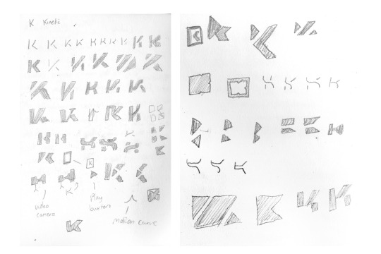
Vectorising
The next step was to vectorise these main sketches. I used Illustrator to keep the vector format of the logos. This meant I could scale them to any size without losing quality. Using Illustrator also meant I could use ratios and geometry to make the logos balanced and edit them more after making them with minor adjustments. Here are the concepts I vectorised:

By using a mixture of the pentool, the shape tool and the shape builder tool, I was able to translate my refined sketches into geometric logos with grids. I made sure to keep in mind the principles of gestalt and the rules of making a successful logo when making them. Altering the logos was made easier with a digital process as I could easily duplicate each logo to keep track of the changes I made.
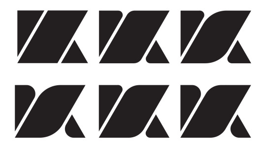
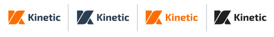
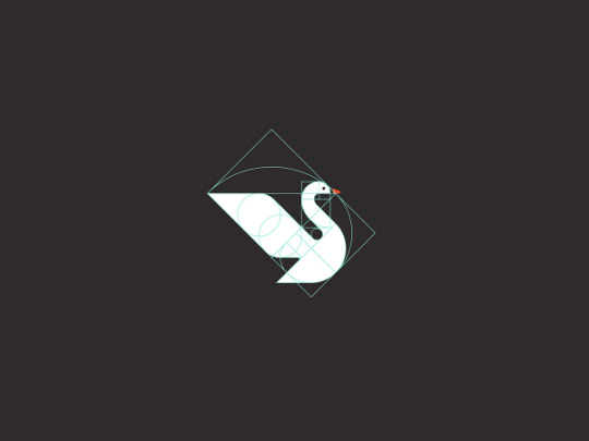
From a mixture of feedback from peers and tutors, I found the most effective logo to be the one below. I feel like its success comes from its consistency in line weight, negative space and angles. Its simplicity means it works at multiple sizes and the combination of the shapes and the spacing between them subtly represents the theme of movement and energy which encapsulates ‘kinetic’.
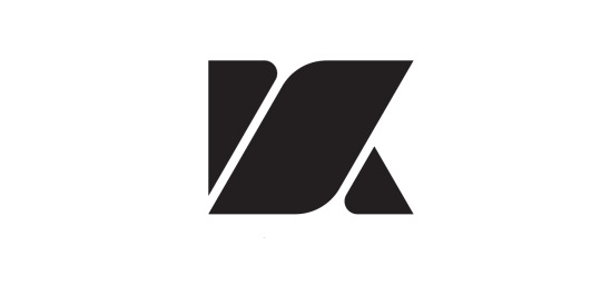
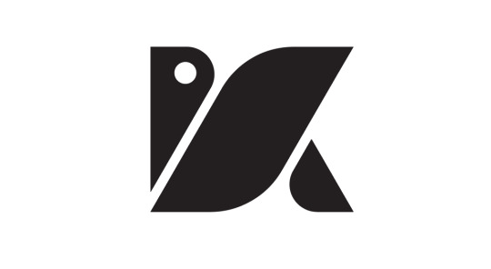
It was also at this stage, where a tutor recognised a subtle bird figure in this K if there was an eye in the top left region. By placing a circle in the top left to act as the eye of the bird and adjusting the rounded edges I started to see the resemblance. The imagery of the bird also links to the theme of ‘kinetic’ as it represents swiftness so it fit well with the concept of the brand. However, I didn’t think the resemblance was enough to justify me using it for the logo. After asking the people around me, some saw the bird first and some saw the ‘K’ first and the top left circle became confusing. To make the logo as objectively understood as possible, I stayed with the original ‘K’ concept, but this experience taught me how some concepts can come up in different stages of the design process after the sketching and vectorising stage.s
Up until this point, I had been working with just the colour black. I highlighted a rule in my logo design research to be making sure the logo works in a single colour first before applying colour afterwards. If I were to reverse these steps, I would risk the legibility of the logo being less in a single colour. Now I had a concept I was happy with and the majority of people I asked also thought it worked, I experimented with a range of colour options.

I chose orange as the primary colour, as well as trying different shades of blue as the secondary colour. When I got feedback about the colours, the feedback was a lot more spread over the options and I found it to be more of a subjective choice. In the end, I chose this option because it implemented the vibrant, energetic orange with the contrast of the dark navy blue, without having too many colours to over complicate the brand identity.

Type
This was probably the hardest section for me as I was unsure where to find fonts that were unique, distinctive and legible. I stayed with sans serif fonts as I wanted them to work at all sizes and reflect the geometric aspect of the logotype. In the end, I chose the typeface “Exo 2″ to be the brand typeface. I thought it was the best fit with the aesthetic of the brand, mainly because of the similar harsh angles that are present in the ‘K’ icon.

Here, I got some critical feedback from a tutor who specialises in typography. This was useful because he spoke less about how the logo looked and more about how it would function. In terms of the colour, he explained the difficulties of printing colours, orange is one of the colours that may be printed inconsistently with how it looks on a screen. To solve this, I was given a Pantone colour booklet to choose a Pantone orange which ensures it will be printed as the same orange. Lastly, he gave me some minor adjustments to make in terms of the kerning of the ‘Kinetic’ type. His reasoning was that typefaces are kerned to suit read type situations, so when used for a logo they need to be adjusted so they work on a larger scale and the spacing doesn’t become too large.

I made these adjustments and then went back to peer feedback. Here, someone pointed out the thickness of the middle section of the ‘K’. I wanted this to be bold, but after looking back at this and how it affected how it was perceived as a ‘K’, I decided to make it thinner to make the overall logo fit square dimensions more. Below is the final variations of the wordmark.
Brand Guidelines
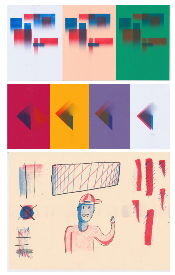
Brand guidelines are important to have to ensure anyone representing the ‘Kinetic’ brand does so by staying to the aesthetic of the brand correctly. This also helped on expanding my final outcome from it just being a singular logo on its own. It meant that anyone could understand the brand identity fully by looking at the brand guidelines. Below are the pages I made.


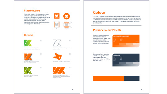
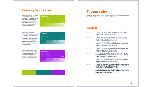

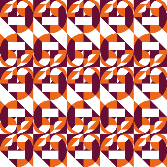
Two new things I introduced here is a secondary colour scheme and patterns. The secondary colour scheme is made out of the complementary colour of the primary orange and two other tones equally spaced out over the colour wheel. The secondary colour scheme is something I added so more colours can be used to represent other areas of the brand if needed.
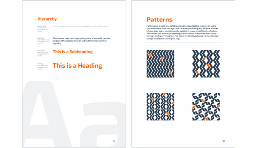
Patterns were something I highlighted when looking at Bierut’s work on logo systems. I tried to follow what I learnt here and in my pattern workshops to create the brand patterns. To do so, I used the middle parallelogram of the ‘K’ as the common aspect of the patterns. This meant that the patterns were still linked to the original brand iconography but each had their own distinctive look. This is my reasoning for keeping a small number of the parallelograms orange in the patterns. This makes it more clear that it links to the logo and makes the parallelogram a more distinctive shape overall.
Review
Overall, the final outcome reflects both my personal interests in processes and how my own future could look in terms of brand identity. Animation is something I highlighted at the very start of the brief as one of my interests, which is why I created branding for a motion design agency. If I were to create this outcome again, I would put more emphasis on the typography and logo system. Although I think both elements work well in this outcome, they are not as strong as some of the examples I have looked at with Michael Bierut’s work. The main aspect of the logo system is the parallelogram and the angle its sides are at. In terms of the typography, I would experiment with creating my own type. That way, I can customise how the letters are structured and possibly use the brand system to accompany this structure. I chose to use an already existing typeface in this case simply because of time constraints.
0 notes
Text
Eadweard Muybridge—Case Study

Although never making a single drawn animation or even image, Eadweard Muybridge is renowned for his vast contribution to the studies of moving image. Muybridge was a photographer and would take sequential images of a subject before playing them back to create the illusion of movement. The studies of animation were so young that some people would explain the movement as ‘magic’ and were baffled as to how they were witnessing the movement, which shows how revolutionary this technique was.
Why is his work helpful/revolutionary?
It is important to look at Eadweard Muybridge’s work and use it as an example to work from because it allows me to look at a similar process the earliest animators would’ve done. Because animation at the time of Muybridge was hardly developed on, what we see today as accessible would’ve seemed alien to most people. Starting with the backbone of animation, rotoscoping from a photographic sequence helps build the contextual knowledge to create more modern animation using the same principles.

Another huge impact he has had on art, in general, is with the accuracy of the depiction of the horse. Horses had always been depicted in art with all 4 hoofs off the ground, spread away from the horse’s body. It was a long-lasting debate whether all of the horse’s hoofs were airborne at once, so Muybridge was hired by businessman and race-horse owner Leland Stanford to settle the case. It took 6 years to settle the case with Muybridge perfecting the photography of a horse gallop until he successfully shot the gallop accurate enough that the airborne pose was a frame.
Process
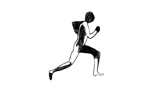
Firstly, I used paper and a pencil above the subject image of Muybridge’s photography sequence of a man running so I could begin roto-scoping over. I used a pencil because I wanted to portray some texture. This was to experiment with how texture could be animated on top of just the main animation, I also used a lightbox underneath everything so I could see the frames on the bottom easily; this caused my outlines to be more accurate so that when they were played back in sequence there wasn’t a large amount of chattering in the frames.

Chattering: This is the effect in which frames seems to ‘wobble’ when they are created with a frame by frame process. This is caused by a lack of consistency in each one which I used to my advantage to compliment the texture my pencil marks made. In comparison to more modern techniques such as key-frame animation where the chattering isn’t there, it can offer a more authentic look to an animation.
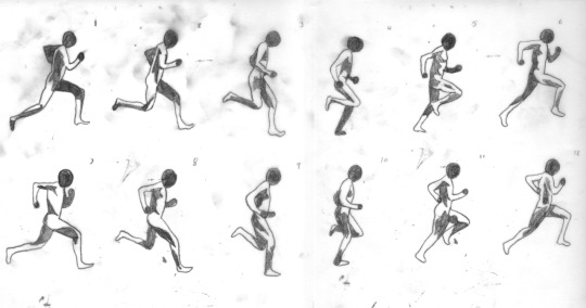
As I sketched over the frames, I made sure to number each one as I was going to composite them digitally at a later stage. To avoid confusion of the order in which the frames play, it’s important to stay organised from the beginning of the animation process.
The next step was to composite the frames together in a sequence to create the illusion of movement. Eadweard Muybridge used a ‘zoöpraxiscope’ to play back his sequences. This was an invention he himself conceptualised, which he then used to bring his photography into movement. It was a circular device with slots for individual frames, which would then be spun at a speed as to give the illusion that the frames passing by were overlapping and therefore would look like movement. For this workshop, the Photoshop timeline is what I used to put together the frames. The way the motion is developed is done in a similar way, by playing the sequence of images at a speed to give the impression that they are connected and part of one motion.
The first part of the Photoshop stage was to edit the frames together to bring out the contrast and remove the colour of them. My aim here was to get the black areas defined enough so that they could easily be seen, but still maintaining the texture of the pencil marks. For this, I used the image adjustments ‘Levels’ and ‘Hue/Saturation.
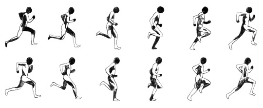
After making the sheet of frames suitable for putting them together, the next step was to isolate each frame to a separate layer. I did this by selecting one frame, cutting it from the original layer and pasting it onto a new one; before doing this for the remaining frames. Lastly, I used the timeline window in Photoshop to play back the layers. I placed the layer labelled ‘1’ as the first timeline frame, then made a new frame for each stage of the animation, making sure to lower the opacity of each one to make sure they were lined up.
Review
Looking and responding to Muybridge has been extremely beneficial in learning about the early techniques of animation before digital processes were possible. It also allowed me to practice hand-rendered frame by frame animation, which was something I was previously uncomfortable. The main thing I have taken from this case study is the importance of rotoscoping in all areas of animation. Rotoscoping is the basic way to animate organic movement. This can be mixed with the 12 principles of animation to make an animation even more effective.
Looking Back
The 12 principles of animation didn’t really apply to this experimentation as I was tracing directly over 12 frames. A potential for this is using techniques I have highlighted over the top of the rotoscoped frames. For example, on the ‘pass’ frames where the arms are moving the fastest, I can add ‘smears’ to the arms to further portray their speed.
Moving Forward
My next step is to explore more modern animation. Using the 12 principles of animation and the processes from Muybridge as my understanding on how to make moving objects have a purpose in a sequence.
0 notes
Text
Fundamentals of Animation—Case Study
My brief title is ‘Kinetic’. Essentially, I need to start implementing moving into my work as I feel like this is something that has been missing so far. I have explored how I can communicate movement without it, but now I want to focus on using movement to make the imagery more powerful. To do so, my first step is to look at the fundamentals of animation.

Two animators who worked for Disney, ‘Ollie Johnston’ and ‘Frank Thomas’ coined the 12 fundamentals of animation in their book titled ‘The Illusion of Life: Disney Animation’. They were both parts of the Disney animation team which was known as the ‘Nine Old Men’. The 12 fundamentals were based on the work of these animators and the aim of these was to produce life-like animation which felt as real as possible. Exaggeration certain elements could be used to give extra expression in character, but understanding how to make movement in a character realistic is crucial for an animator to do.
12 Principles of Animation
Below are the 12 principles of animation as stated by Johnston and Thomas. The gifs were made by Vincenzo Lodigiani and showcase each principle in action and its effect.
Squash & Stretch

The stretching of a subject whilst they are moving will emphasise the importance of this action. The squash and stretch principle comes from how we perceive faster moving objects as blurry. Motion blur is evident when travelling fast distances and observing our surroundings. In a similar way, when an object is moving quickly, the motion blur is implied through the stretching of the object itself.
One important thing to keep in mind when using squash/stretch in my own work is that the volume of the object must remain consistent. Therefore, if I increase its length, the width/depth of the object must be scaled smaller to compensate for its extra length. Without doing this, the animation may have a robotic feel which doesn’t portray life-like movement.
An object’s squash/stretch patterns will also indicate a lot about its weight. Small, sudden changes in shape indicate heavier objects, whereas longer, more accentuated changes imply a lighter object which is more prone to being altered. This is most easily recognisable in a simple ball bounce animation.
The left frames feature no squash/stretch. Along with the small bounce the ball takes, these two qualities are enough to make the ball’s heavy weight obvious and make it seem to be made out of a strong material. On the contrary, the right frames feature a stretch of the ball when it is at its fastest. Both this and it’s higher bounce make the ball seem a lot more lightweight.
Anticipation

Anticipation is the steps leading up to an important animation. Having anticipation gives the viewer a short time to prepare for the following action. This will highlight its importance as it ensures the viewer is ready for what is about to come. Life-like animation is achieved by looking at real-world examples and mimicking them. Anticipation is a reflection of the way both people and animals prepare themselves before releasing a lot of energy. For instance, when we throw a ball, we cannot do so without gathering energy first. When a cat is about to pounce, it gathers energy in its legs rather than instantly leaping. Both of these examples link to the anticipation rule in animation.

Above is an example of how powerful anticipation can be in overstating the impact of the following animation. In this case, ‘Bugs Bunny’ takes part in two acts of anticipation. The first being rubbing hands and then preparing for the major swing. The effect of this is that the audience has enough time to infer the next step which means when it does happen it has more impact. If you were to picture this same animation without any anticipation and the bat beginning to swing instantly, you can picture how sudden and unimportant the swing would be.
Staging

Staging refers to the general presentation of a subject. This could be in regards to its surroundings, or simply how a character is posed in a frame. Good staging makes the narrative clear from just a still frame. How everything is arranged should accompany the narrative and therefore when the animation is frozen, it shouldn’t be unclear as to what is occurring.
Something to avoid when considering the staging of a character is a frontal facing pose: Frontal facing characters are a lot harder to portray as life-like because we naturally tend to perceive faces as side on or with a slight angle to them. Not only this but accentuated poses from a frontal angle do not work as well because of the more layers of detail which are overlayed. The example below demonstrates this.
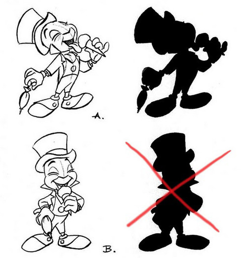
Silhouetted versions of characters are a good indication as to how effectively they are staged. Well-staged characters will have a clear pose even when all of the detail is removed to just a solid block of colour. Because the bottom example has a more frontal-facing angle to it, the ice cream is then forced to be placed over the character, which makes it hidden in a silhouette scenario. Staging applies from the most general stances to the smallest detail. Details in a character’s staging can offer a lot of information about their personality. For example, the top example above has a lifted pinky finger. Not only does this make it more legible as a silhouette, but in its main form, along with the lack of overlap with the other features, the feet being curled upwards and the facial expression, it is extremely evident that this character is happy.
Straight Ahead Action/Pose to Pose

With frame by frame animation, there are typically two ways in which animators create life-like movement. The first is ‘straight ahead action’ which is simply to start at frame 1 and work through each frame individually until the sequence is complete. ‘Pose to pose’ animation focuses on the key poses of a sequence, before filling in the missing frames between these.
A walk cycle is the most common instance where pose to pose animation is used.
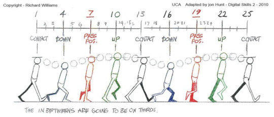
A walk cycle is broken down into 4 poses:
Contact
Down
Passing
Up
When these poses are drawn first, the animator can focus on the most expressive parts of the animation separately and have an easier time controlling the life of the walk. If you want to create a walk of someone who is miserable, these poses will have low ‘down’ and ‘up’ poses, along with the contact poses being almost ‘droopy’ as the character struggles to continue. Once these frames are identified, the frames between these poses (also called ‘tweens’) are filled in to make the animation more smooth. Tweens can also account for the speed of the walk cycle. Fewer tweens mean a faster walk, although more tweens solely concentrated in the middle of two poses can make the walk seem more ‘bouncy’.
With ‘straight ahead action’ it is harder to judge the timing of a walk cycle as you simply go through each frame sequentially. However, straight ahead action works better for more abstract animation such as visual effects because there is no specific poses that are exaggerated.
Follow Through/Overlapping Action
Follow through and overlapping are two techniques which are grouped under one heading because of their similarity. ‘Follow through’ describes when an object stops, the motion that continues after it stops is the follow through action. For example, a running cat will have certain body parts which take part in overlapping such as the hair. or more obviously, the tail. As the cat stops from it’s run, the tail may continue to move in reaction to the run for a period of time after. Overlapping action describes the offset of different parts of an object.
Both of these effects can also indicate an objects weight/sturdiness. A large amount of overlapping action which takes longer to dissipate portrays a more flimsy object. On the contrary, shorter bursts of overlapping action mean the object is less subject to change and therefore more sturdy.
Both can also apply to the primary animation, not exclusively action that happens afterwards, For instance, when a person transitions from lying to standing, they start by raising their core before raising their upper body. When portraying this in an animation, it's important to make this obvious by emphasising the transition of energy from the bottom of their body to the top.
Slow In and Slow Out
This is a simple concept which relates to the change of speed in an object. When an object comes to a halt after moving, it doesn't do so instantly. Instead, it gradually gets slower and slower until it is completely still. The same applies in reverse. An object will not instantly change from still to moving (unless another object acts upon it) so easing must occur to gradually change its speed. There are three main types of eases. Ease in, ease out and ease in and out. Ease in is simply when the ease of speed happens at the start and is abrupt at the end. This would be applied to an object travelling down a hill for example where the speed increases exponentially before approaching a solid terminal at the end. Easing out happens when an object travels along a surface but the lack of ease in the beginning implies a greater force acted upon it at the start. For instance, when hitting a snooker ball with a cue, the speed of the ball is the fastest at the very beginning of the sequence, but it gradually slows due to friction. Easing both in and out is the most common use of ease as this is how organic things move. They start and end slower than their maximum speed.
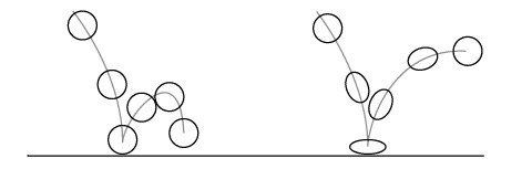
Arc

Objects that follow perfectly straight lines seem robotic and stiff. To avoid this, organic characters should be animated with arcs. Anything from the movement of limbs, to how a ball bounces should all follow paths of arcs rather than straight lines. An example of how useful this can be is in two arcs below. The arcs that the character follow may portray their weight, but in most cases, it reflects their surroundings/things they are interacting with. By simply changing the direction of the arc and body posture, the weight of each ball becomes clear.

Secondary Action

This is the motion that is directly affected by the primary action. There is countless ways this can be portrayed. Some of the most common examples of secondary action are hair flowing, clothing and facial expressions. Secondary action is a subtle way to add distinct character to something. It is what sets apart a stickman and a realistic human other than the illustration.
In the example below, the secondary actions are the smoke trailing behind, the shines on the glasses and the hair flowing. When the figure jumps upwards, the secondary action at that point includes the skateboard movement, the glasses movement and the change in facial expression.

Timing

Timing just refers to the speed of an object and how it changes. This is a similar concept to ease, but in more general terms over the whole sequence. The time something is present for equates to how significant it is perceived to be. More emphasis is put on slower animations as they last longer. Therefore, quick animations can have the effect of portraying energy/eagerness.
In frame by frame animation, timing is determined by how the frames are placed in sequence. More frames equate to a slower animation and less frames make the action pass by quicker. The gif above showcases how the placement of individual frames alters the timing of a liner sequence. When this is applied to organic objects, it changes the animation from robotic to life-like.
Exaggeration

The majority of these techniques are ways in which to add emphasis to certain parts of a sequence. The rule of exaggeration is a more general term which relates to back to the actions themselves. In the gif above, no exaggeration would result in the animation having not as much impact. Exaggeration, in this case, is mainly made through anticipation. Successful exaggeration should be present even in still frames. The most important parts of an object should be altered as much as possible to make them clear to the viewer.
Exaggeration links even to body posture. If someone is miserable, their body will be hunched over, drooping downwards and lacking energy. In animation, these qualities should be exemplified to make it obvious. This also links back to staging. The silhouette of a character should still make it clear what is happening, and a good way to ensure this is by using exaggeration.
When exaggeration is altered past the point of realism, it can have a comical effect.

This is an example of how certain body parts will be exaggerated to put emphasis on a facial reaction. Although it may be comical, one thing is certain. The reaction of shock is extremely clear. Because this frame will only be present for a single frame, the animation will not be overpowered by this reaction.
Solid Drawing

With knowledge on how to draw things in 3 dimensions, solid drawing should be successful. Weight, volume and balance should all be considered and these are the qualities which will be portrayed through the previous principles. I mentioned when discussing squash & stretch that the width of an object should compensate for an increased length. With a solid drawing, the volume of an object should be regarded at all times which is why one dimension must become smaller to keep the volume consistent.
The weight of an object may be shown through the way it is illustrated. However, if it doesn't follow the other rules successfully in portraying its weight it won't be perceived as such.
Appeal

The last principle, considered the most important is a combination of all the previous and means how the animation appeals to the audience in general terms. This links most to the audience as it considers what the target audience will be visually attracted to. This starts at the illustration stage. A younger target audience will be more attracted to simple, cute depictions of characters. As these are animated, their quirks can be presented through more subtle animations like secondary animation.
Appeal transforms realistic movement into the iconic ‘cartoony’ look which is evident in Disney’s animation. It is obvious that in order to emphasise some actions in some cases means sacrificing realism. The exaggeration principle in terms of illustration shows this. The example I used uses unrealistic alterations of certain facial features, but this is done to put the audience’s focus on the emotion.
Looking Back
Looking at animation has given me a new outlook on how to approach portraying organic objects with the use of motion. This has been a refreshing research task into something I am unfamiliar with. Portraying things realistically has always been one of my weaknesses when it comes to sketching/drawing/illustration. Because I have been able to break down a character’s movement into 12 basic principles, I feel like I am more able to portray something using animation than illustration.
Moving Forward
I now want to go on to research an artist that has influenced the field of animation and use their techniques in my own work along with this research. I then want to start combining these fundamentals of motion into my other areas of design (type and branding). To do so, I will carry out some practical development workshops using animation as the primary outcome. I feel like this will better equip me for when I start producing my final outcome as I will have built up the 3 practical skills I want to use and highlighted how they all link together.
0 notes
Text
Geometry/Pattern Experimentation
Illustration
Responding to the two artists George Bokhua and Michael Bierut, I wanted to experiment with patterns which could be implemented into a logo system. I have had plenty of experience with logos in the past, but was yet to look into brand identities as a whole using other elements to correspond to the main logo. I chose to look at the modern approach of geometric illustration that is featured in Bokhua’s work and apply it to a pattern to analyse the effects of how pattern functions.
To create the illustrations, I first created a square with the rectangle shape tool, holding shift to lock the aspect ratio to 1:1, before splitting it into four equal squares by adding more rectangles on the inside. From here, I started to randomly place a mixture of rectangles and circles making sure the ‘smart guides’ option was enabled so they snapped at the edges and centres.

The process here reflects back to the first workshops at the start of the project where the aim was to be loose to gain ideas. Before this project, I struggled with doing this and would continue to restrict myself to working in a very organised way from the start. In some cases such as closed briefs with short deadlines, this may be more efficient but I wanted this experimentation to serve more as a source of inspiration for my final outcomes.
I continued this process several times to have a selection to choose from in terms of which ones I thought were the most successful. Because I was random in my shape placement it meant that some outcomes weren’t as successful.
I changed the colours of all of the individual shapes to make them separate. The effect of this is similar to the contrast I found in my print work when responding to David Carson. There is an element of chaos in the little shapes and colours, but the contrast is in the order of the outlines of the larger shapes.
To experiment with how limiting colours effects this, as well as to relate back to George Bokhua’s use of colour, I then used the ‘Edit Colours’ window in Illustrator to restrict the colours to 3 colours including white. Using the same structure of shapes made it increasingly difficult to make unique configurations of the shapes, so I chose to use different colour schemes for each one to separate them from each other Below are the final illustrations.

Patterns
Because I made the illustrations confined in a square, making them into a tileable pattern was an easy task. I imported the illustrations into a square photoshop file and selected Edit>Define Pattern.
To expand on these patterns and test different ways I could create patterns out of the illustrations, I test alternating the orientation of the illustration every other row and found it to be more successful because the transitions between each individual illustration were more seamless.
Below are the final patterns.


Review
I feel like the way I created the pattern reflects the work of George Bokhua without being too similar. The main difference between these outcomes and his is the use of Black as a key colour. I didn’t choose to use this because I wanted to restrict the colours as much as possible whilst keeping the original geometry I used to make them visible.
One thing I think lacked in this experiment is applying the patterns to a brand identity. I linked back to George Bokhua in terms of practical outcome, but I feel like I overlooked Bierut’s techniques of brand systems.
Looking Back
The process of creating these patterns is very similar to creating logos. This is why I think they have the potential to work alongside each other in a brand system so well. Using shapes and restricting the colour palette, I see a lot of similarity with the work I have done up until this point with logos and simple illustrations.
The patterns also show some areas of gestalt which is why the viewer can still understand the original shapes of the illustration. the main one being continuance. When an outline of a circle is partially complete, the audience implies the full circle which is why in the case of these patterns, it is almost as if there are many shapes that are overlapping, which contrasts with the use of just two colours.
Looking Forward
The main aim of this workshop was to explore a different way to use brand systems. Moving forward, I will apply patterns to a brand system and look at the effects of how logos and patterns work together. I want to go more into the techniques of Bierut when I do this so I can understand why logo systems work as a series and how to create patterns accordingly.
0 notes
Text
Michael Bierut—Logo Systems
Having looked at logo design, my next step is to look at different ways in which logos can be applied to brand identities. I chose to look at Michael Bierut as an example as he is responsible for some of the most versatile logo systems which are being used in the market currently
Born in 1957, Michael Bierut graduate from ‘University of Cincinnati’s College of Design, Architecture, Art and Planning’. From here, he started working at ‘Vignelli’, before becoming a partner at ‘Pentagram’ which is where he currently works. Bierut has a New-York based team amongst Pentagram which was responsible for the rebranding of ‘Barwis’ (an example I have already looked at as a successful logo system design. As another example of a logo system which has been used in a different way, Michael Bierut’s work on the Hillary Clinton logo system is something that I find to be very effective.

The process started off as any logo design would, at the sketching stage. The difference between sketching a logo and sketching one with a system in mind, is that Bierut already started to think about how versatile this logo could be early on. In fact, he chose his most effective pieces not based on his personal preference on them, but how well he though they would work when applied to a logo system.
“It wasn’t clever or artful. I didn’t care about that. I wanted something that you didn’t need a software tutorial to create, something as simple as a peace sign or a smiley face. I wanted a logo that a five-year-old could make with construction paper and kindergarten scissors.”
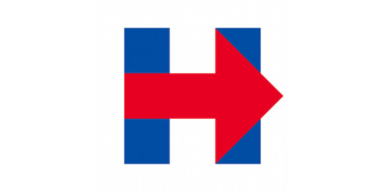
Bierut aimed for something “that a five-year-old could make with construction paper and kindergarten scissors”. This links to one of the original rules I set myself for making successful logos, which is that it must be simple and a good gauge for the rememberability of a logo is if it can be easily redrawn. The minimalism of this logo allows it to become incredibly versatile, to the point where even everyday objects can be substituted for the segments of the logo and it would still represent Hillary Clinton’s political campaign. Below are some variations made by Karen Todd which show this well.
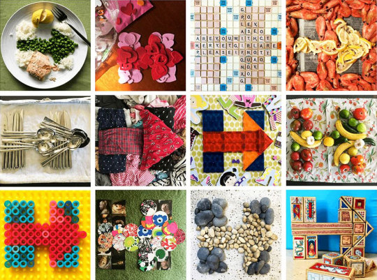
In terms of the official branding, the arrow and the H were used as elements which were then substituted for other imagery. For the most part, the arrow, representing progression and moving forward, was used as a placeholder for the main focus of the imagery. This means that the logo could be altered to fit with a certain political discussion. As an example, some of the imagery in the logo illustrations below have certain connotations relating to ‘hot’ topics. With a simple change of colour, the second and fifth examples relate to LGBTQ+ issues and breast cancer awareness.

Not only is Bierut a designer but he is also a design critic, which made me want to focus more on his views on the field of design.
“The great thing about graphic design is that it is almost always about something else.”
“79 Short Essays on Design” is one of his books in which he gives his observation of design and it supplies multiple interesting and unique quotes due to his sometimes impassive outlook on the field. “The great thing about graphic design is that it is almost always about something else.” and “To me, the conclusion is inescapable: the more things you’re interested in, the better your work will be.” are two quotes I initially found a lot of interest in from the book. Although they don’t discuss how to make a good logo, it’s important to realise how taking influence from other things around you gives more value and individualism to your work. The way I interpret these quotes together, is the more you look at, the more versatile you will be as a designer. With no interests, you are restricted to the same information and research areas. Therefore the more you have an interest in, the more you can take to apply to your own work. I can relate this back to the ay I gathered ideas with my 10 curious objects towards the beginning of the project. Curiosity has been a vital element of the way I have gathered my ideas through trying to make connections between unrelated objects and workshops.
“Making the complicated simple and finding beauty in truth.”
Another quotation from the book is “designers actually can change the world for the better by making the complicated simple and finding beauty in truth.” and this also was relevant to me and my project as it reflects the principles of modernistic work. Logos are the most successful when they are simple. So this usually requires the simplification of what was a complex subject. I saw this in George Bokhua’s work, where he would simplify animal forms into just lines or circles. Michael Bierut’s explanation of “beauty in truth” at first confused me, so I asked myself what he meant by this. Eventually, I linked it back to examples of influential design and came to the conclusion that ‘truth’ refers to the response the audience has of the original subject of a logo, in comparison to the abstracted version of it. It’s important to carry the original connotations in the logo you are making as that is what will make the logo design more recognisable.
Looking Back
Logo systems can link to the work I have already done on logos because they can be used alongside each other. This means that the fundamentals of typography will also play a part as to how effective a logo system is. For example, consistency. The consistency of a typeface makes all of the letters to be perceived as one group rather than individuals. In the same way, consistent elements of a logo system (patterns, grids, colours, imagery etc.) can be used to carry the brand identity amongst a much larger range of media that a single logo could do.
Looking at Michael Bierut has shown me an approach to logo design which differs from George Bokhua’s. Bokhua is a successful artist focusing on modern, clean logo designs. Bierut on the other hand puts more emphasis on the brand identity as a whole as opposed to the logo alone. Bierut’s work being adapted to logo systems means they work best that way. Because of this, I feel like George Bokhua’s logos, although may have a bigger impact upon first seeing them, will not work as well when used as a logo system. Especially in the case of his more organic shaped logos, it will be harder to find elements to use for a logo system which wouldn’t feel disconnected from the main logo.
Moving Forward
My next step is to apply my research on logo systems into some practical outcomes. I have already explored logos and type thoroughly, so I think I should try to expand on this with other elements that would be included in a logo system for practical developments. My main aim over the next week is to explore how patterns can be used with branding.
0 notes
Text
Risograph Printing—Practical Development
Up until this point, I have explored both digital and analogue processes. In this workshop, I aim to look at how they can work together in different ways where the digital stage isn’t for refinement.
The risograph converts black and white imagery into outputs made up of layers of ink. The risograph can only take one colour of ink at a single time, so the prints should be made in separate layers, with the paper being fed back into the risograph to create overlaps.
Process
The first step was preparing the black and white imagery to feed into the risograph. I wanted to test how solid colours and gradients would transfer. I prepared two pages of different types of digital gradients and prepared two pages with hand-rendered materials (sharpies, biros and pencil) so I could compare how both change. I would then overlap these pages when they were printed in the different risograph ink colours. I had to think each page as either a ‘red layer’ or a ‘blue layer’ as that is how they would be printed.

Next, I placed one of the layers in the scanner of the risograph and created a ‘master layer’ to preview what it would print out as. This converted the darker parts to more opaque blues/reds (depending on the colour of ink in the risograph). I then selected the number of page duplicates I wanted (this was to compare how the types of paper affect the quality of the prints.
For the last example, I used tracing paper to sketch out the layers. I used tracing paper to ensure the overlaps were accurate. However, because the layers were produced separately. the outcomes have a slight offset between the reds and the blues. This imperfection is exactly what I was looking for in this workshop as its a quality that lacks in my digital outcomes.
Review
This workshop was an interesting method to combine digital and analogue processes in a new way. Usually, I would produce hand-rendered graphics such as textures or illustrations which would then be manipulated and refined digitally. I almost worked in reverse this time, by using digital graphics as the initial assets and using the risograph to finalise the graphics. The difference in impact is clear. My more refined graphics don’t relate as much to the audience because their technique doesn’t seem as accessible to the normal audience. The risograph outcomes have a lot more texture and overall authenticity to them which aren’t as obvious in digital work.
The specific example of this is the way the risograph layers didn’t perfectly match up. This was unintended, but the fact that mistakes are able to be undone instantly in digital programmes stops the work from having these quirks. It is something subtle that carries the message of deformity in a genuine way.
Looking Back
Looking back to my other print work, there are some qualities that set the risograph apart. Firstly, the tiny ‘dots’ that make up the ink impressions give it a unique texture, whereas with screen/block printing the texture isn’t guaranteed. The similarities of all of the printing processes are the messages they all send to the audience. Ink marking is something most people are familiar with, so when an artwork is created this way it becomes more familiar. This isn’t the case with digital design, so it must be used in the right context.
Moving Forward
Now I have experimented with various types of printing processes and understand the rules of branding and type, my next step is to explore all 3 skills together before introducing motion. I aim to use what I learnt about texture in this workshop and how it affects my work and apply this knowledge into some more digital processes to see how different the outcomes would be.
0 notes
Text
Type Workshop—Pixel Grid
Taking it back to the earliest processes of icon and type design, this workshop looks into using the grid to get the basic form of a letter, then expanding from this using shapes to replicate the pixelated letter form. I was inspired to do this workshop from the work I saw at the design museum (where grids were used to directly sketch onto to produce letters that could be used for low-resolution screens), as well as Paul Renner’s technique to create the typeface ‘Futura’. Paul Renner’s process consisted of the same initial sketching process using a grid, but then he would sketch more concise letters over these using tracing paper and pencil.
Sketching
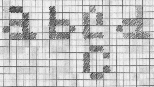
Initially, I jumped straight into the sketching process by going through the alphabet and sketching the letters straight onto the grid. I quickly realised how I needed to establish the X-height and Cap height before starting to sketch the letters so the sizes of the letters stayed consistent. This was evident when I got to the ‘b’ and tried to match its height to the ‘a’. By doing so, I ignored the rule that extenders should rise above the X-height to the Cap height and this made the ‘b’ look miniature in comparison to the ‘a’.
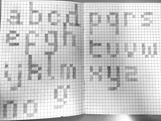
Starting over, I established an X-height of 5 pixels and a Cap height of 8 pixels and tried to keep to 4 pixels as the width for most of the letters. There was no specific reasoning for this other than this is what I felt looked the most balanced when applied to the bowls and stems of the ‘b’ and the ‘d’. Progressing through the alphabet, I started to find an increasing amount of recycled shapes which were used amongst more than one letter. The ‘b’ and ‘d’ are examples of this, as they are identical to each other, just flipped horizontally (excluding the bottom right terminal of the ‘d’). I found that working to a grid made it easier to keep these elements consistent as there was less room to alter their forms. If I would have started straight away at the vectorising process, without knowing what letters featured identical elements to other letters would create an inconsistent typeface.
After creating each letter using the guidelines I had set myself, the next stage was to trace over each letter using tracing paper. By doing so, I refined the forms of the letters using just curves and straight lines. Having the pixel type underneath meant that the letters I traced above still had a balanced structure, but this was combined with smoother lines to make a more modern outcome. This stage was only done roughly because these letters would not be used to produce the final typeface. I wanted to understand how I could convert the pixel type into geometric type before I tried to do so in illustrator. By sketching first, I understood how to convert corners and diagonal lines from pixels to shapes.

Vectorising
My usual process of vectorising a hand-rendered piece of work involves scanning the piece into a digital image, before using the ‘image trace’ function or tracing over the image in Illustrator to convert it to a vector image. In this case, because my type was made solely out of a grid, I could use the grids inside Illustrator along with the rectangle tool to construct each letter. I kept the pixel letters in front of me as a reference, and showed the grid with View>Show Grid. Then, to make sure everything I added to the document stayed to this grid, I enabled ‘Snap to Grid’ with View>Snap to Grid. The grids in illustrator are made up of the grids themselves and subdivisions. Subdivisions are how many smaller squares are inside the main grid. I used the subdivisions as the sizes for the pixels as it was easier for me to ensure each pixel was the same size this way.

Here, I also made some adjustments to the letters themselves. When I converted the ‘a’ into vector format, I felt like the bottom right terminal didn’t fit with it. It just didn’t ‘feel’ right. Therefore, I decided to remove this tail end and just have as a corner. Because I chose to do this for the ‘a’, I also had to carry this change over to all of the other letters with similar tails to them such as ‘d’.

Above is the final pixel typeface. One thing I found hard to carry across was the diagonal lines in letters such as ‘v’ and ‘z’. Where ‘v’ is two lines meeting at a point, with pixels, the lines are forced to merge into each other prematurely and create a block of four pixels at the bottom. With the ‘z’, I had to convert the diagonals into lines that change direction. I felt like this resembled a ‘2′ more and this is why converting the pixels into more legible type was done afterwards.
To start, I highlighted the pixel type, lowered the opacity and locked the layer which they were all a part of. I then used used this layer as a guide to trace over with circles and rectangles and being locked to the same grid as the original pixel type, the letter I constructed over the top would have the same ratios between the positive and negative space. I used the circle and rectangle shape tools to first mark where the shapes would be. Following this, I used the shape builder tool to combine overlaps of the shapes and remove the segments that weren’t included in the letter by holding ALT. This process was aided by sketching over the pixel type first as I understood where the curves would be and therefore where to put the circles.
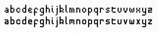
The result of this is illustrated above. Using geometry improves the legibility, especially where diagonals are presented and are obstructed by the limitation of the pixel grid. It also works as a more modern typeface because it has a geometric structure which is used in many other modern typefaces such as Futura.
Presentation
To present the typeface back to a possible customer, I need to create a display of the typeface in different contexts to show how it could be used. I chose to firstly make a type specimen sheet which showcased the entire alphabet as well as a quote to show how the type is legible in larger blocks of text. I aimed to make this typeface a read typeface as I have already explored the creation of display type with my ‘Lost & Found part 1′ workshop. I feel like I was successful in doing so because I understood what qualities I needed the characters to be perceived as legible and putting this first meant the main function of the typeface is to be read.
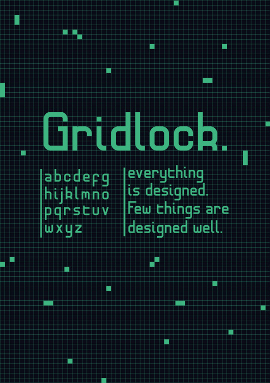
I then made a zine to go into more depth about how the typeface could be used, as well as how it was made. I prefer using a zine as the format because having multiple separate pages allows me separate the different elements of the typeface and present them individually rather than all on one page. More importantly, I think it sells the typeface better as it almost tells a story about the birth of the typeface. From the initial grid sketches, to the vector process to the ways it can be used.


Review
Overall, I am pleased with this outcome as I feel like the success of the typeface links with my initial aims of what I wanted it to be used as. Focusing on just lowercase allowed me to create type which can be used in larger blocks of type, whereas with my past type work I have worked mostly with display type. I also think the way my type specimen sheet and zine are presented work well as it expands on the typeface with the way it was made and almost has a narrative to it. I also wanted to try some different approaches to the presentation in terms of patterns. Both the type specimen and the front and back cover of the zine use a pattern which uses a grid and pixels scattered around it to compliment the pixel element of the typeface.
If I were to take out this development again or expand on what I have made, I would start using the more complex techniques of type such as overshooting or ligatures. The issue with doing this however is that I would be forced to work away from the grid, which may take away from the original pixel structure of the letters. It may be worth doing so as the legibility of a typeface is rarely down to geometric perfection but rather accounting for optical imperfections.
Looking Back
Looking back at Paul Renner’s work, I understand why his process of sketching his type first made the following steps a lot more effective. Sketching on a grid allowed me to produce perfectly balanced letterforms whilst taking it back to the earliest forms of how type were displayed digitally. In particular, I took inspiration from Renner’s ‘Futura’ typeface as it is still being used even though it was made in 1927.
My look into the history of type and the anatomy of a typeface also helped me understand how to convert letters into pixels. I highlighted this at the beginning of my process, where I jumped straight into sketching the letters without establishing an X-height or Cap-height. This made the characters feel imbalanced, so I needed to consider the theory of type before trying to produce it.
Creating logos on a grid and producing type on a grid work in very similar ways as they are both made to be understood by an audience. The process in terms of starting with single pixels and converting them to shapes is the same, but logos tend to include more illustrative techniques which work against the grid.
Moving Forward
Being more imaginative with the presentation of the typeface allowed me to create a pattern which can be used alongside it. This links to the way brand identities use patterns and it is something I want to explore in future practical developments. This is another example I have found of how branding and type relate to each other. Because of this, my next step is definitely to explore branding and use my understanding of both to provide me with ways in which to produce better logos which are understood by the audience more.
0 notes
Text
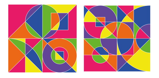
George Bokhua Research
After looking at the history of logo design and techniques which can be used to create successful logos, my next step is to research into someone who uses these processes effectively. For this, I chose to look at the logo designer and art director George Bokhua as he is someone I am personally interested in.

Originally Born in Georgia, on July 22nd 1978, Bokhua is a practising logo designer meaning his work reflects the modern standard of logo design. He didn’t have a conventional design education; he is self-taught and continues to share his lessons through a learning platform called ‘SkillShare’. Along with this and his social media pages, his modern approach to graphic design has amounted to a large online following which is where I first was introduced to his work.
Most of the artists I have researched so far in this project have been traditional artists, so I wanted to use an example of a more prominent practising artist at this time to compare the work and outlooks on design. I feel like George Bokhua is the perfect example to do so, as in his own way he embodies a new approach to design where the online space is taken advantage of to provide new ways for work to be seen.
Bokhua mostly produces clean, modernistic logos and it is what he is most noted for amongst his audience. More recently, he has started experiment with more illustrative graphics, yet still keeping to the clinical, geometric style of his logotypes.
George Bokhua’s logo work mainly looks at letterforms and animal forms. The examples above show various ways in which he has abstracted and altered the look of certain letters whilst maintaining their original perception. It is important when abstracting a letter, to not go too far that the letter becomes unrecognisable. This applies to any sort of logo, but I think it can be seen in type when the viewer starts to question whether the logo is a letter or simply an abstract symbol. The logo with the most ambiguity out of the above 12, in my opinion, is the right-middle example. The overlap of the circles that the logo is constructed out of made me perceive it as an abstract logo at first. It wasn’t until I noticed the subtle shadows, that I saw the separation between the ‘S’ and the oval. I would say this is the least effective example because, without these shadows, it is unclear whether the logo is meant to be perceived as an ‘S’ or just some shapes. Logos should work in one colour, so for this example, in particular, I feel like the way this logo can be recognised is too reliant on the shadows.
On the other hand, my favourite logo from these 12 is the top right ‘R’. This is because Bokhua has simplified the letterform into two simple shapes. The extension of the bottom right leg of the ‘R’ extends from a place where it wouldn’t usually. This doesn’t make the letterform unrecognisable, however, because Bokhua has identified which are the segments that should remain unchanged so that we still perceive it as an ‘R’. This example is also a more effective use of the shadowing technique in my opinion.
Without the shadows, the logo still works in the same way and the communication isn’t sacrificed at all. The shadowed parts are just replaced with negative space, and the audience is left to fill them by using the continuance of the structure around them.
George Bokhua uses this same abstraction of the letter ‘R’, along with implementing more colours and details to produce a more illustrative example of the ‘R’ letterform.

Although this wouldn’t work as well as a logotype, I still find it to be an interesting example to look at. This was the first piece of work where I saw the fundamentals of logo design starting to be used in his other type of work. The ‘R’ has been abstracted into its key components. These are then altered to feature characteristics of a mouth, with the negative space of the top portion being a mouth (as implied through the two teeth at the top) and the leg of the ‘R’ being an extended tongue, which also adds to the implication of a mouth in the section above. The effect of this is that it gives the image two meanings. One is an ‘R’, which could stand for something or represent a word and the second being the mouth, which has been illustrated in a fun and light-hearted way.
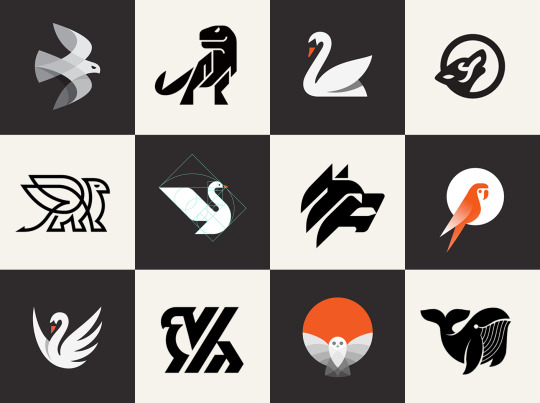
Abstracting an animal requires a different approach to abstracting a letterform. This is because a letter is already a simple piece of imagery, which will, most of the time, already be constructed out of simple geometry. Animals, on the other hand, are an example of more a more organic structure. For me, simplifying animals is harder because of this reason. I personally feel like there is more a jump between making an animal into a logotype than there is making a letter into one. I have already done a project on animal logos this year, looking at simplifying an animal into a modernistic mark. It is here where I learnt a lot about the process of transferring the visual qualities of an animal into a single colour, only using simple geometry and keeping it recognisable. The 12 examples above of George Bokhua’s work are all examples of this being done powerfully.
The simplification of an animal will sometimes go into the simplest forms of geometry—lines. As well as geometry, Bokhua will experiment with line drawings and continuous-lined logos on a regular basis. He does this to practice the technique of simplifying complex things in different ways. The two griffin logos out of the 12 examples above show two ways in which Bokhua uses lines to construct an animal. In the first example (the left-hand griffin), the lines use more circular paths and overlap to add more depth to the wings for instance. The mixture of clinical lines with the smooth flow of the circular directory maintain the organic look of the original animal but simplify it enough that it can easily be redrawn with one continuous line.
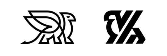
In the second example (the right-hand griffin) the effect is pushed further. The lines are sharper, thicker and overall portray more power. The logo is made up of 4 lines of varying lengths which meet together at sharp points. All 4 lines meet at the bottom at the same cut-off level to portray the 4 legs. Then, as these rise up at the same inclined angle, the head and wings are implied simply through these single lines. Along with all of this, the eye has been taken out, which removes the animalistic essence altogether. These two griffin logos show the effect of converting animal forms to shapes as they both do so in different ways.
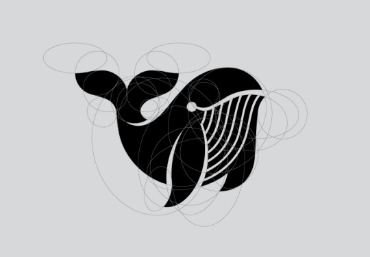
The whale logo above is constructed solely out of one type of shape. These being ovals allows for a balance between an organic form and a geometric grid making it completely balanced. This allows for more expression to show through the mark and almost adds an element of movement to it. I talked about answering the question “how can a logo be ‘kinetic’?’ in my project proposal and I feel like this is one of the ways to do so. By using more organic lines, the original movement of the animal is represented through the flow of the ovals and how they come into contact with each other.
Golden Ratio
The golden ratio is something I identified in my previous case study on logos as something which can help make a visually balanced symbol. George Bokhua has a number of lessons on the website ‘SkillShare’. Two of these are how to create logos from a grid and how to create them using the golden ratio. Here, he goes through the different ways you can use this ratio in your logo designs to make them visually perfect. Below are some examples of where his logo designs contain the use of the golden ratio. Whether the golden ratio is used to determine the sizes of the shapes he uses to construct a logo or simply to work out a line weight to spacing ratio, it is always used with the intent to achieve visual perfection.
Looking at techniques like these are important because I can learn how to implement them into my own work, but also because I can recognise where these techniques become evident in other types of work. Bokhua’s illustrative experiments, for example, use very similar techniques to his logo design just to create different aesthetics.

For instance, the above examples of a series of geometric explorations showcase similar visual language to the second griffin logo I discussed above. The thick, powerful lines, in this case, are constructed out of circles as well as lines. Being an illustration, this allows for more colours to be used and Bokhua has used this to create what looks like overlapping in some of the shapes. This chaotic effect is made solely out of various shapes and less than four colours. Restricting to colours and shapes are both massive processes to his logo work and the effect of this shows through these geometric illustrations also.
In a way, I can relate the chaotic feeling of this work to David Carson’s work. Whilst there is an element of chaos which is prominent, there is an underlying consistency which keeps it balanced and juxtaposes with the chaos of the shapes. In the case of George Bokhua’s geometric illustrations, the underlying consistency is the way he uses geometry to construct everything and the restriction of colour.
Above are more examples from a different illustrative series he produced. This relates more to the whale logo from above, as geometry is still being used, just in a way to portray a more organic and almost fluid shape. The colours are still being restricted for the most part, so there is still that juxtaposition between the chaos of the shapes and the structure of them individually and their colours. I think the effect of this is that it portrays a sense of movement more so. The fluidity of these illustrations come from how roughly the shapes are put together. Whereas the more geometric versions being restricted to lines and perfect circles appear to be more stagnant.
“Talent is overrated... in our field, it’s all about working and getting the form right and engaging and putting more and more and more time into one piece until you get it right”
When asked about giving a piece of advice to newer designers in an interview with ‘LogoGeek’, Bokhua answers quickly with the phrase “Easy. Again, talent is overrated”. Without hesitation, this is Bokhua’s go-to piece of advice so I would assume it has provided a lot of inspiration for his own practice. He, later on, says “it’s all about working and getting the form right and engaging and putting more and more and more time into one piece until you get it right”. This shows me the importance of hard work and that being a good designer isn’t about natural talent but about the work you put into improving. The fact that Bokhua said this with no hesitation makes it all the more compelling. It is important to constantly look at improving everything you produce until you “get it right”.
Looking Back
Since looking at the brief, I have been aiming to challenge my current ideas with new ones that I pick up by researching and developing practical work. Staying constantly curious throughout this project so far has allowed me to gather a much wider range of ideas and concepts that otherwise I would have limited myself from. This process is backed up by George Bokhua himself in his interview with ‘LogoGeek’. In the same way, producing successful outcomes for this project won't come from natural talent, but from the work that I put in to constantly improving my work over and over again.
I originally chose to look at George Bokhua as an artist because he is someone who personally interests me and offers a different approach to the artists I have look at beforehand. I now see how his processes of creating clean and concise logos resonate with my own preferences of designs that I like, which explains why I like his work so much. I can make a comparison between his logo work and the work on typography I have done up until this point. His letter logos, in particular, offer the most obvious comparison between type and branding. Both are used for communication and the techniques to communicate clearly are synonymous in both fields.
At the design museum, I saw the earliest forms of type being sketched onto a grid. Today, grids are being used to structure the most modern types of logos, which shows the link between even the oldest example of type and the newest examples of logos.
Moving Forward
Some potentials I have gained from looking at George Bokhua and his processes are: using grids to construct logos, experimenting with the golden ratio and using shapes to aid illustrative techniques. I aim to expand on my research over the course of the next two weeks, with these techniques of branding playing a large part into the outcomes that I produce. I believe the first step should be to take it back to basics and mirror the earliest processes of designing type but use that to design logos instead. Restricting myself to a grid when designing a logo will ensure that it is recognisable at a small size and if I start from here it will also work in one colour.
0 notes
Text
What Makes Good Branding?—Case Study
The beginning of week 5 marks the time where I am starting to develop my ideas through more independently lead research and practical work. To begin with this, I did a case study on branding so I can understand how I can be successful in my own work.
What is a logo/symbol for? Where do they come from?
A logo is a piece of imagery which is used to represent a brand and its core values through visual recognition. The use of a symbolic graphic to represent a brand makes the brand identity more successful as it is more instantly recognisable to an audience, and this is what makes some of the most iconic logos have such a high value. Because of this, it is crucial to get it right. A poor logo design will carry negative connotations with the brand such as a lack of professionalism or experience. Some of the most successful brands use their iconic imagery as a tool to market their products to their audience.
Through the evolution of corporate identity in an increasingly competitive environment, more complex logo systems are being used to further push the visual identity of a brand through consistency. Logo systems are the fourth type of the logo, the remaining three are:
Wordmark - The most universally recognised type of logo, consisting of the brand name as the primary mark.
Pictorial - A recognisable graphic which illustrates something representing the brand. As an example, a pictorial logo showcasing a Lion would represent pride, which could be one of the core values of the brand.
Abstract Iconography - At first possibly not carrying as much meaning to an audience, but due to its symbolism, an abstract symbol logo becomes more effective over a long range of time.
How do we, the viewer/audience, look at, consume, and read logos/symbols?
When referring to a familiar corporate identity, the viewer will often naturally associate them with the logo which represents them, which is why logos are often compared to the “face of the company”. Once a logo is stapled into mainstream culture, an example being Nike, the iconic “swoosh” becomes influential. Through a logo system and effective marketing, Nike promotes an entire lifestyle through its brand, which the audience adopt by wearing the merchandise. This shows how a good logo can transform from an image to an icon representing a lifestyle over time, without having to drastically change its appearance.
When I visited the design museum, the section on how the brand identities of Apple, Sony and Braun have evolved over time demonstrated exactly this. Both the Apple and Braun logos being the clearest examples, the brand reframe from diverting from the original concept of the logo to further ingrain the concept into the company’s identity.
What are the key principles of successful logo design?
Successful logos most of the time follow a set of characteristics which set them apart from the amateur logo. These are:
Works in a single colour first.
Adaptable: Can be used across multiple mediums and sizes without the recognisability being sacrificed.
Memorable: It must be simple enough to easily redraw. This is a common rule to gauge how effective the memorability of a logo is.
Unique: With an environment full of millions of corporate identities and logos, it can sometimes be hard to produce a logo which is completely unique, but it is important for a brand’s image to stand out from its competition.
Relevant to the brand. If the logo represents something which the brand doesn't, there will be a conflict in the brand identity.
History
The first example of iconographic imagery being used to represent a brand is during the 14th century. Craftsmen would use them to attest to the quality of precious materials. In particular, the Leopard (4th from the right in the image below) has been used to represent ‘The Goldsmiths' Company Assay Office’ since as early as 1300. Being the earliest examples of imagery being used to capture a company’s values, they show how logos can be used to signify quality in a product.
As ‘The Goldsmiths' Company Assay Office’ has evolved, so has the hallmark. However, in a similar way to Apple and Braun, it remains as the same concept—the Leopard’s head. The most recent version fits the guidelines of a good logo but the concept is identical to the first hallmark produced in 1300. By doing so, the icon “continues to be internationally recognised as the stamp of approval and guarantee of quality from the renowned home of hallmarking”.

The ways in which logos were used and made started to develop with the introduction of printing and advertising. During the industrial revolution, businesses started to be founded more often and along with this, advertising products on posters also became a lot more popular. With this, businesses would use imagery and a lot of the time typography to represent and advertise themselves and their products.
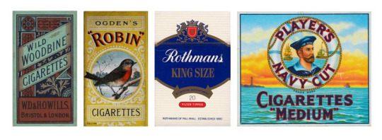
In a similar way to how the Hallmark was used to signify quality, the imagery that was used on posters had connotations which the audience would understand and assign to the product. For example, the coat of arms on the third example would represent patriotism, therefore would suggest that the product being sold was authentic.
The Apple, Sony and Braun logos at the Design Museum offer an insight into how effective logos have evolved along with a constantly changing industry. Another example of this is the ‘McDonalds’ logo.

For the majority of modern logos, the older variations are more complex. As the brand evolves with its logo, the elements which become recognised are kept and overtime, the rest is removed to result in a minimalistic mark. Looking through logos through time, they simplify as they become more modern. I chose the McDonalds logo specifically because it is widely referred to as the “golden arches”. This shows how iconic the simplicity of the logo has become.
Techniques of Branding
Consistency is key amongst a brand identity. This could be through the construction of the logo itself or just how it is used in different ways. There are several techniques for constructing a logo which is consistent.
Grids
I have already seen how grids can be used to produce typefaces that are consistent from the earliest days of type design. Grids can also be used to create logos where the ratios are balanced. The most recent ‘Braun’ variation is an example of this. The logo uses a square grid to keep the line weight of the type, the kerning and the letterforms exactly the same throughout.

Grid techniques aren’t limited to square grids. Some other variations include isometric grids and circle grids, but there is also the possibility to make more unique grids such as the one used in the Apple logo.
Golden Ratio
By using a more ambitious grid, the Apple logo can remain as an organic shape representing an apple. The grid uses the ‘golden ratio’, a value which is found both in nature and some of the oldest architectural designs, which creates compositions that are visually pleasing to the human eye. The golden value is 1.61803398875 and is met when the ratio between the largest value of two values and the smallest value is equal to the ratio between both of the values combined and the largest value. It is easier to demonstrate visually.
The golden ratio is not only used in logo design but has been seen to appear in some of the oldest architectural designs in history.

The golden ratio can be found in the Fibonacci sequence. This is a numerical sequence where the next number is determined by the sum of the previous two numbers (1,1,2,3,5,8,13,21...). The higher the values go through this sequence, the ratio between two consecutive numbers reaches closer to the true golden ratio. When this sequence is visualised with squares, this ‘Fibonacci spiral’ pictured above is produced. This is the spiral that appears in nature in things like sunflowers and spiral shells. It is also the grid that the Apple logo uses.

Some other brands that implement the golden ratio are Twitter and Pepsi. By using the golden ratio, each of these logos has a consistent structure which is visually pleasing to the eye. The form of these isn’t limited by grids which use squares or triangles, so the recognisable form of the original imagery (like the bird in the Twitter logo or the apple of the Apple logo) is still clear. The Pepsi logo is slightly different as it is more of an abstract mark, an example of a symbolic logo.
Geometry
Using shapes to construct logos is popular because of how simple and familiar they are to us. This owl logo made by Ethan Fender demonstrates how far you can abstract a natural form into only using basic shapes. All of this is done whilst retaining to a grid system, ensuring the logo is as balanced as possible.

Negative Space
Negative space is just as important as positive space when considering balance in an image. By controlling the space surrounding the logo just as much as the space covered by it, you avoid there being any question about what is connected and what isn’t. In regards to gestalt, the proximity between two objects is what determines whether they are grouped or not. In a similar way, with too much negative space between two elements in a logo, they may become disconnected and perceived as two separate elements.

The old Verizon logo uses negative space poorly in my opinion. The large tick is over-powered by the wordmark because of how much negative space there is in relation to its positive space. It is also perceived as separate from the ‘Verizon’ type because of the large amount of negative space between them. The right example (the updated Verizon logo) has a lot less space between the two elements and the tick being smaller accounts for the more space around it.
When negative space is used effectively, it can create balance. More imaginatively, however, negative space can actually reveal imagery which at first would be passed off as part of the space around the primary logo. The most notable example of this is in the ‘FedEx’ logo.
Overshooting
This is something I have already identified as being used in type. Overshooting also occurs in other areas of design where there are discrepancies in human perception. For instance, a triangle has more negative space at the top and none at the bottom. This causes the shape to seem bottom-heavy, so when centred correctly it appears to be off-centred downwards. Therefore, many ‘triangular’ logos will be overshot upwards to make them appear centred.
Black and white will also affect our perception of size. White optically expands, meaning that when white and black are used alongside each other, the white space will appear to dominate the black space if they are both equal. Again, to counter this, overshooting is done to make both the black and the white spaces seem to take up the same amount of space.
This is also the reason why the Google logo isn’t a perfect circle. The shape of it has been overshot by being stretched slightly inwards towards the bottom right section of the ‘G’ to account for the flaws in the way humans perceive curves.

Logo Systems
As the commercial environment became more and more competitive, brands starting adopting more ways to implement their logo into the face of their identity. This is where logo systems originate from. They use other visual elements which continue through every aspect of the brand to accompany the logo. An example of this is
Focusing less on the logo itself, but more on the elements of the logo that are the same throughout the entire brand identity, this ‘Barwis’ example by Michael Bierut and his team demonstrates an effective logo system. There is a range of iconography illustrating various athletic activities, each still being restricted to the simple geometry of the main logo, whilst still being easily recognised.
Every icon created to accompany the logo design follows the same strict rules the logo does but are different enough to have their own individualism. The negative space between two areas of positive space never changes throughout the entire iconography, meaning Bierut was able to create the different stances through simple line work at the same time as reflecting the visual style of the logo. Although no part of the actual logo has been maintained, there is a strict set of rules in terms of the spacing and thickness of the lines which is what creates the visual link to the viewer throughout all of the imagery. I like this link in imagery especially because it’s more subtle than anything I’ve looked at. The branding behind Barwis shows how abstracted you can take real-world examples of inspiration whilst linking to a modernistic logo through only using simple shape and structure.
Looking Back
My research has allowed me to draw many connections between branding and typography. I now realise how similar both of these are to each other and how the skills and things which make successful outcomes transfer between the two. Both type and branding attempt to do one crucial thing—communication. They are both examples of the success of the outcomes coming from how they work, rather than how they look. The best types of logos and typefaces are often minimalistic and have no features which don’t have a specific purpose. I see a resemblance between more modernistic, symbolic logos and the quotation by David Carson “don’t mistake legibility for communication”. In a similar way to his type work, more abstract logos may be harder to understand initially, but they work better at communicating the core of the company and being easily recognised.
Moving Forward
After looking further into logo design and brand identity, it is definitely something that has piqued my interest as something to explore even further. I believe the work I have done so far (and will continue to do) on type will transfer to a further understanding of brand identity. I would consider branding one of my main strengths, but looking at logo systems is something I want to do more of in the future.
When I looked at gestalt, I identified patterns as a large part of logo systems because of the similarities they share with the overall logo of a brand. Because of this, if I want to look into logo systems more than logos, I need to start developing my skills with creating things such as patterns. This is a potential for me when I start to make practical outcomes soon. Having mentioned Michael Bierut as an artist above, I want to go more depth into his work so I can understand what it takes to think about a logo as a system rather than just an individual icon.
0 notes
Text
Richard Smith Lecture—Primary Research Talk
Fly in the Ointment
The talk was named “fly in the ointment” and started with the quote:
“The pleasure of the odd, the uneven, the found, the misplaced and the plain wrong”
What I take from this is that Richard Smith finds inspiration from things that aren’t perfect. This is why I think the name ‘fly in the ointment’ is so fitting. On one hand, ointment is clear and has consistent colour, but the phrase ‘fly in the ointment’ prompts me to imagine a singular fly in a glass of ointment that doesn’t fit. There is a juxtaposition between what should be and what is. Something as small as a fly can cause a disturbance amongst something much bigger—the glass of ointment.
He then went on to explain the importance of this. Linking it to how he can gain inspiration from something as simple and common as a ballpoint pen.
He finds humour in the writing reading “ballpoint pen” clearly because of how strikingly obvious it is. Although to some, it’s just a ballpoint pen, he can gather a wide range of ideas just by looking at this and its irony.
I thought this linked back to my original idea gathering with my curious objects. At first, I didn’t expect them to have a large relevance to my work moving forward, but this wasn’t the case. I began to learn how being loose with practical work can allow me to gather inspiration from the most simple objects, which are sometimes thought to be ‘useless’.
Festival del film Locarno
The following is a project Richard Smith helped work on with his design studio for the ‘Festival del film Locarno’, one of the longest-running film festivals held annually in Switzerland.
I wanted to look more into this because I believe it showcases an extremely good brand system which is different from what I have seen previously. Using the Leopard as the common element, all of the brand’s graphics feature the same imagery in different ways. Including a pattern, which is a workshop I want to do in the future to link with brand systems.
The main thing I took away from this case study is how much Richard and his team have thought about how the graphics will be applied. Specifically using the ‘fragmentation’ technique. Below is the design for the billboard advertisement. It features two images which have been ‘sliced’ into each other with many vertical lines. His reasoning for this is to account for all of the angles in which the graphic will be viewed.

The surrounding areas of the billboards tend to be relatively hilly, which means there will be a range of angles where the billboard is seen from the side, higher up or from beneath. To account for this, the fragmentation merges two images that have been stretched in different dimensions. This means that from side-on, the woman can be seen easily. And from high up or down low, the Leopard is clear.


This shows another level of consideration I have not yet come across, where the surroundings of the design influence the design itself.
Review
In conclusion, the main thing I took away from this lecture is how to look at graphics differently with the application considered first. As well as this, it also offered another opportunity to examine a succesfful logo system which has been used in a different. The logo itself doesn’t fit many of the criteria I highlighted that makes a good logo. However, because the ‘golden leopard’ is so iconic, the logo doesn’t necessarily have to be used in every context for the brand to be represented clearly.
Looking Back
Richard Smith’s explanation of gathering inspiration from ‘quirky’ objects links back to my early curious objects. I can’t clearly see any link between Richard Smith’s inspiration and his outcomes and I feel the same way about my curious objects from the start. Although, without them, the idea may have never come about. This is a further emphasis on the importance of working loosely when gathering ideas. It doesn’t matter if the work is relating to the final outcome or the brief, the point is to aid me with inspiration in more ways than one.
Moving Forward
Using the ‘Festival del film Locarno’ branding, I want to develop my understanding of logo systems and brand identities. I aim to do so by researching the fundamentals, artists and then responding to this knowledge in practical outcomes like I have been doing so far with typography.
0 notes
Text
‘Designer/Maker/User’—Practical Development From Research Trip
Using my primary observation from the Design Museum, this workshop looks at recreating some of the sketches and images I gathered from the trip in a way which reflects the work of Michael Craig-Martin. The aim of this workshop, like all Friday workshops, is to practice and develop new practical skills, specifically in digital packages. We used Adobe Illustrator because using vector graphics allows us to easily produce an accurate, clinical outline which is at the core of Craig-Martin’s work.
Michael Craig-Martin
Born in Dublin, Ireland, Michael Craig-Martin’s work has maintained in the same style since the late 1970s. Since then, he has been constantly drawing ordinary objects and looking through his work over time you can see a similar evolution that the Design Museum showcases. The evolution of technology and the transition from analogue objects into digital, whilst maintaining the same visual language for over 40 years. His pieces tend to be either a singular object, illustrated on its own or multiple objects overlapping in a ‘cramped’ fashion with no real structure. Either way, the use of colour is what gives the work it’s unique aesthetic. The colour is always in large, flat vibrant colours (much like the Olivetti posters I saw at the Design Museum) and the colours will never be the original colour of the object. The line work on its own is an accurate depiction of the object, but the colour alone being altered is enough to abstract it to give it a new meaning. But because of the linework remaining recognisable, it is still clear what the object is. Michael Craig-Martin doesn’t consider his use of colour depending on blocks of empty space, but will usually assign a colour for each material of the object until it simply looks right to him.
“You can’t tell in this exhibition which drawing I did in 1978 and which I did in 2014″
When talking about his independent exhibition “transience”, he highlights the consistency of his artwork through this quotation. The fact that his early work and his most recent work are indistinguishable in terms of style makes them all the more effective when shown together. The difference between old technology, which at the time was revolutionary and what we consider revolutionary now, is juxtaposed with how they are illustrated in the same way.
The flashlight on the right in the above image is one of the only objects Michael Craig-Martin has ever illustrated where white is the dominant colour. It doesn’t follow his usual routine of choosing a vibrant colour which will dominate the object first. His reason for this is simply “it just looks wrong to me”. This shows how he works through his art. He works from whatever feels ‘right’ to him which is what carries the abstracted look in the outcomes.
To achieve Craig-Martin’s distinct clinical linework, it’s a lot easier to use digital software, but when the objects are painted directly on the wall, he has to use other methods to achieve this. For this, tape is used to identify either side of where the lines should be and he paints over the tape before removing it. Although this is a much longer process to drawing a path in Illustrator, the effect can be quite stunning. Having the object directly painted onto the wall makes it part of the architecture and has a different reaction to a canvas with the artwork on.

Process
Firstly, I gathered the imagery I collected from the Design Museum trip (photographs and sketches) and chose the ones that I thought could work with each other. I wanted to choose objects that were related to each other but struggled to find enough to work from, so I decided to choose the objects one by one as I worked through illustrating them. This actually was closer to how Michael Craig-Martin works—creating one object, before arranging multiple objects together making a “drawing from drawings”. Because I already had sketches and observation, the first step of the actual workshop was converting these into digital illustrations. I started with the linework, using the pentool to create stroked paths for the outlines. Doing this meant it was a lot easier to alter the width of the strokes, whereas if I used fills it would be harder to make the lines thicker/thinner. The Illustrator pentool also lets you adjust the path after it has been made, which is why I felt more comfortable tracing over my sketches as opposed to using a sharpie beforehand. I made the sketches roughly so I wanted to use them as a rough guide, taking advantage of the control I get with the pentool to create more accurate outlines.
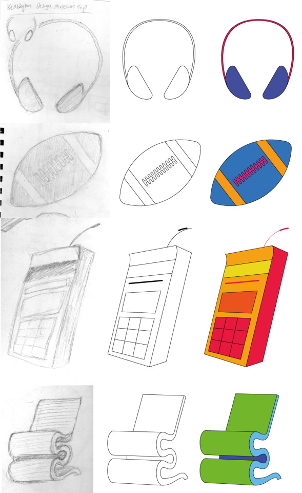
As I completed the outlines of an object, the colouring process proved relatively easy. Because I didn’t have to worry about being accurate, but rather mirroring Michael Craig-Martins process of choosing what “feels right”. I tried to use as many vivid colours as possible, making sure to assign different materials different colours and not have more than one colour in each segment of the object.
Now that I had 4 object illustrations that were all separate, the next stage was to combine them all into an A3 poster using Michael Craig-Martin’s ‘cramped’ overlapping style as the inspiration. In a similar way, the composition of this poster was solely based on what ‘felt right’ to me. I didn’t have any previous idea of what I wanted the poster to look like, so I experimented with the objects’ positions until the layout was balanced but also everything could still be recognised.

Review
In my opinion, my A3 outcome, as well as the individual illustrations are successful at communicating the same effect as Michael Craig-Martin. I was comfortable with this process because it adopted the mindset of doing things for the sake of ‘feeling right’. I wasn’t limited at all with how ambitious I was with the colours, and that is what I liked most about this process. If I were to carry out this workshop again, there are a few things I would like to experiment with.

At the end of the workshop, I compared my work with an example from a peer I found interesting. I chose this example by Jake because the objects he chose all relate to the same theme. This is something that if I were to do thing workshop again, I would want to do. Jake’s work illustrates a narrative of the construction of modern technology. This is because the objects all relate to each other, whereas with my work, the objects are unrelated so it’s harder for a viewer to interpret a common narrative.
Jake’s work also uses the quality of the line work to effectively simplify what was a complex object before. It makes the insides of the phone more understandable without changing their appearance dramatically.
Looking Back
When I researched and produced my display box, an action I wanted to take was to explore how I could use this to help me understand the arrangement of objects in 2 dimensions. This ‘Designer/Maker/User’ development was the chance for me to do this. Working in 2 dimensions means that when objects overlap, the parts that are hidden cannot be seen at all. On the contrary, when working 3 dimensionally you have the ability to overlap objects a lot more because the viewer can always change their perspective to see the objects underneath. I think this is what causes the ‘cramped’ look I identified in Michael Craig-Martin’s work. The proximity of the objects is close enough that from far away, they are perceived as one collective group. The line work from close up, however, lets you see each object individually.
Moving Forward
The aim of these practical workshops is to develop skills in digital packages. A potential for me to expand upon this workshop is to incorporate other things to the poster such as type or even animation. As well as this, I could attempt to add my own elements to the visual language. For example, instead of using flat colour only I could attempt to implement more tonal value or even texture.
0 notes
Text
Design Museum—Primary Research Trip
The Design Museum is a museum focusing on contemporary design and showcases work from a range of time periods and areas of design. As a group, the Year 2 graphics students visited this museum as it relates to the work we have done so far surrounding our curious objects and generating ideas from these. Visiting the museum would give us the chance to see how design as a whole has evolved.
At the entrance of the museum is a sculpture made by Eduardo Paolozzi, a British artist I have previously looked at who was known for having a large influence on pop art. He produced both 2-dimensional artworks as well as sculptures. This piece titled “head of invention” is an example of his sculpting work and features various segments of a human head fitting together with words slotted in between the gaps. When approaching the back of the head, the complex machinery dominates the space. This showcases what I think is the main benefit of creating work in 3-dimensions—the possibility of having different interpretations depending on the viewers’ position. This is elevated by the size of the sculpture as well, which makes the viewing experience completely different from looking at it from a secondary source. The machinery at the back and the slotting together of the segments of the head represents the evolution of technology and I think this is why the sculpture is as big as it is. The size portrays how crucial technology started to become during the industrial revolution.
“I suppose I am interested, above all, in investigating the golden ability of the artist to achieve a metamorphosis of quite ordinary things into something wonderful and extraordinary”
This is a quotation said by Eduardo Paolozzi which relates to my own project. I believe so because this quote talks about making something “wonderful and extraordinary” out of “quite ordinary things” which is something I have been aiming to do so far and will continue to do. Using my 10 curious objects as the main example, I have seen how using seemingly unrelated ideas to generate new ones has been largely beneficial to me by providing a wider scope of inspiration for my project. Paolozzi calls doing this well the “golden ability” of an artist, or the main characteristic a good artist will possess.
Designer/Maker/User
‘Designer/Maker/User’ is the name of the exhibition held at the Design Museum which was the focus of our trip. The name itself relates to the connection between ‘artist’, ‘artwork’ and ‘audience’ which I identified as something I need to constantly look back on and evaluate against. The importance of this is achieving an understanding in all three of the aspects which will carry your work from something which is made to ‘look good’ to something with a real impact. The entrance to the exhibition includes a very large display, where each of the words appear to fade into each other after a period of time. This was an example of a 2-dimensional graphic being applied to a different type of material other than the usual wall or canvas. The effect of this from far away creates the illusion of moving image, but it is instead 3 different images being transitioned into each other by the wall itself.
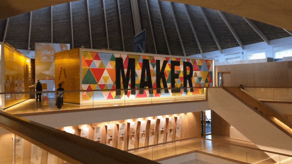
On the opposite side of the entrance, was the first piece of work. When I saw this, I instantly drew the connection to Lisa Temple Cox’s Lion Walk decoration. This piece used a collection of items which were donated in a similar way to Temple Cox’s display boxes. In both cases, the concept reflects the process I have used so far for generating ideas out of random objects. My 10 curious objects are all unrelated to my ideas at this stage, but I wouldn’t have these ideas without using these items and various practical experimentations to develop them.

The main difference which is striking between this new example of assorted objects and the ones I have looked at is the size. Even the Mark Dion examples which were large boxes of still life are a lot smaller than this wall of objects. It’s a mixture between the large-scaled display boxes and the neat organisation of the small examples. As a result, the wall offers a similar narrative which can be seen in the smaller examples but on a larger scale. The viewer can be intrigued for longer because there’s more to explore and interpret.

The exhibition showcased the evolution of technology throughout the years. With this, the production of type was heavily affected by what was seen to be possible with the technology available at the time. This specific example above is some early work developing a typeface with the assistance of early vector graphics. What I find interesting about type and this image especially is how similar the quality of the letters are from then to now. Looking at the ‘Q’s at the bottom right of the image, it’s hard to differentiate them from type made and used today which is evidence of how timeless successful type is.
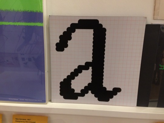
The earliest examples of digital typefaces were made on grids due to the limitations of screen resolutions. All graphics were made on extremely low-resolution bitmap screens which makes the earliest examples of digital graphics have a distinct ‘pixel’ look to them. The Macintosh icons created by Susan Kare are something which follow very similar guidelines and have the same similar distinct look. Susan Kare is an artist I looked at during my ‘Animal Instincts’ project where I looked into the process of limiting myself to sketching on a grid much like she did. Although I am not limited by the grid because of how technology has evolved, exploring this process taught me how revisiting traditional methods and restricting yourself in similar ways can, in fact, produce more effective results. The pixel type is an example of this because when it is sketched onto a grid first, everything is consistent and legible to the viewer.

On the contrary, this bionic arm is an insight into what the future could look like with the advancement of technology. This is a bionic arm which was made completely from the process of 3D printing. A relatively new process for product design which has evolved what is possible with digital software. This was produced by e-NABLE, an organisation where volunteers use 3D printing techniques to produce bionic prosthetics for under-served populations globally. Because of how automated the process of 3D printing is, once you have one digital model to print, the costs become very low which is what allows e-NABLE to give back to communities. The material also works in their favour. The vibrant colours of the 3D printing plastic are a distinction between e-NABLE and other mechanical prosthetics which makes them especially marketable to children.

This is an example of how impactful technology can be. Using design to combat important issues which, without these efficient processes like 3D printing, would not be possible. With the evolution of technology, comes the simplification of the product. Just recently, bionic arms would have been seen as inaccessible, especially by poorer communities. Now e-NABLE produces bionic parts on a mass scale, with construction kits even being an option.

These Olivetti posters and Olivetti posters, in general, are often used as an example when referring to ‘vintage’ design. Although each poster has its own unique qualities, there are certain characteristics which I picked up on which are common. Firstly, the colour and tone. Most of the colours used are flat and saturated with warm colours being used slightly more. There is rarely a lot of gradients being used, but when tonal value is applied, it is done through different flat colours. The large blocks of colour work effectively to draw attention to the posters. I find the posters with the examples of large blocks of colour naturally draw my eye to them, which is the purpose of these. Another thing I noticed, although not as prominent as the use of colour, is the use of shape. Circles are the core in some of the designs and remind me of Saul Bass’ work because of this along with the colour usage. Now I have access to technology which can allow me to produce more ambitious effects in easier ways. But these posters remain effective to this day, which shows how whilst technology evolves, successful design remains that way.

Because branding is something I want to explore with my project; when I saw these examples of logo evolutions I wanted to use them as research. Starting with the leftmost example: Apple. Their logo started off as a complex illustration and the impracticality of this is illustrated by how far away I was standing. The small details become too small to see and the complexity of the logo is lost with its size. In contrast, the simplicity of the next Apple mark remains effective from both close-up and far away. Because of this, once Apple had an effective logo, the changes that followed only became minimal, but eventually leading to the most simple revision of all of them—the plain black version.
A similar instance happened with the ‘Braun’ logotype in the right image. The logo was changed from a minimalistic design to a styled one with a 3D effect added to it. Because this added nothing functionally to the logo, they reverted back to the original concept but with a more modernistic approach applying the logo to a grid.
The middle image shows two variations of the ‘Sony’ logotype. Only being two, the Sony logo has gone through less change but the same elements in terms of legibility have improved. The other logos are companies owned by Sony and are all in my opinion successful logos.
What these teach me is that effective brands should stick with their brand identity for as long as possible as it is over-time that recognisability is created. The Apple logo is the perfect example of this benefitting the company themselves. Over many years the Apple logo has gone through little changes which means the consumers are familiar to the image and link it to the products. This then allows Apple to raise the prices of their products as the customers are more likely to buy into a brand they are familiar with.

I also made sketches as I walked around the exhibition. It’s important to do this because you can portray the feeling you had when reacting to the original object. A photograph can only provide so much to my research, but sketches I made at the time of viewing the research are more insightful into their effects on me.
Review
This trip provided a new element of research to my project in the form of primary investigation. It was a lot more engaging for me as a viewer reacting to the work first-hand as it was intended to be viewed. Secondary research is beneficial due to it taking less time to gather information. However, secondary examples can often provoke a different response to original artworks. Size is something which heavily effects how an audience reacts to art work. From a secondary source, the Paolozzi sculpture or the wall of donated possessions at the Design Museum will not provoke the same reaction that I had when looking at them first-hand. The size adds to the statement the piece is making and makes the work seem a lot more powerful. Large works like these keep me interested to look at because there is often more to look at and interpret.
I have researched designs from other time periods before, but the Design Museum offered a unique outlook on the evolution of technology and how this aided the production of design. The most shocking thing from this visit was how automated the 3D printing was and how cheap it had become to produce products in mass because of this.

Looking Back
As I spectated the numerous examples of design from different times, I kept noticing the similarities between these and my own project. Firstly, the vast wall of donated possessions reminded me of the work I did on my display box and the research I did into artists who produced similar things. Mainly Lisa Temple Cox, who also used donated objects to form various smaller display boxes in the Lion Walk toilets in Colchester. I was also able to observe these in person as they were installed locally, and although the concepts of narrative remain similar between the two, the reaction I had to them both was very different. Lisa Temple Cox herself said that people “don’t go there for it, but they enjoy it while it’s there”. I feel the same way with my experience of looking at her work and found it to be a lot more passive than the vast example at the Design Museum. I was in awe of the size of the. The concept remained the same but the scale alone of the display box altered the reaction from the audience completely.
Next, the examples of type and how they have evolved. Type has been a large of my project so far and I plan to continue this way moving forward. I find type to be so interesting because of how explicitly it can communicate a message but in more ways than one. I have previously looked at type mainly with digital processes; the Lost & Found workshop series allowed me to mirror the same process but with very different materials (such as the garden wire typeface I made in part 1). These seemingly unrelated methods make sense when I view the work at the Design Museum. Restricting myself to garden wire to make a typeface made me feel extremely limited, but as I highlighted when looking at the pixel type work at the Design Museum, limiting yourself to a strict amount of rules to follow can sometimes create more effective outcomes. Even if not, the ideas that spark from challenging yourself allow for a lot more possibilities for outcomes.
Moving Forward
There were some things which I was interested in from the Design Museum that I haven’t yet explore in my project, that now I see as a possible direction to follow. The first one being the Olivetti posters. Looking at these got me interested in poster design as a whole and how it links with type. I then thought about how it could link with animation as that is another area I want to explore. Moving forward, I may consider looking into more abstract poster design which comes from limiting myself and forcing myself to come up with completely different ideas to what I am comfortable with. Much like when I tried screenprinting in the 2nd Lost and Found workshop, I found that being out of my comfort zone may produce results I am less happy with, but the ideas that I will generate can benefit my project.
I highlighted the use of shape in the Olivetti posters. Geometry was something I mind-mapped at the very beginning of the brief as an interest on mine, so I think it would be appropriate to explore using geometry in design in the future. I have already done this with logos in the ‘Animal Instincts’ project, but I want to attempt to combine it with poster design. Looking at gestalt and my display box also let me understand how groups of objects are perceived by a viewer. I could possibly use this knowledge in a 2-Dimensional format such as with poster design and learn about the technicalities of laying things out in 2 dimensions.
On the subject of logos and branding as a whole, this is something I definitely want to explore. I would say it is one of my biggest strengths, which is why I have limited myself away from it so far. But at this stage, I want to start using the ideas I have gathered, combine them with ideas I initially had at the start of the project and use what I am interested in (type, branding, motion etc.) to do so. The Apple, Sony and Braun logos that were showcased at the museum showed me how effective branding works in practice. I want to explore the possibility of creating entire brand identities rather than just a single logo.
Lastly, the type I looked at made me want to continue exploring type but limiting myself more. I know I am comfortable with digital processes so my next step will be to reflect upon early methods of producing type, (such as sketching on grids) to learn about the fundamentals of creating legible typefaces. I believe this will broaden my understanding of the field of type and ultimately allow me to use type more effectively in my own work.
0 notes
Text
Construction of my Display Box
To begin with, I didn’t have an idea of what to make by display box look like. I was in a completely unfamiliar territory which meant being given the open task of ‘constructing a display box’ with a small number of guidelines gave me no ideas initially. The display box should be a “visual manifestation” of my proposal, to both accompany my proposal but also work on its own to tell the story of my project when displayed. It could include what I have done so far, what I plan to do in the future or just be a symbolic representation of my ideas. The only strict guideline is that the box can be no larger than 10cm (100mm) from the wall. This is so when all of the year 2′s display boxes are mounted they don’t conflict each other and the hallway itself.
Firstly, I broke my assignment down into these 6 steps:
Sketch out the design, including measurements making sure what I want to include in the box fits
Collect materials
Seek a technician to guide me in the right direction of crafting my box, rather than guessing and failing
Ensure the box is constructed well. Secure so that it doesn’t fall apart when mounted on a wall or when my objects go inside
Decorate and embellish the box. This will include putting the objects into it and colouring the box
Photograph/document the process along the way
Doing this meant I had a structured plan to work to and could solve problems one by one instead of creating new ones due to a lack of organisation.
Sketching
When I began to sketch, I noticed the majority of people around me were using rectangles for the base of their designs. I knew this would be the easiest option because I was going to be using wood to make the box, but I wanted the box to reflect the areas I am interested in (typography, branding and motion). I then completely skipped sketching cuboid designs and went straight to more unique ones. The first idea I had was to make the box into a ‘J’ which would then represent the typography aspect of my project. I sketched a few J’s before realising that the curve of the letterform would be extremely difficult, but mainly impractical to reproduce with resistant materials. If I was more proficient with creating more organic shapes with resistant materials then this would have been the design I would’ve chosen. I then remembered when I looked at Lisa Temple Cox’s work, she had some more imaginative shapes to her boxes, but they all consisted of 45-degree angles. I used this in my own design and transformed the curved part of the J into three straight lines, which meant I could then form this section out of nothing but straight planks of wood.
I sketched the J shape roughly first, before sketching it onto grid paper. This is a practice I have done in the past when sketching logos so I can vectorise them on a grid. I did the same for this box design however so I could keep the dimensions of the J consistent and easier to measure in relation to my objects. In the end, the front side of the box displaying the J came to be 40cm by 30 cm.
Woodwork
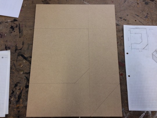
Next, I collected and cut various strips of wood, 8cm wide and one larger piece of wood which I then cut into a 30cm by 40cm rectangle for the base of the box. The strips would be cut and placed around the edges of the box to construct the outer walls. Because of this, when sketching my design onto the 30cm by 40cm rectangle, I needed to account for the width of the wood around the edges. The wood had a depth of 9mm, so I considered this when sketching the walls by planning where I would put each slice of would one by one. This meant that when I cut each piece of wood, there would be no gaps or overlap.

After marking the position of each part out with a pencil, the next step was to start securing the walls in place. Because I had to account for the 9mm depth of the wood, I started placing the walls from a single point and then working from this point (in this case, the top left). This was so if I did make any mistakes in my sketching stage, it would be easier to solve rather than having walls spread out over the whole box. I secured the walls by firstly glueing them into place, before using a hammer and nail to further secure them in place. I hammered the nails into holes I drilled into the original wood plank to make it easier to find where the connections were. The hardest part about this stage was constructing the diagonal sections of the ‘J’ shape. I assumed it would be easy as I thought it would be simple just keeping it to straight lines. However, the difficulty came with having to solve the problem of overlap at different angles to 90 degrees. I had to cut into the wood at different angles where the planks would overlap to make the walls fit at a 45-degree angle. To do this, I simply measured how long the largest side of the wood should be to fit and sanded the edge with an electronic sander to achieve a 45-degree end.
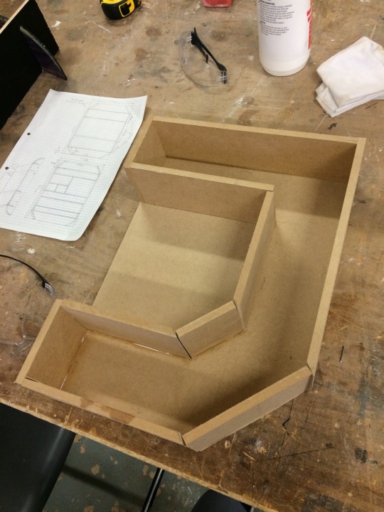
At the end of this stage, I had, in my opinion, successfully produced the shape I had in mind when sketching. I was happy with how it looked, without including the imperfections on some of the edges and gaps in between the walls. To combat this, I chose to add another stage to my process which was to use papier-mache to add a cover to my box, in the hope to correct these defects. I also thought this was a good idea because I knew that I wanted to paint my box, so using a papier-mache coat would avoid the issue of paint soaking into the wood of the box.
Papier-Mache

To start with the papier-mache stage, I mixed PVA glue with water roughly in the ratio of 2:1. I started with this as the mixture, applying it to the box and adding small strips of newspaper over the top, but found it was too runny and wasn’t sticking the newspaper down well enough. Because of this, I added more PVA to the mixture which caused it to become a thicker consistency and work more effectively as a glue. As I worked around the box, the main thing which caused me difficulty was, again, the 45-degree angles at the bottom right of the ‘J’. As the newspaper folded over these sections, I found it hard to keep the newspaper flat to the wood without it ripping. This was solved by just adding more newspaper in smaller pieces over the top to ensure every part was covered. Although some newspaper did overlap onto the back, I didn’t cover this part with papier-mache as this was going to be up against a wall when displayed.
As a result of this step, I had a box which was a lot more prepared for both being painted and being displayed as a piece of work. I successfully corrected the imperfections of the woodwork by controlling the amount of newspaper I placed on certain areas to keep everything as consistent as possible. One thing to note, is, as the newspaper and papier-mache started to dry, there were a few instances where the mache started to crack and become unstuck to the rest. Unfortunately, I didn’t have time to correct this, but it is something which didn’t cause a huge impact on the integrity of the box so I didn’t find it to be a big issue.
Paint

The last stage of constructing the box itself was to finalise it with a coat of paint. For this, I chose a matte black because I wanted the box itself to be a subtle element of the piece as a whole. This was a lot easier to do and only required one coat now that I had a papier-mache layer. Once I applied the paint, when it was wet I was happy with the quality it gave the box. Once I saw it dry, I noticed the small cracks in the papier-mache were accentuated because of the neutral tone of the black. This highlighted to me the importance of not disregarding small problems when working with resistant materials as they could be made more obvious in future stages. Due to time restraints, it wasn’t possible to fix these cracks, but it taught me how important maintaining high accuracy was, because it’s a lot harder to fix problems than it is to keep on top of them and not create them.
Decorating

To decorate the interior, I aimed to portray my project through the arrangement of my objects. I wanted to represent the animation aspect of my proposal by trying to encapsulate a freeze-frame of a moving image. Whereas a lot of the examples I have looked at of other display boxes feature structured assortments of the objects which look relatively stagnant, I wanted my own box to look like it was possible to ‘press play’ for all of the objects to continue moving. I felt like this would be the best way to subtly hint at animation being a large part of my project, much like the ‘J’ being a subtle feature in the backing subtly representing the type aspect of my project. I also wanted to represent branding but struggled to find a similar way to show this in my box. In the end, I chose to not include branding imagery in my box as I didn’t want it becoming crammed with too many concepts.
Blu Tac was one of my objects, but also played a large part in the decoration of my box. I wanted to use the Blu Tac in a different way to the other objects as I thought it would help carry the look of movement. Because of how insecure Blu Tac is, I used it (along with glue to fully secure some objects) to stick the objects into place. I also used it to generally decorate some of the plain black parts of the box, which would then also have a slight movement to them when the box was moved. Although I knew using Blu Tac was going to be risky as it makes the objects prone to shifting or even falling out of place completely, I felt like I was successful in having a balance between security and using the Blu Tac effectively to add the sense of motion to my objects.

Review
Overall, for my first attempt at using resistant materials in this way independently, I think I have been successful in creating what I envisioned at the start of this workshop. The main strengths I think my box has are:
Unique—it goes against the conventional layout of a display box so it truely visualises my ideas.
Interesting—the ‘freeze-frame’ idea I went with resulted in an interesting experience in my opinion. The objects aren’t just sitting passively in the box, but rather work in synergy to portray a narrative.
Capture my project—Using the shape of the ‘J’ as the main structure of the box is probably what I find to be its biggest strength. It clearly demonstrates the idea of type, but being painted solid black makes it subtle enough so that it still works as a box on its own and the objects inside are the main attraction.
On the other hand, things I would improve if I were to take part in this process again are:
The accuracy of the woodwork stage meant I had to add another stage into my process (papier-mache) without planning it. I would take extra care with measurements and finishing of the wood if I were to do this again.
The papier-mache flaking as it dried is probably due to the wrong consistency being used for the mixture, or even not enough being added. I would make sure to keep everything as flat as possible if I was to papier-mache again in the future. However, if I am accurate enough with the woodwork, I shouldn’t need to do this stage at all.
The insecurity of using Blu Tac I would say is it’s the biggest weakness. It works in my favour because it is what carries the look of movement, but I should’ve done more to secure the objects into place before adding the Blu Tac on afterwards as secondary decoration only.
Looking Back
When comparing my outcome to the works of Lisa Temple Cox and Mark Dion, I definitely think Mark Dion has provided more inspiration for my ideas. The idea of using a freeze-frame to represent a narrative was inspired by his “Landfill” piece. Saying this, I also incorporated some of the rules I found Lisa Temple Cox follows with my own box. Specifically, keeping to 45-degree angles, but I also used the box as a subtle part of the design in a similar way that she does to make the objects the main focus.
The main difference between my work and these artist examples I have looked at, is what it is portraying. Temple Cox and Dion choose to represent peoples’ lives, society’s damage and other topics which relate to a lot of their audience. With my own box, no one has previous knowledge of my idea, so it works more as a demonstration of this. As a result, though, the viewer is still left to interpret their own meaning. This is what I find to be most exciting about looking at display boxes—everyone has their own interpretation. Which is why I decided not to have an obvious message with my box, but rather let the audience have their own reactions to it.
I believe my understanding of gestalt helped me make more informed decisions about the direction I took the construction of my box. The main element of gestalt that I think I used more effectively after researching it was ‘Figure & Ground’. After understanding this, I then knew why a plain black backing would work best for the box itself and why I should let the objects stand out from it. Looking at Lisa Temple Cox’s boxes, I am more drawn to the objects themselves when the box is more subtle. My box itself was the ground and the figure was the objects inside. In my opinion, I successfully created a stable figure and ground.
Moving Forward
In a similar way to the workshops I have done in screenprinting and block printing, although I do not plan to use these processes for my final outcome, they still provide me with a new skillset and mindset that I can apply to my own work nonetheless. With this assignment, creating a display box lead me to think about how the arrangement of objects can create different meanings. This can directly link to composition, and along with the knowledge I have with gestalt, these things can be applied to any area of design, not just being limited to resistant materials. Understanding how an audience perceives a group of objects can be crucial in graphics. I plan to look further into how I can use gestalt and layout design to aid me in my own work. When I start to explore animation, an idea that I have is to use animation to alter the gestalt of certain objects to change their meaning. Similarly, with branding, I want to explore how making this display box could perhaps trigger new ideas with how I can use branding in my project.
0 notes
Text
Gestalt—Case Study
For the beginning of week 3, I chose to research into Gestalt: the theory of how humans perceive multiple objects and group them together. I will be constructing my display box this week, so I though gestalt was the perfect research area to understand how I can group unrelated objects together. Gestalt is split into five categories:
Proximity
Similarity
Continuance
Closure
Figure & Ground
Proximity

When a set of objects are within a close proximity from each other they are perceived as a group. On the contrary, when two or more objects are distant from each other relative to their size we see them as two separate objects. Proximity can be demonstrated in many different ways, but in terms of display boxes, an example of proximity being controlled to assort items is in this example by Mark Dion titled “Men and Game”.

“Men and Game” is an assortment of photographs which have been produced with various media. Each of the photographs have been kept very close to the others to make us perceive them as one large collective rather than many individual artworks. The effect of this is clear, it separates the viewing experience into two parts, from faraway and from close-up. From faraway, the photographs are visually grouped into one vast shape which has a fluid element to it. Although the edges are entirely made from square frames, being so closed together causes their edges to merge into a more complex outline. From close-up on the other hand, Each photograph can offer a unique experience when they can be viewed individually. This is where the second layer of proximity is implemented. Around the photographs are not only the frames themselves, but between these is more spacing to isolate each photograph from its surroundings, which compliments how they can each be viewed on their own along with as a whole.
Looking at my own project, proximity doesn’t just apply to assorting multiple objects. It could also dictate how more than one elements of a design function together. The main example of this that I have look at is in logo design. The logo I chose to demonstrate a good use of proximity is the Unilever logo. Although on the complex side of modernistic logos, I still find it to be an effective image for Unilever.

The logo consists of 24 icons, each reflecting something about the company, but because proximity has been controlled to keep all of the icons separated at the same time as being confined into the shape of the letter ‘U’, the logo can still be easily understood. This links to Mark Dion’s “Men and Game” example because the work can be viewed in two different ways depending on the distance from where you are. In the case of the Unilever logo, this changes with the size in which the logo is displayed.

The ‘3D Farms & Machine LLC’ logo is an example of bad proximity. It has a chaotic look which is driven by the irregularity within the logo. Good proximity should draw the eye to the main subject of the image, followed by the secondary information. In this logo, the structures aren’t in the same scale relative to each other, the spacing between them and the text varies a lot and there is random pockets of negative space which make the rest of the design feel cluttered.
I can also link proximity with an area I have already researched—typography. The technique of ‘kerning’ is controlling the horizontal space in between each letter. When kerning is done poorly, the letters have a disorganised look to them as our brains are confused as to which letters are part of the type and which are separate.

Although this can be taken advantage of in an interesting way, much like my block prints which were inspired by David Carson, when creating type which has the purpose of being readable, it is crucial that the kerning is controlled so we understand the type as a group.
Similarity

Objects that are similar to each other in terms of individual appearance are perceived as a group or pattern, as each object is just a translation of all of the others. Objects that otherwise would be one large group, can be perceived as smaller groups if there is a consistency with some of the objects.

Mark Dion’s “Cabinet of Marine Debris” illustrates this well. Because the items have been sorted in terms of their appearance (along with their position on shelves) they are perceived as smaller individual groups. This allows the piece to have a sort of hierarchy, in which the objects at the top appear to dominate those lower down. This is only made possible because of the way we perceive them to be separate from the rest as they are not visually similar.
I used this example from Mark Dion because it also shows a good use of proximity along with the similarity. Proximity has been controlled to keep a central balance. None of the objects visually over-power the rest as they are seen as groups rather than single elements. The shelves themselves could also be regarded as spacing because they are keeping the distance between each row.
The most common example of similarity being used to group items together visually is pattern-making. The essence of a pattern is the repetition of the same image to produce a seamless texture.
Patterns are often used in branding by implementing certain visual elements of the main logo and using similarity to create a seamless pattern. This is done to be able to carry the visual identity of a brand across multiple mediums without using the logo itself. It’s a technique used a lot when creating logo systems because humans recognised similarity and patterns so effectively.
The above example of the pattern “Republic of Patterns” uses for their logo system also shows how similarity can dominate other visual indications of groups. The two yellow semicircles stand out as their difference in colour draws our eye to them. This shows how breaking similarity can be used with purpose to draw our eyes. However, they are still perceived as a group with the rest of the blue semicircles as their shape remains the same.
Closure

When a shape isn’t present, but implied through negative space, it can sometimes become dominant over the positive space around it, making it the first thing someone sees. This happens because when there is enough visual information, we naturally replace any missing information with what we are familiar with.
This is harder to demonstrate with objects, but is extremely prominent in logo design. For instance, this ‘Dog’ logotype uses closure to imply the image of a dog along with the word.
Having the shape of the dog is enough for use to recognise this as it is familiar imagery. The legibility of the ‘dog’ type isn’t sacrificed however, which is what gives this logo two layers of interpretation. Although the dog itself is part of the negative space, closure has been used to make it the main focus of the whole logo.
Another example of closure being used in logo design, but in a different way, is in the WWF logo.

In this case, closure hasn’t been used to draw focus to a particular part of the logo, but it has been used to highlight the white parts of the panda without using any positive space. Pandas being black and white mean transferring this into a logo requires two colours, black and white. If you use black and white in a logo however, it wont be as versatile on different colours and backgrounds because one of the two colours will most likely blend more with the background. To combat this, the WWF logo uses only one colour—black and uses closure to imply the white space of the panda. Our eyes naturally follow the curves of the positive space to understand where the white space of the panda is and where it ends.
Continuance

The eye naturally moves from one object through another. When certain shapes have elements that line up such as lines or curves, although they may not be connected in terms of proximity or similarity, they can still be grouped by these elements are are aligned. To demonstrate this visually, when two dissimilar objects are placed beside each other with a considerable distance, they are perceived as two separate objects. However, when they are given a consistency between them which in this case is the horizontal line being cut from both, this groups them together.
A connection can be made between two separated objects simply through the negative space between then. An example of this being used in practice is with a logo made for Aerospace.com. Although the concept was never finalised and used, I still find this version in particular to be a very good use of continuance. The logo is constructed solely out of a triangle with an example of intersecting negative space. The negative space in this case follows one angle for the majority of its lines, which are the same angles as the left side of the triangle. Because of this, in relation to the rules I previously made on how to ensure I made an effective logo, this logo proves to work well.

The line sliced from the triangle links to one of the ways in which negative space can be perceived, when there is an inconsistency amongst an organised subject, the inconsistency becomes the most prominent feature. The theory of continuance in gestalt refers to how a viewer perceives matching angles, lines and shapes to be connected to each other, but breaking a connection causes more focus to be drawn to that part of the logo. Therefore, a viewer’s eye is taken from the bottom-centre of the logo, before travelling upwards and because of the increased negative space towards the bottom, the shape in that region resembles a subtle ‘blast off’ from a rocket to me. Further complimenting this is the movement of the viewer’s eye itself; the logo was made for a brand featuring space exploration as it’s main focus, so the upwards movement of the viewer’s eye caused by the continuance of the negative space signifies both a rocket lifting off and upwards progression.
Figure & Ground

The rule of ‘figure and ground’ refers to when the object and its surrounding area are separated as the eye can differentiate them enough. This is one of the most widely used techniques in a wide range of areas of art and design. From illustration, to logo design and even in film making, the foreground and background are always considered in a frame. Depending on how obvious the figure is from the ground can alter the ambiguity of an image. When the figure and background are clearly separate, this is referred to as ‘stable’ figure and ground.

Logos generally tend to feature stable figure and ground. The only time this wouldn’t be the case is when the negative space becomes part of the design to portray two different meanings at one.
‘Unstable’ figure and ground is when there is question whether the positive space is the main imagery or if it is in the negative space. Because of this, figure and ground is used in a lot of optical illusions to at first draw you to one image, before confusing you with another image.
The most famous example of a use of unstable figure and ground is in the ‘Vase/Heads’ illusion.
The positive space clearly shows a vase-like shape, so we interpret it as such. However, the ground or negative space is left with another, just as familiar shape of two mirrored faces. This creates an illusion of whether white is the foreground and black is the background or vice versa.
In terms of the display boxes I have looked at, the ‘figure’ element is with the objects themselves. The ‘ground’, being the box itself can play just as large a role in the design as the objects.
This display box by Lisa Temple Cox uses the box itself in a more subtle way. It is distinguishable from the objects meaning the objects stand out more as the main focus. On the other hand her piece “Ladies Entrance Cabinet” uses the ground (the box) more so as part of the design.

To accompany the connotations of the objects, the vivid red is used to signify richness. In this case, the figure and ground work alongside each other towards one emotion.
Looking Back
Without realising, I have already started to implement the rules of gestalt into my own work. I think this is because the psychology of gestalt is based on how humans perceive things, to what naturally looks good to me will be based on these same principles. My lost and found workshop series, specifically part 3 where I looked at the process of block printing by using David Carson as my influence, looked to challenge the conventional methods of how we use gestalt. For instance, David Carson helping to pioneer grunge type allowed for a more experimental approach to using proximity in type. He was one of the first cases where he would strictly overlap certain letters and ignore the usual rules of using consistent kerning.
My main aim of exploring the theory of gestalt was to explain how audiences perceive objects to further understand how I could create a successful display box. Now that I understand this, I can use the gestalt principles in my own work and manipulate them to give my own effect.
Moving Forward
Looking at David Carson as an example, his work carelessly opposes some of the fundamentals of gestalt. However, he does this on purpose because he doesn’t want his type to be read in the conventional way. This links back to his quotation “don’t mistake communication for legibility”. He understood how his audience perceive conventional typography and wanted to drastically challenge this with a completely new form of communication by using type in a unique way. When moving forward this is something I want to consider. Although I understand how gestalt works, this doesn’t mean I have to apply it to my work in any certain way. For example, if I want a disordered look to my work, i should embrace a poor use of gestalt as this will ultimately provoke confusion and carry the disordered look I hoped to achieve. On the other hand, I think it is important that an audience understands the message of my work. And the best way to do this is to critically consider how I use the five elements of gestalt in my work moving forward.
0 notes
Text
Display Box—Artist Research
A display box has a simple purpose to showcase various objects as one collection. For our project, we were tasked with constructing our own display boxes which serve as a visual recollection of the project so far along with our current ideas moving forward. They should use the 10 curious objects we initially gathered as the objects inside and they will work alongside our proposal to offer a more visual demonstration of our ideas.
Before constructing the box, we were introduced to various artists which make display boxes and I wanted to expand on this independently by researching two which interested me in more depth. The goal of this was to understand why each artist arranges their objects in the ways they do, and how I should consider the shape and layout of my box to compliment my objects.
Mark Dion
Mark Dion was born in New Bedford, Massachusetts in 1961. He is a conceptual artist, meaning the core of his work focuses on the idea behind its creation and doesn’t confine to the conventional styles of art and design. He is most noted for his looks into science and nature, which will often comment on the way our perceptions are shaped through popular ideologies and public institutions. This was the first example I saw of how monumental the objects’ arrangement would play in how the overall piece is perceived. Mark Dion successfully makes statements of our current culture just by arranging various objects to tell a narrative.
I believe the example above is an effective demonstration of this. The nature element (the birds, branches and surroundings) are heavily contrasted with the man-made waste. Without the waste there, this display box would have a calming atmosphere, but because of the large collection of waste being abruptly ‘dumped’ in the box, it creates a feeling of destruction. This piece is called “Landfill”, therefore I believe this to be a commentary of how humans are damaging nature with the carelessness of their own produce. I chose this as an example to look at because it offers a different approach to assorting objects which has less structure. Not only this, but the interior of the box itself is used in conjunction with the contents to give context to them.
A very different approach is found in this “Cabinet of Marine Debris”. This organisation is closer to the typical way display boxes are arranged. By using different shelves and compartments, the objects are sorted into different categories of size, shape, use and sometimes colour. In this case, Mark Dion has grouped the objects by their use and relationship to marine life. Interestingly, these objects have a very similar message behind them to the previous “Landfill” example. All of the objects are forms of “Marine Debris”, meaning they can be found in the ocean. Understanding this, the assortment of the man-made bottles on the top section of the cabinet along with the objects you’d expect at sea being unorganised at the bottom reflects how man-made waste is starting to dominate nature. This shows a balance between organisation and a narrative. Although the objects’ positions relative to each other and the surrounding cabinet have been considered, there is still a clear comment on the state of ocean waste.
Throughout all of Dion’s work, there is a consistent look into authority. Whether this is through humanity’s authority over nature, or simply giving objects authority by placing them in certain ways, he uses his work to not push an agenda, but let the audience react to the narrative he creates in their own way.
“I’m examining the trappings of authority while, at the same time, I have some relationship at least to the history of the discipline itself”
In an interview with Art21, Mark Dion comments on his work in regards to ‘role-play’ and ‘performance’. He describes his outlook on the areas he challenges being like a “dilettante“ or “amateur”, which is why he leaves the interpretation to the audience. I believe when he says “trappings of authority”, this links to the two examples I looked at where humans are the authority. Their power allows them to take nature for granted and disregard their effect on the animals.
Overall, the way Mark Dion creates a detailed narrative just by using various objects and arranging them in a display box is what especially intrigues me. It lets me push past the idea of display boxes being limited to any sort of organisation.
Lisa Temple Cox
Lisa Temple Cox is a local example of someone who has an interesting method of arranging objects. She is a contemporary artist based in Colchester and has work displayed at the Lion Walk toilets, which allowed me to experience them first-hand. Her work commonly features themes of anatomy and identity but portrayed in strange, unconventional ways.
This example, “Ladies Entrance Cabinet” includes a lot more objects and prominent use of colour. The first thing that stands out to me when looking at this, is the strong red which empowers the entire box. This is created through the objects themselves. Red material, a poppy and buttons are all things which help the colour red become so exaggerated. In terms of the shape of the box, this doesn’t have any real structure other than the angles being restricted to every 45 degrees. The compartments inside also follow this same rule, which gives a look of several different sections being almost ‘sliced’ into each other carelessly. This is contrasted with the careful placement of the objects inside each section. It harmonises the same contrast of chaos and order I recognised when looking at David Carson’s work. Although at first, it seems chaotic, there is an underlying consistency which means the viewer is guided through the objects.
Lisa Temple Cox being a local artist allowed me to go and visit some examples of her work in person. In 2009, she was commissioned to provide work for decoration of the walls in the Lion Walk toilets. She created various curiosity boxes which showcase everyday items collected and donated by members of the public. It’s for this reason that she calls them ‘modern archaeological cases’. They are an insight into the everyday life of humans and follow similar principles to the previous example of her work that I looked at. The construction of the boxes themselves being restricted to the 45-degree angles, the compartments inside being roughly slotted together but the objects remaining organised, are all qualities I have noticed Lisa Temple Cox implement in a lot of her work. The main difference between these 3 examples and the previous I believe is the colour. “Ladies Entrance Cabinet” contains a lot richer, more vibrant colours (specifically red) which carry the connotation of wealth. Especially in comparison to the more muted colours used in the Lion Walk decoration, where the contents are portraying the everyday life of the public.
“They don't go there for it, but they enjoy it while it's there”
“They don't go there for it, but they enjoy it while it's there” is how Lisa Temple Cox explains the audience’s reaction to her work. For the most part, the curiosity boxes are viewed passively. Public toilets are far from a usual place to be viewing artwork, but that is what compliments the subtlety of the items that are showcased. In juxtaposition with this, the “Ladies Entrance Cabinet” is made to provoke wonder from an audience. The objects can still be regarded as ‘everyday’, but they are obviously from a different time period, so it is almost a look into the past. Linking with this is the main similarity I find between not only the pieces I have discussed but also the rest of her curiosity boxes. They all contain an underlying narrative. This is something I definitely want to try and implement into my own box. I want it to be similar to the “Ladies Entrance Cabinet” rather than the Lion Walk decoration as a passive box will not reflect what I want to produce for my final outcomes.
Looking Back
I made a comparison between Lisa Temple Cox’s construction of her boxes and David Carson’s typography work because of the way they both use the juxtaposition of chaos and order. The curiosity boxes I looked at would at first appear to be randomly arranged and disorganised, but she always follows the same rules when constructing them. Keeping to 45-degree angles, roughly slotting each compartment together whilst keeping the objects organised inside are all things she does to ensure the audience can understand the objects, but most importantly the narrative behind them. As a specific example, the middle image from the Lion Walk examples showcases computer hardware, a small clock, erasers, a toy car, toothbrushes and other random objects donated by the public. Although she may be limited by what the public gives her, it is still clear that these objects belong to someone, which triggers the thought of who these objects belong to. It tells a story about someone’s life, but it is up to the audience to imagine who this curiosity box represents.
In part 1 of the ‘Lost & Found’ workshop series, I looked at objects as type. Specifically, creating a typeface out of an unorthodox material, but it still being functional at the end. In a way, this got me thinking about how objects can communicate a certain feeling. The object I looked at in this workshop was garden wire, which led me through the ideas of gardening and DIY. In a similar way, the objects in the curiosity boxes of Lisa Temple Cox can all relate to how someone lives their life. Although they may not be able to communicate a message as explicitly as type, it is no doubt that they do. This also links to the David Carson quotation I looked into when researching him. “Don’t mistake legibility for communication”.
Mark Dion’s work is slightly different as it usually comments on much larger social issues. In the same way, however, he uses the narrative portrayed in his displays to provoke thought and discussion of a topic, so it is an example of how to produce work which is viewed more actively.
Moving Forward
Because these display boxes are very different to what I am familiar with and have explored so far, it’s important for me to take elements that I have learnt from the way these artists create their work and apply it to my own. One thing, in particular, I take away from this research is how to communicate narrative without any sort of motion, but just a still frame of various objects. It also gets me thinking about how unrelated objects could possibly link together under one idea. This is something I struggled to understand when receiving the brief of collecting and showcasing 10 random objects. Moving forward I’d like to look into the theory of how and why we view things in the way we do. I have looked at artists and linked it back to my own work. The next step for me to fully understand how to create an effective display box is to look at the audience.
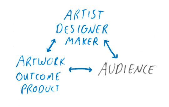
0 notes